← Visit Appcues.com
×
×

8 user onboarding metrics and KPIs you should be measuring

Identifying data-driven optimizations has never been easier when you use these key 8 onboarding metrics and KPIs.
Skip to section:

Skip to section:

Great onboarding flows are crafted, not thrown together willy-nilly. They require experimentation and measurement: Experiments to see what ideas resonate with your audience, and measurement to track how these changes affect your overall onboarding performance. Through continuous experimentation, measuring, and optimization, you’ll slowly develop the best onboarding experience for your product and audience.

But it all starts with tracking the right onboarding KPIs and metrics. Track the wrong things and you might as well not be tracking metrics at all. To put you on the right path, start collecting data on the 8 metrics outlined below to ensure you always have a source of highly relevant data to judge your experiments. Using these metrics, you’ll be able to build an onboarding flow perfectly optimized for your audience, encouraging more sign-ups, activations, and ultimately revenue.

Why measuring user onboarding success is important

Fixing your onboarding flow without metrics is like repairing a leaky pipe with the lights off. Progress will be slow, and you’re likely to do more damage than good (not to mention the mess).

However, improving onboarding with metrics is a whole other story. Suddenly, the solutions become more obvious— you see what works, what doesn’t, and it becomes easier to make improvements based on how users actually interact with your product.  

User onboarding data also allows you to:

This isn't just conjecture, either. Digital communication platform Take was able to make changes that translated into a 124% increase in activation rates after they started tracking user data during onboarding. Similarly, ecommerce marketing platform Yotpo used completion metrics to refine their welcome page and improve retention rates by 50%.

So no more fixing things in the dark. Start tracking key metrics during onboarding so you can understand your users and give them an amazing first impression of what your product has to offer.

8 onboarding metrics and KPIs to track performance

Gauging the health and efficacy of your onboarding flow isn’t easy. These 8 metrics give you unique insights into your onboarding and allow you to set meaningful KPIs that’ll fast track you to success.

1. Retention rate

Retention rate is the percentage of users your product is able to keep over a given timeframe. Onboarding is a key way to improve your overall retention rate, so keeping track of this metric shows how well your optimizations are paying off.

Calculate your retention rate by dividing the number of users in a cohort (i.e., people who signed up on December 3rd) by the number of those users who haven’t churned after one day, week, month, and beyond.
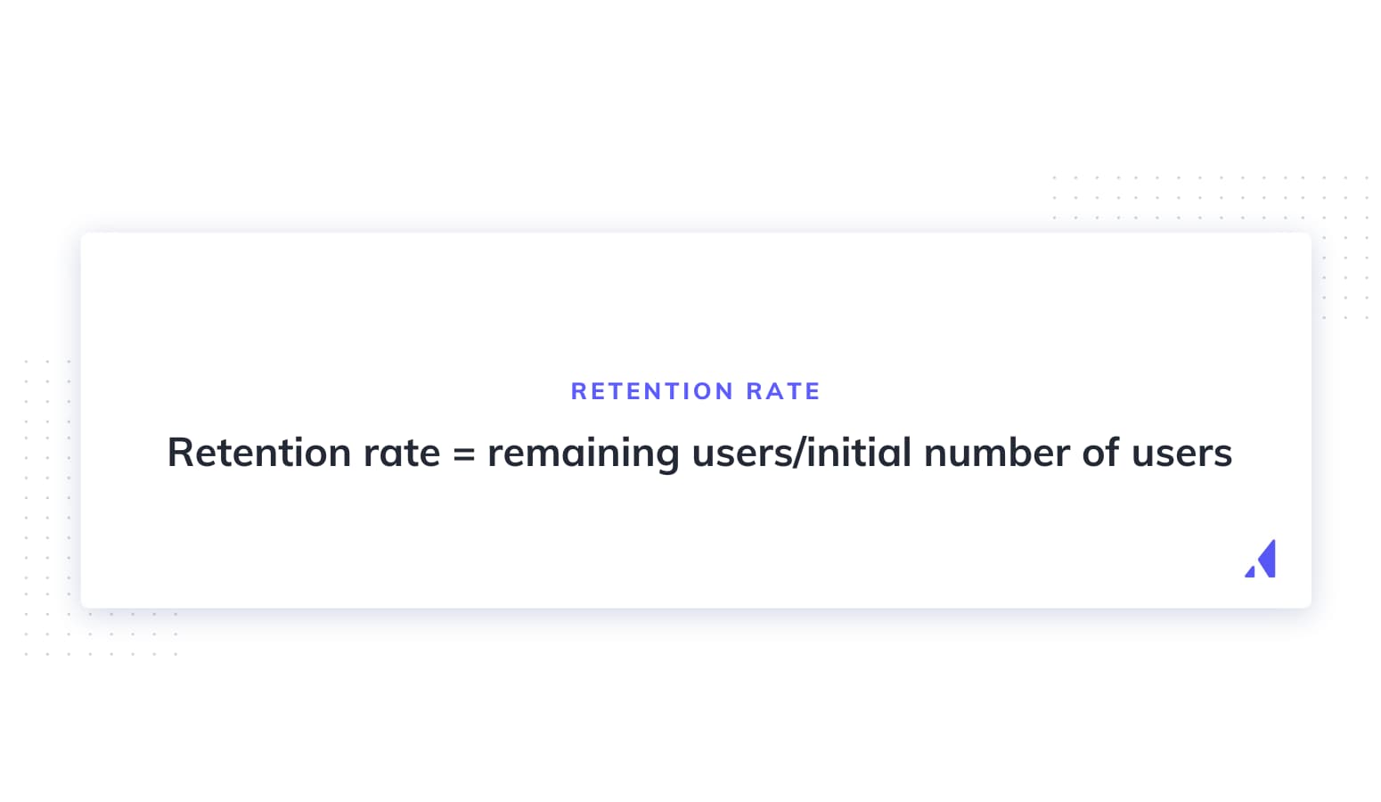
Retention rate = remaining users/initial number of users

Your primary focus should be improving short-term retention rates for onboarding, especially in that crucial first week and month. Use this data to understand what makes people stay and who is staying, so you can double down on what’s working. Improving your retention rate will also help you with your churn rate, which is essentially the flipside of retention. The longer you retain users, the better your churn metrics will look in the long run.

More user retention resources:

2. Engagement rate

Engagement rate is the percentage of users in a group who actively use your product over a period of time.
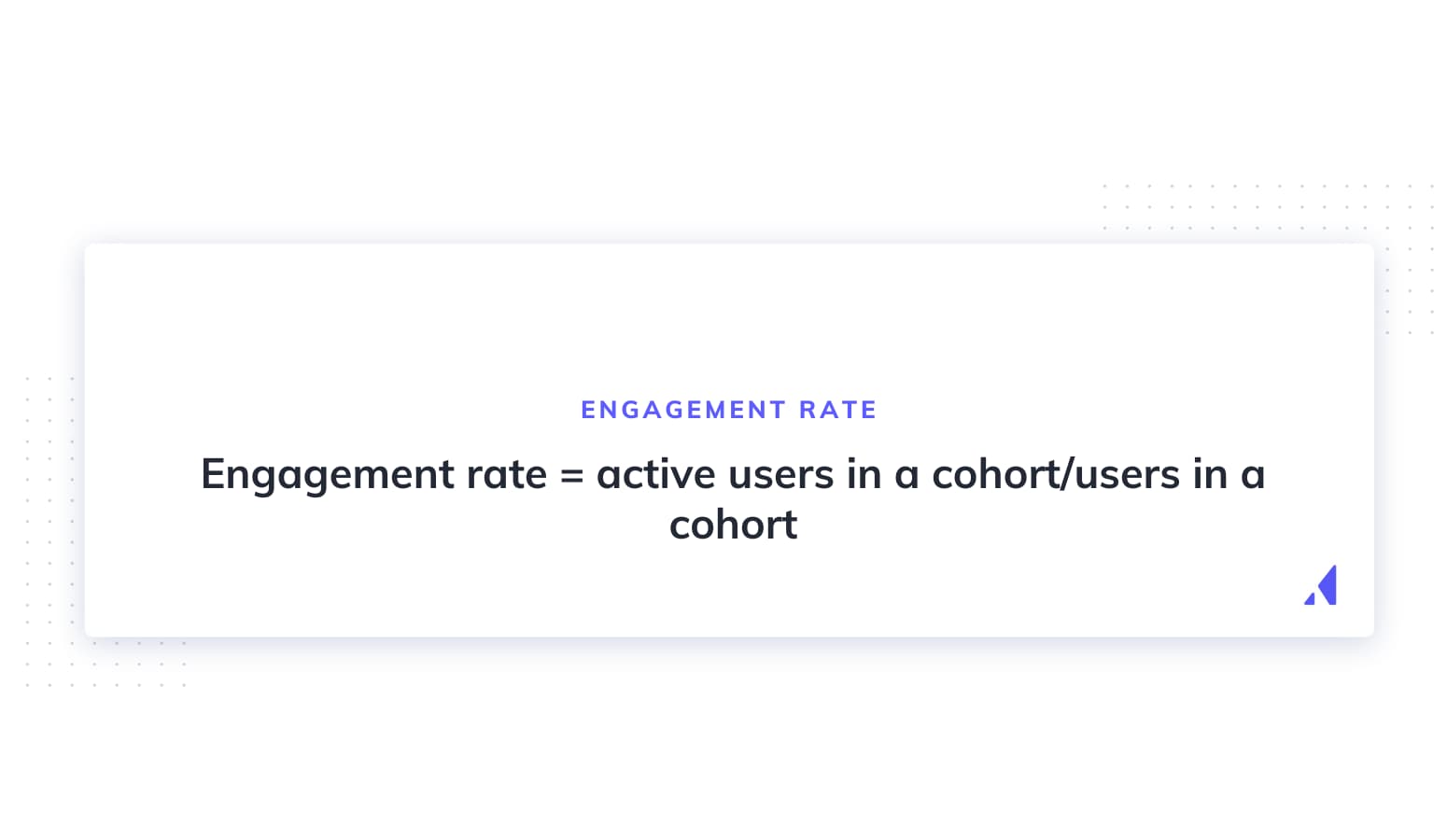
Engagement rate = active users in a cohort/users in a cohort

To get the most out of this metric, you’ll need to divide your user base into cohorts based on when they started onboarding. From there, check what percentage of that cohort uses your product daily, weekly, or monthly (depending on your definition of “active”).

Track this metric to see how changes to onboarding increase engagement with your platform. Over time, these optimizations will create a more engaged user base that’s far less likely to churn.

More engagement resources:

3. Free trial conversion rate

The free trial conversion rate is simply the percentage of free trial users who become paid users over the course of their trial.
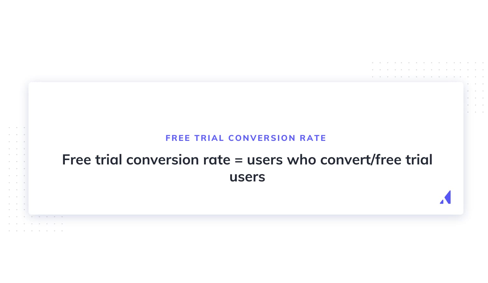
Free trial conversion rate = users who convert/free trial users

Use the free trial conversion rate to get feedback on how well your onboarding shows users the value of your paid options. If you aren’t hitting your conversion rate KPIs, try retooling your onboarding flow to prove the value of your product’s paid offerings. Options include adjusting the trial period, improving your in-app messaging to boost engagement, and adding flows to increase product adoption.

More free trial resources:

4. Completion rate

The completion rate is the percentage of users who actually finish your onboarding.
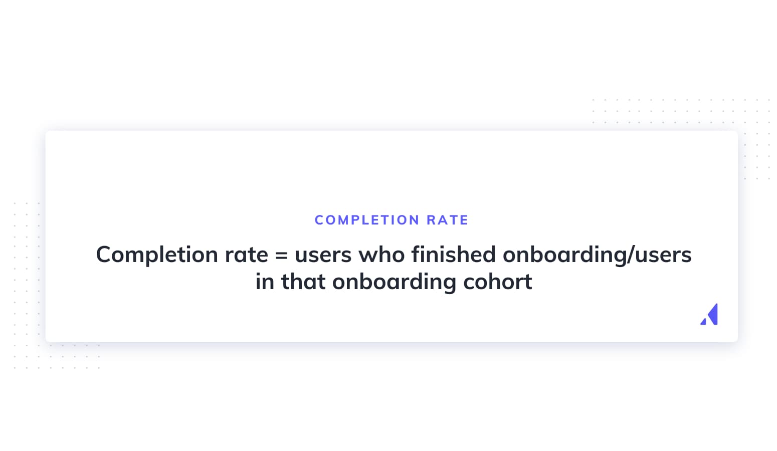
Completion rate = users who finished onboarding/users in that onboarding cohort

If people aren’t finishing your onboarding flow, they’re probably not going to convert. Fix this problem by finding the spots where they’re most likely to exit , and then start making changes there. Try smoothing out these friction points by removing unnecessary steps, improving your UX copy, or providing more guidance to users.

Another issue that could cause low completion rates is too many people entering your funnel who aren’t in your target market. If the wrong people start onboarding and quit because there isn’t a proper product fit, you're wasting time and resources on people who won't convert. In this case, adjust your marketing efforts and landing page copy to convert the right people.

More completion rate resources:

5. Time to value (TTV)

Time to value is how long it takes for users to get from the start of onboarding to getting value from your product (also called the aha moment).
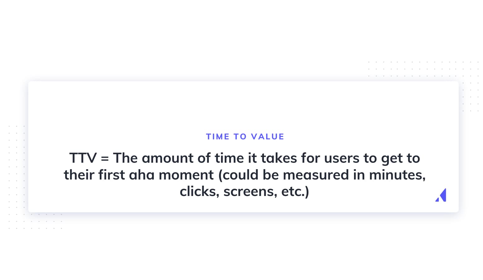
TTV = The amount of time it takes for users to get to their first aha moment (could be measured in minutes, clicks, screens, etc.)

To track TTV, you first need to identify the value your product brings users. Consider why users have decided to try your product and how they hope it’ll help them. Whatever the answer is should be the aha moment your onboarding is building toward.

To improve your TTV,  go back to basics and eliminate all the extra fluff in your onboarding flow. You could try delaying signup or prioritizing aha moments over comprehensive product walkthroughs to get your TTV as low as possible.

More TTV resources:

6. Feature adoption rate

The feature adoption rate measures the percentage of total users who are actually using a feature regularly.
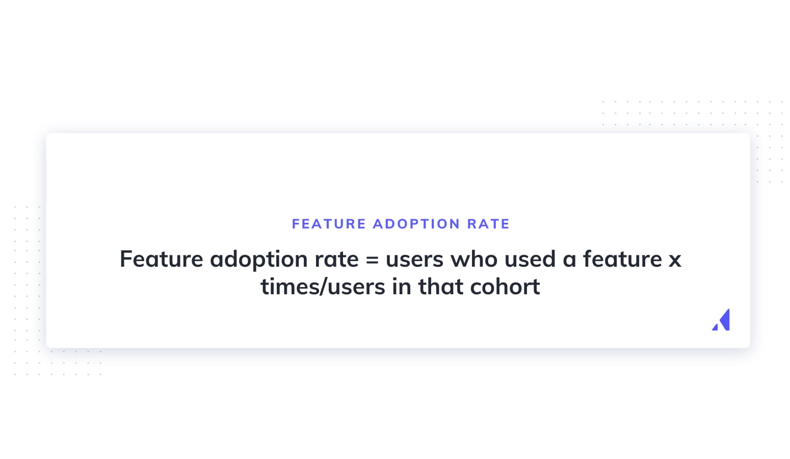
Feature adoption rate = users who used a feature x times/users in that cohort

Fill in x with a number that makes sense for this feature. If this is an auditing feature that should get used once a month, then one is appropriate. For features designed to be used daily, the number should be higher in accordance with the timeframe you’re measuring.

If your feature adoption rate is low, see if you can do more to prioritize your most important features in your onboarding process. Your onboarding goal is to get users to key aha moments as soon as possible; minor features that might distract your users can be introduced after onboarding.

More feature adoption rate resources:

7. Activation rate

Your activation rate measures the percentage of your users who get to predetermined activation points you’ve identified as key indicators of long-term retention.
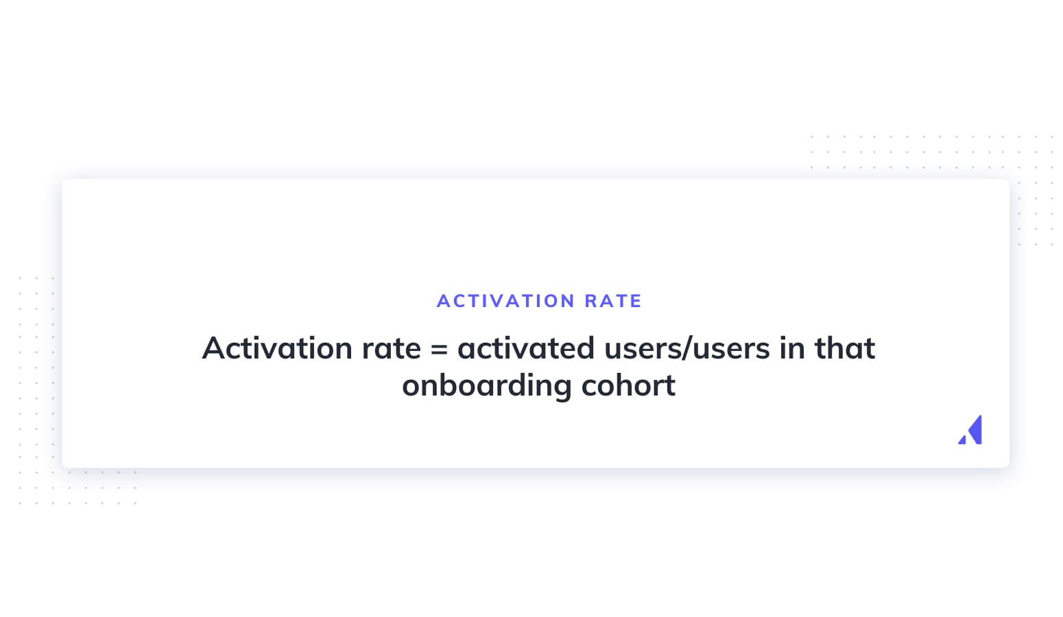
Activation rate = activated users/users in that onboarding cohort

Every product will have unique activation events that show users the value of your product. The better you optimize your onboarding flow to get users to these moments, the more likely they are to stick around.

Find your key activation events by working backward. What events do your most successful user cohort accomplish before converting? Talk to your users—what was the moment they started to love your product? Once you identify what activates users, then start to optimize your flow and use this metric as your north star to see how well your efforts are paying off.  

More activation rate resources:

8. Number of onboarding support tickets per day

The number of onboarding support tickets tells you how many users are struggling to complete your onboarding flow and are forced to ask for help.

Effective onboarding experiences are intuitive and anticipatory. Users should glide from screen to screen with any questions or concerns addressed in a logical progression. Tracking the number and reasons for support tickets generated during onboarding is the easiest way to see how close you are to reaching this lofty onboarding goal.

Use what you learn in these tickets to identify pain points and then A/B test solutions that answer users’ questions and nip churn in the bud before it has a chance to take root.

More support resources:

Measuring your user onboarding process with Appcues

Measuring and tracking important metrics and KPIs is made a lot easier with Appcues. Instead of complicated spreadsheets or manual number-crunching, with Appcues, you get an easy-to-understand dashboard that tracks some of the most important onboarding metrics for your SaaS product.

Appcues measures analytics

Right off the bat, it’s easy to see how well your onboarding flow is performing and how that performance has changed over time. So if you made a change to your flow on August 2nd, you’d be able to see how that change affected your completion rate going forward.

Appcues also allows you to customize this chart based on the KPIs most important to your product by setting and tracking custom goals. For instance, if you’ve identified creating one widget is your activation point, you could track the total number of times users create their first widget as a custom goal. You can then tweak your onboarding and track the results to slowly encourage more users to see value in your product.

Finally, Appcues tracks issues that pop up during your onboarding flow. This way, if your latest experiment has messed with your flow, you’ll catch it early and get the fix in right away.

Tracking user onboarding behavior has never been easier

  • Measure adoption
  • Identify opportunities
  • Track results
Charts and graphs

Improve onboarding metrics with UX best practices

Knowing the metrics you need to track is only half of the job. Now comes the harder part—actually improving them. For that, you’ll need to learn what works (and what doesn't) when it comes to creating world-class customer experiences. Luckily we've got a whole library of case studies and articles you can use to convert new customers into full-on product adopters.

Author's picture
Eric Keating
VP, Marketing at Appcues
Eric heads up Marketing at Appcues. When he isn't helping companies become more product-led, he’s likely to be found keeping up with his wife and two children, exploring the White Mountains, or fermenting things at home.
Skip to section:

Skip to section:

Great onboarding flows are crafted, not thrown together willy-nilly. They require experimentation and measurement: Experiments to see what ideas resonate with your audience, and measurement to track how these changes affect your overall onboarding performance. Through continuous experimentation, measuring, and optimization, you’ll slowly develop the best onboarding experience for your product and audience.

But it all starts with tracking the right onboarding KPIs and metrics. Track the wrong things and you might as well not be tracking metrics at all. To put you on the right path, start collecting data on the 8 metrics outlined below to ensure you always have a source of highly relevant data to judge your experiments. Using these metrics, you’ll be able to build an onboarding flow perfectly optimized for your audience, encouraging more sign-ups, activations, and ultimately revenue.

Why measuring user onboarding success is important

Fixing your onboarding flow without metrics is like repairing a leaky pipe with the lights off. Progress will be slow, and you’re likely to do more damage than good (not to mention the mess).

However, improving onboarding with metrics is a whole other story. Suddenly, the solutions become more obvious— you see what works, what doesn’t, and it becomes easier to make improvements based on how users actually interact with your product.  

User onboarding data also allows you to:

This isn't just conjecture, either. Digital communication platform Take was able to make changes that translated into a 124% increase in activation rates after they started tracking user data during onboarding. Similarly, ecommerce marketing platform Yotpo used completion metrics to refine their welcome page and improve retention rates by 50%.

So no more fixing things in the dark. Start tracking key metrics during onboarding so you can understand your users and give them an amazing first impression of what your product has to offer.

8 onboarding metrics and KPIs to track performance

Gauging the health and efficacy of your onboarding flow isn’t easy. These 8 metrics give you unique insights into your onboarding and allow you to set meaningful KPIs that’ll fast track you to success.

1. Retention rate

Retention rate is the percentage of users your product is able to keep over a given timeframe. Onboarding is a key way to improve your overall retention rate, so keeping track of this metric shows how well your optimizations are paying off.

Calculate your retention rate by dividing the number of users in a cohort (i.e., people who signed up on December 3rd) by the number of those users who haven’t churned after one day, week, month, and beyond.

Retention rate = remaining users/initial number of users

Your primary focus should be improving short-term retention rates for onboarding, especially in that crucial first week and month. Use this data to understand what makes people stay and who is staying, so you can double down on what’s working. Improving your retention rate will also help you with your churn rate, which is essentially the flipside of retention. The longer you retain users, the better your churn metrics will look in the long run.

More user retention resources:

2. Engagement rate

Engagement rate is the percentage of users in a group who actively use your product over a period of time.

Engagement rate = active users in a cohort/users in a cohort

To get the most out of this metric, you’ll need to divide your user base into cohorts based on when they started onboarding. From there, check what percentage of that cohort uses your product daily, weekly, or monthly (depending on your definition of “active”).

Track this metric to see how changes to onboarding increase engagement with your platform. Over time, these optimizations will create a more engaged user base that’s far less likely to churn.

More engagement resources:

3. Free trial conversion rate

The free trial conversion rate is simply the percentage of free trial users who become paid users over the course of their trial.

Free trial conversion rate = users who convert/free trial users

Use the free trial conversion rate to get feedback on how well your onboarding shows users the value of your paid options. If you aren’t hitting your conversion rate KPIs, try retooling your onboarding flow to prove the value of your product’s paid offerings. Options include adjusting the trial period, improving your in-app messaging to boost engagement, and adding flows to increase product adoption.

More free trial resources:

4. Completion rate

The completion rate is the percentage of users who actually finish your onboarding.

Completion rate = users who finished onboarding/users in that onboarding cohort

If people aren’t finishing your onboarding flow, they’re probably not going to convert. Fix this problem by finding the spots where they’re most likely to exit , and then start making changes there. Try smoothing out these friction points by removing unnecessary steps, improving your UX copy, or providing more guidance to users.

Another issue that could cause low completion rates is too many people entering your funnel who aren’t in your target market. If the wrong people start onboarding and quit because there isn’t a proper product fit, you're wasting time and resources on people who won't convert. In this case, adjust your marketing efforts and landing page copy to convert the right people.

More completion rate resources:

5. Time to value (TTV)

Time to value is how long it takes for users to get from the start of onboarding to getting value from your product (also called the aha moment).

TTV = The amount of time it takes for users to get to their first aha moment (could be measured in minutes, clicks, screens, etc.)

To track TTV, you first need to identify the value your product brings users. Consider why users have decided to try your product and how they hope it’ll help them. Whatever the answer is should be the aha moment your onboarding is building toward.

To improve your TTV,  go back to basics and eliminate all the extra fluff in your onboarding flow. You could try delaying signup or prioritizing aha moments over comprehensive product walkthroughs to get your TTV as low as possible.

More TTV resources:

6. Feature adoption rate

The feature adoption rate measures the percentage of total users who are actually using a feature regularly.

Feature adoption rate = users who used a feature x times/users in that cohort

Fill in x with a number that makes sense for this feature. If this is an auditing feature that should get used once a month, then one is appropriate. For features designed to be used daily, the number should be higher in accordance with the timeframe you’re measuring.

If your feature adoption rate is low, see if you can do more to prioritize your most important features in your onboarding process. Your onboarding goal is to get users to key aha moments as soon as possible; minor features that might distract your users can be introduced after onboarding.

More feature adoption rate resources:

7. Activation rate

Your activation rate measures the percentage of your users who get to predetermined activation points you’ve identified as key indicators of long-term retention.

Activation rate = activated users/users in that onboarding cohort

Every product will have unique activation events that show users the value of your product. The better you optimize your onboarding flow to get users to these moments, the more likely they are to stick around.

Find your key activation events by working backward. What events do your most successful user cohort accomplish before converting? Talk to your users—what was the moment they started to love your product? Once you identify what activates users, then start to optimize your flow and use this metric as your north star to see how well your efforts are paying off.  

More activation rate resources:

8. Number of onboarding support tickets per day

The number of onboarding support tickets tells you how many users are struggling to complete your onboarding flow and are forced to ask for help.

Effective onboarding experiences are intuitive and anticipatory. Users should glide from screen to screen with any questions or concerns addressed in a logical progression. Tracking the number and reasons for support tickets generated during onboarding is the easiest way to see how close you are to reaching this lofty onboarding goal.

Use what you learn in these tickets to identify pain points and then A/B test solutions that answer users’ questions and nip churn in the bud before it has a chance to take root.

More support resources:

Measuring your user onboarding process with Appcues

Measuring and tracking important metrics and KPIs is made a lot easier with Appcues. Instead of complicated spreadsheets or manual number-crunching, with Appcues, you get an easy-to-understand dashboard that tracks some of the most important onboarding metrics for your SaaS product.

Appcues measures analytics

Right off the bat, it’s easy to see how well your onboarding flow is performing and how that performance has changed over time. So if you made a change to your flow on August 2nd, you’d be able to see how that change affected your completion rate going forward.

Appcues also allows you to customize this chart based on the KPIs most important to your product by setting and tracking custom goals. For instance, if you’ve identified creating one widget is your activation point, you could track the total number of times users create their first widget as a custom goal. You can then tweak your onboarding and track the results to slowly encourage more users to see value in your product.

Finally, Appcues tracks issues that pop up during your onboarding flow. This way, if your latest experiment has messed with your flow, you’ll catch it early and get the fix in right away.

Tracking user onboarding behavior has never been easier

  • Measure adoption
  • Identify opportunities
  • Track results
Charts and graphs

Improve onboarding metrics with UX best practices

Knowing the metrics you need to track is only half of the job. Now comes the harder part—actually improving them. For that, you’ll need to learn what works (and what doesn't) when it comes to creating world-class customer experiences. Luckily we've got a whole library of case studies and articles you can use to convert new customers into full-on product adopters.

Author's picture
Eric Keating
VP, Marketing at Appcues
Eric heads up Marketing at Appcues. When he isn't helping companies become more product-led, he’s likely to be found keeping up with his wife and two children, exploring the White Mountains, or fermenting things at home.
You might also like...