
.png)
Imagine that a friend has told you about a great new store that just opened up, so you head across town to check it out. You walk up to the storefront, and as you start opening the door, a shopkeeper suddenly pulls the door shut from the inside. Through the glass, he shouts: “Just slip your email address under the door and then you can come in and look around.”
As a new customer, you'd be pretty irritated by the whole experience—in fact, you'd probably just throw up your hands and leave, never to return.
What kind of a company needs that much information about you before they even let you in the door?
Few (if any) in-person businesses would consider such an approach. That sort of thing is generally understood to be bad for business. So why do so many apps treat new users this way? If the first screen in your mobile app is a signup form, you may be doing it wrong.
Let's take a moment to review some numbers: According to Comscore, half of all US mobile users downloaded no new apps in any given month in 2017; in other words, it takes a significant investment of both time and money to get users to even consider downloading your app. And getting them to download is no guarantee that a user will stick around—far from it. Data from mobile analytics service Localytics shows that 21% of users will only ever open your app once, and 71% of users will churn within 90 days.
Security and privacy are major concerns for many users, who are increasingly wary of handing over their personal information to software companies. How and when you ask for that information can make or break the user experience.
To read more about mobile app abandonment, check out our article Why Do Bad User Retention Rates Happen to Good Mobile Apps?.
Think about your app's first screen as a storefront: It should make new users feel welcome and make them want to come inside, not scare them off with too many questions before they've even crossed the threshold.
Rather than forcing new users to input their data or immediately sign up for an account, you need to demonstrate your app's value. It's important to gradually engage new users and reiterate the value you promised in the app store.
Gradual engagement—sometimes called lazy registration—is the process of moving users through your mobile app slowly, helping them experience the value of your app firsthand before requiring that they sign up for an account.
Luke Wroblewski, Product Director at Google, is a big advocate of gradual engagement:
With gradual engagement we can communicate what our mobile apps do and why people should care by actually allowing people to interact with them right away. We can capitalize on all the hard work it takes to get a download instead of turning 75% of our potential audience away with sign-up requirements.
Gradual engagement involves postponing registration for as long as possible—usually until the moment when users must register in order to progress further.
Duolingo does this expertly—instead of forcing users to register immediately, Duolingo allows them to complete a full language lesson before prompting them to create an account. And even then, registration is optional.
Certain features like language clubs and achievement badges remain off-limits to unregistered users, but these users can still access the app's core value proposition of daily language learning without creating an account (though they will receive periodic prompts as they complete lessons).

By allowing their users to engage with the Duolingo app gradually, the actual registration feels like a small step within a larger process, instead of a frustrating obstacle on their path to achieving value.
Giving users the opportunity to interact with your app and understand its benefits before requiring them to make a commitment helps them feel more confident in their decision to continue using your app—which ultimately leads to reduced churn and a better user experience.
So how can you implement this in your own mobile app? Let's take a look at a few examples and principles to follow when building gradual engagement into your app.
Users should be able to explore some of the features of your app before registration. Many ecommerce apps get this right: They let users browse products, and only require registration once the user is ready to make a purchase.
Sneaker marketplace GOAT does a good job of engaging users in their mobile app by letting them browse and search products before requiring personal information. While users are given the option of registering for an account on the first screen, it only becomes a requirement once they wish to save products as favorites or are ready to make a purchase.

By postponing registration until it's truly necessary—which we'll cover in more detail below—signing up feels like less of a burden and more of a logical next step for the user.
Use lightweight interactions to help users accomplish a task within their first session—ideally within the first few seconds of opening your app. If you know that performing certain actions increases a user's likelihood of success—inviting friends to a messaging app, for example, is a critical step to value realization—you should aim to help them complete these meaningful actions as soon as possible.
Helping users find success quickly builds rapport and trust, and can drastically reduce your app's abandonment rates.
Zocdoc's mobile app allows users to quickly find a doctor available in their area within the first few seconds of opening the app. The app doesn't require registration until the user has chosen a provider and is ready to schedule their appointment.
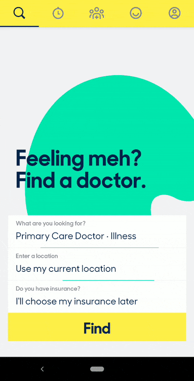
Even though the actual service fulfillment—in this case, the appointment itself—doesn't occur until days or possibly weeks later, the user is able to achieve the app's promised value—finding and scheduling a doctor's appointment without ever picking up a phone—almost immediately.
If the user is asked to enter their registration details at a logical moment in their journey, and you help them understand why the information request is valid and necessary, then registration becomes less of a pain point. If done correctly, user registration can be a moment of true conversion, rather than a hurdle in the user journey—or worse, an exit point out of your app.
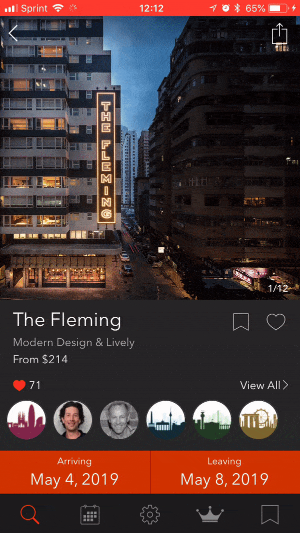
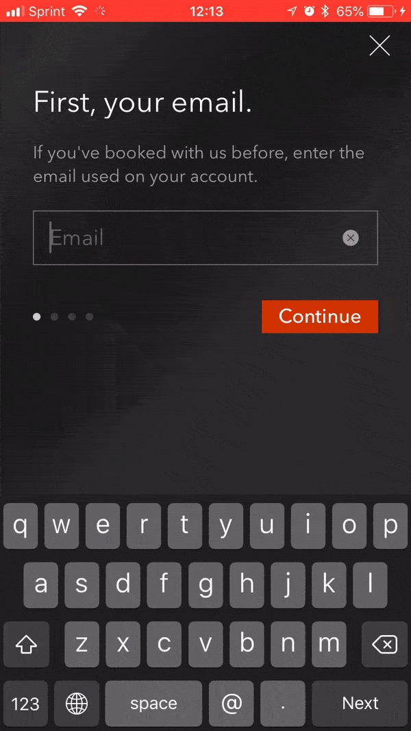
Tablet Hotel's mobile app doesn't require users to register until they are ready to book a room. This step comes at a logical time in the journey—it's obvious to the user that they'll need to provide their personal information to secure the hotel room.
To make the process even smoother, you should also aim to eliminate as many form fields as possible, only asking users for the minimum required information. The fewer form fields you can include, the more likely users will be to complete the registration process. You can leverage single sign-on to make it even easier for new users to register.
Some users might want to use your app without registering at all. If your business model supports this kind of use case, go for it! Give these users the option of a non-registered journey, allowing them to save data locally while continuing to provide the option of signing up if they change their minds.
The TED Talks mobile app—TED—allows users to browse, watch, and download videos—all without an account. Logging in is only required if the user wishes to sync their saved videos or profile information.

Every coin has two sides, and gradual engagement is no exception.
Removing the requirement to register early can cause a drop in the total number of registrations, leading some metrics-obsessed executives to believe it isn't a great approach.
Remember, though, that signups don't equal active and engaged users. Consider whether you would prefer someone who fills out a form once and then never returns, or someone who finds your app valuable and fills out a signup form because they truly want to. For most, the choice between the two is obvious.
Gradual engagement also means potentially missing out on valuable contact information from new users, making it more difficult to reach out and connect with your audience. Communicating with customers is critical for gathering feedback on your product—particularly for early-stage startups—and removing registration requirements can leave your product team in the dark.
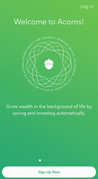
Certain apps also depend on account creation—social media services such as Instagram or mobile finance apps like Acorns, for example. These apps simply can't perform their core functions without some information from the user.
That still doesn't mean you should bombard new users with form fields out of the gate.
Take a look at Acorns' first screen: There is a signup CTA, but it's located at the bottom of the screen; the users' attention is drawn instead to a series of animations that reiterate the app's value proposition and remind them what they can do with the Acorns app and why they downloaded it in the first place.
Yes, it's a signup screen, but it still makes the user feel welcome—and makes them want to continue into the app itself.
For the vast majority of mobile apps, gradual enagement results in better UX, and the business benefits of increased retention rates can outweigh the cost of fewer users and more limited product feedback.
But if your app truly requires account creation to function, an animated screen or two and a bit informative copy can go a long way toward making a necessary signup process part of a pleasant user experience.
Registration is a very real roadblock that can stop users from adopting and engaging with your app. Forcing users to register before they're ready creates unnecessary friction and can significantly reduce your retention rates.
Don't be the shopkeeper yelling through the door. Instead, focus on making a good first impression—then gradually engage your users within your app before requiring them to hand over their personal information.
Your users will thank you for it in the best way possible—by sticking around and engaging with your app, long past the first screen.


.png)