.png)
User onboarding is not a product tour. It's the full system that takes a new user from signup to repeatable value - spanning in-app flows, emails, checklists, and contextual help across multiple sessions.
Most teams get it wrong by front-loading features, building for the product instead of the user, and treating onboarding as a one-time event.
This guide covers the complete framework: how to research before you design, the anatomy of high-performing flows, 10 actionable best practices with real SaaS examples, common mistakes to avoid, measurement strategies, and the onboarding patterns that match your go-to-market model.
Most users who abandon a SaaS product don't leave because the product is bad. They leave because they never understood what it could do for them. Following proven user onboarding best practices is one of the highest-leverage investments a product team can make because the window between signup and abandonment is narrow, and most teams aren't using it well.
User onboarding is the full journey from the moment someone creates an account to the point where they're consistently realizing value from your product. Get it right, and you improve activation, retention, and revenue. Get it wrong, and you're pouring acquisition spend into a leaky bucket.
This guide covers everything product and growth teams need to build onboarding that actually works: the strategy behind it, the UX patterns that drive activation, how to personalize at scale, what to measure, and how to avoid the mistakes that sink most onboarding efforts.
User onboarding is not a product tour. It's not a welcome email sequence. It's not a help doc or a setup wizard. It's the complete experience of guiding a new user from their first interaction with your product to the point where they've achieved meaningful, repeatable value.
That distinction matters because most teams design onboarding as if it were a one-time event - a checklist to complete, a tour to sit through, a modal to dismiss. In reality, onboarding is an ongoing system that spans multiple sessions, multiple channels, and multiple stages of the user's relationship with your product.
Think of a user onboarding flow as the orchestration layer that connects every touchpoint - from the first welcome screen to the moment a user becomes self-sufficient. It includes:
What it does not include - at least not on its own:
The most common misconception is that onboarding ends. For most SaaS products, onboarding is an evolving system - users hit new milestones, unlock new features, and change roles. Each transition is a new onboarding moment. Slack, for example, onboards users to channels and messaging on day one, but the onboarding for Slack Connect (external collaboration) or Workflow Builder only kicks in when those features become relevant to the user's expanding needs.
The business case for onboarding is simple math: if users don't activate, nothing else you build matters. You can have the best product in your category, but if new users can't find value quickly, they leave - and most of them never come back.
The numbers tell the story. Research consistently shows that up to 80% of users who sign up for a SaaS product abandon it within the first week. That's not a product problem - it's an onboarding problem. Those users signed up for a reason. Something between signup and value delivery broke down.
The downstream impact compounds:
Think of it as the leaky bucket problem from the introduction: every dollar spent on acquisition is wasted if users don't activate. Onboarding is the mechanism that patches the bucket. The teams that treat it as a strategic investment - not an afterthought - are the ones that build compounding growth.
Effective onboarding begins before any UI is designed. It begins with understanding who your users are, what they're trying to accomplish, and what "success" looks like from their perspective - not yours. The teams that build the best onboarding experiences invest in research first: user interviews, activation funnel analysis, support ticket themes, and jobs-to-be-done mapping. Skipping this step is the root cause of most onboarding failures - when you don't know what your users actually need, you default to showing them everything, which is the same as showing them nothing.
With that research foundation in place, three components form the backbone of every high-performing onboarding system.
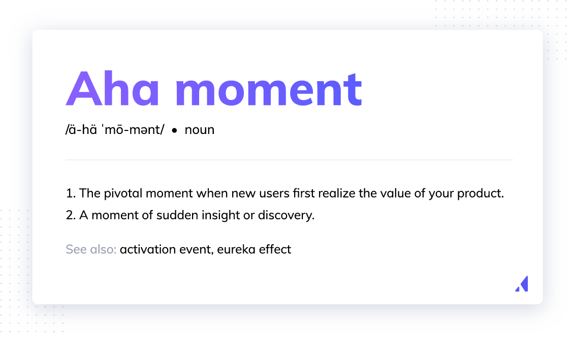
Every product has an aha moment - the specific instant when a user first experiences the core value of the product and thinks, this is why I signed up. For a marketing automation tool, it might be sending a first campaign. For an analytics platform, it might be seeing a first report populated with real data. For an integration tool, it might be connecting two systems and watching data flow between them.
Every decision in your onboarding design should be oriented around getting users to that moment as quickly as possible. Not showing them the most features. Not completing the most setup steps. Getting them to the aha moment.
Teams can identify their aha moment by combining activation data with user research: look for the action that most strongly correlates with long-term retention, then ask activated users what the moment was when the product "clicked" for them. Those two signals usually converge on the same answer.
Users need to feel a win early in the onboarding journey - before they've invested significant time or effort - to build the motivation to continue. This is the principle of sequencing onboarding so that the first meaningful action a user takes produces a visible, satisfying result.
The contrast is with onboarding flows that front-load configuration, form-filling, or feature exploration before delivering any payoff. When users have to do a lot of work before they see any value, most of them won't bother. The cognitive cost exceeds the perceived reward, and they leave.
Design your onboarding so the first action is simple, the result is immediate, and the outcome is clearly connected to something the user cares about. That early win creates the momentum that carries users through the harder parts of setup. Slack applies this well - new users are prompted to send their first message before configuring notifications or privacy settings. That first message exchange is the core value, and it happens before any setup complexity.
Friction is anything that slows a user down or makes them hesitate on the path to the aha moment. It's one of the most underappreciated problems in onboarding - and removing it is often more impactful than adding new onboarding UI elements.
Common friction points include:
A practical way to surface these issues is a friction audit: walk through your entire onboarding flow as a new user, with fresh eyes, and catalog every point of hesitation or confusion. Where do you pause? Where are you unsure what to do next? Where does the product ask for something before it's given you a reason to trust it?
That audit will almost always surface more opportunities to improve than any new tooltip or modal you could add. Dropbox saw this firsthand when they cut their signup form from seven fields to two - name and email. The result was a measurable increase in signup completion, which translated directly into more users reaching the product's core file-sharing experience.
The principles below represent the product onboarding best practices that consistently separate high-performing SaaS teams from the rest. Each one is grounded in real-world outcomes, not theory.
Even lightweight personalization - a few questions at signup, a role-selection screen, a single branching decision - dramatically improves onboarding relevance and completion. When users feel like the product understands their context, they trust it more. When they trust it more, they engage more deeply.
Welcome surveys and role-selection screens are the most common mechanism. A user who identifies as a "marketing manager" should see different first steps than one who identifies as a "developer." The product might be the same, but the path to value is different, and the onboarding should reflect that.
Personalization signals to the user that the product was built for someone like them, which is one of the most powerful things you can communicate in the first five minutes of the experience. Research shows that personalization impacts key customer outcomes across activation, retention, and expansion.
The design app Canva, for example, offers three options for users to select who they are (and why they're on the app). Not only does it make the onboarding process feel personalized to the user by asking them about themselves, it allows PMs to segment the experience to the persona.

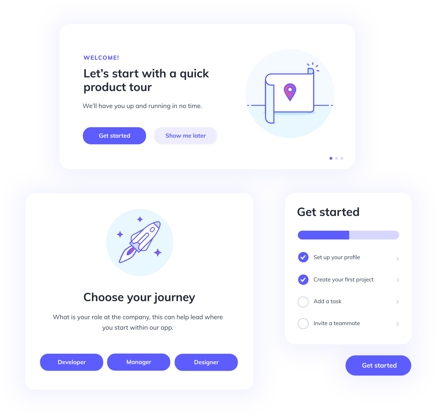
The first touchpoint a user encounters after signup sets the emotional tone for everything that follows. A high-performing welcome experience does three things:
The most common failure mode is overwhelming users with feature announcements or generic "get started" prompts that don't connect to any specific goal. A welcome message that says "Welcome! Here are 12 things you can do" is not a welcome - it's a menu.
Notion does this well. After signup, users see a clean screen with a single prompt to create their first page - no feature tour, no settings menu, just one action tied to the product's core value. The result is immediate: users see a real workspace within seconds, which builds confidence to explore further.
Once users move past the welcome screen, contextual guidance keeps them on track. There's an important distinction between contextual tooltips and linear product tours. A tooltip is triggered by user behavior or location in the UI - it appears when and where it's relevant. A product tour is a scripted walkthrough through a predetermined sequence. Contextual guidance is generally the better default because it meets users where they are rather than forcing them down a predetermined path. When a user navigates to a new section for the first time, a tooltip explaining what they're looking at is helpful. A tour that fires the moment they log in and walks them through features they haven't asked about is often just noise.
When you do write tooltip copy, keep it action-oriented, benefit-focused, and brief. "Click here to add your first team member" is better than "This is the Team Management section where you can invite colleagues."
Building effective product tours starts with getting the welcome experience right and layering contextual guidance that supports - rather than interrupts - the user's momentum.
Progressive onboarding is the practice of revealing features, concepts, and steps gradually over time rather than all at once. It's a foundational UX principle for any product with meaningful complexity.
The logic is straightforward: users can only absorb so much at once. Showing everything on day one doesn't accelerate learning - it creates overwhelm and causes users to disengage. Gradual disclosure respects where the user is in their learning journey and ensures that each piece of information is relevant to what they're doing right now.
In practice, this maps to a multi-session onboarding arc: immediate setup and first value in session one, deeper feature activation over the first week, and advanced capability discovery over the first month. Each stage builds on the last rather than front-loading everything into a single overwhelming experience.
Asana is a strong example. New users start with basic task creation - just a title, an assignee, and a due date. Only after they've built the habit of using tasks does Asana introduce project views, custom fields, rules, and portfolio-level reporting. A brand-new user never sees the full complexity of the platform on day one, which keeps the learning curve manageable and the early experience rewarding.
Onboarding checklists work because of a well-documented psychological principle: people are motivated to complete things they've already started. Once a user has checked off one item, the incomplete items create a pull toward completion. This is sometimes called the Zeigarnik effect - the tendency to remember and be drawn toward unfinished tasks.
For checklists to work, the design has to support that psychology:
A checklist that says "Connect your CRM" is less effective than one that says "Connect your CRM to see which leads are engaging." The first is a task. The second is a reason. Onboarding checklists are one of the most reliable tools for driving sequential activation actions.
Checklists get users started. Gamification keeps them going. While the Zeigarnik effect pulls users toward completing a defined set of tasks, gamification mechanics sustain motivation beyond the initial checklist by making the onboarding journey itself feel rewarding.
The core mechanics that work in SaaS onboarding:
Duolingo popularized gamification in consumer apps, but SaaS teams are applying the same principles effectively. Notion, for example, uses a template gallery unlock as a reward for completing initial setup steps - users who finish onboarding get access to advanced templates, which both incentivizes completion and accelerates deeper product usage.
The numbers back this up. SaaS products that implement progress tracking in their onboarding flows see completion rate improvements of 15-25% compared to flows without visible progress indicators. When you combine progress bars with milestone celebrations, you create a feedback loop where each completed step reinforces the motivation to take the next one.
Empty states - the screens users see before they've added any data or completed any setup - are one of the most underutilized onboarding opportunities in SaaS. Most teams treat them as a design afterthought. The best teams treat them as prime onboarding real estate.
A well-designed empty state does three things:
An empty dashboard that says "No data yet" leaves users stranded. An empty dashboard that says "Add your first project to start tracking progress - here's how" gives them a reason to act and a path forward. The difference in activation rates between these two approaches is significant.
Airtable handles this particularly well. When a user opens a new base, instead of a blank grid, they see sample data pre-populated with a template relevant to their stated use case. The empty state isn't empty at all - it's a preview of the value they'll get, which lowers the effort required to start building something real.
Onboarding doesn't happen in a single session, and it doesn't happen in a single channel. In-app messages and email sequences work together to keep users engaged across sessions and bring them back when they've dropped off.
The key principle is behavioral triggering rather than time-based triggering. A message sent to a user who completed step one but hasn't returned in 48 hours is relevant. A message sent to every user on day three regardless of what they've done is noise.
Message relevance and timing matter more than message frequency. One well-timed, behavior-triggered message will outperform five generic drip emails every time.
Users learn by doing, not by reading or watching. Onboarding flows that ask users to consume information about the product - watch a video, read a tooltip, sit through a tour - are less effective than flows that require users to take real actions within the product.
Interactive walkthroughs, sandbox environments, and "try it now" prompts are the mechanisms for active learning. Instead of explaining how a feature works, let the user try it. Instead of describing what a report looks like, generate one with their data.
Figma is a standout example. New users don't watch a tutorial about the design tools - they're dropped into a hands-on playground where they drag, resize, and style objects immediately. By the time they've finished the interactive introduction, they've already used the core product, which makes the transition to real work feel natural rather than intimidating.
Interactive onboarding also has a practical benefit beyond learning: it generates behavioral data. When users take real actions, you can see exactly where they succeed and where they struggle - which gives you the signal you need to improve the flow.
Even the best-designed onboarding flow will leave some users with questions. The goal is to answer those questions before users have to ask - which means embedding help at the exact moments where users most commonly get stuck.
Proactive help is more effective than reactive support. A knowledge base article linked from within the product at the relevant step is more useful than a support ticket filed three days later. An in-app help widget that surfaces relevant content based on where the user is in the product is more effective than a generic FAQ page.
The most effective resource centers combine multiple content types - short articles, video walkthroughs, and interactive guides - organized by the task the user is trying to complete, not by product feature. When users can search "how do I invite my team" and get a direct answer without leaving the app, friction drops and activation rates climb.
Identify the moments in your onboarding where users most commonly drop off or reach out to support, and embed assistance at those exact points.
Onboarding is not a one-time build. It's a living system that requires ongoing optimization. The teams that treat it as a launch-and-forget project consistently underperform the teams that treat it as a continuous improvement loop.
The feedback loop looks like this: instrument the onboarding flow, analyze where users drop off, form a hypothesis about why, test a change, and measure the result. Then repeat. Even small improvements to onboarding completion rates compound significantly over time given the volume of new users moving through the flow.
Onboarding optimization is a discipline, not a project. The teams that build it into their regular product cadence see the biggest long-term gains in activation and retention.
Even teams that understand onboarding best practices fall into predictable traps. Here are the five most common onboarding mistakes - and how to fix them.
It's tempting to show new users everything your product can do. The logic feels sound: the more they know, the more value they'll see. But in practice, information overload causes the opposite reaction. Users feel overwhelmed, lose focus on the action that matters most, and disengage. Fix it by mapping your onboarding to a progressive disclosure model - session one covers the core action, week one introduces supporting features, and month one unlocks advanced capabilities.
This mistake is subtle because it feels productive. Teams build tours that showcase features, checklists that mirror the product's architecture, and welcome messages that describe functionality. None of that matters to a user who just wants to solve a specific problem. Fix it by starting every onboarding decision with the question: "What is this user trying to accomplish right now?" If the answer isn't clear, go back to research.
Onboarding doesn't end when the checklist is complete. Users encounter new features, change roles, shift use cases, and bring on new team members - each of these is a new onboarding moment. Teams that build a single "new user" flow and never revisit it miss the majority of activation opportunities. Fix it by designing onboarding triggers that respond to user milestones and behavior changes, not just account creation.
Funnel data tells you where users drop off. It doesn't tell you why. Teams that optimize onboarding purely on quantitative metrics often make changes that improve one step but hurt the overall experience. Fix it by pairing your funnel analysis with session recordings, user interviews, and in-app microsurveys at key drop-off points. The combination of "where" and "why" is what leads to confident decisions.
A solo marketer signing up for a free trial has different needs than an enterprise admin onboarding a team of 50. Sending both through the same flow means neither gets a great experience. Fix it by segmenting users at signup - even a simple role or use-case question is enough to branch the flow - and designing paths that reflect the different jobs each segment is trying to do.
Best practices are easier to apply when you can see them in action. Here are three SaaS companies whose onboarding approaches illustrate the principles in this guide. (For more inspiration, see these user onboarding examples.)
Canva's onboarding begins with a simple but powerful question: "What will you be using Canva for?" Users choose from options like "personal," "small business," "teacher," or "large company." That single input shapes the entire onboarding experience - from the templates surfaced first to the design suggestions offered and the collaboration features highlighted.
The result is that a teacher creating classroom materials and a marketing director building brand assets both feel like Canva was designed specifically for them. Canva has grown to over 170 million monthly active users, and their signup-to-first-design activation rate is one of the strongest in consumer SaaS. Personalization at the entry point is a major reason why.
Loom's onboarding is built around a single principle: get users to record and share their first video as fast as possible. After installing the browser extension, users are prompted to record a short video immediately. No configuration, no team setup, no settings to adjust first. The core action is the first action.
Within two minutes of signup, a new user has recorded a video and received a shareable link. That's the aha moment - the instant they see how easy it is to replace a meeting or a long email with a quick video. By front-loading the core value, Loom reduces the gap between signup and activation to nearly zero, which drives strong early retention.
Calendly demonstrates progressive onboarding at its best. New users start by creating a single scheduling link - a task that takes less than a minute and delivers immediate value the first time someone books through it. Only after users experience that core value does Calendly introduce team scheduling, routing rules, integrations, and workflows.
This approach works because the first win is concrete and fast. Users don't need to understand Calendly's full platform to get value. They create a link, share it, and see bookings come in. That early success builds the confidence and curiosity to explore deeper features on their own timeline, rather than being pushed through a comprehensive product tour on day one.
Before choosing specific patterns, it helps to think about onboarding through a behavioral lens. Most effective onboarding ux best practices follow a three-phase model: Orient, Activate, and Reinforce. In the Orient phase, you help users understand where they are and what's possible - through welcome modals and product tours. In the Activate phase, you drive users to complete their first key action - using checklists, tooltips, and guided tasks. In the Reinforce phase, you cement the habit through feedback and celebration - with empty states that reward completion, email follow-ups, and milestone acknowledgments. This framework gives you a strategic layer for deciding which pattern to deploy at each stage of the user's journey.
Product-led onboarding means the product itself guides the user to value - through in-app flows, contextual guidance, checklists, and automated messaging. No human intervention required. This model works best for self-serve products with lower ACV, where the economics of human-assisted onboarding don't make sense and the product is simple enough to be understood without a guide.
Sales-led onboarding means a human - a CSM, AE, or dedicated onboarding specialist - guides the user through setup and initial value realization. This model is better suited to complex, high-touch enterprise deployments where the product requires significant configuration, the stakes of failure are high, and the ACV justifies the investment.
Most teams end up somewhere in between. A hybrid approach - product-led for the initial activation steps, human-assisted for deeper configuration or strategic use cases - is increasingly common and often the most effective model for mid-market SaaS products. For a deeper dive into the mechanics, see our guide to product-led onboarding.
There's no single best onboarding UI pattern. The right choice depends on the complexity of the action being guided, the user's current context, and the urgency of the message. Think of these as a toolkit, not a hierarchy. Choosing the right onboarding UX pattern is a decision that should be made for each specific moment in the flow.
The main patterns and their use cases:
For a deeper look at user onboarding UI and UX patterns, the key question to ask for each pattern is: does this help the user take the next right action, or does it interrupt them?
You can't improve what you don't measure. The core metrics for evaluating onboarding performance are:
These metrics should be tracked at the cohort level - grouping users by when they signed up or which onboarding flow they experienced - so you can see how changes to onboarding affect downstream outcomes. A change that improves completion rate but doesn't improve Day 30 retention isn't actually working. For a complete breakdown of user onboarding metrics and KPIs, cohort analysis is the foundation.
Metrics are more useful when you have a frame of reference. Here are the benchmark ranges that healthy SaaS onboarding programs typically hit:
Slack is a useful reference point here. Their onboarding targets getting a team to exchange 2,000 messages - the activation threshold they identified as the strongest predictor of long-term retention. That's a specific, measurable milestone tied directly to product value, which is exactly how benchmarks should work. For more on the metrics that matter in this context, see our breakdown of product-led growth metrics.
A/B testing onboarding flows is one of the highest-ROI activities a product team can run. But most teams do it wrong - they test too many variables at once, run tests on insufficient sample sizes, or start with the wrong part of the flow.
A practical framework:
Quantitative data tells you where users drop off. Qualitative research tells you why. Both are necessary - neither is sufficient on its own.
Methods for collecting qualitative onboarding feedback:
The best onboarding teams combine both data types. Quantitative data surfaces the problem. Qualitative data explains it. Together, they give you the complete picture you need to make confident improvements.
Here's what matters most from this guide:
Ready to put these practices into action? Start with the section that addresses your biggest gap, and build from there.
Knowing what good onboarding looks like is one thing. Having the tools to build it - without filing an engineering ticket every time you want to change a tooltip - is another.
That's the gap Appcues is built to close. Appcues is a customer engagement platform that lets product, marketing, and growth teams create, deploy, and iterate on onboarding flows without writing code. Welcome modals, checklists, tooltips, product tours, slideouts, hotspots - all of it can be built and launched directly by the people who own the onboarding experience.
Capabilities that map directly to the best practices in this guide:
Appcues also integrates with the tools teams already use - CRMs, analytics platforms, CDPs - so onboarding data flows into the broader product and marketing stack. The insights you generate from onboarding don't live in a silo; they inform every downstream decision about retention, expansion, and product development.

Ready to put these best practices into action? Take an Appcues tour or Book a demo to see how teams are building and optimizing onboarding that compounds over time.


