


This guide breaks down the main types of in-app messaging, where each one works best, and how teams use them to onboard users, announce features, collect feedback, and offer real-time help. It also looks at what changes as products add AI assistants and agentic UI, plus best practices, real examples, and how leading in-app messaging platforms compare.
The reason teams invest here is simple: in-app messages reach users at the exact moment they're doing the work. That makes them better suited than inbox-first channels for speeding up activation, increasing feature adoption, capturing feedback, and improving retention—especially now that users click less and ask AI more.
In-app messages, also called in-app notifications or in-product messages, are the ways you communicate with users while they're using your product. A welcome modal after signup is one. So is the small pointer that explains a new button, the banner about scheduled maintenance, and the two-question survey after someone finishes a report.
Two things make in-app messages different from almost every other channel:
That's why in-app messaging matters most for companies whose customers aren't tech-savvy, like dealership staff, paralegals, contractors, and property managers. These users don't read release notes. They learn the product in the middle of doing their job, so that's where the help has to be.
In-app messages guide users who are already in your product. Push notifications bring users back when they aren't. Most teams need both, for different jobs.
The same logic applies to email. Email follows up after the session. In-app messages do the work during it. For a deeper look at running the channels together, see how to align lifecycle emails with in-app messaging.
Good in-app messages don't fire at random. Unlike push notifications, they appear only while someone is active in your product. They're triggered by what a user does, or doesn't do, in your product. Then they link the user to the next step, often with a deep link to the right screen.
Common behavioral triggers:
The best programs define these moments once and reuse them. In Appcues, those are called Key Moments: named milestones like "created first invoice" or "invited a teammate." That's also how in app messages work: the same Key Moment can trigger a message, define an audience, and measure whether the message worked. Teams can also A/B test these triggers and variations to improve performance over time. Email follow-up still matters, but it's just one messaging channel in broader mobile marketing and marketing channels, so teams usually coordinate it with in-app touchpoints across the customer journey. Push notifications bring people back, while in-app messages support mobile engagement strategies once a user opens the product at the right moment.
Start with the data. Where do new users drop off? Where do they get stuck? Which features do they never find? The answer tells you which format to use.
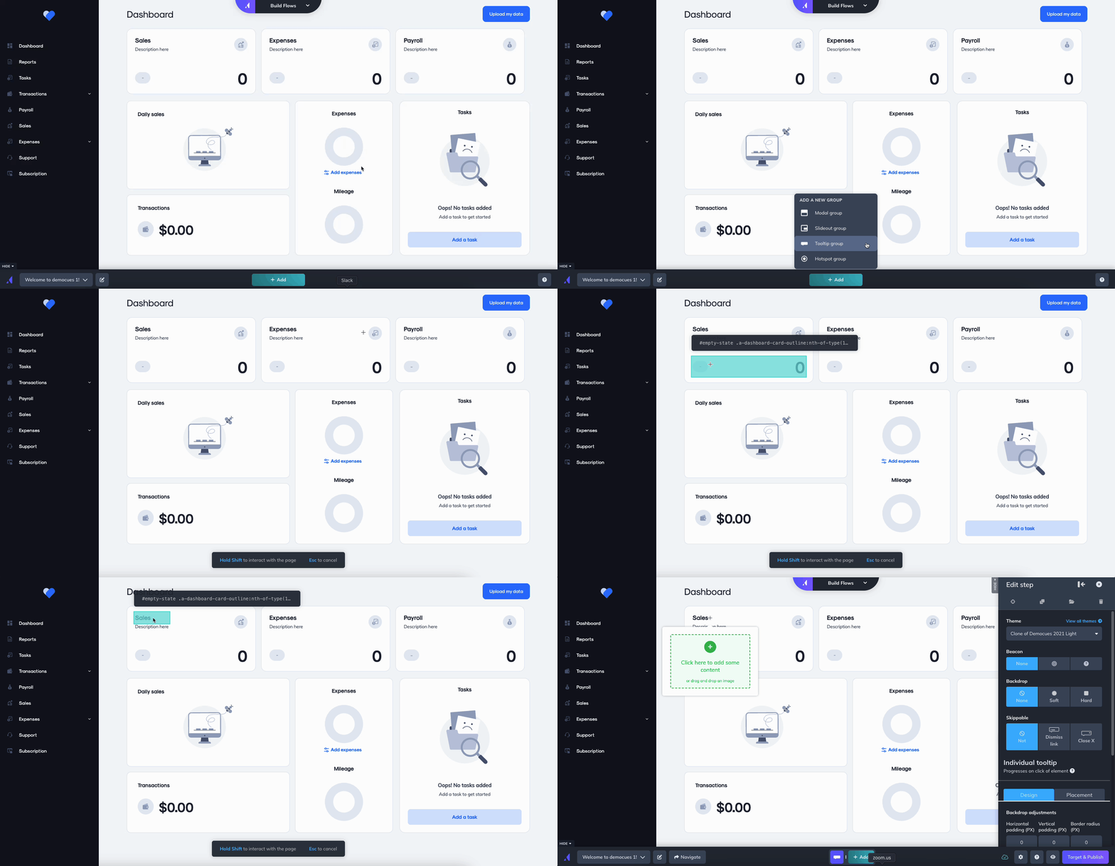
A tooltip is a small message anchored to a specific element on the page. It explains one thing, right where the user needs it, without taking over the screen. Tooltips work best for unfamiliar UI, new buttons, and "here's what this does" moments. (In Appcues, anchored messages like these are built as Pins or as steps in a Flow.)
→ Go deeper: the complete guide to tooltips
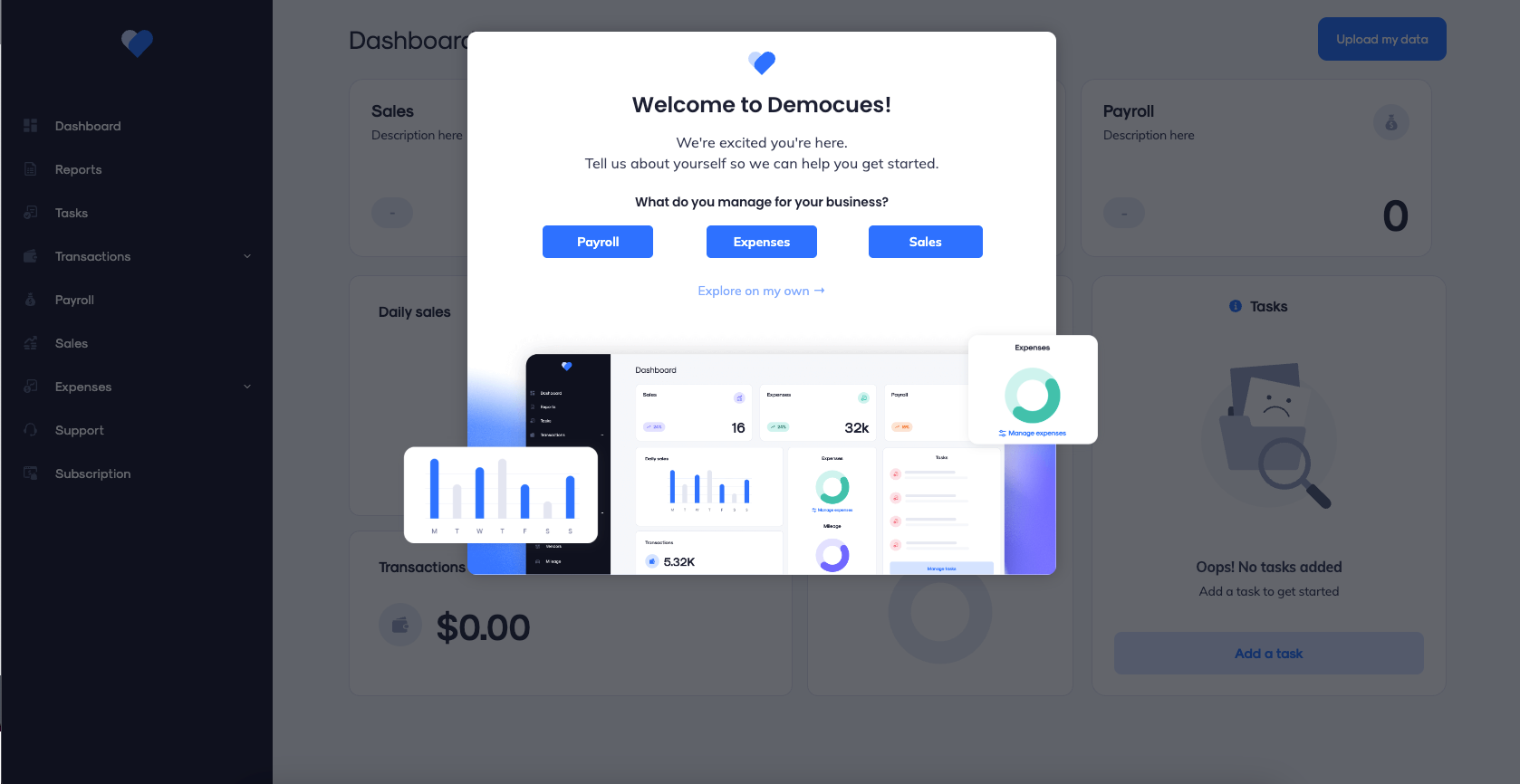
Modals take over the center of the screen, so use them only when something deserves full attention, and keep the copy short, engaging, and simple because the format interrupts the user:
Modals interrupt. That's their strength and their risk. If the message wouldn't justify a tap on the shoulder in person, it doesn't justify a modal.
→ Go deeper: modal dialog windows: when and how to use them
A slideout is a medium-sized message that slides in from the side or corner of the screen. It works well for targeted messages that appear while people are active in the product, since it's visible enough to notice and easy to ignore if the user is busy. That makes it the right default for most non-urgent messages.
Use slideouts to:
The rule of thumb: if you're unsure whether something deserves a modal, it's probably a slideout.
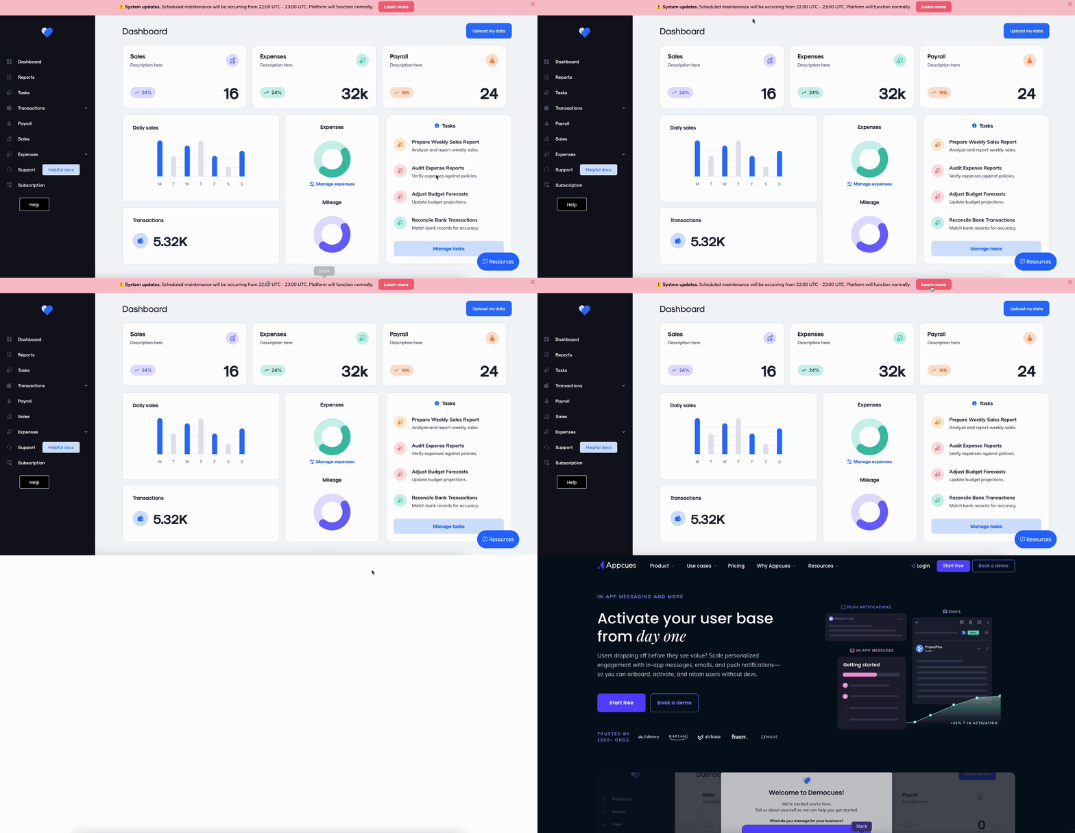
Banners display across the top or bottom of the page. They're the right call for information everyone should see but nobody needs to act on right now, like maintenance windows, policy changes, trial countdowns, and "new feature available" notices..
When users need to learn several things in order, a single message isn't enough. Product tours walk users through a workflow step by step. Checklists list the setup tasks and let users finish them at their own pace, which usually works better for busy, task-driven users. → For which pattern fits which moment, see product tour UI patterns.
Ask in the moment and you get answers based on what just happened, not on memory. Surveys also help collect feedback while interest is still fresh, especially right after download or first use. In-app surveys typically get higher response rates than email surveys. The real gain comes from routing the answer after an early success moment: prompt users to share feedback, send a promoter toward a review request, a detractor toward a CSM, and a "confused" answer toward a how-to.
Live and AI-powered chat give users answers without leaving the product, and they can support new messages asynchronously so people can return to the thread without staying connected the whole time. Make sure you can staff it, or that your AI assistant can actually resolve the questions it gets, before you put a chat bubble on every screen. If your setup truly supports richer media, that can include voice messages too.
Release notes and "what's new" panels give feature launches, fixes, and improvements the space a tooltip can't. They work well as a modal or a full-screen experience that users can open when they want it.
Everything above assumes users click through a traditional interface. More and more, they don't.
Many products now have an AI assistant in a sidebar. Some let users get work done entirely by prompting an agent. A few can be operated with no UI at all, through an MCP connection from Claude, ChatGPT, or Cursor. Each step changes what in-app messaging has to do:
Three things follow for anyone running in-app messaging today:
Most products are somewhere in the middle: a traditional UI with an AI assistant added. That's fine. The point isn't to throw out tooltips. It's to make sure your messaging strategy, and your tooling, can follow users as they move from clicking to asking.
New users decide quickly whether your product is worth learning. Strong onboarding messages improve user engagement, and in-app messages boost user engagement by 12% by helping when a user opens the product and needs a clear path to a first win, the aha moment, before that decision is made. For more on structuring that first session, see our guide to user onboarding. Example: MYOB used targeted in-app onboarding to boost activation 21%.
Shipping a feature doesn't mean anyone will use it, especially when your release cadence is faster than customers can keep up with, so teams should personalize based on which features someone has viewed, ignored, or partially used. In-app announcements reach the users who'll actually benefit at the right moment in the customer journey, while they're in the product. Example: Litmus drove a 2,100% increase in feature adoption with in-app announcements.
→ More: how to improve feature adoption with in-app messaging
The longer you wait to ask, the fuzzier the answer. In-product surveys catch users while the experience is fresh. Example: Circa captured 370% more feedback by moving surveys in-app.
Users who reach value stay. In-app messages can increase engagement over time by surfacing tips, reminders, and useful follow-up prompts that reinforce the habits tied to renewal. They also let you answer common questions before they turn into frustration, which supports long-term customer engagement.
The line between helping users and bothering them is thin. Relevance is what keeps you on the right side of it.
Keep every message to one idea. Users are in your product to do their job, not to read. Cut until it hurts, then cut one more sentence.
A power user doesn't need onboarding, and a day-one user doesn't need an upsell. Go beyond lifecycle stage. A service advisor and a dealership GM use the same product for completely different jobs. Use advanced segmentation to target by role, plan, account, and behavior, and write for each, whether that means welcoming new customers or showing different prompts to long-term customers.
The same message at the wrong time is almost as bad as no message. Trigger guidance at the point of friction. Introduce new features at login, before users are deep in a task, since poorly timed prompts can feel disruptive while the right moment makes them relevant.
Every message should end with a single obvious next step. If you need two buttons, make one clearly primary. "Show me" beats "Learn more."
Feedback is only useful if something happens next, and in-app prompts can also collect feedback while the experience is still fresh, like right after signup or a first success. Branch on the response: a high score goes to a review ask, a low score goes to a human, and "I'm stuck" goes to a walkthrough.
Even helpful messages become noise when they repeat. Set impression caps per user, since users dismiss messages more often when they show up too frequently. Suppress a message once it's dismissed, while letting people close it preserves trust and control. Stop a prompt once the user completes the action it asked for. Frequency rules protect the trust that gets users to read your messages at all.
Onboarding has two jobs: confirm the user made the right choice, and get them to a meaningful action quickly when a user opens the app for the first time—a high-intent moment. Keep the first-run experience focused on two or three critical tasks, with a welcome message that confirms value and guides the first action. A checklist with a progress bar usually beats a ten-step tour.
When users get value before they pay, the product has to make the upgrade case itself, whether the goal is plan expansion or driving in app purchases. The best upgrade prompts show up at the limit, at the right moment when a free user hits a cap or reaches for a paid feature. They should feel like a helpful next step, not a toll booth. Keep them in slideouts or inline messages so users who aren't ready can keep working.
The aha moment is a starting line. Customers make a product indispensable through a series of wins over time, and that sustained messaging should sit inside a broader engagement strategy, not isolated campaigns. Lifecycle nudges, each asking for exactly one next action, move users from "I use this" to "I can't work without this," while also supporting customer journey progression after onboarding.
Upsells and referral asks aren't core actions, so they belong in subtle formats like banners, slideouts, and the empty state of a relevant screen. Aim them at accounts already getting value. Usage data tells you which ones those are.
Most teams start with a platform rather than building in-app messaging from scratch. Building patterns like tooltips, targeting rules, and frequency caps in-house takes ongoing engineering time, and every change goes through a release cycle. Here’s how the main options compare for in app messaging, with key features as the main criteria; the right platform for your business and in app messaging solution also depends on audience size and expected return. For broader roundups, see our guides to user engagement tools and user onboarding tools.
Best for: product teams at mid-market and enterprise B2B and vertical SaaS who want in-app messaging connected to the outcomes it should drive.
Appcues is an in app messaging solution designed to create campaigns tied to measurable outcomes. Appcues covers the full set of in-app formats (Flows, Pins, Banners, Embeds, Checklists, Launchpads, and NPS and in-product surveys) on web and mobile, with email and push. You can organize messages into Campaigns built around a measurable objective, and test different approaches (Tactics) toward that goal. Built-in analytics show whether exposed users reached the objective, compared with users who weren't exposed. Top-tier in-app messaging and product adoption tools have different primary strengths, and Appcues focuses on tying messaging to outcomes.
What's new for 2026:
→ See Appcues in-app messaging in action. Book a demo.
Best for: teams whose main need is deep product analytics, with in-app guides alongside. Pendo pairs guides with an analytics platform and an embedded AI assistant.
Best for: SaaS teams that want onboarding flows, in-app surveys, and product analytics in one place.
Best for: support-led messaging. Intercom is built around a customer messenger and an AI support agent. Its product tours and in-app messages sit alongside support.
Best for: consumer and mobile-first apps, especially app marketers running large cross-channel campaigns across mobile apps, where in-app messages are one channel among push, email, and SMS, and pricing in this category often scales with active users.
Best for: web product teams that want tours, tooltips, and microsurveys with deep styling control.
How to choose: Start with the outcome you're accountable for, like activation, adoption, or retention. Then ask each vendor three questions: Can it target by role, account, and behavior? Can it prove a message changed the outcome, not just that people clicked? Will it work when your users are talking to an AI assistant instead of clicking through screens?
Lifecycle Marketing
In-App Messaging
Product Launches
Retention & Churn
TL;DR
This guide breaks down the main types of in-app messaging, where each one works best, and how teams use them to onboard users, announce features, collect feedback, and offer real-time help. It also looks at what changes as products add AI assistants and agentic UI, plus best practices, real examples, and how leading in-app messaging platforms compare.
The reason teams invest here is simple: in-app messages reach users at the exact moment they're doing the work. That makes them better suited than inbox-first channels for speeding up activation, increasing feature adoption, capturing feedback, and improving retention—especially now that users click less and ask AI more.
In-app messages, also called in-app notifications or in-product messages, are the ways you communicate with users while they're using your product. A welcome modal after signup is one. So is the small pointer that explains a new button, the banner about scheduled maintenance, and the two-question survey after someone finishes a report.
Two things make in-app messages different from almost every other channel:
That's why in-app messaging matters most for companies whose customers aren't tech-savvy, like dealership staff, paralegals, contractors, and property managers. These users don't read release notes. They learn the product in the middle of doing their job, so that's where the help has to be.
In-app messages guide users who are already in your product. Push notifications bring users back when they aren't. Most teams need both, for different jobs.
The same logic applies to email. Email follows up after the session. In-app messages do the work during it. For a deeper look at running the channels together, see how to align lifecycle emails with in-app messaging.
Good in-app messages don't fire at random. Unlike push notifications, they appear only while someone is active in your product. They're triggered by what a user does, or doesn't do, in your product. Then they link the user to the next step, often with a deep link to the right screen.
Common behavioral triggers:
The best programs define these moments once and reuse them. In Appcues, those are called Key Moments: named milestones like "created first invoice" or "invited a teammate." That's also how in app messages work: the same Key Moment can trigger a message, define an audience, and measure whether the message worked. Teams can also A/B test these triggers and variations to improve performance over time. Email follow-up still matters, but it's just one messaging channel in broader mobile marketing and marketing channels, so teams usually coordinate it with in-app touchpoints across the customer journey. Push notifications bring people back, while in-app messages support mobile engagement strategies once a user opens the product at the right moment.
Start with the data. Where do new users drop off? Where do they get stuck? Which features do they never find? The answer tells you which format to use.
A tooltip is a small message anchored to a specific element on the page. It explains one thing, right where the user needs it, without taking over the screen. Tooltips work best for unfamiliar UI, new buttons, and "here's what this does" moments. (In Appcues, anchored messages like these are built as Pins or as steps in a Flow.)
→ Go deeper: the complete guide to tooltips
Modals take over the center of the screen, so use them only when something deserves full attention, and keep the copy short, engaging, and simple because the format interrupts the user:
Modals interrupt. That's their strength and their risk. If the message wouldn't justify a tap on the shoulder in person, it doesn't justify a modal.
→ Go deeper: modal dialog windows: when and how to use them
A slideout is a medium-sized message that slides in from the side or corner of the screen. It works well for targeted messages that appear while people are active in the product, since it's visible enough to notice and easy to ignore if the user is busy. That makes it the right default for most non-urgent messages.
Use slideouts to:
The rule of thumb: if you're unsure whether something deserves a modal, it's probably a slideout.
Banners display across the top or bottom of the page. They're the right call for information everyone should see but nobody needs to act on right now, like maintenance windows, policy changes, trial countdowns, and "new feature available" notices..
When users need to learn several things in order, a single message isn't enough. Product tours walk users through a workflow step by step. Checklists list the setup tasks and let users finish them at their own pace, which usually works better for busy, task-driven users. → For which pattern fits which moment, see product tour UI patterns.
Ask in the moment and you get answers based on what just happened, not on memory. Surveys also help collect feedback while interest is still fresh, especially right after download or first use. In-app surveys typically get higher response rates than email surveys. The real gain comes from routing the answer after an early success moment: prompt users to share feedback, send a promoter toward a review request, a detractor toward a CSM, and a "confused" answer toward a how-to.
Live and AI-powered chat give users answers without leaving the product, and they can support new messages asynchronously so people can return to the thread without staying connected the whole time. Make sure you can staff it, or that your AI assistant can actually resolve the questions it gets, before you put a chat bubble on every screen. If your setup truly supports richer media, that can include voice messages too.
Release notes and "what's new" panels give feature launches, fixes, and improvements the space a tooltip can't. They work well as a modal or a full-screen experience that users can open when they want it.
Everything above assumes users click through a traditional interface. More and more, they don't.
Many products now have an AI assistant in a sidebar. Some let users get work done entirely by prompting an agent. A few can be operated with no UI at all, through an MCP connection from Claude, ChatGPT, or Cursor. Each step changes what in-app messaging has to do:
Three things follow for anyone running in-app messaging today:
Most products are somewhere in the middle: a traditional UI with an AI assistant added. That's fine. The point isn't to throw out tooltips. It's to make sure your messaging strategy, and your tooling, can follow users as they move from clicking to asking.
New users decide quickly whether your product is worth learning. Strong onboarding messages improve user engagement, and in-app messages boost user engagement by 12% by helping when a user opens the product and needs a clear path to a first win, the aha moment, before that decision is made. For more on structuring that first session, see our guide to user onboarding. Example: MYOB used targeted in-app onboarding to boost activation 21%.
Shipping a feature doesn't mean anyone will use it, especially when your release cadence is faster than customers can keep up with, so teams should personalize based on which features someone has viewed, ignored, or partially used. In-app announcements reach the users who'll actually benefit at the right moment in the customer journey, while they're in the product. Example: Litmus drove a 2,100% increase in feature adoption with in-app announcements.
→ More: how to improve feature adoption with in-app messaging
The longer you wait to ask, the fuzzier the answer. In-product surveys catch users while the experience is fresh. Example: Circa captured 370% more feedback by moving surveys in-app.
Users who reach value stay. In-app messages can increase engagement over time by surfacing tips, reminders, and useful follow-up prompts that reinforce the habits tied to renewal. They also let you answer common questions before they turn into frustration, which supports long-term customer engagement.
The line between helping users and bothering them is thin. Relevance is what keeps you on the right side of it.
Keep every message to one idea. Users are in your product to do their job, not to read. Cut until it hurts, then cut one more sentence.
A power user doesn't need onboarding, and a day-one user doesn't need an upsell. Go beyond lifecycle stage. A service advisor and a dealership GM use the same product for completely different jobs. Use advanced segmentation to target by role, plan, account, and behavior, and write for each, whether that means welcoming new customers or showing different prompts to long-term customers.
The same message at the wrong time is almost as bad as no message. Trigger guidance at the point of friction. Introduce new features at login, before users are deep in a task, since poorly timed prompts can feel disruptive while the right moment makes them relevant.
Every message should end with a single obvious next step. If you need two buttons, make one clearly primary. "Show me" beats "Learn more."
Feedback is only useful if something happens next, and in-app prompts can also collect feedback while the experience is still fresh, like right after signup or a first success. Branch on the response: a high score goes to a review ask, a low score goes to a human, and "I'm stuck" goes to a walkthrough.
Even helpful messages become noise when they repeat. Set impression caps per user, since users dismiss messages more often when they show up too frequently. Suppress a message once it's dismissed, while letting people close it preserves trust and control. Stop a prompt once the user completes the action it asked for. Frequency rules protect the trust that gets users to read your messages at all.
Onboarding has two jobs: confirm the user made the right choice, and get them to a meaningful action quickly when a user opens the app for the first time—a high-intent moment. Keep the first-run experience focused on two or three critical tasks, with a welcome message that confirms value and guides the first action. A checklist with a progress bar usually beats a ten-step tour.
When users get value before they pay, the product has to make the upgrade case itself, whether the goal is plan expansion or driving in app purchases. The best upgrade prompts show up at the limit, at the right moment when a free user hits a cap or reaches for a paid feature. They should feel like a helpful next step, not a toll booth. Keep them in slideouts or inline messages so users who aren't ready can keep working.
The aha moment is a starting line. Customers make a product indispensable through a series of wins over time, and that sustained messaging should sit inside a broader engagement strategy, not isolated campaigns. Lifecycle nudges, each asking for exactly one next action, move users from "I use this" to "I can't work without this," while also supporting customer journey progression after onboarding.
Upsells and referral asks aren't core actions, so they belong in subtle formats like banners, slideouts, and the empty state of a relevant screen. Aim them at accounts already getting value. Usage data tells you which ones those are.
Most teams start with a platform rather than building in-app messaging from scratch. Building patterns like tooltips, targeting rules, and frequency caps in-house takes ongoing engineering time, and every change goes through a release cycle. Here’s how the main options compare for in app messaging, with key features as the main criteria; the right platform for your business and in app messaging solution also depends on audience size and expected return. For broader roundups, see our guides to user engagement tools and user onboarding tools.
Best for: product teams at mid-market and enterprise B2B and vertical SaaS who want in-app messaging connected to the outcomes it should drive.
Appcues is an in app messaging solution designed to create campaigns tied to measurable outcomes. Appcues covers the full set of in-app formats (Flows, Pins, Banners, Embeds, Checklists, Launchpads, and NPS and in-product surveys) on web and mobile, with email and push. You can organize messages into Campaigns built around a measurable objective, and test different approaches (Tactics) toward that goal. Built-in analytics show whether exposed users reached the objective, compared with users who weren't exposed. Top-tier in-app messaging and product adoption tools have different primary strengths, and Appcues focuses on tying messaging to outcomes.
What's new for 2026:
→ See Appcues in-app messaging in action. Book a demo.
Best for: teams whose main need is deep product analytics, with in-app guides alongside. Pendo pairs guides with an analytics platform and an embedded AI assistant.
Best for: SaaS teams that want onboarding flows, in-app surveys, and product analytics in one place.
Best for: support-led messaging. Intercom is built around a customer messenger and an AI support agent. Its product tours and in-app messages sit alongside support.
Best for: consumer and mobile-first apps, especially app marketers running large cross-channel campaigns across mobile apps, where in-app messages are one channel among push, email, and SMS, and pricing in this category often scales with active users.
Best for: web product teams that want tours, tooltips, and microsurveys with deep styling control.
How to choose: Start with the outcome you're accountable for, like activation, adoption, or retention. Then ask each vendor three questions: Can it target by role, account, and behavior? Can it prove a message changed the outcome, not just that people clicked? Will it work when your users are talking to an AI assistant instead of clicking through screens?

Sign up for Quickcues and get our monthly updates!


