.png)
Product tours work when they're short, targeted, and tied to a specific activation goal. The best tours guide users to their aha moment in 3-5 steps, not give them a grand tour of every feature.
Build tours around your users, not your product. Segment by role or goal, choose UI patterns that match task complexity, and write copy that gives one action and one reason per step.
Your first tour is a hypothesis, not a finished product. Track step-level drop-off and downstream activation, then adjust. The teams that win at onboarding are the ones that keep iterating.
Product tours (or product walkthroughs) introduce new users to apps by giving them the lay of the land. You can think of them like interactive tutorials - they help users get comfy with your UI while guiding them to the core processes that bring value to your product. Great product tours set users up for long-term engagement and increase the odds of product activation, product adoption, and user retention.
If you want to keep new users as customers, your product has to work seamlessly from the start. Research shows that nearly 40% of users abandon onboarding before completing setup - and there's no better retention mechanism than a stellar product tour that gets them past that hurdle.
A product tour is a guided walkthrough of a product or service, typically presented to users after they sign up or first log in. Product tours are used to onboard new users, introduce them to a product's key features and value, and help them get started using it. They're different from product demos, which intend to show a custom solution to a specific user need.
These terms get used interchangeably, but they serve different purposes:
In practice, the best onboarding experiences blend all three. A product tour orients users, a walkthrough gets them doing real work, and demo content can resurface later to introduce advanced features.
You should expect adopting any new software to come with a bit of a learning curve. A product tour helps users navigate this friction while promptly revealing an app's important value-laden features. Good tours walk a tightrope between annoying users with over-engagement and frustrating users with under-assistance.
Time to value (TTV) measures how quickly a new user gets meaningful results from your product. Without guidance, users wander. They poke around the UI, miss the features that matter, and churn before they ever see what the product can do. Research from ABBYY found that roughly 40% of users abandon onboarding processes altogether. A well-targeted product tour shortens TTV by cutting through the noise and leading users straight to the actions that deliver results.
Tours guide users to their aha moment faster. An aha moment is when users first realize the value your product provides - when they stop exploring and start understanding. A product tour makes that discovery process deliberate instead of accidental, which directly lifts activation rates. Companies that invest in guided onboarding routinely see double-digit improvements in activation.
Most SaaS products have features that users never find on their own. Product tours and interactive walkthroughs surface these underused capabilities at the right moment, turning "I didn't know it could do that" into "I use this every day." This is especially important for product adoption - the gap between signing up and actually using your product's full value.
Proactive guidance reduces repetitive support tickets. When a product tour explains how to complete a common workflow, users don't need to open a ticket or search your help docs to figure it out. This frees up your customer success team to focus on strategic conversations instead of answering the same "how do I..." questions.
Activation is the leading indicator of user retention. Users who reach their aha moment and build habits around your product's core value stick around longer. Product tours influence user behavior early, and that early momentum compounds. The downstream effect is lower churn, higher expansion revenue, and a healthier customer base. Tools like Appcues make it straightforward to build and iterate on tours that drive these outcomes without relying on engineering cycles.
There are several UI patterns you can mix and match when building a product tour. Each serves a different purpose, and the best tours combine multiple patterns to match the complexity of the task at hand.
The right mix depends on your product's complexity, your users' familiarity, and the specific activation goal you're optimizing for.
Selecting the right UI pattern for your product tour sets the tone for the entire onboarding experience. Here's how to make the right call.
A complex app with multiple modules and configuration steps needs more comprehensive guidance - think interactive walkthroughs with checklists. A simpler product with a single core workflow might only need a few tooltips or hotspots to get users oriented.
Zenefits, for example, uses a blend of modal windows and tooltips to smoothly guide users through its HR platform. The modals handle high-priority setup steps while tooltips provide contextual guidance as users explore features.
Understand who your users are. Are they technical users who navigate new software quickly? Or are they less tech-savvy users who need more hand-holding?
Match the UI pattern you choose with the needs of your users and the requirements of your app. More complex apps might require more targeted onboarding guidance, while straightforward apps might only need basic tips.
You should also think about your users' motivation. How likely are they to complete a more extensive product tour? It's important to empathize with users as you choose which UI pattern to apply to your product tour.
These are the 3 most popular UI patterns for building product tours:
How engaged are your users likely to be? Are they ready for a deep-dive tour, or would they prefer the highlights? This is where you gauge the room.
If your users are eager learners ready to explore every corner of your app, a detailed tour with progress bars or task lists might be the right fit. But if they're only popping in for a quick visit, a simple tooltip or a brief explainer video might be the better choice. Read your users' signals and adjust accordingly. For more on matching patterns to onboarding flow design patterns, check out our full guide.
Whether you're building your first product tour or rebuilding one that isn't performing, following a structured process will save you time and produce better results. Here's a six-step framework for creating a product walkthrough that actually drives activation.
Every effective product tour starts with a clear activation goal. What specific action should the tour drive users toward? Look at your analytics to find what retained users did that churned users didn't. That behavior is your aha moment, and your entire tour should be designed to get users there as directly as possible.
For a project management tool, the aha moment might be creating a first project and inviting a teammate. For an analytics platform, it might be building a first dashboard from real data. Be specific. "Understand the product" is not a goal. "Complete their first report" is.
Identify the 3-5 key actions between first login and activation. What must a user do, in what order, to reach the goal you defined in step one? Map this path explicitly, then look for friction points where users commonly stall or drop off. Remove or simplify anything that isn't essential to reaching the aha moment.
Different roles and goals need different tours. A marketing manager and a data analyst logging into the same product have very different jobs to do. Ask segmentation questions at signup or use behavioral data to route users into contextual tours tailored to their needs. Generic one-size-fits-all tours ignore these differences, and users notice.
Match the pattern to the task complexity. Simple orientation? Tooltips. Multi-step configuration? An interactive walkthrough with a checklist. High-priority setup action? A modal. Refer back to the types section above and think about which combination will guide your specific users through your specific path with the least friction.
Each step in your tour should have one action and one reason. Tell users what to do and why it matters, nothing more. Keep tours to 3-5 steps. If you need more than that, you're probably trying to cover too much ground in a single tour. Break it into stages instead.
Your first tour is a starting point, not the final product. Track completion rates, step-level drop-off, and downstream activation. Where are users bailing? Which steps feel unclear? A/B test variations of copy, sequence, and UI patterns. Tools like Appcues let you build and iterate on tours without engineering cycles, so you can move fast and learn from real user behavior. Check out this step-by-step guide to building your first tour in Appcues.
This framework plugs directly into your flywheel. Every tour you build should be moving users from one stage to the next, and every iteration should make that movement smoother.
Once your tour is live, these practices will help you get more out of it over time.
Think of your product tour as a personal guide tailored to each user's needs. Segment your tours based on user roles, goals, or behaviors. A first-time user gets the foundational introduction. A power user returning after a product update gets a focused feature spotlight. This kind of targeting turns a generic experience into a relevant one, and relevance drives completion rates.
Andrew Capland, PLG Advisor and Growth Leader, gives us a bit of insight into how he's structured product tours:
"The main challenge with product tours is that most display 1x (usually when the page/feature loads for the first time) and then disappear forever. That's challenging because many users want to explore on their own first - then have guidance later. With that in mind, I've found the best tours can be minimized and then viewed when the user is ready. Ideally, combined with a checklist or 'getting started' page. Something that provides help when they need it - on their terms."
Provide links to additional content, interactive guides, and access to real-time customer support as users continue to explore your app. Let them know where they can go to revisit the product tour if they need to walk through a step again.
Not everyone wants the full walkthrough. Some users prefer to dive right in and learn by doing. Respect their familiarity and confidence with a "skip tour" option. This flexibility prevents frustration, especially for returning users or experienced professionals who already know the product category well.
Your app evolves, and so should your product tours. Regularly review how your tours are performing. Are users dropping off at a certain point? Maybe that step references a feature that's moved or changed. Update and tweak your tours based on user engagement data. Stale tours create confusion and erode trust.
Don't just track overall completion rates. Look at step-level data to understand where users find value and where they disengage. Which steps have the highest drop-off? Which ones correlate with downstream activation? This granular view tells you exactly where to focus your next round of improvements.
Even well-intentioned product tours can backfire. Here are the most common pitfalls and why they hurt.
The best way to understand what makes a product tour work is to look at real results. Here are SaaS companies that used product walkthroughs to drive measurable business outcomes.

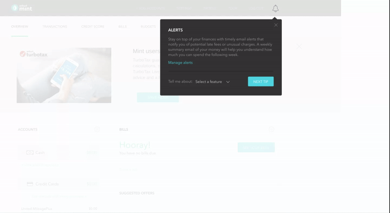
Personal finance management app Mint built its product tour to guide users through a lengthy setup process that involves everyone’s favorite task: typing in sensitive personal information. Mint uses tooltips to make what would otherwise be a thorny starting process a cinch.
After entering their email address, Mint asks users to add all of their bank accounts. Mint knows that most people don’t enjoy tracking down all of their financial information and giving it to a private company, so they include a reassuring sidebar on the right side of the screen to build trust with users. The sidebar includes a checklist of the steps required to get started, while including blurbs highlighting its dedication to security and the trust of its millions of clients.
After that, Mint liberally uses tooltips to point out the most important features within the app. The tooltips employ bold colors to contrast against the rest of the UI. It also includes CTAs and options for more information for users who want to engage with the feature immediately. For everyone else, the “Next Tip” button stands out brightly against the dark gray tooltip.
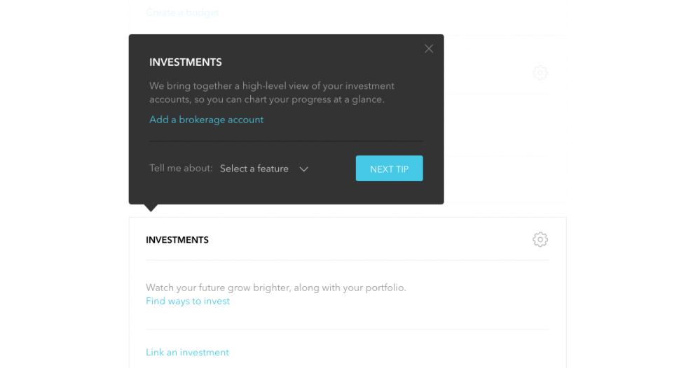

Mint’s tooltips also employ the use of gentle animations to further draw attention to its onboarding tips.
HR platform Zenefits uses a combination of modal windows and tooltips to acquaint users with its app. Its product tour funnels users to a demo version of its platform that allows them to learn about and engage with important features before venturing off on their own.
First, Zenefits uses modal windows for users to input the information required to get started.
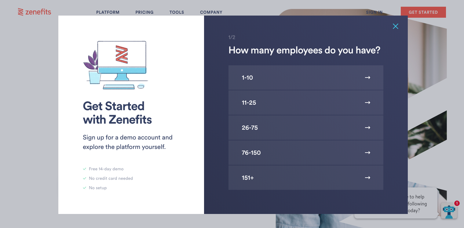
Another modal window then informs the user that they’ll be working inside a demo version of the software. It also uses this as an opportunity to have users review its Terms and Privacy policy.
.png)
From here, Zenefits guides users from function to function with the use of tooltips. The tooltips point directly to the features mentioned in the copy. The product walkthrough thoughtfully includes a “Back” button within each tooltip in the event a user accidentally hits the “Next” button.

Zenefits also grays out the area behind the tooltip and feature to emphasize the feature’s location within the UI.

Product tours should stay short to retain users’ attention, but sometimes complex products require more guidance. Enterprise software company Zuora bills itself as an “all-in-one” solution. It offers a full stack of subscription management tools to stand out from competitors. Users must understand how to work every tool in its stack to see the full benefit of the product. This means its product tour runs long by most standards.
Zuora solves this problem through the smart use of modal windows. Early in the product tour, new users select whether their interest in the app concerns “Product & Growth” or “Finance & Accounting.” This allows Zuora to immediately introduce users with targeted in-app messaging to the features that brought them to the product in the first place.

Zuora uses tooltips as the framework for most of its product tour. Too many tooltips will disengage readers and can lead to customers clicking “Next” without reading anything. Zuora throws in a few action-driven tooltips to prevent this from happening:

It wraps up its lengthy product tour with a modal window congratulating the user. This final modal contains a video that allows curious users to find more helpful information on how to use the product to get results. Users who’ve seen enough can click the “Done” button in the bottom right corner.

Revenue operations platform Chili Piper used guided product walkthroughs to drive upsell opportunities within its existing user base. By introducing contextual tours that surfaced advanced features at the right moment in the user journey, Chili Piper generated over $150K in incremental ARR from upsells. The key was timing: rather than front-loading feature education during initial onboarding, they triggered tours when users hit natural expansion points in their workflow.
Data integration platform Fivetran used product walkthroughs during its pre-launch testing phase to gather structured user feedback. By guiding beta users through specific workflows and capturing their responses at each step, Fivetran identified and eliminated 15 product bugs before the general availability release. This approach turned the product tour into a feedback mechanism, not just an education tool, and produced a more polished product at launch.
AI-powered enterprise search platform Lucy redesigned its onboarding tour with a focus on getting users to their first successful search as quickly as possible. The result: a 6x increase in NPS score. The improvement came from simplifying the initial tour to focus on one core action, removing the feature-by-feature approach they had been using, and letting users discover secondary features through contextual prompts after activation.
For a deeper dive into building product experiences that drive activation and retention, check out 20 Proven Strategies for Creating More Impactful Product Experiences. And if you're evaluating onboarding tools, our guide to product tour software covers the full landscape.
See how Appcues helps product teams create, test, and optimize product tours without engineering dependency. Book a demo to see it in action.
.png)