.png)
Handing your product off to a new user without offering guidance on how to use it is a surefire way to tank your retention rates.
While it’s definitely true that many users learn best by doing, they still need a kernel of awareness to get started. App walkthroughs are an effective way to meet users early on in their journey and guide them toward valuable features that may not be readily apparent. That way, your app can foster the kind of usage habits that help you optimize your UX, boost retention, and drive product growth.
If you’re finding that your users are dropping off before they can get to value, this blog will help you develop or improve upon an app walkthrough to help teach your new users how to get the most out of your product.
An app walkthrough is an in-depth, interactive tutorial that guides users step-by-step through a set of actions to achieve a specific outcome. Tooltips and modal windows are used to explain and highlight what a user needs to do in order to complete their task.
For example, consider building an app walkthrough for a person-to-person payment app like Venmo. You might design a walkthrough that starts with connecting the user’s bank account to the app or shows them how to make their payment.
While this might sound exactly like a product tour, there are some key differences to keep in mind.
Walkthroughs and product tours are often conflated as they both serve as effective onboarding strategies.
As you’re looking to optimize your customer onboarding experience, it’s important that you understand what you’re looking to build.
A product tour is that first foray into your app where users get the lay of the land. They get to quickly see where your product’s most important features can be found and perhaps even complete that first task in order to get to that “aha moment”. While this helps retain new users in the near term, the singular focus on the aha moment sidelines other valuable features.
Meanwhile, app walkthroughs bring users directly to these value-laden features—and then educate on how to use them to get results. These might not be on the first screen users see when they log in but might be an activity or workflow tied to a users success with your product.
Because app walkthroughs are far more in-depth than product tours—and they can be geared toward workflows that users may not be able to think of. Here are a few reasons you should consider adding app walkthroughs into your platform.
The quickest way to lose a user is to not explain how to use your product. The slowest way to lose a user is by taking too long to explain how to use your product as intended.
Avoiding these two scenarios means striking a middle ground and showing them how to use the features they paid for in the first place.
Just because the initial product tour has ended doesn’t mean onboarding is over—and there are likely many features that your user hasn’t been exposed to.
Should they venture off into the unknown corners of your app without a clear path to what they should be doing next, it will likely make for a frustrating experience.
App walkthroughs can make the overall onboarding process smoother and more enjoyable.
Should your users get frustrated with your product, they might try to figure it out for themselves or simply give up. But, when neither of those two are an option, users are going to reach out to your customer support team. Providing an app walkthrough can save countless person hours explaining the same processes time and again, allowing your team to focus on more pressing issues.
The better your users understand how to use your product to its fullest, the more likely they are to stick around. Improving the long-tail of the onboarding experience can help reduce churn due to lack of value recognized by the user.
A good walkthrough can be hard to nail. Too long and you risk losing the user along the way. Too short, and users might not get the product knowledge they need to use your features properly. Too flashy? Distracted. Too boring? They’re on Reddit now.
Here are four companies that provide premium walkthrough experiences for their users.
GoToWebinar began as an enterprise desktop solution and has become a popular choice for webinar hosting. Recent redesigns have repositioned the platform to include a beautiful web app, a free-trial process, and robust user guidance throughout the product journey.
The GoToWebinar team used Appcues to create a new feature announcement slideout and walkthrough to educate users about their new Transcripts feature. Here’s what it looked like when they launched:
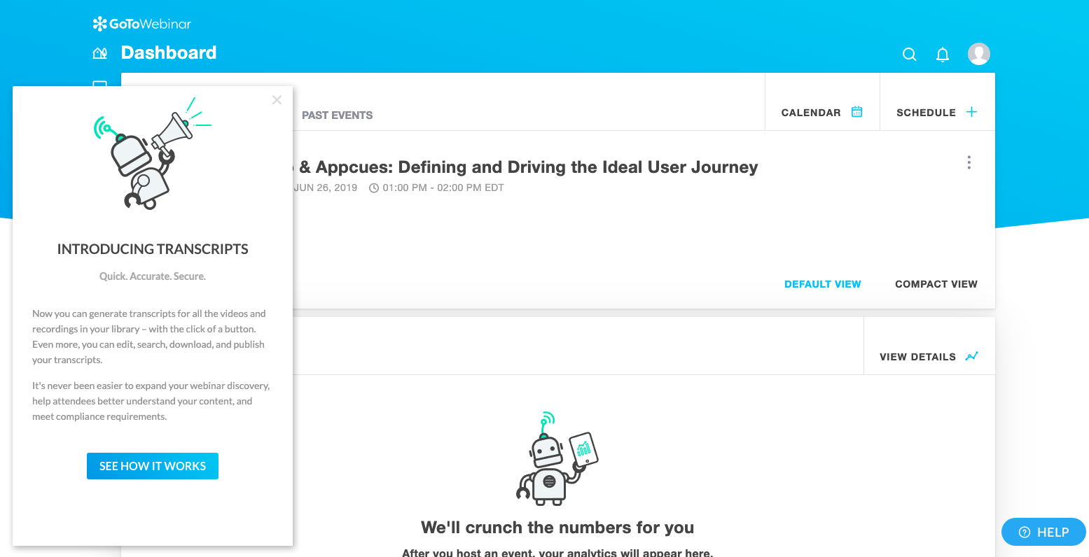
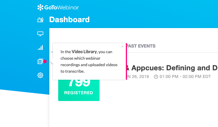
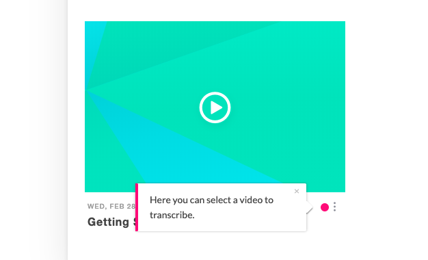
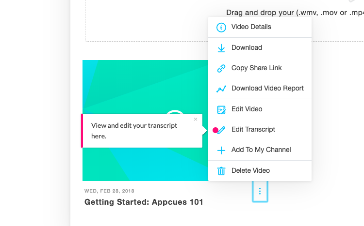
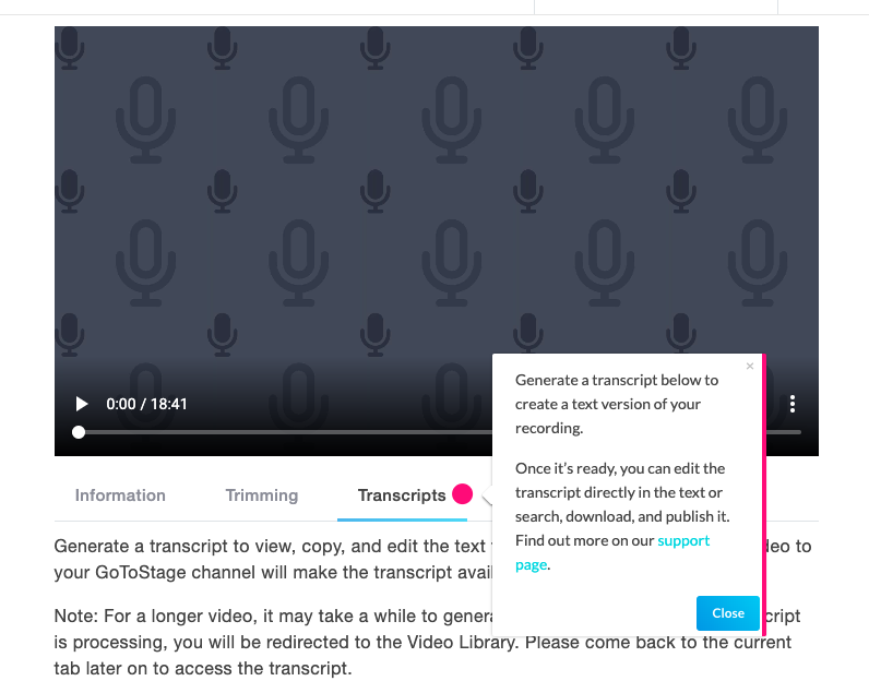
GoToWebinar’s app walkthrough is a great example of user onboarding over a longer term. These walkthroughs target returning users who already knew the platform but had never used a particular feature before. The walkthrough sets good expectations for what users can expect to happen next. It also contains links to support docs, letting users know where to go for more detailed help should they need it. (Plus, it's made with Appcues!)
Project management tool Asana helps teams organize, track, and manage their work. Asana’s clear, simple interface characterizes the app with playful details and pops of color. A succinct, action-driven onboarding tour walks new users through creating their first task—a clear aha moment for new Asana users.
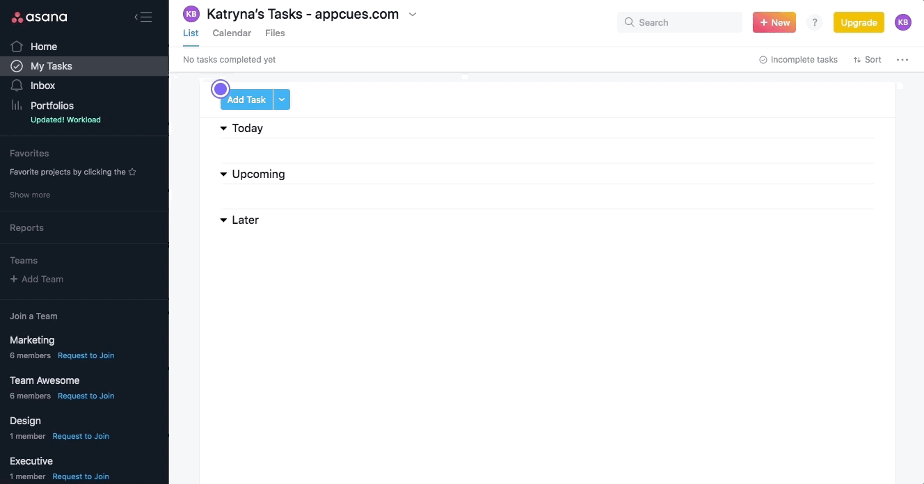
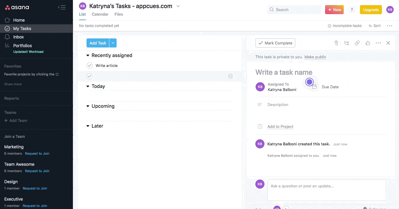
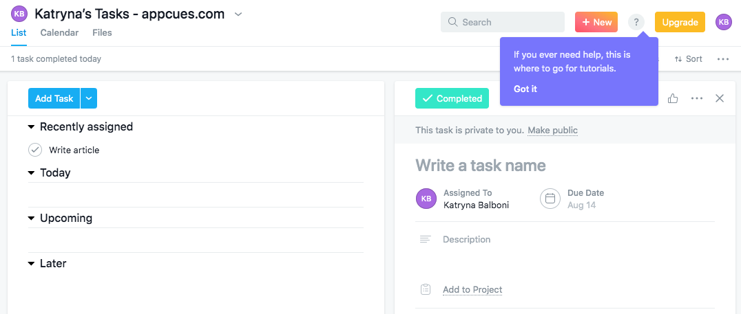
A series of pulsing hotspots draw attention to specific elements, which familiarizes new users with Asana’s UI. It’s prescriptive without sacrificing a sense of discovery. The walkthrough progresses as users take meaningful actions.
Another great addition by the Asana team is a tooltip at the end of the walkthrough that shows users where they can find self-service help in the future. This gives users the resources they need to resolve their own questions, which reduces both support burden and user frustration down the line.
Employee management platform Humanity offers a number of different features, but the company wisely chose to focus its new user onboarding on its core functionality: scheduling. The highly prescriptive walkthrough uses action-driven tooltips to remove the guesswork and sequentially guide new users through the actions they must take to achieve value.
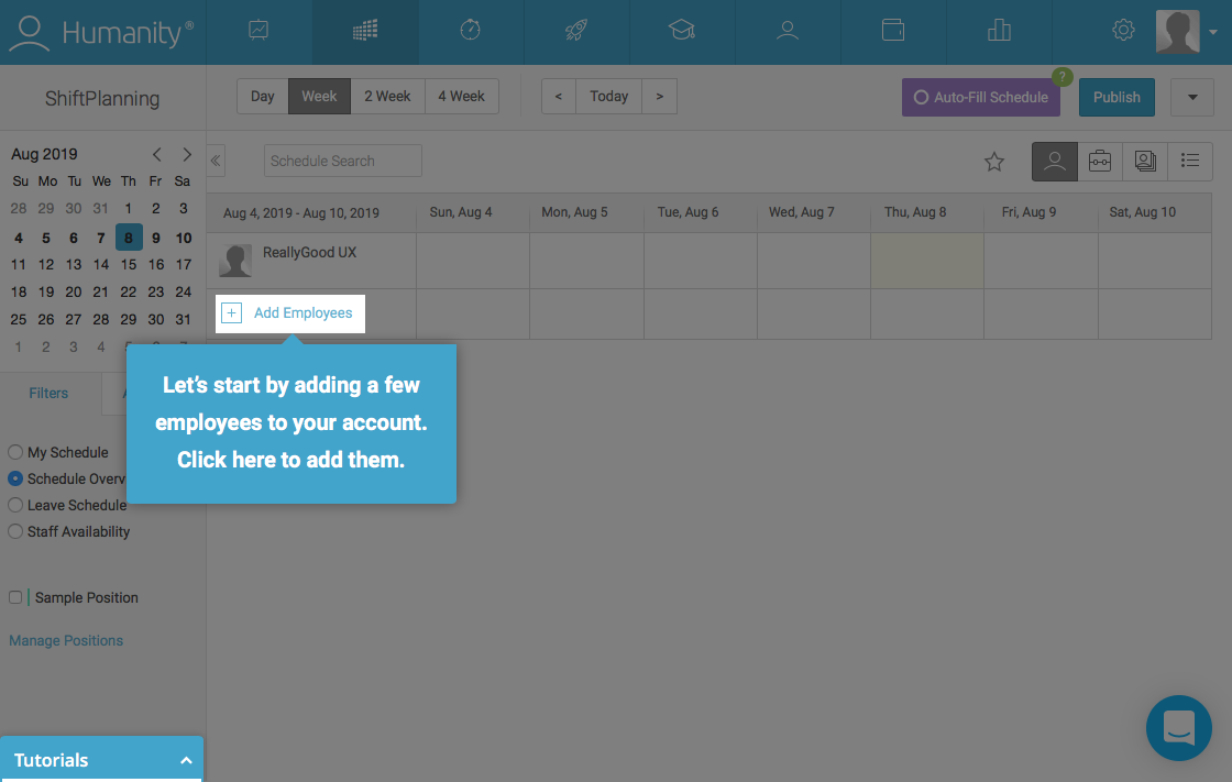
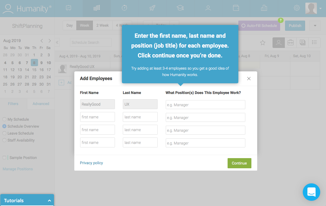
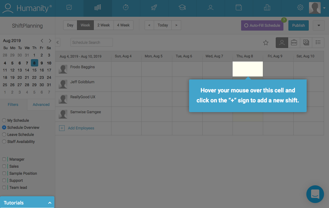
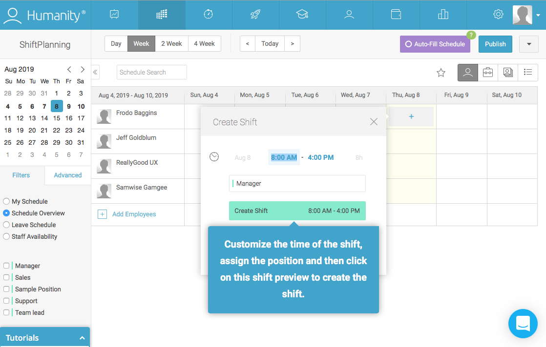
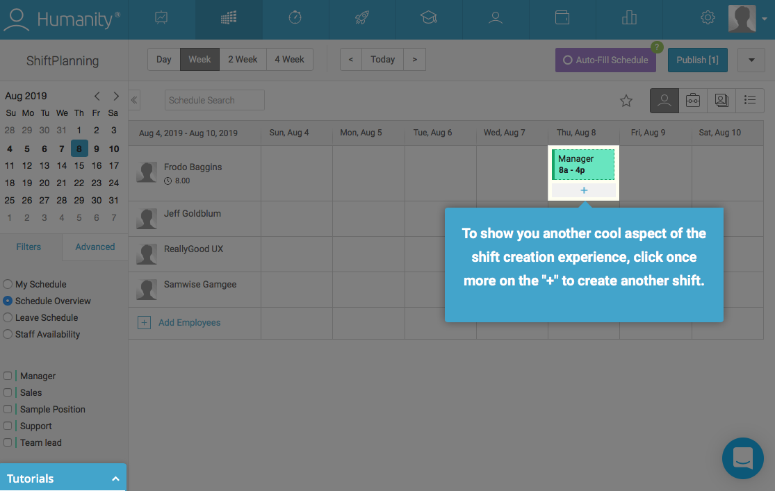
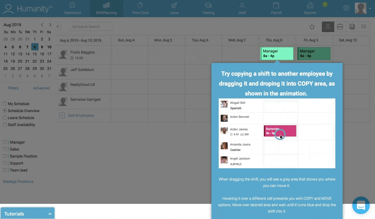
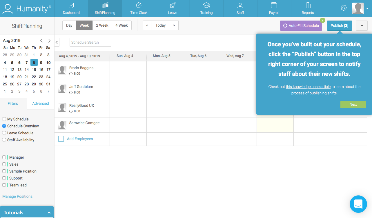
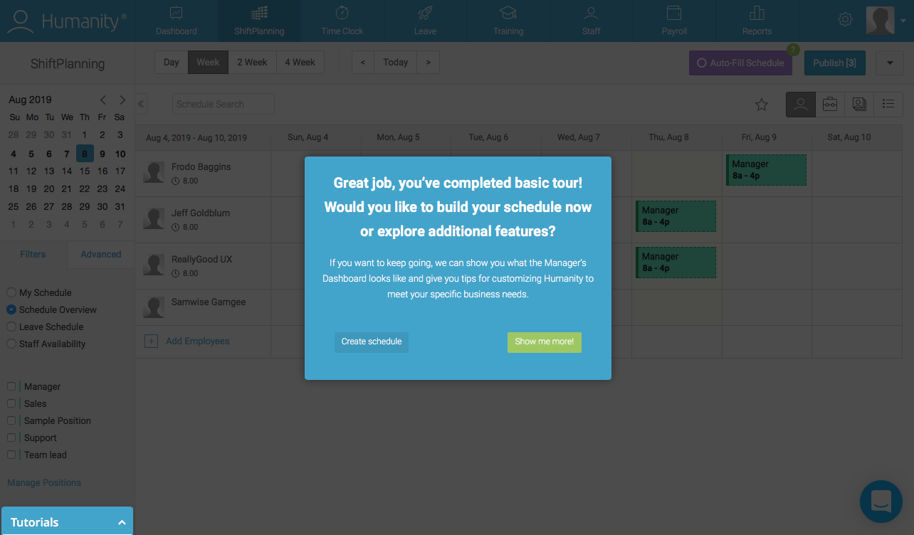
Admittedly, Humanity’s walkthrough could do with a bit of trimming. That said, the highly prescriptive, action-driven walkthrough does a great job teaching new users how to use Humanity’s core features. It’s a thorough guide to the tool without feeling monotonous because it requires user action.
Once the initial app walkthrough is complete, Humanity offers the chance to take a product tour of the rest of Humanity’s features. That tour is less in-depth and enables Humanity to let go of users’ hands gradually versus dropping them into a complex product before they’re ready.
Visual social media platform Pinterest lets users save, share, and search for images from around the internet. It asks new users to select five or more interests during signup, which results in a personalized feed right off the bat. A very brief walkthrough and user onboarding checklist help them get started from there.
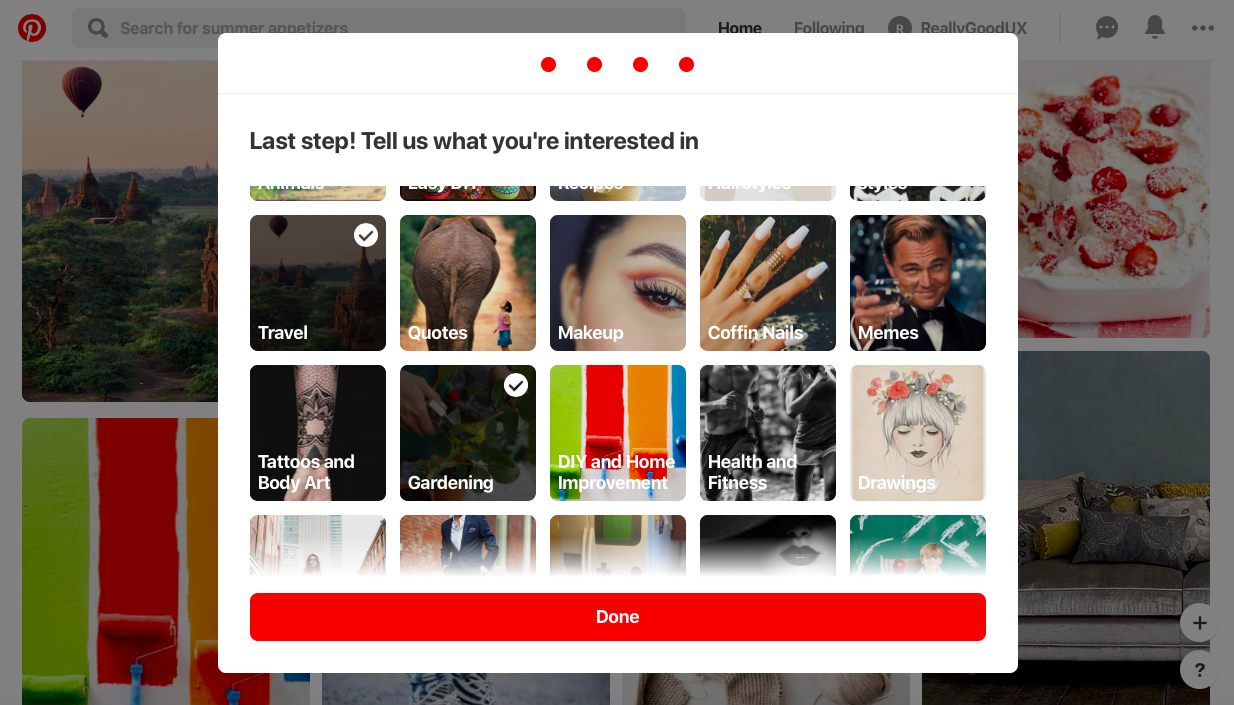
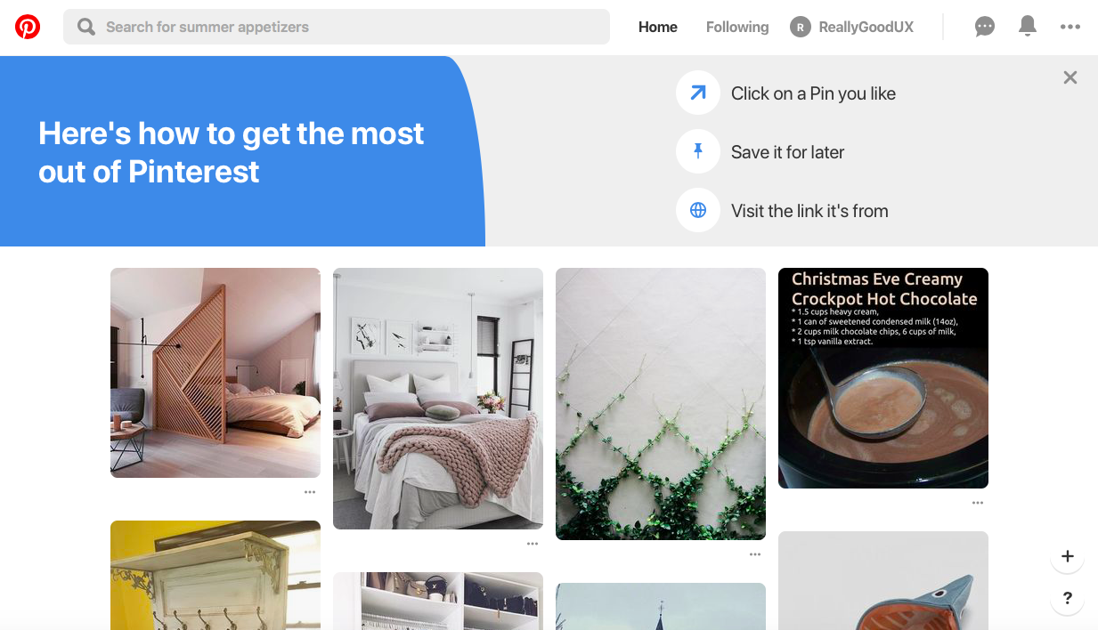
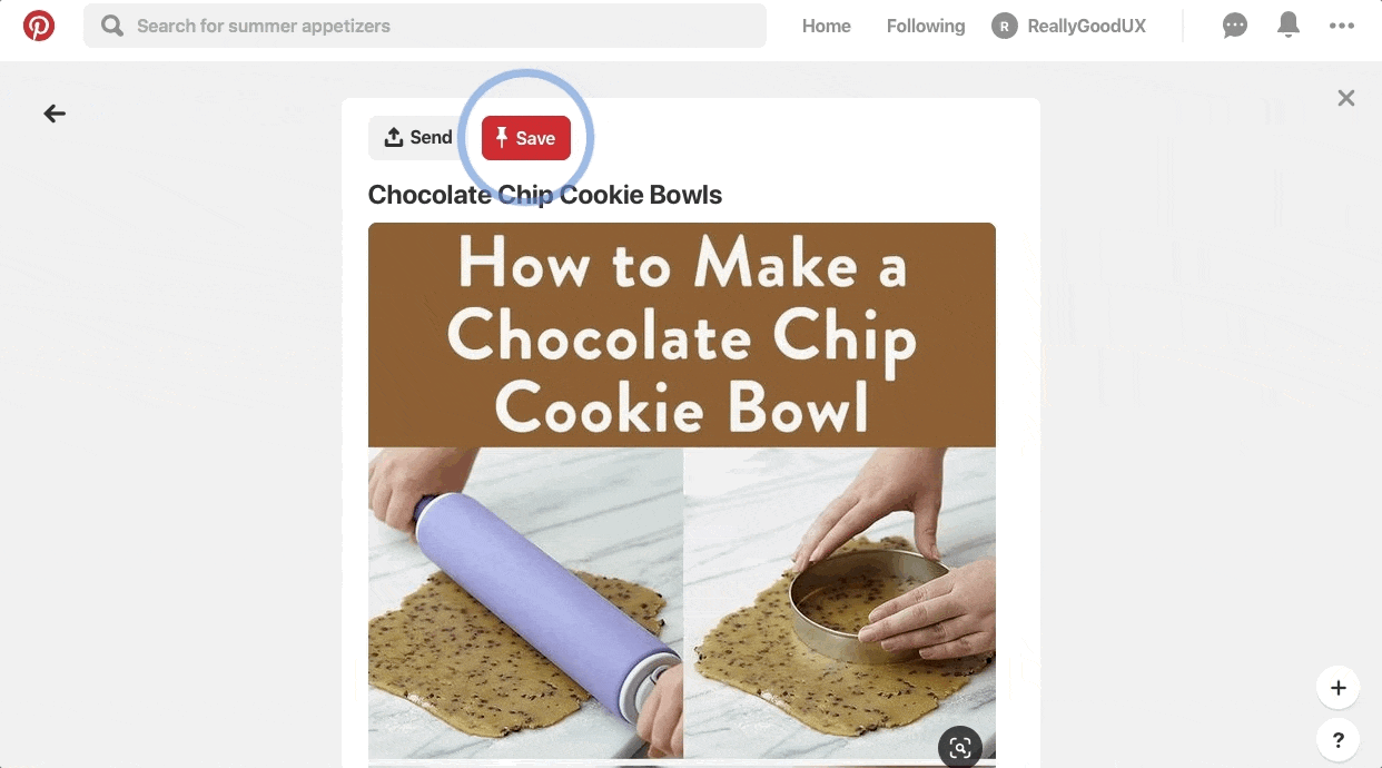
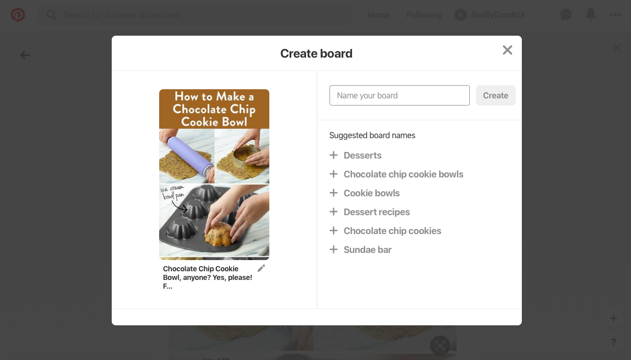
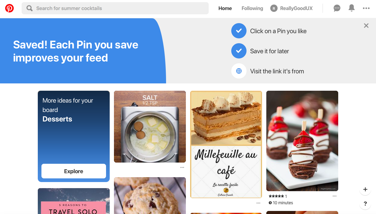
It’s very brief. Pinterest designed the core action around simplicity: just save an image to a board. After customizing your feed during onboarding, there are only three clicks required to save an image to create your first board. If users need more ideas of what to do next, a simple checklist makes it clear to new users what their priorities are. We’re a sucker for a good checklist.
Now that you have an idea of what quality walkthroughs look like, turn your eye to improving the onboarding experience of your own product. These four steps will help you to create a stellar walkthrough, whether your current solution needs an update or you’re creating a walkthrough from scratch.
You can’t fix problems you can’t identify—which is why you should thoroughly examine your UX in its current state. Usability tests offer a hands-on way to evaluate where users get stuck in your app (in real time). Focus groups, surveys, and customer interviews provide additional channels for users to communicate their pain points to you directly.
Companies plugged into their product data will find valuable insights within their analytics. Tools like event tracking enable you to view where customers fall off in the feature adoption experience. Your data will also reveal which events encourage engagement and retention.
You should test your walkthrough after you’ve already built your product tour. A product tour focuses on driving users to the aha moment as quickly as possible. Your app walkthrough needs to complement your product tour, not hinder it. Measure where your UX stands with your tour in place to get a base understanding of how your walkthrough will enhance the user’s experience with your product.
User journey maps are a great, visual way to chart the steps a user takes with your product, from the very first time they’ve heard about it all the way through ongoing usage. They typically look something like this:
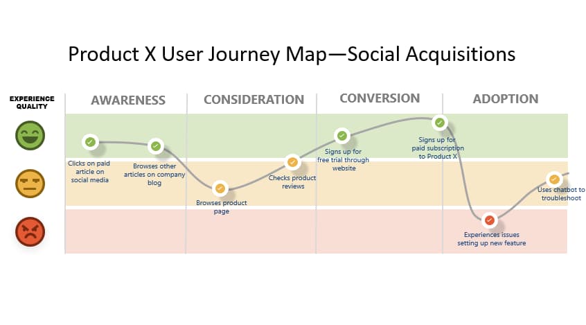
Creating a user journey map requires understanding of who is buying your product, different stages they go through and the potential obstacles they may encounter on the way. In the case of app walkthroughs, you’re likely to be focusing more on the Adoption side of the process.
Now you have to address the friction in your product’s adoption process. Create a map of the user’s experience within your app that includes existing pain points. From there, determine which UX patterns, messages, and actions best help the user understand the feature.
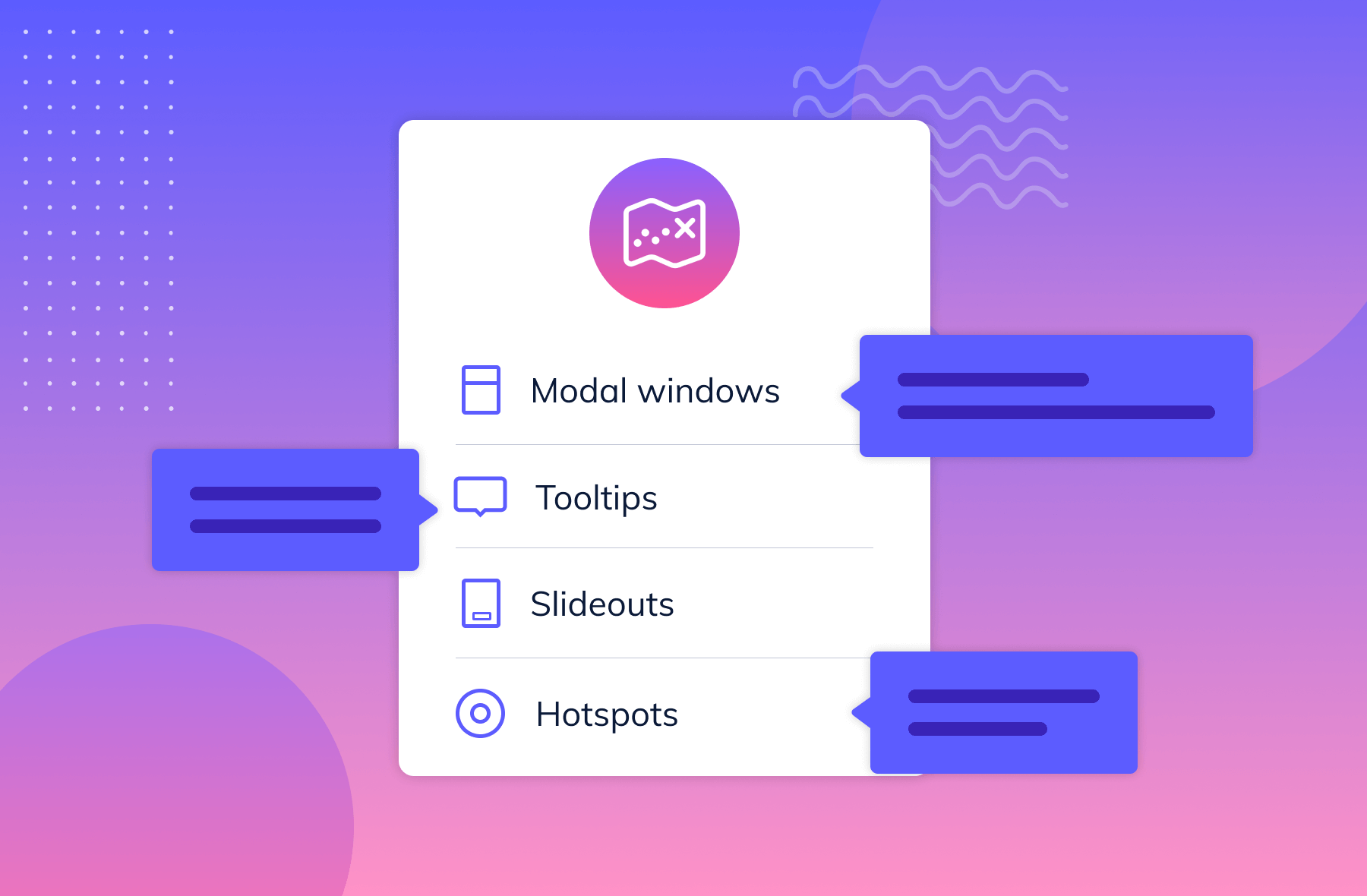
And remember, user engagement is the name of the game. The examples we highlighted earlier leverage several reliable UI patterns to build interactive walkthroughs that transform users into active participants. The best UI patterns to engage users during a walkthrough include:
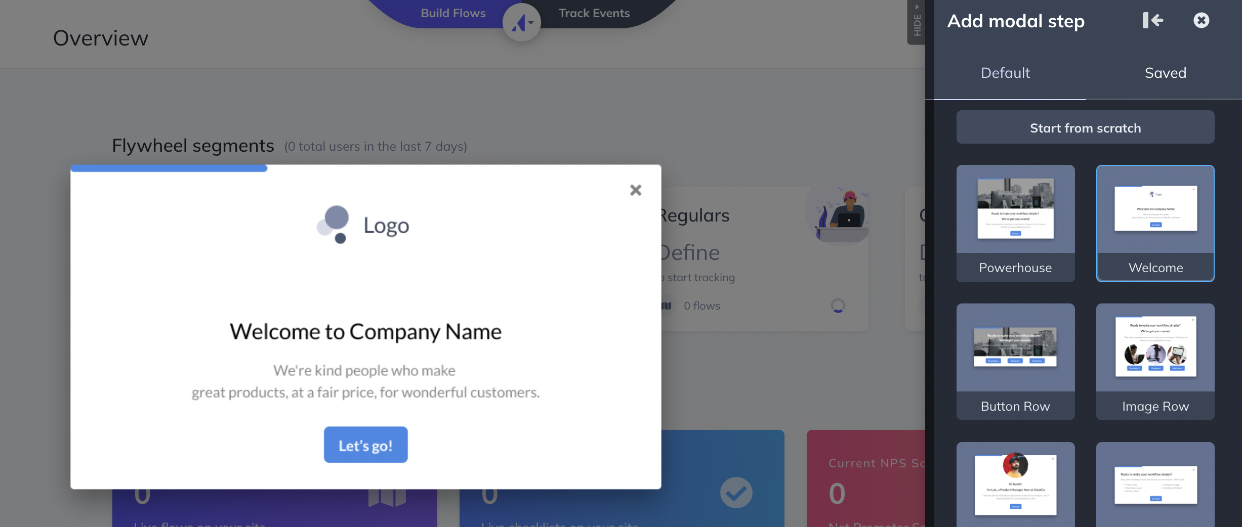
Modal windows are too often mixed up with their oft-maligned cousin, the pop up.
Used sparingly and at the proper time, modal windows can be a way to force users to pay attention to a certain part of your tool or to deliver a message.
One example would be a dialogue box in your product that pops up and asks the user if they’d like to try out a new feature.
More subtle than modals, tooltips can also highlight a specific place in your product that you want your users to pay attention to. Tooltips could be guiding users step by step through completing a task or explaining what different parts of the user interface mean.
Think of slideouts as modal windows in motion. They function in much the same way but instead of commanding the users solitary attention, they can give the user information they might need to process further in the app or, should the information not be needed, it can easily be ignored.
Hotspots are small dots or flashing beacons that indicate to users that there’s something to pay attention to in a certain portion of the product screen. These can help nudge your users without being too overbearing as they continue to explore your app walkthrough.
UI patterns don’t materialize out of thin air. You’ll need to build the elements of your app walkthrough and schedule them to trigger at the right place and right time.
If you or someone on your team is proficient in coding, you might tackle building these patterns yourself. However, there are easier and less time-consuming ways to build the necessary components of a good app walkthrough. A number of third-party tools exist for building the UI patterns involved, many of which also work well for building product tours.
For example, Appcues enables product teams to build UI patterns for app walkthroughs, product tours, and more without getting caught up in the hassles of coding. A well-designed Appcues-built walkthrough looks striking and feels seamless to users—which is why companies like GoToWebinar trust it to build their own.
Build your app walkthrough according to your blueprint—just don’t release it to your users yet. Your original design is gold-star material, but you need to test your new walkthrough thoroughly to ensure it fixes friction without creating new pain points.
First, you should test your walkthrough against itself. A/B testing will help you determine messaging, UI patterns, and even aesthetics that perform highest among segments of your user base. A proper A/B test can determine the best option to use for something as simple as the color of the “Next” button within your modal windows.
After that, you’ll want to release your A/B-tested walkthrough to increasingly larger user groups to determine its viability before releasing it to every user:
Use the same methods described in Step One to gather and evaluate feedback. Your key indicator of success: the percentage of users who adopted your target feature after taking your new walkthrough. It should increase significantly over the same rate for your original walkthrough.
Walkthroughs aren’t necessarily a good fit for every product. For example, part of the joy of a tool like Canva lies in discovering all the possible templates and customizations users can choose from. A walkthrough for these types of tools might feel overbearing and inhibit creativity. Instead, a product like Canva should prioritize discoverability instead.
For most other products, walkthroughs are great for addressing valuable features that require a little more work to uncover and learn.
Complex SaaS platforms that require users to take a series of particular actions to realize a core value will benefit from a more prescriptive onboarding experience.


.png)