Why your users' brains love checklists

.png)

.png)
In the Second World War, Boeing launched the formidable Model 299 airplane—known as the Flying Fortress. With four radical engines and an imposing wingspan of nearly 104 feet, the machine could fly faster, go farther, and carry five times as many bombs compared with previous bombers. It was a military game changer.
But when a small crowd gathered to witness the test flight, the promise of the Model 299 turned to ruin. The airplane thundered down the runway, lifted smoothly, but then climbed uncontrollably. It stalled, swung, and then plunged to a fiery end.
The crash report confirmed that pilot error caused the accident. People concluded that the complexity of having a pilot manage four engines was an unrealistic demand. It was, according to one newspaper, “too much airplane for one man to fly.”
Despite this, the army purchased a few of the brutish airplanes and asked their pilots to find a way to tame them.
The answer?
It was not extensive training. It was much simpler: It was the pilot's checklist.
The simple, yet powerful solution of a checklist enabled the Flying Fortress to fly 1.8 million miles without a single accident and provide a crucial air advantage in the Second World War.
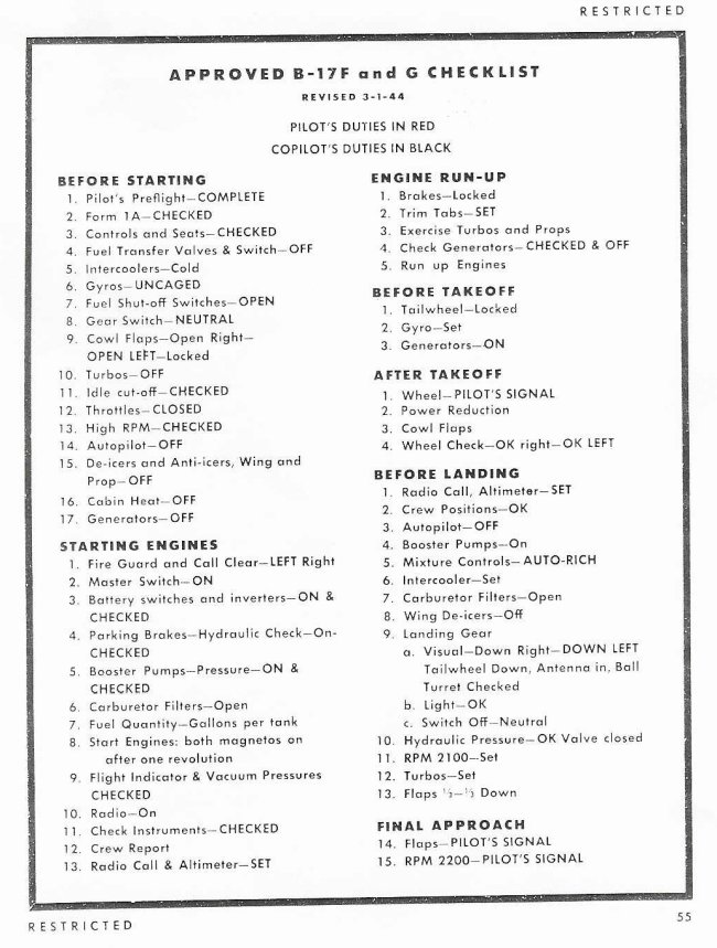
But checklists not only protect against errors and failures to help win wars. Checklists also improve the experiences people have with technology by managing complexity on behalf of the user. They make a task's minimum requirements explicit, offer satisfying verification, and prompt people to take action.
Why? It's psychological.
Let's take a look.
Why do we fail?
Philosophers Gorovitz and MacIntyre offer two reasons—ignorance and ineptitude. We fail because we either don't have the information to perform a task or, if we do have the information, we fail to apply that information consistently and correctly.
So why do users still fail when given the information and tools they need to succeed? It's not a problem of brain capability—humans can hold 4.7 million books in their memory. The problem is getting the information and the method into the brain in the first place.
It is a problem of effort and attention.
To explain this, Daniel Kahneman—a Nobel Prize-winning psychologist—discusses two systems for how our brain works.
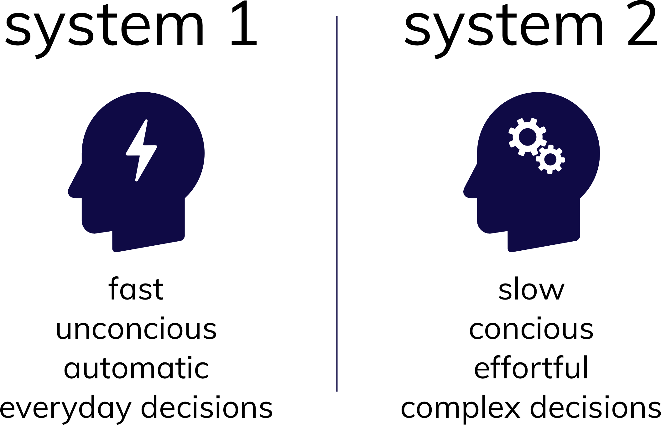
It's hardly surprising that people prefer to use System 1 thinking whenever they can. It's quicker and takes less effort.
And this is why users love checklists.
Checklists are familiar. Those who use them know what they look like, how to use them, and how they work. This means a user needs very little effort and time to comprehend what must be done to use a product. This is otherwise known as the mere exposure effect.
Checklists are concise; they present the minimal amount of information required for a user to complete a task. The user does not have to decide what to do. This is otherwise known as the paradox of choice.
Because of these psychological principles, checklists permit fast and automatic thinking to support everyday decisions. And that's good onboarding UX.
Here, PayPal takes full advantage of the checklist to provide the information and the method required to complete an unfamiliar task intuitively and concisely.
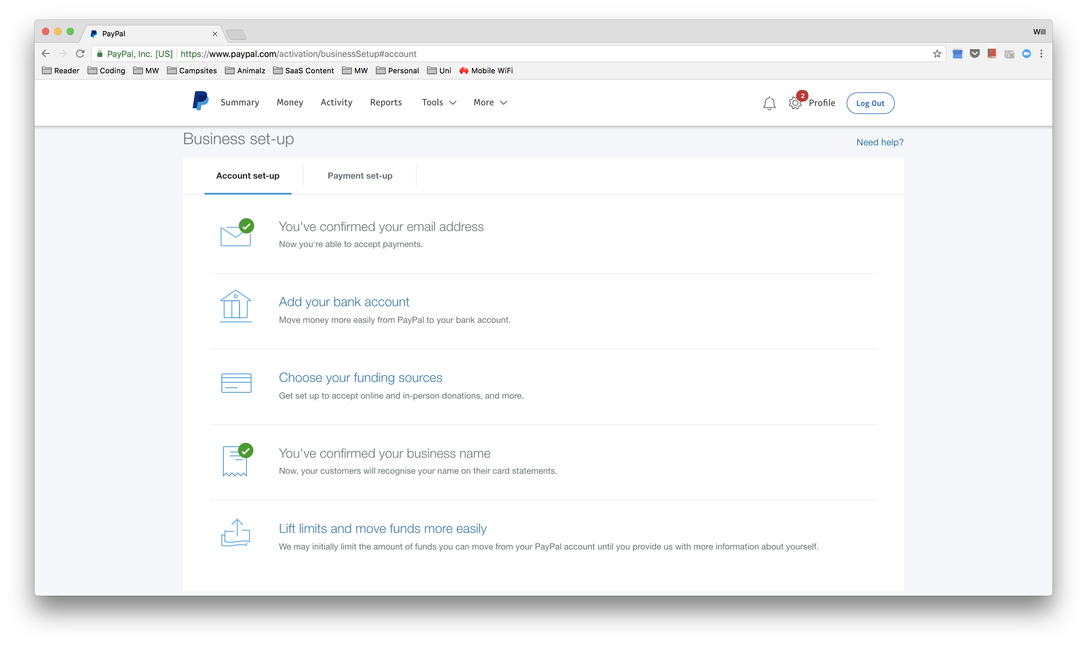
Setting up a PayPal business account sounds daunting, but the checklist makes the process friendly.
Instantly, the user understands that only five steps are required, which reduces the perceived effort. The ticks highlight completed and uncompleted tasks intuitively, and the concise copy and icons put each step into context, reducing ambiguity.
The user does not have to think, "What information do I need? Where can I find this information? What do I need to do? And what do I need to remember?"
Instead, the checklist takes on this burden and displays the task in a way that System 1 thinking can handle.
He probably didn't realize it at the time, but Mark Twain was describing a psychological effect when he said, “Twenty years from now you will be more disappointed by the things you didn't do than by the ones you did do.”
Most people bring this quote up to justify taking a risk like bungee jumping or putting a career on hold. But in this context, it's about how users are disappointed, sometimes deeply, when they fail to complete a task they set out to do—known as the Zeigarnik effect.
This was first discovered by Bluma Zeigarnik, who found that subjects who were interrupted in the middle of a task—and were unable to complete it—were much more likely to recall the task and therefore had higher motivation to complete it. But this motivation can also be amplified with another psychological phenomenon called the goal-gradient effect.
The goal-gradient hypothesis was originally presented by Clark Hull, in 1932. He tested his hypothesis in 1934 by observing rats racing to receive a food reward. Using motion sensors, he found that the rats' level of effort increased as the distance to the food reward decreased. In other words, the closer the rats got to the food, the more they wanted it.
Recent studies have shown the same in humans. People are more likely to pitch into a charitable campaign as it gets closer to its goal, and a 10-space coffee card pre-stamped twice will be completed faster than an 8-space card with no pre-stamps.
The number of coffees to completion is equal, but the pre-stamped card feels incomplete and creates an illusion of being closer to completion.
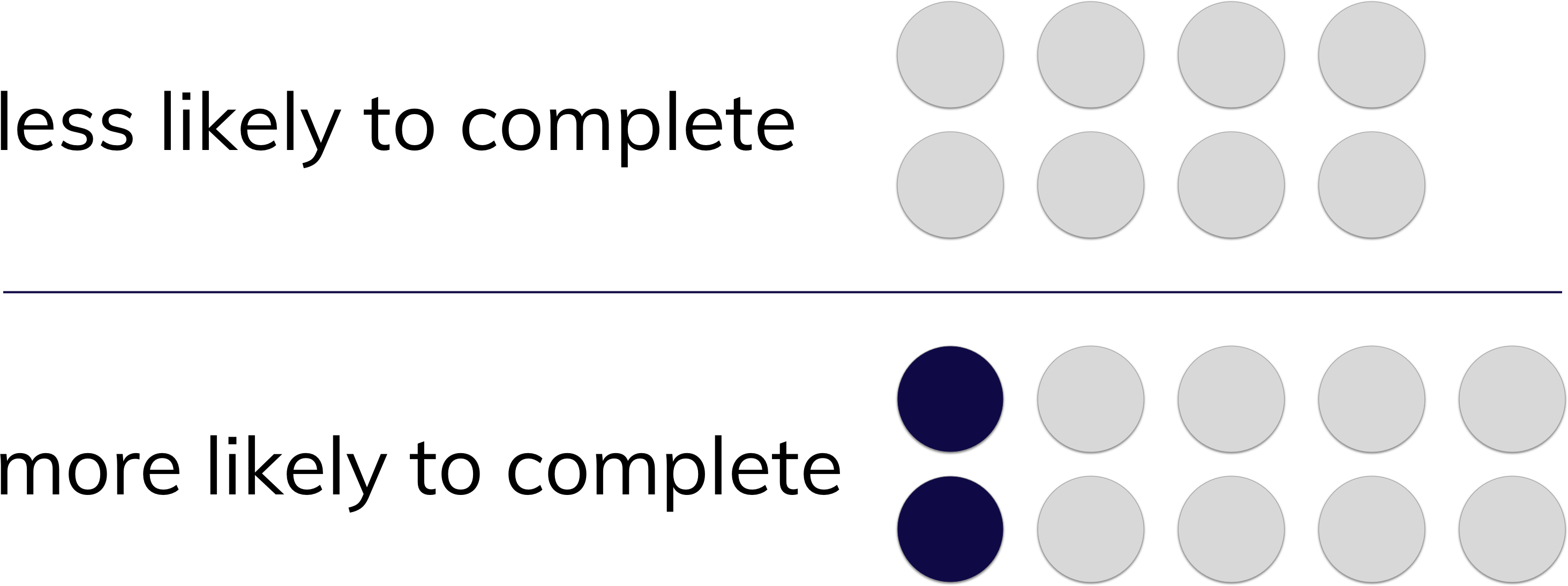
This evidence shows the feeling of ambiguity or uncertainty of not finishing a task puts users on edge. The motivation to complete the task is enhanced as the perceived distance of obtaining closure reduces. And then, it is only when the user has reached the goal or found a solution that they can feel comfortable setting the thing aside.
This is exactly what makes the checklist so powerful—it offers a visual representation of an unfinished task and informs the user how far away they are from completing it. If you want your users to complete something, look no further than the checklist.
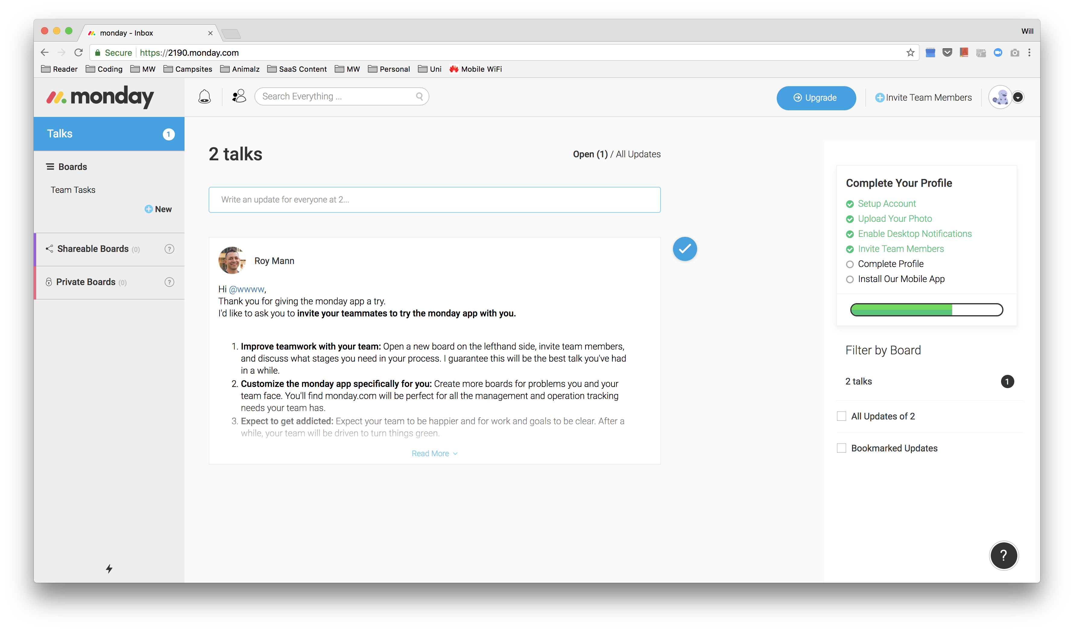
The team project management app monday.com uses both the Zeigarnik effect and the goal-gradient effect to motivate users to invest time and effort into completing the profile setup. This is powerful because when a user invests in a product like this, they are likely to value it more and therefore return.
Monday.com uses color in their checklist to highlight incomplete tasks and in the status bar to visualize the progression toward completion. The checklist is difficult to ignore, which makes it effective, and it dramatically increases the likelihood of user completion.
With each success, our brains release a neurotransmitter called dopamine. When dopamine is released, it makes us feel good, it helps us concentrate, and it makes us want to revisit the thing that released it in the first place. Dopamine is the secret sauce of fantastic user experiences.
Conversely, when tasks are too hard, and we fail, the brain gets drained of dopamine. Users lose concentration, get frustrated, and feel bad. This is the opposite of a fantastic user experience.
This means your product needs to be designed in a way that helps users get on a winning streak. When users win, and complete tasks frequently, they feel productive and maintain concentration. They feel like they are getting closer to their goals, and they feel that the time and effort they've put into your product are well spent. Dopamine is in full flow.
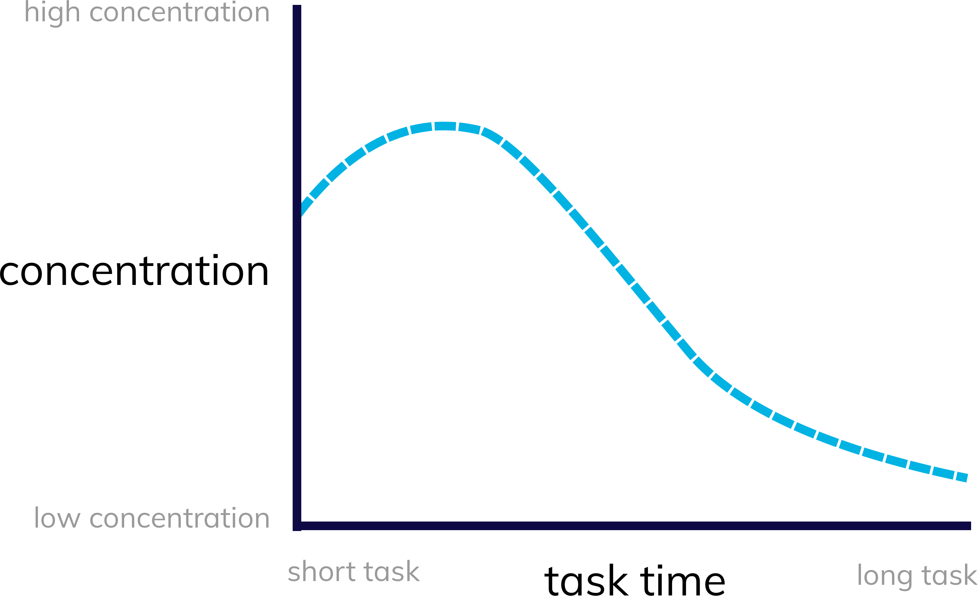
The ultimate tool to get your users on a winning streak is, again, the humble checklist. The checklist breaks down a complex and challenging task into multiple achievable steps. This way, instead of asking users to climb a mountain, they now only have to traverse a series of manageable molehills.
With the time, effort, and complexity for each win reduced, the cadence of dopamine release becomes consistent, and the users have a much more positive experience.
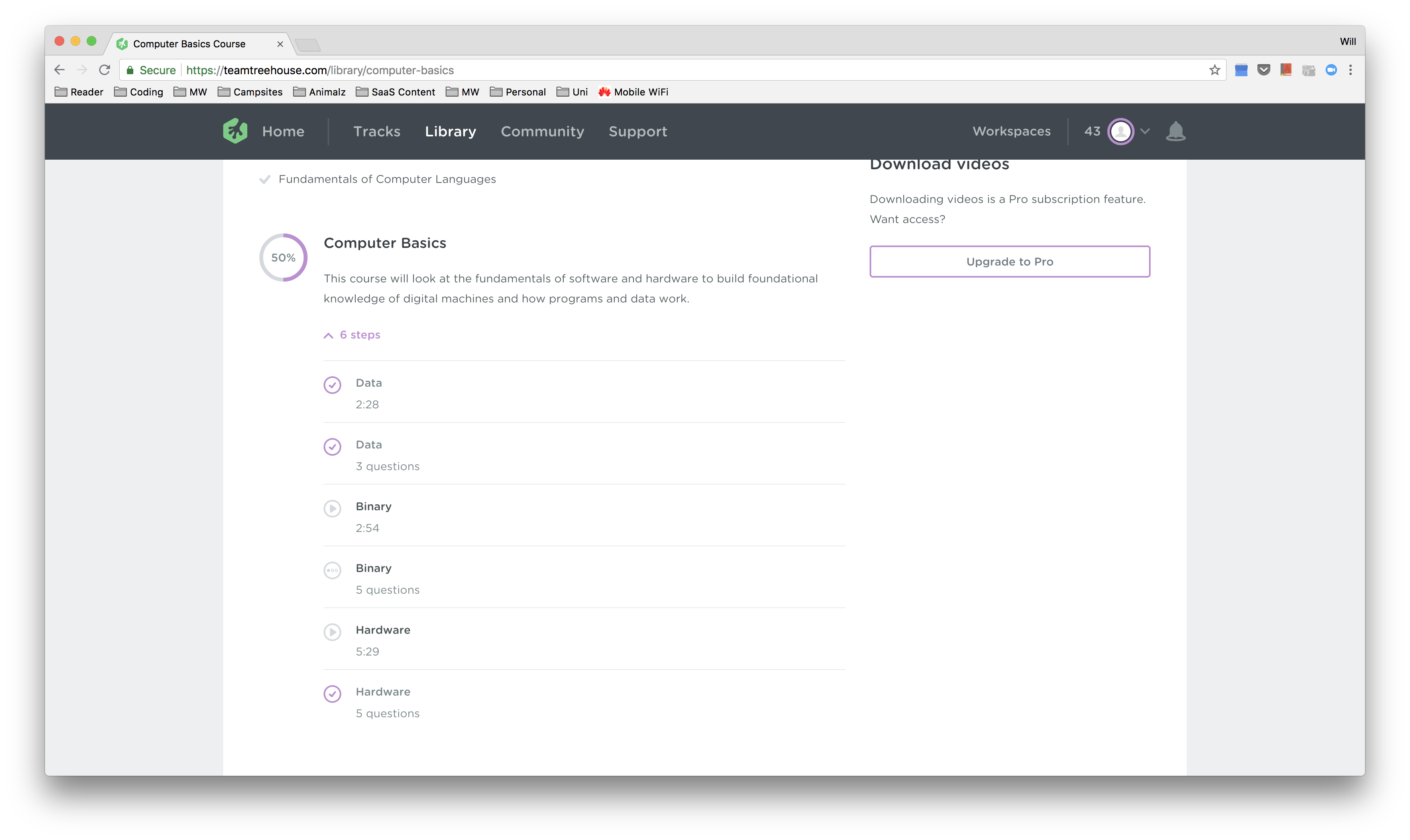
Treehouse is an online-learning platform that provides courses on web development and technology. Because technology and the web are inherently complicated, the path to knowledge and skill acquisition can feel intimidating.
This is why Treehouse breaks down its courses into a checklist format, ensuring the user can maintain a winning streak and consequently maintain their dopamine levels for an enjoyable learning experience.
The checklist is a beautiful thing. It is simple, elegant, and practical.
It helps prevent failures, promote productiveness, and win wars. It is used everywhere, from hospitals to construction to web development.
Checklists are everywhere, for good reason.
The reason the checklist is so prevalent is that it supports our psychological biases and tendencies. So when it comes to design patterns and flows to help your users complete tasks and progress with your product, don't try to reinvent the wheel.
Stick to what works—psychologically—with the simple checklist.