.png)

Tooltips are small contextual hints that appear when a user hovers over, focuses on, or taps a UI element - providing extra information without cluttering the interface.
They matter because they reduce support tickets, speed up onboarding, and drive feature adoption by answering "what does this do?" at the exact moment a user needs to know.
This guide covers the four main tooltip types, three creation methods (open-source libraries, custom code, and low-code tools like Appcues), eight design best practices, common mistakes to avoid, and real-world examples from companies like Airtable, LinkedIn, and GitHub.
Picture a new user logging into your product for the first time. They see a dashboard full of buttons, icons, and menus - but nothing tells them where to start. They hover over an unfamiliar icon and get nothing. They click a gear symbol hoping for settings and land somewhere unexpected. Within minutes, they are frustrated. And frustrated users do not stick around.
This is the problem tooltips solve. A well-placed tooltip turns a confusing interface into a self-explanatory one. It answers "what does this do?" at the exact moment the question arises, without forcing users to dig through help docs or submit a support ticket.
Tooltips are one of the simplest UI patterns in existence, but they punch well above their weight. They work across web apps and mobile apps alike. They support onboarding, feature adoption, contextual help, and engagement. And when designed well, users barely notice them - which is exactly the point.
But "simple" does not mean "easy to get right." Poorly designed tooltips clutter the interface, block important content, or annoy users with redundant information. The difference between a helpful tooltip and a frustrating one comes down to design choices: what you say, when you show it, and how you let users dismiss it.
This guide covers everything you need to build tooltips that actually help your users. You will learn what tooltips are, the four main types, three ways to create them, eight design best practices, common mistakes to avoid, and real-world examples from companies like Airtable, LinkedIn, GitHub, and Humanity.
A tooltip is a small text label that appears when a user hovers over, focuses on, or taps a UI element, providing additional context without cluttering the interface.
Think of it as a helpful sidekick that provides quick tips without interrupting the user experience.
Look familiar? Of course it does - tooltips are everywhere.
Traditional tooltips appeared when you hovered your cursor over an element. (Think back to old Microsoft applications.) Today, tooltips are much more dynamic. Many web and mobile products use tooltips when a user lands on a page, or after a user interacts with a specific element. You may also hear them called infotips, hint text, or screen tips - they all refer to the same pattern.
Not all tooltips are created equal. Understanding the four main types helps you choose the right one for each situation in your product.
These are the simplest and most common variety. A plain-text tooltip displays a short label or description when a user hovers over or focuses on an element. They are best for icon clarification and button descriptions where users just need a quick label. Think of hovering over a toolbar icon in Google Docs to see its name - that is a plain-text tooltip doing its job.
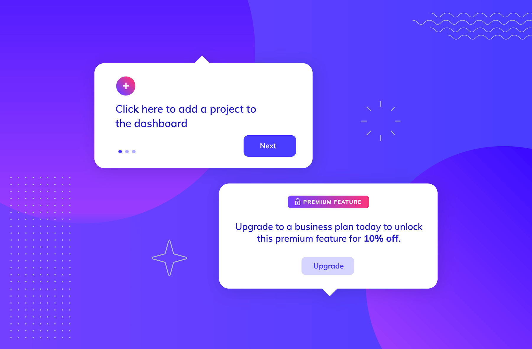
Rich tooltips go beyond a single line of text. They can include formatted text, images, or even short descriptions with multiple data points. They are best for feature explanations that need more than a sentence. Airtable, for example, uses rich tooltips to explain column field types - giving users enough context to understand the feature without leaving the current view.
Interactive tooltips contain clickable elements like buttons, links, or navigation controls. They are the building blocks of onboarding flows and product tours, where each tooltip advances the user through a sequence of steps. Humanity uses interactive tooltips to walk new users through complex scheduling workflows, with each step building on the last.
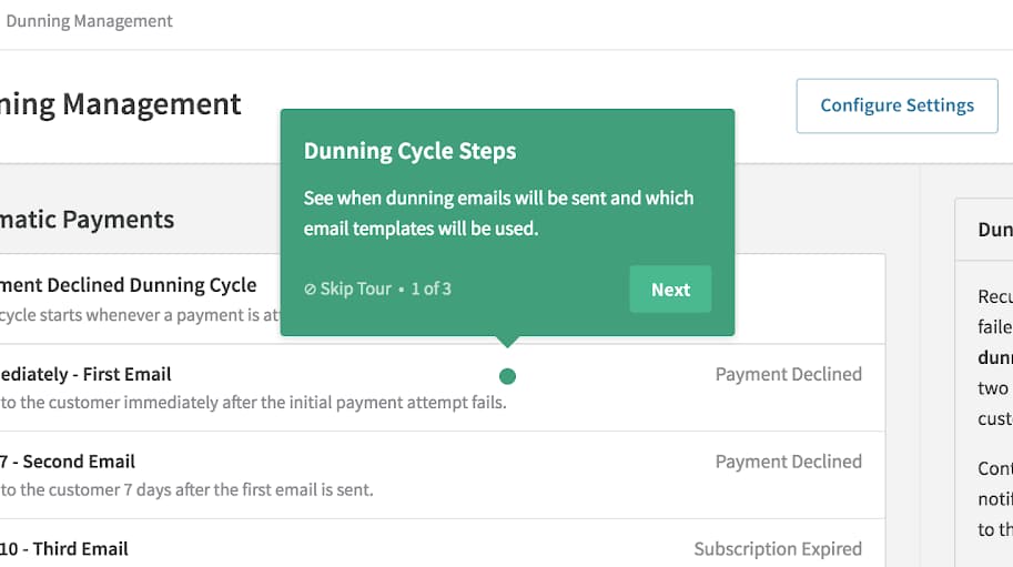
These appear when users click or hover on an information icon (the "i" or "?" symbols common in forms and settings pages). They are ideal for explaining specific fields or configuration options without cluttering the interface with permanent help text. Recurly uses icon-triggered tooltips in their billing settings to explain dunning-related fields clearly.
Tooltips are small, but their impact on your product's success is anything but. Here is why they deserve a spot in your UX strategy.
Tooltips answer "what does this do?" before users need to ask. Every tooltip that clarifies a confusing element is one fewer support ticket in your queue. When your interface explains itself, your support team can focus on the complex problems that actually require human help.
New users reach their aha moment faster when the interface guides them in context. Instead of forcing users to watch a tutorial video or read a knowledge base article, tooltips deliver the right information at the right time - right where users are already looking.
Tooltips combat feature blindness by drawing attention to underused functionality. A well-timed tooltip pointing out a feature a user has never tried can be the difference between a user who churns and one who discovers lasting value in your product.
Properly implemented tooltips with ARIA attributes make interfaces usable for screen reader users and keyboard-only navigation. They ensure that contextual information is available to everyone, not just users who can see and hover with a mouse.
Tooltips let you remove instructional clutter from the primary interface without losing the information entirely. Instead of cramming help text next to every element, you tuck it away in a tooltip that appears only when a user needs it.
With those benefits in mind, let's look at how to actually build tooltips for your product.
There are several ways to create tooltips for your product. Here is a step-by-step guide to building tooltips using three different methods:
If your product team is proficient in coding, they can use open-source programs like Bootstrap and jQuery to create great tooltips. For a more modern option, Tippy.js is a lightweight, highly customizable library that has become a popular choice. The right library depends on your tech stack. This method allows you to control the HTML elements, background color, placement, and animation effects.
Here's how:
For teams with advanced coding experience, building tooltips from scratch using JavaScript, HTML, and CSS offers the most control:
Appcues enables you to create tooltips and other important UI patterns without heavy engineering lift. Use the Appcues builder to create tooltips for user onboarding, product walk-throughs, feature announcements, upselling prompts - you name it - all in a matter of minutes, not weeks.

YotPo, an eCommerce marketing CRM, uses tooltips built with Appcues to help users navigate their product, especially during onboarding.

Tooltips should be treated as annotations - they help explain things, but they are not the main attraction. They can be applied in a variety of contexts to enhance user experience and drive product adoption. Here are some popular use cases:
Product tours are common user onboarding mechanisms. Tours walk users through a specific, early workflow or call out the most important parts of a product's UI and functionality. Tumblr combines tooltips with simple animations for an especially eye-catching product tour:

Tooltips greatly enhance most product tours - but not all of them. You should study examples of onboarding UX/UI patterns to determine whether tooltips are right for your product's onboarding process and/or user interface, or if another UI pattern is a better fit.
Tooltips are the perfect vehicle for a pithy feature announcement. They are especially helpful for drawing your users' attention to a new feature without interrupting their workflow. You do not always need a huge feature rollout: the feature discovery approach with a single tooltip is effective for its subtlety. The tooltip's compact size makes them well-suited to the space constraints of mobile interfaces, too. Just check out LinkedIn's mobile app to see how that looks in action:
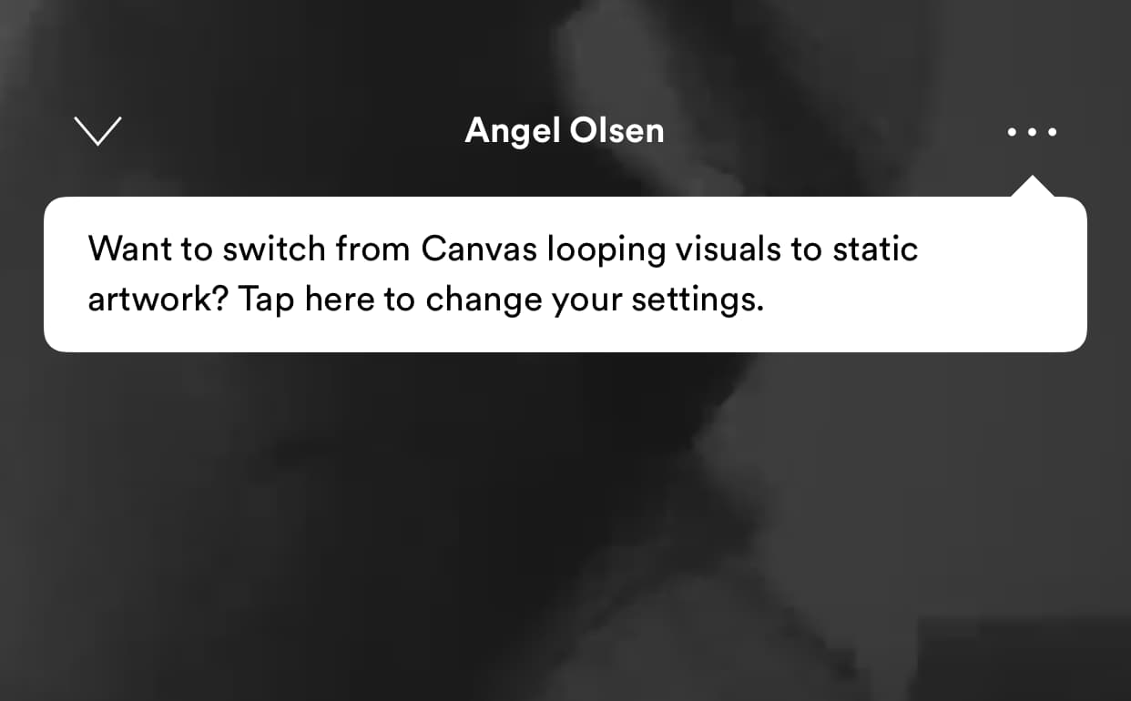
Tooltips can also remind users of overlooked features. Spotify does this often:
Tooltips are handy for walking users through a specific action. Action-driven tooltips advance or go away when a user interacts with another element. Unlike static tooltips, interactive walk-through tooltips engage users actively - encouraging them to click, hover, or perform an action. They support progressive onboarding by unfolding step-by-step guides based on user actions, and they provide just-in-time learning by showing the right information at the right moment.
Employee scheduling tool Humanity uses an interactive product tour to walk users through a complex workflow. The tooltip below disappears when users add a new employee to their accounts:
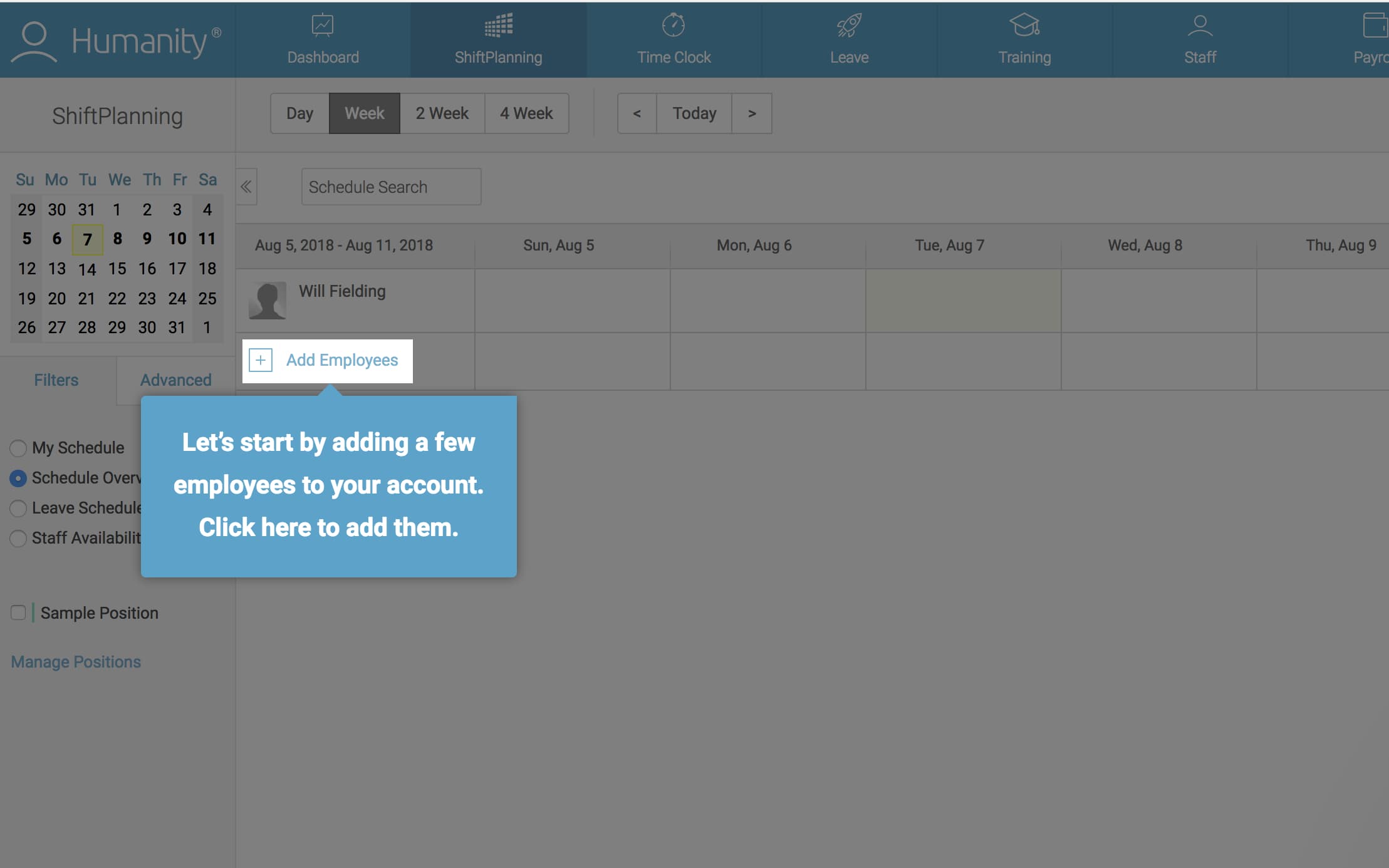
Interactive tooltips work especially well for complex workflows and multi-step processes where users need guidance at each stage. For product tours, they let you introduce features progressively rather than overwhelming users with information all at once. That said, action-driven tooltips can feel heavy-handed if overused. Save them for situations when users really need to perform a complex series of actions to accomplish a goal, or reach their aha moment.
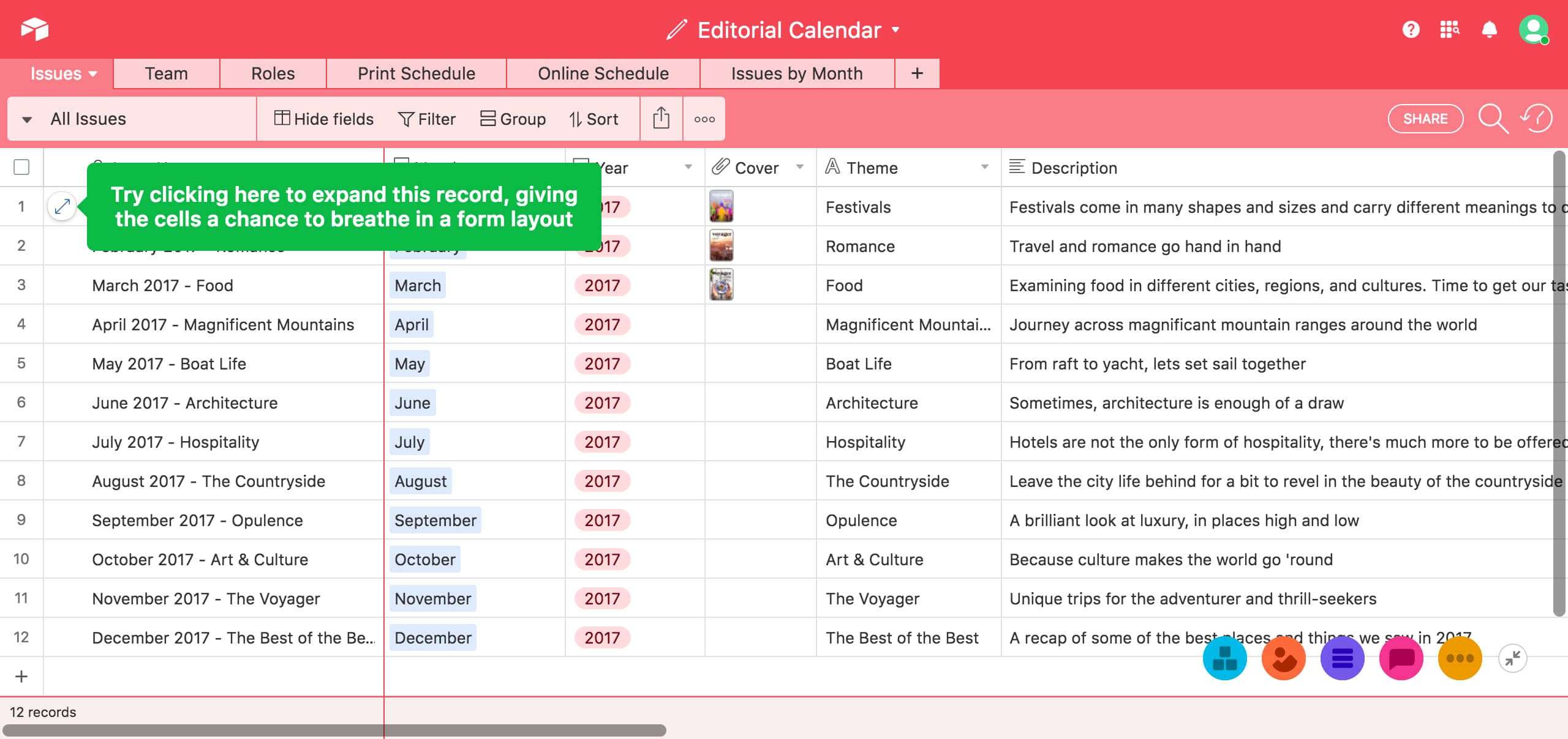
Your more unique features may require a bit of context before users fully grasp the best way to use them. Take Airtable, for example. Part of what makes their spreadsheet-database hybrid so powerful is the sheer breadth of its features and functions - an aspect that can also make it overwhelming to new users.
Airtable avoids overloading users with information during their initial onboarding tour by using contextual tooltips as the user moves through the app, offering advice in the right place at the right time:
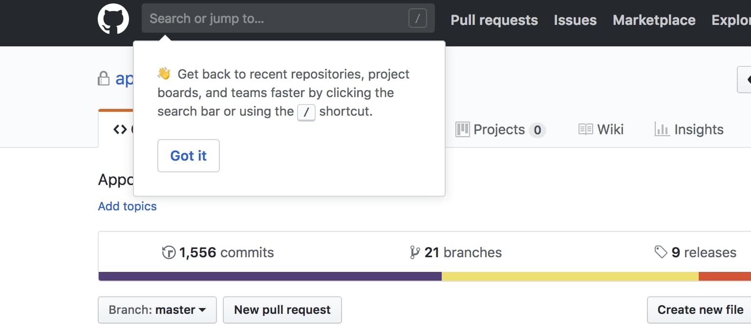
Similarly, web-based hosting platform GitHub uses tooltips to periodically offer hints that help users gradually level up their product usage:
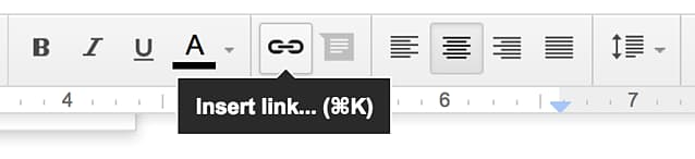
Use persistent tooltips to add additional contextual help. Persistent tooltips can explain icons that may be unclear to users and provide additional information on the spot. Hover tooltips work best for this scenario, like this one from Google Docs:
Tooltips also drive user engagement. Users may not use your product despite being fully aware of how to use it. Well-placed tooltips help nudge these users in the right direction to get them to use your product and appreciate its value.
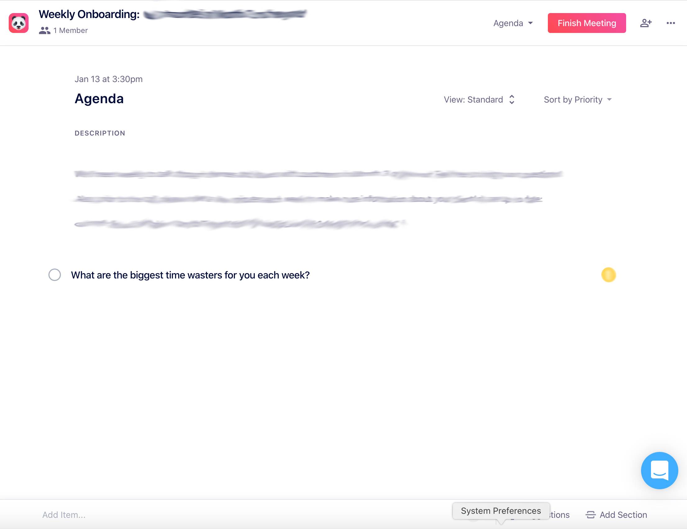
Team management tool Soapbox uses tooltips to make product engagement as simple as possible for its users. When a user logs in to their account and opens up a meeting, a tooltip appears at the bottom of an empty agenda and prompts them to add items to it.
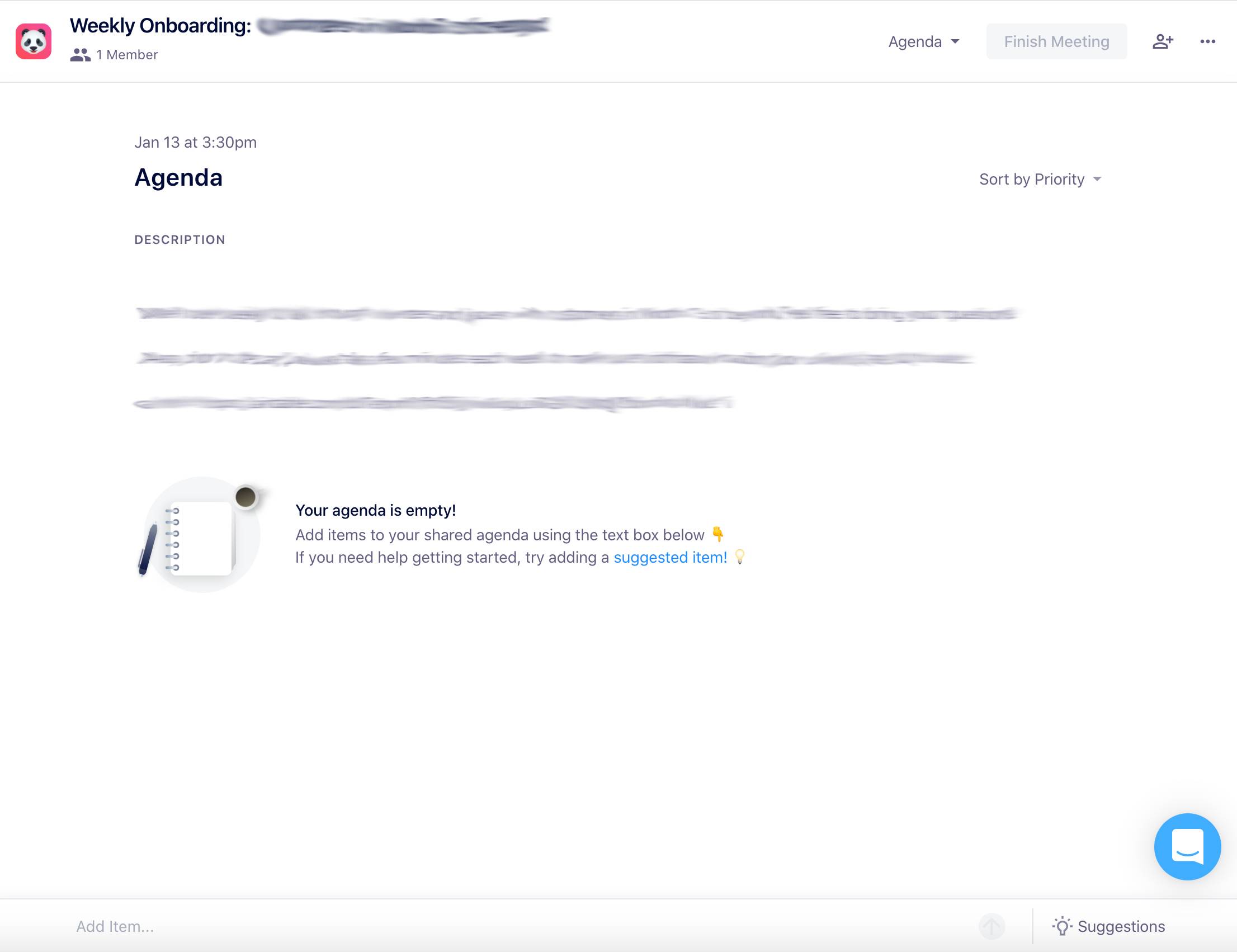
Users are not pressured to think of agenda items ahead of meetings because the tooltip links to a modal window with suggestions, including conversation starters and templates.

The tooltip only disappears if a user adds an item to their agenda, or clicks to add a suggested idea.
The best way to implement tooltips within your product ultimately depends on your final goal. Tooltips for a product tour may use different copy, design, and placement principles than those of contextual tooltips. However, there are several best practices to consider while building any variety of tooltip:
Tooltips either contain both a header and body text, or just body text. Messages like feature announcements use headers to give the tooltip more weight and signal the functional importance of the message. Users often prefer smaller, simpler tooltips for less urgent communications - so we suggest skipping the formalities in quieter tooltips and ditching the headers.
Use imperative statements in appropriate sections to drive the user to action. Commands convey value concisely and directly. An example from Google Slides:
Tooltips should be quick reads, like little nudges in the right direction. Use concise, imperative statements that drive users to take action. For example, instead of saying, "You might want to try this," go for, "Try it now." Clear, commanding copy not only respects your users' time but also creates a more engaging experience. Aim for fewer than 150 characters and avoid crowding the tooltip with too much information. If you have a lot to say, break it up across multiple tooltips or use a modal window or slideout instead.
Nobody likes feeling trapped - especially your users. But before we talk about exits, let's talk about what goes inside the tooltip. The content should add information, not restate what is already visible. A tooltip that says "Settings" on a button already labeled "Settings" wastes the user's time. Instead, use tooltips to surface hidden context: keyboard shortcuts, formatting options, or a brief explanation of what happens when the user clicks.
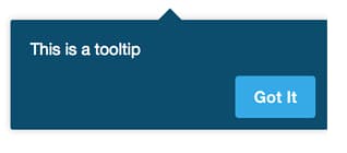
Always provide a clear way to dismiss a tooltip, whether it is an "x" in the corner or a friendly "Got it" button. To end on a more affirmative note, single tooltips can use a confirmation CTA (like Asana's "Got it").
The best exit to use for your product depends on what you plan on using your tooltips for. Customers close click-outs with a single touch, which makes tooltips a great choice for pointing out details in quick succession. However, the ability to quickly click through the information makes it more likely that certain users will click through a tour rapidly without reading anything. Use dismissals or acknowledgments for essential information to ensure the user actually engages with the tooltip.
Tooltips should feel like a natural extension of your product, not an outlier. Position them close to the element they describe, and make sure they do not cover the element itself or adjacent interactive areas. Keep styles consistent across all in-app messages so tooltips blend in rather than disrupt. Use colors that contrast nicely against your background to make the tooltip visible without being jarring.
Tooltips included in multi-step product tours often include a progress indicator. This lets users know how far along they are in the process. Progress indicators motivate users and improve the rate of completion for a product tour. Check out the "1 of 3" example below from subscription-management software Recurly:
Be careful when using tooltips in long product tours. They convey important information so well that you may be tempted to overuse them. Longer product tours may provide more information, but they usually result in lower completion rates. Keep your product tours short to maintain an optimal user onboarding experience.
Your tooltips should not exist in a vacuum. Think about how they fit into the larger context of your product's messaging. A well-coordinated in-app messaging strategy, where tooltips complement other messages rather than compete with them, creates a seamless user experience. Measure their performance and be ready to tweak and refine based on real user feedback.
Mobile users cannot hover, so your tooltips need different triggers on touch devices. Design for tap-to-reveal or long-press interactions, and make sure touch targets are large enough to be usable. Test tooltip positioning on smaller viewports to avoid content getting cut off. For more on this, see the dedicated mobile section below or read about tooltips for mobile apps.
Everyone should be able to benefit from your tooltips. Accessible tooltip design is not optional - it is a requirement for reaching your full user base. Here is what to cover:
role="tooltip" and aria-describedby to associate the tooltip with its trigger element so screen readers can announce the relationship.For a deeper dive into accessible markup, review the WAI-ARIA guidelines.
Even well-intentioned tooltip implementations can backfire. Here are the most common mistakes and how to fix them:
Adding a tooltip to every element creates noise instead of clarity. Users start ignoring all of them when there are too many competing for attention. Use tooltips only where context is genuinely missing - not as a blanket solution for unclear UI.
Tooltips that read like paragraphs defeat the purpose. If you need more than 150 characters, the message probably belongs in a popover, modal, or help article. Keep tooltip copy tight and focused on a single piece of information.
A tooltip that covers the element it describes - or blocks adjacent buttons and fields - frustrates users. Test placement carefully across different screen sizes and ensure the tooltip never sits on top of the element it is supposed to explain.
No ARIA attributes, no keyboard trigger, insufficient contrast. Screen reader users miss the content entirely, and keyboard-only users cannot reach it. Follow the accessible design practices outlined in the best practices section above.
Hover-triggered tooltips simply do not work on touch devices. If you do not test tooltip behavior on phones and tablets, a significant portion of your users will never see them. Always implement tap or focus-based alternatives for mobile.
A tooltip that says "Settings" on a button already labeled "Settings" wastes the user's time and erodes trust in the rest of your tooltips. Every tooltip should add information that is not already visible on screen.
Interactive or step-based tooltips that lack a clear close button or skip option trap users in a flow they may not want. Always give users a way out, whether that is an X button, a "Skip tour" link, or an automatic timeout.
The best way to understand effective tooltip design is to see it in action. Here are four examples from well-known products, each using a different tooltip type from the taxonomy above.
Airtable uses rich tooltips triggered by hovering on column headers to explain field types. Each tooltip includes formatted text describing how the field works, without pulling the user out of their current view. What makes it effective: it answers a specific question ("What does this field type do?") at the exact moment the user has it. The tooltip provides enough context to keep working, but not so much that it becomes a distraction. Read more about Airtable's contextual tooltips.
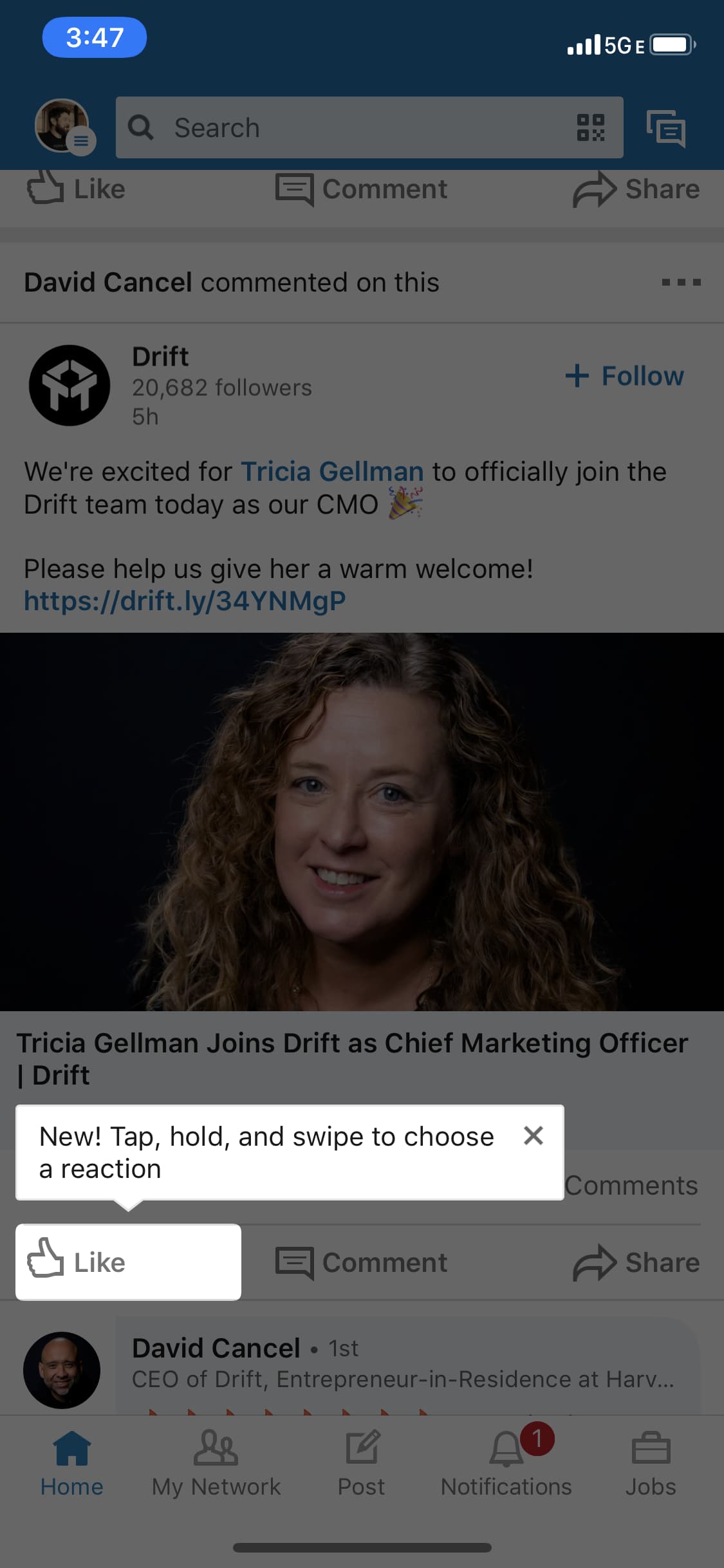
LinkedIn uses a simple tooltip anchored to navigation elements to announce new features. The tooltip appears once, highlights the new addition, and disappears after the user acknowledges it. What makes it effective: it is non-intrusive, clearly tied to the specific element that is new, and respects the user's attention by showing up once rather than repeatedly.
Humanity's multi-step tooltip sequence guides new users through their initial setup of employee scheduling. Each tooltip advances when the user completes the required action, and a progress indicator shows how many steps remain. What makes it effective: progressive disclosure. Each step builds on the last, so users never feel overwhelmed. The tooltips disappear only when the action is complete, ensuring users actually learn the workflow. See Humanity's onboarding tour in detail.
GitHub sprinkles plain-text tooltips throughout its interface to label icons and explain UI elements. Each tooltip is never more than a few words, and the behavior is consistent everywhere in the product. What makes it effective: predictability. Users learn to hover on any unfamiliar icon and trust that a helpful label will appear. The consistency builds confidence and reduces friction across the entire interface. See how GitHub's practical tooltips work in practice.
It is important to consider the context in which users interact with tooltips - especially which devices they are on. Teams looking to optimize their product for mobile usage often ask themselves, "Do tooltips work for mobile?"
The short answer: yes. Tooltips created for mobile have the same function and benefits as those for web-based apps. However, there is a chief difference between those engaging with tooltips at their desktop computers and those scrolling through their phones: display size. Unless you have purchased a smartphone the size of a pizza box, your tooltips have less space to exist within your UI. Tooltips that fit comfortably within a web-based display may overlap with your product's important features to create UX chaos and no small amount of friction.
Ultimately, this means you should consider the following when designing your tooltips for mobile apps:
role="tooltip", aria-describedby) and keyboard focus triggers for accessibility.Tooltips work to maintain momentum during a moment of necessary friction. They inform and affirm without distracting a user from their journey. However, the user journey sometimes requires disruption to ensure the communication of essential information. Other UI patterns like modal windows and slideouts more forcefully draw attention to announcements. They serve as the louder alternative to the calmer, quieter guidance tooltips offer.
Every onboarding process contains its quiet moments and its loud ones. You should use tooltips in conjunction with modals and slideouts to provide the most comprehensive and stress-free UX for your users. In the same way that onboarding should be stress-free for users, building UX-friendly onboarding flows should be easy for you. Create low-code tooltips, modals, and more with Appcues and take your in-app messaging game to the next level.
Book a demo to see how Appcues can help you build tooltips and other in-app experiences that drive adoption and engagement.
.png)