← Visit Appcues.com
×
×

How to turn your top help articles into in-app guides 

You can have the best help documentation in the world, but if users have to dig for it, it's not doing you (or them) any good.
Skip to section:

Skip to section:

You have built an awesome product, put it out in the world, and actually cleared the activation hurdle. By proving your product’s value, you got tire-kickers to the critical aha moment, and moved them further along in their user journey. Now they are officially “beginners”—people who understand how your product can meet their needs and are excited to learn more. 

So what now?

While you might want to breathe a sigh of relief and pat yourself on the back, this isn’t the time to sit back and relax. 

Beginners have lots of questions. They are eager to explore your product’s features and functionality, but they aren’t always sure of where to start. Their interest in your product brought them this far—but now you need to step up and help them become more proficient. 

“Help” is the operative word here. Help documentation, to be specific. 

The thing is, you could have the best help documentation in the world—but if users have to dig for it, it’s not going to do you (or them) any good. And if users can’t get the help they need, they’re unlikely to adopt and you may find yourself in churn territory. 

Surfacing your help content via in-app guides makes that vital information instantly accessible. It provides users with what they need, exactly when they need it—removing any friction that might otherwise keep them from falling more deeply in love with your product.

Providing easy access to timely and contextual information is one of the best ways to drive and accelerate adoption. Your users are happier because they’re able to accomplish their tasks. And you’re happier because your users are moving—step by step, task by task—closer to becoming regular users.

Step 1: Get your bearings–meet the Product-Led Growth Flywheel

But let’s not get ahead of ourselves… We need a little context.

When we talk about beginners, we’re referring to a cohort of users in the Product-Led Growth Flywheel, a framework for growing your business by investing in a product-led user experience. 

The Product-Led Growth Flywheel consists of 5 sequential user segments that correlate with stages in the user journey from awareness to evangelism—Stranger, Explorer, Beginner, Regular, and Champion—and the key actions these users need to take to graduate from one stage to the next: Evaluate, Activate, Adopt, Expand, and Advocate.
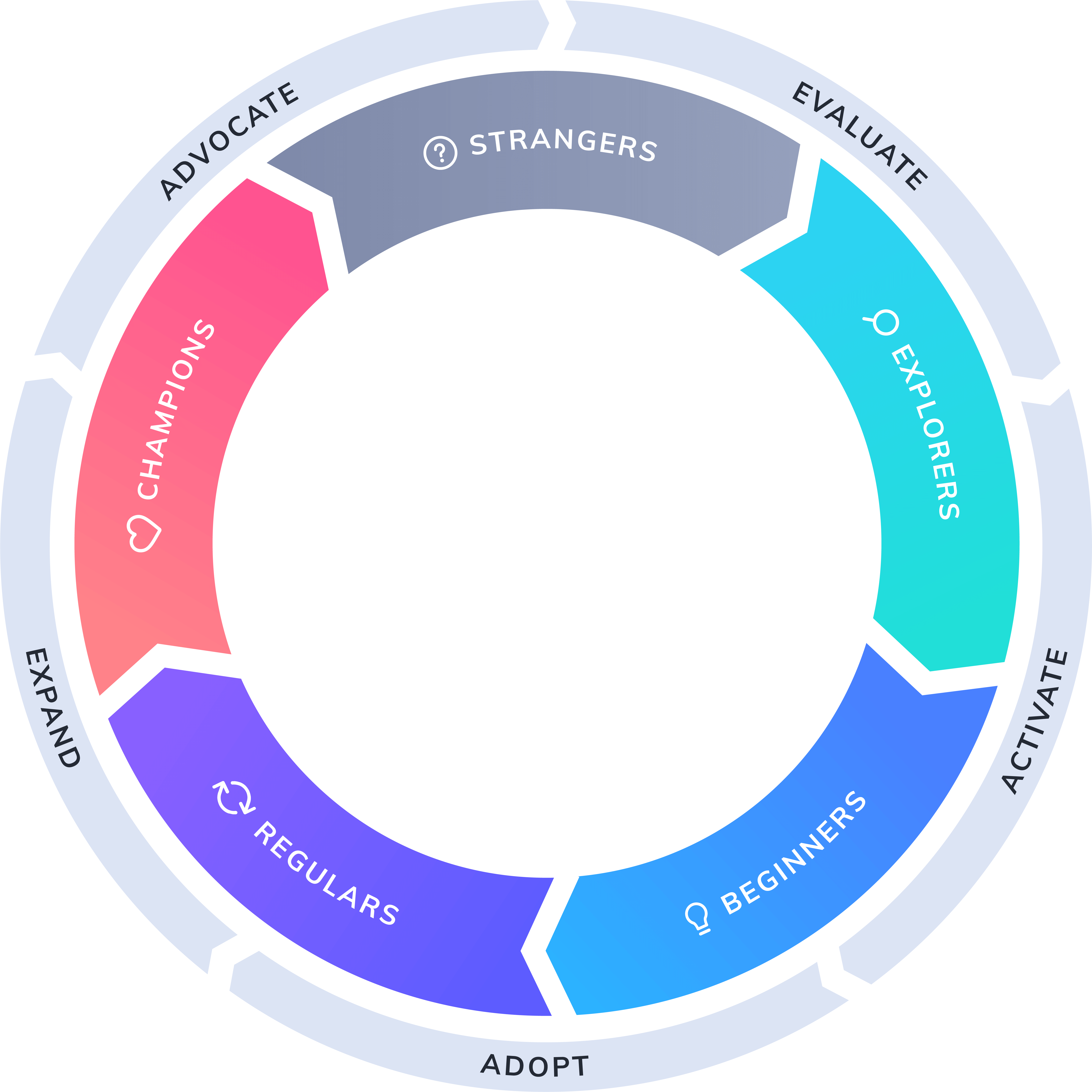
product-led growth flywheel

Beginners are users who have activated and successfully completed onboarding. Next step: product adoption. 

Adoption is the action that keeps a user moving along in their journey, turning beginners into regulars. At the adoption stage, it’s all about getting full user buy-in and delivering value so users come to rely on your product and integrate it into their regular tech stack.

Because they are just starting out, Beginners are most focused on product basics. They are starting to incorporate things into their workflows, but are not yet using advanced features or sophisticated use cases. They have a fair amount of confidence in your product, but are really still just figuring things out. 

Your job: Make it easy for Beginners to increase the breadth and depth of their knowledge about your application.

Ultimately, your goal is to improve their proficiency, which will increase their confidence, which will encourage them to use your product more, which will lead them to form habits, which will transform them into regulars.

Here’s where your help content comes in. 

Step 2: See the possibilities–how to transform help docs into in-app guides

There are a variety of ways to transform your help docs into in-app guides. Which method you use depends on the specifics of your product and your audience. 

Here are a few of the most popular options:

Feature walkthrough

If you have some complex features (or maybe a UI that is not yet quite as intuitive as you’d like it to be), a feature walkthrough is an excellent way to provide explicit instructions. 

Things to note:

  • Because walkthroughs are inherently prescriptive, they can actually end up adding friction instead of removing it. Be selective about the information you included, and focus on what users are trying to achieve, rather than every single detail or button.
  • A walkthrough is not a product tour. The difference has to do with the level of detail. A product tour is the 30,000-foot high-level overview of the most important features. A walkthrough gets down in the weeds with step-by-step instructions on how to complete a specific task. 

Example: Asana’s subtle but effective walkthrough

As a leading project management solution, Asana helps teams organize, track, and manage their work with a clear, simple, inviting interface. Creating a task is a clear aha moment for new users, so Asana provides a succinct, easy-to-follow feature walkthrough that uses an action-driven approach and a series of pulsing hotspots to guide the user through the process:
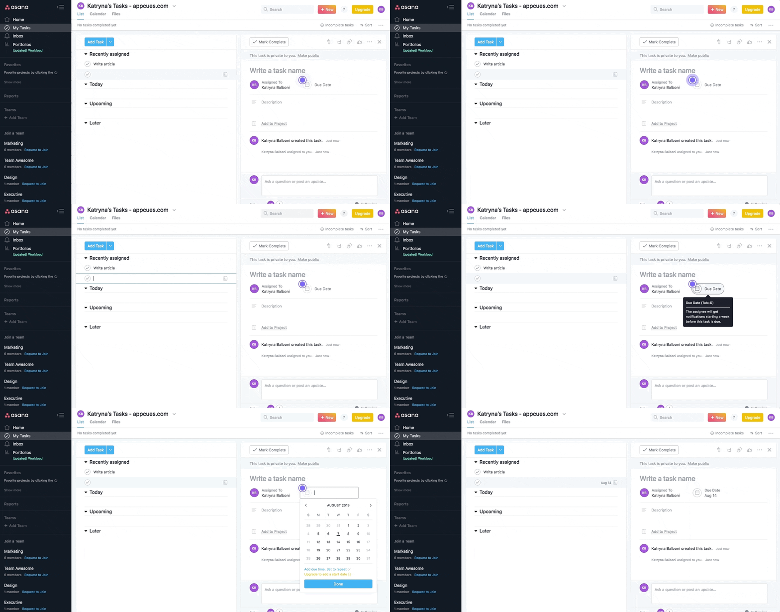
gif image of asana walktrough with animated hotspot and tooltip tour

Feature nudge 

Beginners aren’t yet familiar with all your product’s bells and whistles, so they generally appreciate a feature nudge—typically in the form of a tooltip or hotspot—that highlights a specific tool or functionality that will help them get more value out of your product. You can also use this technique to encourage users to take a specific action, such as inviting teammates to a platform or project.

Things to note:

  • A feature nudge should only appear when needed. The experience should be completely contextual based on the user’s activity.
  • The best tooltips blend into the overall user experience seamlessly, offering an assist without being overbearing or distracting. 
  • When writing tooltip copy, brevity is your friend. The shorter the better. Break things into bite-sized bits for easy consumption.
  • While part of the hotspot’s appeal is how unobtrusive they are, be careful not to make them invisible—use contrasting colors or add a pulsing animation to ensure that users take notice. 

Example: GitHub’s quick and contextual feature nudge

The best place for developers to share and collaborate on code, GitHub’s extensive platform can be overwhelming at first. To help new users get more value more efficiently, GitHub uses a series of tooltips to highlight new features, suggest links to related support articles, and provide general guidance.
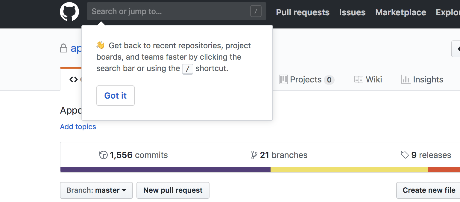
github tooltip pointing to he search bar that explains github keyboard shortcuts

Webinar and training announcements

Email invites to webinars and training sessions often get lost in the black hole that is your customer’s inbox. Even if a user sees the email, there’s no guarantee it’ll hold their attention long enough to register. 

In-app event announcements are an excellent way to reach your users in-context, while they are already already thinking about your product. Because they are isolated (rather than buried in an avalanche of emails) and relevant (to what the user is doing in the moment), they can substantially boost registration and attendance. 

Things to note:

  • Placement and timing is key. If you know users are logging into their dashboard to complete an urgent task, don’t interrupt their workflow—use a less intrusive slideout or banner to capture their attention without causing annoyance. 
  • If you’ve noticed that some users aren’t taking advantage of certain parts of your product, try targeting your announcements to people who haven’t yet mastered a particular feature or completed a complex task.

Example: How Acuity used a simple slideout to 7X their webinar attendance

Billed as the “personal assistant for your schedule,” Acuity Scheduling automates the process of scheduling meetings from booking to confirmation to follow up. Acuity used Appcues to increase feature adoption—in this case, webinar attendance—by targeting users with triggers around more complex features. Promoting the training events through an in-app slideout doubled (and sometimes septupled!) their traffic.
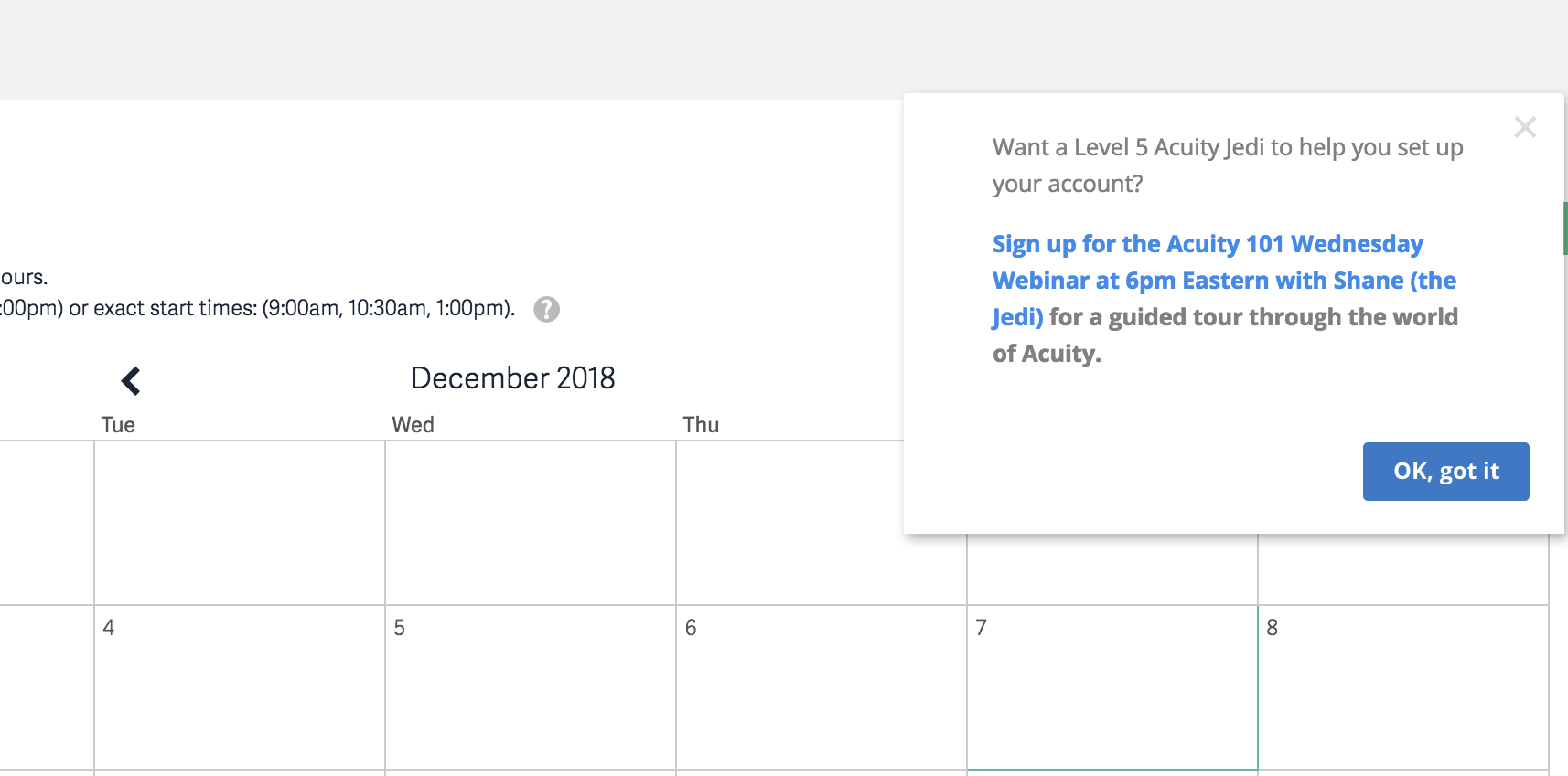
screenshot of slideout in-app webinar announcement. this is an example of in-product marketing


Often, combining tactics is the most effective approach. For example, a feature nudge might include a CTA that triggers a feature walkthrough. Or a feature walkthrough might end with a tooltip that directs users to self-service help for future reference. There are many combinations to try, each with its own benefits.

Step 3: Getting started

Transforming your static help document archive into dynamic and contextual in-app guides is not as complicated as you might think. But to make the most of the opportunity, you do need to do a little homework. 

Here are the 5 steps we recommend:

1. Identify speed bumps and bottlenecks

The first thing you need to know is where users are getting stuck. Review your help page doc views and support ticket history to see where users have the greatest demand for information.

2. Pick your battles

Once you have identified the opportunities, narrow your sights down to the top 1 to 3 items. Bonus points if you can cross check your list of friction points against the key actions that contribute to your product’s activation metric and find opportunities that fall into both categories.

3. Choose your locations

Just like in real estate, the success of your in-app guides has a lot to do with location, location, location. Consult your user journey map to plot out where and when each in-app guide will be most relevant and helpful to the user.

4. Create your assets

Now comes the fun part—creating your actual tooltip, walkthrough, or other messaging sequence. Remember to balance thoroughness with brevity, and don’t be afraid to bring a little personality into the mix.

5. Measure, iterate, repeat

Like other aspects of your product, in-app guides are rarely—if ever—a once-and-done thing. Measure their performance, and be prepared to iterate. This might mean updating copy or changing placement or switching up the overall flow. Be sure your product and development teams make room on their roadmaps to revisit your in-app guides as needed—or consider investing in a codeless third-party solution like Appcues that lets you publish tooltips, hotspots, and modals in a matter of minutes (not months).

Moral of the story: Don’t confine your help content to traditional documentation. 

Your help content has so much more to offer your users. Drive accelerated adoption by taking a free-range approach that puts your help content in its natural environment—your product UI. 

Bringing this guidance into your product ensures that beginners won’t be derailed from their tasks by having to hunt and peck for answers to their questions. They’ll receive the answers they need automatically, almost before they’ve even asked.

This is a very effective way to make your help content work harder for you and your users.

And it’s not just a benefit for your beginners. Your regular users will also appreciate a little help here and there. For instance, if there are new features or features they haven’t used since their initial onboarding, a well-placed announcement or refresher will be more than welcome. Just remember that your more advanced users value a subtle and unobtrusive approach, so make sure you’re not doing anything to slow them down. 

Find out more about using Appcues to reduce support burden with in-app guidance and self-service assistance. Your users will thank you!

Author's picture
Jack Moberger
Marketing Operations and Strategy at Appcues
Skip to section:

Skip to section:

You have built an awesome product, put it out in the world, and actually cleared the activation hurdle. By proving your product’s value, you got tire-kickers to the critical aha moment, and moved them further along in their user journey. Now they are officially “beginners”—people who understand how your product can meet their needs and are excited to learn more. 

So what now?

While you might want to breathe a sigh of relief and pat yourself on the back, this isn’t the time to sit back and relax. 

Beginners have lots of questions. They are eager to explore your product’s features and functionality, but they aren’t always sure of where to start. Their interest in your product brought them this far—but now you need to step up and help them become more proficient. 

“Help” is the operative word here. Help documentation, to be specific. 

The thing is, you could have the best help documentation in the world—but if users have to dig for it, it’s not going to do you (or them) any good. And if users can’t get the help they need, they’re unlikely to adopt and you may find yourself in churn territory. 

Surfacing your help content via in-app guides makes that vital information instantly accessible. It provides users with what they need, exactly when they need it—removing any friction that might otherwise keep them from falling more deeply in love with your product.

Providing easy access to timely and contextual information is one of the best ways to drive and accelerate adoption. Your users are happier because they’re able to accomplish their tasks. And you’re happier because your users are moving—step by step, task by task—closer to becoming regular users.

Step 1: Get your bearings–meet the Product-Led Growth Flywheel

But let’s not get ahead of ourselves… We need a little context.

When we talk about beginners, we’re referring to a cohort of users in the Product-Led Growth Flywheel, a framework for growing your business by investing in a product-led user experience. 

The Product-Led Growth Flywheel consists of 5 sequential user segments that correlate with stages in the user journey from awareness to evangelism—Stranger, Explorer, Beginner, Regular, and Champion—and the key actions these users need to take to graduate from one stage to the next: Evaluate, Activate, Adopt, Expand, and Advocate.

product-led growth flywheel

Beginners are users who have activated and successfully completed onboarding. Next step: product adoption. 

Adoption is the action that keeps a user moving along in their journey, turning beginners into regulars. At the adoption stage, it’s all about getting full user buy-in and delivering value so users come to rely on your product and integrate it into their regular tech stack.

Because they are just starting out, Beginners are most focused on product basics. They are starting to incorporate things into their workflows, but are not yet using advanced features or sophisticated use cases. They have a fair amount of confidence in your product, but are really still just figuring things out. 

Your job: Make it easy for Beginners to increase the breadth and depth of their knowledge about your application.

Ultimately, your goal is to improve their proficiency, which will increase their confidence, which will encourage them to use your product more, which will lead them to form habits, which will transform them into regulars.

Here’s where your help content comes in. 

Step 2: See the possibilities–how to transform help docs into in-app guides

There are a variety of ways to transform your help docs into in-app guides. Which method you use depends on the specifics of your product and your audience. 

Here are a few of the most popular options:

Feature walkthrough

If you have some complex features (or maybe a UI that is not yet quite as intuitive as you’d like it to be), a feature walkthrough is an excellent way to provide explicit instructions. 

Things to note:

  • Because walkthroughs are inherently prescriptive, they can actually end up adding friction instead of removing it. Be selective about the information you included, and focus on what users are trying to achieve, rather than every single detail or button.
  • A walkthrough is not a product tour. The difference has to do with the level of detail. A product tour is the 30,000-foot high-level overview of the most important features. A walkthrough gets down in the weeds with step-by-step instructions on how to complete a specific task. 

Example: Asana’s subtle but effective walkthrough

As a leading project management solution, Asana helps teams organize, track, and manage their work with a clear, simple, inviting interface. Creating a task is a clear aha moment for new users, so Asana provides a succinct, easy-to-follow feature walkthrough that uses an action-driven approach and a series of pulsing hotspots to guide the user through the process:

gif image of asana walktrough with animated hotspot and tooltip tour

Feature nudge 

Beginners aren’t yet familiar with all your product’s bells and whistles, so they generally appreciate a feature nudge—typically in the form of a tooltip or hotspot—that highlights a specific tool or functionality that will help them get more value out of your product. You can also use this technique to encourage users to take a specific action, such as inviting teammates to a platform or project.

Things to note:

  • A feature nudge should only appear when needed. The experience should be completely contextual based on the user’s activity.
  • The best tooltips blend into the overall user experience seamlessly, offering an assist without being overbearing or distracting. 
  • When writing tooltip copy, brevity is your friend. The shorter the better. Break things into bite-sized bits for easy consumption.
  • While part of the hotspot’s appeal is how unobtrusive they are, be careful not to make them invisible—use contrasting colors or add a pulsing animation to ensure that users take notice. 

Example: GitHub’s quick and contextual feature nudge

The best place for developers to share and collaborate on code, GitHub’s extensive platform can be overwhelming at first. To help new users get more value more efficiently, GitHub uses a series of tooltips to highlight new features, suggest links to related support articles, and provide general guidance.

github tooltip pointing to he search bar that explains github keyboard shortcuts

Webinar and training announcements

Email invites to webinars and training sessions often get lost in the black hole that is your customer’s inbox. Even if a user sees the email, there’s no guarantee it’ll hold their attention long enough to register. 

In-app event announcements are an excellent way to reach your users in-context, while they are already already thinking about your product. Because they are isolated (rather than buried in an avalanche of emails) and relevant (to what the user is doing in the moment), they can substantially boost registration and attendance. 

Things to note:

  • Placement and timing is key. If you know users are logging into their dashboard to complete an urgent task, don’t interrupt their workflow—use a less intrusive slideout or banner to capture their attention without causing annoyance. 
  • If you’ve noticed that some users aren’t taking advantage of certain parts of your product, try targeting your announcements to people who haven’t yet mastered a particular feature or completed a complex task.

Example: How Acuity used a simple slideout to 7X their webinar attendance

Billed as the “personal assistant for your schedule,” Acuity Scheduling automates the process of scheduling meetings from booking to confirmation to follow up. Acuity used Appcues to increase feature adoption—in this case, webinar attendance—by targeting users with triggers around more complex features. Promoting the training events through an in-app slideout doubled (and sometimes septupled!) their traffic.

screenshot of slideout in-app webinar announcement. this is an example of in-product marketing


Often, combining tactics is the most effective approach. For example, a feature nudge might include a CTA that triggers a feature walkthrough. Or a feature walkthrough might end with a tooltip that directs users to self-service help for future reference. There are many combinations to try, each with its own benefits.

Step 3: Getting started

Transforming your static help document archive into dynamic and contextual in-app guides is not as complicated as you might think. But to make the most of the opportunity, you do need to do a little homework. 

Here are the 5 steps we recommend:

1. Identify speed bumps and bottlenecks

The first thing you need to know is where users are getting stuck. Review your help page doc views and support ticket history to see where users have the greatest demand for information.

2. Pick your battles

Once you have identified the opportunities, narrow your sights down to the top 1 to 3 items. Bonus points if you can cross check your list of friction points against the key actions that contribute to your product’s activation metric and find opportunities that fall into both categories.

3. Choose your locations

Just like in real estate, the success of your in-app guides has a lot to do with location, location, location. Consult your user journey map to plot out where and when each in-app guide will be most relevant and helpful to the user.

4. Create your assets

Now comes the fun part—creating your actual tooltip, walkthrough, or other messaging sequence. Remember to balance thoroughness with brevity, and don’t be afraid to bring a little personality into the mix.

5. Measure, iterate, repeat

Like other aspects of your product, in-app guides are rarely—if ever—a once-and-done thing. Measure their performance, and be prepared to iterate. This might mean updating copy or changing placement or switching up the overall flow. Be sure your product and development teams make room on their roadmaps to revisit your in-app guides as needed—or consider investing in a codeless third-party solution like Appcues that lets you publish tooltips, hotspots, and modals in a matter of minutes (not months).

Moral of the story: Don’t confine your help content to traditional documentation. 

Your help content has so much more to offer your users. Drive accelerated adoption by taking a free-range approach that puts your help content in its natural environment—your product UI. 

Bringing this guidance into your product ensures that beginners won’t be derailed from their tasks by having to hunt and peck for answers to their questions. They’ll receive the answers they need automatically, almost before they’ve even asked.

This is a very effective way to make your help content work harder for you and your users.

And it’s not just a benefit for your beginners. Your regular users will also appreciate a little help here and there. For instance, if there are new features or features they haven’t used since their initial onboarding, a well-placed announcement or refresher will be more than welcome. Just remember that your more advanced users value a subtle and unobtrusive approach, so make sure you’re not doing anything to slow them down. 

Find out more about using Appcues to reduce support burden with in-app guidance and self-service assistance. Your users will thank you!

Author's picture
Jack Moberger
Marketing Operations and Strategy at Appcues
You might also like...