
.png)

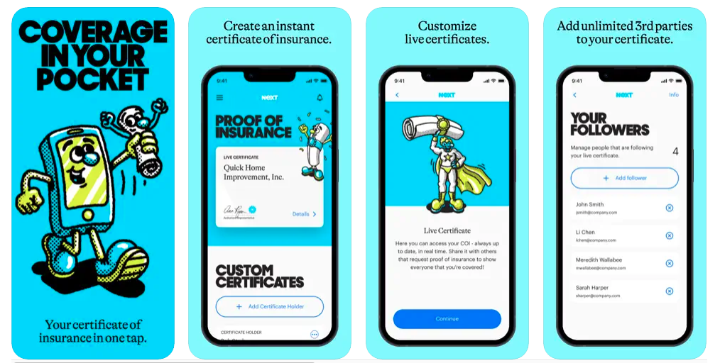
Modern insurance apps have come a long way from PDF policy docs and 1-800 numbers, but many still struggle to deliver frictionless digital experiences. From claims filing to policy setup and safe-driving programs, walkthroughs help reduce user anxiety, explain coverage clearly, and ensure adoption of critical features. In this guide, we’ll break down how to build insurance walkthroughs that inspire trust and drive engagement, with examples from Lemonade, State Farm, Next Insurance, and Clearcover.
Handing your product off to a new user without offering guidance on how to use it is a surefire way to tank your retention rates.
And, let’s be real, how many people are going to sit through a 10 minute video about your product? To bridge the dreaded “Learning-Doing” gap, you have to get a little creative and offer hands-on learning.
Specifically? App walkthroughs.
App walkthroughs are an effective way to take what users know they have to do and teach them how to, well, actually make it happen. Like using your software or those underutilized features you’re trying to get folks on board with.
With a good app walkthrough, you don’t just teach; you build understanding. That kind of innate, deep knowledge not only boosts retention, but drives your product forward into better growth.
The problem you’re seeing: Your users are dropping off the app before they can get to your value.
The play to try: Build an app walkthrough that doesn’t just passively teach; but actively walk users through what good usage looks like.
Use the blog below to learn more about:
An app walkthrough is an interactive tutorial built inside of a digital product that prompts users step-by-step through best practice and how-tos. The goal of an app walkthrough is to teach users how to use the product by doing vs passive watching.
Companies use app walkthroughs for onboarding, feature education, subscription renewals, product launches, and more.
Insurance isn’t something people interact with daily, which makes onboarding even more important. If users don’t immediately understand how to file a claim, view documents, or save on premiums, they’ll abandon your app (and maybe your brand).
Effective walkthroughs can:
For example, Blip, a chatbot builder, opted to use in-app walkthroughs to create a better onboarding experience.
“We knew that the aha moment or activation criteria for our users was publishing and testing their chatbot,” Guilherme Valadares, Product Marketing Manager, said.
“The problem for us was that the users were not creating and publishing their flows in the first session. They were exposed to a lot of features in our platform and they did not have a clear path.”
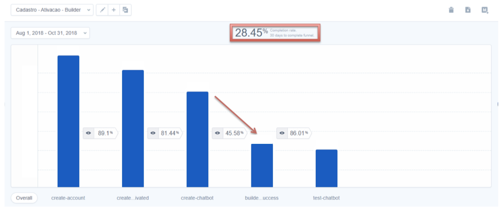
Overexposure to features is a common problem in the digital age. A solid app walkthrough can take a low completion rate (in this case, ~28%) and lay a more clear path so users are less overwhelmed.
For example, Blip started their onboarding process with a modal (a pop-up window) welcoming users onto their platform. With a combination of tooltips, hot spots, and other Learning-Doing app techniques, they were able to build a full journey that brought their users immediate value. No more getting lost, no more sitting in an overwhelming feature forest.
That’s the result of a well-considered app walkthrough.
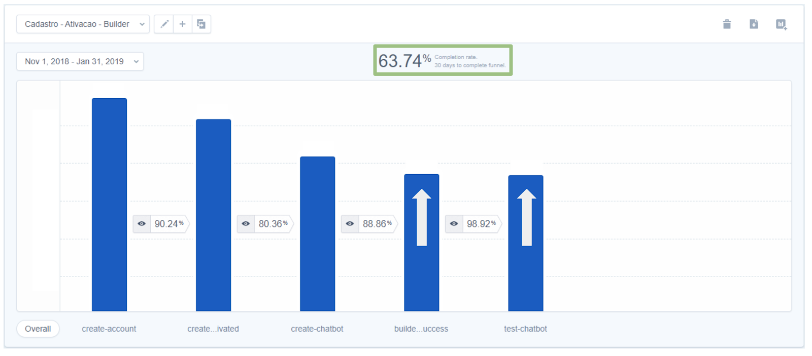
By building out an onboarding app walkthrough path, they saw their retention rate spike to ~64%.
That’s a 124% jump thanks to users learning by doing, and being given a clear path forward.
You can learn more about Blip here, but if you want to get a better understanding of the tools you can use to build an app walkthrough like this one, we have a course for you!
Check out The Ultimate Guide to User Onboarding to learn the principles to build an onboarding app walkthrough like the one you just learned about.
How you use app walkthroughs can change based on your goals, but the best problem solvers that see real results have specific traits in common. They include:
Problem: Insurance owners are getting overwhelmed and specific features are being underutilized.
Solution: You teach your users how to use insurance features with interactive feature walkthroughs and breakdowns.
What’s the point of having a product if no one knows how to use it? One of the best app walkthrough uses are a series of modals, hot spots, etc that:
This is a great opportunity to take a page out of the SaaS handbook and pick up some of their customer retention and education strategies.
In order to help your user get the most out of the app experience, you need to have a set goal in mind for your walkthrough. What are you trying to get your users to accomplish, and what’s the quickest path to get there?
App walkthroughs can make the overall onboarding process smoother and more enjoyable, but only when you have a clear recommended journey in mind.
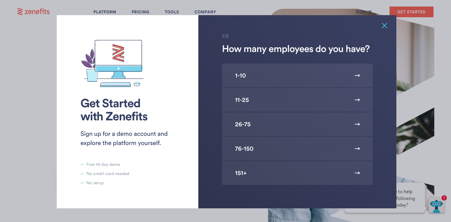
For example, app Zenefits knows exactly where it wants you to go when you first begin your trial.
Want an easy user journey onboarding template? Use this flow to map out your walkthrough from first idea to final step.
Should your users get frustrated with your product, they might try to figure it out for themselves or simply give up. But, when neither of those two are an option, users are going to reach out to your customer support team.
Providing an app walkthrough can save countless person hours explaining the same processes time and again, allowing your team to focus on more pressing issues.
We pulled together our own version of this, check out how we figured out our support sweet spot.
"We recently rolled out a new trial experience for Appcues. Our goal was to personalize the onboarding for each user and highlight the exact features that would bring value.Previously our onboarding pushed all users to a specific “aha moment” of building an experience. Now we use app walkthroughs to show which parts of the product will provide the most value to them based on their use case. For example, for the user onboarding use case we highlight flows and experiments." - Meg Gowell, Director of Growth @ Appcues
The difference between an app walk through and a product tour can be hard to define. In the software industry, the two are often meant to define the same thing.
In this instance, an app walkthrough is interactive, while a video product tour is visual. It’s a recording of how to use the app, not an actual “learn by doing” technique. And although that kind of passive education can help some users, it’s not a perfect solution.
Having both covers your bases for multiple learning types.
A good walkthrough can be hard to nail. Too long and you risk losing the user along the way. Too short, and users might not get the product knowledge they need to use your features properly. Too flashy? Distracted. Too boring? They’re on Reddit now.
Here are four companies that provide premium walkthrough experiences for their users.
Filing a claim is the most emotionally charged moment in the insurance journey. A good walkthrough should reduce stress, clarify what’s needed, and guide the user through step-by-step.
Lemonade does this exceptionally well. Their mobile flow for car insurance claims uses clear language, a calm tone, and visual progress cues to guide users. Rather than dumping a form on the screen, Lemonade asks one question at a time, making the process feel personal, not bureaucratic.
Takeaways:
Apps tied to telematics (driving behavior monitoring) often require opt-ins, permission prompts, and background processes. A strong walkthrough ensures users set things up correctly and understand what’s being tracked.
State Farm’s Drive Safe & Save app walks users through the setup of location permissions, Bluetooth settings, and trip tracking. The walkthrough ensures users don’t miss key steps that could impact rewards or data accuracy.
Tips for this flow:
For independent contractors and small businesses, insurance apps must balance flexibility and clarity. Onboarding needs to educate users quickly, especially if they’re unfamiliar with terms like “general liability” or “professional indemnity.”
Next Insurance provides a self-serve mobile experience that helps users get covered in minutes. The app uses guided questions, progress checklists, and upfront explanations to walk users through policy setup.
What works well here:
Even after setup, insurance apps must guide users to high-value features: digital ID cards, bill pay, roadside assistance, or chat support. A well-placed tooltip or contextual nudge can significantly increase adoption.
Clearcover’s mobile app includes a clean, intuitive dashboard that highlights key actions. It uses microcopy and subtle prompts to show users how to access coverage details, contact support, and manage policies.
Best practices:
So you’ve got a video product tour—maybe it lives on your homepage, maybe it’s the first thing users see post-signup. Great. But while a good video can show off your product, it can’t help your users actually use it.
Here’s how to translate that passive watch-and-leave experience into a hands-on walkthrough that guides users through the real thing.
Before you build anything new, zoom in on what you’ve already got. Where are people dropping off? Where do they get stuck or confused?
Look at your data. Tap into event tracking. Watch session replays. Layer in qualitative stuff—customer interviews, support logs, live usability tests. What you’re trying to pinpoint: the gaps between what users see and what they actually do.
If you already have a product tour in place, use it as a baseline. A walkthrough shouldn’t repeat the same content—it should move the user from “got it” to “did it.”
Try analyzing a few user cohorts and see what that information tells you.
Forget the marketing flow. What do users actually need to do to be successful inside your product?
Sketch out the steps a user has to take from login to value. (The real ones, not just the pretty ones.) Note where things are unclear, repetitive, or easy to miss. That’s where your walkthrough should step in.
This doesn’t have to be fancy. A quick user journey map or list of tasks can help you visualize what support needs to show up when.
They typically look something like this:

Creating a user journey map requires understanding of who is buying your product, different stages they go through and the potential obstacles they may encounter on the way. In the case of app walkthroughs, you’re likely to be focusing more on the Adoption side of the process.
Now that you know what needs fixing, you can design your walkthrough to fill in the blanks, where users typically stall or skip.
This is where in-app patterns come in. Some go-to formats:
You don’t need to use all of them; just the ones that help your users keep moving forward.
Once you’ve mapped it out, it’s time to build. If you’ve got engineering help, go for it. If not, tools like Appcues can help you design and deploy walkthroughs without touching code.
Either way, don’t skip validation. Test it internally first. Then soft-launch to a subset of users. Watch the data. Ask for feedback. Tweak accordingly.
A walkthrough isn’t a one-and-done project. It’s part of your product experience—and that means it’s never really finished.

Building an app walkthrough? Use this checklist to keep things focused on what actually helps your users, not just what looks good.
Not every product needs a walkthrough. Some tools are designed for discovery—where the joy In insurance, clarity builds trust—and walkthroughs are your first line of defense. Whether you're launching a next-gen claims app or modernizing SMB onboarding, a great walkthrough helps reduce confusion, increase app engagement, and differentiate your product in a crowded market.
Take Canva, for example. A guided tour of all their templates would be overwhelming. The product is built for exploration, so handholding might actually get in the way. What Canva needs more than a walkthrough is great discoverability.
But if your product has a few more moving parts—or if your users need to complete a set of actions before they hit value—a walkthrough can make all the difference.
This is especially true for complex insurance platforms, where “getting started” might mean navigating 4+ menus, toggling on an integration, and flipping a few switches most people have never heard of.
In those cases, a walkthrough isn’t just helpful. It’s critical. It shows your users what to do, when to do it, and why it matters. And done well, it can dramatically speed up time-to-value.
Product Adoption
Product Tours & Walkthroughs
Retention & Churn
Checklists, Tooltips & Modals
TL;DR
Modern insurance apps have come a long way from PDF policy docs and 1-800 numbers, but many still struggle to deliver frictionless digital experiences. From claims filing to policy setup and safe-driving programs, walkthroughs help reduce user anxiety, explain coverage clearly, and ensure adoption of critical features. In this guide, we’ll break down how to build insurance walkthroughs that inspire trust and drive engagement, with examples from Lemonade, State Farm, Next Insurance, and Clearcover.
Handing your product off to a new user without offering guidance on how to use it is a surefire way to tank your retention rates.
And, let’s be real, how many people are going to sit through a 10 minute video about your product? To bridge the dreaded “Learning-Doing” gap, you have to get a little creative and offer hands-on learning.
Specifically? App walkthroughs.
App walkthroughs are an effective way to take what users know they have to do and teach them how to, well, actually make it happen. Like using your software or those underutilized features you’re trying to get folks on board with.
With a good app walkthrough, you don’t just teach; you build understanding. That kind of innate, deep knowledge not only boosts retention, but drives your product forward into better growth.
The problem you’re seeing: Your users are dropping off the app before they can get to your value.
The play to try: Build an app walkthrough that doesn’t just passively teach; but actively walk users through what good usage looks like.
Use the blog below to learn more about:
An app walkthrough is an interactive tutorial built inside of a digital product that prompts users step-by-step through best practice and how-tos. The goal of an app walkthrough is to teach users how to use the product by doing vs passive watching.
Companies use app walkthroughs for onboarding, feature education, subscription renewals, product launches, and more.
Insurance isn’t something people interact with daily, which makes onboarding even more important. If users don’t immediately understand how to file a claim, view documents, or save on premiums, they’ll abandon your app (and maybe your brand).
Effective walkthroughs can:
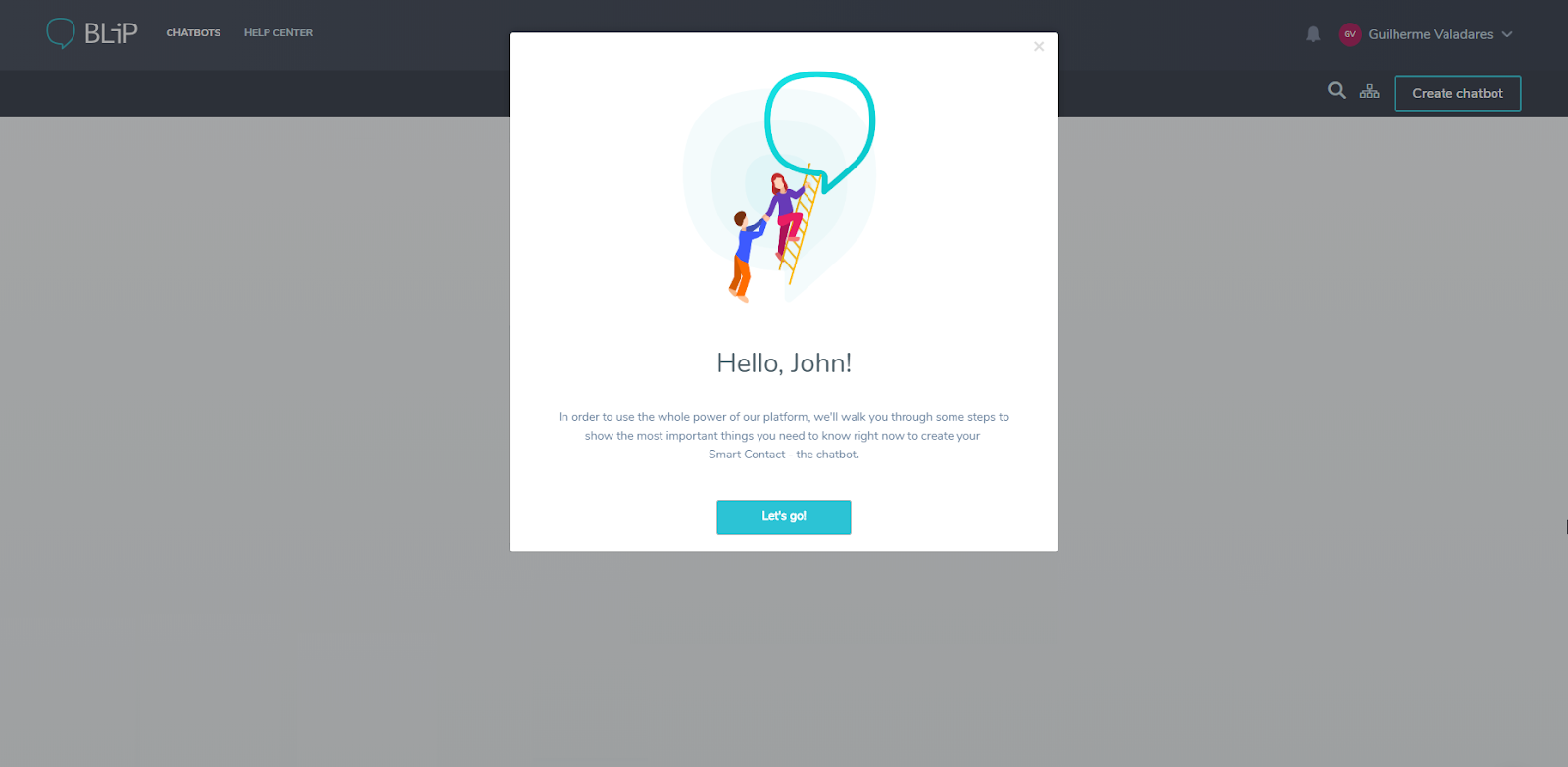
For example, Blip, a chatbot builder, opted to use in-app walkthroughs to create a better onboarding experience.
“We knew that the aha moment or activation criteria for our users was publishing and testing their chatbot,” Guilherme Valadares, Product Marketing Manager, said.
“The problem for us was that the users were not creating and publishing their flows in the first session. They were exposed to a lot of features in our platform and they did not have a clear path.”
Overexposure to features is a common problem in the digital age. A solid app walkthrough can take a low completion rate (in this case, ~28%) and lay a more clear path so users are less overwhelmed.
For example, Blip started their onboarding process with a modal (a pop-up window) welcoming users onto their platform. With a combination of tooltips, hot spots, and other Learning-Doing app techniques, they were able to build a full journey that brought their users immediate value. No more getting lost, no more sitting in an overwhelming feature forest.
That’s the result of a well-considered app walkthrough.
By building out an onboarding app walkthrough path, they saw their retention rate spike to ~64%.
That’s a 124% jump thanks to users learning by doing, and being given a clear path forward.
You can learn more about Blip here, but if you want to get a better understanding of the tools you can use to build an app walkthrough like this one, we have a course for you!
Check out The Ultimate Guide to User Onboarding to learn the principles to build an onboarding app walkthrough like the one you just learned about.
How you use app walkthroughs can change based on your goals, but the best problem solvers that see real results have specific traits in common. They include:
Problem: Insurance owners are getting overwhelmed and specific features are being underutilized.
Solution: You teach your users how to use insurance features with interactive feature walkthroughs and breakdowns.
What’s the point of having a product if no one knows how to use it? One of the best app walkthrough uses are a series of modals, hot spots, etc that:
This is a great opportunity to take a page out of the SaaS handbook and pick up some of their customer retention and education strategies.
In order to help your user get the most out of the app experience, you need to have a set goal in mind for your walkthrough. What are you trying to get your users to accomplish, and what’s the quickest path to get there?
App walkthroughs can make the overall onboarding process smoother and more enjoyable, but only when you have a clear recommended journey in mind.
For example, app Zenefits knows exactly where it wants you to go when you first begin your trial.
Want an easy user journey onboarding template? Use this flow to map out your walkthrough from first idea to final step.
Should your users get frustrated with your product, they might try to figure it out for themselves or simply give up. But, when neither of those two are an option, users are going to reach out to your customer support team.
Providing an app walkthrough can save countless person hours explaining the same processes time and again, allowing your team to focus on more pressing issues.
We pulled together our own version of this, check out how we figured out our support sweet spot.
"We recently rolled out a new trial experience for Appcues. Our goal was to personalize the onboarding for each user and highlight the exact features that would bring value.Previously our onboarding pushed all users to a specific “aha moment” of building an experience. Now we use app walkthroughs to show which parts of the product will provide the most value to them based on their use case. For example, for the user onboarding use case we highlight flows and experiments." - Meg Gowell, Director of Growth @ Appcues
The difference between an app walk through and a product tour can be hard to define. In the software industry, the two are often meant to define the same thing.
In this instance, an app walkthrough is interactive, while a video product tour is visual. It’s a recording of how to use the app, not an actual “learn by doing” technique. And although that kind of passive education can help some users, it’s not a perfect solution.
Having both covers your bases for multiple learning types.
A good walkthrough can be hard to nail. Too long and you risk losing the user along the way. Too short, and users might not get the product knowledge they need to use your features properly. Too flashy? Distracted. Too boring? They’re on Reddit now.
Here are four companies that provide premium walkthrough experiences for their users.
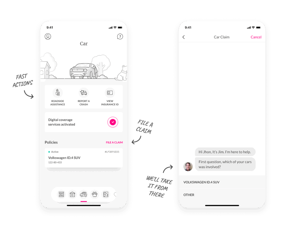
Filing a claim is the most emotionally charged moment in the insurance journey. A good walkthrough should reduce stress, clarify what’s needed, and guide the user through step-by-step.
Lemonade does this exceptionally well. Their mobile flow for car insurance claims uses clear language, a calm tone, and visual progress cues to guide users. Rather than dumping a form on the screen, Lemonade asks one question at a time, making the process feel personal, not bureaucratic.
Takeaways:
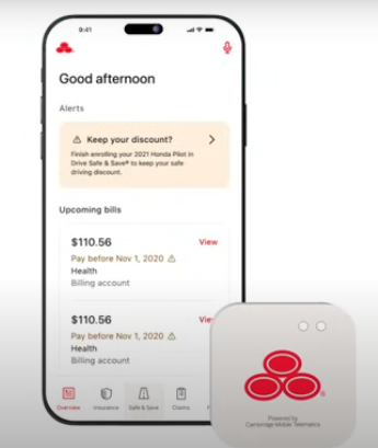
Apps tied to telematics (driving behavior monitoring) often require opt-ins, permission prompts, and background processes. A strong walkthrough ensures users set things up correctly and understand what’s being tracked.
State Farm’s Drive Safe & Save app walks users through the setup of location permissions, Bluetooth settings, and trip tracking. The walkthrough ensures users don’t miss key steps that could impact rewards or data accuracy.
Tips for this flow:
For independent contractors and small businesses, insurance apps must balance flexibility and clarity. Onboarding needs to educate users quickly, especially if they’re unfamiliar with terms like “general liability” or “professional indemnity.”
Next Insurance provides a self-serve mobile experience that helps users get covered in minutes. The app uses guided questions, progress checklists, and upfront explanations to walk users through policy setup.
What works well here:
Even after setup, insurance apps must guide users to high-value features: digital ID cards, bill pay, roadside assistance, or chat support. A well-placed tooltip or contextual nudge can significantly increase adoption.
Clearcover’s mobile app includes a clean, intuitive dashboard that highlights key actions. It uses microcopy and subtle prompts to show users how to access coverage details, contact support, and manage policies.
Best practices:
So you’ve got a video product tour—maybe it lives on your homepage, maybe it’s the first thing users see post-signup. Great. But while a good video can show off your product, it can’t help your users actually use it.
Here’s how to translate that passive watch-and-leave experience into a hands-on walkthrough that guides users through the real thing.
Before you build anything new, zoom in on what you’ve already got. Where are people dropping off? Where do they get stuck or confused?
Look at your data. Tap into event tracking. Watch session replays. Layer in qualitative stuff—customer interviews, support logs, live usability tests. What you’re trying to pinpoint: the gaps between what users see and what they actually do.
If you already have a product tour in place, use it as a baseline. A walkthrough shouldn’t repeat the same content—it should move the user from “got it” to “did it.”
Try analyzing a few user cohorts and see what that information tells you.
Forget the marketing flow. What do users actually need to do to be successful inside your product?
Sketch out the steps a user has to take from login to value. (The real ones, not just the pretty ones.) Note where things are unclear, repetitive, or easy to miss. That’s where your walkthrough should step in.
This doesn’t have to be fancy. A quick user journey map or list of tasks can help you visualize what support needs to show up when.
They typically look something like this:
Creating a user journey map requires understanding of who is buying your product, different stages they go through and the potential obstacles they may encounter on the way. In the case of app walkthroughs, you’re likely to be focusing more on the Adoption side of the process.
Now that you know what needs fixing, you can design your walkthrough to fill in the blanks, where users typically stall or skip.
This is where in-app patterns come in. Some go-to formats:
You don’t need to use all of them; just the ones that help your users keep moving forward.
Once you’ve mapped it out, it’s time to build. If you’ve got engineering help, go for it. If not, tools like Appcues can help you design and deploy walkthroughs without touching code.
Either way, don’t skip validation. Test it internally first. Then soft-launch to a subset of users. Watch the data. Ask for feedback. Tweak accordingly.
A walkthrough isn’t a one-and-done project. It’s part of your product experience—and that means it’s never really finished.
Building an app walkthrough? Use this checklist to keep things focused on what actually helps your users, not just what looks good.
Not every product needs a walkthrough. Some tools are designed for discovery—where the joy In insurance, clarity builds trust—and walkthroughs are your first line of defense. Whether you're launching a next-gen claims app or modernizing SMB onboarding, a great walkthrough helps reduce confusion, increase app engagement, and differentiate your product in a crowded market.
Take Canva, for example. A guided tour of all their templates would be overwhelming. The product is built for exploration, so handholding might actually get in the way. What Canva needs more than a walkthrough is great discoverability.
But if your product has a few more moving parts—or if your users need to complete a set of actions before they hit value—a walkthrough can make all the difference.
This is especially true for complex insurance platforms, where “getting started” might mean navigating 4+ menus, toggling on an integration, and flipping a few switches most people have never heard of.
In those cases, a walkthrough isn’t just helpful. It’s critical. It shows your users what to do, when to do it, and why it matters. And done well, it can dramatically speed up time-to-value.

Sign up for Quickcues and get our monthly updates!
.svg)

