.png)

You know you’re in trouble when your user journey looks like a rapid fire series of “next”s. It happens to the best of us. Your product tour isn’t working the way it should. The game is changing, and when retention hinges on your relationship with your customers, their behavior is often all you have to go off of. Which makes that “next” chain double damning.
There’s a bigger decision today than “what widget goes where”. First, you have to answer should you even be walking your users through your product?
The answer comes down to expectations and making an informed decision about who’s in the driver’s seat: the product, the user, or an agent.
When you pick one, the patterns fall into place. So how do you make a choice between the three options and what does each mean for the playing field you’re entering?
In this article, we’ll review each choice, the nine product tour patterns that follow, and new AI patterns you might want to consider.
%20(1)%20(1).png)
Before you even begin to think about patterns, you have to start by answering that larger question. Who’s going to be doing the most work to learn your product? Aka: who’s in the driver’s seat?
The best way to think about it are in three modes
Here’s how to pick.
Once you’ve decided your driver, you narrow down what patterns will work best for the best product tour UI for adoption and retention.
A product tour pattern is a surface over your product, the visual indicator to your user that there’s information they need to know. The level of importance helps determine which pattern it belongs in.
A lot of the success of these patterns comes down to a second axis: timing. Does it appear upfront? On-demand? Or does it trigger based on specific behavior? Even the same pattern, when paired with different kinds of timing, becomes a varied series of experiences for your user.
Most pattern lists mix components, timing, rules, and capabilities to create effective guidance series. For this article, we focus on the driver as a way to determine which pattern is the most effective choice for your product tour UI.
This is what we traditionally understand as a product tour, where patterns stop the user’s experience in order to share information.
A tooltip is a short, quick message pinned to one thing on the product/the user’s screen.
There are two versions of the tooltip, one that’s gated and won’t let the user continue until they complete an action. The other is a passive tooltip, that still explains and stays out of the way.
For more on writing and targeting, read our tooltip guide.
A modal is a box that covers up the entire screen until it's dealt with, also known as a pop-up.
This is a big swing, since it costs user patience. The best use this full stop to offer something useful to their user, like picking a template or naming a project, rather than the more typical ‘welcome to the platform’ message.
For more on copy and timing, read our modal guide.
A slideout is a panel that slides in from the edge of the screen ( usually a corner) and offers users information without stopping them from taking other actions.
Think of it as an in-between for tooltips and modals. Let’s say you want to pin information that’s more than a sentence, but you don’t want to stop people in their tracks. A slideout is that middle ground. It can carry a paragraph, an image, a short video, and two buttons, without blocking a user’s work. That makes it the right choice for the message that's too big for a tooltip and too optional for a pop-up.
It's also the most useful pattern for new features, surveys, maintenance heads-ups, and nudges towards upgrading to a new pricing tier.
Remember, slideouts on mobile are a different animal. A panel that takes a tidy corner of a desktop screen ends up covering about a third of a phone for the same message.
A pin is a dot or pulse placed next to a button, or an area of interest, that invites a click without demanding immediate action. It is the politest pattern.
Sometimes, your user knows exactly what they want to do. Here are two patterns that help you step out of the way.
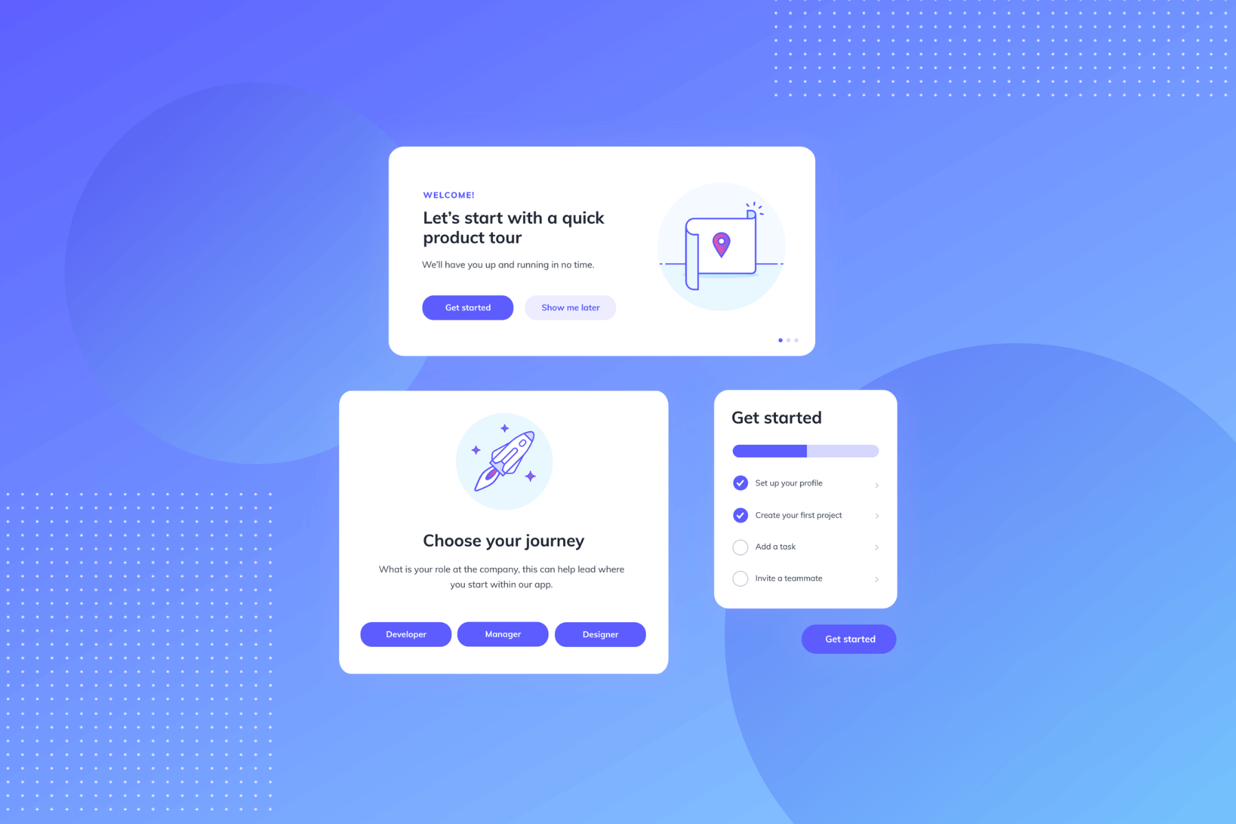
A checklist shows a short list of setup steps and how many a user has left.
A user goes in wanting an outcome, but doesn’t know how much work is between them and their desired action. A list gives them an end to work towards, so what they have to do becomes more reasonable in their mind.
Every product has screens that start blank. That’s free real estate for instructions that sit where the work happens, then disappear when a user succeeds and the empty screen changes.
This is the new pattern that AI introduced, and it’s been going on strong with some of the fastest growing PLG companies in the game.
Instead of touring five features, you ask “what are you here to do”. Then, use the answer to build a personalized first outcome.
Many PLG leaders adopted this one. Airtable's relaunch in July 2025 made it the center of their onboarding: you describe what you want to track, and it builds a working base from the sentence. Zapier does the same for automations.
This is directly tied to the question at signup. Build the first version of whatever task the user is working on, so their first job is to make tweaks,
Fixing something is easier than starting it. A rough version that's kind of right beats twelve polished templates that are all slightly wrong. That rougher draft is built off of whatever context the user provides, making it immediately more personalized and specific, even if they don’t get it in one shot.
AI stepped into product tours and improved both modes and introduced the third.
However, this doesn’t take people out of the equation. Someone still has to decide what a good first outcome looks like. AI can build toward a definition of "set up correctly”, but it can't tell you what that means for your product. That work moved earlier in the process, to an internal decision that happens before anyone builds a step.
For full teardowns, check out the best user onboarding examples
An interactive demo and a product tour are not the same thing. An interactive demo runs before signup, usually on its own page, and often built in an entirely separate tool. It wins in three situations: long sales cycles, expensive decisions, and products nobody can get into without talking to sales.
Remember: keep it short. Wanting to cover more features in one tour is an impulse that overwhelms your user.
Before designing a tour, ask what you'd have to remove in order not to need one. Sometimes that's the cheaper project.
Completion rate is the most common way people report their product tour success, but it answers the wrong question. It tells you if someone made it through the tour, but not if it worked.
What you want to know is whether the people who experienced the tour (and your chosen patterns) will be deeper users than the people who didn't. For that, you need a control group that didn't get the same experience. Without one, you're comparing motivated users to unmotivated users and reporting the gap as a result.
This gets more important the more you let the product drive. You can test two versions of a tooltip cleanly since you wrote both. You can't test a generated setup the same way, because what the model produced varies, not the words you chose. Once the experience stops being identical for everyone, a control group becomes the only honest way to answer the question.
Your product analytics will show you the final effect. But what it usually won't show you is cause. That's what a holdout gives you, and it's what Appcues Impact and Uplift are for — measuring whether an experience made the difference, with control groups built in rather than reconstructed afterward. It sits on top of the measurement you already have.
Choosing the pattern, oddly enough, is the quickest part. The hardest is shipping the patterns, changing your tactics when they underperform, and knowing which version moved your numbers — then doing that continuously, across the whole customer relationship instead of just the first ten minutes.
That's what Appcues does: build these experiences without waiting on a release, put them in front of the right people at the right moment, and find out whether they caused the change.
Product Adoption
Product Tours & Walkthroughs
Retention & Churn
Checklists, Tooltips & Modals
You know you’re in trouble when your user journey looks like a rapid fire series of “next”s. It happens to the best of us. Your product tour isn’t working the way it should. The game is changing, and when retention hinges on your relationship with your customers, their behavior is often all you have to go off of. Which makes that “next” chain double damning.
There’s a bigger decision today than “what widget goes where”. First, you have to answer should you even be walking your users through your product?
The answer comes down to expectations and making an informed decision about who’s in the driver’s seat: the product, the user, or an agent.
When you pick one, the patterns fall into place. So how do you make a choice between the three options and what does each mean for the playing field you’re entering?
In this article, we’ll review each choice, the nine product tour patterns that follow, and new AI patterns you might want to consider.
Before you even begin to think about patterns, you have to start by answering that larger question. Who’s going to be doing the most work to learn your product? Aka: who’s in the driver’s seat?
The best way to think about it are in three modes
Here’s how to pick.
Once you’ve decided your driver, you narrow down what patterns will work best for the best product tour UI for adoption and retention.
A product tour pattern is a surface over your product, the visual indicator to your user that there’s information they need to know. The level of importance helps determine which pattern it belongs in.
A lot of the success of these patterns comes down to a second axis: timing. Does it appear upfront? On-demand? Or does it trigger based on specific behavior? Even the same pattern, when paired with different kinds of timing, becomes a varied series of experiences for your user.
Most pattern lists mix components, timing, rules, and capabilities to create effective guidance series. For this article, we focus on the driver as a way to determine which pattern is the most effective choice for your product tour UI.
This is what we traditionally understand as a product tour, where patterns stop the user’s experience in order to share information.
A tooltip is a short, quick message pinned to one thing on the product/the user’s screen.
There are two versions of the tooltip, one that’s gated and won’t let the user continue until they complete an action. The other is a passive tooltip, that still explains and stays out of the way.
For more on writing and targeting, read our tooltip guide.
A modal is a box that covers up the entire screen until it's dealt with, also known as a pop-up.
This is a big swing, since it costs user patience. The best use this full stop to offer something useful to their user, like picking a template or naming a project, rather than the more typical ‘welcome to the platform’ message.
For more on copy and timing, read our modal guide.
A slideout is a panel that slides in from the edge of the screen ( usually a corner) and offers users information without stopping them from taking other actions.
Think of it as an in-between for tooltips and modals. Let’s say you want to pin information that’s more than a sentence, but you don’t want to stop people in their tracks. A slideout is that middle ground. It can carry a paragraph, an image, a short video, and two buttons, without blocking a user’s work. That makes it the right choice for the message that's too big for a tooltip and too optional for a pop-up.
It's also the most useful pattern for new features, surveys, maintenance heads-ups, and nudges towards upgrading to a new pricing tier.
Remember, slideouts on mobile are a different animal. A panel that takes a tidy corner of a desktop screen ends up covering about a third of a phone for the same message.
A pin is a dot or pulse placed next to a button, or an area of interest, that invites a click without demanding immediate action. It is the politest pattern.
Sometimes, your user knows exactly what they want to do. Here are two patterns that help you step out of the way.
A checklist shows a short list of setup steps and how many a user has left.
A user goes in wanting an outcome, but doesn’t know how much work is between them and their desired action. A list gives them an end to work towards, so what they have to do becomes more reasonable in their mind.
Every product has screens that start blank. That’s free real estate for instructions that sit where the work happens, then disappear when a user succeeds and the empty screen changes.
This is the new pattern that AI introduced, and it’s been going on strong with some of the fastest growing PLG companies in the game.
Instead of touring five features, you ask “what are you here to do”. Then, use the answer to build a personalized first outcome.
Many PLG leaders adopted this one. Airtable's relaunch in July 2025 made it the center of their onboarding: you describe what you want to track, and it builds a working base from the sentence. Zapier does the same for automations.
This is directly tied to the question at signup. Build the first version of whatever task the user is working on, so their first job is to make tweaks,
Fixing something is easier than starting it. A rough version that's kind of right beats twelve polished templates that are all slightly wrong. That rougher draft is built off of whatever context the user provides, making it immediately more personalized and specific, even if they don’t get it in one shot.
AI stepped into product tours and improved both modes and introduced the third.
However, this doesn’t take people out of the equation. Someone still has to decide what a good first outcome looks like. AI can build toward a definition of "set up correctly”, but it can't tell you what that means for your product. That work moved earlier in the process, to an internal decision that happens before anyone builds a step.
For full teardowns, check out the best user onboarding examples
An interactive demo and a product tour are not the same thing. An interactive demo runs before signup, usually on its own page, and often built in an entirely separate tool. It wins in three situations: long sales cycles, expensive decisions, and products nobody can get into without talking to sales.
Remember: keep it short. Wanting to cover more features in one tour is an impulse that overwhelms your user.
Before designing a tour, ask what you'd have to remove in order not to need one. Sometimes that's the cheaper project.
Completion rate is the most common way people report their product tour success, but it answers the wrong question. It tells you if someone made it through the tour, but not if it worked.
What you want to know is whether the people who experienced the tour (and your chosen patterns) will be deeper users than the people who didn't. For that, you need a control group that didn't get the same experience. Without one, you're comparing motivated users to unmotivated users and reporting the gap as a result.
This gets more important the more you let the product drive. You can test two versions of a tooltip cleanly since you wrote both. You can't test a generated setup the same way, because what the model produced varies, not the words you chose. Once the experience stops being identical for everyone, a control group becomes the only honest way to answer the question.
Your product analytics will show you the final effect. But what it usually won't show you is cause. That's what a holdout gives you, and it's what Appcues Impact and Uplift are for — measuring whether an experience made the difference, with control groups built in rather than reconstructed afterward. It sits on top of the measurement you already have.
Choosing the pattern, oddly enough, is the quickest part. The hardest is shipping the patterns, changing your tactics when they underperform, and knowing which version moved your numbers — then doing that continuously, across the whole customer relationship instead of just the first ten minutes.
That's what Appcues does: build these experiences without waiting on a release, put them in front of the right people at the right moment, and find out whether they caused the change.

Sign up for Quickcues and get our monthly updates!
.svg)