
.png)
.png)
Modal windows demand attention - by design. They overlay the main interface and block interaction until a user responds, making them one of the most powerful (and most misused) UI patterns in product design.
Use them for high-stakes moments. Onboarding, feature announcements, critical confirmations, and security acknowledgments are all strong use cases - anything that genuinely deserves a user's full attention.
Skip them for everything else. Routine updates, contextual help, and low-priority alerts are better served by tooltips, banners, slideouts, or inline elements. Overusing modals erodes trust and frustrates users.
Good modal design is intentional. Clear titles, concise body text, action-oriented CTAs, easy dismissal, proper sizing, and accessibility features separate great modals from annoying ones.
Mobile modals play by different rules. Smaller screens blur the line between modals, slideouts, and tooltips - but they also open up unique engagement opportunities like permission priming and upgrade prompts.
Can you think of a product or website experience that was ruined by one too many pop-ups? A modal window that hijacked your workflow with no clear escape? A pesky notification that just wouldn't take a hint?
Of course you can. This sort of bad UX behavior is unfortunately common.
Because they have the power to grab attention, modals are often seen as quick fixes to anything that could use a boost in engagement.
But when used correctly, modal windows are a great way to deliver messages that deserve users' full attention. Many companies - Google, Grammarly, HubSpot, Spotify - use them successfully to onboard users and nudge them toward high-impact actions.
Modals (also known as modal windows, overlays, dialogs, and lightboxes) are large UI elements that sit on top of an application's main window - often with a layer of transparency behind them to give users a peek into the main app.
The key concept behind a modal is that it creates a "mode" - a state where the main interface is temporarily disabled. To return to the application's main interface, users must interact with the modal layer by completing an action, making a choice, or explicitly dismissing it. Because they are inherently and deliberately disruptive, they should not be used lightly.
The terms are often used interchangeably, but there's an important distinction. A modal is a specific type of overlay that blocks interaction with the underlying page - users have to deal with it before moving on. "Popup" is a broader term that includes any content appearing over the main interface, including non-blocking elements like notification toasts or chat widgets. All modals are popups, but not all popups are modals.
A modal dialog requires user interaction before they can return to the main content - think of a confirmation prompt before deleting a file. A non-modal (or modeless) dialog lets users continue interacting with the parent page while the dialog stays open - like a find-and-replace toolbar in a text editor. Use modal dialogs when you need a definitive response. Use non-modal dialogs when the interaction is supplementary and doesn't require immediate resolution.
Modals are best used for noteworthy announcements and essential information - like welcome messages or can't-miss updates. Since they aren't attached to any specific element, they tend to work better for broad in-app messages, rather than highly contextual help.
Some common use cases include:
A modal window can be just the thing for a simple welcome message that warmly greets new users.
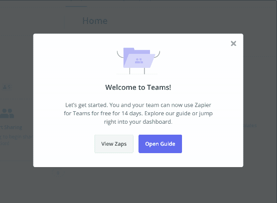
Zapier adds a touch of delight to their welcome message with a bit of animated confetti.
If you have a lot to say, multi-modal flows can be a great way to onboard new users to your product. Progress indicators help motivate users to complete multi-step onboarding or product tours.
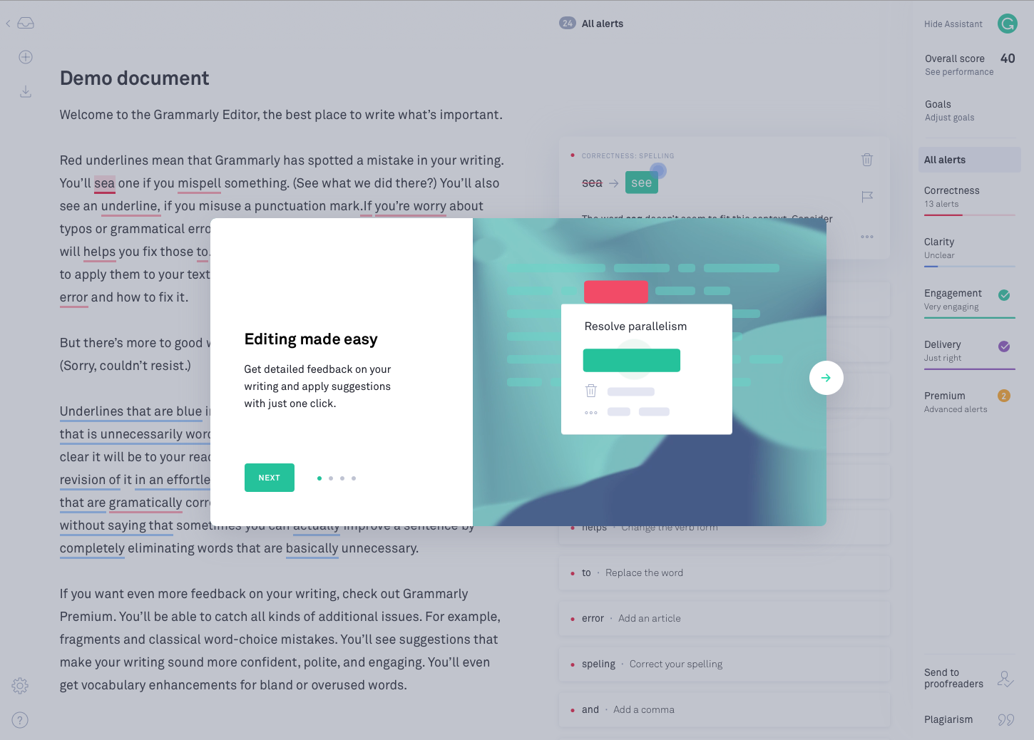
Grammarly uses a series of modal windows to introduce new users to important features, while reiterating the product's core value propositions.
Big announcements - like a product redesign or the release of a long-awaited feature - often deserve a big modal splash.
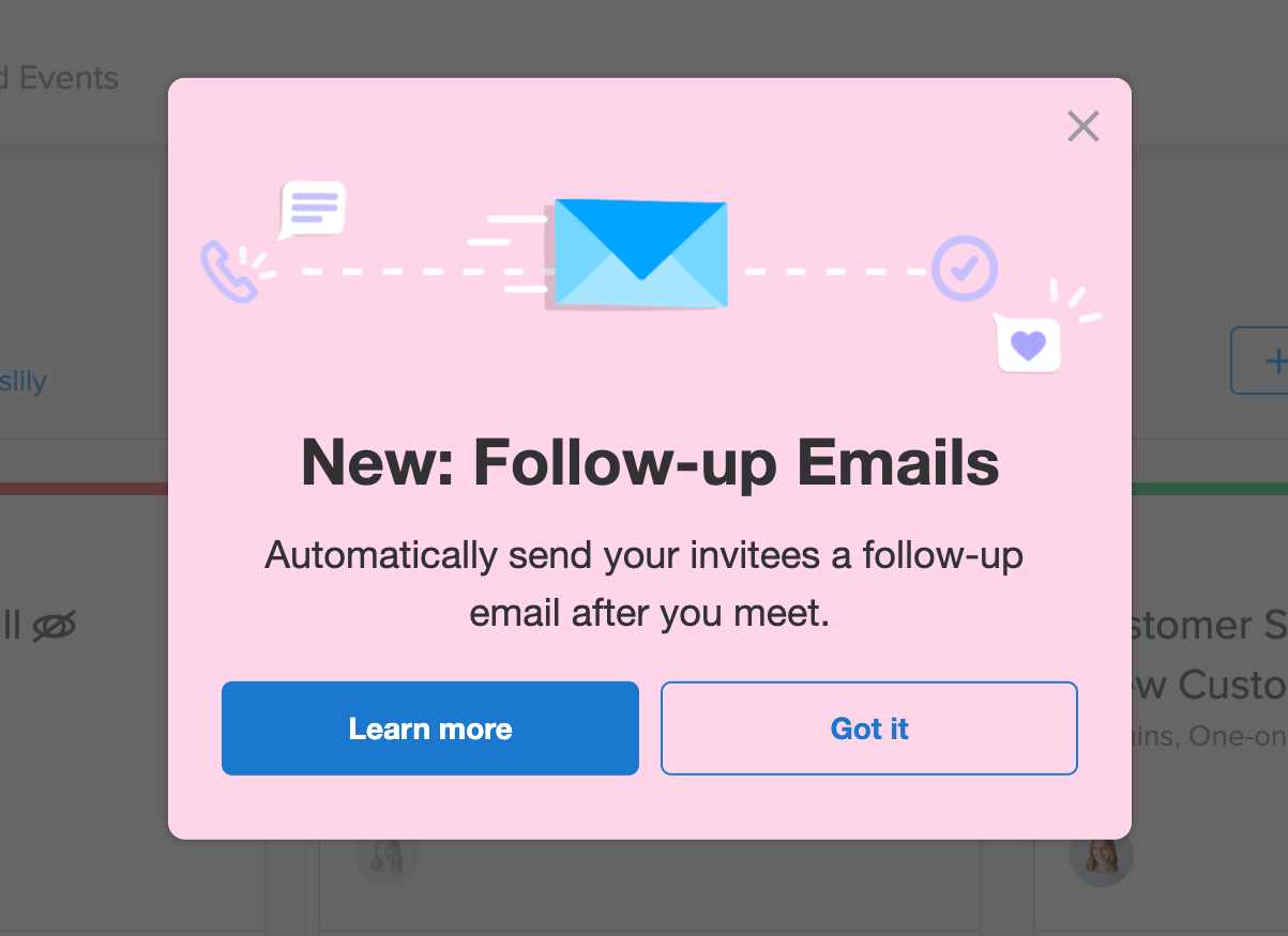
Calendly used a single, simple modal to announce an exciting new feature (automated followup emails).
Modal windows are ideal for moments that require additional user input - whether that's a form or a one-click confirmation. This is arguably the strongest use case for modals: any action with important consequences, like deleting something, saving progress, or making a purchase, is worth interrupting a workflow for. Requiring explicit confirmation for irreversible actions prevents costly mistakes and builds user trust.
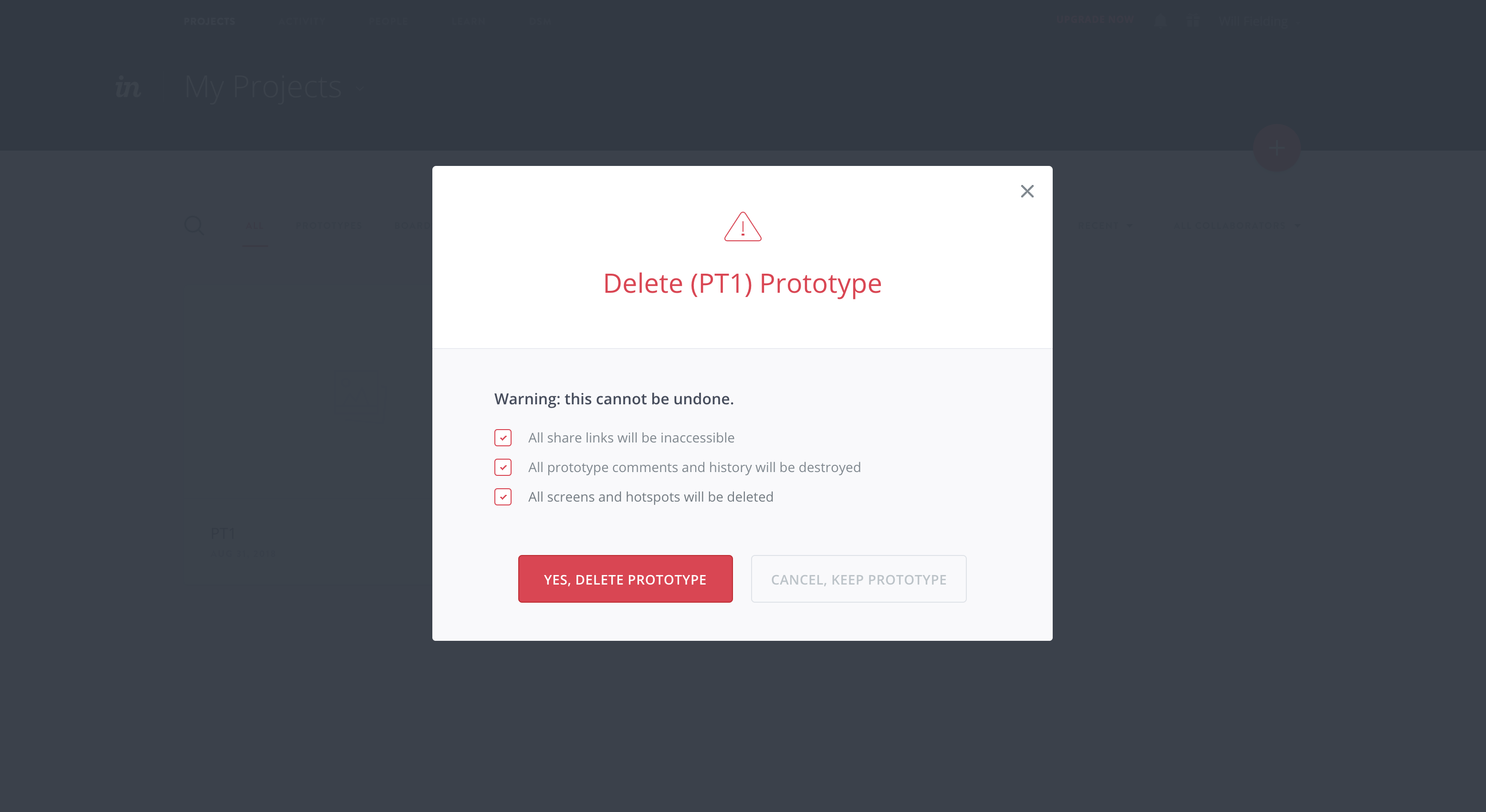
InVision uses a modal to require additional user input before deleting a prototype. This is an important action, and an attention-grabbing UI pattern is useful to prevent accidental deletion of data.
When users must agree to terms of service, acknowledge a privacy policy update, or complete a security step before proceeding, a modal is the right pattern. Think cookie consent banners that require explicit opt-in, two-factor authentication prompts, or data-processing agreements. These interactions are non-negotiable by design - the modal's blocking behavior ensures compliance.
Multi-step modals work well for short, self-contained workflows - like onboarding wizards, payment setup, or profile completion. Progress indicators keep users motivated and oriented. A word of caution: if a flow requires more than 3-4 steps, consider moving it to a dedicated page instead. Cramming too much into a modal defeats the purpose of keeping things focused.
Some modals take over a user's full-screen, blocking visibility into your app and focusing a user entirely on the message and user onboarding experience in front of them. We refer to this pattern as a full-screen takeover. On desktop especially, this UI pattern is best reserved for mission-critical information or when there are required inputs that a user must complete before they can perform an action.
Modal windows are inherently disruptive. Every modal forces a context switch - users have to stop what they're doing, process new information, and decide how to respond before they can get back to their task. That cognitive load adds up quickly. When modals appear too frequently or for low-value content, they start to feel like the boy who cried wolf. Users learn to dismiss them reflexively, which means your genuinely important messages get ignored right along with the routine ones.
Before reaching for a modal, consider whether a lighter-touch pattern would work just as well:

For contextual messages that refer to specific page elements or features (as in the example from HubSpot below), tooltips are often a better choice.

So now that you know when to use a modal - and when you'd be better off with a smaller UI pattern - it's worth taking a closer look at what good modal design actually looks like.
There's no one-size-fits-all template, of course, but there are a few rules of thumb worth remembering. Let's break it down:
The modal title should tell users what the modal is all about with just a glance. Try to match your title to the primary action button - if the title says "Delete photo?" the button should say "Delete," not "OK."
One of the biggest advantages of modals over smaller patterns is that they can easily accommodate visual content. Hero images can be added under the title for extra emphasis. Short videos or GIFs can help demonstrate how a feature works, add a human touch, or even just a dose of humor. Product screenshots are particularly effective for feature announcements - they show users exactly what's new rather than just telling them.
The body text can be as long as a few short paragraphs, or as short as a sentence. As with any UX writing, be clear and concise.
Strong, action-oriented language works best for CTAs. While calls-to-action can be intriguing, don't be too mysterious. The best ones allude to what comes next in a compelling way. Avoid vague labels like "OK" or "Yes/No" - use specific actions like "Delete file," "Save changes," or "Start free trial" so users know exactly what will happen.
For inspiration, read more about which power words resonate with users.
Don't hold your users hostage. It should be easy for users to leave the modal window and get back to your main application.
Modals can include both an "X" button and a CTA for exit. They can also be designed to close if the user clicks outside of the modal. For non-critical modals, supporting the Escape key is a must - users expect it, and leaving it out feels like a trap.
Modals should not take over the full screen unless absolutely necessary. A good rule of thumb is to keep modals to roughly 25% of the screen area - large enough to hold meaningful content, small enough to maintain context. Center modals for critical actions that demand focus. For optional or informational content, an off-center position can feel less imposing. Always use background dimming so users understand the main interface is temporarily inactive.
When using a series of modals, a progress bar works to keep users motivated and let them know how many more steps are left in the flow. Subtle dots (like those Google uses), a simple fraction, or a classic bar can all have a big impact on whether or not people complete a modal series.
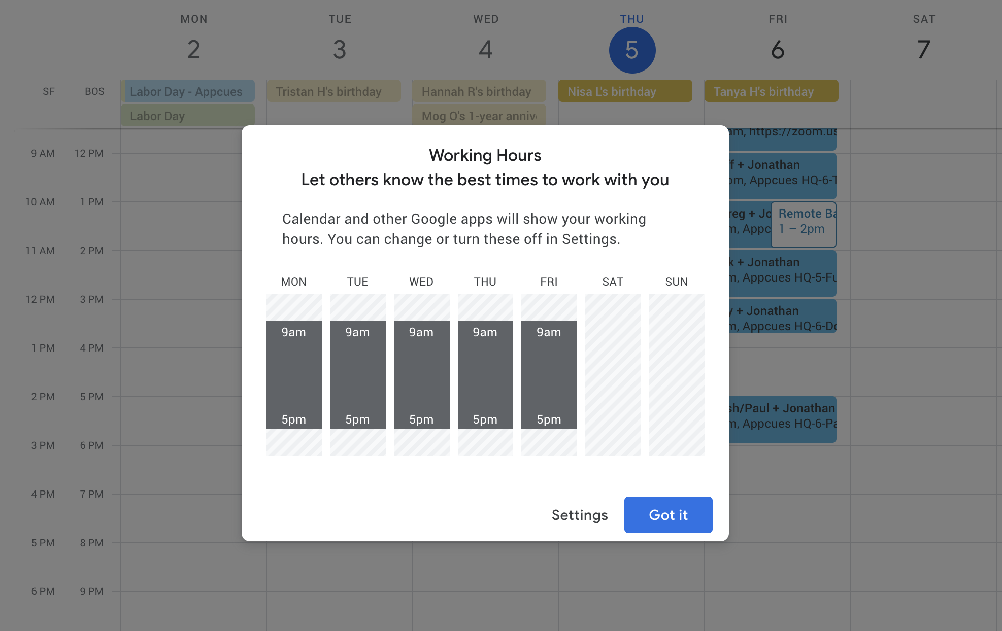
Take a look at the modal from Google Calendar below. There's no progress bar here since it's a single step, but all the other components of a good modal are present: descriptive title, branded graphics, informative body text, and an opportunity to exit with or without taking action.
Accessible modals aren't just a nice-to-have - they're essential for reaching all of your users. A few key practices to follow:
dialog or alertdialog) and descriptive labels so assistive technology can announce the modal's purpose and content.Modals can be a powerful tool for mobile app engagement, too. Because mobile screens offer limited real estate, the line between mobile modals, slideouts, and even tooltips can get blurred - a large tooltip can start to look a lot like a small modal in the palm of your hand.
This can be limiting - every in-app message can feel that much more disruptive on mobile devices - but also open up interesting opportunities for app owners and marketers.
While using a modal window to upsell to a higher tier subscription might feel a little aggressive on desktop, for instance, upselling is a perfectly fine use case for a mobile modal, when handled thoughtfully.
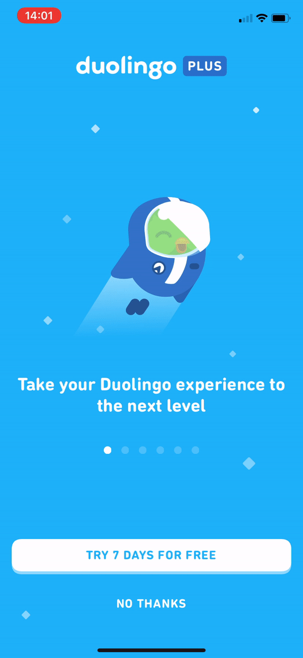
Duolingo uses a series of playful, animated modals to nudge frequent users towards its premium product.
Permission priming is another common use case for modal windows on mobile:
.png)
Skyscanner uses a partial-screen modal to prompt users turn on notifications after they complete their first flight search in the app.
Want to learn more about using mobile modals? Check out these 8 examples of great mobile modals that will delight and engage your app users for the full scoop.
Modal windows are unabashedly bold. Use them sparingly, and ensure that the messages they contain provide value to engage - not enrage - your users.
Appcues makes it easy to create modals that look native to your app - with a low-code builder, precise user targeting, and no engineering bottleneck to slow you down. Whether you're onboarding new users or announcing your latest feature, you can go from idea to live modal in minutes.
Book a demo to see how Appcues can help you build modals that engage your users at the moments that matter most.
Product Adoption
Checklists, Tooltips & Modals
User Engagement
Product Tours & Walkthroughs
TL;DR
Modal windows demand attention - by design. They overlay the main interface and block interaction until a user responds, making them one of the most powerful (and most misused) UI patterns in product design.
Use them for high-stakes moments. Onboarding, feature announcements, critical confirmations, and security acknowledgments are all strong use cases - anything that genuinely deserves a user's full attention.
Skip them for everything else. Routine updates, contextual help, and low-priority alerts are better served by tooltips, banners, slideouts, or inline elements. Overusing modals erodes trust and frustrates users.
Good modal design is intentional. Clear titles, concise body text, action-oriented CTAs, easy dismissal, proper sizing, and accessibility features separate great modals from annoying ones.
Mobile modals play by different rules. Smaller screens blur the line between modals, slideouts, and tooltips - but they also open up unique engagement opportunities like permission priming and upgrade prompts.
Can you think of a product or website experience that was ruined by one too many pop-ups? A modal window that hijacked your workflow with no clear escape? A pesky notification that just wouldn't take a hint?
Of course you can. This sort of bad UX behavior is unfortunately common.
Because they have the power to grab attention, modals are often seen as quick fixes to anything that could use a boost in engagement.
But when used correctly, modal windows are a great way to deliver messages that deserve users' full attention. Many companies - Google, Grammarly, HubSpot, Spotify - use them successfully to onboard users and nudge them toward high-impact actions.
Modals (also known as modal windows, overlays, dialogs, and lightboxes) are large UI elements that sit on top of an application's main window - often with a layer of transparency behind them to give users a peek into the main app.
The key concept behind a modal is that it creates a "mode" - a state where the main interface is temporarily disabled. To return to the application's main interface, users must interact with the modal layer by completing an action, making a choice, or explicitly dismissing it. Because they are inherently and deliberately disruptive, they should not be used lightly.
The terms are often used interchangeably, but there's an important distinction. A modal is a specific type of overlay that blocks interaction with the underlying page - users have to deal with it before moving on. "Popup" is a broader term that includes any content appearing over the main interface, including non-blocking elements like notification toasts or chat widgets. All modals are popups, but not all popups are modals.
A modal dialog requires user interaction before they can return to the main content - think of a confirmation prompt before deleting a file. A non-modal (or modeless) dialog lets users continue interacting with the parent page while the dialog stays open - like a find-and-replace toolbar in a text editor. Use modal dialogs when you need a definitive response. Use non-modal dialogs when the interaction is supplementary and doesn't require immediate resolution.
Modals are best used for noteworthy announcements and essential information - like welcome messages or can't-miss updates. Since they aren't attached to any specific element, they tend to work better for broad in-app messages, rather than highly contextual help.
Some common use cases include:
A modal window can be just the thing for a simple welcome message that warmly greets new users.
Zapier adds a touch of delight to their welcome message with a bit of animated confetti.
If you have a lot to say, multi-modal flows can be a great way to onboard new users to your product. Progress indicators help motivate users to complete multi-step onboarding or product tours.
Grammarly uses a series of modal windows to introduce new users to important features, while reiterating the product's core value propositions.
Big announcements - like a product redesign or the release of a long-awaited feature - often deserve a big modal splash.
Calendly used a single, simple modal to announce an exciting new feature (automated followup emails).
Modal windows are ideal for moments that require additional user input - whether that's a form or a one-click confirmation. This is arguably the strongest use case for modals: any action with important consequences, like deleting something, saving progress, or making a purchase, is worth interrupting a workflow for. Requiring explicit confirmation for irreversible actions prevents costly mistakes and builds user trust.
InVision uses a modal to require additional user input before deleting a prototype. This is an important action, and an attention-grabbing UI pattern is useful to prevent accidental deletion of data.
When users must agree to terms of service, acknowledge a privacy policy update, or complete a security step before proceeding, a modal is the right pattern. Think cookie consent banners that require explicit opt-in, two-factor authentication prompts, or data-processing agreements. These interactions are non-negotiable by design - the modal's blocking behavior ensures compliance.
Multi-step modals work well for short, self-contained workflows - like onboarding wizards, payment setup, or profile completion. Progress indicators keep users motivated and oriented. A word of caution: if a flow requires more than 3-4 steps, consider moving it to a dedicated page instead. Cramming too much into a modal defeats the purpose of keeping things focused.
Some modals take over a user's full-screen, blocking visibility into your app and focusing a user entirely on the message and user onboarding experience in front of them. We refer to this pattern as a full-screen takeover. On desktop especially, this UI pattern is best reserved for mission-critical information or when there are required inputs that a user must complete before they can perform an action.
Modal windows are inherently disruptive. Every modal forces a context switch - users have to stop what they're doing, process new information, and decide how to respond before they can get back to their task. That cognitive load adds up quickly. When modals appear too frequently or for low-value content, they start to feel like the boy who cried wolf. Users learn to dismiss them reflexively, which means your genuinely important messages get ignored right along with the routine ones.
Before reaching for a modal, consider whether a lighter-touch pattern would work just as well:
For contextual messages that refer to specific page elements or features (as in the example from HubSpot below), tooltips are often a better choice.
So now that you know when to use a modal - and when you'd be better off with a smaller UI pattern - it's worth taking a closer look at what good modal design actually looks like.
There's no one-size-fits-all template, of course, but there are a few rules of thumb worth remembering. Let's break it down:
The modal title should tell users what the modal is all about with just a glance. Try to match your title to the primary action button - if the title says "Delete photo?" the button should say "Delete," not "OK."
One of the biggest advantages of modals over smaller patterns is that they can easily accommodate visual content. Hero images can be added under the title for extra emphasis. Short videos or GIFs can help demonstrate how a feature works, add a human touch, or even just a dose of humor. Product screenshots are particularly effective for feature announcements - they show users exactly what's new rather than just telling them.
The body text can be as long as a few short paragraphs, or as short as a sentence. As with any UX writing, be clear and concise.
Strong, action-oriented language works best for CTAs. While calls-to-action can be intriguing, don't be too mysterious. The best ones allude to what comes next in a compelling way. Avoid vague labels like "OK" or "Yes/No" - use specific actions like "Delete file," "Save changes," or "Start free trial" so users know exactly what will happen.
For inspiration, read more about which power words resonate with users.
Don't hold your users hostage. It should be easy for users to leave the modal window and get back to your main application.
Modals can include both an "X" button and a CTA for exit. They can also be designed to close if the user clicks outside of the modal. For non-critical modals, supporting the Escape key is a must - users expect it, and leaving it out feels like a trap.
Modals should not take over the full screen unless absolutely necessary. A good rule of thumb is to keep modals to roughly 25% of the screen area - large enough to hold meaningful content, small enough to maintain context. Center modals for critical actions that demand focus. For optional or informational content, an off-center position can feel less imposing. Always use background dimming so users understand the main interface is temporarily inactive.
When using a series of modals, a progress bar works to keep users motivated and let them know how many more steps are left in the flow. Subtle dots (like those Google uses), a simple fraction, or a classic bar can all have a big impact on whether or not people complete a modal series.
Take a look at the modal from Google Calendar below. There's no progress bar here since it's a single step, but all the other components of a good modal are present: descriptive title, branded graphics, informative body text, and an opportunity to exit with or without taking action.
Accessible modals aren't just a nice-to-have - they're essential for reaching all of your users. A few key practices to follow:
dialog or alertdialog) and descriptive labels so assistive technology can announce the modal's purpose and content.Modals can be a powerful tool for mobile app engagement, too. Because mobile screens offer limited real estate, the line between mobile modals, slideouts, and even tooltips can get blurred - a large tooltip can start to look a lot like a small modal in the palm of your hand.
This can be limiting - every in-app message can feel that much more disruptive on mobile devices - but also open up interesting opportunities for app owners and marketers.
While using a modal window to upsell to a higher tier subscription might feel a little aggressive on desktop, for instance, upselling is a perfectly fine use case for a mobile modal, when handled thoughtfully.
Duolingo uses a series of playful, animated modals to nudge frequent users towards its premium product.
Permission priming is another common use case for modal windows on mobile:
Skyscanner uses a partial-screen modal to prompt users turn on notifications after they complete their first flight search in the app.
Want to learn more about using mobile modals? Check out these 8 examples of great mobile modals that will delight and engage your app users for the full scoop.
Modal windows are unabashedly bold. Use them sparingly, and ensure that the messages they contain provide value to engage - not enrage - your users.
Appcues makes it easy to create modals that look native to your app - with a low-code builder, precise user targeting, and no engineering bottleneck to slow you down. Whether you're onboarding new users or announcing your latest feature, you can go from idea to live modal in minutes.
Book a demo to see how Appcues can help you build modals that engage your users at the moments that matter most.

Sign up for Quickcues and get our monthly updates!
.svg)

