.png)
Way back in 1996, the popup window was invented. This has made a lot of people very angry and has been widely regarded as a bad move.
If the phrase “popup window” generally conjures a negative association, modal windows are like their more presentable sibling. And while these web experiences still sometimes get a bad rap, it’s not entirely warranted.
Why? Because the way people use modal windows is often more of a problem than the modals themselves.
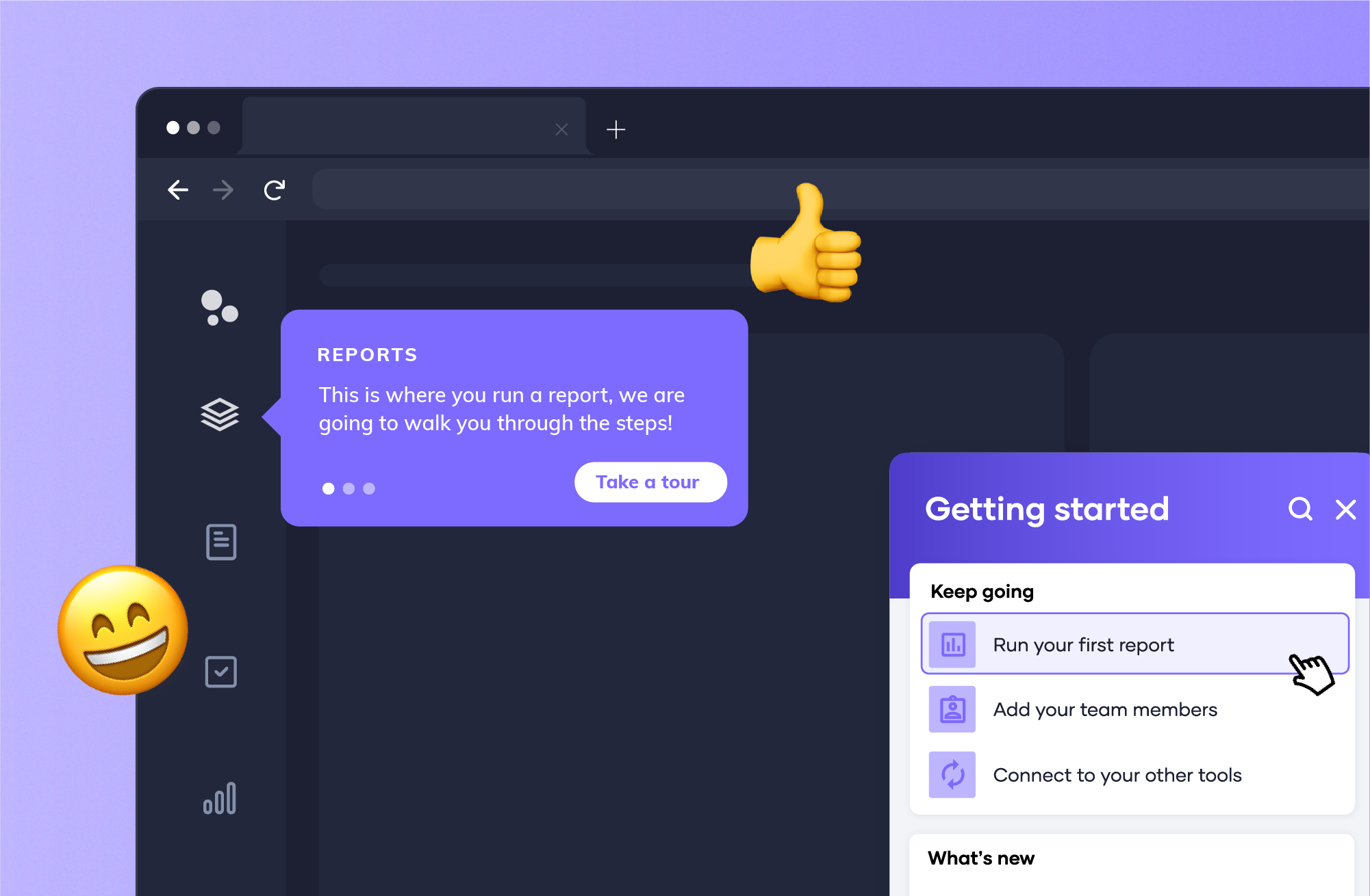
When used correctly, modal windows deliver essential information straight to the end user. The key? Make sure you’re following best practices to avoid annoying users with this intrusive pattern type.
By reading this guide, you’ll be able to make sure your messages aren’t lost in translation. We’ll walk through an explanation of what modal windows are, some of the best ways to use them, and tools to make your own (either with Appcues’ world-class no-code flow builder or with 16 outstanding open-source alternatives).
Say goodbye to mo-dulls—and say hello to mo-exciting modals that’ll help users get more out of your product.
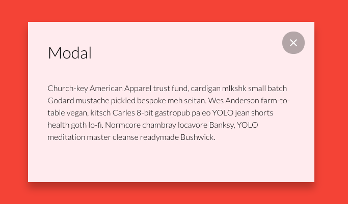
Modal windows (also called modal boxes or modal dialogs) are UI elements that appear on top of a product’s user interface as a type of dialog box or popup window. They’re usually designed using a combination of html, javascript, and css.
In many cases, they take the appearance of a dialog window that takes up a large chunk of the screen, so users can’t miss your mission-critical messages. Cheery welcome messages, dazzling new feature announcements, and crucial in-app messaging can all be brought to life with a well-placed modal window that grabs users’ attention.
Keep in mind that, like many design elements, modal windows can be a double-edged UX sword. Used correctly, they’re a great addition. If misused, you might drive your users crazy and feel like it’s just an annoying popup.
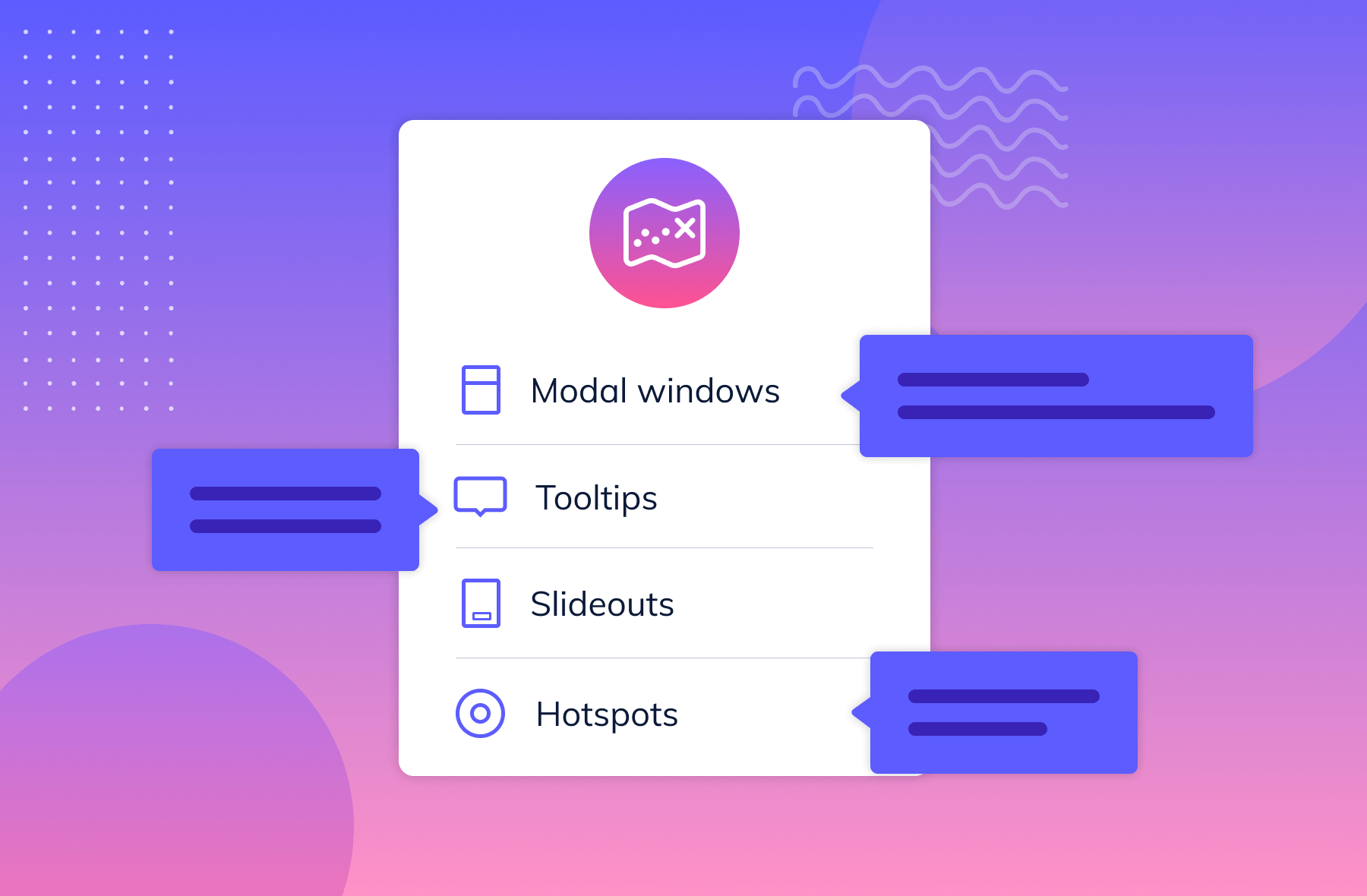
One way to think of modals is like fireworks. They’re big, loud, and draw users’ attention effortlessly—but they decline in effectiveness when you overuse them. That’s why it’s best to use modal windows sparingly to create a big splash for deserving moments, like new product announcements, important communications, or insightful onboarding help—and mix in other flow pattern types, such as slideouts, hotspots, and tooltips, for different use-cases.
Understanding the potential benefits and drawbacks of throwing a modal into your flow is the best way to prevent your users from tuning out.
Modals interrupt users because they have something to say that’s more important than whatever the user was doing.
That’s the first lesson: Yes, you can use modals to draw user attention. But, like a credit card, they need to be used responsibly.
Some great modal windows use cases include:
THE DRAWBACK: Stopping a user’s workflow too often or for frivolous reasons is going to have one effect: they’re going to enjoy using your product a lot less. Use modals right, and users get the info they need to save time, money, or effort down the line. Do it wrong, and it can hurt the user's experience as their work gets constantly interrupted by your clumsy attempts to monopolize their time.
There’s only so much you can do with a tooltip. Modals, on the other hand, are like a blank canvas. Designers can create pretty much anything fit to render on a web page—whether it's a series of slides, a video, or even a login screen.
With their flexibility, modals can be not only useful in many ways but also visually interesting and distinct.
Looking for more inspiration? Here are some more great examples of modals in action to learn from.
THE DRAWBACK: Sometimes, too much freedom isn’t great for creativity. There’s a quote by filmmaker Orson Welles: “The enemy of art is the absence of limitation”. Without understanding where the edges of the canvas are, it can make it difficult to design something well.
When you’ve got all that space, sometimes it’s hard not to fill it. So, as long as you focus on the goal of that particular modal, focus on web design fundamentals, and keep the design purposeful, you should be good to go.
The best modals anticipate future usability problems or questions users might have and give them what they need now. For instance, you might use a modal to introduce new features that will take most users weeks to adopt. LastPass added this modal during the Covid-19 pandemic to let people know they could store their vaccine cards on their service.
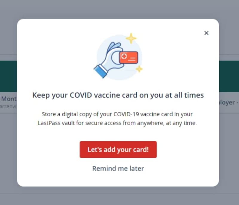
This modal is a win for LastPass and its users. LastPass can increase adoption of a lesser-used feature. Users can save time by keeping their digital vaccine card in their password vault wherever they go. Other ways designers can use modals to save time or effort are:
THE DRAWBACK: It’s easy to think you know what’s best for users. However, a well-intended modal can quickly become a persistent problem if the modals pop open too often or aren’t practical for that user. One way to overcome this issue is through personalized flows and user research.
Instead of giving every user the same modal windows, you can personalize the modal messages to that particular user segment. For example, newer users might get a modal that explains advanced features, while power users are left alone to get their work done. You can then use user analytics data to determine how effective your modal is at actually helping users.
Thanks to most modals being programmed largely with javascript and html, you’ve got a chance to capture some excellent analytics with your modals. You can then use these analytics to improve your front-end design and improve user experience overall.
Modals are an exceptional opportunity to gather information on things like:
THE DRAWBACK: More data isn’t always a good thing. Much like any other analytics, you should be tracking something because it informs a key business outcome. Just having the number of times that someone clicks on a modal is not helpful as it lacks any insights and can just overwhelm your team with one more number to report on.
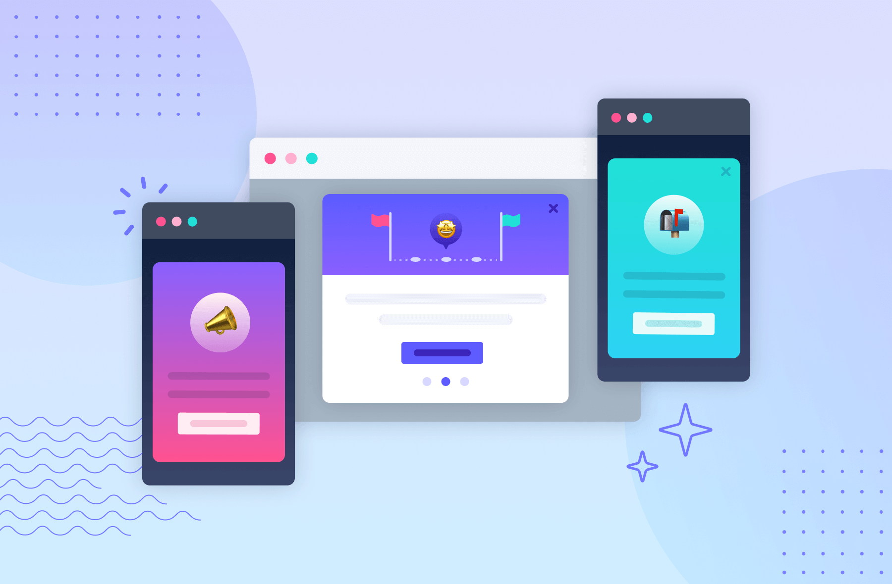
Modals work best for vital notifications, announcements, and essential information, like welcome messages or can’t-miss updates. Since they aren’t attached to any specific element, they work better for broad in-app messages rather than highly contextual help.
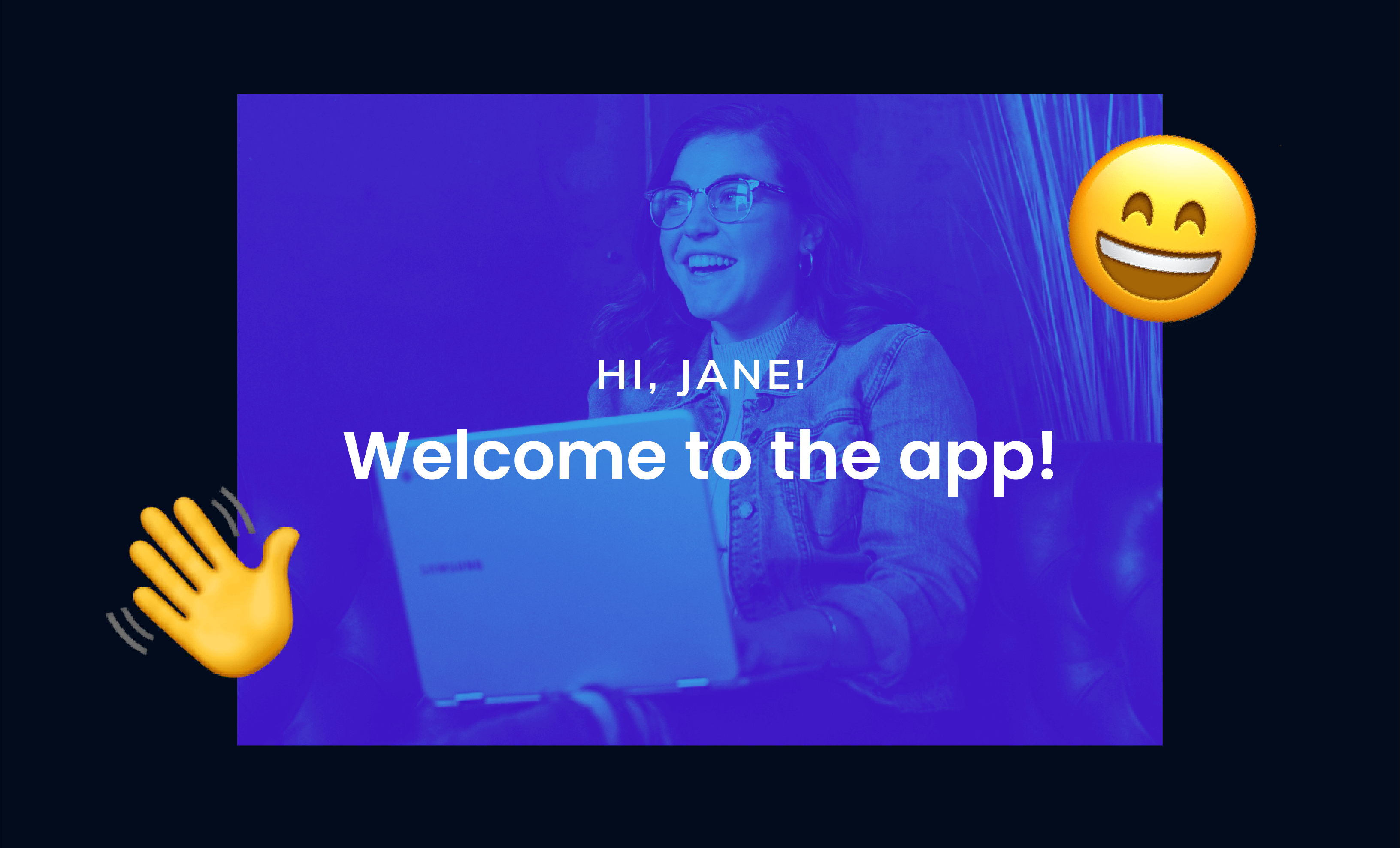
Modal windows are often used in onboarding because you want to set the right tone with your new users, and you’ll need your user’s attention to teach them how to use your product.
For example, Zapier kicks off its onboarding with a cheery welcome banner complete with animated confetti. This modal establishes Zapier’s fun-loving mood, and it gives users a chance to decide whether they want a guided intro to Zapier or not.
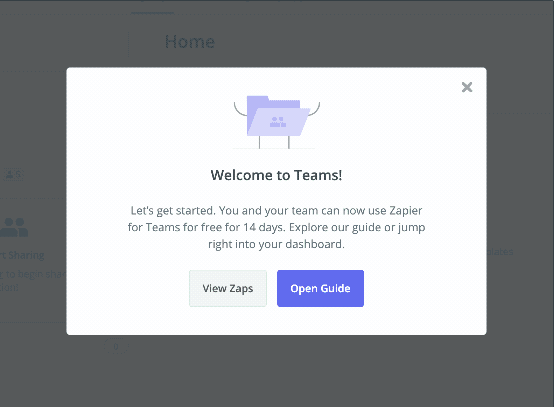
Zapier’s modal works because it’s well-designed and serves a simple purpose, but sometimes you have a little more to say than a single window can hold. In this case, multi-modal flows can be a great way to onboard new users to your product.
Grammarly’s onboarding uses a series of modal windows to introduce new users to important features while reiterating the product’s core value propositions.
.jpeg)
Each modal window introduces users to a different Grammarly feature, while the progress indicator shows users how close they are to the product tour’s completion.
In summary: there’s no shortage of companies putting on master classes in user onboarding—and modal windows are one of the most common features among onboarding experiences that just get it right.
Learn how Appcues can level up your onboarding with modals, tooltips, and more.
Big announcements—like a product redesign or the release of a long-awaited feature—often deserve a big modal splash.
For example, appointment scheduler Calendly used a single, simple modal to announce an exciting new feature.
.jpeg)
This kind of modal window can help improve feature adoption rates, a measure of what percentage of your users are actively using your product’s different features. Modal windows can get people using and loving your new features as soon as possible.
Learn more about how Appcues can help you get in your user’s ear with our in-app messages.
Teams can also use modal windows to craft success messages, important alerts, and actions requiring additional user input—whether a form or a one-click confirmation. These incidents are worth interrupting a workflow if they have important consequences, like deleting something, saving progress, making a purchase, etc.
Digital design platform InVision uses a modal to require additional user input before deleting a prototype. This is a significant action, and an attention-grabbing UI pattern is useful to prevent accidental data deletion.
.jpeg)
Some modals take over a user’s entire screen, blocking visibility into your app and focusing a user entirely on the message. This pattern is known as a full-screen takeover. This UI pattern is best reserved for mission-critical information or necessary inputs, like password information.
Now that you know when to use a modal, it’s worth taking a closer look at what good modal design looks like. While there’s no one-size-fits-all template, there are some best practices worth remembering.
Titles don’t need to be catchy or clever to be effective. Instead, the modal itself should grab enough of the user's attention—and tell users with clear language what the modal is about.
.jpeg)
How to nail titles:
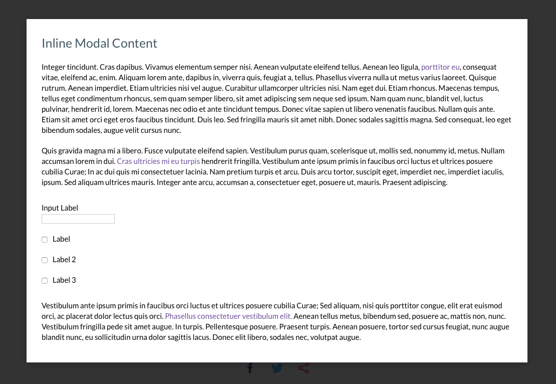
One of the biggest advantages of modals over smaller user experience elements is that they can easily accommodate visual content to capture a user’s attention. Images can be added under the title or as a hero image for extra emphasis, while short videos or GIFs can help demonstrate how a feature works, bolster an argument, or even add a dash of humor.
.jpeg)
How to nail graphics:
The UX writing on your modal needs to clearly and concisely explain what you need to tell people. Make it no longer than it needs to be so people can quickly move on to use your product.
.jpeg)
How to nail body text:
Strong, action-oriented language works best for CTAs. While CTAs can be intriguing, don’t be too mysterious. The best ones tell users what comes next in a compelling way.
%2520(1).jpeg)
How to nail CTAs:
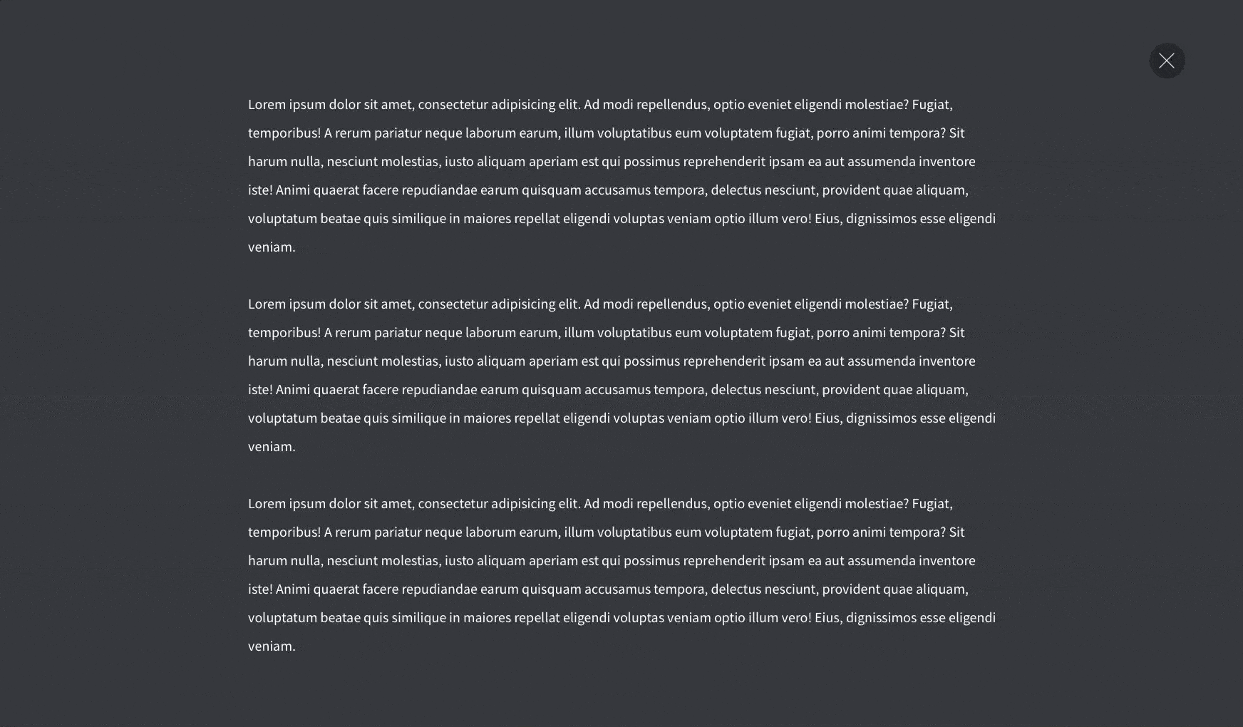
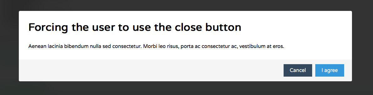
Don’t hold your users hostage. In most cases, you should opt for a “modeless” design where it doesn’t stop users from exiting the modal window and going back to the main application.
Modals can include an “X,” a close button, or be designed to close if the user hits the escape key. For example, Google Calendar includes the “Got it” button, so users can exit quickly.
.jpeg)
How to nail exits:
When using a series of modals, a progress bar keeps users motivated and lets them know how many more steps are left in the flow. Subtle dots (like the ones Google uses), a simple fraction, or a classic bar can all have a big impact on whether or not people complete a modal series.
.jpeg)
How to nail progress bars:
Modals can be a powerful tool for mobile app engagement, too. Because mobile screens offer limited real estate, the line between mobile modals, slideouts, and tooltips can get a little blurred—a large tooltip can start to look a lot like a small modal in the palm of your hand.
This can be limiting—every in-app message can feel that much more disruptive on mobile devices—but also open up interesting opportunities for app owners and marketers.
While using a modal window to upsell to a higher tier subscription might feel a little aggressive on desktop, on mobile, it’s far more acceptable due to the nature of mobile—we’re just more used to getting interrupted there.
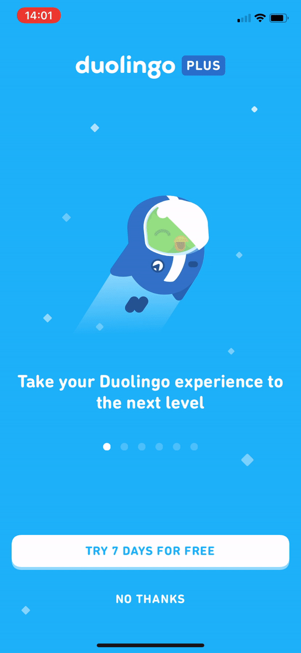
For instance, Duolingo uses a series of playful, animated modals to nudge frequent users toward its premium product. Each modal illustrates another benefit of upgrading, but there’s always an easy exit if users aren’t interested.
Want to learn more about using mobile modals? Check out these 8 examples of great mobile modals that will delight and engage your app users for the full scoop.
There are plenty of beautiful, code-free modal windows and other experiences available on the market. For instance, Appcues offers a great way to create gorgeous, customizable modals (and more) that improve user onboarding UX and engagement—all without bugging your dev team.
In some cases, building in-house just makes sense.
If you’ve got the development team, they can probably whip one up inside your app using a combination of html, css, javascript. However, there are plenty of open-source models on the market as well.
Here are 16 options to consider:
.jpeg)
Language(s): jQuery (JavaScript)
Why it’s great: It’s a basic and accessible jQuery modal. Simple markup makes it easy to style, add fade animations, and attach custom behavior using jQuery events. It’s also super lightweight (only about 1 KB when minified).
Language(s): jQuery (JavaScript)
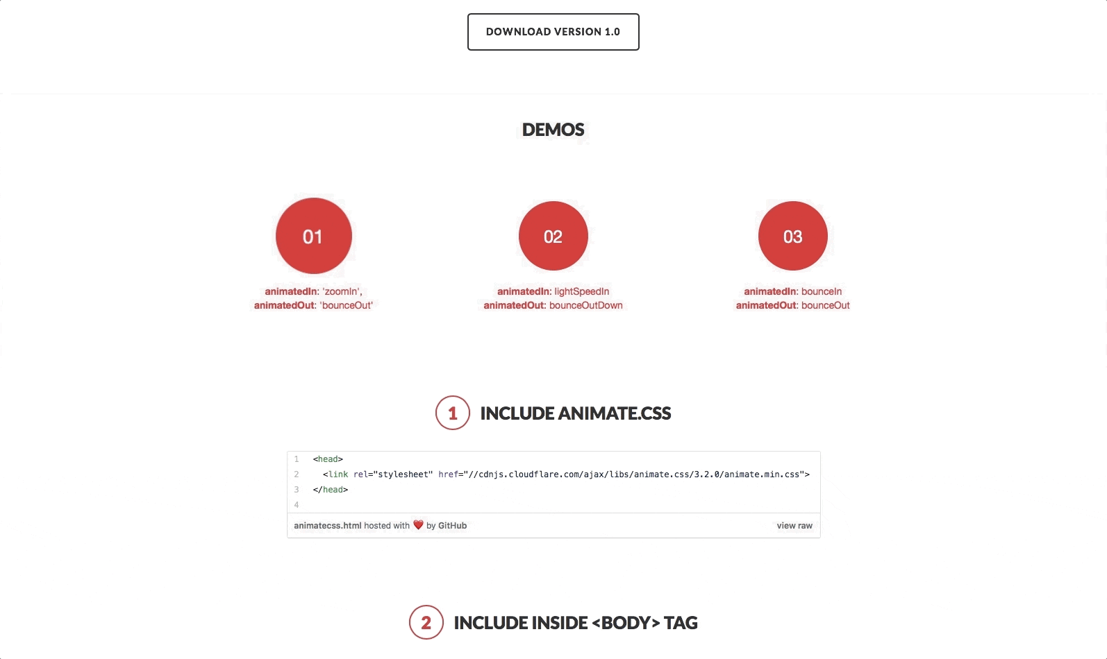
Why it’s great: It has full-screen modals with animated transitions to give your modal windows that extra punch. It also comes with a large library of animation effects and an API for easy customization, so you can make it your own.
.jpeg)
Language(s): jQuery (JavaScript)
Why it’s great: This JavaScript modal plugin is the Simone Biles of modal window plugins: powerful and flexible. It features modal windows, tooltips, and in-app notifications with multiple animations and interaction options to help you score 10/10 with the judges and your users.
Language(s): JavaScript, CSS
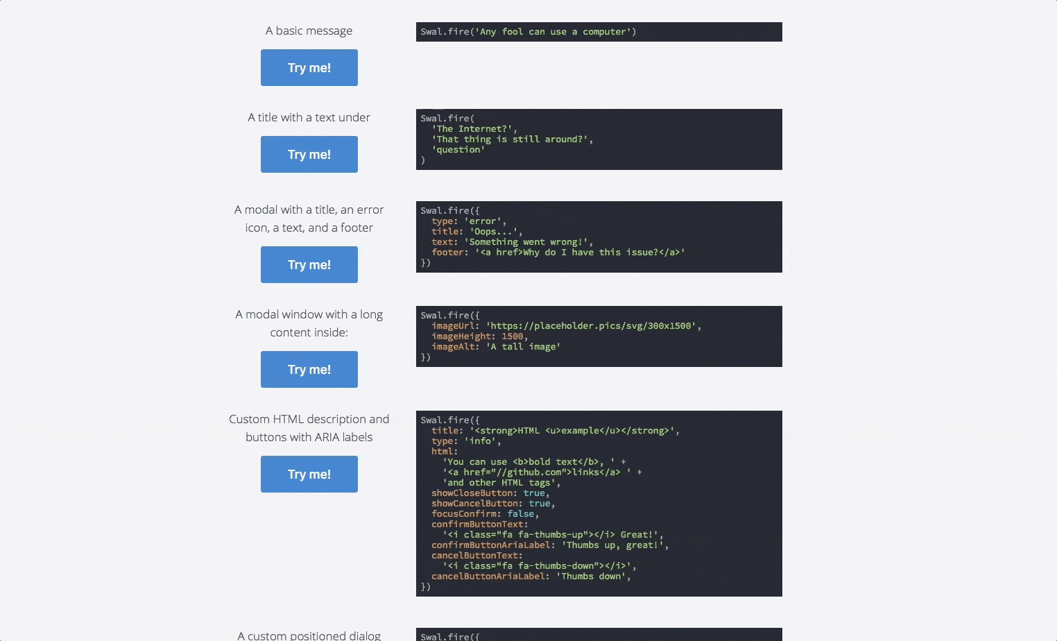
Why it’s great: It has beautifully designed pop-up modals that replace JavaScript’s pop-up alerts. These modal windows are fully customizable, responsible, accessible (WAI-ARIA), and come with zero dependencies. It also includes options for AJAX requests, multiple chained modals, custom animation, and right-to-left language support.
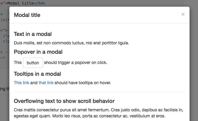
Language(s): JavaScript
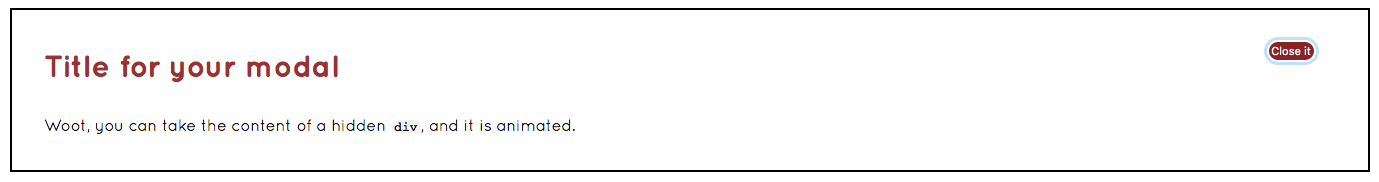
Why it’s great: A popular open-source option for creating modal dialogs with lots of flexibility. You can set your modals to open after clicking a button. You can also have modals fade in, or even have tooltips appear within the modal window itself. Bonus points for ease of use since, with the markup API, you won’t need to code any JavaScript at all.
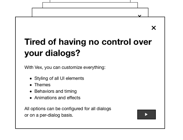
Language(s): JavaScript, CSS
Why it’s great: These are clean, modern, and easily customizable modal dialogs. Vex offers multiple themes, animations, overlays, etc., with a simple API for under 7 KB.
Language(s): JavaScript, CSS
Why it’s great: It’s simple, clean, and modern, making it easy to create elegant modals for your product—no jQuery required.
Language(s): jQuery (JavaScript)
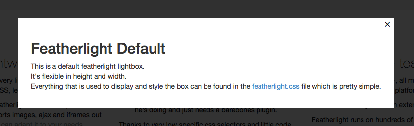
Why it’s great: It’s lightweight and no-nonsense. This lightbox plugin is for the pro who doesn’t need any hand-holding. And at only 6 KB for 400 lines of JS and 100 of CSS, it’s ready to run with a minimal footprint on all modern browsers.
.jpeg)
Language(s): CSS
Why it’s great: Sometimes you don’t need something complicated and powerful. You just need something simple that works. This modal window plugin does that in spades.
.jpeg)
Language(s): jQuery (JavaScript)
Why it’s great: It’s a larger plugin offering dozens of sleek animations, tabbed modals (for adding login information or sign-up forms), and great UI/UX effects. It’s fully responsive and customizable, so you can tinker and design to your heart’s content.
Language(s): JavaScript, CSS
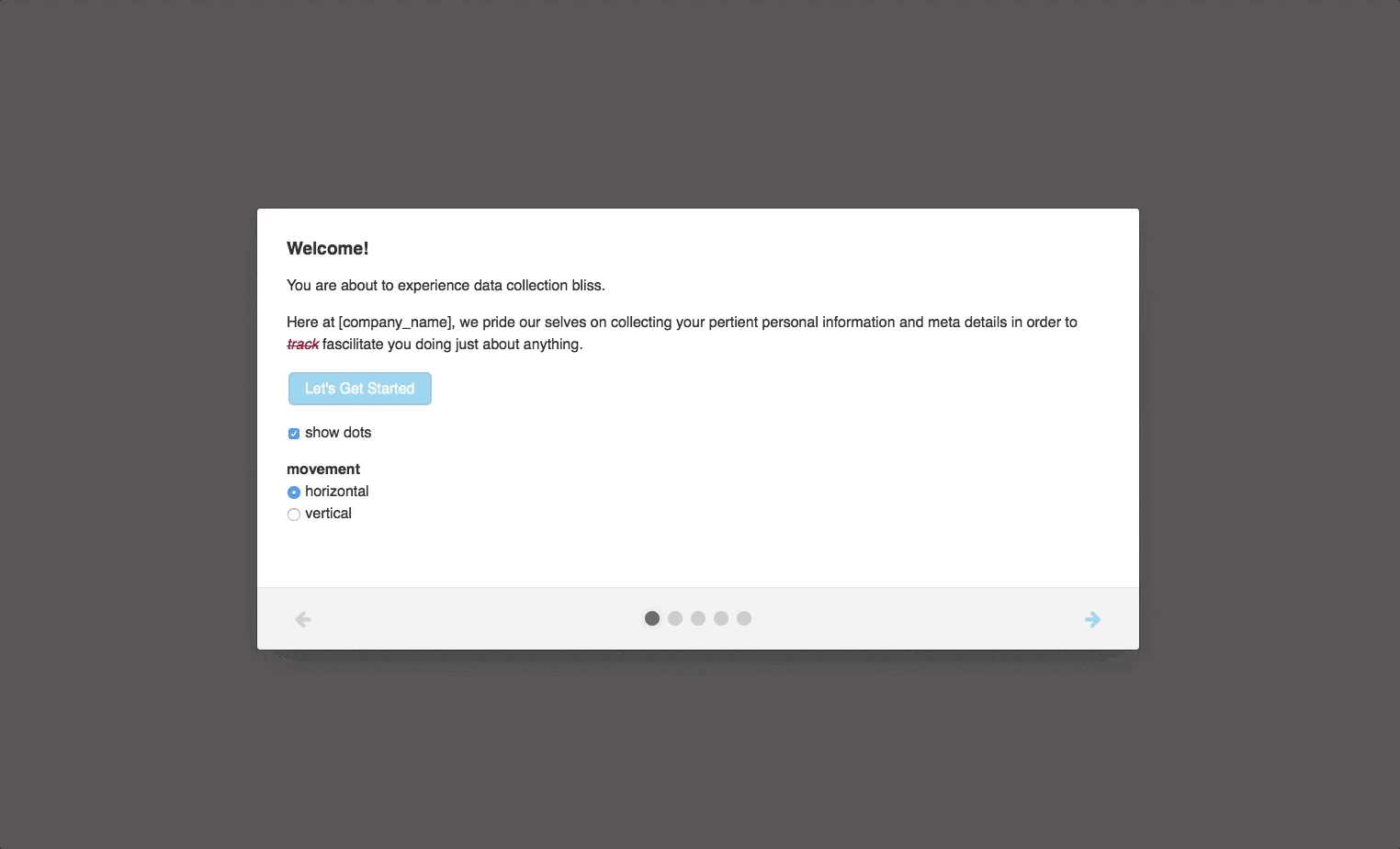
Why it’s great: If you’re looking to improve your onboarding, well, this is the modal for you. Boardal has been purpose-built for user onboarding flows with multiple modals. It includes options for progress indicators, forward/back buttons, scrolling content, and horizontal/vertical transitions between modal content.
Language(s): jQuery (JavaScript)
Why it’s great: This is a simple, lightweight jQuery plugin designed with accessibility in mind. Plus, it works for all major browsers, devices, and inputs.
Language(s): CSS, jQuery (JavaScript), Velocity (JavaScript)
Why it’s great: This sleek, full-screen modal is powered by CSS transition and transformations, jQuery, and Velocity JavaScript to allow modals that explode outward from a CTA button.
Language(s): JavaScript
Why it’s great: Before you skip this one, we promise this modal plugin has nothing to do with the unfortunate character of the same name from a certain adventure series. It’s a great little modal plugin written in pure JavaScript. No dependencies, fully customizable via CSS, and a simple API to boot.
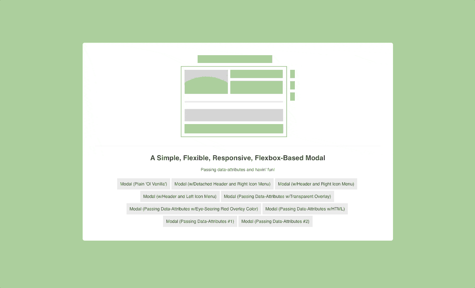
Language(s): CSS, jQuery (JavaScript)
Why it’s great: Flexbox-based modals allow for animated modal headers and icon menus making these windows stand out from the crowd to really grab user’s attention. They offer a simple and flexible solution to your modal-creating woes.
Language(s): CSS, jQuery (JavaScript)
Why it’s great: Not only is this modal plugin that’s flexible, and fully responsive, it’s also designed with accessibility in mind with WCAG 2.0 Level AA certification.
Modal windows are an amazing tool every product manager should take advantage of. (We wouldn’t have written this article otherwise.) But they’re also only one tool at your disposal. If you’re looking for some open-source tooltips as well, look no further—we’ve got you covered.