← Visit Appcues.com
×
×

How to design persuasive call-to-actions for every step of the user journey
Great CTAs shouldn't be mere nudges—they should help the user complete specific actions that unlock pieces of your product's core value.
Skip to section:

Skip to section:

Perhaps we should rename the CTA. 

“Call-to-Action.” For a start, the word “call” sounds like we're shouting to users from a distance. Instead, each call-to-action should be a direct line to your user, an invitation to a gem of knowledge, whether it's a “sign up to learn more” or a “download this tool.”

“Call-to-Action” also implies that the action is yet to come. It says “we're just providing the nudge, now you're on your own.” Instead of focusing on the call, we should be focusing on the action. Great CTAs shouldn't be mere nudges—they should help the user complete specific actions that unlock pieces of your product's core value. Actions shouldn't be initiated at random, but at specific stages of the user's experience, so that they give the user more than one aha moment as they go deeper into the product. This is how loyal users and advocates are made.

Let's look at how four successful CTAs boost user engagement by delivering real value at the click of a button.

Prove your product's aha moment with value-packed onboarding steps

When you're onboarding new users, you're helping them solve a problem they have. Any action you ask users to perform during the onboarding phase has to do something to solve that problem. 

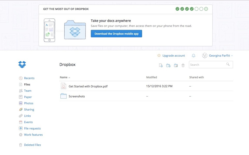
Design onboarding CTAs to immerse your user in the ideal experience of your product. Not a floundering, newbie experience, but a productive experience that will get them hooked. People go to Dropbox because they want a fast, easy way to keep everything organized on the cloud. Dropbox designs its onboarding checklist in a way that guides the user to this aha moment.

The steps in its onboarding flow are: install the Dropbox app, upload a file, share a folder, invite friends, and download the mobile app. This is a deliberate journey. Installing the Dropbox app is a higher friction initial step, but it puts Dropbox onto the new user's desktop, a handy place where it will be seen regularly. Each subsequent onboarding checkpoint can then build on this foundation.
Dropbox user onboarding CTA

Dropbox's “Share a Folder” CTA gets users to complete a core action of Dropbox — collaboration. By guiding the user through the act of inviting a colleague, Dropbox shows its user firsthand proof of the product's value. All of a sudden that user is using Dropbox to work better with her colleagues — that's the aha moment — and is more likely to stick around

Beat feature blindness with relevant feature releases 

At the onboarding stage, you just want people to use your app. Once the user is using your product, they may have built a routine workflow, but it's more difficult to engage them with new things. 

There are still tons of actions in your product that the user can take to customize their experience and better serve their needs. But they've become familiar with your product's core actions and have stopped noticing extra tricks and value adds. This is known as feature blindness. Use CTAs as spotlights on your features and tools to show users how useful they are. 

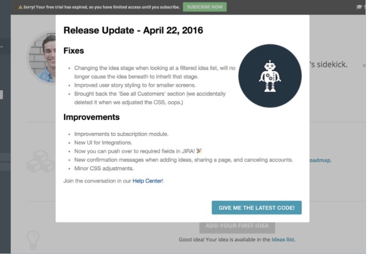
A great way to do this is to time a compelling prompt along with feature releases, and design them to appear when the user can take advantage of them. ProdPad is a product management tool where teams can build roadmaps for their ideas. ProdPad's feature CTAs must aid the generation process rather than interrupt it. Since ProdPad releases new code 1-2 times a week, interrupting users through email or chat didn't feel right. ProdPad instead uses this modal window to announce new code right in the product. The update appeals to product managers, who want to see what new stuff they can use to improve their process.
ProdPad Appcues modal window feature release
Built with Appcues

The CTA button isn't just gift wrap — it's the present itself. Rather than “learn more about the latest code” or “take a look at the latest code,” each CTA is customized and causes the user's browser to refresh, which then downloads and deploys the code to ProdPad's single-page app.

Keep customers learning with enticing CTAs

Users are learning at a rapid rate during onboarding, and as they start doings things in your product, their capacity to learn new things decreases. They just want to get on with their task. 

But regular learning — in the form of product tours, tutorials or tooltips — helps users to adopt your service into their daily routine. It activates them to try new features and use existing features more deliberately. A well-timed product tour can mobilize users to reconnect with your UI, and spot things, like a new aha moment, they'd forgotten about or never noticed before. 

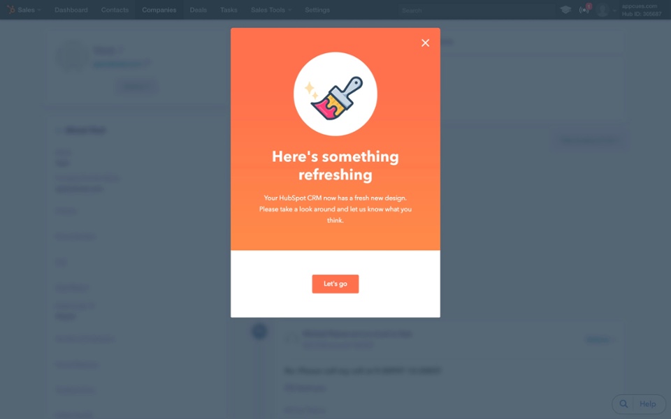
This one is from HubSpot. If the user wants to click, they're taken into the updated version of HubSpot's CRM where improvements are highlighted, drawing their attention into nooks and crannies with a multi-step product tour. Crucially, if they don't have the time to click right away, they're still led into updated version, but can explore in their own time.
HubSpot new product launch modal window

The key is to only use these energetic and attention-grabbing CTAs with consideration, when you have a grab-worthy update, or after users have used your product peacefully for a while. If the user is greeted with a modal window like this every time they log in, the prompt loses its effect and turns into a barrier to entry.

Improve user retention with well-timed upgrade prompts

When users have engaged with your product, they may be using it regularly to make their lives better, but they may also have reached a stalemate — they've used certain features that apply to them but they haven't become part of your cult. 

You can keep building user engagement and help users to become loyal advocates by planting CTAs that upgrade or ramp up their experience before they ask or pay for it. ClassPass uses this modal window to give users the chance to extend their membership with reduced-price add-on classes. They recognize that customers who hit their membership limits may not necessarily remember or bother to upgrade by themselves, but also that customers who have used their service multiple times are ones they need to keep impressing.
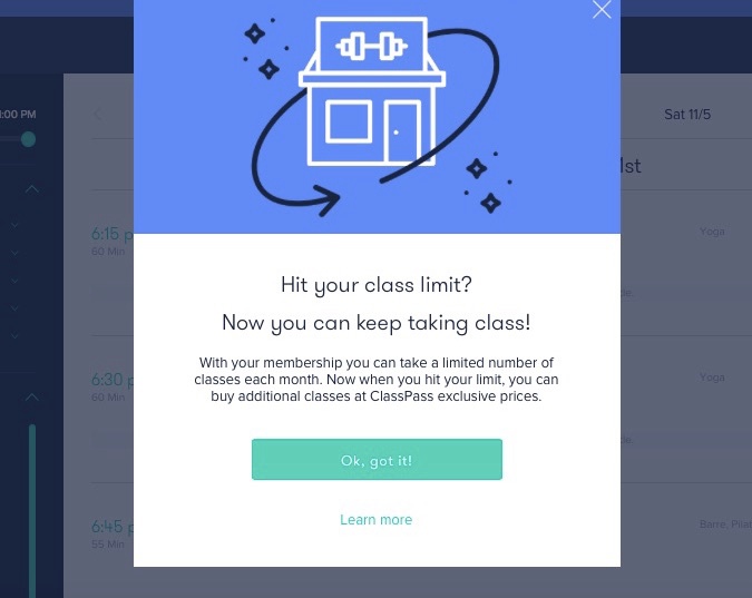
ClassPass upgrade modal

ClassPass plants this modal window in the class schedule area of the site so they know users are in the market for more classes. The modal displays two options. Users can click “Okay, got it!” and head back to their schedule, or they can learn more and go directly to shop for additional classes.

Providing these options is important. It puts the user in control and activates a two-way interaction between user and brand. Now the user is more likely to upgrade their membership on their own accord, because they've seen the aha moment and how rewarding a relationship with this brand can be.

Reward loyalty before users show it

Each of these call-to-action examples gives users moments of high value proactively. Don't wait for users to churn or experience feature blindness. Get ahead of the next stage of the customer lifecycle by spurring users into action when they're prepped and ready to act.

Great products use CTAs as gifts, value-adds, and hacks to immerse users in the value of your product—no persuasion necessary. Once they've experienced what your product has to offer, muscle memory will kick in and they'll be hooked.

Author's picture
Julia Chen
Skip to section:

Skip to section:

Perhaps we should rename the CTA. 

“Call-to-Action.” For a start, the word “call” sounds like we're shouting to users from a distance. Instead, each call-to-action should be a direct line to your user, an invitation to a gem of knowledge, whether it's a “sign up to learn more” or a “download this tool.”

“Call-to-Action” also implies that the action is yet to come. It says “we're just providing the nudge, now you're on your own.” Instead of focusing on the call, we should be focusing on the action. Great CTAs shouldn't be mere nudges—they should help the user complete specific actions that unlock pieces of your product's core value. Actions shouldn't be initiated at random, but at specific stages of the user's experience, so that they give the user more than one aha moment as they go deeper into the product. This is how loyal users and advocates are made.

Let's look at how four successful CTAs boost user engagement by delivering real value at the click of a button.

Prove your product's aha moment with value-packed onboarding steps

When you're onboarding new users, you're helping them solve a problem they have. Any action you ask users to perform during the onboarding phase has to do something to solve that problem. 

Design onboarding CTAs to immerse your user in the ideal experience of your product. Not a floundering, newbie experience, but a productive experience that will get them hooked. People go to Dropbox because they want a fast, easy way to keep everything organized on the cloud. Dropbox designs its onboarding checklist in a way that guides the user to this aha moment.

The steps in its onboarding flow are: install the Dropbox app, upload a file, share a folder, invite friends, and download the mobile app. This is a deliberate journey. Installing the Dropbox app is a higher friction initial step, but it puts Dropbox onto the new user's desktop, a handy place where it will be seen regularly. Each subsequent onboarding checkpoint can then build on this foundation.

Dropbox user onboarding CTA

Dropbox's “Share a Folder” CTA gets users to complete a core action of Dropbox — collaboration. By guiding the user through the act of inviting a colleague, Dropbox shows its user firsthand proof of the product's value. All of a sudden that user is using Dropbox to work better with her colleagues — that's the aha moment — and is more likely to stick around

Beat feature blindness with relevant feature releases 

At the onboarding stage, you just want people to use your app. Once the user is using your product, they may have built a routine workflow, but it's more difficult to engage them with new things. 

There are still tons of actions in your product that the user can take to customize their experience and better serve their needs. But they've become familiar with your product's core actions and have stopped noticing extra tricks and value adds. This is known as feature blindness. Use CTAs as spotlights on your features and tools to show users how useful they are. 

A great way to do this is to time a compelling prompt along with feature releases, and design them to appear when the user can take advantage of them. ProdPad is a product management tool where teams can build roadmaps for their ideas. ProdPad's feature CTAs must aid the generation process rather than interrupt it. Since ProdPad releases new code 1-2 times a week, interrupting users through email or chat didn't feel right. ProdPad instead uses this modal window to announce new code right in the product. The update appeals to product managers, who want to see what new stuff they can use to improve their process.

ProdPad Appcues modal window feature release
Built with Appcues

The CTA button isn't just gift wrap — it's the present itself. Rather than “learn more about the latest code” or “take a look at the latest code,” each CTA is customized and causes the user's browser to refresh, which then downloads and deploys the code to ProdPad's single-page app.

Keep customers learning with enticing CTAs

Users are learning at a rapid rate during onboarding, and as they start doings things in your product, their capacity to learn new things decreases. They just want to get on with their task. 

But regular learning — in the form of product tours, tutorials or tooltips — helps users to adopt your service into their daily routine. It activates them to try new features and use existing features more deliberately. A well-timed product tour can mobilize users to reconnect with your UI, and spot things, like a new aha moment, they'd forgotten about or never noticed before. 

This one is from HubSpot. If the user wants to click, they're taken into the updated version of HubSpot's CRM where improvements are highlighted, drawing their attention into nooks and crannies with a multi-step product tour. Crucially, if they don't have the time to click right away, they're still led into updated version, but can explore in their own time.

HubSpot new product launch modal window

The key is to only use these energetic and attention-grabbing CTAs with consideration, when you have a grab-worthy update, or after users have used your product peacefully for a while. If the user is greeted with a modal window like this every time they log in, the prompt loses its effect and turns into a barrier to entry.

Improve user retention with well-timed upgrade prompts

When users have engaged with your product, they may be using it regularly to make their lives better, but they may also have reached a stalemate — they've used certain features that apply to them but they haven't become part of your cult. 

You can keep building user engagement and help users to become loyal advocates by planting CTAs that upgrade or ramp up their experience before they ask or pay for it. ClassPass uses this modal window to give users the chance to extend their membership with reduced-price add-on classes. They recognize that customers who hit their membership limits may not necessarily remember or bother to upgrade by themselves, but also that customers who have used their service multiple times are ones they need to keep impressing.

ClassPass upgrade modal

ClassPass plants this modal window in the class schedule area of the site so they know users are in the market for more classes. The modal displays two options. Users can click “Okay, got it!” and head back to their schedule, or they can learn more and go directly to shop for additional classes.

Providing these options is important. It puts the user in control and activates a two-way interaction between user and brand. Now the user is more likely to upgrade their membership on their own accord, because they've seen the aha moment and how rewarding a relationship with this brand can be.

Reward loyalty before users show it

Each of these call-to-action examples gives users moments of high value proactively. Don't wait for users to churn or experience feature blindness. Get ahead of the next stage of the customer lifecycle by spurring users into action when they're prepped and ready to act.

Great products use CTAs as gifts, value-adds, and hacks to immerse users in the value of your product—no persuasion necessary. Once they've experienced what your product has to offer, muscle memory will kick in and they'll be hooked.

Author's picture
Julia Chen
You might also like...