
.png)

Tooltips drive feature adoption - but only when they're short, contextual, and benefit-focused.
The best tooltip examples - show what top products like Slack, GitHub, and HubSpot do right (and what patterns you can steal).
Key patterns worth copying - benefit-driven copy, strong visual contrast, easy dismissal, and contextual timing.
Works for product managers, marketers, and UX teams - real-world examples you can apply to your own product, whatever your role.
No two users are exactly alike. Some are familiar with your UI to the point where any disruption to their routine causes frustration. Others are new, excited, and perhaps a bit confused about the best way to use your product to accomplish their goals. At least one person is actively trying to remember their log-in password and has been for the last fifteen minutes.
Tooltips act as tour guides for your app. They provide simple but essential information for users as they click and hover their way through your product. Used correctly, even basic tooltips help enhance your user experience by minimizing friction. Used poorly, they frustrate users by disrupting their journey.
The difference comes down to design. The best tooltip examples in this post share a few patterns: benefit-driven copy, strong visual contrast, easy dismissal, and contextual timing. Below, you'll see how 10 products put these patterns into practice to drive feature adoption and keep users moving.
A tooltip is a short, contextual message that appears when a user hovers over, clicks, or focuses on a specific element in your UI. Tooltips surface just enough information to help users understand a feature, complete a task, or discover something new, without pulling them out of their current workflow.
They're one of several in-app messages you can use to communicate with users. Unlike modals, tooltips don't block the screen or demand attention. Unlike hotspots, they deliver actual content rather than just flagging that something exists. That makes them ideal for contextual guidance: feature announcements, quick explanations, and gentle nudges toward adoption.
Team messaging app Slack's built-in search tool is called the Quick Switcher. This sidebar is the fastest way to get around an app that handles a high volume of conversations every day. Messages often get tangled, channels can become congested, and important information can quickly become buried.
.png)
Slack made users aware of the search feature through a tooltip that demonstrates the search functionality. However, instead of explaining the functionality (searching messages), the tooltip explains how the search feature benefits the user (getting around Slack faster).
The Quick Switcher is easy to use, so Slack wisely dedicates the copy to explaining why customers should use it, not how. This copy is easy to read as the blue tooltip contrasts nicely against the rest of the UI. It also offers an option to hide the sidebar button in a single click for maximum ease. Finally, the tooltip provides a keyboard shortcut to make navigation even faster for developers and other Slack users who might prefer the keyboard.
Tooltips are particularly effective for complex tools like Google Analytics. The user interface is quite busy to begin with, with many features hidden behind small icons. Tooltips help highlight subtle changes to the UI that would otherwise be ignored, helping to spur feature adoption without cluttering up the interface.
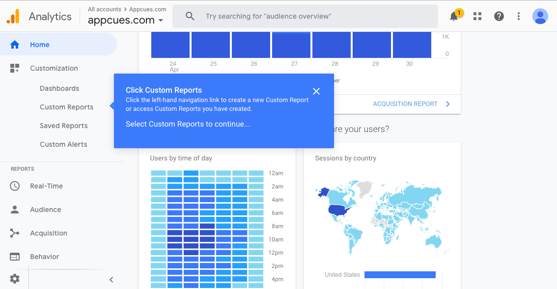
Google uses tooltips to guide users through each click instead of automatically taking users to the custom reports feature. This builds familiarity with the interface and makes it easier for users to find their way back on future visits.
Importantly, this tooltip provides minimal disruption to users who don't want additional assistance. These users can opt out of the tooltips using the cursor instead of being stuck on a tooltip-aided tour.
Tooltips can be used in conjunction with other in-app messages like modal popups to build guided tours for users. When webinar hosting service GoToWebinar rolled out their Transcription feature, they used Appcues to create a new feature announcement slideout and tooltip walkthrough.
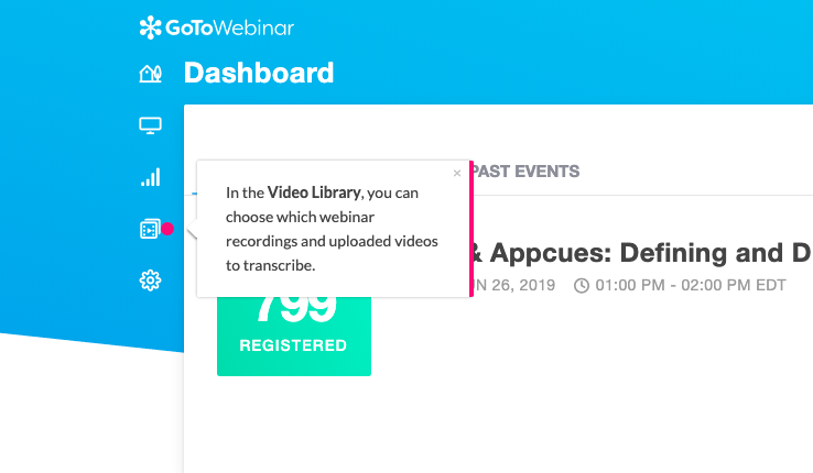
GoTo Webinar keeps the walkthrough brief - 5 steps in total - and keeps the amount of copy in each step to a minimum. This flow targets returning users who probably don't need much hand-holding. The walkthrough is thorough without feeling overwhelming and shows users how to access this somewhat "hidden" feature in the future.
Software development platform GitHub uses tooltips to highlight new features, provide links to related support articles, and give helpful tips so users can get more value from the platform.

GitHub's tooltips are specific, contextual, and timely, appearing when a user is most likely to interact with a new feature. The example above provides enough information for the average user. However, it also provides a hyperlink to further resources for users requiring more details. This prevents the tooltip from becoming oversaturated with too much detail and instead focuses the reader's attention on the most essential information.
Marketing platform HubSpot has constantly evolved since launching way back in 2005, with regular tweaks, updates, and new features. They often use tooltips to ensure that users discover and adopt each new feature to get the most out of the tool's capabilities.
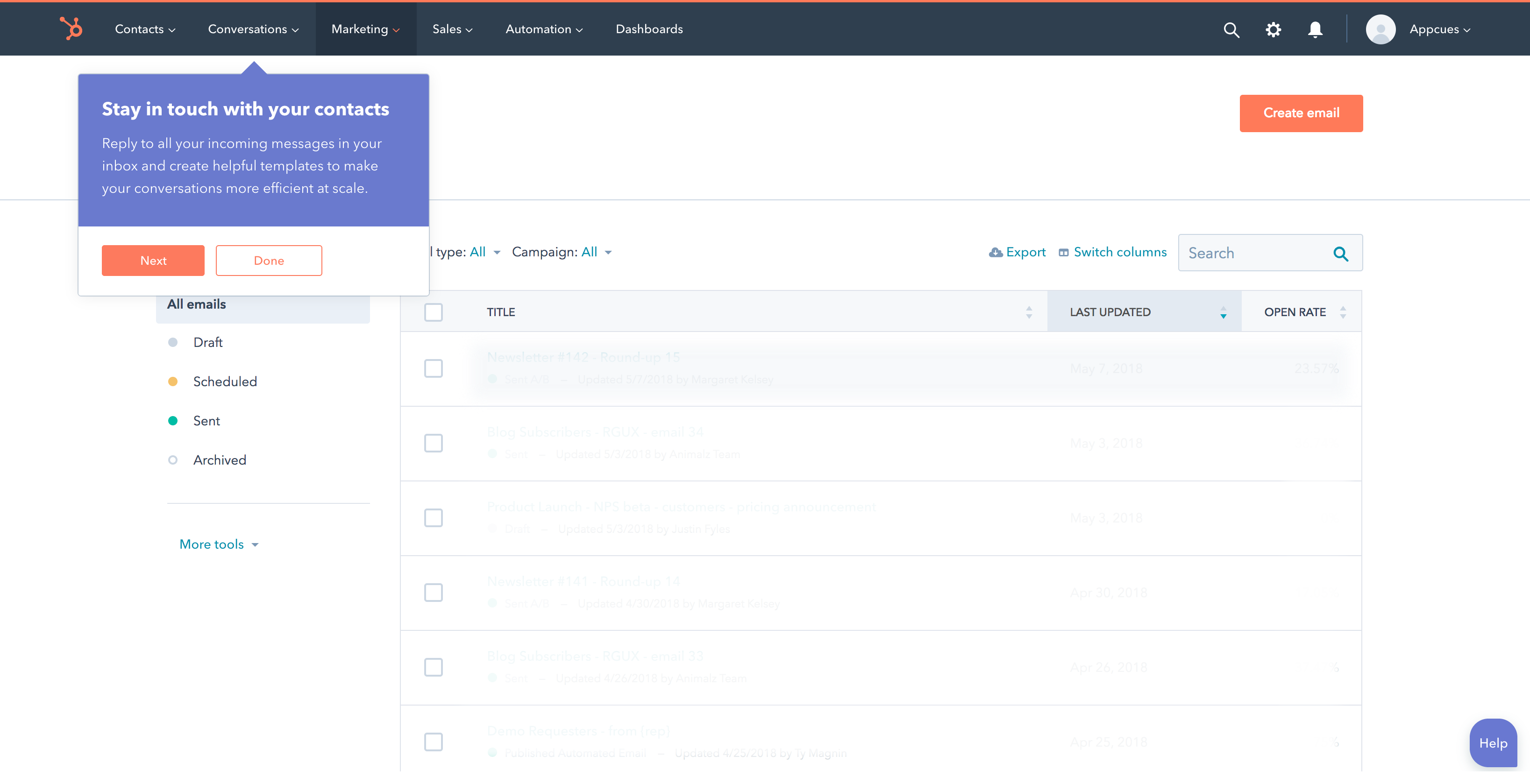
HubSpot's tooltips make great use of contrast. The purple background stands out against the mostly white interface, and the CTA buttons' colors are consistent across both tooltips and app. Additionally, the headline and body copy in this tooltip clearly outline the benefits of the new feature. This helps focus the in-app messages around the user's goals, not the features themselves.
The online grocery delivery service Instacart offers a few promotions to new and existing consumers. The company uses a tooltip to remind new users of a free delivery offer during the shopping experience.
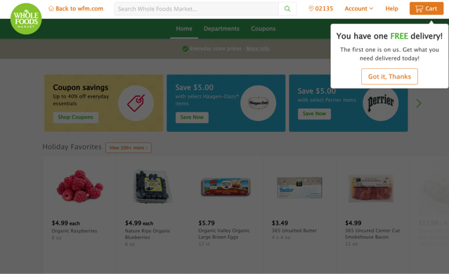
This tooltip is simple and to the point. It efficiently addresses two separate but equally important purposes. First, the headline emphasizes the value of the deal to the user by contrasting against the background color and using all caps. Secondly, the tooltip brings attention to the deal but only requires a single click to dismiss. This last point is especially important for new users, a group often susceptible to churning when faced with friction in their user journey.
Online retail juggernaut Amazon uses personalization as a way to boost engagement and drive sales. Customers can "heart" items they find interesting as they shop. These "hearted" items provide a basis for Amazon's recommendation engine to predict other items the customer may find interesting. The company uses tooltips in their mobile app to simply explain a rather involved process.
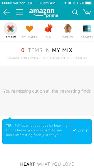
When a customer hasn't "hearted" any items, their list of personalized recommendations remains empty. This doesn't help the customer or Amazon. It probably doesn't help that "My Mix" doesn't explain anything about what a mix is or why a customer should want one.
Amazon uses a blue tooltip in its mobile app to overcome this gap in information. The copy explains how the recommendation system works in simple language. The tooltip arrow points at an empty field and suggests how to fill it and why filling it is in the customer's interest.
Design platform Canva faces a unique tooltip challenge on mobile: screen space is limited, and users can't hover. When introducing their Effects editing tool on mobile, Canva uses a full-width instructional tooltip that appears at the bottom of the screen.
The tooltip previews the value of the Effects feature by telling users what they can do (apply filters, adjust brightness, create visual depth) rather than describing what the tool is. It's a benefit-first approach similar to what Slack does in Example 1, adapted for a touch interface.
Canva also handles dismissal well for mobile. Instead of relying on a small "X" button (which is easy to miss or mis-tap on a phone), the tooltip uses a clear "Tap to close" cue. This matters because mobile tooltips that are hard to dismiss quickly become annoying, and annoyed users don't adopt features.
ChatGPT's interface relies heavily on icons, from the command palette to dictation, file uploads, and sidebar toggles. Without labels, users are left guessing what each icon does. ChatGPT solves this with clean hover tooltips that label each icon on demand.
This is the simplest tooltip pattern on the list, and that's exactly why it works. Each tooltip appears on hover, confirms the action behind the icon, and disappears when the cursor moves away. There's no CTA, no walkthrough, no promotional copy. Just a plain text label that removes guesswork.
It's a reminder that not every tooltip needs to be clever. For icon-heavy interfaces, a descriptive label is often the most effective way to reduce friction and help users find what they need. This pattern is especially valuable during feature discovery, when users are still building a mental model of your product's layout.
Dropbox uses a large promotional tooltip to highlight its desktop File Explorer integration. Rather than waiting for users to discover the feature on their own, Dropbox proactively surfaces a tooltip explaining why installing the desktop app improves speed and file organization.
Unlike most tooltips on this list, Dropbox's is explicitly promotional. It's designed to nudge users toward deeper product integration by connecting the tooltip message to a clear benefit: faster access to files and better organization.
This pattern works well for feature adoption because it meets users where they already are (inside the web app) and makes a case for expanding their usage. The tooltip doesn't just announce a feature; it explains why the user should care. For teams trying to drive adoption of secondary features or platform extensions, this kind of benefit-first promotional tooltip can be more effective than email campaigns or in-app banners that users have learned to ignore.
The examples above share a handful of patterns. Here are the practices that separate effective tooltips from ones users dismiss (or resent). For more on product tour patterns that complement tooltips, check out our guide to onboarding flow patterns.
Across all 10 examples, a few patterns show up again and again:
If you're looking for a way to build and test tooltip experiences without a heavy engineering lift, Appcues makes it easy to create targeted, contextual in-app messages, including tooltips, walkthroughs, and modals, and measure their impact on feature adoption.

.png)