
.png)
Ask any mobile PM or app owner how to increase app retention and odds are they’ll say it’s done by improving the user experience. Kind of a no brainer, right? But how do you improve your UX without redesigning your whole app? Much of the time, the answer is “better in-app messaging”.
Fewer pixels doesn't mean fewer possibilities. Mobile experiences offer unique design opportunities and the chance to create novel interfaces that just aren’t possible on web.
Yet funnily enough, the most popular and effective mobile UI patterns include the same ones that we’ve seen on web apps for ages—tooltips, for instance, remain one of the stars of the show.
But that doesn’t mean you should use mobile tooltips exactly the same way as their web counterparts. Below, we’ll walk you through 5 ways you can use tooltips in your mobile app to engage (not enrage) your mobile users.
Let’s start from the top and quickly define what exactly we mean by mobile tooltips.
Mobile tooltips are small in-app messages attached to a specific UI element or place on the screen. They’re typically (but not exclusively) text-based, and are used to provide highly contextual guidance, highlight key features, or alert about new updates during app usage.
Mobile tooltips are a product owner’s way of offering a friendly nudge towards key features to ensure that users fully understand how the app works and how to get maximum value out of it. They’re a great way to make sure users interact with the key features that will drive adoption, engagement, and retention.
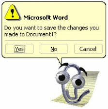
Computer programs have been using tooltips for years. Raise your hand if you remember the chatty paperclip from Word. ✋
“Clippy” was launched in 1995 by Microsoft as a way to simplify software onboarding and do away with tedious manuals. Clippy was one of the first tooltips to go mainstream and despite all of his flaws, he paved the way for the UX-enhancing tooltips we enjoy today.
One of the main differences between web and app tooltips lie in the way the message is conveyed. Put simply, mobile app tooltips have limited real estate. There’s less room for lengthy copy and fewer options for tooltip placement given the minimal screen dimensions they’re working with.
👉Small mobile screens also mean that any bit of UI takes up a larger percentage of the screen than a similarly sized object would on web. That means a tooltip that feels subtle on a large screen is going to feel a lot more prominent on mobile.👈
For these reasons, it’s incredibly important for mobile app owners to get creative with their mobile tooltips. Below are a few tips mobile app owners can use to make the best of their condensed creative space:
Did you know that 25% of users abandon an app after using it only once? There’s a short window of time in which to impress new users, which is why app onboarding is critical to improving app retention. But the helpful hints shouldn’t end after onboarding. Keep users engaged and exploring your app by using mobile tooltips to provide guidance.
A great example of this comes from the Mindbody app, which uses a mobile tooltip to point users in the direction of where core app features lie. In Mindbody’s case, this is the ‘Activity’ section. After using the app to sign up for their first class, users see the following tooltip:
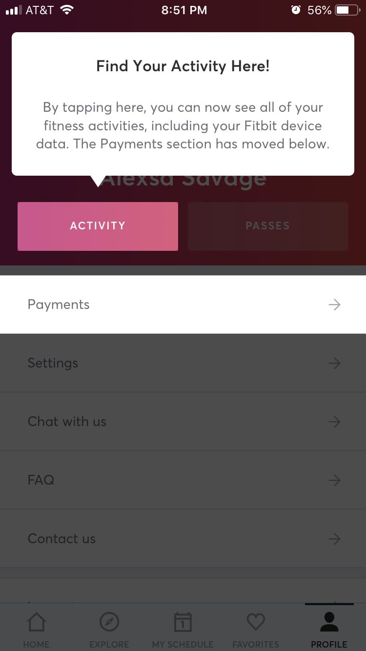
Understanding which parts of your app resonate with users is key to getting them to return. In the mobile app world, this is often referred to as app stickiness. Mindbody’s strategy is to waste no time getting users familiarized with their most engaging app features.
The most important thing to recognize about app retention is that you need to be in it for the long game. Even utilitarian apps should aspire to optimize and delight users with features they may not even have known they needed.
Take the example from Gmail below. Google uses an aptly timed mobile tooltip to let users know about their email scheduling feature:
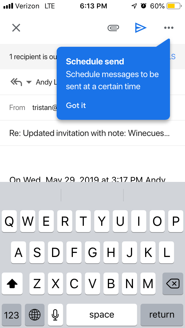
Introducing a new app feature at the precise time when a user would be likely to use it makes the tooltip feel relevant. As a result, users are more likely to pay attention and potentially adopt the feature.
New features aren’t the only ones that need highlighting. It’s often important for product owners to let users know about a cool feature they might not be aware of—or haven’t tried out yet. Product and behavioral analytics tools can help identify your app’s most popular or “sticky” features, and which audience members have yet to check them out.
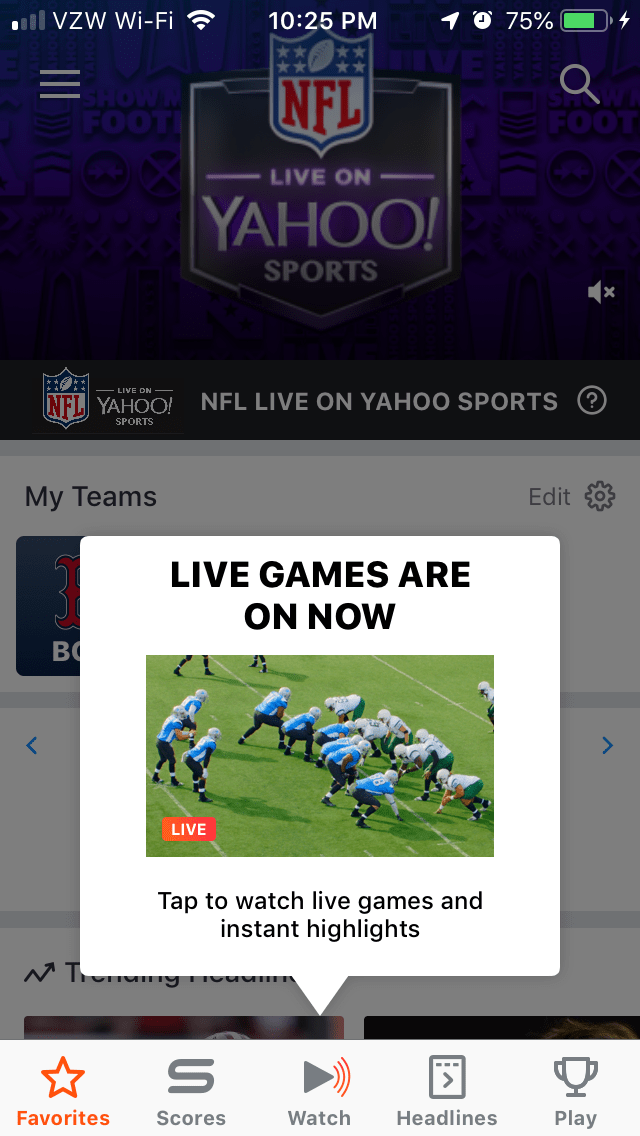
The Yahoo Sports app uses a mobile tooltip to let users know that they can watch live games and highlights directly within their app. Timing is key to the success of this tooltip, since the ‘happening now’ messaging conveys a sense of urgency and excitement. The use of an image in this instance is eye-catching and effective.
One of the most difficult feats for app owners is the upsell. The upsell tooltip is one that needs an especially mindful strategy. App users are fickle, and won’t hesitate to delete an app if they feel their experience is interrupted by advertisements or upsells.
If you’re using tooltips (or any other type of in-app messaging) to upsell, you should take the following things into careful consideration:
Fisdom, an Indian fintech app, uses a tooltip to nudge users to upgrade. The tooltip is only shown to frequent users and appears while a user views their portfolio, making it a timely and relevant experience:
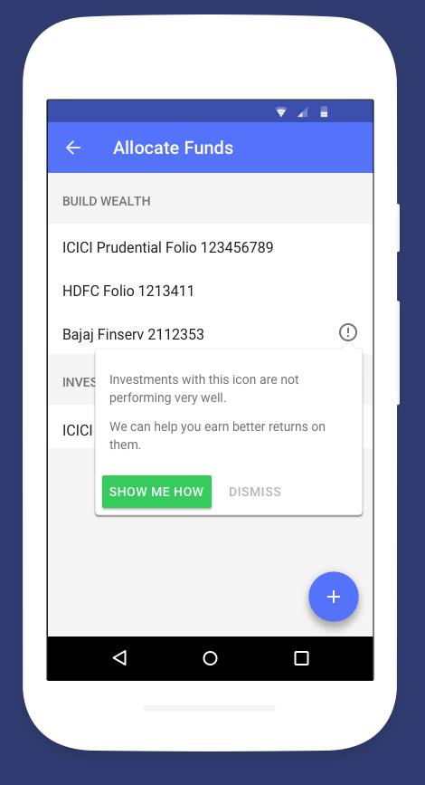
And, importantly, the messaging is helpful—it lets users know that their investment is falling short of expectations and that Fisdom can help. The action-oriented CTA is simple yet effective.
We all know how powerful peer recommendations can be—when a user shares something within your app with a friend, that equates to recommending your app. Pinterest understands how important this sort of word-of-mouth can be, which is why they use a mobile tooltip to familiarize their users with their sharing functionality:
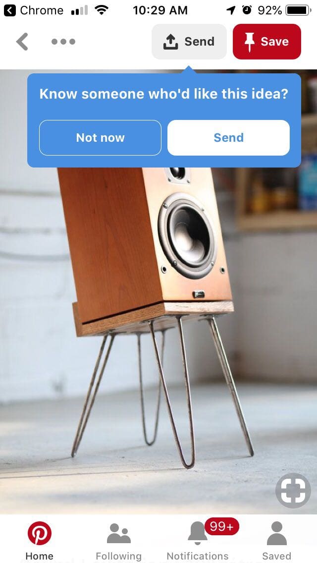
The tooltip is a win-win. The user learns of a useful tool that can help them collaborate with friends and bring their visions to life, while Pinterest gets to introduce their app to potential new users—or re-engage folks whose accounts may otherwise be dormant.
When used correctly, mobile tooltips are powerfully engaging. When used the wrong way, they can feel like spammy popups that disrupt the user experience—ultimately causing users to churn.
So, it’s important to find the right balance between communicating with your users and just letting them do their thing. Put careful consideration into the “when” and “why” of your mobile tooltip design. Remember, tooltips are annotations—they should add value to the user experience, not overpower it.
For more on tooltip best practices, be sure to check out our article, Tooltips: How to use this small but mighty UI pattern correctly.


.png)