.png)

This post breaks down real in-app messaging examples by tactic - personalization, feature walkthroughs, upsell priming, progress celebration, and more - so you can see what actually works and why.
Great in-app messaging isn't about volume - the examples here succeed because they match the right message to the right moment in the user journey.
You'll walk away with transferable tactics - patterns you can apply to your own product, whether you're onboarding new users, announcing features, or nudging upgrades.
Most in-app messages get dismissed in under two seconds. Users see the modal, register that it's not relevant, and click the X. The message wasn't bad - it just landed at the wrong time, for the wrong person, with the wrong format.
The examples that work are different. They're built around a specific tactic - personalization, progressive guidance, intentional friction - and they show up when the user is most likely to care. That's what separates a message that drives action from one that drives annoyance.
This post collects 8 in-app messaging examples from real products, organized by the tactic each one uses. These aren't just screenshots. For each example, we'll look at what the company does, why the approach works mechanically, and what you can take back to your own product. Whether you're a lifecycle marketer building engagement campaigns or a product team shipping feature announcements, the patterns here are designed to transfer.
Before diving into examples, it helps to know the core formats you're working with. Each one fits different moments and intentions.
The examples below show these formats in action - and more importantly, how the tactic behind the format is what makes the message land.
Amid crowds of confused travelers at the airport, a woman bee-lines for a sign displaying her name. Even the simplest personalization can mean the difference between chaos and calm. It's a great user onboarding tactic, but can also be used at any stage of the user lifecycle to help users engage more deeply with your product.
Mailchimp's welcome page following sign-up is a masterful example. Large text welcomes the user, calling her by name. The greeting is based on the time of day in the user's time zone.
From here, Mailchimp wants to customize this first customer experience with personalized marketing recommendations. To do that, they use a banner to invite users to answer a few questions.
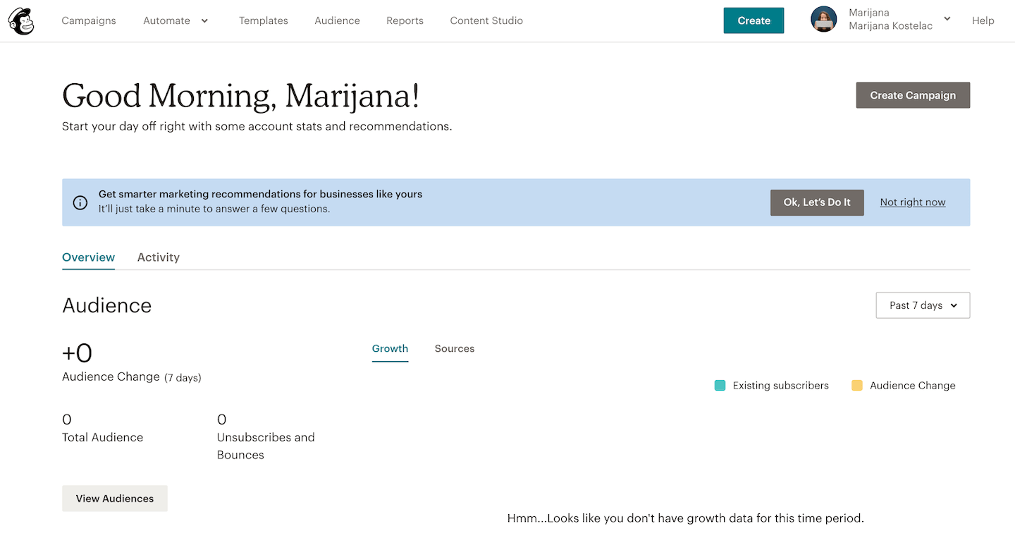
And Mailchimp continues to personalize the dashboard long after onboarding. Returning users see that same friendly greeting, along with tips that will help them take the right actions for growing their audience.
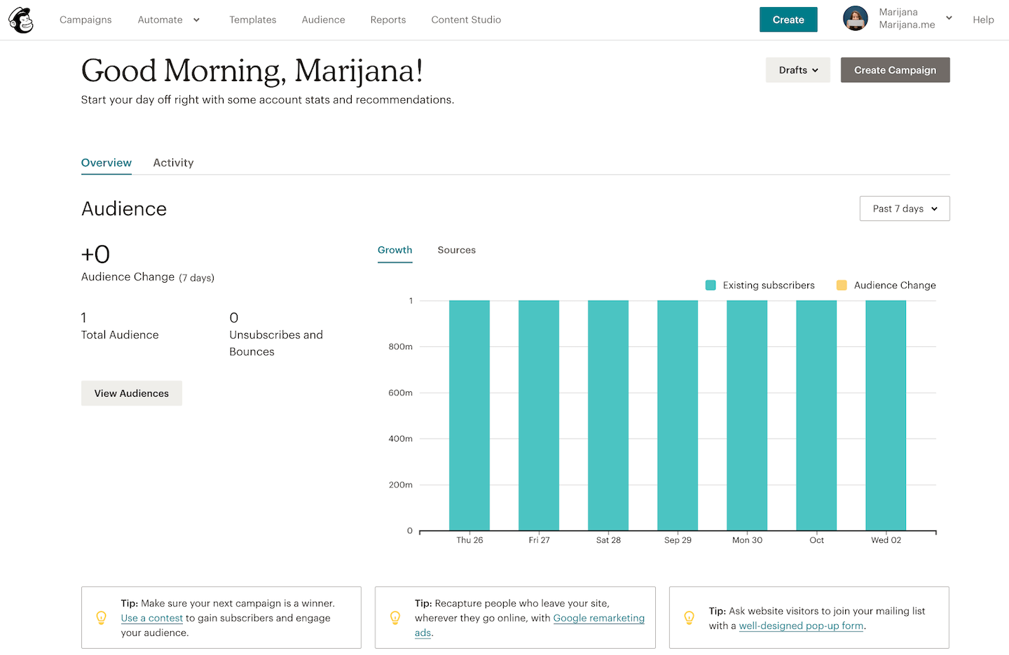
Utilize personalization for user segments to build familiarity and encourage a sense of ownership that will lead to greater exploration and user engagement across the entire customer journey.
A user's first aha moment kicks off a journey toward becoming a loyal customer and brand advocate down the road. But getting users to achieve activation is only the beginning. To become a regular user and eventual champion, you need to help app users discover deeper and ongoing value with your product. A big part of this involves continuously iterating on your product and app features - but it's equally important to show your users how to use the features you've already got.
GoToWebinar, a webinar and online conference software, offers a wide range of features. This means that new features or functionalities have the potential to go unnoticed if they aren't easy to see and discover within the main dashboard (even - perhaps especially - for the most experienced users who have already built habits around the product).
To announce their new Transcripts feature, GoToWebinar used Appcues to create an animated slideout that briefly describes the feature and invites users to see how it works.
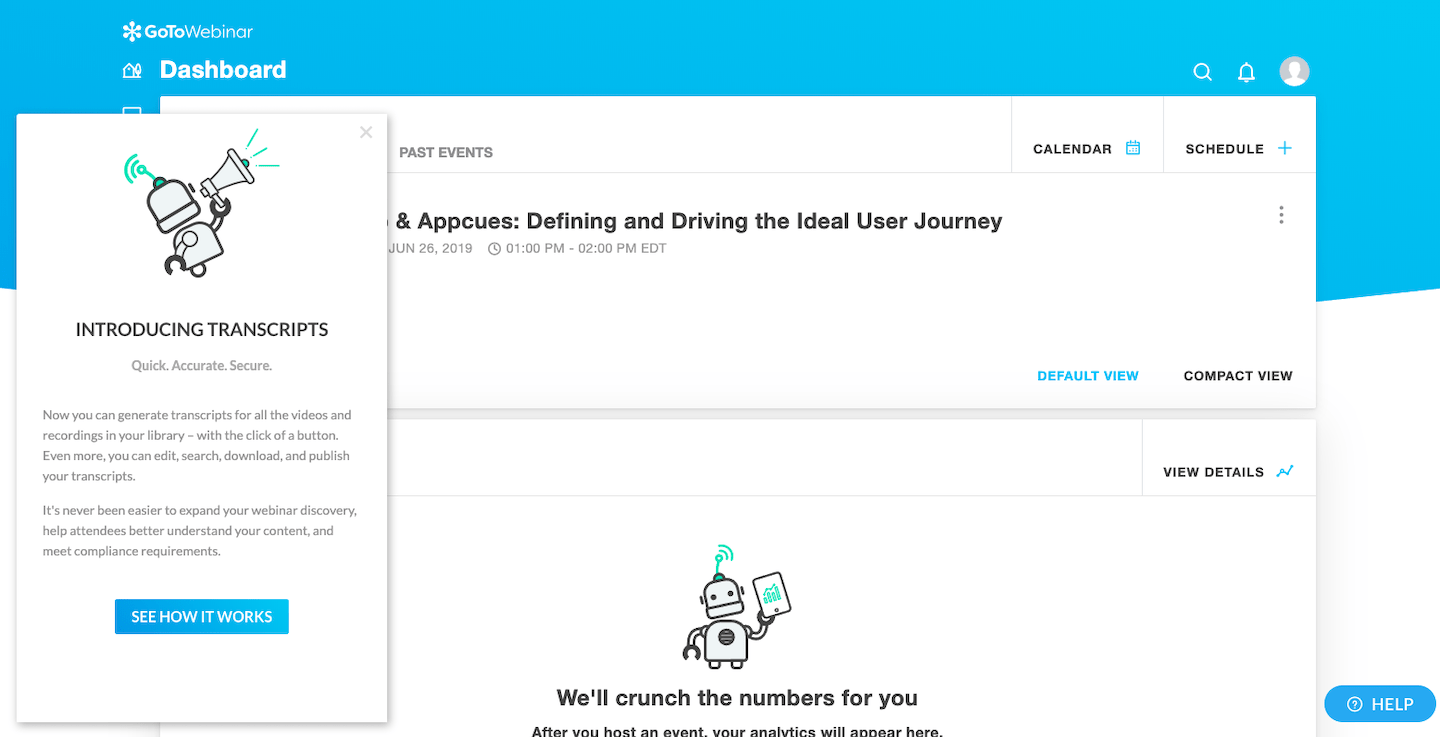
From here, they show the user exactly where to click to navigate to the new feature.
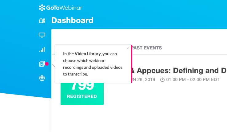
Each hotspot is accompanied by a tooltip that describes each step.

This feature announcement was targeted to returning GoToWebinar users who already know their way around the app and probably don't need too much hand-holding. This walkthrough feels thorough, but not dragged out.
New and returning users need different levels of guidance at different moments in their experience, and features that experienced users find exciting might be too much for new users to take in. When designing your in-app messaging and announcements, it's important to consider the relationship your users may already have with your product. Getting the walkthrough right is a key part of feature adoption.
If you redecorated your entire house, you'd probably be pretty excited to show off the result to your friends. At the same time, you'd (hopefully) realize that your choice of wallpaper is probably more interesting to you than it is to them. When you're dealing with a product redesign or sweeping product updates, the same logic should apply. You want to show users how to take advantage of new features, but you don't want to force them into every nook and cranny.
When Dropbox launched their desktop app, they introduced some pretty big changes to users' workflow.
Instead of showing users everything they can do with the desktop app (and there's so much they can do), Dropbox hones in on the most significant shift of all: powerful, seamless integrations in one place.

After greeting returning users with a simple, high-contrast welcome modal, Dropbox uses a tooltip to call out 2 specific tools - Dropbox Paper and Google Docs - and show users where to click to get started.
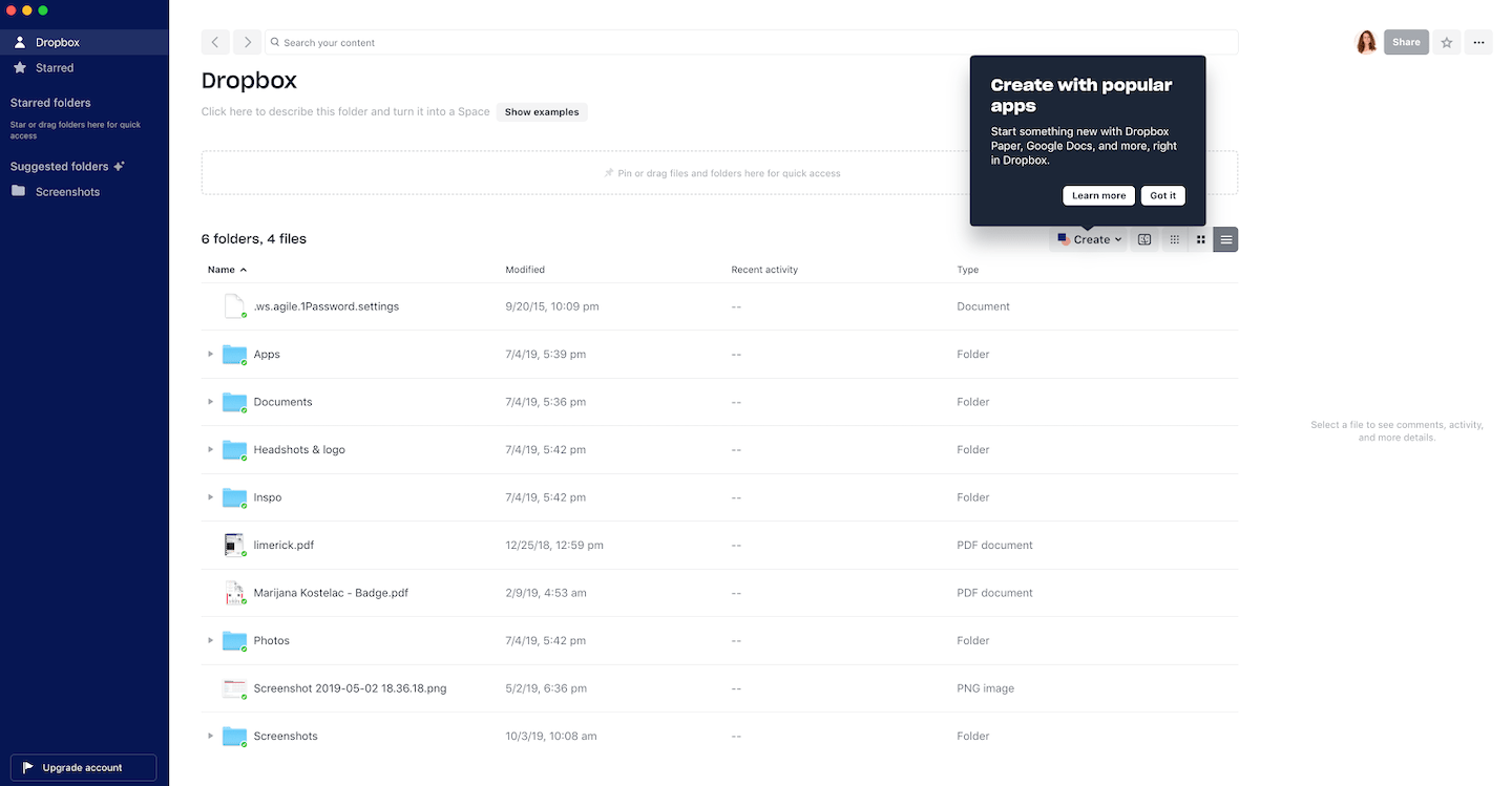
Rather than taking users through each and every feature and basic new functionality, which remains the same across platforms, Dropbox smartly focused their desktop app introduction around a couple key features. The result gives existing Dropbox users a sense of both familiarity and novelty - and perhaps even a second aha moment to drive deeper product adoption.
A high-level overview of a few features can be great for a user onboarding process or for introducing a product redesign. But when users have gotten into a routine with your app, you want to ration out those tips so they don't feel like a to-do list.
Harvest, a time-tracking app for teams, displays a simple modal when users log into the mobile app. The tip positions the value first, so it's quick to skim, and then follows up with a "get started" CTA that takes the user right where they need to go.
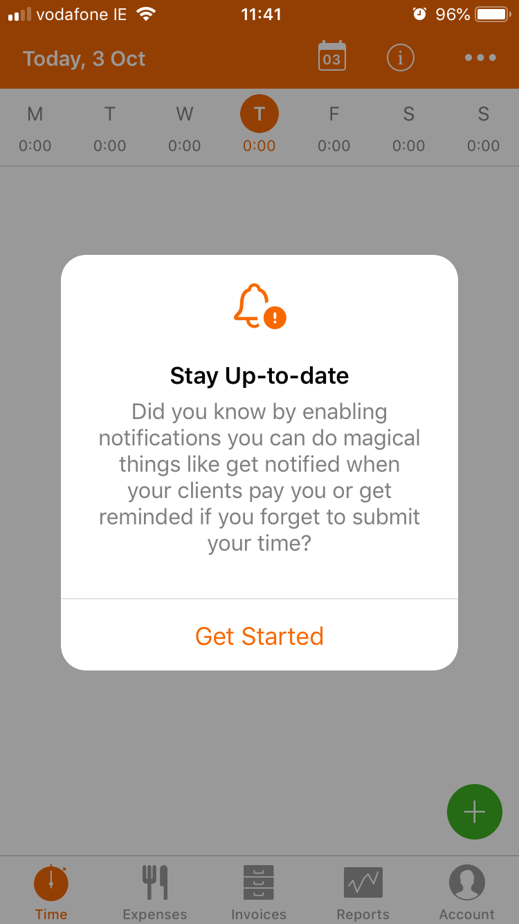
This is a great example of mobile permission priming. Users are increasingly wary of granting device permissions to mobile apps - use your permissions requests as an opportunity to educate them and make the benefits of granting those permissions obvious - like Harvest did.
Unlike a free trial, which typically involves a firm expiration date, freemium products often let users access a product for free indefinitely - with important restrictions. While many users are savvy to the fact that certain features will be off-limits until they pay, getting hit with a paywall can still be jarring.
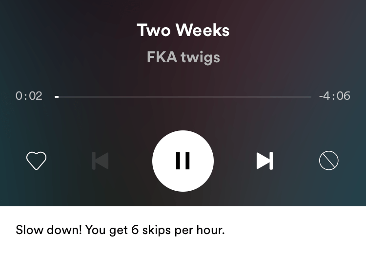
Spotify makes their freemium restrictions more palatable by gently warning users when they're getting close to their usage limit. Freemium users can listen to music for as long as they want, but they can only skip 6 tracks per hour.
Instead of simply hitting them with an upgrade prompt when they reach the limit, Spotify gives users a heads up when they're moving through their hourly skips too quickly.
When users do exceed the limit, Spotify gets clever with its messaging. They position the paywall as an opportunity ("you discovered a Premium feature") rather than a restriction.
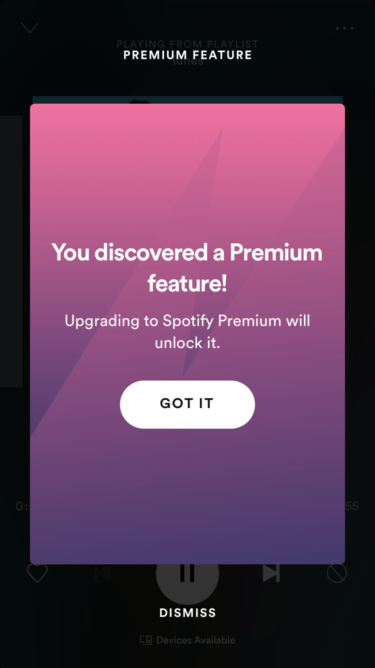
Rather than making users feel bad for not paying up, use your in-app upsell prompts to convey the extra value a user can access if they upgrade.
When users log in, they don't want to spend time sorting through product updates to get on with their work. Keep a separate but visible place for new features and updates in your app's interface, where users can be tempted (but not interrupted) by product updates.
See how Slack hides their updates behind a little red gift box in the corner of the screen.
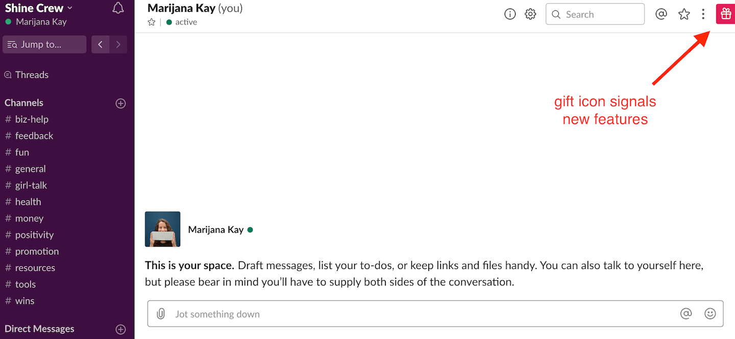
When users are ready to explore, the icon expands without obstructing the user's primary workspace. The content is super clear and user-driven: The title of the update and the short excerpt are focused on the user's pain point, allowing them to see the update's value immediately.
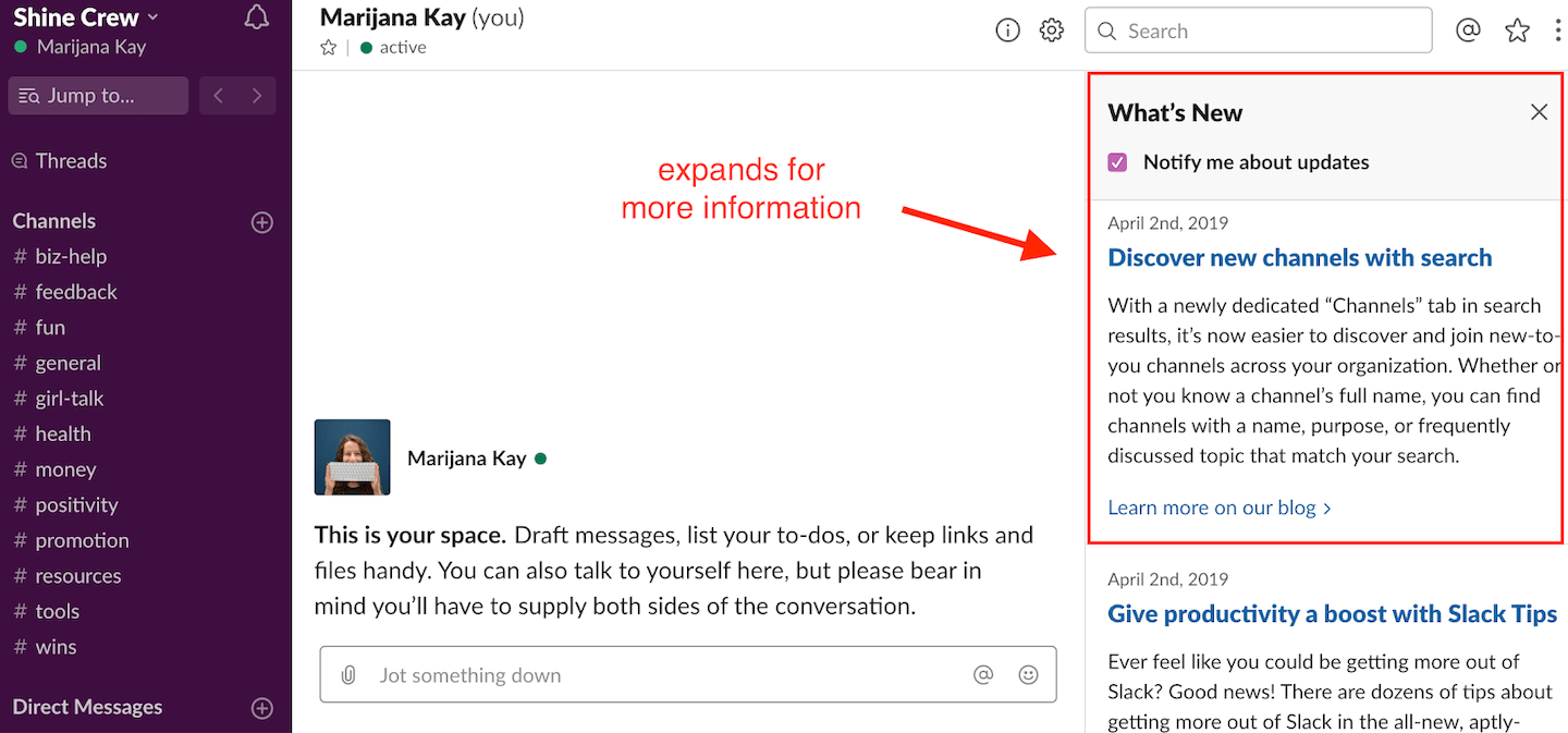
Give users the power to get straight to their work by keeping updates out of the way and letting users access them at the moments when they're actually ready to take action. Choosing the right UI pattern for your update can make or break its impact.
Some products have an outsized impact (like helping companies reach a big audience all at once). Powerful tools are great, but they also involve an equally huge risk (like sending the wrong message to that same big audience). The ability to make an important mistake in just a few clicks can translate to anxiety, and the last thing you want is for your product to make your users anxious.
HubSpot combats the anxiety of scheduling an email to a large list by doing the unthinkable: They actually add friction to the user's workflow. What does good product friction look like? In this case, it's a simple modal window that confirms the date, time, and time zone, along with reassurances that, yes, the email can still be edited or canceled after scheduling.

HubSpot does two things well here: First, they're confirming that the user will indeed accomplish their goal once they hit the orange button. And second, they're telling users that the action isn't irreversible. This reassuring copy gives HubSpot's user a sense of control over an important action.
Think about how your own users feel after completing certain high-impact tasks within your product and look for ways to add relief to their app experience - whether that means removing unnecessary friction, or adding it back in.
The ultimate challenge for making app chores fun? Tax prep software. If an app can make you feel good while doing your taxes, you know it's doing something right.
Here, TurboTax makes filing easier and more fun by breaking up the filing process with milestones, marked by friendly in-app messages and notifications. Celebratory messages serve as mile markers and give users a sense of progress.
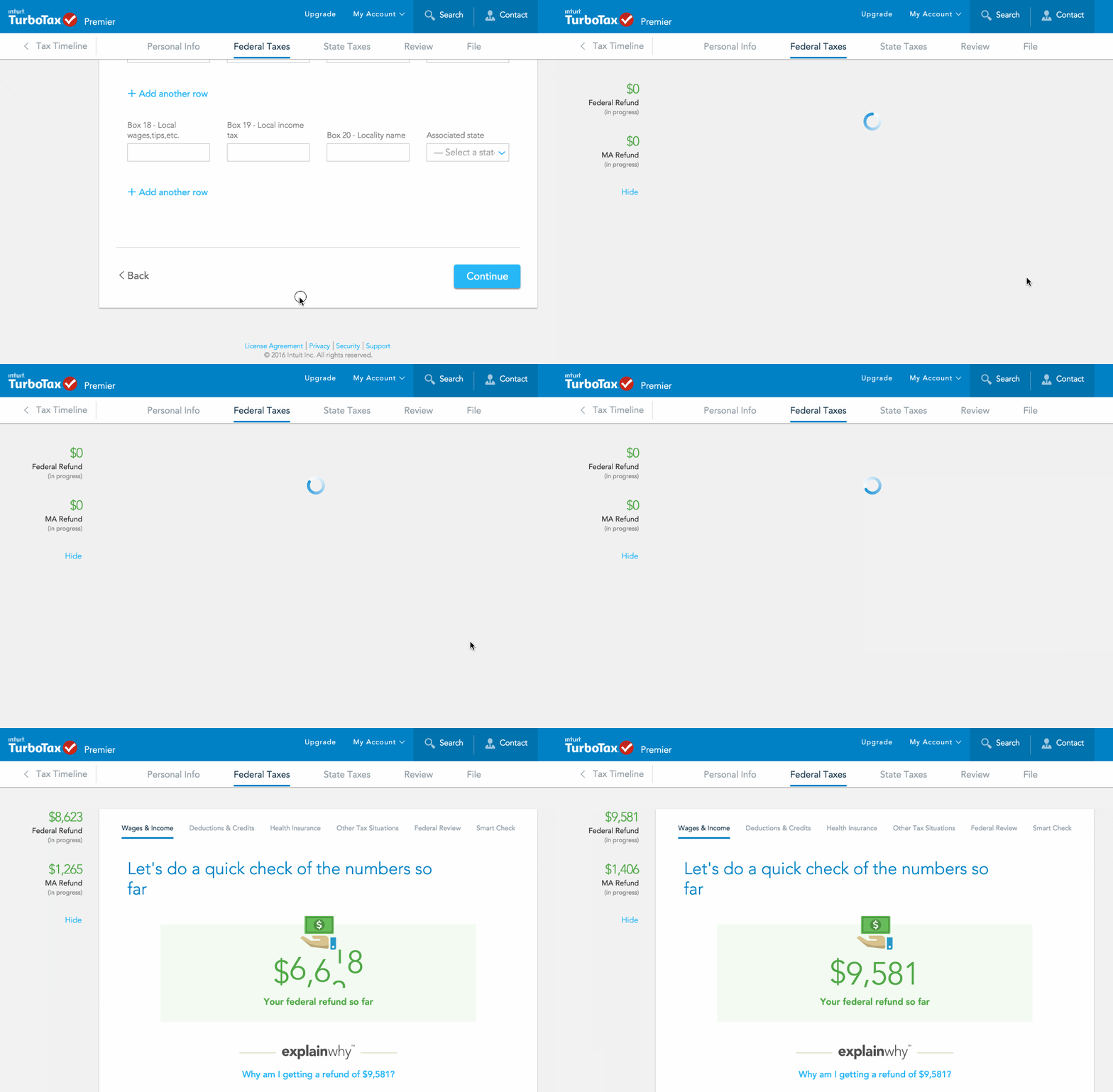

With these notifications, TurboTax makes something objectively dreadful kind of pleasant. Take a page out of their book and spend some extra time on the unpleasant parts of your product. Break up complex tasks, celebrate progress, and give users a clear indicator of where they are in a lengthy process. That way, users will be more likely to stick around for the fun stuff.
Different users need different messages at different lifecycle stages. A new user exploring your product for the first time shouldn't see the same in-app message as a power user who's been around for two years. Segment by behavior, lifecycle stage, and role so your messages land with relevance instead of noise. Here's more on how to drive feature adoption with in-app messaging.
The Spotify example above nails this: "you discovered a Premium feature" reframes a limitation as a benefit. Position what the user gains before explaining what the feature does. People act on outcomes, not functionality lists.
Modals work for big moments that deserve full attention. Tooltips are better for contextual, in-the-flow guidance. Banners suit passive awareness. Matching the format to the moment is just as important as the message itself - the wrong pattern can turn a helpful nudge into an interruption.
The best in-app messages enhance a user's workflow rather than obstruct it. Slack's gift box pattern is a perfect example: the update is visible but never blocks the user's primary task. Design your messages so users feel supported, not sidetracked.
Track dismissal rates, completion rates for multi-step flows, and downstream actions (did the user actually adopt the feature you announced?). A message that gets high impressions but low engagement is a signal to rethink the timing, targeting, or format. Check out the do's and don'ts of in-app notifications for more on finding the right balance.
Don't say anything at all. Chores have no place in your app. Just because you can publish a tooltip tour in minutes doesn't mean you always should. Make sure to step back from your product and put yourself in your users' shoes. Take the time to understand your users (who needs what and when), and target your messaging only to the people who will find it useful. That's the key to grabbing user attention without overwhelming them.
Targeted, thoughtful in-app messaging can deepen customer engagement and drive product adoption. A clumsy barrage of popups, on the other hand, only drives people away.
Check out the do's and don'ts of in-app notifications for more tips on how to strike the right balance in your own product.
Ready to build in-app messages that actually drive engagement? Book a demo to see how Appcues helps teams create targeted, personalized experiences - without waiting on engineering.
Don't say anything at all. Chores have no place in your app. Just because you can publish a tooltip tour in minutes doesn't mean you always should. Make sure to step back from your product and put yourself in your users' shoes. Take the time to understand your users (who needs what and when), and target your messaging only to the people who will find it useful. That's the key to grabbing user attention without overwhelming them.
Targeted, thoughtful in-app messaging can deepen customer engagement and drive product adoption. A clumsy barrage of popups, on the other hand, only drives people away.
Check out the do's and don'ts of in-app notifications for more tips on how to strike the right balance in your own product.
Ready to build in-app messages that actually drive engagement? Book a demo to see how Appcues helps teams create targeted, personalized experiences - without waiting on engineering.
Lifecycle Marketing
In-App Messaging
Product Launches
Personalization
TL;DR
This post breaks down real in-app messaging examples by tactic - personalization, feature walkthroughs, upsell priming, progress celebration, and more - so you can see what actually works and why.
Great in-app messaging isn't about volume - the examples here succeed because they match the right message to the right moment in the user journey.
You'll walk away with transferable tactics - patterns you can apply to your own product, whether you're onboarding new users, announcing features, or nudging upgrades.
Most in-app messages get dismissed in under two seconds. Users see the modal, register that it's not relevant, and click the X. The message wasn't bad - it just landed at the wrong time, for the wrong person, with the wrong format.
The examples that work are different. They're built around a specific tactic - personalization, progressive guidance, intentional friction - and they show up when the user is most likely to care. That's what separates a message that drives action from one that drives annoyance.
This post collects 8 in-app messaging examples from real products, organized by the tactic each one uses. These aren't just screenshots. For each example, we'll look at what the company does, why the approach works mechanically, and what you can take back to your own product. Whether you're a lifecycle marketer building engagement campaigns or a product team shipping feature announcements, the patterns here are designed to transfer.
Before diving into examples, it helps to know the core formats you're working with. Each one fits different moments and intentions.
The examples below show these formats in action - and more importantly, how the tactic behind the format is what makes the message land.
Amid crowds of confused travelers at the airport, a woman bee-lines for a sign displaying her name. Even the simplest personalization can mean the difference between chaos and calm. It's a great user onboarding tactic, but can also be used at any stage of the user lifecycle to help users engage more deeply with your product.
Mailchimp's welcome page following sign-up is a masterful example. Large text welcomes the user, calling her by name. The greeting is based on the time of day in the user's time zone.
From here, Mailchimp wants to customize this first customer experience with personalized marketing recommendations. To do that, they use a banner to invite users to answer a few questions.
And Mailchimp continues to personalize the dashboard long after onboarding. Returning users see that same friendly greeting, along with tips that will help them take the right actions for growing their audience.
Utilize personalization for user segments to build familiarity and encourage a sense of ownership that will lead to greater exploration and user engagement across the entire customer journey.
A user's first aha moment kicks off a journey toward becoming a loyal customer and brand advocate down the road. But getting users to achieve activation is only the beginning. To become a regular user and eventual champion, you need to help app users discover deeper and ongoing value with your product. A big part of this involves continuously iterating on your product and app features - but it's equally important to show your users how to use the features you've already got.
GoToWebinar, a webinar and online conference software, offers a wide range of features. This means that new features or functionalities have the potential to go unnoticed if they aren't easy to see and discover within the main dashboard (even - perhaps especially - for the most experienced users who have already built habits around the product).
To announce their new Transcripts feature, GoToWebinar used Appcues to create an animated slideout that briefly describes the feature and invites users to see how it works.
From here, they show the user exactly where to click to navigate to the new feature.
Each hotspot is accompanied by a tooltip that describes each step.
This feature announcement was targeted to returning GoToWebinar users who already know their way around the app and probably don't need too much hand-holding. This walkthrough feels thorough, but not dragged out.
New and returning users need different levels of guidance at different moments in their experience, and features that experienced users find exciting might be too much for new users to take in. When designing your in-app messaging and announcements, it's important to consider the relationship your users may already have with your product. Getting the walkthrough right is a key part of feature adoption.
If you redecorated your entire house, you'd probably be pretty excited to show off the result to your friends. At the same time, you'd (hopefully) realize that your choice of wallpaper is probably more interesting to you than it is to them. When you're dealing with a product redesign or sweeping product updates, the same logic should apply. You want to show users how to take advantage of new features, but you don't want to force them into every nook and cranny.
When Dropbox launched their desktop app, they introduced some pretty big changes to users' workflow.
Instead of showing users everything they can do with the desktop app (and there's so much they can do), Dropbox hones in on the most significant shift of all: powerful, seamless integrations in one place.
After greeting returning users with a simple, high-contrast welcome modal, Dropbox uses a tooltip to call out 2 specific tools - Dropbox Paper and Google Docs - and show users where to click to get started.
Rather than taking users through each and every feature and basic new functionality, which remains the same across platforms, Dropbox smartly focused their desktop app introduction around a couple key features. The result gives existing Dropbox users a sense of both familiarity and novelty - and perhaps even a second aha moment to drive deeper product adoption.
A high-level overview of a few features can be great for a user onboarding process or for introducing a product redesign. But when users have gotten into a routine with your app, you want to ration out those tips so they don't feel like a to-do list.
Harvest, a time-tracking app for teams, displays a simple modal when users log into the mobile app. The tip positions the value first, so it's quick to skim, and then follows up with a "get started" CTA that takes the user right where they need to go.
This is a great example of mobile permission priming. Users are increasingly wary of granting device permissions to mobile apps - use your permissions requests as an opportunity to educate them and make the benefits of granting those permissions obvious - like Harvest did.
Unlike a free trial, which typically involves a firm expiration date, freemium products often let users access a product for free indefinitely - with important restrictions. While many users are savvy to the fact that certain features will be off-limits until they pay, getting hit with a paywall can still be jarring.
Spotify makes their freemium restrictions more palatable by gently warning users when they're getting close to their usage limit. Freemium users can listen to music for as long as they want, but they can only skip 6 tracks per hour.
Instead of simply hitting them with an upgrade prompt when they reach the limit, Spotify gives users a heads up when they're moving through their hourly skips too quickly.
When users do exceed the limit, Spotify gets clever with its messaging. They position the paywall as an opportunity ("you discovered a Premium feature") rather than a restriction.
Rather than making users feel bad for not paying up, use your in-app upsell prompts to convey the extra value a user can access if they upgrade.
When users log in, they don't want to spend time sorting through product updates to get on with their work. Keep a separate but visible place for new features and updates in your app's interface, where users can be tempted (but not interrupted) by product updates.
See how Slack hides their updates behind a little red gift box in the corner of the screen.
When users are ready to explore, the icon expands without obstructing the user's primary workspace. The content is super clear and user-driven: The title of the update and the short excerpt are focused on the user's pain point, allowing them to see the update's value immediately.
Give users the power to get straight to their work by keeping updates out of the way and letting users access them at the moments when they're actually ready to take action. Choosing the right UI pattern for your update can make or break its impact.
Some products have an outsized impact (like helping companies reach a big audience all at once). Powerful tools are great, but they also involve an equally huge risk (like sending the wrong message to that same big audience). The ability to make an important mistake in just a few clicks can translate to anxiety, and the last thing you want is for your product to make your users anxious.
HubSpot combats the anxiety of scheduling an email to a large list by doing the unthinkable: They actually add friction to the user's workflow. What does good product friction look like? In this case, it's a simple modal window that confirms the date, time, and time zone, along with reassurances that, yes, the email can still be edited or canceled after scheduling.
HubSpot does two things well here: First, they're confirming that the user will indeed accomplish their goal once they hit the orange button. And second, they're telling users that the action isn't irreversible. This reassuring copy gives HubSpot's user a sense of control over an important action.
Think about how your own users feel after completing certain high-impact tasks within your product and look for ways to add relief to their app experience - whether that means removing unnecessary friction, or adding it back in.
The ultimate challenge for making app chores fun? Tax prep software. If an app can make you feel good while doing your taxes, you know it's doing something right.
Here, TurboTax makes filing easier and more fun by breaking up the filing process with milestones, marked by friendly in-app messages and notifications. Celebratory messages serve as mile markers and give users a sense of progress.
With these notifications, TurboTax makes something objectively dreadful kind of pleasant. Take a page out of their book and spend some extra time on the unpleasant parts of your product. Break up complex tasks, celebrate progress, and give users a clear indicator of where they are in a lengthy process. That way, users will be more likely to stick around for the fun stuff.
Different users need different messages at different lifecycle stages. A new user exploring your product for the first time shouldn't see the same in-app message as a power user who's been around for two years. Segment by behavior, lifecycle stage, and role so your messages land with relevance instead of noise. Here's more on how to drive feature adoption with in-app messaging.
The Spotify example above nails this: "you discovered a Premium feature" reframes a limitation as a benefit. Position what the user gains before explaining what the feature does. People act on outcomes, not functionality lists.
Modals work for big moments that deserve full attention. Tooltips are better for contextual, in-the-flow guidance. Banners suit passive awareness. Matching the format to the moment is just as important as the message itself - the wrong pattern can turn a helpful nudge into an interruption.
The best in-app messages enhance a user's workflow rather than obstruct it. Slack's gift box pattern is a perfect example: the update is visible but never blocks the user's primary task. Design your messages so users feel supported, not sidetracked.
Track dismissal rates, completion rates for multi-step flows, and downstream actions (did the user actually adopt the feature you announced?). A message that gets high impressions but low engagement is a signal to rethink the timing, targeting, or format. Check out the do's and don'ts of in-app notifications for more on finding the right balance.
Don't say anything at all. Chores have no place in your app. Just because you can publish a tooltip tour in minutes doesn't mean you always should. Make sure to step back from your product and put yourself in your users' shoes. Take the time to understand your users (who needs what and when), and target your messaging only to the people who will find it useful. That's the key to grabbing user attention without overwhelming them.
Targeted, thoughtful in-app messaging can deepen customer engagement and drive product adoption. A clumsy barrage of popups, on the other hand, only drives people away.
Check out the do's and don'ts of in-app notifications for more tips on how to strike the right balance in your own product.
Ready to build in-app messages that actually drive engagement? Book a demo to see how Appcues helps teams create targeted, personalized experiences - without waiting on engineering.
Don't say anything at all. Chores have no place in your app. Just because you can publish a tooltip tour in minutes doesn't mean you always should. Make sure to step back from your product and put yourself in your users' shoes. Take the time to understand your users (who needs what and when), and target your messaging only to the people who will find it useful. That's the key to grabbing user attention without overwhelming them.
Targeted, thoughtful in-app messaging can deepen customer engagement and drive product adoption. A clumsy barrage of popups, on the other hand, only drives people away.
Check out the do's and don'ts of in-app notifications for more tips on how to strike the right balance in your own product.
Ready to build in-app messages that actually drive engagement? Book a demo to see how Appcues helps teams create targeted, personalized experiences - without waiting on engineering.

Sign up for Quickcues and get our monthly updates!
.svg)