.png)

Onboarding UX determines whether users stay or leave. The first few sessions set the activation arc for everything that follows - and most teams underinvest in getting those moments right.
There is no single right pattern. Welcome messages, product tours, checklists, hotspots, progressive disclosure, and deferred account creation all serve different user moments. The best onboarding flows combine two to four of them.
The biggest mistakes are easily avoided. Overloading users on Day 1 and skipping personalization are the most common failure points - and both are fixable.
Measurement is non-negotiable. Track activation rate and time to first key action at minimum. Add checklist completion rate once those are in place.
Onboarding is not a feature. It is your product's first chance to show users why they signed up - and most teams underinvest in it. Most SaaS teams ship a welcome modal, maybe a tooltip or two, and stop there - leaving users without guidance at the moments they need it most.
The cost of getting it wrong is not abstract. When new users cannot find value in their first session, they leave. They do not file support tickets. They do not send angry emails. They simply never come back. And for product teams, that silent drop-off is harder to diagnose than an outright complaint because there is no signal to act on.
The challenge is not a lack of options. There are dozens of onboarding UX patterns available - from user onboarding checklists to progressive disclosure to persona-based flows. The real question is which pattern fits your product, your users, and the specific moment in their journey where they are most likely to drop off.
That is what this guide is for. We have analyzed hundreds of user onboarding UI/UX experiences across SaaS products of every size, and we have distilled them into the patterns, practices, and examples that actually move activation metrics. Whether you are building your first onboarding flow or redesigning one that is underperforming, you will find a practical framework here - not theory.
Good user onboarding experiences do not happen by accident. They are designed, tested, and iterated. Here is how to apply them to your own product.
User onboarding is the process of helping new users learn and understand your product with the goal of turning them into long-term customers. When done well, it shortens a user's time to value - the gap between signing up and reaching their aha moment, that point where they think, "Now I get why this matters."
Onboarding UX is more specific. It refers to the design decisions, interface patterns, and interaction flows that shape how a new user moves from sign-up to first value. It is not about a single screen or a single tour. It is about a sequence of moments - the welcome modal, the first action prompt, the empty state, the follow-up nudge - and how those moments feel in context.
Think of it this way: onboarding is the strategy (get users to value). Onboarding UX design is the execution (the specific screens, patterns, and micro-interactions that make it happen). A product can have an onboarding strategy and still fail because the UX is confusing, overwhelming, or poorly timed.
Onboarding tools help you build these experiences into your product - overlaying or augmenting your app's UI with annotations, guides, and prompts that move users toward activation. And the data supports the investment: users who reach their aha moment faster are more likely to retain beyond their first session. That is true even for products with otherwise great UX.
If you are a product manager or growth lead, you already know that early churn is expensive. But the numbers are sharper than most teams realize. Research consistently shows that 40-60% of users who sign up for a SaaS product will use it once and never return. The core issue is onboarding UX, not conversion strategy.
The business case breaks down into three layers:
What poor onboarding costs you. When users cannot figure out how to get value from your product in the first session, activation rates drop and support tickets spike. Free-to-paid conversion stalls as a result. Every user who churns during onboarding is a user you already paid to acquire. The cost compounds fast - especially for teams running paid acquisition campaigns.
What good onboarding drives. Teams that invest in onboarding UX see measurable gains in retention, expansion revenue, and product-qualified leads. A shorter time to value means more users reaching the activation threshold. More activated users means a larger base for upsell, cross-sell, and advocacy. The downstream effects are significant: even a modest improvement in Day 7 retention can shift the entire LTV curve.
Why UX specifically matters. You can have the right onboarding strategy - the right steps and the right goals - and still lose users because the experience feels clunky, overwhelming, or impersonal. UX is the difference between an onboarding flow that users tolerate and one they actually complete. It is the quality of the tooltips, the pacing of the prompts, the clarity of the empty state. When the UX is right, users do not just learn your product - they build confidence in it.
The bottom line: onboarding UX is not a design exercise. It is a growth lever. And the patterns you choose to implement determine how effectively that lever works. Let's look at those patterns.
No single pattern works for every product or user type. The best onboarding flows combine two to four patterns based on product complexity, user goals, and where each user is in their journey. Think of the patterns below as a toolkit, not a hierarchy - the combination matters more than any individual choice. Here is a look at the core onboarding UI patterns and UX approaches used across SaaS today.
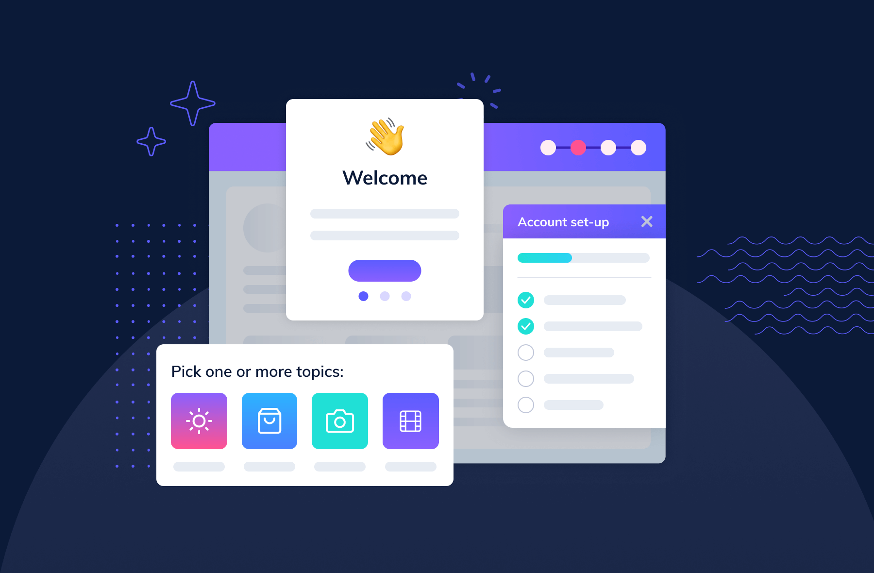
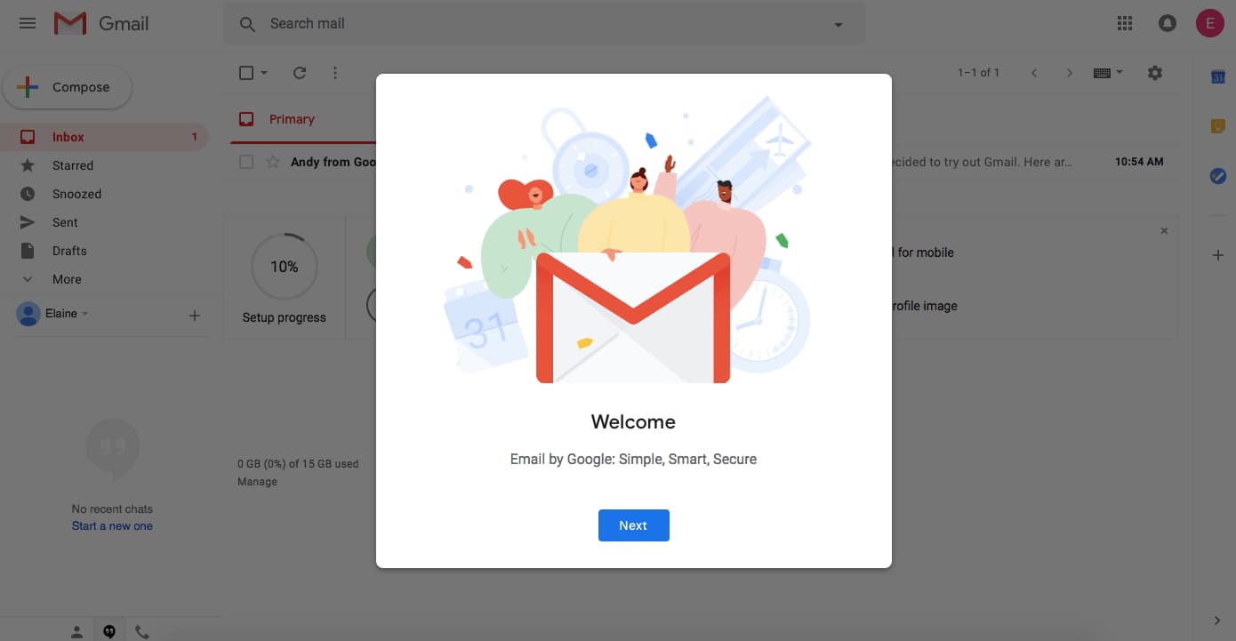
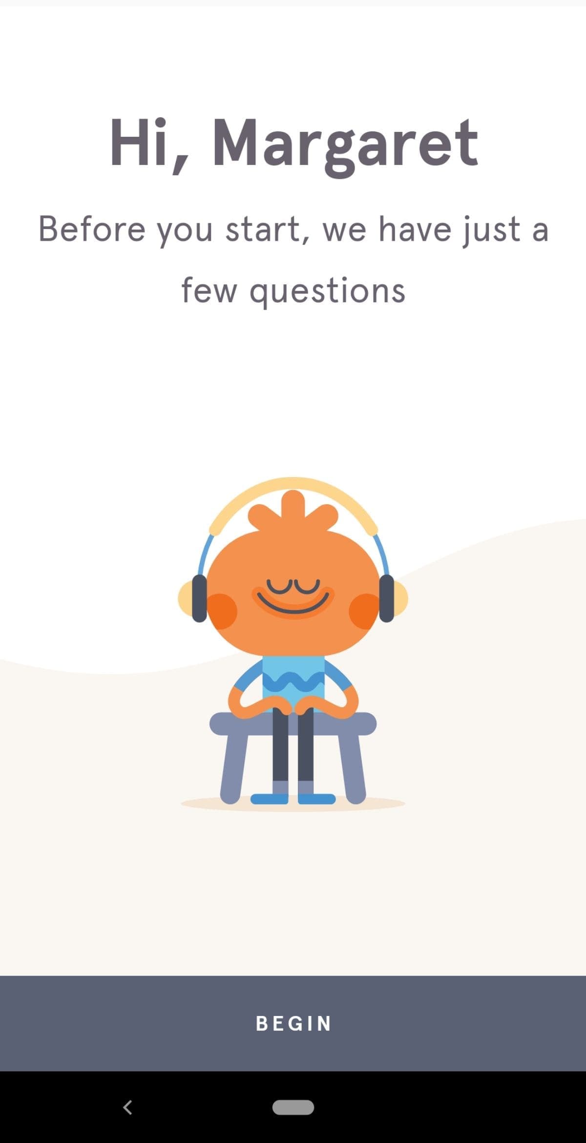
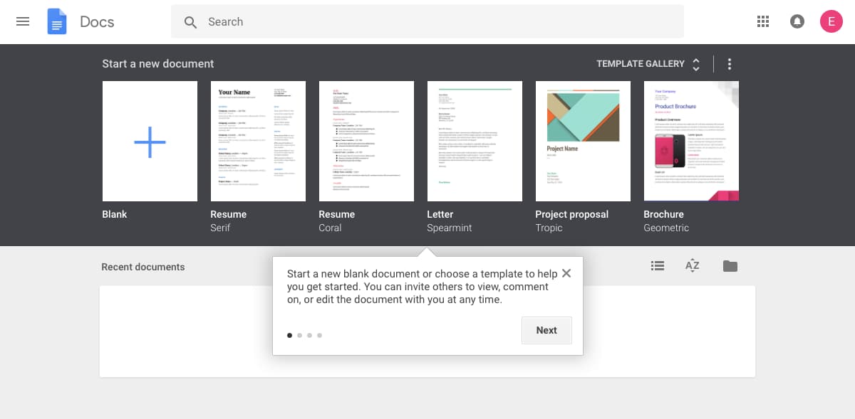
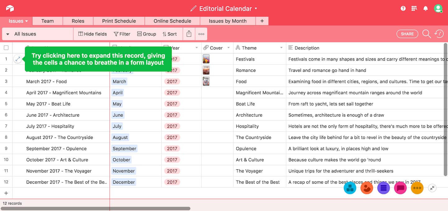
Welcome messages are any greeting that first-time users see when they log into an app for the first time. These messages usually contain words like "Hello" or "Welcome" and often include an opportunity for action - like a CTA to begin a brief product tour or walkthrough. Welcome messages help users feel more, well, welcome to your app and can set expectations and tone for the experience ahead.
Slack, for example, greets new users with a simple, no-nonsense welcome message and a single CTA. There are no walls of text, no feature lists - just a focused prompt that reduces cognitive load at the moment when a user is most uncertain about what to do next.
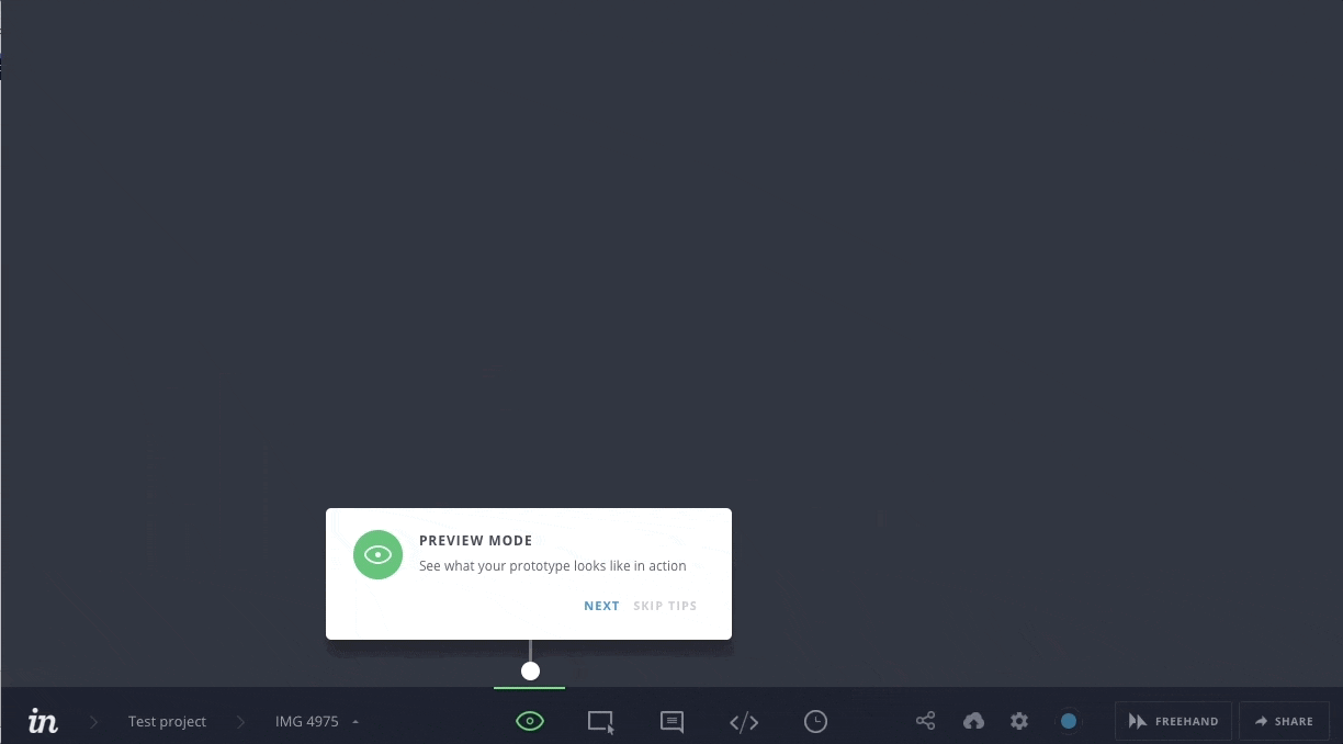
When to use them: About 9 in 10 new user onboarding sequences begin with a welcome message. Use them when users first log in to give direction on next steps. Welcome messages are often contained within a modal window - a large UI element that visually separates the onboarding experience from the application's interface. A layer of transparency behind the modal gives users a peek into the main app, which helps maintain motivation to complete onboarding and start using the product.
Some welcome modals take over a user's entire screen, blocking visibility into your app and focusing attention entirely on the message. This full-screen takeover pattern is highly disruptive and is best saved for required inputs that a user must complete before using your product.
You can build welcome messages with Appcues' modal windows.
.jpeg)
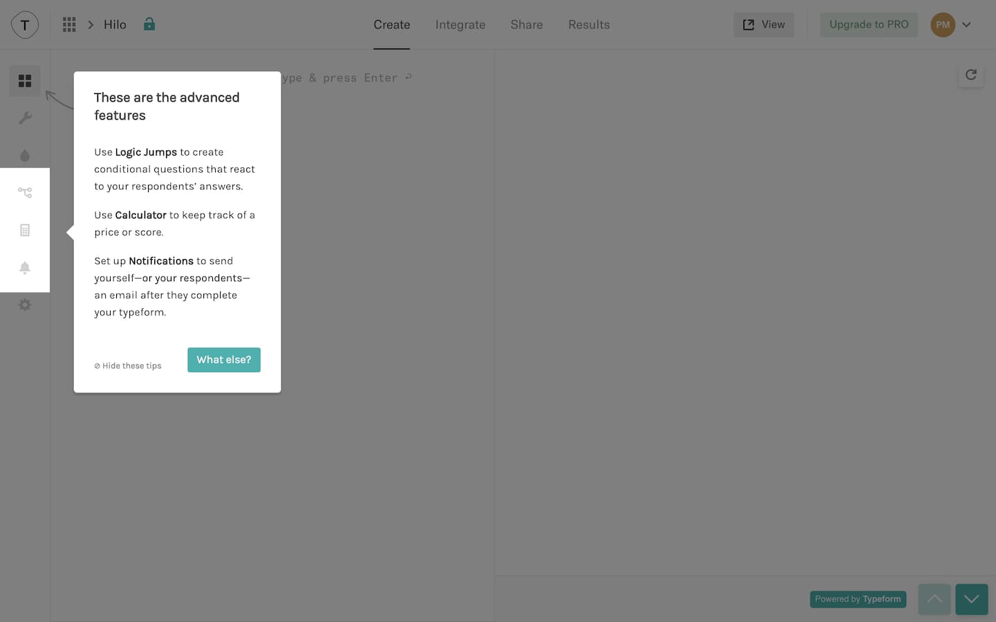
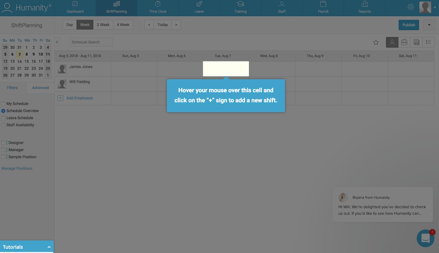
Product tours are in-app guides that walk new users through your app to familiarize them with your UI. Unlike hotspots (which sit passively and wait for a user to notice them), product tours are sequential walkthroughs - they take users through a defined series of steps to show key workflows or processes that make your product valuable.
Typeform, for instance, uses tooltips to walk new users through its form builder step by step. The tour focuses on the actions a user needs to take to create their first form, not on every feature the product offers.
When to use them: Use product tours when you want users to take specific actions or complete certain processes. The process can be simple or complicated - what is difficult to the user might be simple for you, so err on the side of building a walkthrough.
Product tours often come in the form of tooltips - boxes with pointers that call out and contextualize elements within a product. A few tips to optimize your product tour's onboarding UX:
You can build product tours with Appcues' tooltips.
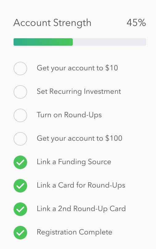
Progress bars are visual representations of a new user's progress toward completing tasks in your app. They say, "Hey, you're on your way. Just a little more effort, and you'll get there." Progress bars tap into the same psychological principles that make gamification effective - the desire to complete what you have started. LinkedIn's profile strength meter is one of the most recognizable examples: it gives users a visual incentive to fill out additional fields by showing how close they are to a "complete" profile.
When to use them: Use progress bars (or similar indicators like dots, dashes, and fractions) to motivate new users to complete their onboarding. They are especially effective for multi-step setup flows.
Progress bars work best when they show a substantial percentage already filled out. Starting with a partially completed bar helps users feel like they have already accomplished something instead of starting from scratch. This sense of existing progress increases a person's desire to complete the task.
You can add progress bars to your app onboarding with Appcues' modal windows.
A checklist is a visual depiction of tasks that informs people how many tasks they have and have not completed. Like progress bars, they play into powerful psychological principles, motivating new users to finish - and even enjoy - the crucial setup tasks required to get up and running within your product.
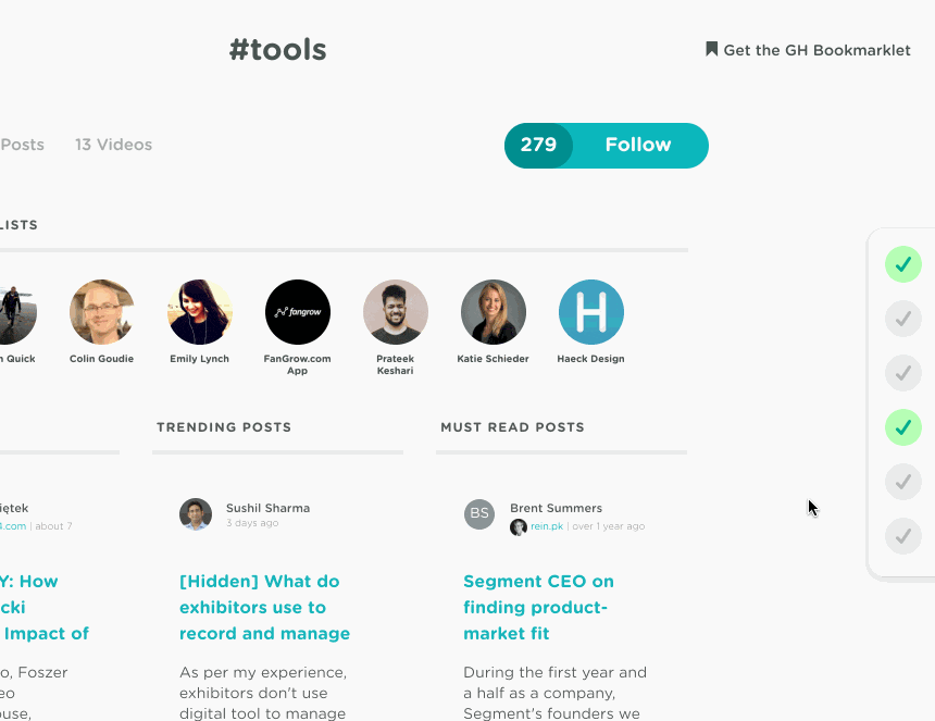
GrowthHackers, for example, uses a sliding checklist that appears from the right side of the UI, keeping tasks visible without blocking the main interface.
When to use them: Checklists are ideal for complex tasks and multi-step processes during onboarding. They combine well with progress bars to amplify motivation. One metric worth tracking: checklist completion rate. It is one of the most direct indicators of onboarding health. If users consistently drop off at a specific step, that step is where your flow needs work.
Checklists work best when they live alongside your product as a persistent reminder of tasks that still need to be completed. For more design inspiration, check out 5 examples of best-in-class checklists.
You can add checklists to your user onboarding with Appcues' Checklists.
Hotspots are small pulsating dots that draw attention to specific elements or features in your app's UI. They are distinct from tooltips in one important way: hotspots are passive beacons that sit quietly until a user engages with them, while tooltips are triggered contextual tips that appear in sequence as part of a guided flow. Think of hotspots as "come look at this when you are ready" and tooltips as "let me walk you through this now."
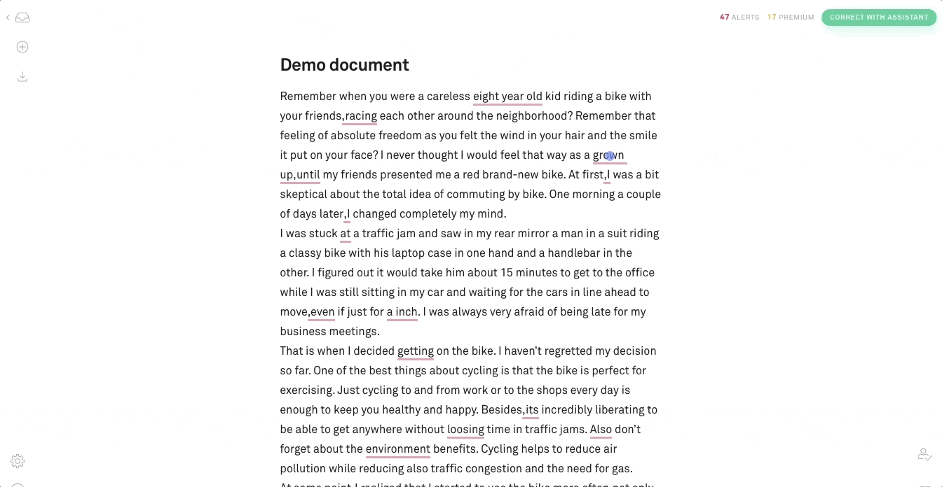
Grammarly uses hotspots in its learn-by-doing demo document to guide new users through key features without interrupting the writing experience. The hotspots appear on relevant elements, and users engage with them at their own pace.
When to use them: Hotspots are subtle and discreet. They are best for calling out non-essential features without interrupting user workflow. They are also useful for giving contextual help to entice users to activate certain elements or features in your app. Beautify your hotspots with pulsating animations to catch the user's eye, but adjust the intensity so users can easily digest the information.
You can build hotspots with Appcues.
Tooltips are in-app messages that pop up when someone hovers over, stops at, or clicks a specific element on your website or mobile app. They work best on elements like text links, buttons, and icons. Unlike hotspots, tooltips are action-oriented - they guide users through sequential steps and disappear when the user leaves the element.
Airtable uses contextual, action-driven tooltips to prompt users to perform specific actions designed to familiarize them with key features. Each tooltip highlights one element and darkens the surrounding space to maintain focus.
When to use them: Use tooltips when you want to isolate elements like form fields or buttons to guide a user through account setup. Once a user completes a step, they are referred to the next one. Be careful not to overdo tooltips - they can frustrate more independent-minded users. And don't place tooltips on information that is essential to a task. Tooltips disappear, and users would need to memorize the content to complete the task.
You can build action-driven tooltips with Appcues' tooltips.
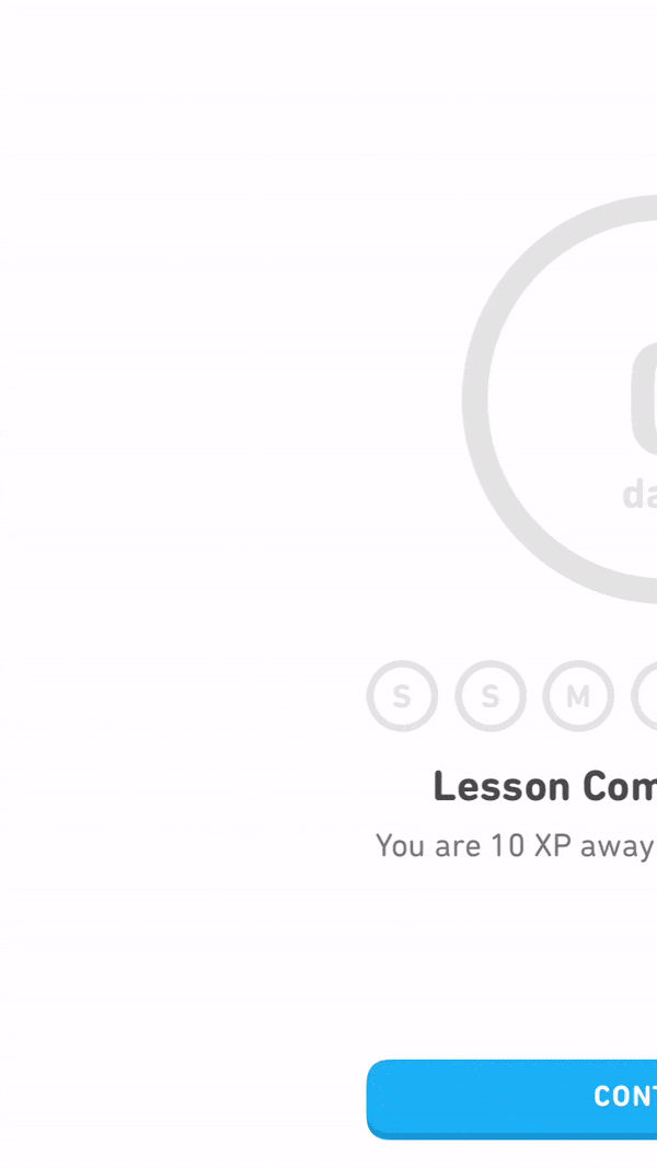
Deferred account creation allows new users to experience the value of your product before asking them to sign up. Users can see what your product does without the commitment of adding their email, creating a password, or inputting other details. This approach helps you avoid signups from users who are not a good match - and it gives committed users a reason to convert because they have already experienced the value firsthand.
Duolingo is one of the strongest examples. Its signup prompts occur at logical moments - after users complete a language lesson, for example - reducing the friction typically associated with registration.
When to use it: Defer account creation when you want to ensure new users have a certain level of commitment before signing up. Some products delay creation until after the initial landing page, while others go as far as delaying it until after a user has reached their aha moment. This process is called gradual engagement.
Move new users through your app slowly, helping them experience value firsthand before requiring sign-up. You can also reduce friction by decreasing the number of form fields - asking for just an email address at first, for example, increases conversion rates by lowering the barrier of entry.
The UI for delayed account creation needs to be hyper-focused once you get to the registration step. If users do not realize they need to save their account, you may lose them if they bounce - or worse, they may lose their progress and churn out of frustration.
Depending on how you plan to communicate the need for registration, you may want to use tooltips to draw attention to a signup CTA or a modal window at the right moment in the user journey. You can build either pattern with Appcues.
Persona-based user onboarding means designing new users' onboarding experiences based on their role or desired outcome. This approach prompts users to self-segment by selecting their own course of action, with each option leading to a different first experience. Segmenting can happen without the user knowing it - by using data collected on signup - or through a choose-your-own-adventure option.
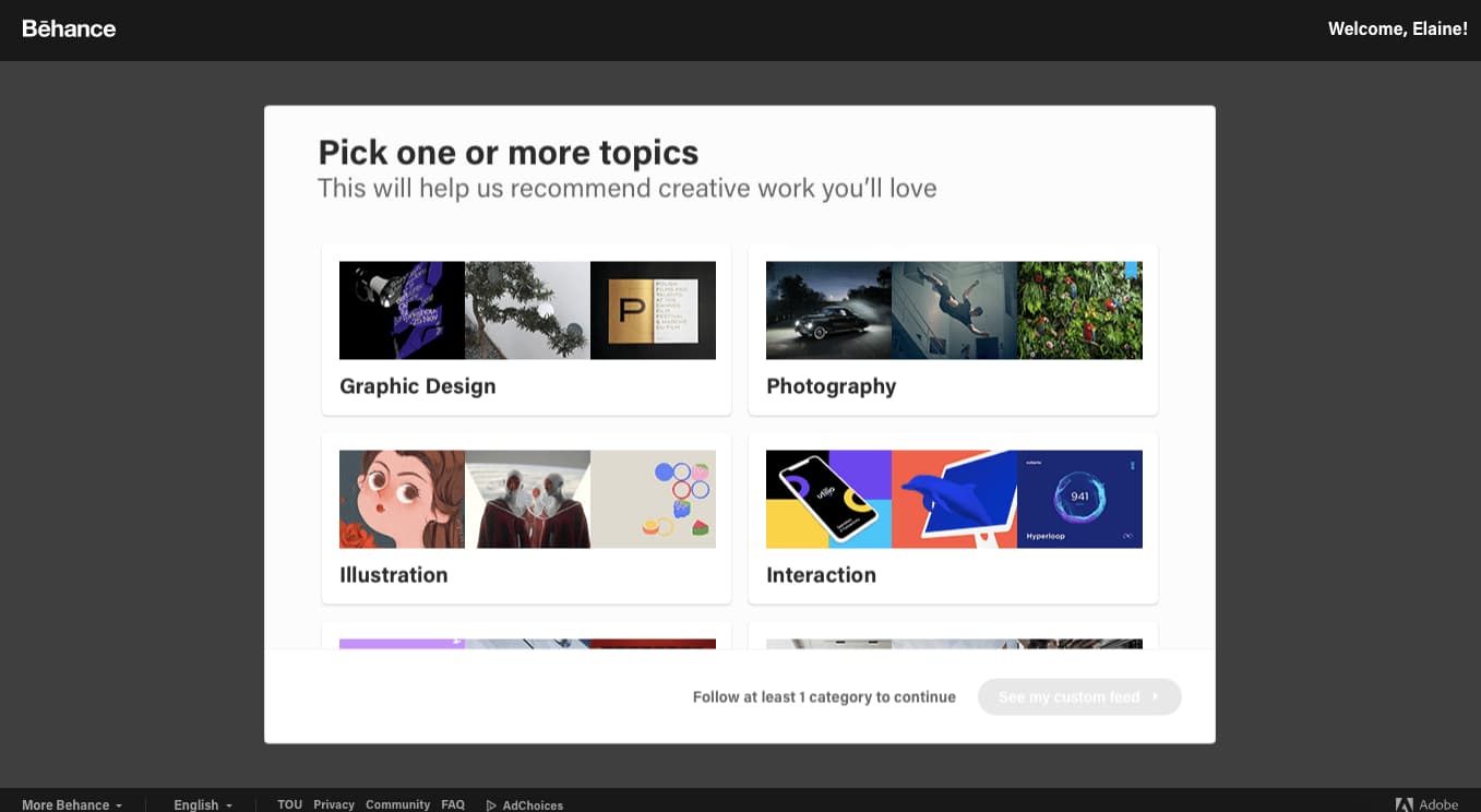
Behance, for example, asks new users to select their interests in order to provide them with a personalized feed and a better first experience.
When to use it: Use persona-based onboarding during or after signup if your app has multiple products or offerings serving different audiences. It gives users personalized, relevant first experiences with higher engagement and shorter time to value.
Keep the options manageable. From what we have seen, 2-5 choices seem to be the sweet spot. It is important not to overwhelm users with too many paths. Persona-based onboarding connects directly to the principle of progressive disclosure: by showing users only what is relevant to their role or goal, you reduce cognitive load and surface the right features at the right time.
You can create persona-based onboarding with Appcues. There are also hundreds of onboarding examples for every pattern listed here.
Progressive disclosure is a design principle that underpins several of the patterns above: showing users only what they need at each stage, rather than everything at once. Instead of presenting every feature on Day 1, you layer information and functionality across the first days or weeks - introducing capabilities as users build competence.
Grammarly is a strong example. Rather than explaining every feature during setup, Grammarly stages its introduction across the first week. New users start with basic grammar suggestions and gradually encounter tone detection and clarity recommendations as they use the product more. The result is an onboarding experience that feels lightweight even though the product itself is feature-rich.
When to apply it: Progressive disclosure is especially valuable for complex products, multi-step setup flows, and situations where users have widely varied experience levels. If your product has a deep feature set and you find that users feel overwhelmed in their first session, progressive disclosure is likely part of the solution. It directly answers one of the most common onboarding UX design challenges: how do you show users enough to get them started without showing so much that they shut down?
The empty state is the screen a user sees when they first enter a product and there is no data yet - no projects, no messages, no dashboard metrics. It is one of the most common silent drop-off points in early activation, and it is also one of the most overlooked.
There are two main approaches. The first is an instructional empty state that prompts the user's first action: "Create your first project," "Import your contacts," or "Set up your first workflow." The second is demo content or data seeding - pre-populating the interface so users can see what the product looks like in use before they add their own data. Asana does this well with pre-populated project templates that give new users a working example to explore rather than a blank screen.
When to use it: Audit your product for every screen that a brand-new user could land on with zero data. If any of those screens show a blank state with no guidance, you have a drop-off risk. Good empty state design turns a dead-end moment into a starting line.
Knowing the patterns is the first step. Applying them well is what separates onboarding flows that convert from ones that frustrate. Here are the best tips for creating onboarding experiences that actually drive activation.
Each user is different, but they signed up because they believed your product could help them. Use your onboarding experience to validate that belief. Look at existing customers who have stayed beyond 90 days. Find behavioral patterns and compare them with users who did not stick around. Segment users into behavioral cohorts to understand what is driving retention or causing churn. If you do not have enough data, collect direct feedback through user interviews and in-app surveys. The insights should drive every design decision in your onboarding flow.
UX copy is your user's guide throughout their interactions with your product. A few principles: use clear verbs ("Save your file" instead of "Reserve your file"), keep terms consistent across the interface, use active voice, and avoid technical jargon. If a user needs to Google an error message to understand what happened, your copy has failed. Check out this guide on how to write exceptional UX copy for a deeper dive.
Resist the temptation to show users everything your product can do in the first session. Stage features and information across the first days and weeks. Users who are overwhelmed on Day 1 do not come back for Day 2. Start with the one or two actions that get users to value fastest, and introduce additional capabilities as they build confidence.
Every onboarding flow should have a clear activation goal - the single action or outcome that signals a user has found value. Build backward from that goal. Strip out anything that does not directly contribute to getting a user to their aha moment. The shorter the path from sign-up to "I see why this matters," the higher your activation rate will be.
Do not rely on instincts. Run tests and experiments to confirm or disprove assumptions about what users need during onboarding. A/B test your welcome messages, tooltip copy, checklist order, and flow length. Sometimes the change that moves the needle is smaller than you expect - a rewritten tooltip, a removed step, a changed CTA. Test the UX copy and the UI patterns, not just the features.
You cannot improve onboarding if you are not tracking it. Focus on the metrics that matter: activation rate (the percentage of users who complete the key value action), time to first key action, checklist completion rate, and drop-off point in the flow. These metrics tell you not just whether onboarding is working, but where it is breaking. Review them regularly and tie them back to specific flow changes.
Onboarding does not end after the first session. Users encounter new features, use cases, and complexity over time. The best onboarding experiences are ongoing - they surface relevant guidance when users need it, not just when they first sign up. Feature announcements, contextual tips for advanced features, and re-engagement flows for inactive users are all part of a mature onboarding strategy.
Most onboarding failures are not caused by bad intentions. They are caused by patterns that feel logical from the builder's perspective but fall apart from the user's perspective. Here are the ones we see most often.
Showing everything at once. It is tempting to introduce every feature in the first session - after all, you built them and they are great. But users who are hit with a cascade of modals, tooltips, and prompts on first login do not feel guided. They feel overwhelmed. The fix: pick the one or two actions that drive the most value and save the rest for later sessions.
Using the same flow for every user. A developer evaluating a new tool has different needs than a marketing manager. An enterprise admin has different needs than a solo user. If your onboarding flow treats all of them the same way, it is irrelevant to most of them. The fix: use persona-based onboarding or role-based branching to tailor the first experience based on who the user is and what they are trying to accomplish.
Treating sign-up as the finish line. Too many teams invest heavily in the first session and then go silent. But users encounter new challenges in their second, third, and tenth sessions - and those are the moments where churn actually happens. The fix: design onboarding as a multi-session journey. Surface contextual guidance when users encounter new features or reach milestones, not just when they first log in.
Ignoring empty states. A blank dashboard with no data and no guidance is one of the most common silent drop-off points in SaaS. Users land on an empty screen and have no idea what to do next. The fix: turn every empty state into a prompt - "Create your first project," "Import your contacts," or show pre-populated demo data so users can see what the product looks like in action.
Building without measuring. Shipping an onboarding flow and never tracking whether users complete it is like launching a feature and never checking if anyone uses it. The fix: track activation rate, checklist completion rate, and the specific step where users drop off. Without this data, you are guessing - and guessing is expensive.
The patterns and practices above are useful as frameworks, but the real test is in implementation. Here are three companies that apply these principles well - each in a different way, for a different type of product.
Slack's onboarding experience is a case study in restraint. When a new user logs in for the first time, the welcome message does not try to explain every channel, integration, or setting. Instead, it focuses on a single, low-friction action: send your first message - nothing more.
What makes this work is the recognition that a user's first login is the moment of highest cognitive load. They do not know the interface, the terminology, or the workflow. Slack responds to that uncertainty with simplicity - one action, one clear outcome. After the user sends that first message, subsequent onboarding moments (like creating a channel or inviting a teammate) are introduced gradually, in context. It is progressive disclosure executed through the welcome message pattern.
Grammarly has a deep feature set - grammar, tone, clarity, style, plagiarism detection - but it does not try to introduce all of those features during setup. Instead, new users start with a learn-by-doing demo document that uses hotspots to guide them through basic functionality. Over the next few days, Grammarly surfaces additional capabilities as users write more: Tone suggestions appear after a few sessions, and style guides are introduced once users have established a writing pattern.
This staged approach means that users are never overwhelmed, but they also never feel like the product is too basic. Each new feature appears at the moment when the user is most likely to benefit from it - a textbook application of progressive disclosure. For product teams considering a similar approach, the lesson is clear: you do not need to show users everything on Day 1 if you have a plan for Days 2 through 7.
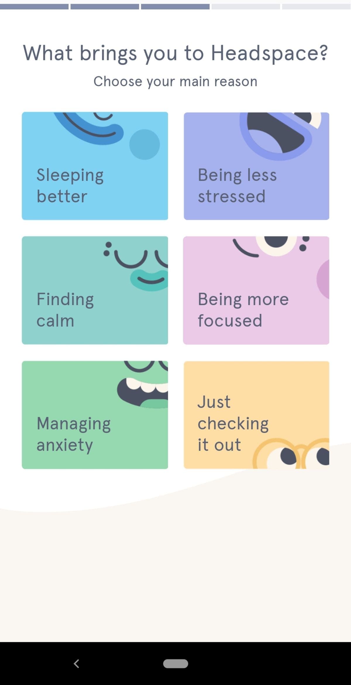
Headspace serves users with very different goals - stress management, better sleep, focus improvement, general mindfulness. Rather than guessing which content to serve, Headspace asks new users to self-segment during onboarding by selecting their experience level and primary goal. The result is a personalized first session that feels immediately relevant.
What is notable about Headspace's approach is how few choices they present: the onboarding asks just two or three questions, each with a small set of options. This keeps the flow fast while still collecting enough data to personalize the experience. The progress indicator at the top of the screen (a progress bar pattern) reinforces that the setup will be brief. For SaaS onboarding, this combination of persona-based routing and visual progress cues is a model worth studying.
Use the table below to choose an appropriate pattern based on your product's needs:
Every pattern above can be built with open-source tools (open-source modal plugins, tooltip plugins, Intro.js) or with a SaaS platform. Open-source gives you full control but requires engineering for every change. A platform like Appcues lets product and marketing teams own the experience directly, with built-in analytics and no deploy cycle. For a deeper look at SaaS onboarding implementation approaches, see our dedicated guide.
The patterns and practices in this guide are the starting point. The next step is putting them to work in your product - building the flows, measuring the results, and iterating on what you learn. Appcues gives product and growth teams the tools to do all of that without engineering bottlenecks.
Book a demo to see how Appcues can help you design onboarding experiences that turn new users into engaged customers.


.png)