← Visit Appcues.com
×
×

How to simplify complex user onboarding for mobile

Smaller screens demand simpler onboarding. Here's how to streamline your mobile onboarding and improve your app abandonment rates.
Skip to section:

Skip to section:

Editor's note: This article was updated and republished in November 2019.

The average 2-week retention rate for mobile apps is less than 10%. And by the 90-day mark, 71% of users will have churned completely, never to return.

No matter how you look at it, those are some pretty startling numbers. And in fact, of the more than 2 million apps in each of the leading app stores, only a few thousand sustain significant traffic.

According to Ankit Jain, founding partner at Gradient Ventures and former Head of Search and Discovery at Google Play, bending that retention curve happens through effective activation and onboarding:

“Users try out a lot of apps but decide which ones they want to ‘stop using’ within the first three-to-seven days. For ‘decent’ apps, the majority of users retained for seven days stick around much longer. The key to success is to get the users hooked during that critical first three-to-seven day period.”

Getting users invested in your product within the first few days—and on the first visit, in particular—is critical to keeping those users around as long as possible. Smaller screens bring with them a host of usability constraints: scaled-down interfaces, cluttered menus, and error-prone input, to name just a few.

So how do you onboard users when your mobile product is complex?

While there's no silver bullet for mobile onboarding, there are a few simple strategies you can steal from the top mobile apps to tame the complexity of your mobile app onboarding.

But first, it's helpful to understand why mobile onboarding is different from desktop onboarding and the psychological principles behind those differences. Let's take a look:

Challenges of mobile onboarding

Choice paralysis

Many onboarding flows for desktop applications are geared towards exploration. While users might need some guidance to get started, desktop apps frequently offer a lot more freedom for users to click around and explore the features of the product.

The restrictions of smaller mobile interfaces make that kind of exploration much more difficult. If a mobile app were to present a user experience that was designed for bigger screens, it would end up overwhelming most users, making them less likely to be successful with your app.

Nearly 2 decades ago, psychologists Sheena Iyengar and Mark Lepper published a study (affectionately known as the “jam study”) that illustrates this point well. The researchers ran an experiment in which they presented shoppers in a California grocery store with a table a variety of different jams to sample. Every few hours, they would switch between offering samples of 6 jams, to offering a collection of 24 different jams. The researchers gave any customer who tasted a jam a coupon good for $1 off any jar of jam.

Roughly 30% of people who sampled the smaller collection ended up buying jam, while only 3% of those who sampled the larger group made a purchase.

In other words, even though people may say they want more options, too many choices actually results in indecision and, ultimately, inaction.

Key takeaway: Giving users too many choices in your mobile onboarding sequence can overwhelm them and actually increase app abandonment rates.

Poetry versus prose

People expect mobile experiences to be much faster and more concise than their desktop counterparts. In fact, a survey by Clutch found that 72% of respondents believed that the onboarding process for mobile apps should take 60 seconds or less.

Samuel Hulick of UserOnboard.com describes the difference between desktop and mobile onboarding on GrowthHackers:

My thought on mobile vs. web has always been akin to "poetry vs. prose" -- it has to be a really compressed, elegant experience. Ideally the web experience can be held to the same high regard, but it seems like there's a little more room for error there.

Key takeaway: Your onboarding experience needs to be greatly simplified to meet the compressed timelines and distraction-heavy environment that comes with mobile devices.

The Flow Model

First introduced by psychologist Mihaly Csíkszentmihályi in his book Flow: The Psychology of Optimal Experience, the Flow Model seeks to explain the feeling of concentration and productivity that we experience when we're able to focus entirely on a specific task.

Csíkszentmihályi discovered that there exists a sweet spot where the level of challenge presented by a task balances the user's skill level. It's within this zone that both frustration and boredom can be avoided, and the user experiences a state of “flow.”
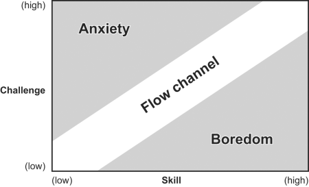
This is a graph showing a flow channel that bisects areas of anxiety and boredom, showing the relationship between challenge and skill in enjoyment of a task. This is a model introduced by Mihaly Csíkszentmihályi. It is an example of using psychology in UX.
Image credit

The goal of your mobile onboarding should be to keep users in this state for as long as possible, engaged but not overwhelmed. If the onboarding process becomes too difficult or users experience too many unnecessary points of friction, they will become anxious and more likely to abandon your app.

Key takeaway: Your aim should be to remove as much unnecessary friction as possible from your mobile onboarding experience, to help users stay within this optimal state of productivity and focus.

A framework for simplified mobile onboarding

Using our insights from the section above, we can now establish a framework for simplifying onboarding to meet the challenges of mobile. While many of the same concepts apply to both desktop and mobile onboarding, the nature of mobile demands that you take each one at least a step further than you would for a desktop application.

When designing and refining mobile onboarding, your 3 principle goals should be to:

1. Help users reach your app's core value quickly

Begin by thinking about the core value of your app. Ask yourself:

  • How can you simplify your existing desktop onboarding to help mobile users get to that core value even faster?
  • What are the key activation events for your product?
  • Are there any steps you can cut from the process, or choices you can eliminate to help users reach their aha moment more quickly?

While you might get away with a more extensive onboarding flow for a desktop application, trying to explain every feature of a sophisticated mobile app within the first session is a recipe for disaster. The best way to help your users become more successful with your app is to reduce the number of steps and choices in your onboarding process.

One of the most effective ways to see which steps you can safely cut is to reorient how you're introducing your app to the user. Instead of walking them through the app feature-by-feature, organize your onboarding flows based on value—aka, how your app can solve users' problems.

Frequently, focusing on value over features will let you cut a significant number of steps from your onboarding process—by giving users fewer options, they're much less likely to experience choice paralysis and much more likely to continue using your app.

Duolingo's mobile app is a perfect example of an app that helps users reach their core value quickly.
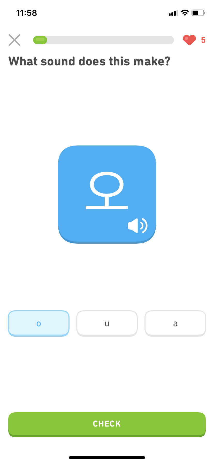
duolingo language lesson mobile app screenshot. this is a great example of mobile user onboarding

With a clear value proposition of helping users learn a new language quickly and easily, Duolingo's mobile onboarding experience starts delivering on that promise almost immediately. Users can experience lessons matched to their experience level and set their learning goals before even being asked to register for an account.
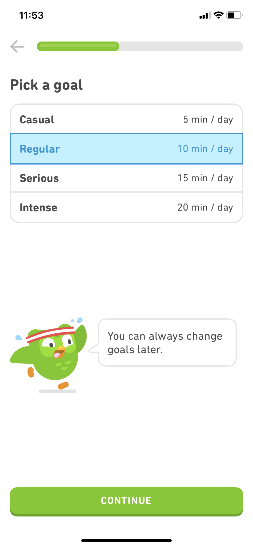
duolingo mobile app screenshot of account setup and language learning goals screen.

From the moment users begin their first session, the focus remains on providing the core benefit of the app.

2. Break down long processes into shorter steps

Next, consider how mobile usage differs from desktop. Mobile users are frequently on the go, balancing the use of their phones with other tasks they might be completing at the same time. 

Users may only have a short window of time to complete your onboarding and will avoid starting the process unless they know they can finish it in a single sitting (or standing, or walking, or jogging—you get the point). 

Lengthy tasks like entering form details should therefore be broken down into multiple, shorter steps. By breaking these actions down, it becomes much easier to communicate how each step is relevant to the user and how that step helps them achieve the core value of the app.

At the beginning of a lengthy process, it can help to set expectations around how long things should take—a simple message explaining “this might take a few minutes to complete” often suffices.

As users progress through each step, it's essential to keep their motivation high. Use clear progress indicators like progress bars and checklists to help them feel like they're making progress towards an end goal, especially if your onboarding process is particularly complex. 

Finally, be sure to automatically save users' progress at each step, in case they need to leave your app and pick things up on a later visit.

Expensify's mobile app does a great job of breaking down a lengthy setup process into more manageable steps.
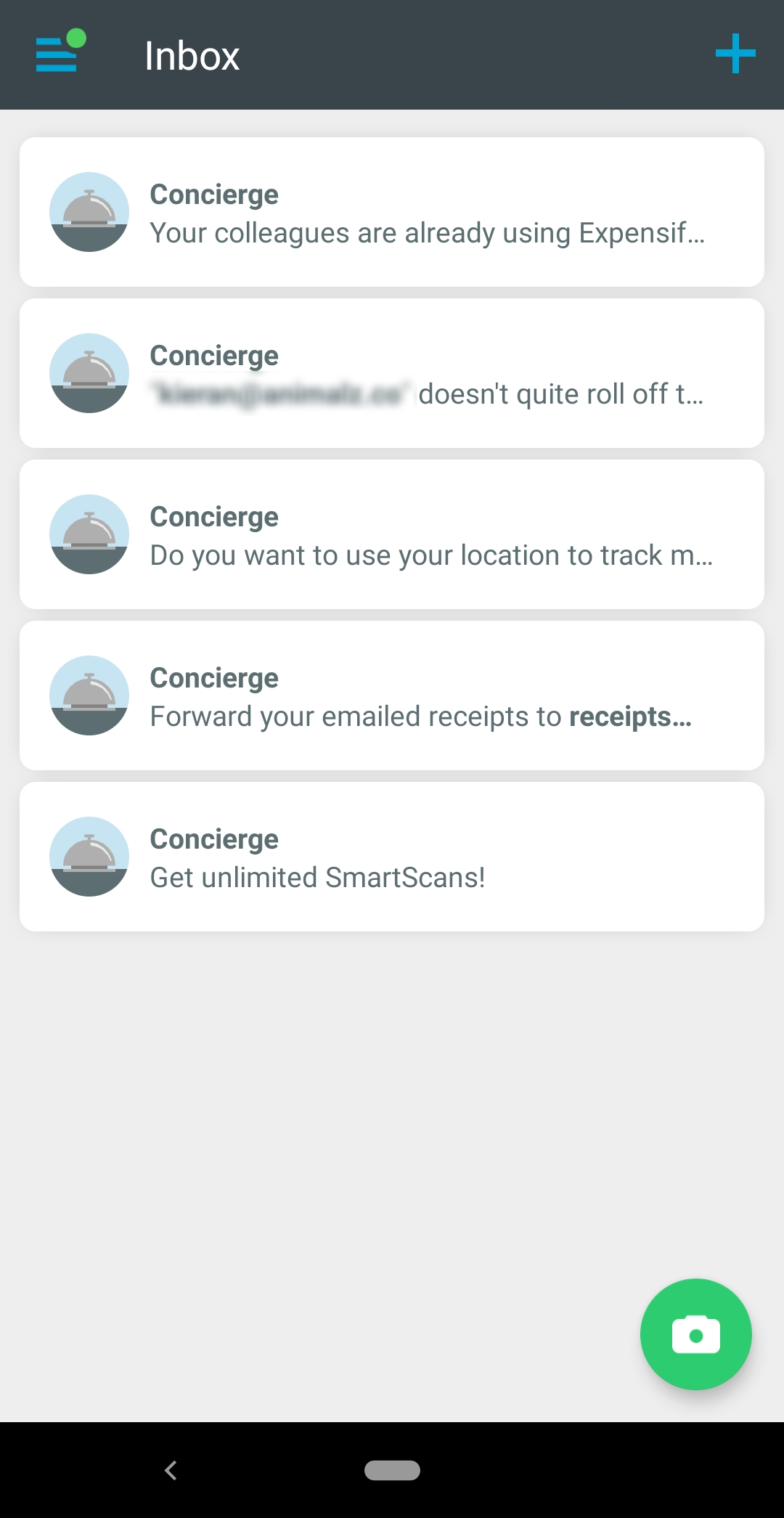
This is a screenshot of Expensify's mobile app concierge style onboarding sequence.

After signing up, the app presents an onboarding “Concierge,” with a set of steps that should be completed to begin using the app—like inviting colleagues, enabling location tracking, and forwarding expense receipts via email. The microcopy clearly communicates the value of each step, and the steps can be completed at any time, in any order, and are automatically hidden once completed. 

The Concierge approach ensures that users can complete Expensify's multi-step onboarding process in their own time.

3. Eliminate friction points that interrupt the onboarding flow

While it's nearly impossible to eliminate all friction from your onboarding, you can balance necessary friction against the skill and expectations of your mobile users to keep them in the "flow channel".

For instance, instead of forcing users to create a new account on your platform, make it easier to get started by integrating with an existing login platform, like Facebook or Google.

Scanning a QR code or taking a photo of a check can also make data entry much faster, and connecting to the users' existing list of contacts can simplify inviting colleagues to your app. 

Note, however, that most of these functions require you to request additional permissions on a users' mobile device. Asking at the wrong time or requesting unnecessary permissions confuses and annoys mobile users. Be sure you're only asking for permissions your app truly needs, and ensure you explain the context behind each request.

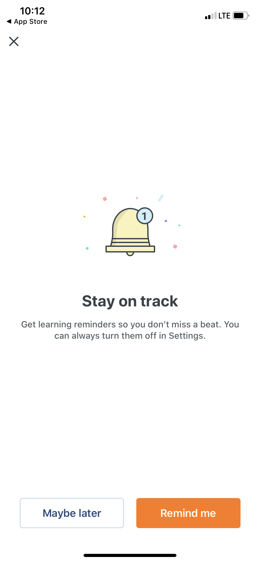
Babbel does a great job of smoothing down this point of friction with clear and contextual permission priming that makes the benefit of turning on push notification apparent to users—and makes it simple to decline this request as well.
Use what you learn from mobile to improve your desktop UX

While the interface restrictions and specific interactions might be different between desktop and mobile apps, the same simplification framework can be applied to desktop onboarding as well. 

Take Duolingo, for example—while their desktop onboarding includes a handful of extra options, it looks remarkably similar to their mobile interface:
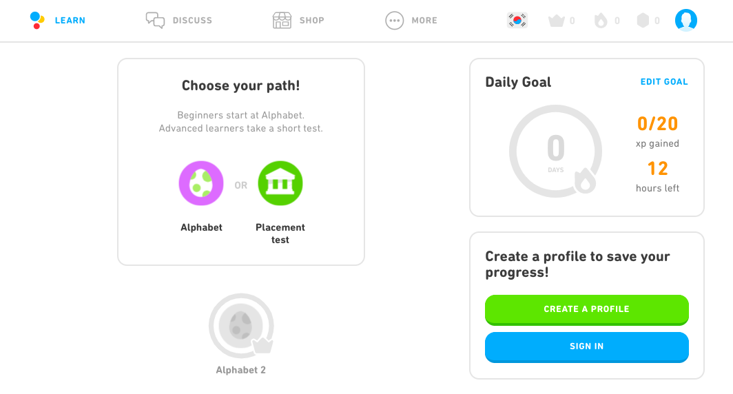
duolingo desktop app simplified user interface

By optimizing their mobile onboarding experience first, Duolingo was able to apply the lessons learned from mobile onboarding to improve their desktop experience as well by stripping away unnecessary elements.

Once you've refined your mobile onboarding, you should take the opportunity to revisit your desktop app with the same critical eye.

In conclusion

Simplifying complex user onboarding, whether you're working on a mobile or desktop app, is an ongoing process. There's always room for improvement.

Start by focusing on your app's core value—and how you can best help users achieve it—then ruthlessly cut the steps that don't get them there. Keep your eye out for any moments of friction, no matter how small, and think creatively about how to polish those down for a smoother experience. And then go back and do it all again!

Your users (and your abandonment rates) will thank you for it.
Go to the ultimate guide to user onboarding. Discover user onboarding definitions, examples, best practices, and resources.


Author's picture
Katryna Balboni
Content and Community Director at User Interviews
Katryna is the Content and Community Director at User Interviews. Before User Interviews, she made magic happen with all things content at Appcues. Her non-work time is spent traveling to new places, befriending street cats, and baking elaborate pies.
Skip to section:

Skip to section:

Editor's note: This article was updated and republished in November 2019.

The average 2-week retention rate for mobile apps is less than 10%. And by the 90-day mark, 71% of users will have churned completely, never to return.

No matter how you look at it, those are some pretty startling numbers. And in fact, of the more than 2 million apps in each of the leading app stores, only a few thousand sustain significant traffic.

According to Ankit Jain, founding partner at Gradient Ventures and former Head of Search and Discovery at Google Play, bending that retention curve happens through effective activation and onboarding:

“Users try out a lot of apps but decide which ones they want to ‘stop using’ within the first three-to-seven days. For ‘decent’ apps, the majority of users retained for seven days stick around much longer. The key to success is to get the users hooked during that critical first three-to-seven day period.”

Getting users invested in your product within the first few days—and on the first visit, in particular—is critical to keeping those users around as long as possible. Smaller screens bring with them a host of usability constraints: scaled-down interfaces, cluttered menus, and error-prone input, to name just a few.

So how do you onboard users when your mobile product is complex?

While there's no silver bullet for mobile onboarding, there are a few simple strategies you can steal from the top mobile apps to tame the complexity of your mobile app onboarding.

But first, it's helpful to understand why mobile onboarding is different from desktop onboarding and the psychological principles behind those differences. Let's take a look:

Challenges of mobile onboarding

Choice paralysis

Many onboarding flows for desktop applications are geared towards exploration. While users might need some guidance to get started, desktop apps frequently offer a lot more freedom for users to click around and explore the features of the product.

The restrictions of smaller mobile interfaces make that kind of exploration much more difficult. If a mobile app were to present a user experience that was designed for bigger screens, it would end up overwhelming most users, making them less likely to be successful with your app.

Nearly 2 decades ago, psychologists Sheena Iyengar and Mark Lepper published a study (affectionately known as the “jam study”) that illustrates this point well. The researchers ran an experiment in which they presented shoppers in a California grocery store with a table a variety of different jams to sample. Every few hours, they would switch between offering samples of 6 jams, to offering a collection of 24 different jams. The researchers gave any customer who tasted a jam a coupon good for $1 off any jar of jam.

Roughly 30% of people who sampled the smaller collection ended up buying jam, while only 3% of those who sampled the larger group made a purchase.

In other words, even though people may say they want more options, too many choices actually results in indecision and, ultimately, inaction.

Key takeaway: Giving users too many choices in your mobile onboarding sequence can overwhelm them and actually increase app abandonment rates.

Poetry versus prose

People expect mobile experiences to be much faster and more concise than their desktop counterparts. In fact, a survey by Clutch found that 72% of respondents believed that the onboarding process for mobile apps should take 60 seconds or less.

Samuel Hulick of UserOnboard.com describes the difference between desktop and mobile onboarding on GrowthHackers:

My thought on mobile vs. web has always been akin to "poetry vs. prose" -- it has to be a really compressed, elegant experience. Ideally the web experience can be held to the same high regard, but it seems like there's a little more room for error there.

Key takeaway: Your onboarding experience needs to be greatly simplified to meet the compressed timelines and distraction-heavy environment that comes with mobile devices.

The Flow Model

First introduced by psychologist Mihaly Csíkszentmihályi in his book Flow: The Psychology of Optimal Experience, the Flow Model seeks to explain the feeling of concentration and productivity that we experience when we're able to focus entirely on a specific task.

Csíkszentmihályi discovered that there exists a sweet spot where the level of challenge presented by a task balances the user's skill level. It's within this zone that both frustration and boredom can be avoided, and the user experiences a state of “flow.”

This is a graph showing a flow channel that bisects areas of anxiety and boredom, showing the relationship between challenge and skill in enjoyment of a task. This is a model introduced by Mihaly Csíkszentmihályi. It is an example of using psychology in UX.
Image credit

The goal of your mobile onboarding should be to keep users in this state for as long as possible, engaged but not overwhelmed. If the onboarding process becomes too difficult or users experience too many unnecessary points of friction, they will become anxious and more likely to abandon your app.

Key takeaway: Your aim should be to remove as much unnecessary friction as possible from your mobile onboarding experience, to help users stay within this optimal state of productivity and focus.

A framework for simplified mobile onboarding

Using our insights from the section above, we can now establish a framework for simplifying onboarding to meet the challenges of mobile. While many of the same concepts apply to both desktop and mobile onboarding, the nature of mobile demands that you take each one at least a step further than you would for a desktop application.

When designing and refining mobile onboarding, your 3 principle goals should be to:

1. Help users reach your app's core value quickly

Begin by thinking about the core value of your app. Ask yourself:

  • How can you simplify your existing desktop onboarding to help mobile users get to that core value even faster?
  • What are the key activation events for your product?
  • Are there any steps you can cut from the process, or choices you can eliminate to help users reach their aha moment more quickly?

While you might get away with a more extensive onboarding flow for a desktop application, trying to explain every feature of a sophisticated mobile app within the first session is a recipe for disaster. The best way to help your users become more successful with your app is to reduce the number of steps and choices in your onboarding process.

One of the most effective ways to see which steps you can safely cut is to reorient how you're introducing your app to the user. Instead of walking them through the app feature-by-feature, organize your onboarding flows based on value—aka, how your app can solve users' problems.

Frequently, focusing on value over features will let you cut a significant number of steps from your onboarding process—by giving users fewer options, they're much less likely to experience choice paralysis and much more likely to continue using your app.

Duolingo's mobile app is a perfect example of an app that helps users reach their core value quickly.

duolingo language lesson mobile app screenshot. this is a great example of mobile user onboarding

With a clear value proposition of helping users learn a new language quickly and easily, Duolingo's mobile onboarding experience starts delivering on that promise almost immediately. Users can experience lessons matched to their experience level and set their learning goals before even being asked to register for an account.

duolingo mobile app screenshot of account setup and language learning goals screen.

From the moment users begin their first session, the focus remains on providing the core benefit of the app.

2. Break down long processes into shorter steps

Next, consider how mobile usage differs from desktop. Mobile users are frequently on the go, balancing the use of their phones with other tasks they might be completing at the same time. 

Users may only have a short window of time to complete your onboarding and will avoid starting the process unless they know they can finish it in a single sitting (or standing, or walking, or jogging—you get the point). 

Lengthy tasks like entering form details should therefore be broken down into multiple, shorter steps. By breaking these actions down, it becomes much easier to communicate how each step is relevant to the user and how that step helps them achieve the core value of the app.

At the beginning of a lengthy process, it can help to set expectations around how long things should take—a simple message explaining “this might take a few minutes to complete” often suffices.

As users progress through each step, it's essential to keep their motivation high. Use clear progress indicators like progress bars and checklists to help them feel like they're making progress towards an end goal, especially if your onboarding process is particularly complex. 

Finally, be sure to automatically save users' progress at each step, in case they need to leave your app and pick things up on a later visit.

Expensify's mobile app does a great job of breaking down a lengthy setup process into more manageable steps.

This is a screenshot of Expensify's mobile app concierge style onboarding sequence.

After signing up, the app presents an onboarding “Concierge,” with a set of steps that should be completed to begin using the app—like inviting colleagues, enabling location tracking, and forwarding expense receipts via email. The microcopy clearly communicates the value of each step, and the steps can be completed at any time, in any order, and are automatically hidden once completed. 

The Concierge approach ensures that users can complete Expensify's multi-step onboarding process in their own time.

3. Eliminate friction points that interrupt the onboarding flow

While it's nearly impossible to eliminate all friction from your onboarding, you can balance necessary friction against the skill and expectations of your mobile users to keep them in the "flow channel".

For instance, instead of forcing users to create a new account on your platform, make it easier to get started by integrating with an existing login platform, like Facebook or Google.

Scanning a QR code or taking a photo of a check can also make data entry much faster, and connecting to the users' existing list of contacts can simplify inviting colleagues to your app. 

Note, however, that most of these functions require you to request additional permissions on a users' mobile device. Asking at the wrong time or requesting unnecessary permissions confuses and annoys mobile users. Be sure you're only asking for permissions your app truly needs, and ensure you explain the context behind each request.

Babbel does a great job of smoothing down this point of friction with clear and contextual permission priming that makes the benefit of turning on push notification apparent to users—and makes it simple to decline this request as well.

Use what you learn from mobile to improve your desktop UX

While the interface restrictions and specific interactions might be different between desktop and mobile apps, the same simplification framework can be applied to desktop onboarding as well. 

Take Duolingo, for example—while their desktop onboarding includes a handful of extra options, it looks remarkably similar to their mobile interface:

duolingo desktop app simplified user interface

By optimizing their mobile onboarding experience first, Duolingo was able to apply the lessons learned from mobile onboarding to improve their desktop experience as well by stripping away unnecessary elements.

Once you've refined your mobile onboarding, you should take the opportunity to revisit your desktop app with the same critical eye.

In conclusion

Simplifying complex user onboarding, whether you're working on a mobile or desktop app, is an ongoing process. There's always room for improvement.

Start by focusing on your app's core value—and how you can best help users achieve it—then ruthlessly cut the steps that don't get them there. Keep your eye out for any moments of friction, no matter how small, and think creatively about how to polish those down for a smoother experience. And then go back and do it all again!

Your users (and your abandonment rates) will thank you for it.

Go to the ultimate guide to user onboarding. Discover user onboarding definitions, examples, best practices, and resources.


Author's picture
Katryna Balboni
Content and Community Director at User Interviews
Katryna is the Content and Community Director at User Interviews. Before User Interviews, she made magic happen with all things content at Appcues. Her non-work time is spent traveling to new places, befriending street cats, and baking elaborate pies.
You might also like...