.png)
Onboarding optimization is a continuous loop, not a one-time project. It's the ongoing process of measuring, testing, and improving how new users reach their first value moment.
This guide gives you a repeatable system: the 5 metrics you should track, a 4-step optimization framework you can run on a 2-to-4 week cycle, and the highest-impact fixes that actually move activation rates.
Unlike static best-practices lists, this is a framework you can run again and again, compounding your gains across every cohort.
Onboarding optimization is the systematic process of analyzing how new users move through your product's early experience, identifying where they get stuck, running experiments to reduce friction, and iterating until more users reach activation.
It's worth separating this from two things it's often confused with.
Onboarding design is building the first version: choosing which steps to include, writing the copy, setting up the flow. That's V1. User onboarding best practices are the static lists you've probably already read: "use a welcome survey," "add a checklist," "send a Day 1 email." Useful starting points, but they don't tell you what's actually broken in your product.
Onboarding optimization starts after launch. It's what happens when you treat your user onboarding like a product with its own roadmap, its own metrics, and its own experimentation cycle. You stop thinking of onboarding as something you "set and forget" and start thinking of it as a system you improve every sprint.
This applies across every channel your users touch: in-app flows, onboarding emails, mobile push notifications, even support documentation. If it shapes how a new user experiences your product in the first days, it's fair game for optimization.
A useful mental model here is Appcues' "understand, decide, act, learn" loop. You understand user behavior through data. You decide what to change based on that data. You act by shipping an experiment. And you learn from the results, feeding those insights back into the next cycle. That loop is the engine behind every framework in this guide.
Activation rate is the single strongest predictor of long-term retention and revenue in SaaS. If users don't reach their first value moment quickly, they don't stick around, and no amount of re-engagement email can fix a broken first experience.
The data backs this up. According to research from Mixpanel, users who complete key activation events in their first session are over 3x more likely to be retained at Day 30 than users who don't. That's not a marginal difference. It's the gap between a growing product and a leaky funnel.
Companies that actively optimize onboarding see measurable results: higher trial-to-paid conversion benchmarks, lower first-90-day churn, and faster time to expansion revenue. SaaS conversion data from ChartMogul confirms these patterns across hundreds of software products. These aren't theoretical improvements. A SaaS company running onboarding experiments on a regular cadence can reasonably expect 10-30% improvement in activation rates over 2-3 quarters.
The cost of not optimizing is equally concrete. Most users who don't activate in their first session never come back. You've already paid to acquire them through marketing, sales, or product-led growth motions. Every user who bounces off a confusing empty state or a 12-step setup wizard is acquisition spend you'll never recover.
Here's what makes onboarding optimization especially powerful: the returns compound. Every percentage point of activation improvement applies to every future cohort. If you add 1,000 new users per month and improve activation by 5 percentage points, that's 50 more activated users every month, forever. Over a year, that's 600 additional activated users from a single improvement, and the effect stacks with each subsequent optimization. That's the core of value-first onboarding: accelerating the growth loop that activation creates.
You can't optimize what you don't measure. These five metrics give you a complete picture of onboarding health, from the macro (is it working?) to the micro (where is it breaking?). For a deeper dive into each, see our full guide to onboarding metrics and KPIs.
This is the percentage of users who finish your defined onboarding flow. It's your top-of-funnel indicator for whether the experience is even viable. If users aren't completing onboarding, nothing downstream matters.
Benchmark: 60-70% completion rate is a solid target for SaaS products. If you're below 50%, you likely have a structural problem: too many steps, unclear value, or a flow that asks too much before delivering anything.

Time to value measures how long it takes a new user to reach their first meaningful outcome. That might be sending their first campaign, creating their first report, or inviting a teammate.
Track median, not average. A handful of power users who activate in 30 seconds will skew your average and hide the majority of users who are struggling. Median TTV tells you what the typical user actually experiences.

Activation rate is the percentage of new signups who complete a predefined set of key actions that correlate with long-term retention. This is your leading indicator. If activation goes up, retention almost always follows.
The tricky part: defining "activated" correctly. Your activation criteria should be validated against retention data, not assumed. Look for the actions that best predict whether a user is still active at Day 30 or Day 60. Learn how to identify your product's activation metric to get this right.

This is funnel analysis applied to your onboarding flow. You're looking at the specific steps where users abandon the process. Maybe 90% of users complete step 1, but only 40% make it past step 3.
This metric tells you where to focus. The biggest drop-off is your biggest opportunity. Don't guess; let the data point you to the specific moment users lose momentum.
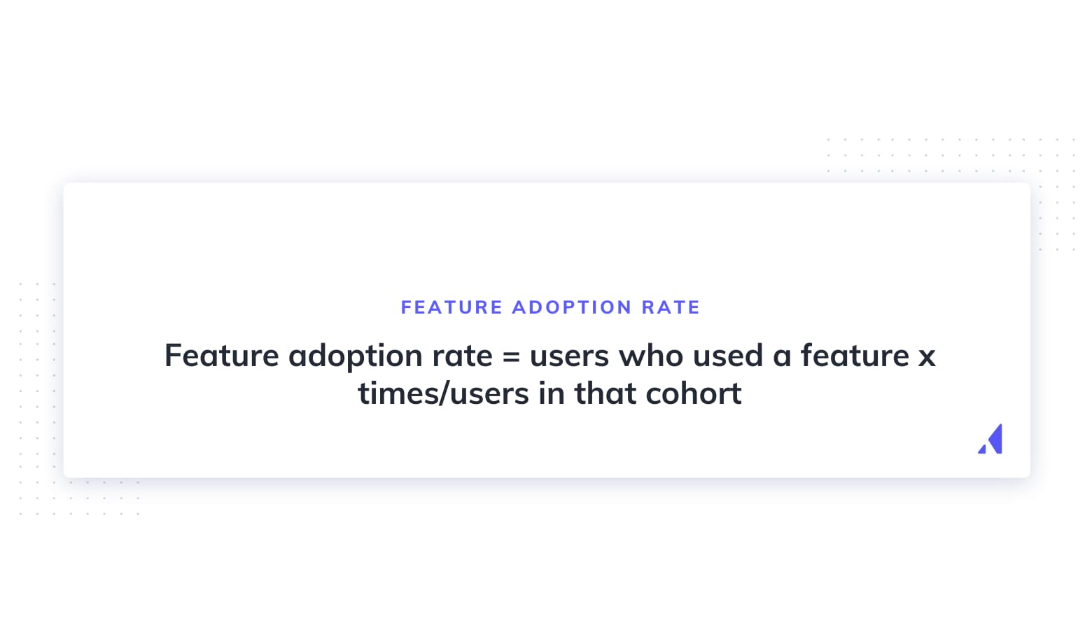
This measures which features new users actually engage with during the onboarding window. It helps you understand whether users are discovering the capabilities that matter most for long-term success.
If users complete onboarding but skip your core differentiating features, you've got a flow that checks boxes without building habits. Compare feature adoption patterns between users who retain and users who churn to identify which features your onboarding should prioritize.
This is the core of the system. A repeatable four-step loop you can run every 2-4 weeks to continuously improve your onboarding. For additional context on this approach, see Reforge's guide on new user onboarding.
Start by mapping your onboarding funnel end to end. Every step, every screen, every email. Then layer on the data: where are users dropping off, and how many?
Combine quantitative data (funnel analytics, session recordings, event tracking) with qualitative signals (user interviews, support tickets, NPS verbatims). Numbers tell you where the problem is. Conversations tell you why.
Prioritize by impact. A 30% drop-off at a step that 100% of users reach is a bigger opportunity than a 50% drop-off at a step only 20% of users see. Multiply the drop-off rate by the volume of users affected to rank your targets.
Don't try to fix everything at once. Pick the single biggest friction point and make that your focus for this cycle. An onboarding checklist can help you audit your funnel systematically.
Translate your diagnosis into a testable hypothesis: "If we [change], we expect [metric] to improve by [amount] because [reason]."
For example: "If we replace the 5-field account setup form with a single-field entry plus progressive profiling, we expect step 2 completion to increase by 15% because users can reach the product faster."
Common fix categories include:
The principle of progressive disclosure is key here: show users only what they need at each step, and reveal complexity gradually.
Test one variable at a time. If you change three things simultaneously and activation goes up, you won't know which change mattered.
Run an A/B test when you have enough traffic. Split new users between the current experience and your variant, then measure against your target metric for at least one full cycle (typically 1-2 weeks, depending on signup volume).
If your volume is too low for a statistically significant A/B test, use before/after cohort analysis instead. Compare a cohort from the two weeks before your change to a cohort from the two weeks after. It's not as clean, but it's better than guessing.
Define your success criteria upfront. What metric are you tracking, and what counts as a win? A 5% improvement in step completion? A 10-second reduction in TTV? Lock this down before you launch the test, not after.
This is where Appcues makes a real difference. Non-engineers can build and test onboarding variants (tooltips, modals, checklists, slideouts) without code deploys. That means your experimentation cycle isn't bottlenecked by sprint planning. Product and growth teams can ship a test in hours, not weeks.
When you have a clear winner, roll it out to 100% of users. Document what you tested, what you found, and why the winner worked. This documentation is critical because it builds institutional knowledge and prevents future teams from re-running experiments you've already settled.
Then queue up your next target. Go back to step 1, pull up your funnel data, and identify the next biggest drop-off. Aim for 2-4 week optimization cycles. That cadence gives you enough time to run a meaningful test while keeping momentum.
Over the course of a quarter, that's 3-6 experiments. Over a year, it's 12-24 compounding improvements. That's how good onboarding teams consistently outperform their benchmarks.
These are the changes that tend to move the needle most. Each one is backed by a clear mechanism and includes a concrete example.
Not every user needs the same onboarding path. A project management tool might route managers toward team setup and reporting views, while individual contributors see task creation and personal workflows first. Capture role or use case during signup (a short welcome survey works well), then branch users into tailored flows.
Why it works: users reach relevant value faster because they skip steps that don't apply to them. Products that personalize onboarding by segment typically see 10-20% higher completion rates than those running a single generic flow. See real-world onboarding examples for inspiration on how companies segment their flows.
The classic product tour ("Here's the dashboard. Here's the sidebar. Here's settings.") is a lecture. Action-driven guidance asks users to do something meaningful. Canva doesn't show you where the tools are; it prompts you to create your first design. That single action teaches more than a 10-step tour ever could.
Swap passive "click next" product tours for prompts that lead to a real outcome. "Create your first project," "Invite a teammate," or "Send a test message." Each action should bring the user closer to their activation moment.
Checklists and progress bars give users a clear sense of how far they've come and how much is left. This reduces the uncertainty that causes drop-offs ("How much more of this is there?") and taps into the completion effect: people are more likely to finish a task when they can see the finish line.
Products using onboarding checklists regularly report 15-25% higher completion rates. Keep the checklist short (3-5 items) and tie each item to a meaningful action, not busywork.
When a user lands in your product for the first time, an empty dashboard is a dead end. Pre-populate sample data, offer templates, or surface a guided prompt that says, "Here's what to do first."
Notion does this well by offering template galleries during onboarding. Instead of staring at a blank page, users start from a structure that matches their use case. The result is faster first value and lower bounce rates.
In-app is just one touchpoint. The best onboarding programs coordinate across in-app flows, email sequences, and mobile onboarding. A user who completes step 1 in-app but doesn't return the next day should get a targeted email nudging them toward step 2.
The key is coordination: make sure your channels complement each other rather than repeating the same message. In-app handles real-time guidance. Email handles re-engagement and context when users are outside the product. Push handles time-sensitive prompts on mobile.
You can't improve what you haven't baselined. Teams that jump straight to "let's add a checklist" without first mapping their funnel and identifying drop-offs are guessing. And guessing burns cycles. Invest in instrumentation first. Track the 5 metrics above before you change anything.
New users don't need to see everything your product can do. They need to see the one thing that will make them say, "This is worth coming back to." Feature overload is one of the most common reasons onboarding flows underperform. Ruthlessly prioritize. If a feature isn't essential for first value, save it for a secondary onboarding phase or a feature announcement later.
A startup founder, an enterprise admin, and a team member all have different goals, different contexts, and different tolerance for setup complexity. Running all three through the same linear flow guarantees that at least two of them will have a suboptimal experience. Segment early, personalize early.
If your in-app onboarding is polished but your email sequence is generic (or nonexistent), you're losing every user who doesn't complete onboarding in a single session. And most users don't. Onboarding email should be behavior-triggered, not time-triggered. Send the next email based on what the user did (or didn't do), not based on "it's been 24 hours."
You've got the framework, the metrics, and the playbook. Now you need the platform to execute it. Appcues gives product and growth teams the tools to build, test, and personalize onboarding experiences across in-app, email, and mobile, without waiting on engineering.
Book a demo to see how teams run the optimization loop faster with Appcues.