.png)
The best user engagement examples share a few things in common: they start with what users are doing, deliver value at the right moment, and use the right channel for the job. In this guide, we round up real engagement examples from product-led B2B teams (GoToWebinar, Sitemate, Circa, Accelo, ProfitWell, Zywave, Printify), consumer apps (Spotify, Apple Music, Trello, Airtable, UberEats, Mailchimp), and a deep dive into how the world's biggest travel sites engage users, plus the frameworks and channel playbooks behind them.
User engagement is how actively customers interact with your product across in-app, email, and other touchpoints—measured by the frequency, depth, and recency of meaningful actions. Engaged users come back, bring their friends, and advocate for your brand, which translates directly into stronger activation, higher retention, and expansion revenue.
The bar for great engagement keeps rising. People are accustomed to consumer apps that respond to their behavior in real time, so they expect the same from every product they use, B2B included. The examples in this guide show what that looks like in practice.
The case studies in this guide span SaaS, heavy-industry software, and consumer apps. Here's what teams are actually achieving with behavior-based engagement experiences:
Now let's get into how each one works, [lus 20+ more examples from consumer apps, B2B SaaS, and travel sites.
Ever find yourself constantly recommending that one cafe? Not just because the coffee is top-notch, but because the place just gets you—the cozy ambiance, the barista who remembers your order, the occasional freebie. That's user engagement in its purest form: you're not just a customer, you're an advocate.
Engaged users experience your brand in a way that sticks with them long after they've signed up. They come back, bring their friends, and shout your praises from the rooftops. That's why savvy product teams are doubling down on engagement strategies that resonate deeply and personally.
But how, exactly? It's more than just the product itself; it's the whole experience:
Translate that to software, and you get the same outcomes engagement strategies are built to drive:
Engaged users aren't just happier. They're more invested—and that investment compounds.
Ever noticed how some Netflix recommendations feel like they're reading your mind, while others make you wonder if they've ever met you? That's the difference between messages that connect and ones that just add to the noise.
Think of user messages like conversations at a party. Nobody likes the person who only talks about themselves and never reads the room. Yet that's exactly what most product messages do:
"Your best message isn't about your product—it's really about your customer and how they could change for the better. If you approach your story from that point of view, you're winning."— Emma Stratton, Founder, Punchy
Great messages start with understanding. Three rules to make every one count:
The perfect-message checklist before you hit send:
Channel selection is a strategic decision that can significantly impact your engagement results. The most powerful engagement strategies don't rely on a single channel—they orchestrate multiple channels working together as a coordinated system.
Best for: contextual guidance (tooltips that explain a feature as users encounter it), feature announcements, quick wins, immediate action items, on-demand education.
Not great for: complex explanations or recovery campaigns (you can't reach users who aren't actively in your product).
Printify's strategically placed tooltip drew attention to a critical onboarding step and resulted in a 10% uplift in conversion rate. Read the full story →

Best for: detailed explanations (e.g., monthly product updates with multiple sections), re-engagement of inactive users, milestone celebrations, strategic announcements.
Not great for: urgent updates—average email open rates of 15–25% mean many users will miss time-sensitive information—and context-dependent tasks disconnected from the product experience.
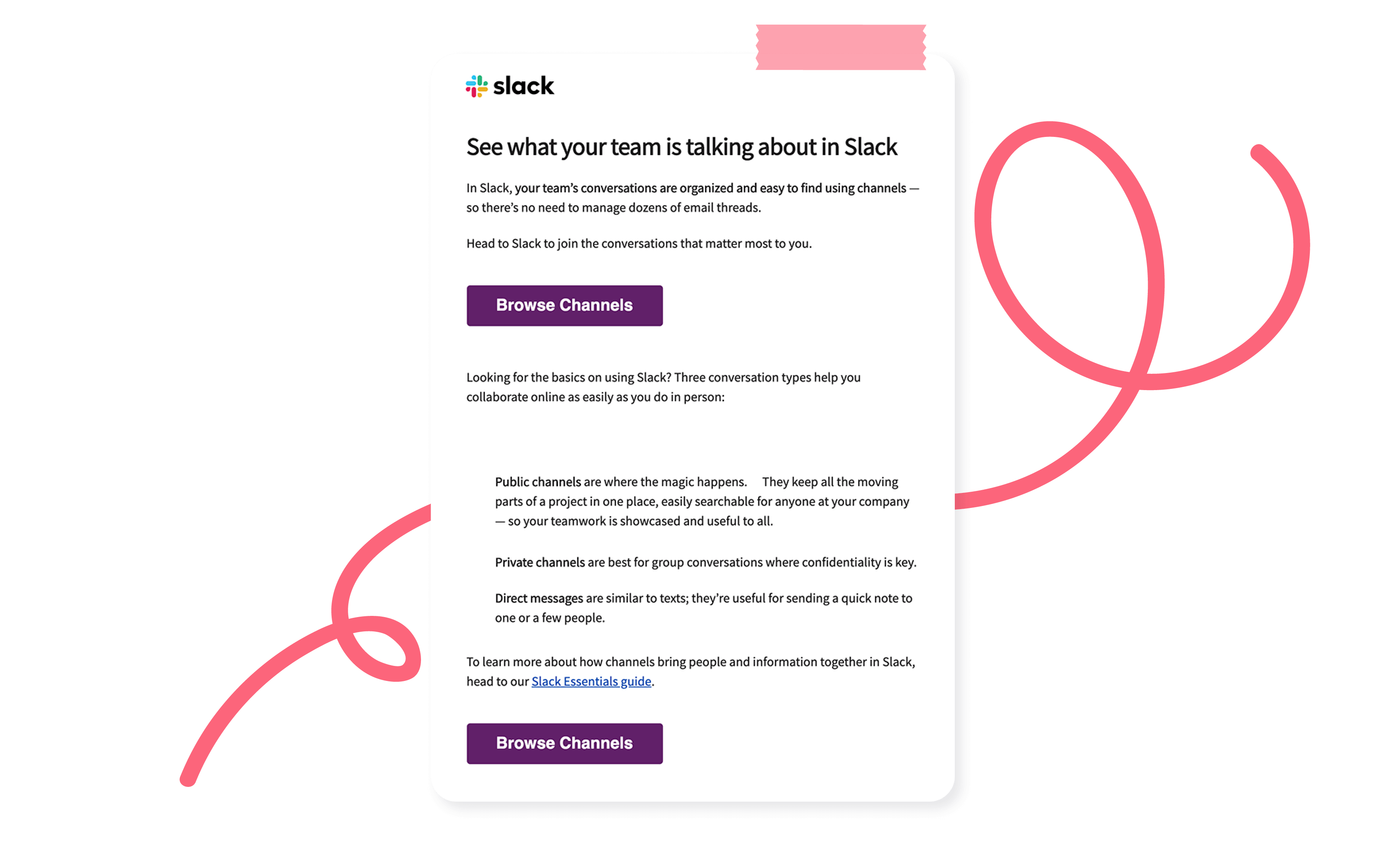
Slack's re-engagement email cleverly entices dormant users with a FOMO play, encouraging them to see what conversations their teammates are having. See more email examples on the Appcues blog →
Best for: time-sensitive updates regardless of where users are, important alerts requiring immediate attention, quick re-engagement at optimal moments.
Not great for: complex information (limited characters) or educational content (too brief for meaningful learning).
Spotify uses behavioral data to drive re-engagement via push, then continues the momentum with in-app experiences that lead users straight to value. More tips on push notifications →

The most powerful engagement strategies don't rely on a single channel—they orchestrate multiple channels working together as a coordinated system. This isn't about choosing in-app versus email; it's about designing how they complement each other to create a seamless experience at scale.
The key is designing these channels to share context and build on each other. Each touchpoint should acknowledge previous interactions and set up future ones.
Every channel is a tool in your engagement toolbox. The magic isn't in having all the tools—it's in knowing exactly when to use each one.
Strategic, in-the-moment messaging is one of the highest-leverage things a product team can do. Done right, it makes every customer feel like the guest of honor.
Personalization isn't sprinkling customer names across your messages. To create truly personalized experiences, every message should feel tailor-made.
Mailchimp uses a friendly banner during onboarding, encouraging customers to answer a few simple questions for personalized recommendations. Once customers answer, their dashboard highlights key insights tailored to their business and tips to optimize.

Just like a barista might start making your regular order as soon as you walk through the door, automated messages can create a similar experience that exudes anticipation and personal care.
The UberEats app triggers a discount to new customers when they log in for the first time. Since getting new customers to convert is a big hurdle, providing an incentive is a great way to get them to take the next step. The trick: recognizing that the customer has taken an action, registering it, and responding accordingly. It makes the product feel like a 2-way conversation.

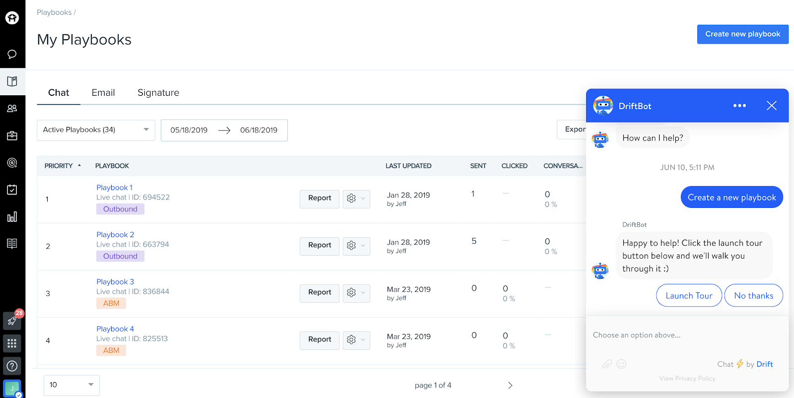
With users practically glued to their phones, chat tools have become the new face of customer service engagement. Chatbots help alleviate substantial support burden while getting customers the answers they need efficiently.
The key is to make it feel human. Start the conversation with a greeting before you address the customer's problem. Drift's chatbot provides the extra guidance a new user needs to navigate their platform.
Proactive help is especially important for the people who use business tools, because they're looking to complete a specific task as quickly and easily as possible. What sets sticky products apart is when their tooltips are accessible without detracting from the user's own experience.
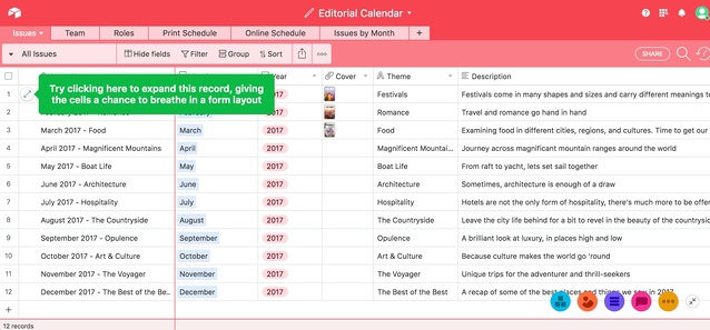
Airtable does this beautifully. Their tooltips appear in context as users spend more time in the product. The tooltips:
Tooltips like Airtable's provide preemptive help without making users a passive observer. They keep the most important thing at the forefront: helping the user as they engage with the product themselves.
Consumer apps can't rely on support teams to handle every user, so they build helpful features into the product to help users proactively, rather than retroactively.
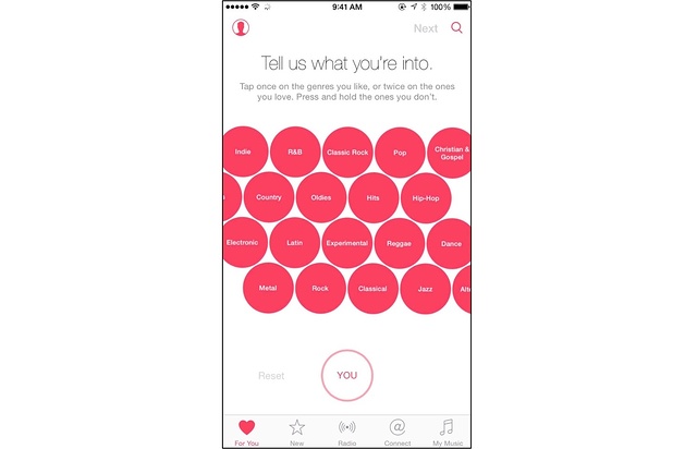
Apple Music's user onboarding sequence helps customers set up uniquely tailored playlists from the very first time they open the app. Consumer apps like this have to do this right away—or the user loses interest before figuring it out themselves.
Self-serve and freemium models put the product directly in users' hands. Trello's free plan is designed so users can start interacting with the product immediately. It's an organizational tool people work in all day; the freemium offering lets users see for themselves how it fits their workflow.
A bottom-up, self-serve model lets product-led companies scale logistically and strategically. Letting users engage with the product on their own takes the load off your team and earns buy-in from the people who'll actually use it. Long term, that strengthens brand image and reduces churn.

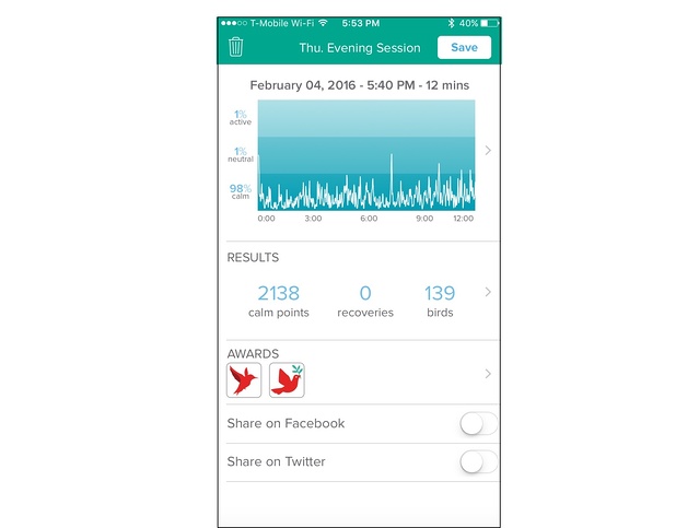
Consumer companies gamify their products so users are encouraged to hit the next checkpoint, unlock the next level, or reach a personal goal. The meditation app Muse gives users "calm points" for hitting meditation goals and shows them their usage in a dashboard that looks like a game screen.
This works for B2B, too. At Digital Ocean, the team identified in-product behaviors that signaled customers were about to build something high-value (adding team features, load-testing banners, usage spikes). Then they reached out with a relevant piece of technical content tied to what the user just did. They automated the entire process by syncing behavioral triggers to their CRM.
The data showed clear lift in upsells among the group that received outreach and responded—proving that identifying in-product behavioral triggers and automating responses makes it easy to provide relevant help to an expanding customer base, at scale.
More on this approach: How to influence user behavior with in-app cues →
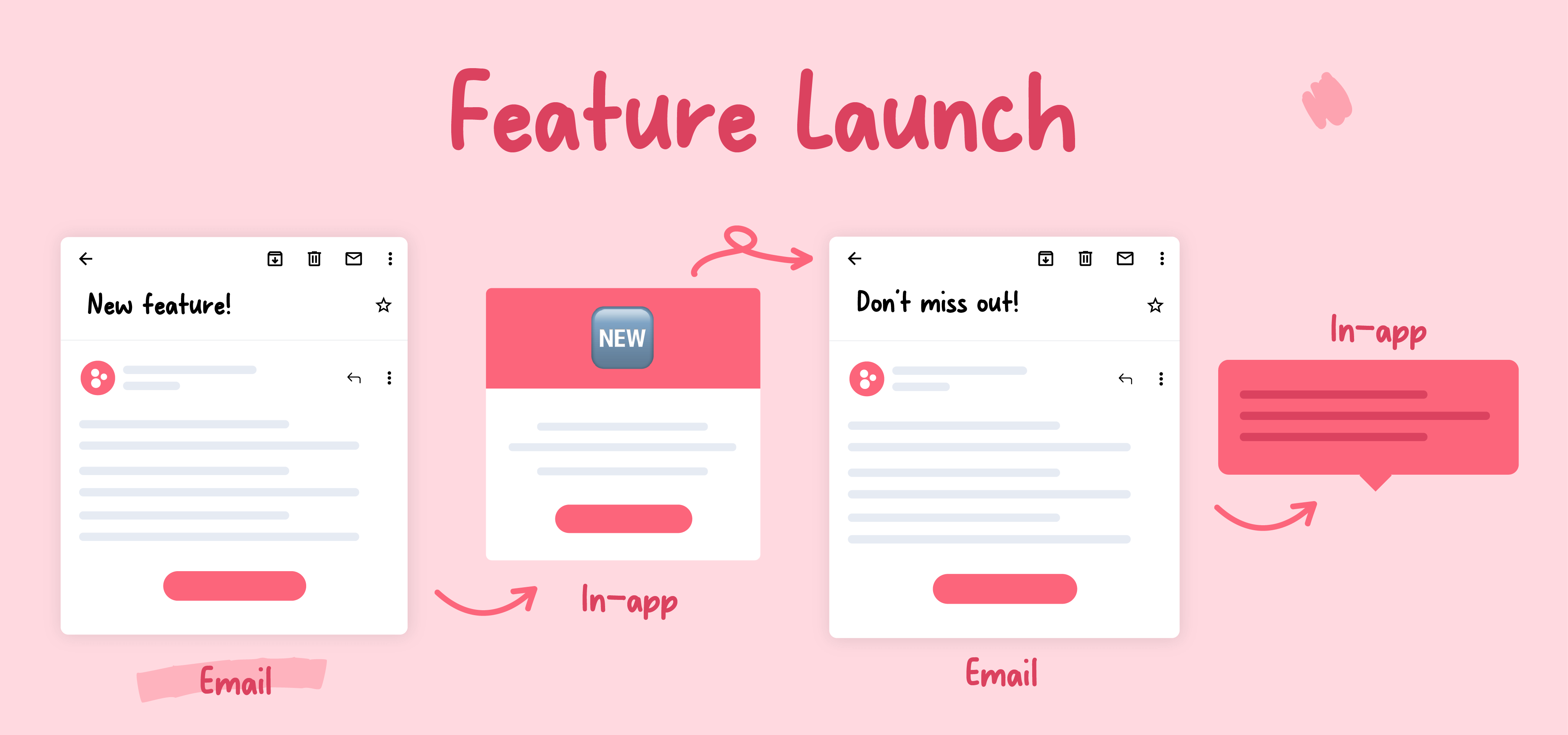
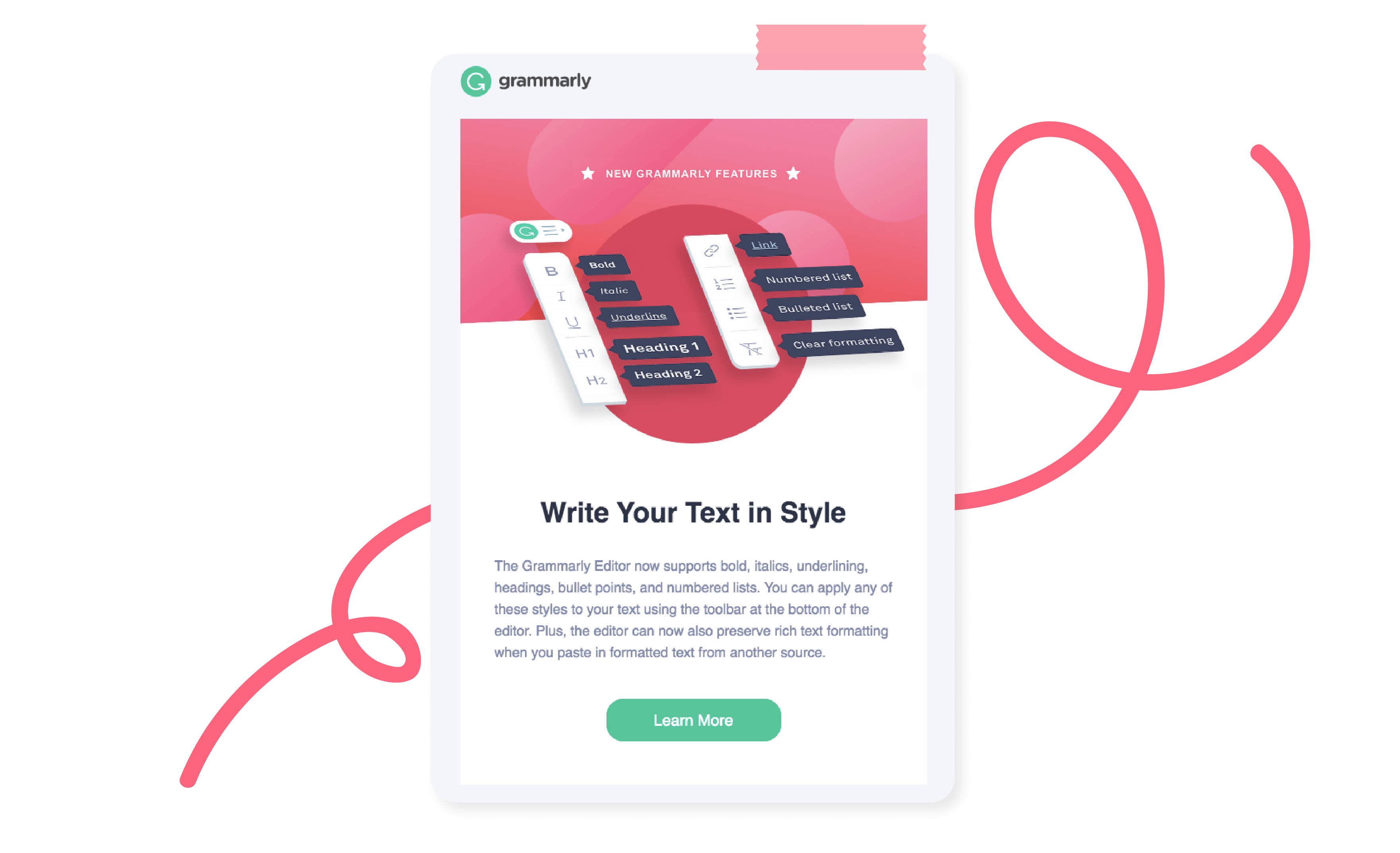
When composing product launch emails, Grammarly opts to keep it tight—just three sentences—and showcases the new feature with an informative illustration against a bold background, making it easy to digest and act. See more product launch email examples →
Think email nurturing is only for wooing new customers? Think again. The Appcues approach is to use email nurture campaigns to engage with all customers, no matter where they are in their journey. By tailoring content relevant to each stage, routine emails become personal notes that anticipate needs, celebrate milestones, and provide value that's hard to ignore.
This kind of nurture works because it's personalized and beneficial to the customer. You're not asking for anything—you're building a relationship and continuing the conversation.
Spotify offers a quintessential push experience. They've perfected the art of leveraging user data to provide a hyper-personalized experience that creates urgency and leads users directly to value. See more mobile onboarding examples→
Push notification pro tips:
When teams stop sending one-off messages and start building workflows—sequences that respond to behavior across channels—engagement compounds. Here are real examples from teams putting this into practice.
Circa started using in-app NPS surveys and saw a huge spike in customer feedback—370% more responses. But collecting feedback is only half the battle. They needed a way to act on it without spending hours chasing down responses.
So they built a workflow:
✅ Sent an automated follow-up to every user who left an NPS response
✅ Used branching logic to customize the message based on scores
✅ Made sure every user felt heard—without the team lifting a finger
Promoters got a friendly nudge to leave a review. Detractors got a thoughtful check-in with an invite to share more. The result: more meaningful customer interactions, less manual effort.

Before selecting channels for a workflow, evaluate:
Then sequence the message intentionally—Awareness → Education → Action → Reinforcement—and design adaptive paths based on what users actually do (or don't do):
GoToWebinar is a self-service webinar tool offered by LogMeIn. Senior Product Marketing Manager Tanya Jacob and her team used Appcues for three things at once: onboard new users, run an in-app beta program, and migrate existing users to a new UI.
As a product-led company, GoToWebinar offers a 7-day free trial. Scheduling a webinar is a key activation event in the new user onboarding experience.
"We wanted to ensure that our customers understand the multi-step webinar scheduling process. Appcues seemed to be a perfect choice for orienting new users to key features and functionality."— Tanya Jacob, Senior Product Marketing Manager, GoToWebinar
Tanya added native-looking hotspots to walk users through each critical step. This simple walkthrough helped draw users' attention to the right page elements and reduce cognitive load.
Almost 77% of users who saw the walkthrough scheduled a webinar—an outstanding activation rate.
The product team wanted to delight power users with exclusive early access to a wishlist feature: charging for webinars. They started with email—and the conversion rate was only 0.5%.
So Tanya created an in-app campaign with an Appcues slideout.
On the very first day, dozens of users signed up, with an overall 5% conversion rate—a 10x increase compared to email.
"The timing and placement of information play a critical role in conversion. Our in-app beta campaign was a huge success."

When GoToWebinar rolled out a new interface, they used Appcues to create five walkthroughs accessible at all times through a Quick Tips widget. Despite migrating thousands of users, the volume of UI-related support calls remained the same. 84% of migrated users saw the Quick Tips link, and 40% of those accessed the menu for self-service answers.
"We migrated thousands of users to the new UI but did not see a spike in our support calls. Much of the credit goes to the Quick Tips widget and walkthroughs we created with Appcues."

Sitemate's flexible software platform Dashpivot helps heavy-industry companies (construction, mining, oil and gas) digitize how they capture, organize, and track their work.
Within the first 6 months of using Appcues, Sitemate doubled their engagement rate, expanded from 1 country to 100, and doubled the rate of feedback they received every week.
Co-leaders Sam McDonnell (Head of Customer Success) and Lance Hodgson (Head of Marketing & Growth) believe in making the in-app experience the biggest lever of growth.
"We needed something scalable (i.e. automated). We didn't want to spend time messaging users individually or sending them an email campaign—it had to be in-product."— Sam McDonnell, Head of Customer Success
End users were accustomed to paper-based record keeping that they'd relied on for decades. To create new habits and abolish old ones, Sitemate had to drive users to value faster than the status quo and reduce friction.
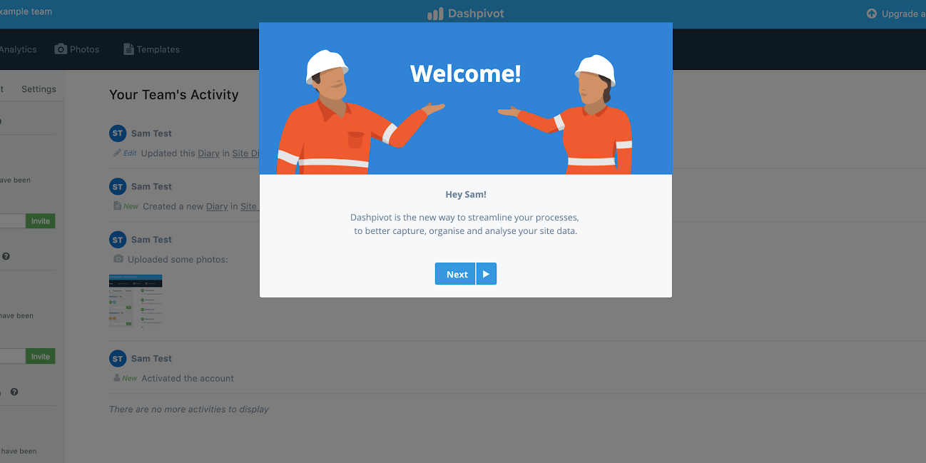
Sam used Appcues to create a personalized welcome modal, followed by a modal embedding a product explainer video. These helped users understand how the product works—and why they should keep exploring—within the first 3 minutes. He layered in tooltips and slideouts for contextual guidance at each step of the user's journey.
Engagement rate—measured by frequency of pictures and forms uploaded—doubled from 30% to 60% in the first 6 months.
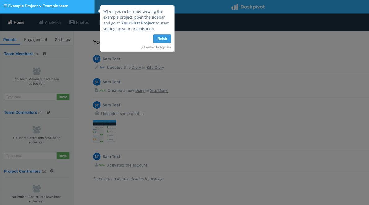
Seeing early success with automated experiences, Sitemate extended the free trial worldwide. Within 6 months, the startup went from a local Australian business to reaching customers in over 100 countries.
"We couldn't have gone global without Appcues. The solution has been an integral part of our growth strategy."— Lance Hodgson, Head of Marketing & Growth
Building these experiences without dev resources saved an estimated $20,000 in initial build costs and $12,000 in expected maintenance. NPS surveys delivered in-app doubled the amount of feedback they received every week, with the team calling every respondent for richer follow-up.

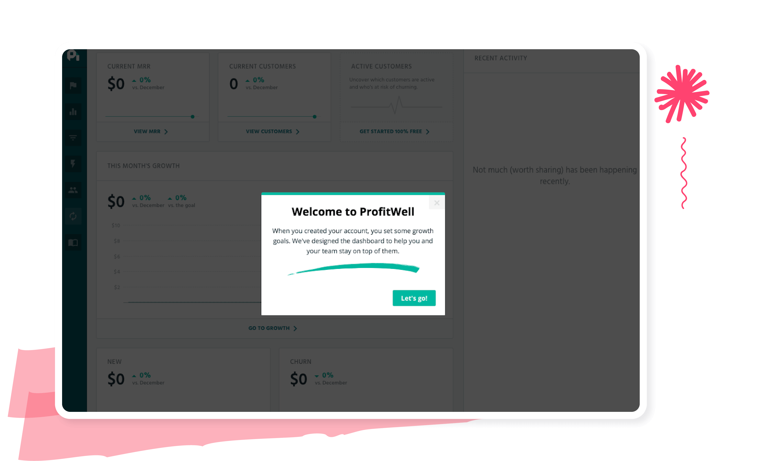
ProfitWell analyzed retention patterns and found that users who saw value within the first week were significantly more likely to stick around. They reworked onboarding to spotlight key outcomes earlier—and saw a 20% increase in first-week retention. Read the full story →
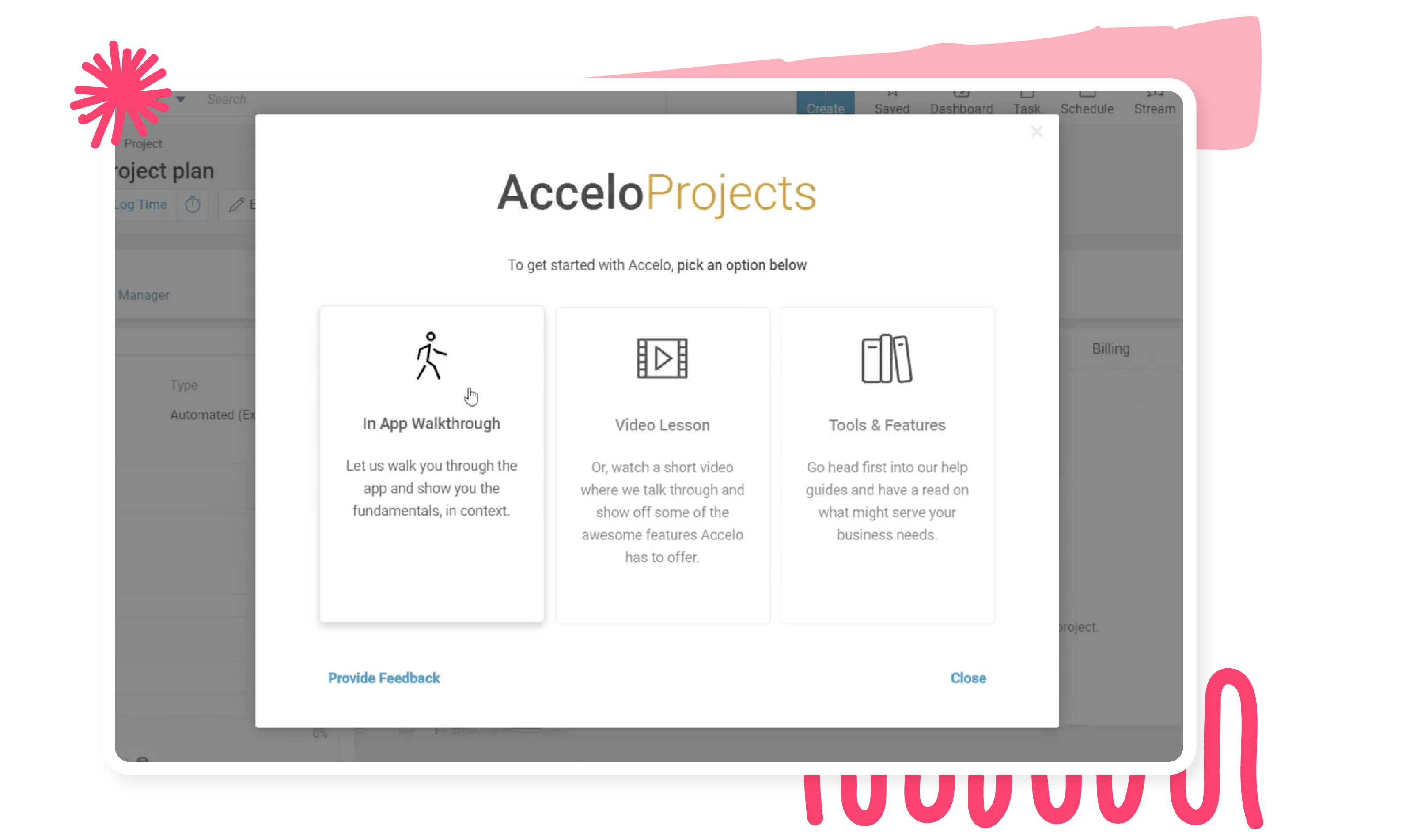
Accelo wanted to scale support without overwhelming the team, so they used behavior-based prompts to guide users at the right moment—surfacing help docs and walkthroughs when users explored key features. They saw a 48% increase in feature activation, and 84% of users rated the guidance helpful. Read the full story →
To drive feature adoption, Zywave added a contextual nudge with clear instructions to help users connect with their carriers. The result: an 88% success rate. Read their story →
Few industries have to cater to as diverse needs as the travel industry does. A backpacker on a shoestring wants very different things than a couple looking for a romantic getaway or an entrepreneur on a business trip. Some people book everything in one sitting; others shop for weeks before deciding.
Travel sites have to appeal to all while personalizing to individual needs—without overwhelming customers. The best of them combine UI patterns to drive immediate action and set the foundation for retention. Specifically, they use UI patterns to:
Looking for onboarding examples for your specific industry? Check out these posts:


User engagement and retention are hard for any business, but it's especially tricky in an industry rife with competition that caters to a wide range of buyer needs. Travel sites have to drive immediate conversions while building lasting customer relationships—and the top ones pull it off thanks to the flexibility of UI patterns.
In-app messaging is the workhorse, but the best engagement programs extend to where users live the rest of their lives.
In-app notifications are the secret sauce to maintaining an ongoing dialogue with your users. They reach customers with timely messages right where they spend most of their time: within your product. Whether it's a new feature, a useful tip, or a friendly check-in, these notifications make each user feel like they have a backstage pass to your latest and greatest. Personalized messages from the customer success team make all the difference—letting users know you're invested in their success.
Community forums add a hands-on quality to a low-touch approach—customers get 1:1 engagement with someone from your company or a fellow user. Done right, forums let your users do the work for you. Done wrong, they feel like duds.
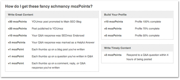
Some well-crafted forums reward users for consistently using the product. Moz uses "MozPoints" to incentivize, essentially outsourcing the moderation while jumping in where needed. Users engage with the product, have a 1:1 conversation with a real human, and get their questions answered. Buffer's community forums are another strong example.
Community forum best practices:
We're digital-first, but who doesn't love a tangible piece of happiness in the mailbox? Blend the best of both worlds with occasional snail mail—a handwritten note, some cool swag, a thoughtful gift. These physical tokens of appreciation cut through the digital noise and create memorable moments.
HubSpot likes to surprise and delight customers and prospects with swag after they show love on social media. Never underestimate the power a little surprise and delight can have on your customers.

Videos are a scalable way to put a human face on your business. Wistia has a whole host of engaging videos meant to inspire marketers and spark conversations.
One of the many benefits of video is that it's reusable. Unlike a phone call, video is a high-touch engagement tactic you can use over and over again, in different contexts.
"We argue that videos are like blog posts or other content. You don't write one and consider yourself finished. You point back to them, reference them in other content, and ensure they get the mileage they deserve."— Kristen Craft, former Head of Demand Gen & Business Development, Wistia
If a community member asks about something a tutorial video already covers, re-posting that video in the thread gets additional mileage out of the asset. The user feels like the video was made exactly for them—even though it was a fixed cost.
Across channels and tactics, the same mistakes show up again and again:
Message-level
Channel-level
Great messages feel less like broadcasts and more like conversations. They show users you understand their needs and have something valuable to offer.
Pulled together, the engagement examples above share a small set of underlying principles. Whether you're a product-led B2B startup or a consumer app at scale, these are the same beats:
Product-led companies like Trello, Airtable, and Digital Ocean win by building relationships directly with the people who actually use the product every day. People have more software tools to choose from at work and they're already used to consumer tools like Google Docs and Dropbox—so they decide what to use based on their own experience, not what's prescribed from above.
Traditional B2B communication is reactive: customers don't know which plan, they call sales; they don't know how to use a feature, they call support. That's great early on—but it doesn't scale. Build helpful features into the product so users can self-serve, the way Apple Music and Airtable do.
The best engagement examples in this guide—from Digital Ocean's behavioral upsell to Circa's NPS workflow to Sitemate's tooltips—all start with what the user just did. Most B2B companies are already collecting a ton of data on user behavior. The next step is digging into that data to understand what drives higher usage—and creating a scalable way to encourage more of it.
The most powerful engagement programs orchestrate in-app, email, and push together. Each channel acknowledges the previous one and sets up the next.
Engaged users aren't just happier. They're more invested. Pick a north-star engagement metric (Sitemate's was upload frequency; GoToWebinar's was webinar scheduling; ProfitWell's was first-week retention), measure it ruthlessly, and feed the results back into the next iteration.
"While the customer is not always right, he or she must always feel heard."— Danny Meyer, restaurateur and founder, Union Square Hospitality Group
Every example in this guide—from Spotify's push to Sitemate's onboarding to Circa's NPS workflow—shares one thing: they meet the user with the right experience, on the right channel, at the right moment based on what the user just did.
That's exactly what Appcues is built for. With Workflows, teams are closing feedback loops faster, bringing inactive users back, and creating more personalized activation experiences—without the manual work or the dozen stitched-together tools.
Customers using Appcues to engage users today have:
Whether your engagement strategy lives in-product, across email, or across every channel a user touches, you can launch experiences in hours, not weeks—and tie every one of them back to measurable growth.
Book a demo → | Explore Appcues on your own →
More stories and behind-the-scenes looks at how teams use Appcues: Made with Appcues →