Everything teams need to plan, build, and improve onboarding for real, meaningful activation.
First impressions matter. The user onboarding experience is the first (and most powerful) introduction to not just your product, but who you are and what your users can expect.
But for all its importance for both new users and the customer lifecycle, teams still struggle to get it right. And it’s not that they don’t understand what onboarding is. It comes from limitations.
After all, how are you supposed to build a good user onboarding experience when you’re using tools and processes that weren’t built for speed, clarity, or even iteration?
Consider this guide to user onboarding a re-introduction to what you already know, or what you’ve been taught. And how to improve the user journey from the start that goes deeper than vague “best practices”.
Want to dive right in? Skip ahead to the onboarding plays.
So we know we’re all on the same page, we have to address the elephant in the room. What is user onboarding?
User onboarding is the process of guiding new users to find value with your software product or service.
“Now hold on,” we can hear you thinking. “Isn’t user onboarding just teaching someone how to use my product?”
Yes and no.
Consider education a tactic to your larger goal, not the goal itself. Frame your understanding of user onboarding as a process, one that helps new users shift from knowing your product’s value to experiencing it for themselves.
That’s why it’s called an ‘aha’ moment; it’s the human response to when learning and emotional clarity align.
You motivate users to ‘aha’ through a series of actions and outcomes. And those moments in their totality are what’s known as ‘user onboarding’.
Let’s go back down to earth for a second.
In grounded terms, onboarding is the system you design to:
And, of course, user onboarding means different things for different teams.
For Product Managers
Onboarding is how you know the product is being used as intended.
For CS/CX
Onboarding is a way to deliver a consistent, reliable experience for customers.
Product tours and user onboarding often get lumped together, but they’re not the same thing. In fact, confusing the two is one of the fastest ways to end up with an onboarding flow that looks polished but doesn’t actually improve activation.
Let’s break it down.
A product tour, or an interactive tutorial, are typically:
Product tours are useful for getting users oriented. They help users understand what exists and where things live. When someone opens a product for the first time and thinks, “Okay, where am I”, a tour can help answer that question.
But that’s where their usefulness usually ends.
User onboarding is broader, more intentional, and ongoing.
Instead of “Here’s everything you can do,” user onboarding says: “Here’s the next thing you should do to get value.”
That shift from explanation to guidance is the difference between users knowing what your product does and actually using it.
Product tours often fail because:
Product tours are more welcome mat with the onboarding the house tour that comes after.
Most user onboarding doesn’t fail because an idea was bad. Again, best practices are fairly well known at this point, and you're smart. You understand the basic principles that go into onboarding success. The issue is more nuanced.
Failure happens because of limitation—in time, data, resources, and even alignment.
Which begs the question: what does user onboarding failure look like?
It shows up in six ways:
Too many onboarding experiences treat education as the goal instead of a way to guide users to a meaningful outcome and the first “aha” moment.
One-size-fits-all onboarding is easy to build, but hard to do anything with.
Onboarding plans look great in kickoff meetings, but more often than not, stall in execution.
Onboarding isn’t a one-time project. It requires ongoing iteration and autonomy.
When onboarding underperforms, teams often see the outcome but not the cause.
Cognitive overload is one of onboarding’s biggest killers.
Good onboarding narrows the aperture.
Bad onboarding widens it.
When onboarding relies on people instead of systems, cracks appear fast.
Great onboarding should scale through systems.
User onboarding fails when it’s built around what the product can do instead of what the user needs to achieve.
It fails when teams can’t iterate fast enough, and when new users have to work too hard to reach value.
But the good news?
Every failure play has a clear, fixable counterpart. And that’s what the rest of this guide is here to help you do. Move away from the habits and habitations of bad user onboarding towards user journeys that start on the right foot.
Before we move, let’s break down the difference between user onboarding and product tours, which are more feature forward.
Good user onboarding has a cascading effect on your long-term users. It reaches deeper than immediate wins and directly touches lifetime value.
When we surveyed teams who work in product adoption every day, three signals stood out:
On their own, these numbers don’t prove that onboarding guarantees retention. What they do show is something more subtle and, luckily enough, more actionable:
Many teams are losing users before onboarding is even finished, and at the same time keeping users engaged long-term is getting harder.
That matters because user onboarding is the earliest place teams can reliably influence whether users:
The gap between average and top-performing onboarding completion rates suggests that some teams are much better at guiding users through those early moments than others. And in an environment where user retention is increasingly slippery, those early moments carry more weight than they used to.
So onboarding isn’t a silver bullet for user retention. Nor should it be. It is, however, one of the few levers teams can pull early before disengagement becomes invisible and irreversible.
That’s why onboarding plays such an outsized role in long-term outcomes: not because it guarantees retention, but because it determines whether users ever have a real chance to stay.
One of the more interesting parts of the user onboarding process comes from within ourselves. That is, our own human psychology.
Really, user onboarding is the practice of crafting capability. It’s how real people learn, make decisions, and build confidence. It's also what makes up the majority of user onboarding best practices.
And more than ever, UI/UX psychologists have entered the field, using human behavioral principles as far back as Freud and Goffman to inform the work.
When we encounter something new, our brains go through specific processes that have been well documented. We go through four predictable stages:
Really effective onboarding supports each of these stages without overwhelming or distracting users. Here’s how to match strategy to principle:
Progress can only happen when we first have the right amount of mental space to maneuver.
New experiences, even outside of the product world, come with unfamiliarity. In our world, that looks like new interfaces, alien terminology, and expectations. If onboarding introduces too much at once, users become too overwhelmed to ever get oriented.
Effective user onboarding starts by narrowing down focus:
Rather than consider this ‘hiding features’, we offer: this is pacing.
Once users have gotten their footing, it’s time to point them in a direction.
Contextual guidance (prompts that appear inside the user onboarding workflow) helps users understand what to do next without stopping to think or go on a scavenger hunt. You reduce uncertainty and keep them moving.
And again, clarity is not the same as explanation. Guidance should stay light, showing up with the same cognitive-light intention.
Confidence is an earned state, a combination of knowing what to do and why you’re doing it in the first place.
Users don’t need to feel like experts during an onboarding flow, just that they’re capable. Small wins feel larger here: little confirmations, successful action, even visible progress signals to a user they’re on the right track.
Now this is the moment where we see the onboarding completion rates we mentioned before diverge. While the average sits at 58%, top-performers reach 82%, which suggests that confidence is the missing ingredient in so many flows. Not motivation at all.
But to say confidence alone is enough is a misrepresentation. Users also need to actually feel their own forward motion.
Checklists, milestones, and clear next steps make a world of difference to turn abstract goals into practical onboarding tasks. Each completed step reinforces momentum and reduces the chance of drop-off.
When progress isn’t visible, users stall out. When it is, they carry on.
Early experience shapes expectations.
More than half the teams we surveyed (55% if you recall) say retention is harder now than it was 3 years ago. Users have less tolerance for friction now and even fewer reasons to wait around for the coveted ‘aha’.
Onboarding matters because it helps users reach a meaningful outcome before frustration or indifference sets in.
Tone matters. A lot.
It’s important to users that they feel brought in, but also that their intelligence is respected. The best onboarding experiences weigh both those needs.
The user journey for those top performers feels supportive, optional, and responsible. It adapts to users' progress and respects their autonomy.
Great onboarding doesn’t say “Here’s how everything works”, it offers “Here’s what makes sense to do next”.
When onboarding reduces cognitive load, provides contextual clarity, reinforces progress, and helps new users reach value early, it creates an experience they trust.
And trust is what keeps them coming back.
After all that—the psychology, the definitions, the justifications—it would be downright disingenuous to claim that there’s one clear way to onboard.
What we’ve seen works in our decade of working with product growth folks, frankly, is all dependent on the product, the user’s goal, and even the moment they’re in.
The real winners in the space, those 82% onboarding completion champions, have done their due diligence. When they implement user onboarding, it's from a place of planned decision-making. They're working from a series of tried-and-true tactics that they've tested and honed.
Those tactics, when combined, become plays that can be adapted and iterated on over time.
Below are the delivery mechanisms those teams return to again and again. Not because they’re easy. Because they work. Actually work.
Most onboarding experiences can be built using five core plays.
User response to this play:
“I know where I am, and I know what to do first.”
What makes this play distinct:
Its only job is getting users grounded, not education.
A full product tour. If you’re explaining features in depth, you’ve gone too far afield.
User response to this play:
“I’m making progress, and I’m getting closer to something useful.”
What makes this play distinct:
It creates momentum over time, deepening user engagement beyond a good first impression.
User response to this play:
“Help showed up exactly when I needed it.”
What makes this play distinct:
Guidance appears inside the workflow at the moment of action.
User response to this play:
“This product understands why I’m here.”
What makes this play distinct:
It changes which guidance users see, not how it’s delivered.
User response to this play:
“Oh! That’s why this is useful.”
What makes this play distinct:
Its focus is value, not instruction.
Each play answers a different user question:
When an onboarding flow fails, it’s usually because one of these questions goes unanswered rather than from a lack of UI polish.
Play Type | User Feels Like… | Core Purpose | Answers This User Question | What Users See | Use This When | Best-Fit UI Patterns |
|---|---|---|---|---|---|---|
Orientation | “I know where I am, and I know what to do first.” | Ground users quickly and reduce early confusion | Where am I? |
|
| Modals, slideouts, short walkthroughs |
Progression | “I’m making progress, and I’m getting closer to something useful.” | Create momentum and visible progress toward activation | How do I move forward? |
|
| Checklists, progress indicators |
Contextual Guidance | “Help showed up exactly when I needed it.” | Guide users inside the workflow at the moment of action | What do I do right now? |
|
| Tooltips, hotspots |
Personalization | “This product understands why I’m here.” | Show the right guidance to the right user | Is this for me? |
|
| Modals (questions), segmented flows |
Activation & Value Reinforcement | “Oh! That’s why this is useful.” | Connect actions to outcomes and reinforce value | Why is this worth it? |
|
| Slideouts, inline messages, success states |
These plays are nothing without the tools that make them real in-app. So here's a brief breakdown of tooltips, modals, hotspots, slideouts, and checklists: the cells of the user onboarding experience.
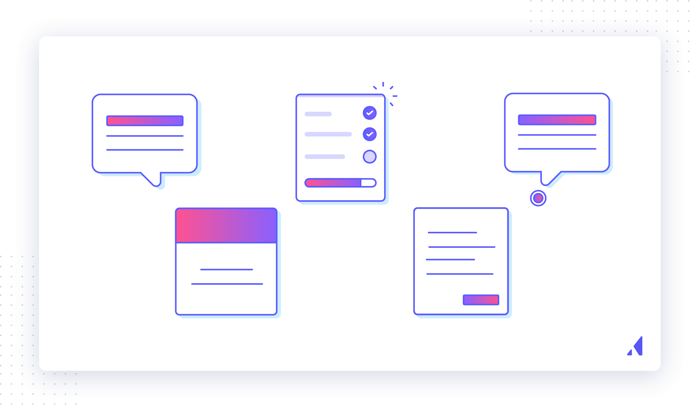
These methods are tried and tested—and they persist for a reason. They're flexible, effective, and are normal practice now to educate users. We recognize them for what they are on sight: learning aids. That automatic recognition speeds up the onboarding journey by introducing familiar elements.
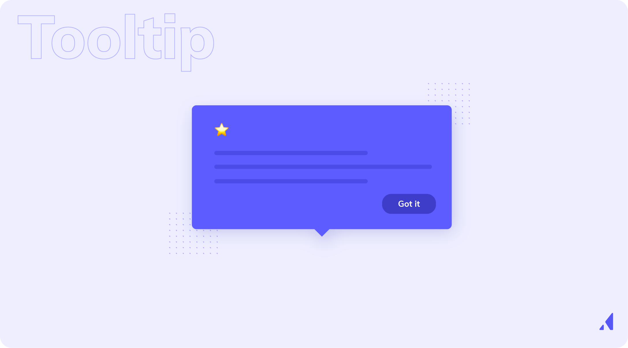
Tooltips are small in-app messages that can be used alone or as part of a series. They’re great for self-service walkthroughs, contextual product tutorials, and new feature announcements.
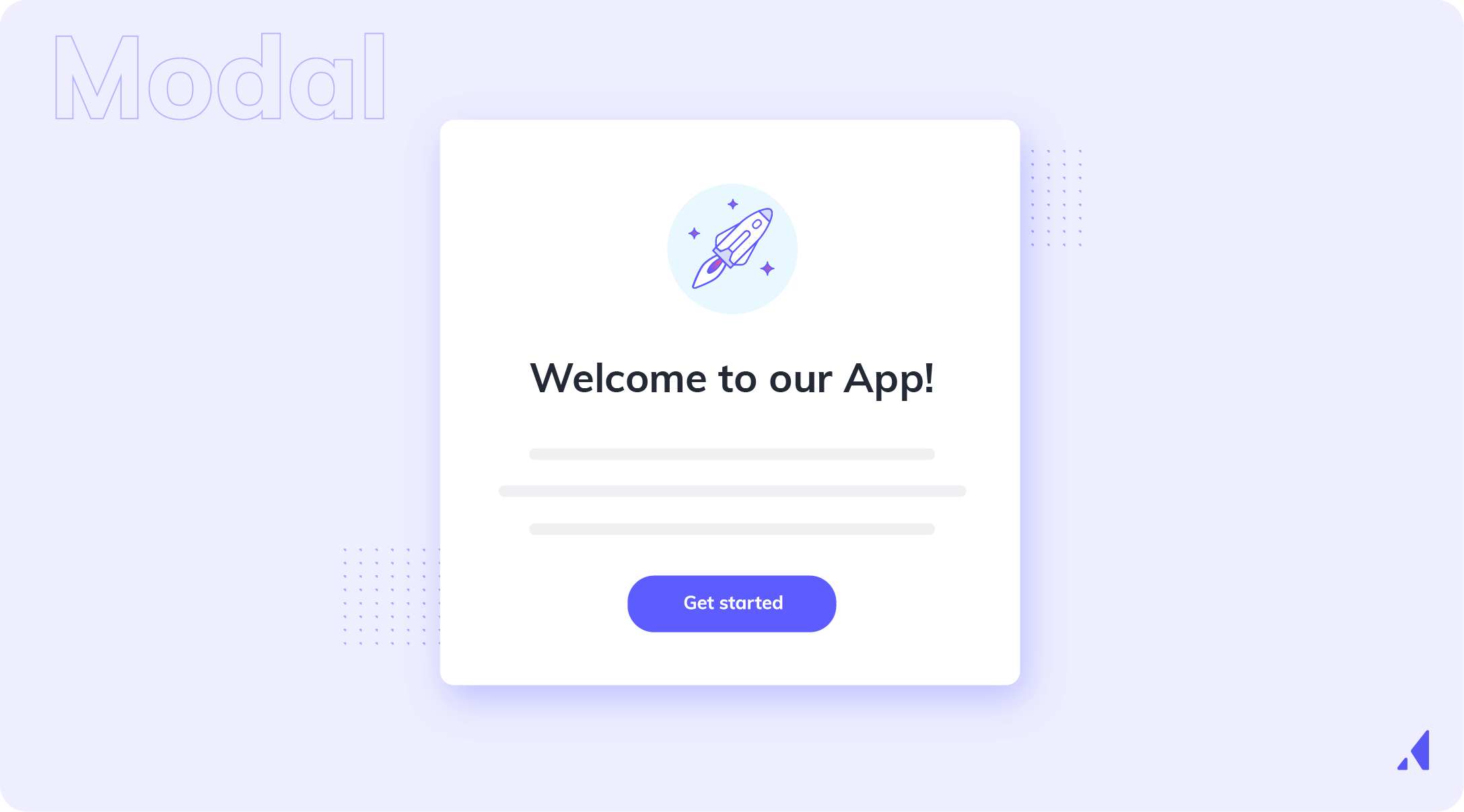
Modals are large UI tools that sit on top of your app’s main interface. They’re perfect for welcoming new users, introducing key features, and delivering important messages or notifications.
Slideouts are mid-sized UI plays that slide out from the side of the user’s screen. Like modals, they’re great for welcoming users, making in-app announcements, and prompting action.

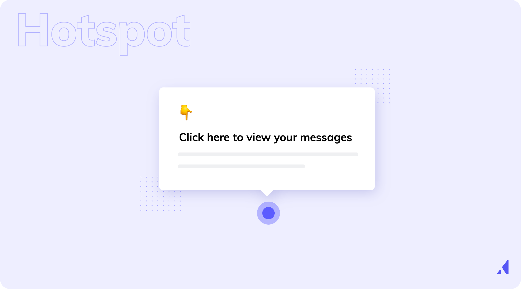
Hotspots are small dots or beacons that encourage users to focus on certain play elements or features. They are ideal for encouraging exploration, creating a more self-service experience, and reducing support burden.
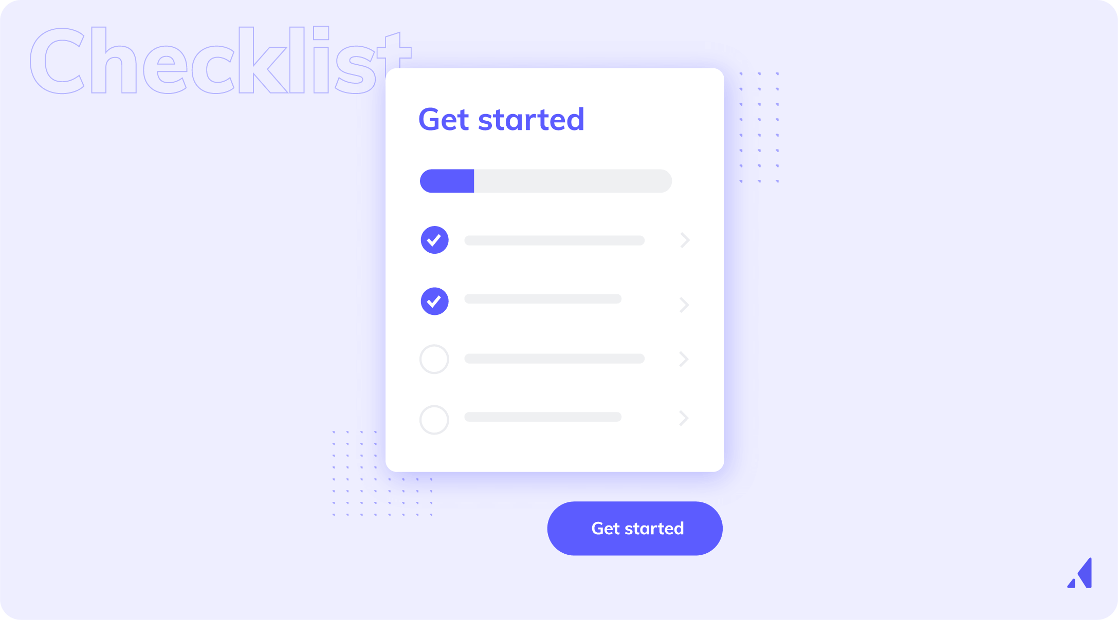
User onboarding checklists are simple yet effective tools for onboarding and engaging your users.
If you want to learn more about how technology can improve your onboarding experience, check out our list of the best onboarding tools.
If you don’t measure user onboarding, any activity looks like progress.
You hammer out your strategy and build. You make sure you have tours, checklists, even tooltips within well-thought out mechanisms that you know improve on what you have.
But then, the moment comes where you have to answer: Is this actually helping our users reach value? And you realize you don’t know.
Here’s the truth: you don’t need to track everything.
Good user onboarding metrics are only helpful if they give you a clear picture of whether your experience is doing what you built it for.
The following metrics are the ones that matter most to understand user behavior:
Are users reaching meaningful value?
Activation is the single most important onboarding metric. But only if it’s defined correctly. You should tie it to a specific behavior that signals real value beyond account creation or setup.
Average activation rate: 32%
Track how many new users reach activation, and how long it takes them to get there. If your rate is low or activation itself is slow, the onboarding process isn’t doing enough to guide users to the right actions.
Activation Rate = (Number of users who reach activation ÷ Total new users) × 100
How quickly users experience the eureka moment of why your product is important to them.
Time to value measures the gap between signup and activation. The longer that gap, the more opportunities there are for confusion, distraction, or drop-off.Are users reaching meaningful value?
Average time to value: 38 days
Look for ways onboarding can:
Shortening time to value often has a bigger impact than adding more onboarding steps.
Time to Value = Timestamp of activation - Timestamp of signup
This is usually tracked as:
Whether users are making it through the onboarding experience, and at what rate.
Completion rate doesn’t tell the whole story, but it’s useful as a signal.
When onboarding completion is low, it usually means one of three things:
Average onboarding completion rate: 58%
Use completion rate to identify where new users drop off, not to optimize for completion alone. High completion without activation is a red flag.
Onboarding Completion Rate = (Users who complete onboarding ÷ Users who started onboarding) × 100
Where onboarding breaks down.
Overall completion doesn’t take the smaller details into account, like where users hesitate, abandon, or get stuck.
Step Drop-Off Rate = (Users who reached step − Users who completed step) ÷ Users who reached step × 100
Whether your onboarding is reinforcing the right/intended behaviors.
Not all features are valued equally, and some matter more to getting the most out of your platform or service. Early user onboarding should focus on the features most closely tied to activation and long-term value.
Average product adoption rate: 36%
Track adoption of one to three core features in the first days or weeks of their launch or introduction. If users skip, onboarding may be directing attention to the wrong places.
Feature Adoption Rate = (Users who use feature ÷ Eligible users) × 100
How onboarding feels to your users.
Numbers show what’s happening, but they don’t tell the full story. Qualitative feedback helps explain why, and gives a real voice to the data.
Pair qualitative insights with quantitative metrics so you can understand what you’re seeing from all angles. Especially useful when numbers alone can’t explain friction.
Here’s what you should start with and why:
Metric | Question it answers |
|---|---|
Activation rate | Are users reaching value quickly? |
Time to value | How quickly? |
Where users drop off | Where are we losing them? |
If a metric doesn’t help answer one or more of those questions, it’s probably not worth tracking yet.
Most onboarding teams don’t fail because teams choose the wrong UI play. In fact, they often build the right thing. It’s just at the wrong moment, or solving the wrong problem.
So how do you make smarter choices? How do you build a user onboarding that isn’t more, but, rather, intentional.
A real onboarding strategy answers three questions:
Here’s how strong Product and Onboarding teams approach it.
Every onboarding strategy starts with a clear definition of success. But what does success look like for your product? Your service? Do you know the clear moments that need to be prioritized for the best possible experience?
Ask:
Hold this action in your mind. This is now your activation moment and is the solid ground you always come back to. This action is the anchor for everything else.
Without it, the user onboarding process becomes a collection of steps with no destination.
Once you’ve nailed down what success looks like, it’s time to map the steps required to get there. This is your user journey map, and should prioritize value over product education.
Focus on:
This map should be short, opinionated, and ruthless about what doesn’t matter yet. Consider it this way: if a step doesn’t move the user closer to value, it doesn’t belong in your onboarding.
Now it’s time to bring back the plays we talked about. This is where we open the toolkit to build the map.
Remember your plays.
Play | Goal |
|---|---|
Orientation | Reduces early confusion |
Progression | Sustains momentum |
Contextual Guidance | Reduces friction |
Personalization | Increases relevance |
Reinforcement | Makes value obvious |
A strong strategy knows how to do more with less, the minimum guidance needed to help users move forward.
Not everything belongs in your in-app onboarding. Sometimes you need a human touch.
A good user onboarding strategy is explicit about:
This is especially important for CS teams scaling onboarding who aren’t looking to increase headcount.
In-app guidance should handle the repeatable path to value. Humans should step in where nuance matters.
The onboarding process isn’t something you “get right”. It’s a call-and-response where you’re called upon to improve and iterate as you go.
Strong strategies plan for:
There’s really no such thing as the perfect flow. You’re looking to build a system that evolves as your users (and your product) learns, grows, and changes.
The teams that really nail digital adoption think of user onboarding as more than an add-on. For them, it’s part of the core product experience.
That means:
When the onboarding process lives outside product strategy, it shows. And users feel it.
A good user onboarding experience doesn't come from choosing the right tooltip or checklist.
It’s about:
When onboarding is treated as a strategy beyond a set of plays, it becomes one of the most reliable ways to improve activation and long-term outcomes.
The question you will finally run into is universal: do you build all this in-house or do you buy a digital adoption platform (DAP)?
To answer this question, we’re going to ask one more:
What kind of onboarding do you actually need right now?
Different constraints lead to a variety of answers and strong teams make this decision intentionally, not by default. The answer will not always be user onboarding software, and knowing what you're looking to accomplish is a huge part of understanding which way to go.
Building user onboarding yourself often wins when:
Where build clearly wins:
Control, flexibility, and deep integration.
Where it struggles:
Speed of iteration once things stabilize.
Buying an onboarding platform makes sense when onboarding becomes a core growth or retention lever, not just a setup task.
This is usually the case when:
At this stage, user onboarding isn’t just something you’re on the hook to ship. You’re also responsible for optimizing it.
The upside:
The tradeoff:
Buying works best when onboarding is treated as part of the product experience, and not as an afterthought.
The biggest difference between building and buying is how quickly you can learn and adapt.
Onboarding is rarely “done.” As products change, so too do users. Expectations rise, onboarding needs evolve along the same lines.
Teams that build everything in-house often find that:
Teams that buy don’t automatically win, but they do remove the biggest bottleneck: the ability to iterate.
There’s no “right” option really. The only consideration is how critical onboarding is to your product at this time.
Consideration | Build in-house | Buy a platform |
|---|---|---|
Control over UI logic | ✅ Full control | ⚠️ Constrained by platform |
Deep workflow integration | ✅ Native by default | ⚠️ Depends on tooling |
Speed to firsts version | ⚠️ Slower | ✅ Faster |
Iteration speed | ❌ Dev-dependent | ✅ Low code |
Experimentation | ❌ Costly | ✅ Designed for it |
Personalization at scale | ⚠️ Complex | ✅ Built-in |
Measurement & analytics | ⚠️ Custom work | ✅ Included |
Long-term maintenance | ❌ High | ⚠️ Vendor dependency |
Early-stage flexibility | ✅ Strong | ⚠️ Can be overkill |
Mature product scalability | ⚠️ Hard | ✅ Designed for scale |
There’s no “right” option really. The only consideration is how critical onboarding is to your product at this time.
If you answer “yes” to most of these, buying is usually the better fit:
If not, building is perfectly reasonable.
Building out your user onboarding experience works when it’s simple and stable.
Buying works when onboarding is strategic and evolving.
The more onboarding influences activation, retention, and growth, the more important speed, iteration, and insight become.
And truthfully, those are hard to bolt on later.
At this point, we’ve covered the important definitions, best practices, and reasons for investing in onboarding in the first place. By now you may be thinking: All this knowledge is great, but I’m still not sure what great onboarding actually looks like.
Below are 4 user onboarding examples from real companies.
Project management tool Asana helps teams organize, track, and manage their work on web or mobile. Their product is characterized by a clear, simple interface with playful details and pops of color.
New users are given a succinct, action-driven onboarding tour that walks them through creating their first task—a clear aha moment.
Qordoba (an AI writing assistant for businesses) used our platform to create a beautiful user onboarding flow.
Qordoba greets its free trial users with 5 beautifully played modals. The succinct onboarding flow does a great job of reiterating Qordoba's key value propositions, introducing new users to key parts of the product, and driving them toward an activation event (installing the Chrome Extension).
Grammarly acts as a personal writing assistant—users can check for spelling, grammar, word choice, and more through in-line suggestions.
We’re big fans of Grammarly’s UX in general—they do a great job with everything from emails to upgrade prompts—and their onboarding experience is no exception. Their clever learn-by-doing demo doc does an excellent job of encouraging discovery and teaching users how to use the tool’s myriad features within a controlled environment.
Unlike many apps, Duolingo has a user onboarding experience that begins with the product and ends with a signup form—it’s an excellent example of gradual engagement.
Gradual engagement involves postponing registration for as long as possible—usually until the moment when users must register in order to progress further. Duolingo does this expertly: Their onboarding flow guides visitors through a quick translation exercise, showing how quick and easy it is to learn a new language, before asking users to commit to the product with a signup.
If there’s one thing this guide should make clear, it’s this:
Great user onboarding is deeper than UI. It gets to the heart of user behavior and decision making.
Teams struggle with onboarding not because they lack ideas, but because onboarding often lives in the gray space between product, growth, and customer success. It’s owned by everyone and no one at the same time.
The teams that get it right treat continuous user onboarding as a system:
That’s what turns this entire endeavor from a one-time project into a durable advantage.
Before you move on, it’s worth asking yourself a few honest questions:
If some of these are hard to answer, that’s not a failure on your part. Take it as a signal that onboarding is doing its job by revealing where clarity is needed next.
Depending on where you are, a few paths usually make sense:
Onboarding is about constant improvement, both for your users and yourself. And the teams that treat it as universal growth tend to win.