A beginner's guide to cohort analysis: How to reduce churn and make better product decisions
.png)
.png)
.png)
.png)
Churn is bad. It’s not hard to understand why.
Your startup can acquire billions of potential customers. If none of them stick around, it doesn’t matter. That’s why retention hacking is the new growth hacking.
PMs have come up with all kinds of tactics to boost retention. Improving user onboarding is a biggie.
But to get directly at churn reduction, you need to first diagnose your product's specific problems. Then, make adjustments.
Put on your goggles and swim cap and dive into the numbers. That’s how you’ll find out exactly why users stop using your app. And it all begins with cohort analysis.
Cohort analysis is a type of behavioral analytics in which you take a group of users, and analyze their usage patterns based on their shared traits to better track and understand their actions. A cohort is simply a group of people with shared characteristics.
Cohort analysis allows you to ask more specific, targeted questions and make informed product decisions that will reduce churn and drastically increase revenue. You could also call it customer churn analysis.
The 2 most common types of cohorts are:
Acquisition cohorts help you understand when an action is taking place, but behavioral cohorts are best for discovering and understanding churn rates, as they tell you why a user has taken an action.
But wait—there’s less! Less work for you if you use Appcues’ Insights no-code tracking and segmentation features to conduct cohort analyses.
Cohort analysis is a valuable tool for anyone looking to gain a deeper understanding of their customers and why they make certain choices in your app. Here are some of the benefits of conducting cohort analysis:
Your users are the ones with mouths, but the timeline is going to tell you more about your churn problem than they ever will. If you find out when the churn happens, you can figure out what’s happening around that time to cause it.
But how do you establish the timeline in the first place? By performing an acquisition cohort analysis.
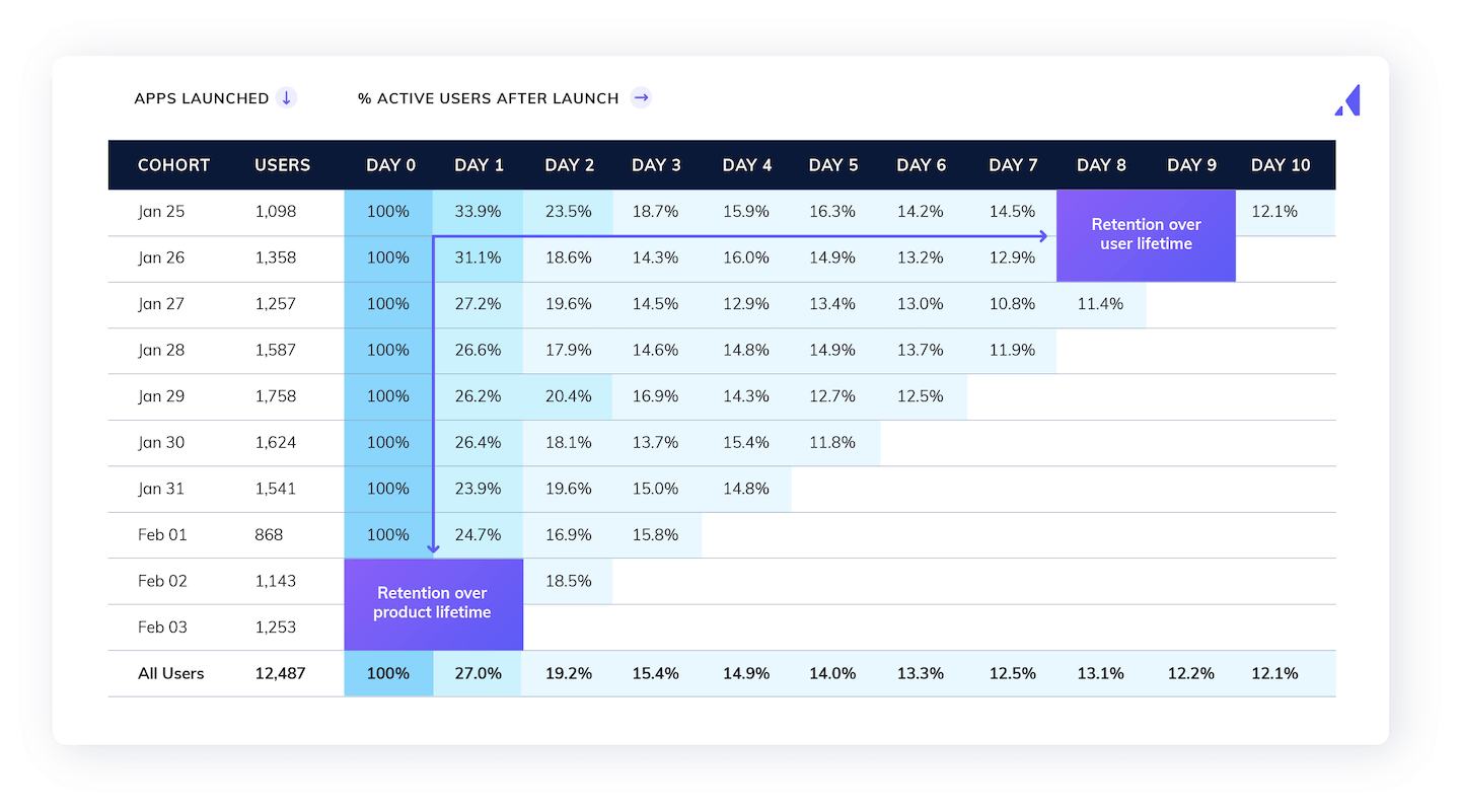
In this case, you need to create a cohort chart. You need your various cohorts, as well as the number of users for each and a column for each day of the period you’re analyzing.
Like this:

As you can see, the cells under each day show the portion of the original cohort for that row that you’ve retained on that day. Nice.
A couple of things to remember as you’re setting up your acquisition cohort analysis:
With your trusty acquisition cohort analysis and timeline in hand (who and what), the next step is the analysis (why).
Look for the big drop-offs and make a note of them. Ask yourself what happened on those drop-off days.
Imagine you’re seeing users drop off by 23% on day 3 (yikes). What happens on day 3? Are you asking them to sync their data (for example)?
If the answer is yes, you’ve found the problem. Maybe not the problem, but a problem you can solve nonetheless.
Your analyses will likely be more complex. In fact, you’ll probably need to apply this analysis to all of your app’s core features.
Here’s what you should not do: See how app engagement in the first 30 days correlates with churn.
Why? Because that information tells you nothing about what to change.
Here’s a better idea: How does the completion of an app onboarding checklist correlate with churn?
In other words, keep it specific. Which specific features are sticky for your users? That’s what you need to find out.
Wouldn’t it be great if the problem was always a single feature? Sure. But that’s almost never the case.
It’s usually a combination of features and behaviors that influences cohort churn. For example, those who complete the onboarding checklist in your app may be much less likely to churn when you ask them to sync their data than those who didn’t.
That’s just one extra layer, but remember—there are dozens of layers to consider.
How do you do that? By comparing your behavioral cohorts.
If you’re handy with pivot tables and conditional formatting and have a lot of time on your hands, you can do it in a spreadsheet.
Or you can use one of the many tools designed to streamline the churn cohort analysis process. Amplitude, for examplitude, is purpose-built for creating and comparing behavioral cohorts in a flash.
(Here’s a quick guide on how to use Amplitude for cohort analysis.)
As you get deep into the data, don’t forget your purpose. You’re trying to find the combinations of behaviors and features that are influencing retention—positively or negatively.
That means you need to be analyzing this stuff in a way that spits out hypotheses ripe for the testing.
ALERT: You’ve just found that users who don’t complete your onboarding checklist fall off by 67% by day 10.
Obviously, it’s time to change everything. Add dozens of reminders from day 1 to day 7 to complete the checklist.
We’re kidding. Please don’t do that.
You’re just as likely to increase churn with harsh pivots like that. Try this instead: Test, test and test some more.
Your gut feeling that you need to add some reminders about the checklist to promote the best onboarding experiences may be exactly right. That’s great, but test it so you can back it up with data.
And if you test a change to your app that improves retention, don’t stop there.
You should have at least a handful of other hypotheses to test. Test those, too.
Why? Because you may find that other changes reduce churn even more than the first one you tested.
Be thorough. Take your time. Iterate it, rinse it, repeat it until you’ve solved the problem you came to solve.
What do AdRoll’s 3X increase in upsells and GetResponse’s 60% user activation rate have in common? Us! Take advantage of Appcues suite of tools to improve your app and grow your adoption, conversion, and retention rates. Get started here.
To give you a clearer picture of a customer cohort analysis, let's do one on a fictional data set from a productivity app.

Starting with your data, ask yourself: where do users drop off? The biggest drop is right around the 2-week mark. It’s a full 3 percentage-point drop from day 14 to day 15.
You know what to do: Hypothesize about why users are leaving.
Start with the churn. Here's the average churn rate for the productivity app based on an acquisition cohort analysis:

Then, compare that average churn rate to the rate for users who engage with certain features or complete a key action.
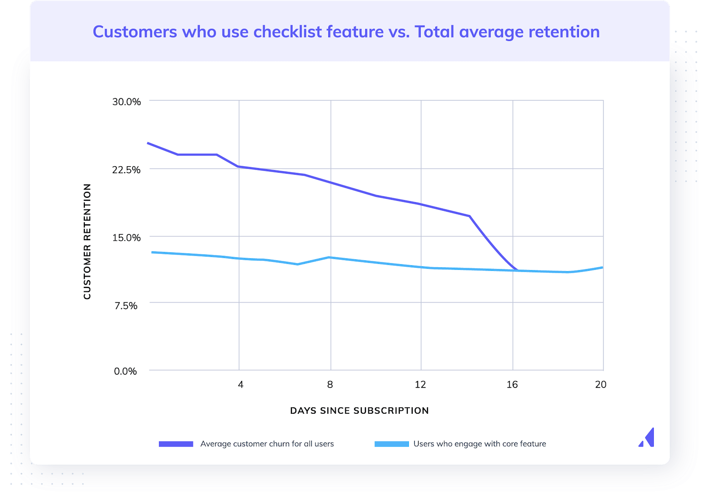
For example, here's that same average churn compared to the churn of users who use one of the core features of the productivity app: the checklist feature.

Bingo!
Users who engaged with the core feature (the light blue line) churned at a very low rate. Most of the people who churned did not use this core feature.
The next step in this shockingly simple and tidy fictional example, of course, is to come up with ways to adjust the factor we’ve just identified. How could we improve user engagement with the checklist?
To complete the cohort analysis, we would come up with ideas and A/B test them until we found the winner. Bingo, indeed.