
.png)
Most SaaS teams are measuring the wrong things. They track signups, page views, and MQL volume — metrics that feel productive but don't tell you whether your product is actually driving growth. In a product-led growth model, that disconnect is fatal.
Product-led growth metrics are different. They're behavioral signals that connect what users do inside your product to the revenue outcomes your business depends on. The challenge most teams face isn't a lack of data — it's knowing which metrics actually predict retention, conversion, and expansion, and which ones are just noise.
This guide covers every critical PLG metric category you need to build a measurement framework that works. From virality and activation through conversion, retention, and unit economics, you'll walk away with a clear picture of how to connect product behavior to business outcomes — and how to stop optimizing for metrics that don't move the needle.
Traditional SaaS metrics were built for a sales-led world. They measure pipeline volume, lead quality, and sales cycle length — all useful signals when a salesperson is the primary growth driver. But when the product itself is responsible for acquiring, activating, and expanding users, those metrics miss most of what matters.
Product-led growth metrics measure how users experience and derive value from the product — and how that experience drives acquisition, conversion, and expansion without heavy sales intervention. They span the full user lifecycle, not just the top of the funnel.
The distinction matters because PLG metrics create feedback loops. When you track activation rate and see it drop, that's a signal to fix onboarding. When you track feature adoption and see a specific feature correlating with retention, that's a signal to make that feature more discoverable. Sales-led metrics rarely give you that kind of product-level intelligence.
The best PLG teams don't just report on these metrics — they use them to make go-to-market decisions. Which acquisition channels bring users who actually activate? Which onboarding paths lead to conversion? Which accounts are ready for a sales conversation based on their in-product behavior? These are the questions PLG metrics are designed to answer.
Choosing the right metrics matters more than tracking everything. A bloated dashboard full of vanity metrics creates noise, not clarity. The goal is a focused set of behavioral signals that tell you, at each stage of the user lifecycle, whether your product is doing its job.
Before diving into individual metrics, it helps to have a framework for organizing them. The most useful structure for PLG teams is a product-led adaptation of the AARRR pirate metrics model — covering four core stages: Acquisition, Activation, Revenue, and Retention/Expansion.
Each stage feeds the next. Acquisition metrics are meaningless if you're bringing in users who never activate. Activation metrics are irrelevant if those activated users churn before converting. Revenue metrics look great until you realize NRR is declining because expansion isn't keeping up with churn. The sequence matters.
This framework also prevents teams from measuring in silos. Product teams tend to own activation and engagement metrics. Growth teams own acquisition and conversion. Finance owns unit economics. But in a PLG model, all of these connect — and the most effective organizations use a shared framework to see how changes at one stage ripple through the rest.
Think of this as the navigational spine of your PLG measurement system. The sections that follow go deep on each stage, but the framework is what keeps them connected.
In a traditional SaaS model, acquisition is almost entirely a marketing function — you run campaigns, generate leads, and hand them to sales. In a PLG model, the product itself becomes an acquisition channel. Users invite colleagues, share outputs, and embed your product into workflows that others eventually encounter.
That changes what you need to measure. Raw signup volume tells you how many people found you. It doesn't tell you whether those people are likely to activate, convert, or refer others. PLG acquisition metrics focus on the quality and source of new users, not just the quantity — and they track the organic, product-driven channels that traditional attribution models often miss.
The most important insight here: tracking where your high-retention users come from is more valuable than tracking where your most signups come from. Those are often very different answers.
Virality is one of the defining characteristics of a strong PLG model. When users invite colleagues, share work, or collaborate inside your product, they're generating acquisition at near-zero marginal cost. Viral coefficient and referral rate are the metrics that capture this.
Viral coefficient measures how many new users each existing user brings in through product-native sharing, invites, or collaboration features. The formula is straightforward: multiply the number of invites sent by the conversion rate of those invites. A viral coefficient above 1.0 means each user generates more than one new user on average — which creates compounding, self-sustaining growth.
To track virality accurately, you need to instrument the right product behaviors: invite flows, shared links, in-product collaboration events, and any feature that exposes your product to someone who isn't yet a user. Without that instrumentation, you're flying blind on one of PLG's most powerful growth levers.
Virality metrics are especially critical for freemium and collaborative products, where the product's value often increases with more users — creating a natural incentive to invite others.
If there's one stage in the PLG funnel that determines everything downstream, it's activation. Users who don't reach their "aha moment" — the point where they first experience the core value of your product — will churn before they convert, refer anyone, or expand. No downstream metric will look good if activation is broken.
Activation in the PLG context isn't just completing a signup flow. It's the moment a user does something meaningful inside the product — something that correlates with long-term retention and value realization. Identifying and measuring that moment is the foundation of everything else.
Activation metrics are leading indicators. They tell you what's going to happen to your retention and conversion numbers before those numbers move. That's why product and growth teams need to monitor them closely and continuously.
Activation rate is the percentage of new users who complete a defined set of actions that correlate with long-term retention and value realization. The key word is "correlate" — your activation milestone shouldn't be assumed, it should be validated against retention data.
For a project management tool, activation might mean creating a project and inviting a teammate. For an analytics product, it might mean connecting a data source and viewing a dashboard. The right milestone is product-specific, and getting it wrong means you're optimizing for the wrong behavior.
A low activation rate is almost always a signal of onboarding friction. Users are signing up but not reaching the value that would make them stay. That's a fixable problem — but only if you're measuring it. User onboarding metrics like activation rate give you the visibility to diagnose exactly where users are dropping off.

Time-to-Value is the elapsed time between a user's first login and the moment they complete their activation milestone. It's a deceptively simple metric with significant downstream consequences.
Shorter TTV correlates with higher retention and higher free-to-paid conversion. When users reach value quickly, they're more likely to stick around, upgrade, and tell others. When TTV is long — because onboarding is confusing, setup is complex, or the path to value isn't clear — users disengage before they ever experience what makes your product worth paying for.
Reducing Time-to-Value typically involves improving onboarding design, adding in-app guidance that surfaces the right actions at the right moment, and using progressive disclosure to avoid overwhelming new users. The goal is to remove every unnecessary step between signup and the moment the product clicks for a user.
TTV is also a useful diagnostic tool. When you map where users are spending time before reaching activation, you can identify the specific friction points that are adding delay — and prioritize fixes accordingly.

Activation gets users to first value. Engagement metrics tell you whether they're building a habit around your product or just dipping in occasionally. These are the signals that reveal whether your product has earned a place in users' daily or weekly workflows.
Engagement goes beyond login frequency. The most useful engagement metrics capture both breadth (how many features a user touches) and depth (how intensively they use the features that matter most). Both dimensions matter — a user who touches many features superficially is different from a user who relies heavily on your core functionality.
The DAU/MAU ratio — often called the stickiness ratio — measures what percentage of your monthly active users are returning on a daily basis. A higher ratio means users are building a daily habit around your product rather than treating it as an occasional tool.
Benchmarks vary significantly by product category. A communication or collaboration tool should have a much higher DAU/MAU ratio than a quarterly reporting tool — because the nature of the product determines how often users naturally return. Comparing your ratio against the right benchmark matters more than chasing an arbitrary number.
What the ratio tells you: when stickiness is high, retention tends to follow. Users who return daily are far less likely to churn and far more likely to expand their usage over time.
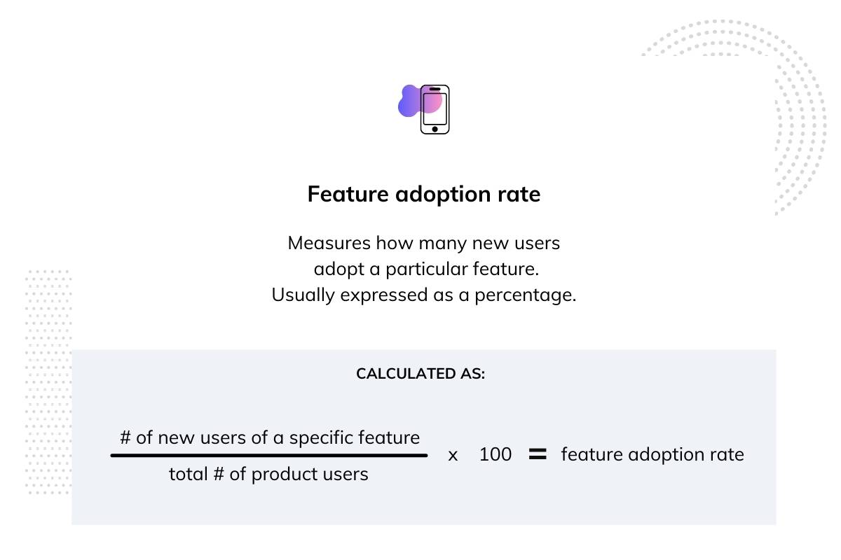
Feature adoption rate is the percentage of users or accounts actively using a specific feature within a given time window. It's one of the most actionable feature adoption metrics in the PLG toolkit because it connects directly to both onboarding decisions and product roadmap priorities.
Not all features are worth tracking equally. Focus adoption measurement on features tied to core value delivery and expansion revenue — the features that, when adopted, correlate with retention and upsell. Low adoption of those features is a signal worth acting on.
Low feature adoption can mean several things: users don't know the feature exists, they can't figure out how to use it, or it doesn't solve a problem they actually have. The first two are fixable with better in-app messaging and onboarding design. The third is a product-market fit signal worth investigating.
In a sales-led model, conversion is something that happens to users — a salesperson closes them. In a PLG model, conversion is something users do because they've experienced enough value to justify paying. That distinction changes how you measure and influence it.
PLG conversion metrics need to capture both the rate and the quality of conversion. The most effective PLG teams don't wait for conversion to happen organically — they use product usage data to predict when a user is ready to convert and create the conditions that accelerate it.
Free-to-paid conversion rate is the percentage of free or trial users who upgrade to a paid plan within a given period. It's one of the clearest signals of product-market fit and onboarding effectiveness available to a PLG team.
The aggregate number is a starting point, but the real insight comes from segmentation. Breaking free-to-paid conversion down by cohort, acquisition channel, and activation status reveals which users are most likely to convert — and why. A user who activated quickly and adopted core features converts at a very different rate than one who signed up and barely engaged.
Freemium and free-trial PLG models have different conversion dynamics. Freemium models typically see lower overall conversion rates but larger top-of-funnel volume. Free-trial models tend to see higher conversion rates but require more urgency-driven onboarding. Knowing which model you're running shapes how you interpret and benchmark this metric.
It’s a lot easier to get more money from happy, paying customers than it is to acquire new ones. It’s more cost-effective, too—it’s roughly 2X cheaper to upsell to an existing customer than to acquire a new one, and over 3X cheaper to generate expansion revenue than the customer acquisition cost (CAC) of a new customer.
That’s why expansion revenue is easily one of the most important levers for sustainable SaaS growth. Also called expansion monthly recurring revenue (MRR), this metric measures the revenue generated from existing customers through upsells, add-ons, and cross-sells. For a healthy SaaS business, ProfitWell recommends that at least 30% of your revenue should be expansion revenue.
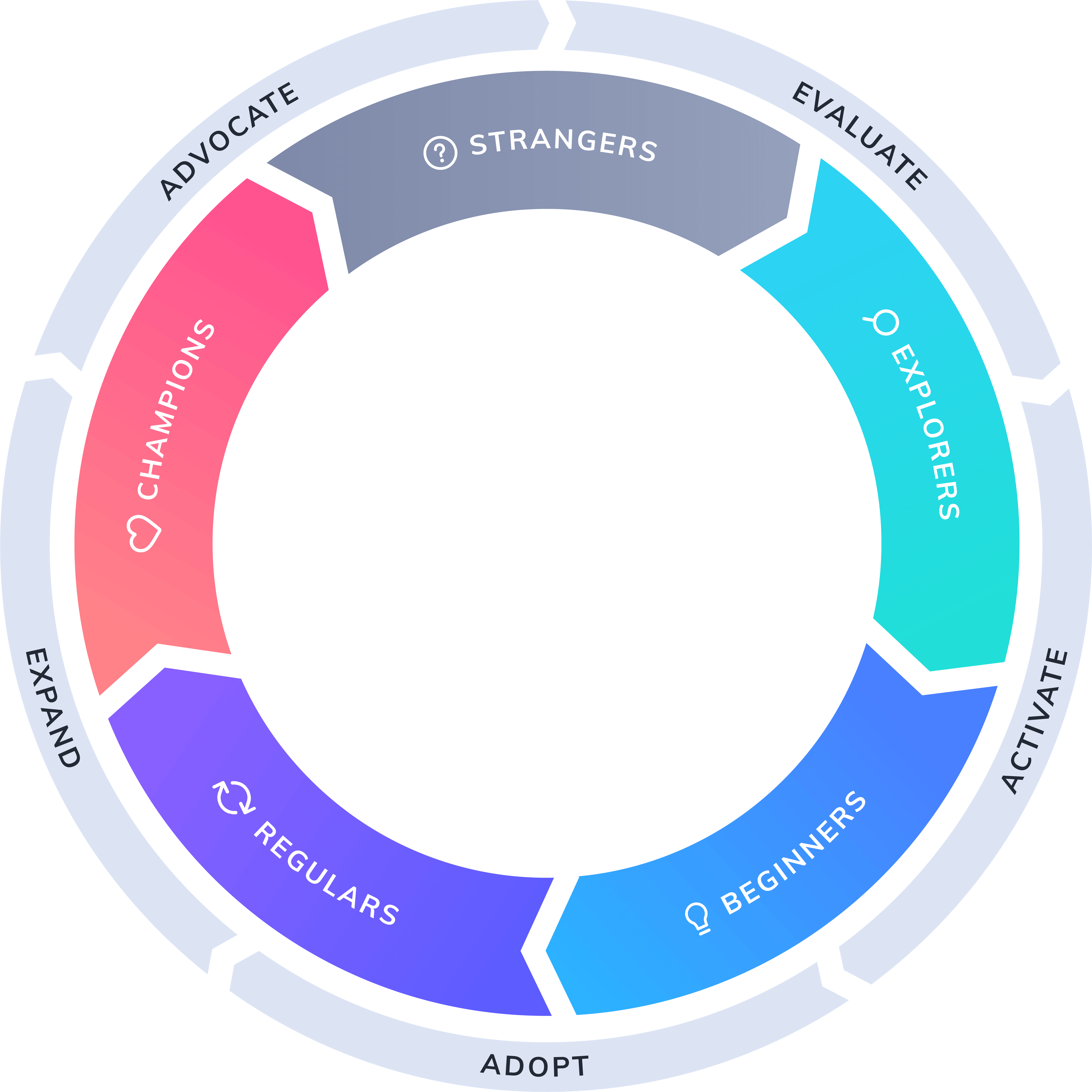
In the Product-Led Growth Flywheel framework, expansion revenue is associated with the expansion stage of the user journey—when your regular users are looking for new ways to use your product.
A Product Qualified Lead is a user or account whose in-product behavior signals they're ready for a sales conversation or a paid upgrade. PQLs replace the traditional MQL as the primary signal of purchase intent in a PLG model — because behavior is a far more reliable indicator of intent than demographic fit or content downloads.
PQL scoring works by defining behavioral thresholds that indicate high purchase intent: feature usage frequency, team size, integration connections, usage limits approached. When a user or account crosses those thresholds, they become a PQL — a signal for either a timely in-app upgrade prompt or a sales outreach.
PQL rate — the percentage of free users who reach PQL status — serves as a leading indicator of conversion pipeline. It tells you how many users are on a trajectory toward paid before they actually convert. That's valuable for forecasting, and it's valuable for prioritization: sales teams can focus outreach on accounts most likely to close, and product teams can design in-app experiences that accelerate the journey to PQL status.
Retention isn't just a success metric in PLG — it's the engine of compounding growth. Retained users drive expansion revenue, generate referrals, and become the case studies that attract new users. Without strong retention, every other PLG metric is a leaky bucket.
It's important to track retention at two levels: user-level retention (are individual users coming back?) and account-level retention (are companies renewing and expanding?). Both matter, and they can tell very different stories about the health of your PLG motion.
User retention rate measures the percentage of users who continue using your product over a given period. Churn rate is its inverse — the percentage who stop. Both are straightforward to define and surprisingly easy to misread.
The most common mistake is calculating churn as a single aggregate number. Cohort-based analysis is far more revealing. When you look at retention by cohort — users who signed up in the same period, came from the same channel, or followed the same onboarding path — you can identify which acquisition sources, onboarding experiences, and user segments produce the most durable retention. Aggregate churn rates hide that information.
Healthy PLG products show retention curves that flatten over time — meaning users who stay past a certain point tend to stay indefinitely. If your retention curve keeps declining without flattening, that's a sign the product hasn't found its core habitual users yet.
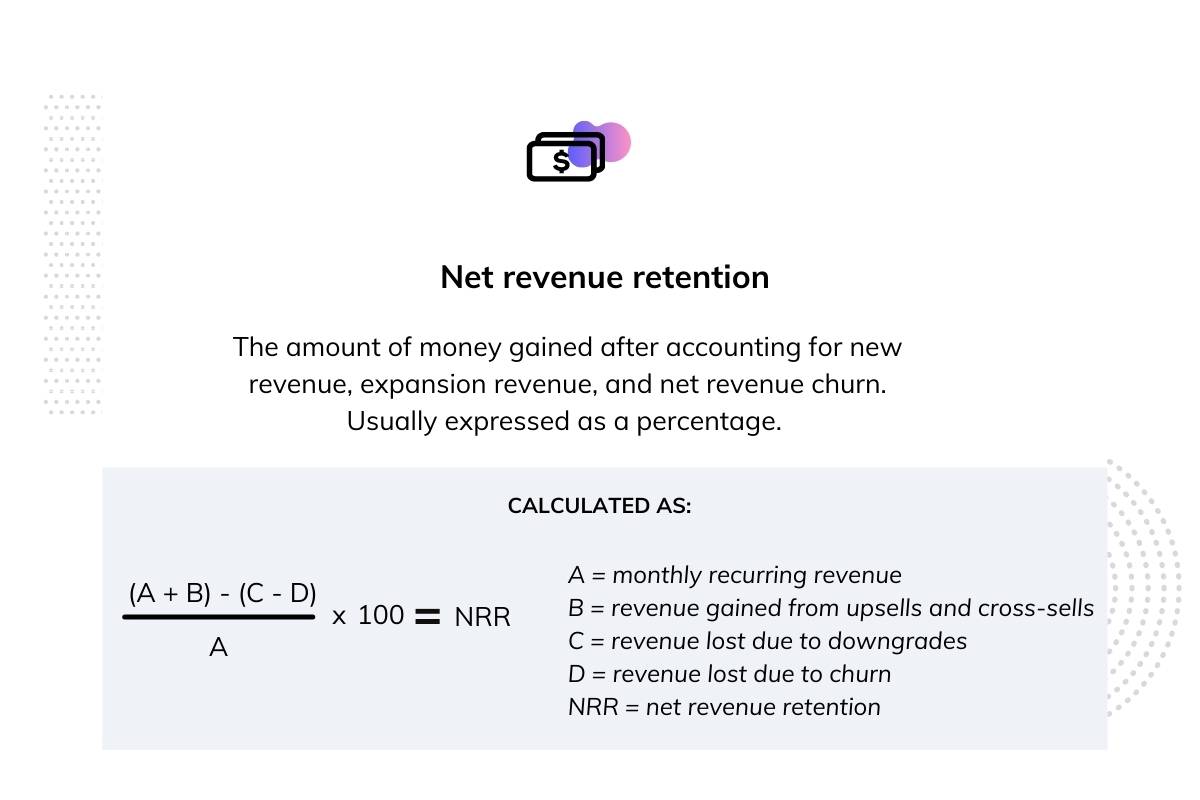
Net Revenue Retention is the percentage of recurring revenue retained from existing customers after accounting for churn, contraction, and expansion. It's the single metric that most clearly demonstrates whether a PLG model is working as a compounding revenue engine.
NRR above 100% means your existing customer base is growing revenue faster than you're losing it to churn. That's the hallmark of a healthy PLG business — and it's what makes PLG so compelling to investors. You don't need to acquire new customers just to maintain revenue; your existing customers are doing that work for you.
Expansion revenue — upsells, seat additions, plan upgrades — is what pushes NRR above 100%. And expansion revenue is driven by product engagement. Users who deeply adopt your product, activate advanced features, and add teammates are the ones who expand. That's why the connection between activation metrics and NRR is so direct: better activation leads to deeper engagement, which leads to expansion, which drives NRR.
Product behavior metrics tell you whether your product is working. Unit economics tell you whether your business is working. In a PLG model, those two things are more tightly connected than in any other growth model — but you still need to look at both.
PLG models often have favorable unit economics compared to sales-led models because the product does much of the selling. But "often" isn't "always," and favorable unit economics don't happen automatically. They require tracking the right metrics and optimizing accordingly.
Customer Acquisition Cost in a PLG context is different from sales-led CAC in an important way: acquisition costs are often lower because the product generates organic growth through virality and word-of-mouth. But PLG teams still need to account for product development costs, onboarding infrastructure, and self-serve support when calculating true CAC.
Tracking blended CAC gives you an overall picture of acquisition efficiency. Tracking channel-specific CAC tells you which acquisition sources are most efficient — and where to double down. A channel that brings in users with high activation rates and low CAC is worth investing in. A channel with low CAC but poor activation is often a false economy.
Customer Lifetime Value is the total revenue a customer is expected to generate over their lifetime with your product. It's calculated using average revenue per account, gross margin, and churn rate — and it's the numerator in the ratio that matters most for evaluating PLG efficiency.
The LTV:CAC ratio benchmarks how much value you generate relative to what you spend to acquire a customer. A ratio of 3:1 or higher is typically considered healthy. PLG companies can improve this ratio by reducing TTV (which improves activation and retention), increasing activation rates (which reduces early churn), and driving expansion revenue (which extends and increases lifetime value).
The connection between LTV and NRR is direct: strong NRR means customers are staying longer and spending more, which compounds lifetime value over time. That's the flywheel effect that makes PLG unit economics so attractive when the model is working.
Revenue per Employee is an executive-level efficiency metric that reflects how well a PLG model is scaling without proportional headcount growth. Because PLG reduces reliance on large sales and customer success teams — the product handles much of what those teams would otherwise do — high-performing PLG companies tend to generate significantly more revenue per employee than sales-led peers.
This metric matters to investors and operators evaluating the scalability of a PLG motion. It's a signal that the product is genuinely doing the work of growth, not just supplementing a traditional sales motion with a self-serve tier.
Knowing which metrics exist is different from knowing how to use them. The goal of a PLG metrics dashboard isn't to display every metric simultaneously — it's to surface the right signals at the right time so teams can make fast, confident decisions.
A well-designed dashboard is tiered. Leading indicators — activation rate, TTV, PQL rate — sit at the top because they tell you what's going to happen. Lagging indicators — NRR, LTV, churn — confirm what already happened. You need both, but you act on leading indicators first.
Metric ownership matters as much as metric selection. When product, growth, sales, and finance teams each own different metrics without a shared framework, PLG metrics become siloed reporting rather than cross-functional signals. Aligning ownership across teams — so that a drop in activation rate triggers action from both product and growth — is what turns a dashboard into a decision-making tool.
A North Star Metric is the single metric that best captures the value your product delivers to users and predicts long-term business success. It's not a vanity metric, and it's not a financial metric — it's a behavioral signal that sits at the intersection of user value and business outcomes.
The right North Star Metric is product-specific. For a project management tool, it might be "weekly active projects created." For a collaboration tool, it might be "documents shared." The metric should reflect the core action that, when users do it repeatedly, predicts retention and expansion.
Aligning the entire organization around a North Star Metric creates focus. But it requires keeping the supporting metrics — activation rate, feature adoption, NRR — visible alongside it, so teams understand what drives the North Star rather than just chasing the number itself.
The distinction between leading and lagging indicators is one of the most practically important concepts in PLG measurement. Leading indicators predict future outcomes. Lagging indicators confirm past performance. PLG teams that rely primarily on lagging indicators are always reacting — by the time revenue or churn shows a problem, the window to course-correct has often already closed.
Here's a simple mapping from the metrics covered in this guide:
Leading indicators:
Lagging indicators:
Prioritize leading indicators in your day-to-day decision-making. Use lagging indicators to validate that your leading indicator improvements are translating into business outcomes. That's the feedback loop that keeps a PLG metrics system honest.
Knowing which metrics to track is only half the battle. The harder problem is actually moving them — and doing it fast enough to matter.
Appcues sits at the intersection of measurement and action. It gives product and growth teams the tools to understand where users are struggling and deploy in-product experiences that fix those problems — without waiting on engineering resources.
On activation and Time-to-Value: Appcues' onboarding flows, checklists, and tooltips guide users to their "aha moment" faster by surfacing the right actions at the right moment. When users know exactly what to do next, TTV drops and activation rate climbs.
On free-to-paid conversion: Appcues' in-app messaging and announcement features let teams surface upgrade prompts at the exact moment a user demonstrates high intent — turning PQL signals into timely, contextual nudges rather than generic email campaigns.
On feature adoption: Appcues' analytics and event tracking let teams instrument key activation milestones, monitor which features are being adopted, and identify exactly where users drop off in the onboarding funnel. That's the visibility you need to run in-product experiments that actually improve adoption.
On integration: Appcues connects with the analytics and CRM tools PLG teams already use — Segment, Amplitude, HubSpot, Salesforce — so product behavior data flows directly into PQL scoring models and retention dashboards. You don't have to choose between your existing stack and better in-product experiences.
Appcues isn't a reporting tool. It's an action layer that closes the loop between insight and improvement across every PLG metric category — from the moment a user signs up through activation, conversion, and expansion.
Product-led growth only compounds when you measure the right things at the right stage of the user lifecycle. Virality and activation metrics tell you whether your product is generating and converting interest. Conversion and retention metrics tell you whether that interest is turning into durable revenue. Unit economics tell you whether the whole system is building a sustainable business.
The most effective PLG organizations treat metrics not as scorecards but as signals — signals that drive continuous product improvement and align go-to-market decisions with actual user behavior. That's what separates teams that grow from teams that just report.
Don't try to instrument everything at once. Start with the metrics most relevant to your current growth stage. If activation is your biggest problem, focus there first. If you're converting well but churning fast, NRR and cohort retention deserve your attention. Build the measurement system incrementally, and let the signals tell you where to go next.
Ready to move the needle on your most important PLG metrics? Start a free trial of Appcues and see how in-product experiences can improve activation, conversion, and retention — or request a personalized demo to see how it works for your specific product. You can also explore the Appcues product metrics benchmark report to see how your metrics stack up against industry benchmarks.
Lifecycle Marketing
Retention & Churn
Upsell & Cross-sell
Customer Journeys
Most SaaS teams are measuring the wrong things. They track signups, page views, and MQL volume — metrics that feel productive but don't tell you whether your product is actually driving growth. In a product-led growth model, that disconnect is fatal.
Product-led growth metrics are different. They're behavioral signals that connect what users do inside your product to the revenue outcomes your business depends on. The challenge most teams face isn't a lack of data — it's knowing which metrics actually predict retention, conversion, and expansion, and which ones are just noise.
This guide covers every critical PLG metric category you need to build a measurement framework that works. From virality and activation through conversion, retention, and unit economics, you'll walk away with a clear picture of how to connect product behavior to business outcomes — and how to stop optimizing for metrics that don't move the needle.
Traditional SaaS metrics were built for a sales-led world. They measure pipeline volume, lead quality, and sales cycle length — all useful signals when a salesperson is the primary growth driver. But when the product itself is responsible for acquiring, activating, and expanding users, those metrics miss most of what matters.
Product-led growth metrics measure how users experience and derive value from the product — and how that experience drives acquisition, conversion, and expansion without heavy sales intervention. They span the full user lifecycle, not just the top of the funnel.
The distinction matters because PLG metrics create feedback loops. When you track activation rate and see it drop, that's a signal to fix onboarding. When you track feature adoption and see a specific feature correlating with retention, that's a signal to make that feature more discoverable. Sales-led metrics rarely give you that kind of product-level intelligence.
The best PLG teams don't just report on these metrics — they use them to make go-to-market decisions. Which acquisition channels bring users who actually activate? Which onboarding paths lead to conversion? Which accounts are ready for a sales conversation based on their in-product behavior? These are the questions PLG metrics are designed to answer.
Choosing the right metrics matters more than tracking everything. A bloated dashboard full of vanity metrics creates noise, not clarity. The goal is a focused set of behavioral signals that tell you, at each stage of the user lifecycle, whether your product is doing its job.
Before diving into individual metrics, it helps to have a framework for organizing them. The most useful structure for PLG teams is a product-led adaptation of the AARRR pirate metrics model — covering four core stages: Acquisition, Activation, Revenue, and Retention/Expansion.
Each stage feeds the next. Acquisition metrics are meaningless if you're bringing in users who never activate. Activation metrics are irrelevant if those activated users churn before converting. Revenue metrics look great until you realize NRR is declining because expansion isn't keeping up with churn. The sequence matters.
This framework also prevents teams from measuring in silos. Product teams tend to own activation and engagement metrics. Growth teams own acquisition and conversion. Finance owns unit economics. But in a PLG model, all of these connect — and the most effective organizations use a shared framework to see how changes at one stage ripple through the rest.
Think of this as the navigational spine of your PLG measurement system. The sections that follow go deep on each stage, but the framework is what keeps them connected.
In a traditional SaaS model, acquisition is almost entirely a marketing function — you run campaigns, generate leads, and hand them to sales. In a PLG model, the product itself becomes an acquisition channel. Users invite colleagues, share outputs, and embed your product into workflows that others eventually encounter.
That changes what you need to measure. Raw signup volume tells you how many people found you. It doesn't tell you whether those people are likely to activate, convert, or refer others. PLG acquisition metrics focus on the quality and source of new users, not just the quantity — and they track the organic, product-driven channels that traditional attribution models often miss.
The most important insight here: tracking where your high-retention users come from is more valuable than tracking where your most signups come from. Those are often very different answers.
Virality is one of the defining characteristics of a strong PLG model. When users invite colleagues, share work, or collaborate inside your product, they're generating acquisition at near-zero marginal cost. Viral coefficient and referral rate are the metrics that capture this.
Viral coefficient measures how many new users each existing user brings in through product-native sharing, invites, or collaboration features. The formula is straightforward: multiply the number of invites sent by the conversion rate of those invites. A viral coefficient above 1.0 means each user generates more than one new user on average — which creates compounding, self-sustaining growth.
To track virality accurately, you need to instrument the right product behaviors: invite flows, shared links, in-product collaboration events, and any feature that exposes your product to someone who isn't yet a user. Without that instrumentation, you're flying blind on one of PLG's most powerful growth levers.
Virality metrics are especially critical for freemium and collaborative products, where the product's value often increases with more users — creating a natural incentive to invite others.
If there's one stage in the PLG funnel that determines everything downstream, it's activation. Users who don't reach their "aha moment" — the point where they first experience the core value of your product — will churn before they convert, refer anyone, or expand. No downstream metric will look good if activation is broken.
Activation in the PLG context isn't just completing a signup flow. It's the moment a user does something meaningful inside the product — something that correlates with long-term retention and value realization. Identifying and measuring that moment is the foundation of everything else.
Activation metrics are leading indicators. They tell you what's going to happen to your retention and conversion numbers before those numbers move. That's why product and growth teams need to monitor them closely and continuously.
Activation rate is the percentage of new users who complete a defined set of actions that correlate with long-term retention and value realization. The key word is "correlate" — your activation milestone shouldn't be assumed, it should be validated against retention data.
For a project management tool, activation might mean creating a project and inviting a teammate. For an analytics product, it might mean connecting a data source and viewing a dashboard. The right milestone is product-specific, and getting it wrong means you're optimizing for the wrong behavior.
A low activation rate is almost always a signal of onboarding friction. Users are signing up but not reaching the value that would make them stay. That's a fixable problem — but only if you're measuring it. User onboarding metrics like activation rate give you the visibility to diagnose exactly where users are dropping off.
Time-to-Value is the elapsed time between a user's first login and the moment they complete their activation milestone. It's a deceptively simple metric with significant downstream consequences.
Shorter TTV correlates with higher retention and higher free-to-paid conversion. When users reach value quickly, they're more likely to stick around, upgrade, and tell others. When TTV is long — because onboarding is confusing, setup is complex, or the path to value isn't clear — users disengage before they ever experience what makes your product worth paying for.
Reducing Time-to-Value typically involves improving onboarding design, adding in-app guidance that surfaces the right actions at the right moment, and using progressive disclosure to avoid overwhelming new users. The goal is to remove every unnecessary step between signup and the moment the product clicks for a user.
TTV is also a useful diagnostic tool. When you map where users are spending time before reaching activation, you can identify the specific friction points that are adding delay — and prioritize fixes accordingly.
Activation gets users to first value. Engagement metrics tell you whether they're building a habit around your product or just dipping in occasionally. These are the signals that reveal whether your product has earned a place in users' daily or weekly workflows.
Engagement goes beyond login frequency. The most useful engagement metrics capture both breadth (how many features a user touches) and depth (how intensively they use the features that matter most). Both dimensions matter — a user who touches many features superficially is different from a user who relies heavily on your core functionality.
The DAU/MAU ratio — often called the stickiness ratio — measures what percentage of your monthly active users are returning on a daily basis. A higher ratio means users are building a daily habit around your product rather than treating it as an occasional tool.
Benchmarks vary significantly by product category. A communication or collaboration tool should have a much higher DAU/MAU ratio than a quarterly reporting tool — because the nature of the product determines how often users naturally return. Comparing your ratio against the right benchmark matters more than chasing an arbitrary number.
What the ratio tells you: when stickiness is high, retention tends to follow. Users who return daily are far less likely to churn and far more likely to expand their usage over time.
Feature adoption rate is the percentage of users or accounts actively using a specific feature within a given time window. It's one of the most actionable feature adoption metrics in the PLG toolkit because it connects directly to both onboarding decisions and product roadmap priorities.
Not all features are worth tracking equally. Focus adoption measurement on features tied to core value delivery and expansion revenue — the features that, when adopted, correlate with retention and upsell. Low adoption of those features is a signal worth acting on.
Low feature adoption can mean several things: users don't know the feature exists, they can't figure out how to use it, or it doesn't solve a problem they actually have. The first two are fixable with better in-app messaging and onboarding design. The third is a product-market fit signal worth investigating.
In a sales-led model, conversion is something that happens to users — a salesperson closes them. In a PLG model, conversion is something users do because they've experienced enough value to justify paying. That distinction changes how you measure and influence it.
PLG conversion metrics need to capture both the rate and the quality of conversion. The most effective PLG teams don't wait for conversion to happen organically — they use product usage data to predict when a user is ready to convert and create the conditions that accelerate it.
Free-to-paid conversion rate is the percentage of free or trial users who upgrade to a paid plan within a given period. It's one of the clearest signals of product-market fit and onboarding effectiveness available to a PLG team.
The aggregate number is a starting point, but the real insight comes from segmentation. Breaking free-to-paid conversion down by cohort, acquisition channel, and activation status reveals which users are most likely to convert — and why. A user who activated quickly and adopted core features converts at a very different rate than one who signed up and barely engaged.
Freemium and free-trial PLG models have different conversion dynamics. Freemium models typically see lower overall conversion rates but larger top-of-funnel volume. Free-trial models tend to see higher conversion rates but require more urgency-driven onboarding. Knowing which model you're running shapes how you interpret and benchmark this metric.
It’s a lot easier to get more money from happy, paying customers than it is to acquire new ones. It’s more cost-effective, too—it’s roughly 2X cheaper to upsell to an existing customer than to acquire a new one, and over 3X cheaper to generate expansion revenue than the customer acquisition cost (CAC) of a new customer.
That’s why expansion revenue is easily one of the most important levers for sustainable SaaS growth. Also called expansion monthly recurring revenue (MRR), this metric measures the revenue generated from existing customers through upsells, add-ons, and cross-sells. For a healthy SaaS business, ProfitWell recommends that at least 30% of your revenue should be expansion revenue.
In the Product-Led Growth Flywheel framework, expansion revenue is associated with the expansion stage of the user journey—when your regular users are looking for new ways to use your product.
A Product Qualified Lead is a user or account whose in-product behavior signals they're ready for a sales conversation or a paid upgrade. PQLs replace the traditional MQL as the primary signal of purchase intent in a PLG model — because behavior is a far more reliable indicator of intent than demographic fit or content downloads.
PQL scoring works by defining behavioral thresholds that indicate high purchase intent: feature usage frequency, team size, integration connections, usage limits approached. When a user or account crosses those thresholds, they become a PQL — a signal for either a timely in-app upgrade prompt or a sales outreach.
PQL rate — the percentage of free users who reach PQL status — serves as a leading indicator of conversion pipeline. It tells you how many users are on a trajectory toward paid before they actually convert. That's valuable for forecasting, and it's valuable for prioritization: sales teams can focus outreach on accounts most likely to close, and product teams can design in-app experiences that accelerate the journey to PQL status.
Retention isn't just a success metric in PLG — it's the engine of compounding growth. Retained users drive expansion revenue, generate referrals, and become the case studies that attract new users. Without strong retention, every other PLG metric is a leaky bucket.
It's important to track retention at two levels: user-level retention (are individual users coming back?) and account-level retention (are companies renewing and expanding?). Both matter, and they can tell very different stories about the health of your PLG motion.
User retention rate measures the percentage of users who continue using your product over a given period. Churn rate is its inverse — the percentage who stop. Both are straightforward to define and surprisingly easy to misread.
The most common mistake is calculating churn as a single aggregate number. Cohort-based analysis is far more revealing. When you look at retention by cohort — users who signed up in the same period, came from the same channel, or followed the same onboarding path — you can identify which acquisition sources, onboarding experiences, and user segments produce the most durable retention. Aggregate churn rates hide that information.
Healthy PLG products show retention curves that flatten over time — meaning users who stay past a certain point tend to stay indefinitely. If your retention curve keeps declining without flattening, that's a sign the product hasn't found its core habitual users yet.
Net Revenue Retention is the percentage of recurring revenue retained from existing customers after accounting for churn, contraction, and expansion. It's the single metric that most clearly demonstrates whether a PLG model is working as a compounding revenue engine.
NRR above 100% means your existing customer base is growing revenue faster than you're losing it to churn. That's the hallmark of a healthy PLG business — and it's what makes PLG so compelling to investors. You don't need to acquire new customers just to maintain revenue; your existing customers are doing that work for you.
Expansion revenue — upsells, seat additions, plan upgrades — is what pushes NRR above 100%. And expansion revenue is driven by product engagement. Users who deeply adopt your product, activate advanced features, and add teammates are the ones who expand. That's why the connection between activation metrics and NRR is so direct: better activation leads to deeper engagement, which leads to expansion, which drives NRR.
Product behavior metrics tell you whether your product is working. Unit economics tell you whether your business is working. In a PLG model, those two things are more tightly connected than in any other growth model — but you still need to look at both.
PLG models often have favorable unit economics compared to sales-led models because the product does much of the selling. But "often" isn't "always," and favorable unit economics don't happen automatically. They require tracking the right metrics and optimizing accordingly.
Customer Acquisition Cost in a PLG context is different from sales-led CAC in an important way: acquisition costs are often lower because the product generates organic growth through virality and word-of-mouth. But PLG teams still need to account for product development costs, onboarding infrastructure, and self-serve support when calculating true CAC.
Tracking blended CAC gives you an overall picture of acquisition efficiency. Tracking channel-specific CAC tells you which acquisition sources are most efficient — and where to double down. A channel that brings in users with high activation rates and low CAC is worth investing in. A channel with low CAC but poor activation is often a false economy.
Customer Lifetime Value is the total revenue a customer is expected to generate over their lifetime with your product. It's calculated using average revenue per account, gross margin, and churn rate — and it's the numerator in the ratio that matters most for evaluating PLG efficiency.
The LTV:CAC ratio benchmarks how much value you generate relative to what you spend to acquire a customer. A ratio of 3:1 or higher is typically considered healthy. PLG companies can improve this ratio by reducing TTV (which improves activation and retention), increasing activation rates (which reduces early churn), and driving expansion revenue (which extends and increases lifetime value).
The connection between LTV and NRR is direct: strong NRR means customers are staying longer and spending more, which compounds lifetime value over time. That's the flywheel effect that makes PLG unit economics so attractive when the model is working.
Revenue per Employee is an executive-level efficiency metric that reflects how well a PLG model is scaling without proportional headcount growth. Because PLG reduces reliance on large sales and customer success teams — the product handles much of what those teams would otherwise do — high-performing PLG companies tend to generate significantly more revenue per employee than sales-led peers.
This metric matters to investors and operators evaluating the scalability of a PLG motion. It's a signal that the product is genuinely doing the work of growth, not just supplementing a traditional sales motion with a self-serve tier.
Knowing which metrics exist is different from knowing how to use them. The goal of a PLG metrics dashboard isn't to display every metric simultaneously — it's to surface the right signals at the right time so teams can make fast, confident decisions.
A well-designed dashboard is tiered. Leading indicators — activation rate, TTV, PQL rate — sit at the top because they tell you what's going to happen. Lagging indicators — NRR, LTV, churn — confirm what already happened. You need both, but you act on leading indicators first.
Metric ownership matters as much as metric selection. When product, growth, sales, and finance teams each own different metrics without a shared framework, PLG metrics become siloed reporting rather than cross-functional signals. Aligning ownership across teams — so that a drop in activation rate triggers action from both product and growth — is what turns a dashboard into a decision-making tool.
A North Star Metric is the single metric that best captures the value your product delivers to users and predicts long-term business success. It's not a vanity metric, and it's not a financial metric — it's a behavioral signal that sits at the intersection of user value and business outcomes.
The right North Star Metric is product-specific. For a project management tool, it might be "weekly active projects created." For a collaboration tool, it might be "documents shared." The metric should reflect the core action that, when users do it repeatedly, predicts retention and expansion.
Aligning the entire organization around a North Star Metric creates focus. But it requires keeping the supporting metrics — activation rate, feature adoption, NRR — visible alongside it, so teams understand what drives the North Star rather than just chasing the number itself.
The distinction between leading and lagging indicators is one of the most practically important concepts in PLG measurement. Leading indicators predict future outcomes. Lagging indicators confirm past performance. PLG teams that rely primarily on lagging indicators are always reacting — by the time revenue or churn shows a problem, the window to course-correct has often already closed.
Here's a simple mapping from the metrics covered in this guide:
Leading indicators:
Lagging indicators:
Prioritize leading indicators in your day-to-day decision-making. Use lagging indicators to validate that your leading indicator improvements are translating into business outcomes. That's the feedback loop that keeps a PLG metrics system honest.
Knowing which metrics to track is only half the battle. The harder problem is actually moving them — and doing it fast enough to matter.
Appcues sits at the intersection of measurement and action. It gives product and growth teams the tools to understand where users are struggling and deploy in-product experiences that fix those problems — without waiting on engineering resources.
On activation and Time-to-Value: Appcues' onboarding flows, checklists, and tooltips guide users to their "aha moment" faster by surfacing the right actions at the right moment. When users know exactly what to do next, TTV drops and activation rate climbs.
On free-to-paid conversion: Appcues' in-app messaging and announcement features let teams surface upgrade prompts at the exact moment a user demonstrates high intent — turning PQL signals into timely, contextual nudges rather than generic email campaigns.
On feature adoption: Appcues' analytics and event tracking let teams instrument key activation milestones, monitor which features are being adopted, and identify exactly where users drop off in the onboarding funnel. That's the visibility you need to run in-product experiments that actually improve adoption.
On integration: Appcues connects with the analytics and CRM tools PLG teams already use — Segment, Amplitude, HubSpot, Salesforce — so product behavior data flows directly into PQL scoring models and retention dashboards. You don't have to choose between your existing stack and better in-product experiences.
Appcues isn't a reporting tool. It's an action layer that closes the loop between insight and improvement across every PLG metric category — from the moment a user signs up through activation, conversion, and expansion.
Product-led growth only compounds when you measure the right things at the right stage of the user lifecycle. Virality and activation metrics tell you whether your product is generating and converting interest. Conversion and retention metrics tell you whether that interest is turning into durable revenue. Unit economics tell you whether the whole system is building a sustainable business.
The most effective PLG organizations treat metrics not as scorecards but as signals — signals that drive continuous product improvement and align go-to-market decisions with actual user behavior. That's what separates teams that grow from teams that just report.
Don't try to instrument everything at once. Start with the metrics most relevant to your current growth stage. If activation is your biggest problem, focus there first. If you're converting well but churning fast, NRR and cohort retention deserve your attention. Build the measurement system incrementally, and let the signals tell you where to go next.
Ready to move the needle on your most important PLG metrics? Start a free trial of Appcues and see how in-product experiences can improve activation, conversion, and retention — or request a personalized demo to see how it works for your specific product. You can also explore the Appcues product metrics benchmark report to see how your metrics stack up against industry benchmarks.

Sign up for Quickcues and get our monthly updates!
.svg)