
.png)

Fintech launches aren’t just feature drops—they’re trust-building moments. Whether you’re rolling out a waitlist campaign or debuting an embedded finance product, how you launch sets the tone for adoption, retention, and growth. This isn’t about announcing—it’s about delivering clarity at the moment of change.
In this post, we’ll look at five fintech brands that launched with precision, empathy, and smart distribution—from Robinhood’s viral waitlist to Plaid’s developer-first rollout.—from Robinhood and Klarna to Plaid and Varo—that show how to generate buzz, support adoption, and turn feature releases into real growth levers.
A poorly timed update or confusing interface can undo trust built over months—or even years. These launches impact everything from customer onboarding to daily money management. Without the right rollout strategy, users can feel lost, support tickets can spike, and adoption can stall.
A successful fintech launch isn’t just PR—it’s a user-first moment that makes people feel supported and confident as they use something new.
Fintech users don’t just need new features—they need to understand them, trust them, and feel confident using them. A successful product launch isn’t about making a splash. It’s about making sure customers feel informed and supported as they interact with something new.
Here’s what sets standout fintech launches apart:
The best time to explain a new feature is when someone’s about to use it. That’s why tools like pop-up messages (called modals), helpful hints (tooltips), and simple prompts on the dashboard work so well. They meet users where they already are—inside your app or platform—and offer helpful direction right when it’s needed.
A good launch doesn’t start the day your product goes live. Building interest ahead of time with waitlists, early-access invitations, or teaser emails gives users something to look forward to. More importantly, it signals that what’s coming is valuable.
When something is brand new, users may not know where to start. That’s why guided introductions—like step-by-step tours or checklists—are so important. These tools help customers get through their first “win,” such as connecting a bank account or sending their first payment. And that early success makes them more likely to come back.
Instead of just saying, “Here’s what’s new,” strong launch messages explain why the change matters. Will it save time? Offer more control? Improve security? Helping users see how a new feature fits into their goals makes it more meaningful—and more likely to be used.
No launch is perfect. That’s why successful teams watch closely after release. Are people using the new feature? Are they confused at certain points? Are support requests going up? Paying attention to what’s working (and what isn’t) lets you make fast improvements before small problems become big frustrations.
In short: a fintech launch isn’t a single event—it’s a process. One that starts before release day, meets users at every step, and evolves based on real feedback. The more thoughtful your approach, the more likely your users are to trust and adopt what you’ve built.
Sometimes, the simplest tools are the most effective. When Crunchbase wanted to highlight its new Marketplace feature, it didn’t overwhelm users with pop-ups or complex tutorials. Instead, it used a clean, well-timed message right in the app. The small window (called a modal) appeared in a way that felt natural—explaining the feature clearly without disrupting anything else on the screen.
If you’re introducing something new, this kind of approach can be powerful. Focus on one message at a time, place it where users will naturally see it, and keep the experience smooth. A short message in the right place can do more than a long explanation no one reads.

Before Robinhood’s app ever launched, the company had already captured the attention of more than a million people. How? By turning its waitlist into a challenge. When people signed up early, they could move up the line by inviting friends. The more people you brought in, the sooner you’d get access.
What really made this work was the message: “Stop paying $10 per trade.” It was bold, easy to understand, and spoke to something users were frustrated with. The campaign took off, especially after it was featured on tech forums. With no paid ads, Robinhood built a loyal following before writing a single line of code for the public. It’s a reminder that clear value and smart timing can be more powerful than a big ad budget.
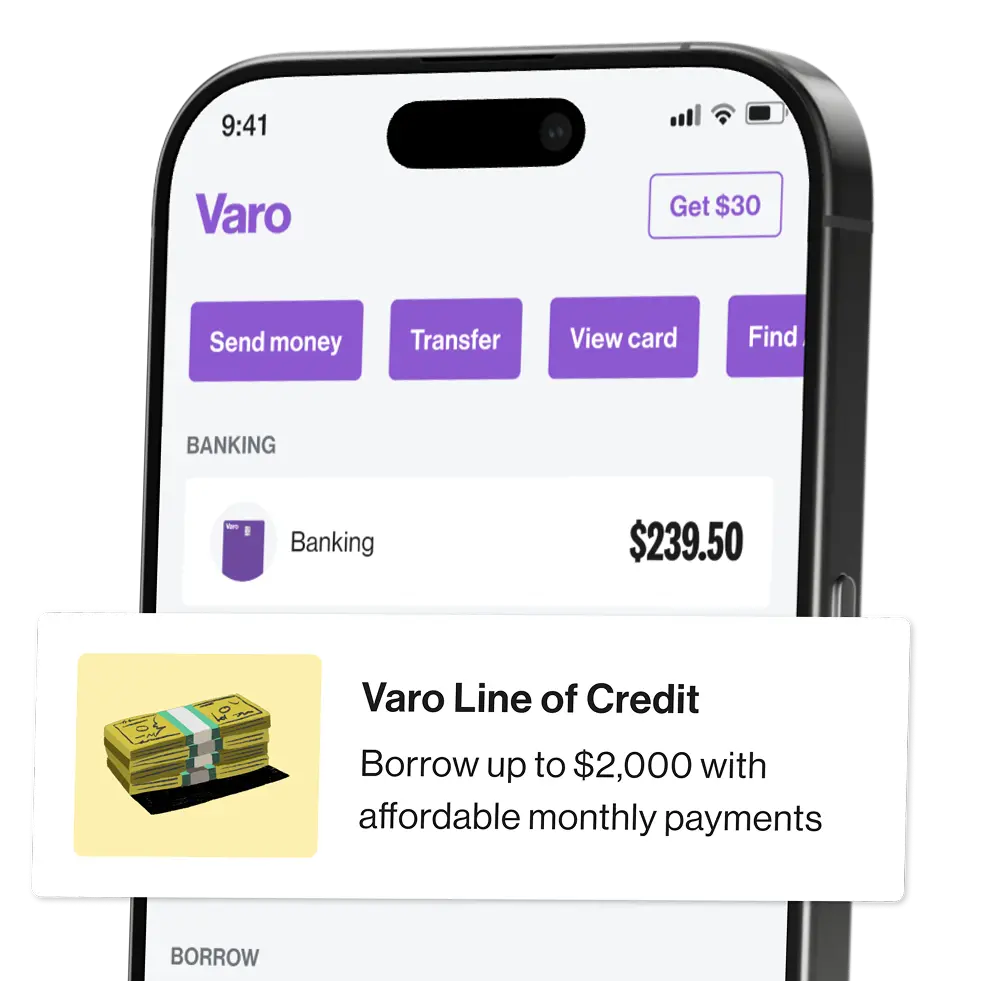
In 2024, Varo launched two features to help customers manage money more confidently: a small line of credit and better tools to track spending. The loan product offered up to $2,000 for emergencies like car repairs—no credit score required. Instead, approval was based on how people used their Varo account. It came with clear terms, no hidden fees, and could be used right from the app.
At the same time, Varo rolled out new budgeting features that let people see how much they were spending on things like groceries or utilities. They could also track how their income changed over time, making it easier to plan ahead.
This launch worked because it didn’t just introduce features—it addressed real stress points. Varo showed it was listening and designing tools to help people stay in control of their money, especially during uncertain times.
Klarna’s card launch in 2025 blended the familiar with the flexible. On the surface, it looked like a regular debit card. But users could choose to either pay now or spread payments out over time—both online and in stores. The card worked wherever Visa was accepted, which made it easy to use without needing a learning curve.
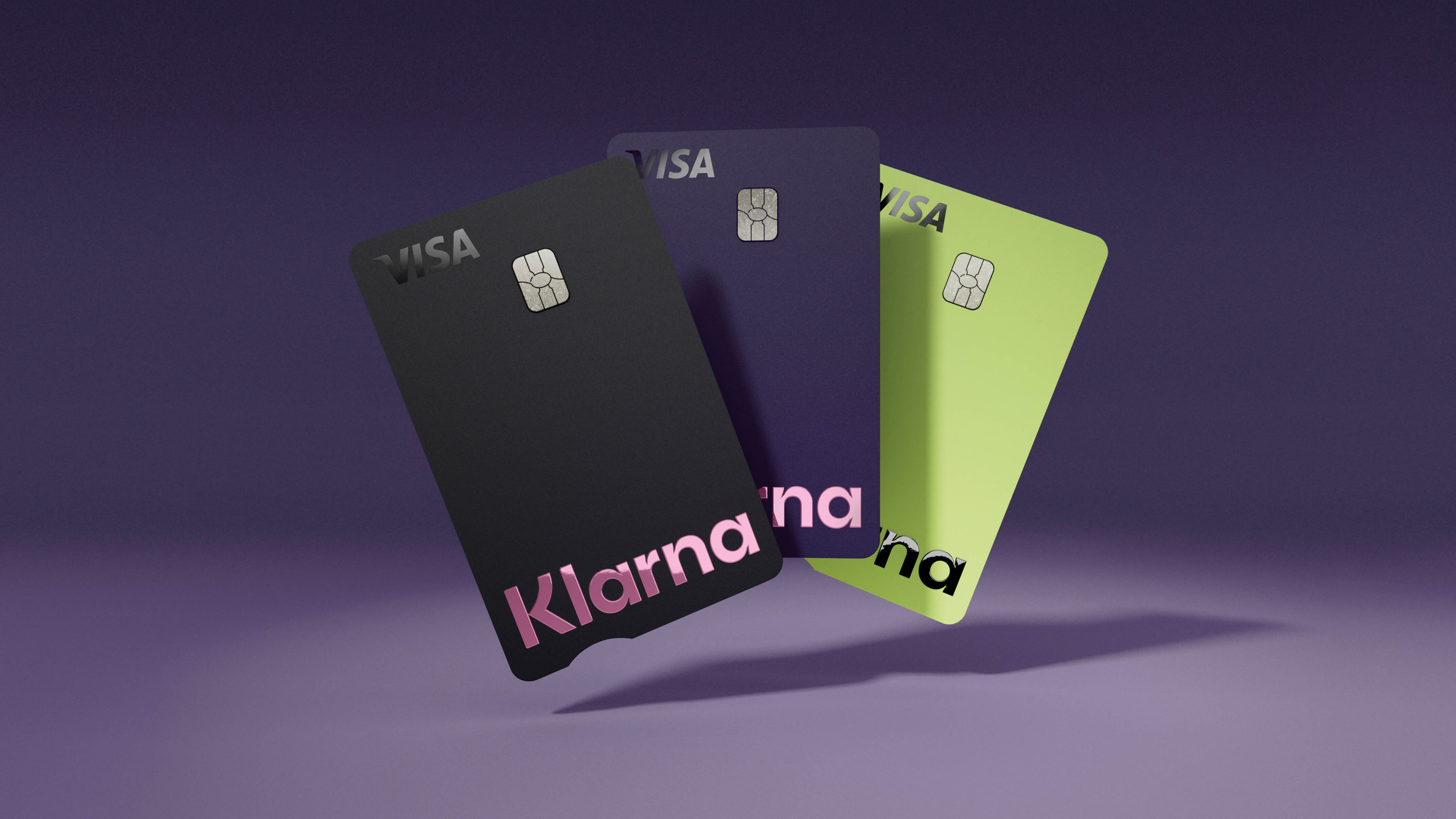
More than 5 million people joined the waitlist before the card even launched in the U.S. Why? Because Klarna kept the focus on transparency, options, and simplicity. People didn’t need to take on credit card debt or figure out confusing rules. Everything—from budgeting tools to spending insights—was built into the app.
This launch wasn’t rushed. Klarna tested it with a smaller group, listened to feedback, and refined the experience before a full rollout. By combining modern design with financial flexibility, Klarna positioned its card as a smarter alternative to traditional credit.
In 2025, Plaid launched Layer, a new identity and onboarding platform that compresses what once took minutes into a few taps—all by collecting a phone number. With access to saved user information across Plaid’s network, Layer enables users to verify their identity and link their bank accounts instantly, helping financial apps cut onboarding time by nearly 90%.
Built for speed, security, and conversion, Layer dynamically determines when a user qualifies for fast-track onboarding using Plaid’s eligibility API. It only appears when it can fully streamline the experience, ensuring users never share unnecessary data. Layer integrates high-security protocols like silent network authentication, passkeys, and real-time risk analysis to minimize fraud risks, including SIM-swap attacks.
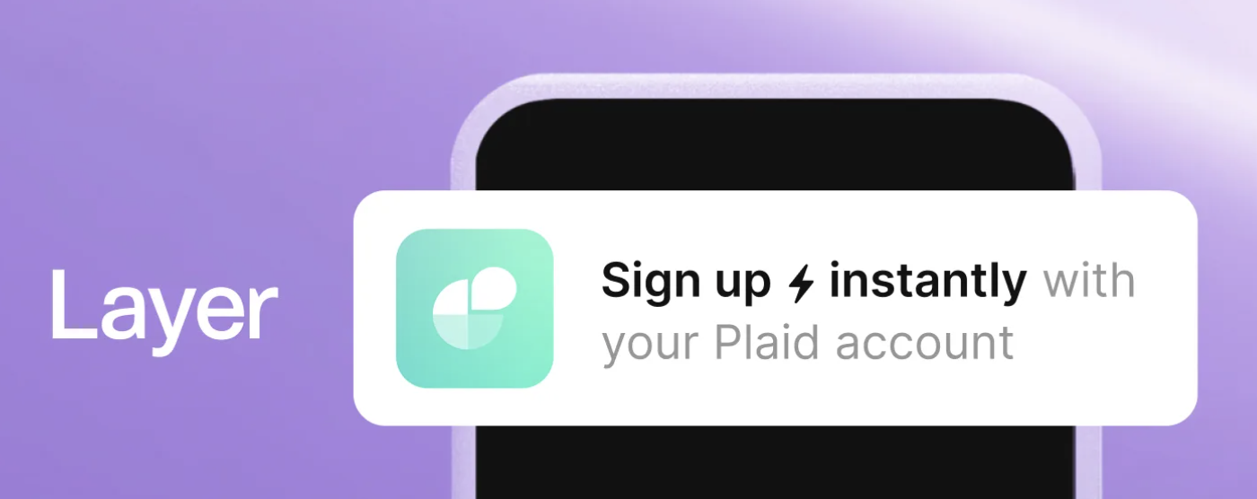
Already adopted by companies like Possible Finance and Empower, Layer supports compliance with KYC and CIP requirements, while giving users complete control over their information. With a customizable interface tailored to each brand’s data needs, Plaid is positioning Layer as the future of secure, frictionless financial onboarding—blending fintech-grade trust with a consumer-first experience.
Did they link their bank account? Try out the new budgeting feature? Look for signs that people are actively trying what you built. These “first steps” are like a test drive—if they don’t happen, the rest won’t either.
Pay attention to what’s coming into support. Are you getting the same question over and over? Did tickets spike after launch? If users are stuck, overwhelmed, or confused, your support team is going to feel it first.
Don’t assume silence means everything’s fine. Use short in-app questions or email check-ins to see how people feel. Even a one-click “Was this helpful?” can go a long way in spotting rough patches early.
Create a few easy-to-skim guides or short videos to walk users through new features. Not everyone will read a full help doc—but a quick step-by-step with screenshots? That’s gold, especially for first-timers.
Find the users who picked up the new feature quickly and are loving it. Then, give them the mic—ask for a quote, let them lead a community Q&A, or feature their story in your newsletter. People listen to people like them.
Tracking these key indicators after launch can help you understand how well your new feature is working—and what you might need to adjust.
This is the percentage of users who take the first step with your new feature—like setting up a savings goal, making a payment, or connecting their account. A strong activation rate means users understood what the feature was and saw enough value to try it.
If the number is low, it’s worth asking: Was the feature easy to find? Did we explain the benefit clearly? Were there any blockers in the setup process?
This measures how often users come back to the feature after trying it once. Are people using it again the next day? The next week? Regular return usage is a good sign that the feature is useful and forming part of a habit.
If return visits are low, the feature may not be delivering on expectations—or it may need better reminders or follow-ups to bring users back.
Are users asking more questions after launch—or fewer? If support tickets go up, especially with similar issues, it may mean the feature is confusing or something’s not working as expected. On the other hand, if support volume stays low or drops over time, it usually means users are picking it up easily and getting value without needing much help.
This is one of the quickest ways to spot friction early.
These scores reflect how people feel about your product. You might ask, “How satisfied are you with this feature?” or “Would you recommend this to a friend?” Higher ratings after launch are a great sign you’re meeting user needs. If scores drop, that’s a signal to investigate what’s missing or confusing.
It’s also helpful to look at open comments—what people write in their own words often reveals the story behind the score.
This is the big-picture view: Did the feature help grow your business? This could show up as more people opening accounts, higher transaction volume, fewer cancellations, or increased revenue. You’re not just checking for interest—you’re measuring real results.
The strongest launches don’t just feel good—they show up in the numbers.
This Notion template brings order to the controlled chaos of product launches by centralizing all critical details into one place. With streamlined access to information, teams communicate better and execute product launches more effectively together.
This template was a labor of love I worked on for many years to get it right. Here's a peak at what's inside—but I've got an entire video walkthrough that explains exactly how to use it here.
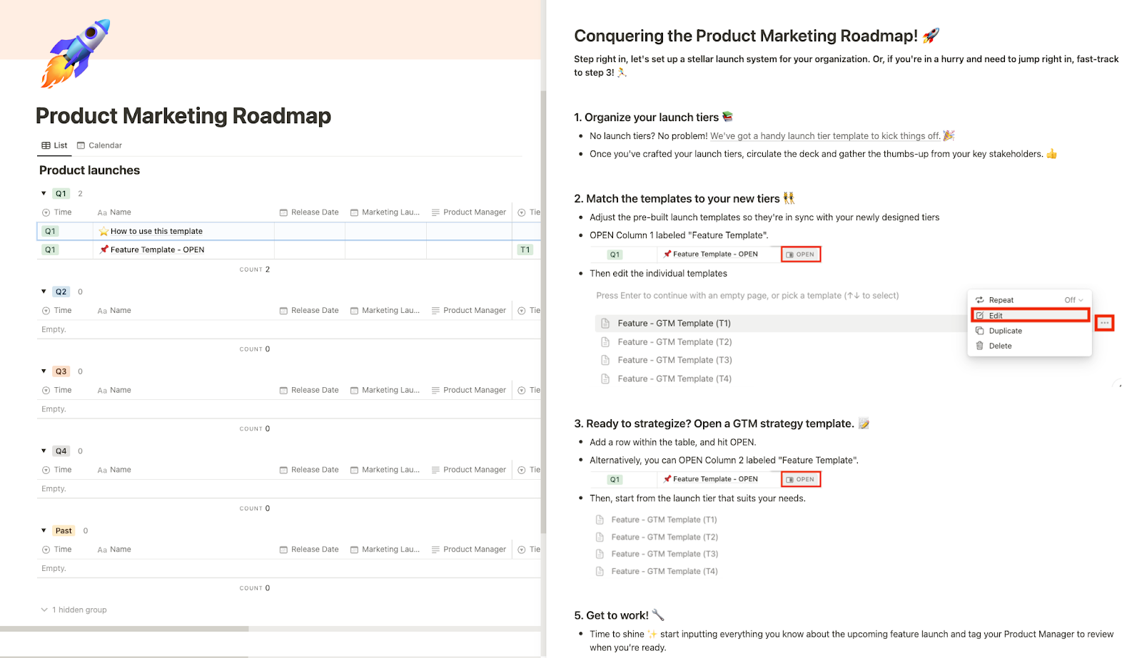
As you're going through the Notion template, keep these product launch steps in mind.
Launching your product is just the beginning. To truly succeed, it's essential to continuously measure and adapt. Data is your compass here, guiding you through the user behaviors and preferences that shape your product's journey. Understanding what features your users love, what they ignore, and what they're craving next is crucial. It’s not just about making a splash—it’s about sustaining the momentum.
A great fintech launch isn’t just about what you ship—it’s about how it lands with your users. These are the principles that turn a rollout into long-term value:
When you build your launch around clarity, timing, and support, it stops being a feature release—and starts being a reason people stay.


