.png)
The fastest way to design better SaaS onboarding isn't to read another framework. It's to study the products that already nailed it. Below are eight SaaS onboarding flows from companies like Asana, HubSpot, and Notion, each broken down into what they did and the specific lesson you can lift for your own product.
Most users who churn never give your product a real chance. They sign up, poke around for a few minutes, and disappear — often within the first week, before they've ever experienced what makes your product worth keeping. Studying real SaaS onboarding examples is one of the fastest ways to understand what separates the products that activate users from the ones that lose them at hello.
This guide is built for product and growth teams who want to move beyond theory. You'll see how specific companies — Slack, Stripe, HubSpot, Notion, Grammarly, and more — structure their onboarding experiences, understand the patterns that make each approach work, and walk away with a checklist and framework you can apply to your own product. We'll cover onboarding for new signups, returning users, and new feature adoption, because great onboarding doesn't stop after the first login.
SaaS user onboarding is not a product tour. It's the full journey from the moment a user signs up to the moment they first experience meaningful value — what product teams call the "aha moment." Everything in between — the welcome screen, the guided walkthrough, the first action a user takes — is onboarding.
That journey is the highest-leverage stage in the entire user lifecycle. A user who reaches their aha moment is dramatically more likely to return, upgrade, and stick around. A user who doesn't reach it churns — and usually does so quietly, without ever telling you why.
Onboarding connects directly to three metrics that matter most in early-stage retention: activation rate (did the user do the thing that signals they've found value?), time-to-value (how long did it take them to get there?), and Day 7 and Day 30 retention (did they come back?). Improve onboarding, and you move all three.
It's also worth distinguishing between the different contexts where onboarding applies. New signup onboarding gets the most attention, but returning users who've been inactive need re-onboarding too. And every time you ship a significant new feature, you're asking existing users to learn something new — which is its own onboarding challenge. The examples in this guide span all three.
Before diving into specific examples, it helps to have a shared vocabulary. The best onboarding experiences are built from a small set of repeatable components. Understanding what each one does — and when to use it — makes it much easier to analyze what any given product is doing and why.
Onboarding is far more complicated than these five best practices. If you would like to learn more about creating the best experience for your new users, check out our guide to user onboarding best practices.
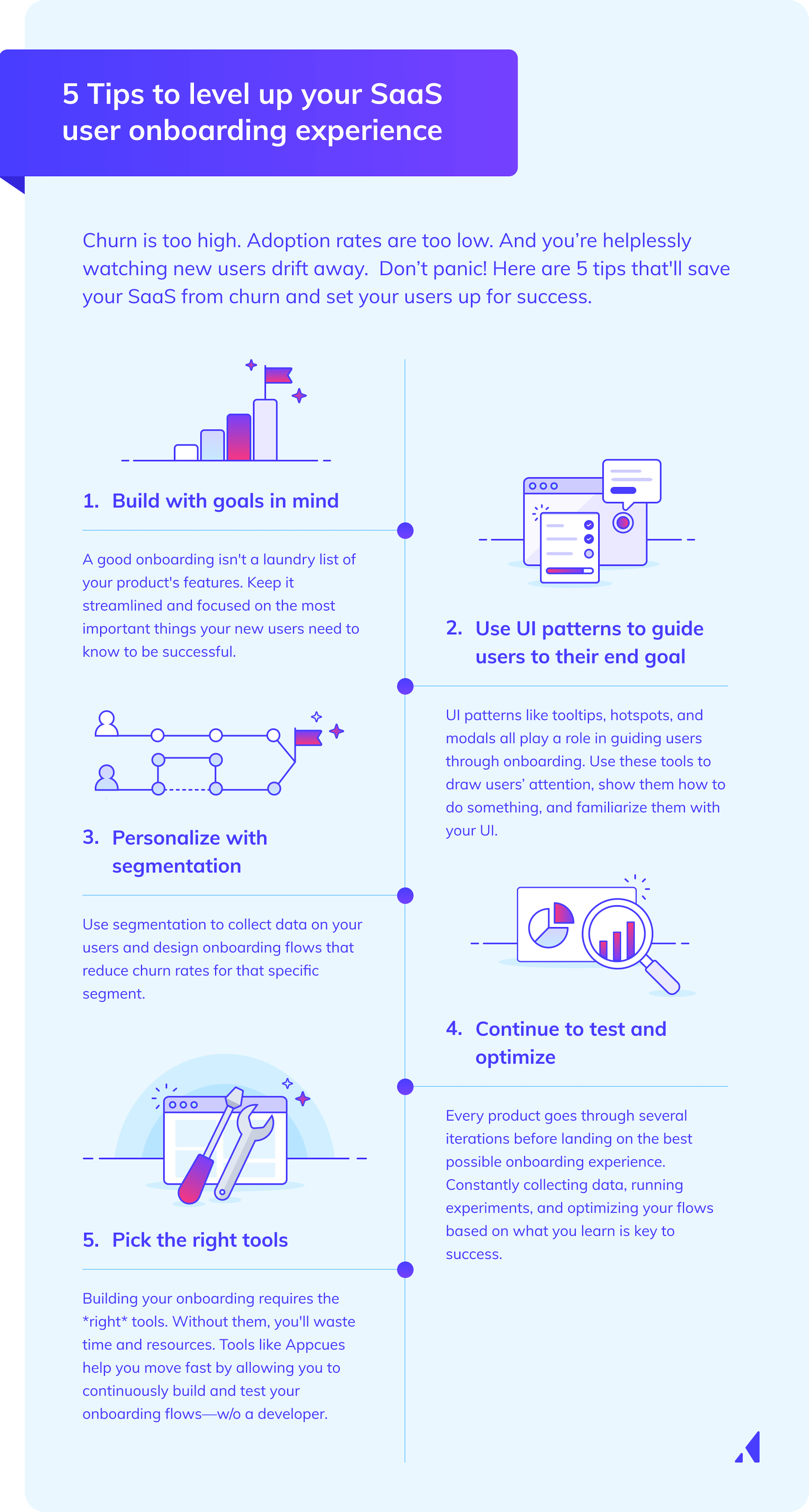
A welcome screen does more than say hello. The best ones orient the user, set expectations for what comes next, and collect segmentation data through a short survey. That data is what makes the rest of the onboarding flow feel personal rather than generic.
The key is asking the right questions. Two to four questions is the sweet spot — enough to understand who the user is and what they're trying to accomplish, not so many that it feels like a form. Ask about role, use case, or primary goal. Avoid questions that feel like they're for your benefit rather than the user's (company revenue, for example, rarely helps you personalize the experience in a meaningful way).
The best welcome screens feel like the product is already paying attention to the user. They're the first branch point in a personalized flow — and they set the tone for everything that follows.
New users face a cognitive load problem. They've just entered an unfamiliar environment, they don't know where to look, and they're trying to figure out whether this product is worth their time. A well-designed product tour reduces that load by walking users through one key action rather than leaving them to explore alone.
There are two main patterns: linear tours (step-by-step sequences that guide users through a fixed path) and contextual tooltips (triggered by user behavior, surfacing help at the moment it's relevant). Linear tours work well for simple products with a clear activation path. Contextual tooltips work better for complex products where users might take different routes to value.
The most important rule for both: keep them short, focus on one core action, and end with the user having completed something meaningful. A tour that ends with the user having watched a demo is less effective than one that ends with the user having done the thing.
Checklists work because of a simple psychological principle: people are motivated to complete things they've started. A progress bar at 40% completion is more motivating than a blank slate. That's why onboarding checklists are one of the most reliable tools for keeping users moving through setup.
A well-designed checklist includes three to five items tied directly to activation milestones, links to supporting documentation, access to help resources, and a clear exit option for users who want to explore on their own. The exit option matters — forcing users through a checklist they don't want creates friction, not momentum.
The checklist items should map to the user's stated goal, not to your product's feature list. "Connect your first data source" is a better checklist item than "Explore the integrations tab."
Empty states are one of the most underused onboarding opportunities in SaaS. When a user first logs in and sees a blank dashboard, a blank project list, or a blank inbox, that's a moment of maximum uncertainty. The product hasn't proven its value yet, and the user is staring at a blank canvas with no idea where to start.
The best products use empty states to show users what the product looks like when it's working — sample data, pre-populated templates, or a visual preview of a completed state. They also provide a single, clear first action that removes the paralysis of choice.
Contextual in-app prompts extend this logic beyond the first session. Rather than following a fixed sequence, they surface at the right moment based on what the user is actually doing — which makes them feel helpful rather than interruptive.
One-size-fits-all onboarding is a conversion killer. A sales rep and a software engineer signing up for the same product have completely different goals, different levels of technical comfort, and different definitions of "value." Showing them the same onboarding flow means one of them — probably both of them — is going to see steps that feel irrelevant.
The most effective SaaS onboarding examples share a common trait: they adapt to the individual user. The mechanism is usually a short onboarding survey — two to four questions asked immediately after signup — that segments users by role, use case, company size, or primary goal, and routes them into a tailored flow.
Good survey questions are specific and actionable. "What are you hoping to accomplish with [product]?" is better than "How did you hear about us?" The answers should map directly to different onboarding paths: a user who says they want to track sales pipeline should see a different first experience than one who says they want to manage customer support tickets.
This approach consistently improves activation rates because it reduces the number of irrelevant steps a user has to sit through before reaching their aha moment. Every unnecessary step is a drop-off risk. Personalization removes steps that don't apply, which shortens time-to-value for every segment.
The survey data also becomes the foundation for everything that follows — which onboarding flow to show, which features to highlight, which emails to send. It's the input that makes the rest of the system work.
Onboarding patterns vary significantly by product category. The challenges a project management tool faces are fundamentally different from those facing a developer API or an analytics platform. What follows is a breakdown of how leading products in each category approach onboarding — and what you can borrow from each.
Project management tools face a specific onboarding challenge: the product only becomes valuable once a user has created a project, invited teammates, and assigned tasks. That's multiple activation actions in sequence, which means onboarding has to drive a chain of behaviors — not just one.
Asana handles this with a guided setup flow that uses pre-populated templates. Instead of asking users to build a project from scratch, Asana gives them a starting point — a template that looks like a real project — which removes the blank-canvas problem and makes the first success moment faster.
Notion takes a different approach. It uses a personal workspace model that lets users experience value alone before they ever need to invite anyone else. This is smart product strategy: it decouples individual activation from team adoption, so users can reach their aha moment without depending on colleagues to join.

Monday.com uses a visual board demo to show the product in action before the user has entered any real data. Users see what a populated board looks like — with real-looking tasks, statuses, and assignments — before they've done any setup. It's a preview of the promised land.
The shared pattern across all three: reduce time-to-first-value by removing setup friction. Whether through templates, personal workspaces, or demo data, each product finds a way to show users what "working" looks like before they've done the work to get there.
CRM onboarding is uniquely complex because the product's value depends entirely on data the user hasn't imported yet. An empty CRM is useless — which makes the empty state problem especially acute in this category.
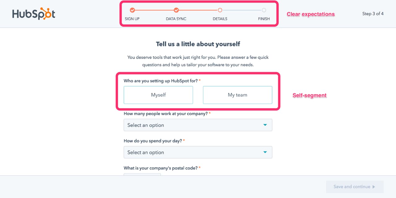
HubSpot addresses this with a step-by-step setup checklist tied to a clear business outcome: getting your first deal into the pipeline. Each checklist item is a milestone, not a feature. Users aren't asked to "explore the CRM" — they're asked to complete a specific action that moves them toward a concrete goal.
Pipedrive uses a visual pipeline demo with sample data, so users can see the product working before they've done any setup at all. The sample data shows what a healthy pipeline looks like — deals at different stages, activities logged, revenue forecasted — which makes the value proposition tangible before the user has invested any effort.
Salesforce takes a different approach because the product is simply too complex to onboard through UI alone. It relies heavily on guided learning paths through Trailhead — a separate educational platform that walks users through the product in a structured, gamified way. The lesson here is that when a product's complexity exceeds what in-app guidance can handle, the onboarding experience has to extend beyond the product itself.
The key insight for this category: when setup is complex, break it into milestone-based steps with visible progress. Users need to feel like they're making headway, even when the full setup is still weeks away.
Collaboration tools face a network-effects onboarding challenge. The product is more valuable with more people, which means onboarding has to drive both individual activation and team adoption simultaneously. That's a harder problem than it sounds.
Slack uses a bot-driven onboarding sequence — Slackbot — that teaches features through conversation. Instead of a traditional product tour, users learn by doing, inside the actual product interface. The bot sends messages, asks questions, and guides users through key actions in a way that feels like using Slack, not learning about it.
Loom solves the activation problem by making the first action the aha moment. The entire onboarding flow is built around getting users to record their first video within minutes of signup. Once a user has recorded and shared a video, they've experienced the core value proposition. Everything before that moment is just setup.
Figma uses a pre-built template that lets users experience the collaborative canvas immediately. New users land in a real-looking design file — not a blank canvas — which demonstrates the product's value before they've created anything themselves.
The shared insight: identify the single action that creates the aha moment and build the entire onboarding flow around getting users there as fast as possible. Everything else is secondary.
Analytics tools have a particularly high onboarding bar. Before users can see any value, they typically have to complete a technical integration — installing a tracking snippet or SDK. That's a prerequisite that can take hours or days, and it creates a massive drop-off risk.
Mixpanel addresses this by offering a demo environment with pre-populated data. Users can explore the full product — build funnels, analyze cohorts, create dashboards — before they've installed a single line of code. This is a powerful move: it lets users experience the value of the product before they've committed the technical effort to set it up.
Amplitude uses a guided integration checklist with clear documentation links. The checklist makes the technical setup feel manageable by breaking it into discrete steps, and the documentation links ensure users have what they need at each step without having to search for it.
Hotjar uses a visual progress bar tied to installation steps. The progress bar keeps users moving through a technically demanding setup by making their progress visible — and by making the finish line feel close.
The key lesson: when onboarding requires a technical prerequisite, give users a way to experience value before that prerequisite is complete. Demo environments and sample data are the most effective tools for this.
Developer-focused tools must balance technical depth with speed-to-first-success. The activation event in this category is usually a first API call, a first integration, or a first successful test — and the best onboarding experiences are built entirely around getting developers there as fast as possible.
Stripe is the canonical example. Its onboarding is built around making a test payment as quickly as possible, with pre-filled code samples and a sandbox environment that removes the need to set up real payment infrastructure before seeing the product work. Developers can run their first transaction in minutes.
Twilio uses a "send your first message in five minutes" framing — a clear, achievable goal that sets expectations and creates urgency. The specificity of "five minutes" is deliberate: it signals that the first success moment is within reach, which reduces the intimidation factor of a new API.
It's also worth noting that developer onboarding often happens partly outside the product UI — in documentation, CLI tools, and SDKs. The best examples in this category create a seamless handoff between the app and the docs, so developers never feel like they've left the onboarding experience when they go to read the documentation.
Individual productivity tools often have the shortest path to value, which means their onboarding can — and should — be the most streamlined. There's no team adoption challenge, no complex integration, and no data import required. The product just needs to show the user something useful as fast as possible.
Grammarly does this with a browser extension install plus a writing sample. Within the first two minutes of signup, users see Grammarly working on real text — their own text, or a provided sample — which makes the value proposition immediate and personal. There's no gap between "I signed up" and "I see why this is useful."
Calendly builds its entire onboarding around a single action: setting your availability and sharing your scheduling link. Once a user has done that, they've experienced the core value of the product. The onboarding doesn't try to show everything — it focuses entirely on getting users to that one moment.
Dropbox historically used a checklist with a storage reward — completing key setup steps earned users additional free storage. This is a clever mechanic: it ties onboarding completion to a tangible benefit, which gives users an external motivation to finish setup in addition to the intrinsic motivation of getting the product working.
The shared pattern: when the product's value is immediate and personal, onboarding should be frictionless and focused on a single "wow" moment. Don't make users work for it.
Looking across all of these examples, a set of repeatable principles emerges. These aren't coincidences — they're the underlying logic that the best onboarding experiences share, regardless of product type.
Lead with value before asking for setup effort. Mixpanel's demo environment, Pipedrive's sample data, Monday.com's visual board demo — all of these show users what the product can do before asking them to do any work. Value first, effort second.
Use progressive disclosure to avoid overwhelming new users. Don't show everything at once. Surface features and information as they become relevant, not all at the beginning. The best onboarding experiences feel simple even when the underlying product is complex.
Make the first success moment fast and visible. Loom's first video, Stripe's first test payment, Calendly's first shared link — these are activation events that users can see and feel. The faster and more tangible the first success, the stronger the motivation to continue.
Use personalization to remove irrelevant steps. Every step a user has to sit through that doesn't apply to them is a drop-off risk. Segmentation and survey-driven routing reduce the number of irrelevant steps, which shortens time-to-value for every user.
Design for the user's goal, not the product's feature set. HubSpot's checklist is organized around "getting your first deal into the pipeline," not around "exploring the CRM features." The framing matters. Users care about their goals, not your features.
Build in human touchpoints alongside in-app flows. In-app onboarding is powerful, but it works best when it's supported by onboarding emails, live chat, and — for higher-value accounts — CSM check-ins. The best onboarding experiences are multi-channel, not just in-app.
Keep checklists short and tied to activation milestones. Three to five items, each one a meaningful step toward the user's goal. Not a feature tour disguised as a checklist.
Use this checklist to audit your existing onboarding experience or evaluate a new one you're building. It's organized by stage.
Pre-signup
First login
Activation
Post-activation
One note on checklist design: if you're building an in-app onboarding checklist as part of your product experience, apply the same principles described in the anatomy section. Keep it short (three to five items), tie each item to the user's stated goal, and make the completion state visible and rewarding. The checklist itself should model the best practices it's helping users follow.
Onboarding rarely belongs to a single team. It sits at the intersection of product, marketing, customer success, and sometimes sales — which means it's everyone's responsibility and, too often, no one's priority.
The risks of siloed ownership are real. Marketing optimizes for signups; product optimizes for activation; customer success optimizes for retention. When these teams aren't aligned, you get inconsistent messaging, gaps between the marketing promise and the product experience, and onboarding flows that optimize for one team's metrics at the expense of another's.
High-performing SaaS companies typically structure onboarding ownership with a product-led growth or customer success team as the primary driver, but with clear input and accountability from other functions. A simple RACI framework helps:
The goal is a single, coherent experience that feels like one team built it — even when four teams did.
Great onboarding isn't just about looking good. It's about driving outcomes. These are the metrics that matter for evaluating whether your onboarding is actually working.
Activation rate — The percentage of new users who reach your defined activation milestone. This is the most important onboarding metric. If you don't have a defined activation milestone, defining one is the first step.
Time-to-value — How long it takes a user to reach their first success moment. Shorter is almost always better. Track this as a median, not an average, to avoid distortion from outliers.
Onboarding completion rate — For checklist or tour-based flows, what percentage of users complete the full sequence? High drop-off at a specific step is a signal that something is broken or confusing.
Feature adoption rate — Are users discovering and using the key features that drive retention? This tells you whether onboarding is successfully introducing the product's core value drivers.
Day 7 and Day 30 retention — Did users come back? Early retention is the downstream outcome that onboarding is ultimately trying to move. If your activation rate is high but Day 7 retention is low, the activation milestone may not be the right one.
To measure the impact of onboarding changes, use cohort analysis. Compare the activation rate, time-to-value, and Day 30 retention of users who went through the new onboarding experience against users who went through the old one. This is the only way to know whether a change actually moved the needle — or just looked like it did.
There's a gap between seeing great SaaS onboarding examples and being able to build them. Most product teams know what good looks like. The challenge is execution — specifically, the engineering time and resources required to build, test, and iterate on onboarding flows inside a live product.
Appcues closes that gap. It's the infrastructure that lets product and growth teams move from inspiration to execution quickly, without waiting in an engineering queue for every change.
Appcues allows product managers and growth teams to build, launch, and update onboarding flows — product tours, tooltips, modals, checklists — without writing code. That speed advantage is critical for onboarding work, where the difference between a 30% and a 50% activation rate often comes down to rapid iteration. Teams can ship an onboarding change in hours rather than weeks, test it against real users, and adjust based on what they learn.
Appcues's targeting and segmentation capabilities allow teams to show different onboarding flows to different user segments — by role, plan, use case, or behavior. This is the technical layer that makes the survey-driven personalization strategy described earlier in this guide actually executable. You can ask users what they're trying to accomplish at signup, capture that data, and immediately route them into a flow that's relevant to their answer — without any custom engineering.
Appcues provides built-in analytics that track flow completion rates, step-by-step drop-off, and feature adoption. This gives teams the data they need to evaluate onboarding performance against the metrics outlined in the previous section — and to identify exactly where users are falling off. A/B testing capabilities allow teams to run controlled experiments on onboarding flows and make data-driven decisions about what to keep, cut, or change. The result is an onboarding program that gets measurably better over time, not just one that gets rebuilt from scratch every quarter.
The best SaaS onboarding examples all share a common philosophy: they're built around the user's goal, not the product's feature list. Slack doesn't onboard users to "learn about channels." Loom doesn't onboard users to "explore the recording interface." They onboard users to accomplish something specific — and they get them there as fast as possible.
The most important takeaways from this guide: personalization drives activation because it removes irrelevant steps; the fastest path to value wins because every extra step is a drop-off risk; measurement is non-negotiable because you can't improve what you can't see; and great onboarding is a team sport that requires alignment across product, marketing, and customer success.
Now that you know what great looks like, the next step is building it. Start a free trial of Appcues or request a demo to see how your team can build the kind of onboarding experiences you've just spent this guide learning about — without waiting on engineering to make it happen.

.png)
%2520(1).png)