.webp)
.png)
A user journey map is a visual presentation of how your customer moves through your marketing and sales funnels. Much like directions guide a driver's progress through physical space—a user journey map tracks a customer's progress through time.
Your customers take a trip from unaware all the way through to being a paying customer. User journey maps are an attempt to capture each potential customer touchpoints along the way, giving you a roadmap-like view of customers' experience with your brand and product.
Ever felt like journey maps come in all shapes and sizes? That’s because they do! Just like ice cream flavors, there’s a map for every taste. Let’s break down the popular variations and figure out how they stack up against each other. Grab a spoon!
If you’re improving a specific product experience, the UX journey map is perfect. But if you’re strategizing across the full customer relationship, the customer journey map is your winner.
Here's why they're so different:
Simply creating user journey maps often reveals insights into your customers' experience with your product. These completed user journey maps can then be used to enhance:
It's easy to become nearsighted as you scrutinize your UX. It's understandable: you've been staring at your product for a very long time. However, prospective customers are not likely to be as empathetic.
A single snag in their experience can derail an otherwise positive process. If your customer support team is dealing with reports of a steep learning curve, your journey maps may help rectify the situation.
A user journey map allows you to visibly identify pain points in your UX design that may have escaped you during development and in-house testing.
Furthermore, a user journey map should be embraced by the entire product team as a way to triple-check your work and vet product usability. Someone else on your team may identify a potential problem area that you were unable to see yourself.
A frictionless UX lends itself to stellar onboarding. Your analytics and market research will reveal the critical events that prompt customers to fully engage with your product and its features.
When your user journey is laid out visually, it's easier to identify ways to shorten the distance between signing customers up and converting them into long-time users.
For example, let's say you know that filling out a user profile doubles the rate of product adoption. An analysis of your user journey map reveals that there are three steps that occur between initially signing up for your product and filling out a user profile.
Instead of hoping that you don't lose your newly onboarded customers before they fill the profile out, you could add the critical profile fields to the sign-up form and set your customers up for immediate success.
Mapping their journey would reveal the best places within their journey to send in-app messages or emails highlighting the wish list feature and describing its benefits. This helps you draw the line between certain features and customer pain points.
Team members from every department benefit from understanding the customer needs. Understanding potential frustrations builds empathy for customers and keeps their issues in perspective. It allows others to see how a customer's experience affects their likelihood to upsell, churn, or even advocate for the brand.
Wisdom can be trapped in departmental silos. The insights of others outside the product management team are integral to creating a fully realized user journey map.
Meeting with key stakeholders within your company is a critical component of the research stage of mapping as they can provide outside insights that the product team can't gather analytically.
So, what actually goes into an effective user journey map? That depends who you're asking. If you're asking us, we'd say there are a few key traits to them all.
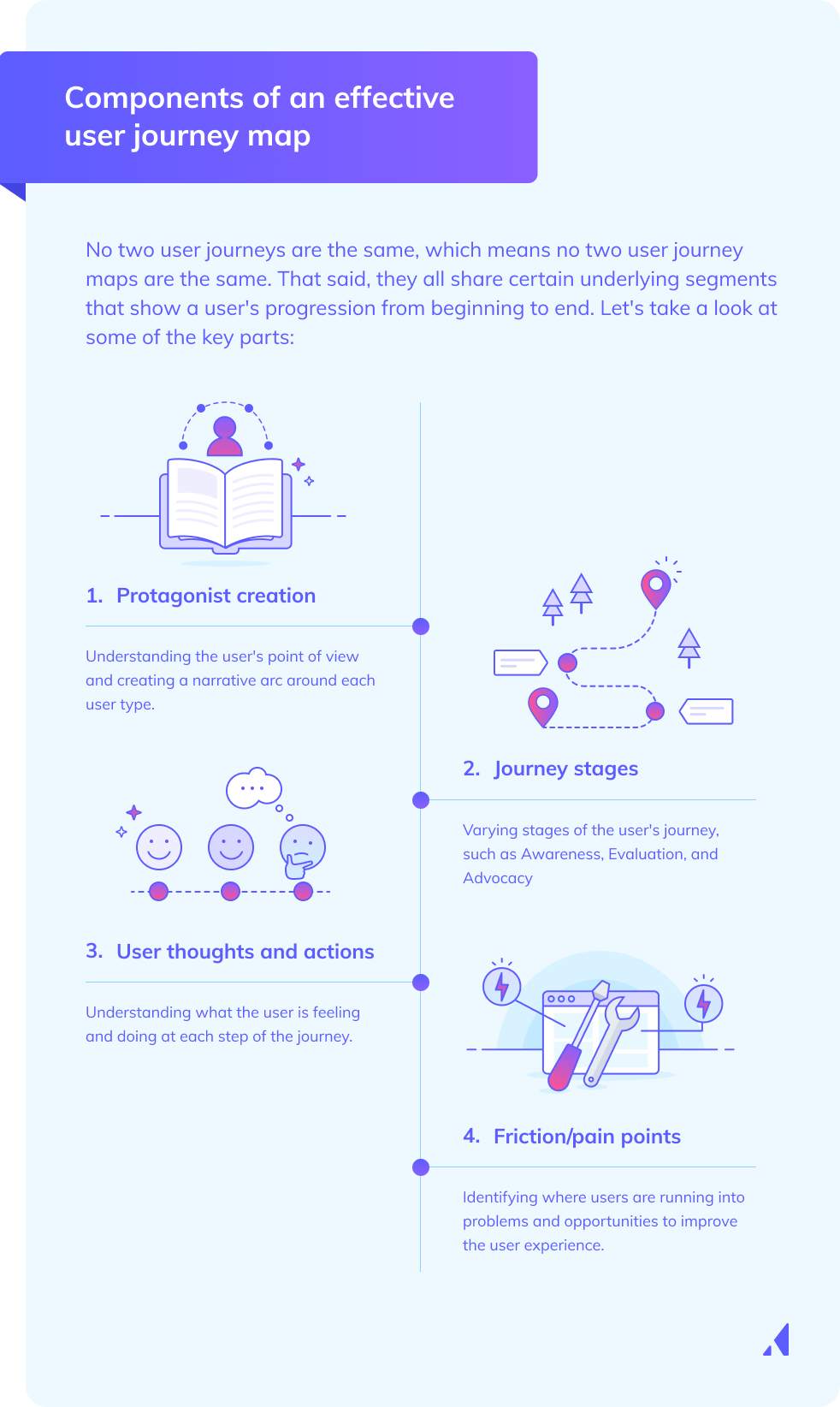
Different folks use varying terms to describe the individual who actually goes through the user journey. Worse yet, some companies imagine themselves as the heroes in their own stories. In reality, the character at the center of this odyssey is the user. That's why we give them the title of "protagonist" here.
To chart a user's journey, you have to understand their point of view. The protagonist in a user journey map isn't unlike a buyer persona. Who they are and what they're trying to accomplish will make their journey unique.
Just like in a story, the user has a purpose driving their actions and a specific end objective they're going for. Whether they’re rushing to book a last-minute flight or troubleshooting a device issue, their scenario—shaped by their environment, context, and needs—sets the stage for the journey.
The goals of this protagonist are their desired outcomes, the “why” behind their interaction. These can include completing a task, solving a problem, or achieving a personal objective. By framing the user as the central character in the story, teams can better understand their motivations and challenges, ensuring the product or service supports a seamless path to success.
In a story, a protagonist experiences rising action, complicating circumstances, and, hopefully, resolution. Each of these different parts is what makes novels and Hollywood movies emotionally resonant. They're also at the heart of the user journey.
The stages of your protagonist's (user's) journey will vary depending on what you sell and how they use it. In the case of B2B software, the journey stages might roughly track against the following steps:
This one is pretty straightforward: what is our protagonist feeling and doing at each step of the user journey?
Putting yourself in the shoes of your users as they navigate the process of using your product is a useful exercise because it helps you understand where things can improve or where the experience is suboptimal, which leads us to our next points...
Where are users running into problems? What's stopping them from getting the best overall experience? Answering this question helps you identify the opportunities to improve your user experience throughout the journey.
Whether your users are running into problems during the purchasing process, onboarding, or while actually using the product, taking a good hard look at the stumbling blocks will only make your user journey more seamless.
Whenever the protagonist encounters challenges or friction points along their journey, you gain an opportunity for improvement. By identifying these opportunities, you can find new ways to improve efficiency, satisfaction, and results for the end user.
Identifying opportunities is just one part of the puzzle. Action only comes with ownership. Assign a clear owner for each improvement point to keep your team accountable and promote better collaboration opportunities.
The final step: Seeing if your user journey was a success. Work with specific metrics that track progress and outcomes. One idea is to look at quantitative data such as conversion rates, task completion times, or user satisfaction scores, as well as qualitative feedback through surveys or user interviews.
Tracking these metrics over time gives you plenty of opportunities for continuous improvement. This is a must if you want to keep your journeys effective, user-centered, and aligned with broader business objectives.
The actual contents of an experience map will vary depending on what you’re trying to achieve, but there are several features common to most versions: phases, experience qualifiers, and interactions. Keep in mind that there are many different types of user journey maps that each address specific purposes. For this example, we'll build a basic type called an experience map.
A user journey map is a single quadrant of a coordinate graph. Each interaction your users have is given a visual representation as a point on this graph. Before you start logging these points, you need to define the values for each axis.
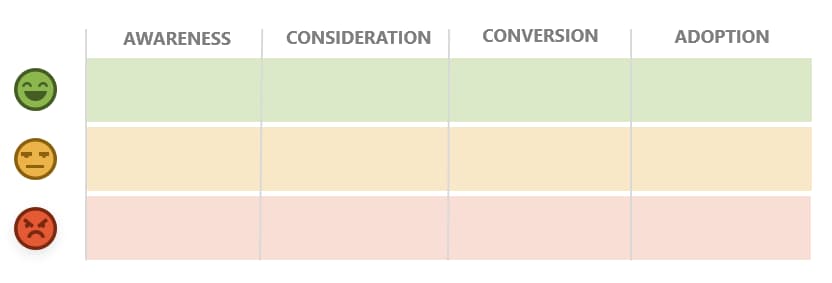
The horizontal axis of your map measures the time and sequence of your customer journey. The point furthest to the left of the graph should be the first interaction, and the furthest to the right should be the last interaction. Seeing as how a customer’s journey from discovery to power usage might contain dozens of points, it’s best to divide the horizontal axis into multiple phases. Commonly, user journey maps for products are segmented into the following phases:
Visually, the first stage of building a journey map template might look something like this:
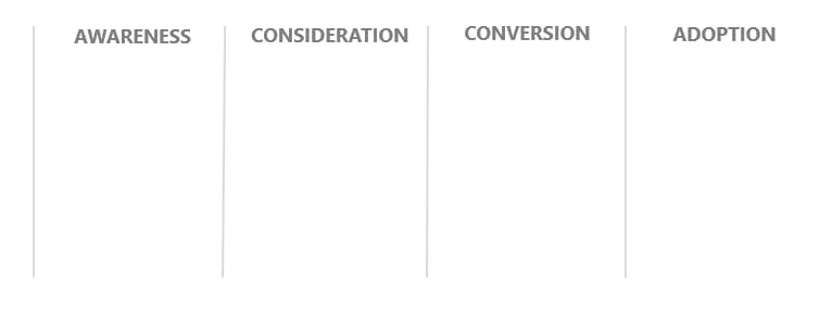
Adding phases to your map delineates the different stages of a customer’s life cycle. A customer experiences your product in a specific sequence. They can’t use your product without first becoming aware of it. Setting up the correct framework of stages establishes how each touchpoint is affected by the one preceding it and affects the event that follows.
Not all interactions with your product are equally positive. Onboarding struggles or software bugs are downright frustrating. Thus, the vertical axis of your user journey map should track the quality of each interaction. Drawing a line between good, bad, and even neutral experiences will help you identify potential problem areas (and solutions!) upon later evaluation.
Such a user journey map would look something like this:
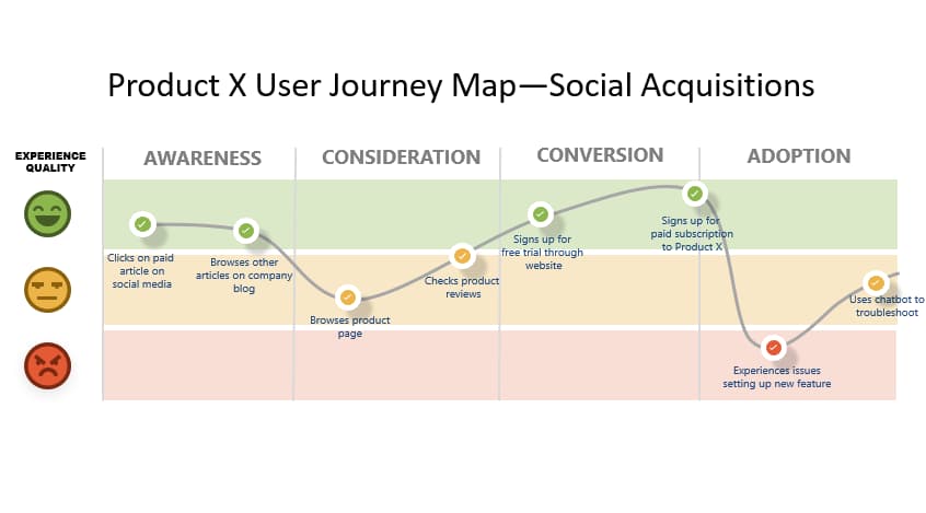
With your life cycle phases fleshed out, you can start adding interactions to your map. It’s important to remember that you’re not trying to map out every possible user interaction of every possible user. Instead, you’re trying to brainstorm how a particular user persona is likely to interact with your product. For each customer persona you’re attempting to understand, you should create a new customer journey map.
Keep in mind that customer experiences occur across sales and marketing channels. These omnichannel interactions with your brand include:
For best results, your user journey map should note the channels in which these interactions happen to ensure that you engage with the user in the right place. For example, if a customer talks to a pre-sales agent, you should note if that’s expected to happen over the phone or through an online live chat.
Once your initial touchpoint is established, you can begin to move through the phases in logical order. As you add each event to the graph, determine whether each event is positive, negative, or neutral, and log them on the vertical axis accordingly.
Done correctly, your finished user journey map should look something like this:
Imagine you're running an ice cream shop and you want to understand the full customer journey. By mapping out their experience, you can identify pain points, emotional highs and lows, and moments of delight.
This helps you improve the overall experience by pinpointing where users may struggle (e.g. like waiting in a long line or not knowing which flavor to choose).
Through mapping, you can optimize the experience at every touchpoint. For instance, the journey map might highlight that customers feel confused or frustrated by a complicated menu or feel rushed at the checkout.
This can hurt their overall satisfaction so you have to first identify these touchpoints to make improvements (e.g. adding flavor suggestions, streamlining ordering processes, or training staff).
Insufficient data should be the challenge you tackle first. Without a deep understanding of user behaviors, preferences, and pain points, you can't map a meaningful journey.
Tools like Appcues can help gather user interaction data across different touchpoints, making it easy to visualize user behavior, identify pain points, and build a data-driven journey map
Users often have diverse goals and needs, making it challenging to create a single map that represents the journey for all. This can result in a generalized or incomplete view of the experience. To overcome this, create multiple journey maps for different personas for an accurate and comprehensive depiction of everyone's experience.
It's easy to get caught up in details and create an overly complex journey map that’s difficult to interpret and use effectively. This can lead to confusion, making it harder to pinpoint actionable improvements.
Keep the map focused on key moments and pain points. Start with a high-level view, and then drill down into more specific areas only if necessary.
But sometimes, it’s challenging to identify and quantify the pain points along a journey. Users may not always articulate their frustrations, and teams may overlook subtle issues that are impacting the experience.
Appcues can help you track both qualitative and quantitative data to uncover pain points. By tracking user behavior directly within the product, you'll understand where users drop off, struggle, or feel frustrated.
User journey maps aren’t one-size-fits-all. Many variations on the core concept exist to fit your needs. Perhaps you just want to zoom in on a particular phase of a customer’s life cycle. You might not even want to map your customer’s current experience at all and instead use a future-state map to flesh out their journey through the next iteration of your product.
The dynamic nature of a user journey map only increases its value to your product strategy. Your needs and objectives differ from every other company. You can read a book on customer experience to gain general UX guidance, but a user journey map allows you to capture a snapshot of the unique relationship between your product and your customer base.
The mapping of your user journey eliminates so much of the guesswork from strategy and innovation. Think back to your friend who gives terrible directions. You can continue to rely on their bad directions every single time you embark and slowly go mad. Alternatively, you could do a little research yourself ahead of time and build your own accurate map that clearly shows the way forward.
And if you use Appcues, you can effectively build user journey maps within the platform to better plan and visualize in-app experiences.


.png)
%2520(1).png)