.png)

As designers, we select our design tools and develop our individual and team processes; from that point forward, those tools and processes shape us and our work—whether we’re conscious of it or not.
Certain features of tools shape what you do with them: Do you use a user-flow tool with easy-to-share links and collaboration features? Your process will benefit from the perspectives of your teammates.
Of course, the tools themselves are less important than the process of which they’re a part. With the right mix of research and iteration, for example, you could design something amazing on sticky notes scanned into Microsoft Paint.
But time and effort are scarce resources: Whatever your reflections on ideal processes may be, if a tool makes some things easy and others things hard, you’ll likely find yourself doing the easy thing when the rubber hits the road and you’re doing the work.
So while tools are not everything—and being good at using a design tool has very little to do with being a good designer—they do matter for the often invisible ways in which they shape our work and process.
Appcues, where I work as a product designer, is a design tool. People use it to create user onboarding, feature announcements, and other experiences on top of their websites or apps, code-free. So the Appcues design team cares about about design tools for the reasons that all designers do, but also as a source of inspiration and learning.
A couple of months back, UX Tools published the results of their 2018 Design Tools Survey, which features responses from over 2,500 designers.
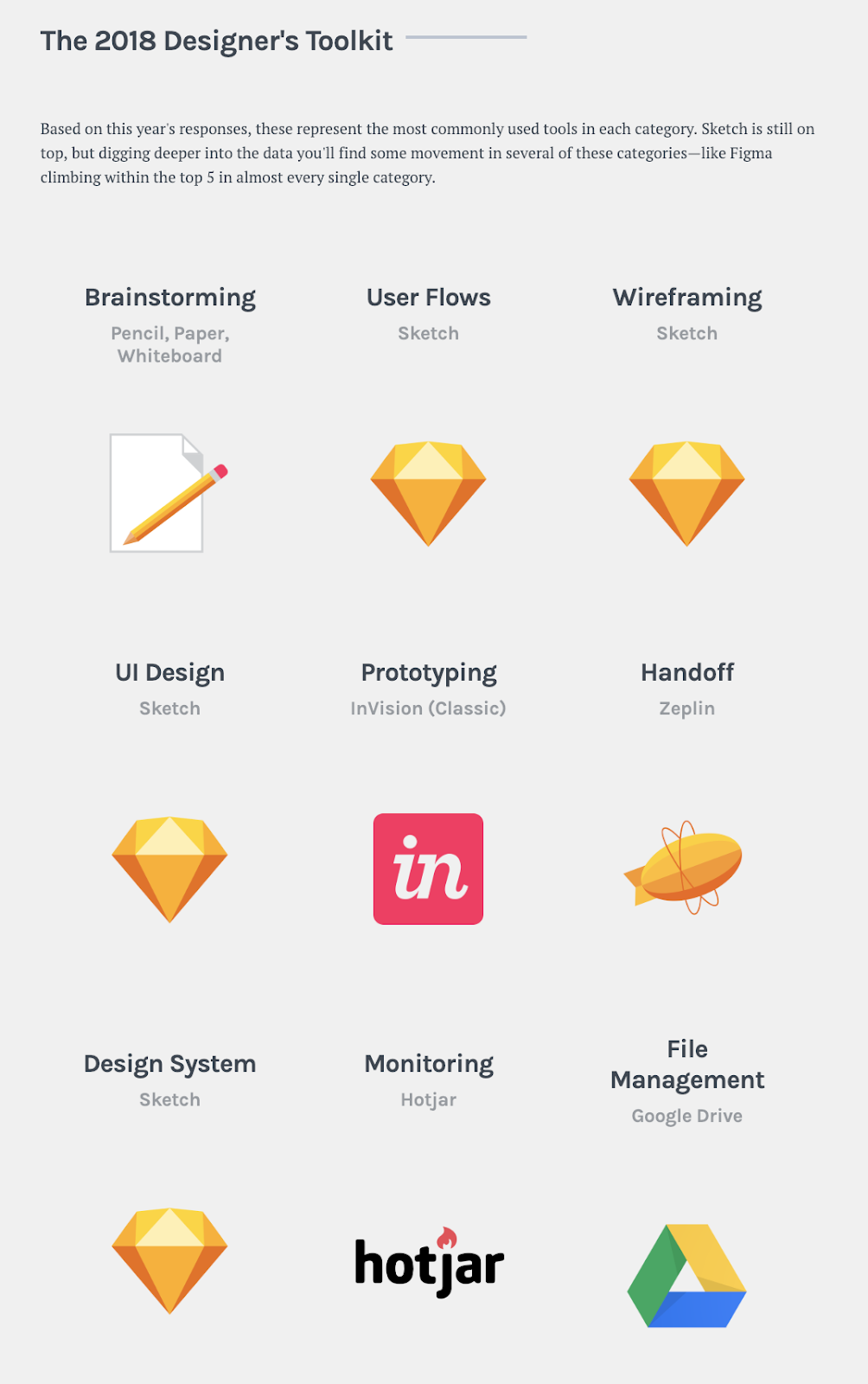
This high-level view of a designer’s toolkit is a great way to discover new tools and identify trends. But as all designers know, quantitative data can only get you so far. We decided to offer a “zoomed-in” look at one specific team’s toolkit, in all it’s messy glory.
Read on for the design toolkit of a 3-person design team at a 65-person (and growing!) startup.
The very beginning of a project is critical. It’s where the problem space is defined—all solutions that come thereafter will be influenced by the data used, assumptions made, and directions considered.
During this period, we lean on a wide array of tools:
During the brainstorming phase, specific tools are way less important than processes.
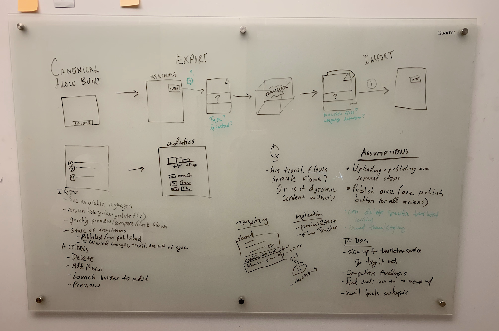
This spans everything from large, risky, and ambiguous undertakings where we may run a full design sprint, to medium-sized projects—where we may get everyone on the project team in a room to “diverge” on ideas (using a technique like crazy-eights)—all the way to small enhancements, where a couple of people may sketch things out together on a whiteboard.
Once we understand the problem space and have diverged on approaches, we can start to consider the user experience at a high level—what steps will a user take? Sometimes it can be hard, but we try to be disciplined about not getting too attached to specific ideas for the interface. We’ll focus on the user’s goals and conceptual steps they may take to achieve them.
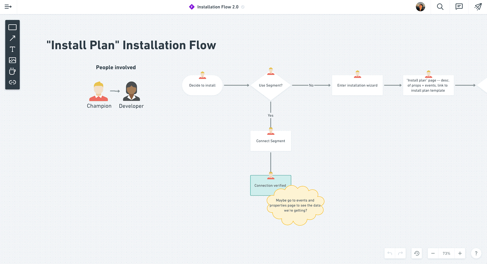
This year we discovered a tool called Whimsical, which has become our go-to for user flows and other kinds of diagrams.
Flows in Whimsical are easy to create, and look simple but great by default. There are barely any customization features (forget using your own typeface or color palette), and this actually ends up being a great thing, because it focuses you on the experience itself, not on making the world’s most beautiful user flow.
User flows are just tools for thinking, so as long as they are clear and understandable, the visuals are really secondary.
Whimsical also makes it easy to invite others to your flows and to export all or part of them, so collaboration is a snap. (Seriously, big fans).
Another flow tool is Flowkit, which is a Sketch (or Figma) library of flow chart pieces. It’s a great way to quickly throw together diagrams without leaving your primary tool, though isn’t quite as powerful as Whimsical.
One user flow tool we are excited to try in 2019 is Overflow. It’s purpose-built for elegantly presenting the flow a user will take through an experience, which has the potential to help designers frame experiences and “tell the story” of their design.
In the past, wireframing was a step wherein you would figure out the details of an interface without worrying too much about the visuals, because nailing the visuals was too time-intensive.
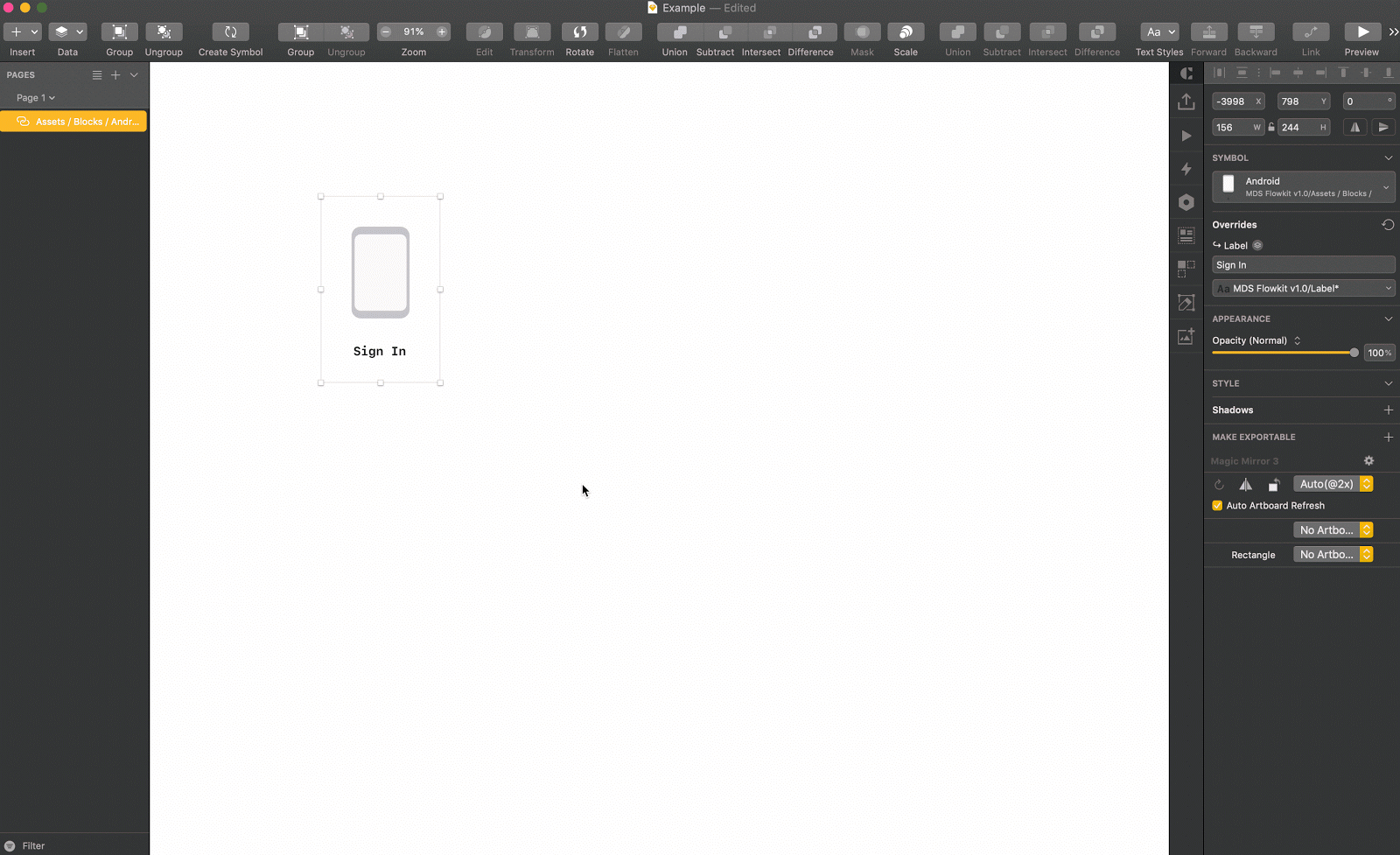
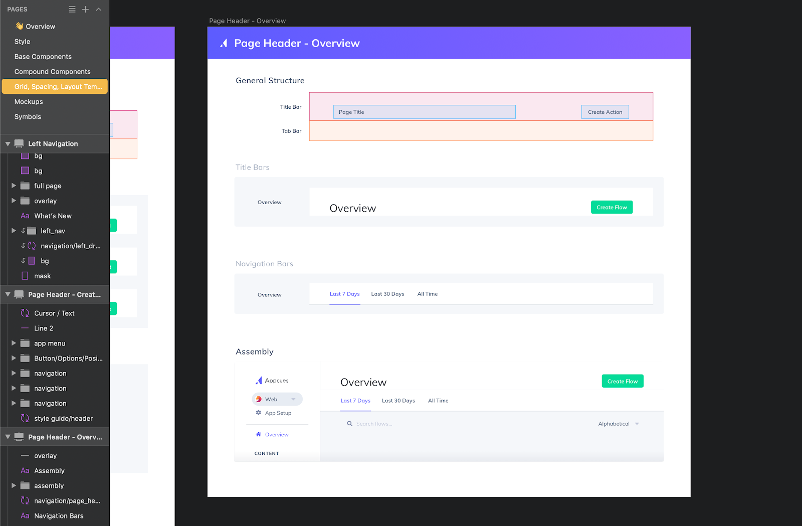
For many design teams (ours included) this is no longer the case. We have a robust design system, with everything from page layouts to icons to buttons, which means putting high-fidelity screens together is a snap.
However, there are still times when a lower-fidelity “wireframe” screen makes sense. If you are trying to gather feedback on conceptual directions (i.e. if you’re still in the “what?” phase, not yet at the “how?” phase), a screen that look too polished can actually be a hindrance. If the visuals are too sleek, people may focus their feedback on visual details. People may also assume that the high-level approach is already agreed upon and not open for feedback.
For these times, we use Whimsical’s wireframe tool, or Sketch or Figma and intentionally hold back on visual quality.
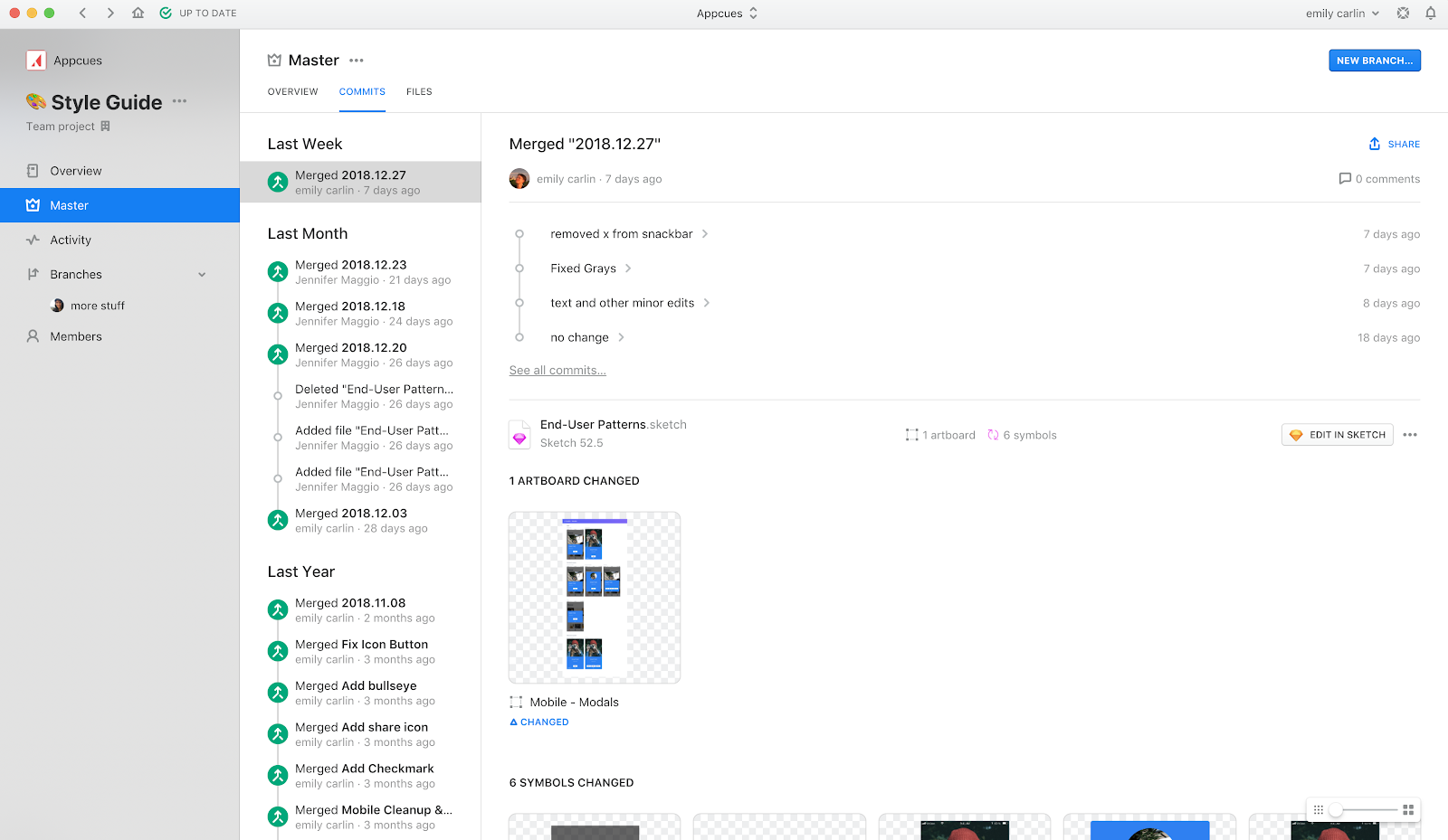
Sketch is where we spend most of our time. It’s the industry standard for a reason—it was designed for interface design, and it shows. There are three reasons Sketch is our main tool (at least for the moment):
Near the end of 2018, we began to explore Figma as a replacement to Sketch. Judging from the UX Tools’ survey, this makes us part of a larger trend among designers. Its multiplayer mode, in-tool prototyping, and open ecosystem are some of the things that set it apart from Sketch and have us seriously considering a move to Figma.
Choosing the right tool for prototyping is critical. Every time we prototype an experience, we ask ourselves what we want to learn from it. The answer to that question informs the tool we select.
Most of the time, a click-through prototype in InVision or in Figma’s prototyping tool gets the job done. We use these to gather feedback from our teammates, and from our users during user testing.
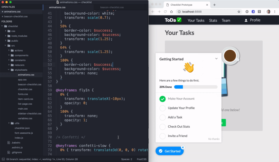
Sometimes we need more than that though, and may turn to building all or part of the experience in code. For example, when we were working on Appcues’ Checklists in 2018, one of the designers on our team built a prototype in code, because the micro-interactions and feel were integral to the experience.
This year , we’re hoping to spend more time prototyping in Framer X. Framer X is a different kind of design tool. They describe it in their documentation as “more like Unity than like Photoshop. An IDE for design, if you will.”
Something like Framer X, where designers can compose interfaces using actual components that already exist in their app (and build highly interactive and state-aware prototypes) is probably the future of design tools. Soon, people will be designing with actual components, not Sketch symbols.
One step in the UX Tools survey was the “handoff.” At Appcues, we don’t really think in terms of handoffs—we believe that design is collaborative and iterative. That being said, we do provide developers with assets to work from, with the awareness that designs are living documents that will shift and adapt as we learn—whether through the process of building, user research, late-breaking ideas, or paired design and development sessions.
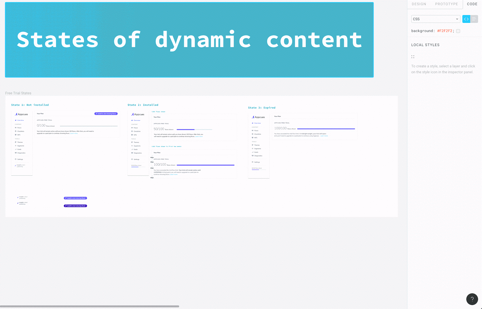
For this, we use InVision’s Inspect tool and Figma’s code inspection tool. One nice thing about Figma is that you can share an entire canvas with developers and annotate and organize specific elements, as opposed to just sharing screens (which is the way InVision Inspect & Zeplin work):
Our goal is to make this information sharing as seamless as possible. One way we do this is by aligning the words we use as designers with the words developers use. For example, we align our layer style names with the color names in the component library that the developers use. That way, we’re all speaking the same language.
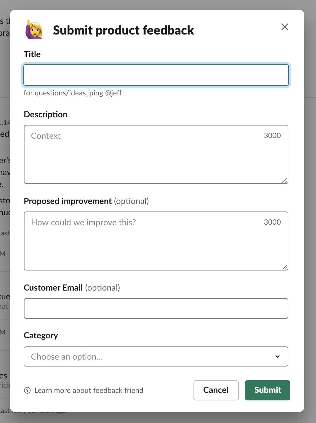
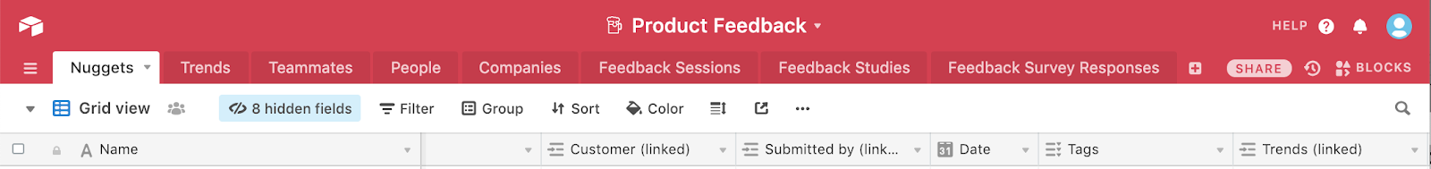
We do a lot of active user research at Appcues. As discussed earlier, we use Airtable (with lots of awesome Zapier integrations) to organize this process. A lot of our process is inspired by the Zapier team’s generous and in-depth posts about how they do things.
We also monitor the experience of our product in more passive and quantitative ways. At the beginning of each project we define the instrumentation we will need to get the quantitative data we want.
We then use Amplitude, a product analytics tool, to gather and understand that data.
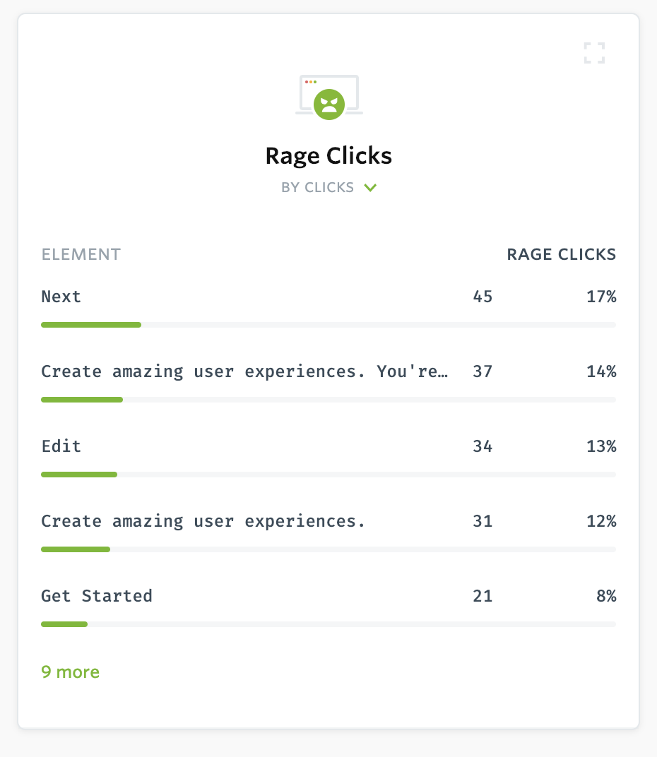
We also use FullStory, which is a powerful tool that replays users’ sessions in Appcues and helps us understand how folks interact with Appcues “out in the wild.”
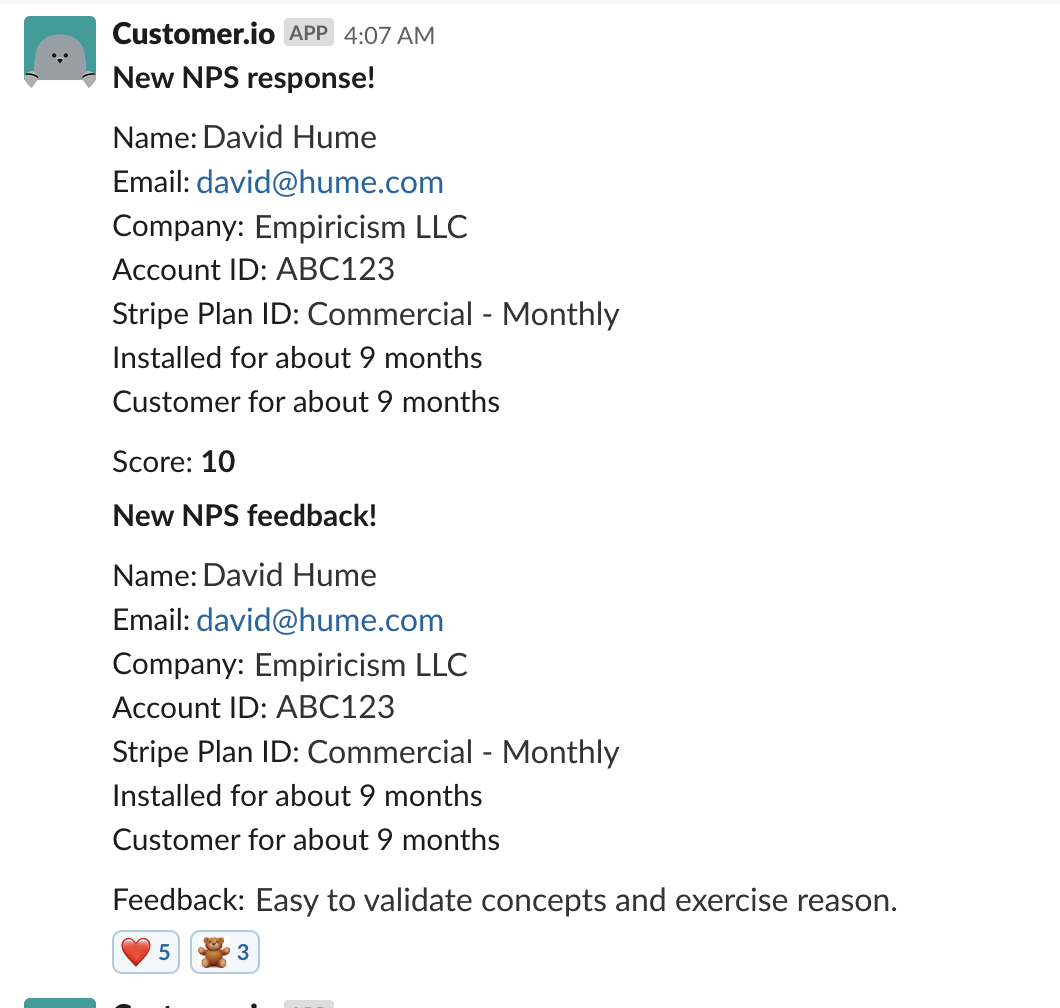
We also use our own NPS survey tool. NPS surveys aren’t perfect, but they are a great way to track sentiment over time, and also to gather lightweight qualitative feedback. When an Appcues user fills out an NPS survey, their response pipes into Slack, so all of our teammates get a pulse on how users are feeling.
As our team grows, our product matures, and design tools evolve, our design toolkit will shift. But as of right now, these are the tools we use! What tools do you and your team use?
We’d love to hear from you—feedback and questions are all fair game—design@appcues.com.
...
PS: If you like what you read and have ideas on how to make our toolkit even stronger, we’re hiring designers!
.png)