.png)

Effective user onboarding ux is what separates a mediocre SaaS business from an extraordinary one.
The process of user onboarding is all about making sure the visitor (who just converted to your customer) is successful at using your product. It’s about getting your customers to reach their “wow moment.”
And although the process consists of welcome screens, in-app messages and follow up emails, all onboarding journeys should start with an effective landing page.
Good user onboarding ux doesn’t just involve your exchange with visitors after they’ve signed up for your service. It starts as soon as they interact with any offer you’re promoting. This could be a free product demo or an ebook download that leads your visitors to a signup page down the road.

And this first exchange of pleasantries between your visitor and your product hopefully happens on your landing page.
A landing page is the first detailed account of your company that your visitors’ see. Before that, all they’ve seen is maybe a display ad on a third party website, a social media ad, or an AdWords ad.
You always want to put your best foot forward when it comes to potential customers, and this is precisely why all effective user onboarding starts with a good landing page. The way you represent your product or service is the way your visitors come to expect you to behave once they sign-up as customers.
For example, if the lead capture form on your landing page was easy to complete and didn’t ask for too much, they’ll expect you to maintain this kind of behavior once they become customers.
Not every landing page is created equal. When optimized properly, landing pages have the power to educate your visitors about your product as a solution to their problem and get them to buy whatever you’re offering.
When landing pages are not optimized — and onboarding ux is not considered — visitors usually get frustrated within seconds and abandon the page for a better, more personalized experience.
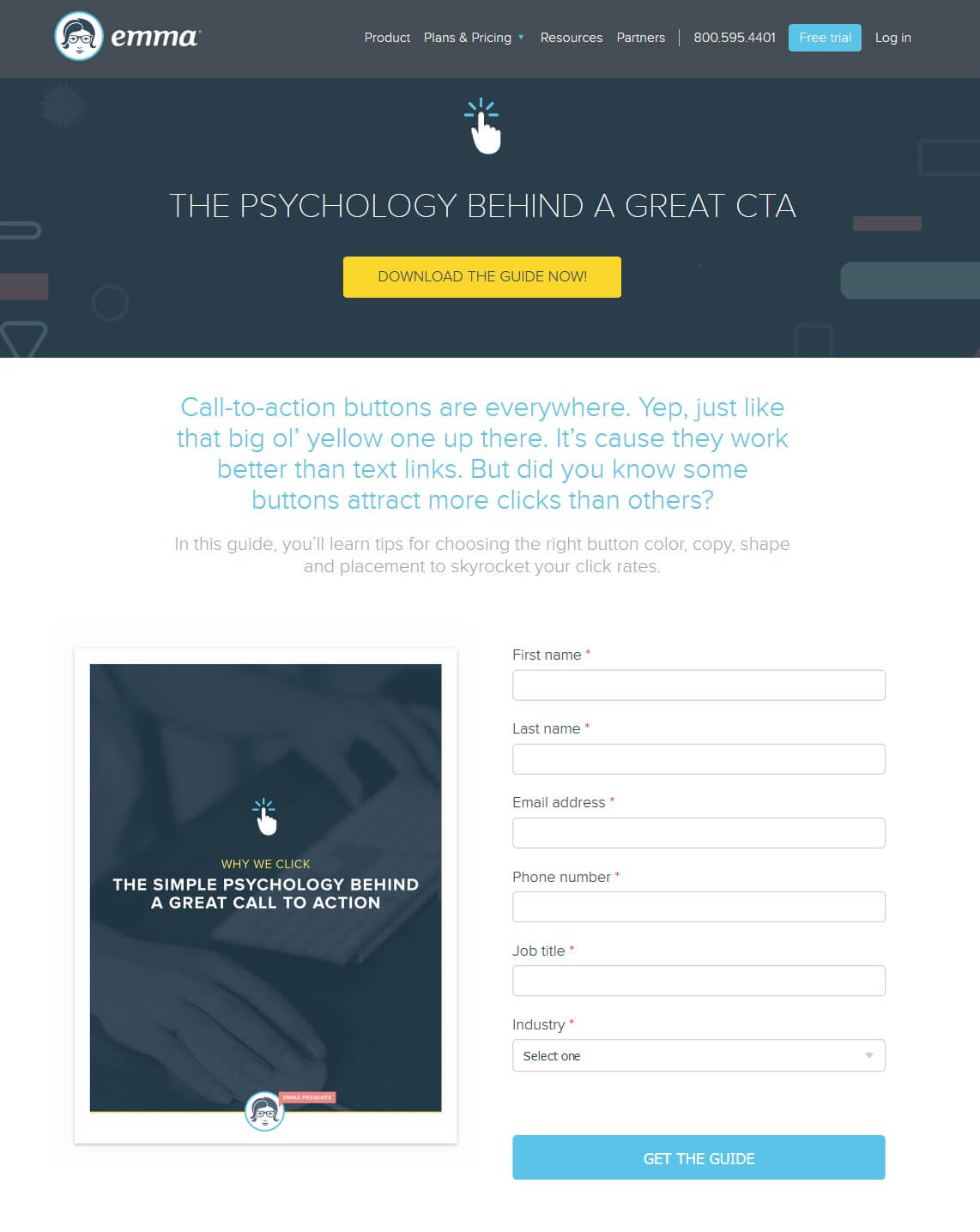
Here’s an example of a landing page that’s optimized for the visitor:
Although I don’t agree with the amount of navigation links (and full footer) that they’ve included on the page, Emma’s landing page is a good page overall.
The page has a clear headline, a form that’s easy to fill out, a graphic that’s relevant to the offer, and copy that tells me what to expect from the guide.
After downloading the guide, I’d be more inclined to click the blue “Free Trial” button I see on this page. Even if I don’t sign up for the service from this page, I’m warmed up to the idea that Emma is a product worth trying out.
On the other hand, here’s an example of a landing page that wasn’t designed keeping the visitor in mind:
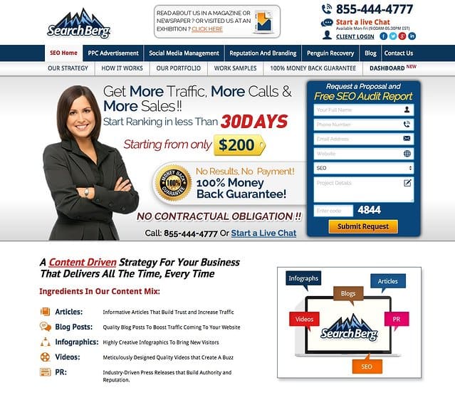
Looking at this cluttered page, I wouldn’t consider becoming a SearchBerg customer if I needed SEO services — mainly because I don’t understand anything that’s happening on the page.
Your user onboarding doesn’t start post-click. Rather, it starts the moment a visitor comes into contact with your landing page. The transition from your landing page to your dashboard must be smooth and helpful, guiding the customer about what he or she is expected to do next.
To analyze what the transition from your landing page to your dashboard must look like, let’s analyze two real world onboarding ux examples.
Let’s begin with the onboarding journey of Gmail, how the email giant takes a visitor from their landing page to the dashboard and what help they get once they’ve transitioned to customers.
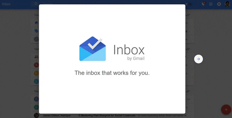
This is the landing page for Inbox by Gmail:
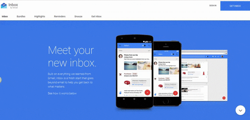
This is a fairly lengthy landing page, but that’s okay because I like what they’re offering. Plus, it’s Gmail so I know I can trust them with my information. Also, the length of the page and the amount of copy tells me that once I sign up, there’s going to be a lot of handholding until I’m comfortable with Inbox on my own.
The copy and imagery complement each other perfectly on the landing page. The copy is presented in short chunks, taking me to through a “tour” of sorts as to what I can expect to see once I click the call-to-action button. The images explaining the new Gmail Inbox features are all real dashboard images giving me a visual taste of what to expect from the product.
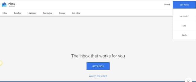
Now convinced, I click the bright blue “Get Inbox” call-to-action button in the top right corner.
Once I do that, I’m asked to select one of three available options — Android, iOS, or Web:
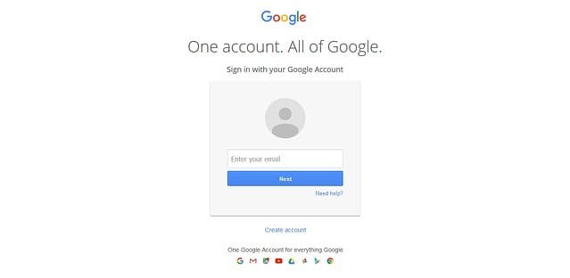
I’m then asked to enter my Gmail account:
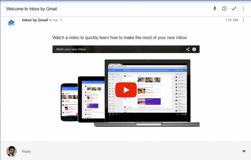
I then get to this welcome screen, with an arrow indicating that I need to keep clicking forward to get the full introduction:
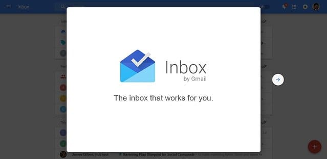
And that’s what I do:
These images and copy are similar to those that convinced me to sign up on the landing page. The similarity reassures me that I’ve landed in the right place, and also that my onboarding experience is going to be just as comfortable as my landing page experience.
I’m notified of what I can expect to see in my inbox and that’s it – hello new Inbox.
Not only that, I also get a welcome email from Gmail in my inbox with a video and a list of FAQs.
Gmail notified me of what to expect from this particular service on their landing page and they followed through nicely when I arrived in their dashboard.
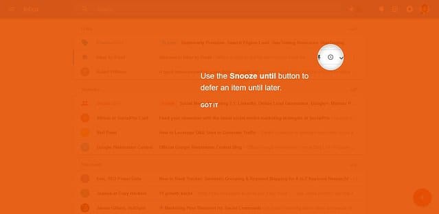
That’s not all. I see prompts about the new features:
Now let’s see how we do things over at Instapage.
The page below is one of our main landing pages:
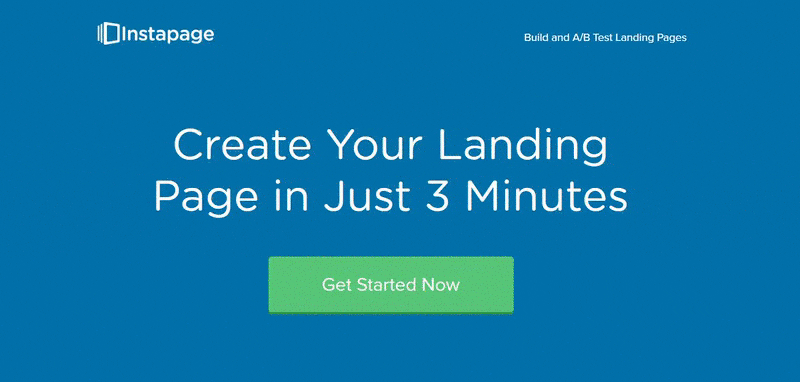
The headline gives me the expectation of creating a landing page quickly, and if a visitor is new to creating landing pages, they’ll assume that Instapage is going to help them out during the process.
There’s a video on the landing page that introduces the builder as an easy and simplistic solution to create stunning landing pages. The mention of “no design skills required” notifies me that I’ll probably have all the designing done for me and won’t have to worry about a thing.
I also get acquainted with A/B testing on the landing page and how Instapage makes it easy to increase your conversion rates with the power of easy testing.
Let’s walk through our onboarding ux sequence to see if this is true.
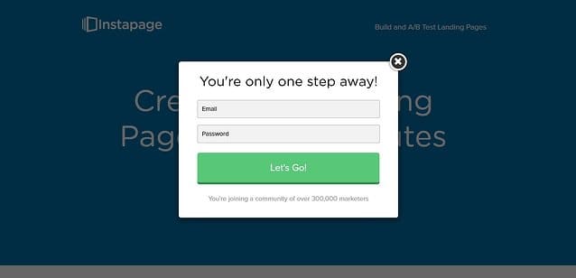
Once I click the CTA button, the form appears asking for my email and password to setup my account. It also informs me that I’ll be joining a community of over 300,000 marketers, which serves as proof that Instapage is a trusted landing page builder.
Now I’m in the dashboard, and I see this welcome message:
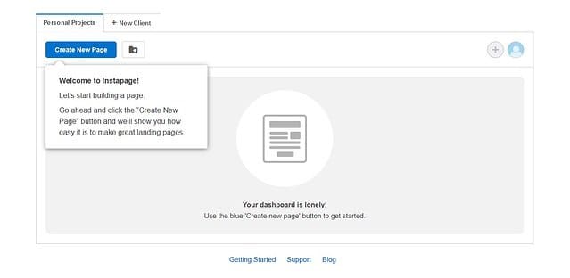
The onboarding sequence also promises to show me how to create great landing pages.
This is my next set of instructions to “make it my own:”
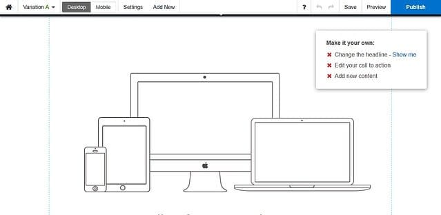
The landing page promised me that I would need no designing skills to create my page, and here I have a pre-made template ready for me. Not only that I also see a mini checklist of sorts, telling me to add in my headline, CTA, and content, fulfilling the promise of Instapage allowing me to test and optimize my landing pages.
The builder even shows me how I can create high-performing headlines right from the start:
The same is true for other landing page elements. Instapage not only gives me a short explanation of what that element should look like, but also sends me to a blog post that discusses things in detail.
So far Instapage is upholding their promise of helping users create great landing pages.
And once I publish my page, an in-app message pops up from the support team taking me to other helpful resources if I need them.
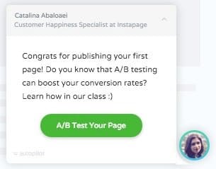
The landing page promised me easy A/B testing and the onboarding ux follows through. Here I have a direct message from an agent taking me to an A/B testing resource that can help boost my conversion rates.
Both Gmail and Instapage’s landing pages and their respective onboarding journeys are connected nicely to each other. The user is not left helpless once they become customers. Instead, users are helped every step of the way.
Don’t forget, your onboarding ux journey starts with your landing page. Establish a relevant connection between your users’ pre-click and post-click experiences and you can expect your users to stay committed to using your product, resulting in a lower churn rate.
As marketers, isn’t that what we all want in the end?
Fahad Muhammad is a Content Marketer at Instapage. He writes about landing page examples, marketing trends, Instapage updates, and conversion psychology on the Instapage blog. When he’s not busy hunting down landing page examples he can be found glued to an episode of “Top Gear.”
Want to become a User Onboarding Master? Check out our free User Onboarding Academy!

.png)