← Visit Appcues.com
×
×

UX psychology: 6 essential principles for better UX design

To design products that stick, you have to understand what makes your users tick!
Skip to section:

Skip to section:

Editor's note: This article was originally published in March 2019 and has been updated in March 2020.

Exceptional user experiences are rooted deep in cognitive and behavioral psychology.

A deeper understanding of the psychology behind your users' decisions can help you build more powerful, engaging, and effective user onboarding experiences.

You don't need a degree in psychology to make meaningful changes to your user experiences. All you really need to get started is an understanding of a few key psychological principles that influence the way users interact with your product. In this article, we'll cover the following:

  1. Goal gradient effect
  2. Speak-easy effect
  3. Endowment effect
  4. Choice paradox
  5. Zeigarnik effect
  6. Peak-end rule

Let's dive in!

1. Goal gradient effect: Motivate users through a feeling of progress

The closer we get to reaching a goal, the harder we work to complete it. Think about the second wind you get after reaching the midpoint of a race or the feeling of excitement you experience when you're about to beat a high score.

As it turns out, whether or not we're actually making progress is irrelevant—even the illusion of progress toward a goal can encourage us to push to reach a goal faster. This is known as the goal gradient effect (aka the goal gradient hypothesis).

Many products take advantage of this human tendency by using progress bars or checklists. Helping users get started—whether through artificial accomplishments (like with a pre-stamped coffee card, to give a real-world example) or real progress toward a goal—significantly increases the likelihood that they will complete a given task.

The principle in practice

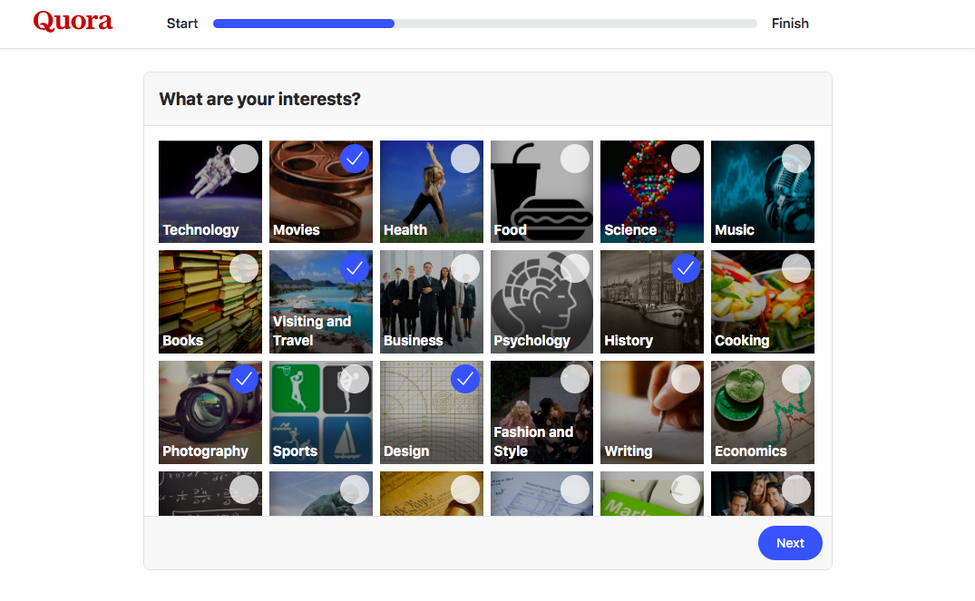
Showing users a progress bar with a substantial percentage already completed helps users feel like they've already made some progress and are not starting from scratch. This further motivates them to complete the task at hand, whether that's a signup form or an onboarding tutorial.
quora new user signup what are your inter

To give a very simple example, take a look at Quora's signup flow above. Quora briskly asks them to create an account and verify their email address. Once this is done, it shows them a progress bar that is already 30% completed. Thanks to the goal gradient effect, users are far less likely to abandon the signup process when they see this upfront progress.

2. Speak-easy effect: Use simple language in UX copy

The speak-easy effect is really just another term for familiarity bias (or the familiarity heuristic).  Humans innately prefer things we're familiar with whether they're words, products, or experiences. This principle works in reverse, too: We associate new experiences or words with risk and uncertainty. 

When the things that a company or product tells us feels familiar, we trust that it's true and that they have our best interests in mind, increasing the likelihood that we'll follow a direction or complete an assigned task. 

People tend to trust words that are easy to read more than complicated phrases. For example, one study showed that people rated food additives as more harmful when their names were more difficult to pronounce.

The principle in practice

Keeping UX copy concise helps build trust—always use the fewest words possible to convey meaning.
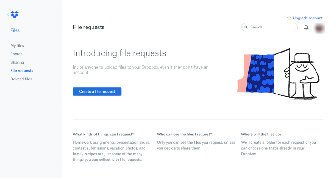
this is a screenshot image from dropbox that shows an example of clear UX copy and microcopy that uses plain language.

Dropbox does a great job of simplifying their microcopy, explaining each step of their onboarding process and app without overwhelming users.

Dropbox Paper adds a human element to their copy by populating their empty states with witty prompts and sample headlines each time a user creates a new document.

this is a screeshot from dropbox showing clever ux copy in a blank document. This is a good empty state screen example. the headline reads "untitled composition"
this is a screeshot from dropbox showing clever ux copy in a blank document. This is a good empty state example.

It's a small touch, but it helps build familiarity and trust in the product and brand.

3. Endowment effect: Let users take ownership of their experience

Say I give you a gift and tell you it's yours to keep. Then I say you can trade your gift with someone else. Do you want to keep the gift because it's “yours” even though I only just gave it to you? Or what if you inherited property that you'd never seen from a distant relative across the country: Would you care how the lawn was landscaped or what color the shutters were painted?If you answered yes to either question, you're not alone. The tendency to ascribe value to products that people think they own is known as the endowment effect.  

The principle in practice

Adding some aspect of customer-owned personalization to your onboarding can drastically improve onboarding completion rates.

Look for ways to customize the user experience or provide personalization options early in your user onboarding flow. This helps users to begin attributing value to your product early, creating an emotional connection with your app and increasing the likelihood they'll continue (or start) paying for your product.

Wealthfront's mobile investment app is an example of personalization done well: Not only does Wealthfront ask personalizing questions early on, but they also use the answers to customize moments of friction (like linking bank accounts) to put users at ease and remind them of their personal motivations.

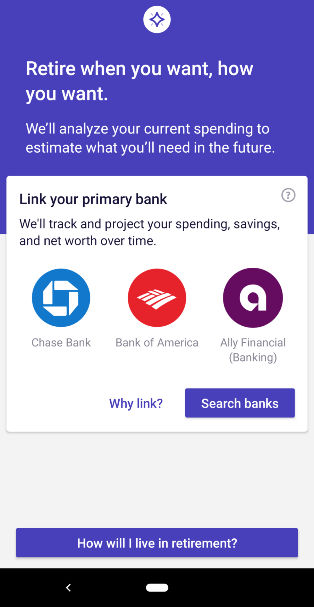
this is an example of personalized ux in the wealthfront mobile app. this gif image shows personalizing questions that help boost user motivation
this is an example of personalized ux in the wealthfront mobile app. this image shows personalized UX copy that help boost user motivation

By adding personal details and customizing their preferences, users make the Wealthfront app “theirs” and are more likely to place a higher value throughout their experience.

4. Choice paradox: Give users fewer options

If you've ever felt overwhelmed by a restaurant menu with too many options, you've suffered from the paradox of choice.

The choice paradox occurs as the number of choices we're offered grows and we start to become overwhelmed and overloaded. Making a decision becomes difficult or impossible. Not only do we feel mentally exhausted after choosing between many different options, it also leaves us with the feeling that we could have made a better choice or that we missed something important.

The principle in practice

TurboTax does a great job of removing irrelevant options from the complicated process of filing tax returns. When filling out a tax return by hand, it's nearly impossible to know which sections of the pages and pages of forms are relevant to your personal tax situation.

By asking a few simple questions about a user's personal situation, TurboTax is able to eliminate a significant portion of the tax filing process that relevant. This reduction of choice keeps users from feeling overwhelmed by the complex process of deciphering the tax code.
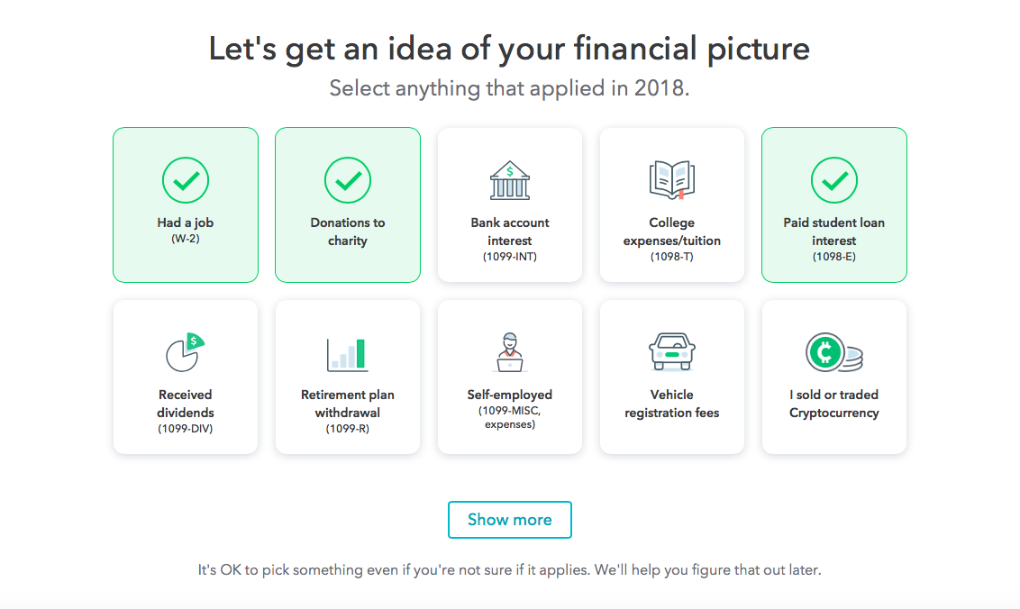
this is a screenshot from turbotax 2019 ux. it shows clear ux copy, simplified choices, and personalization that helps make the user experience more relevant

Another example of a product that is designed to eliminate unnecessary options is Headspace's mobile app. Throughout the user onboarding flow, Headspace keeps its personalizing questions simple, straightforward, and limited. In the screen below, for example, Headspace could have given users more ways to answer a question about their past experience with meditation, but instead they went with 3 broadly applicable choices. The question feels easy to answer as a result, and helps users move more quickly through the onboarding flow.
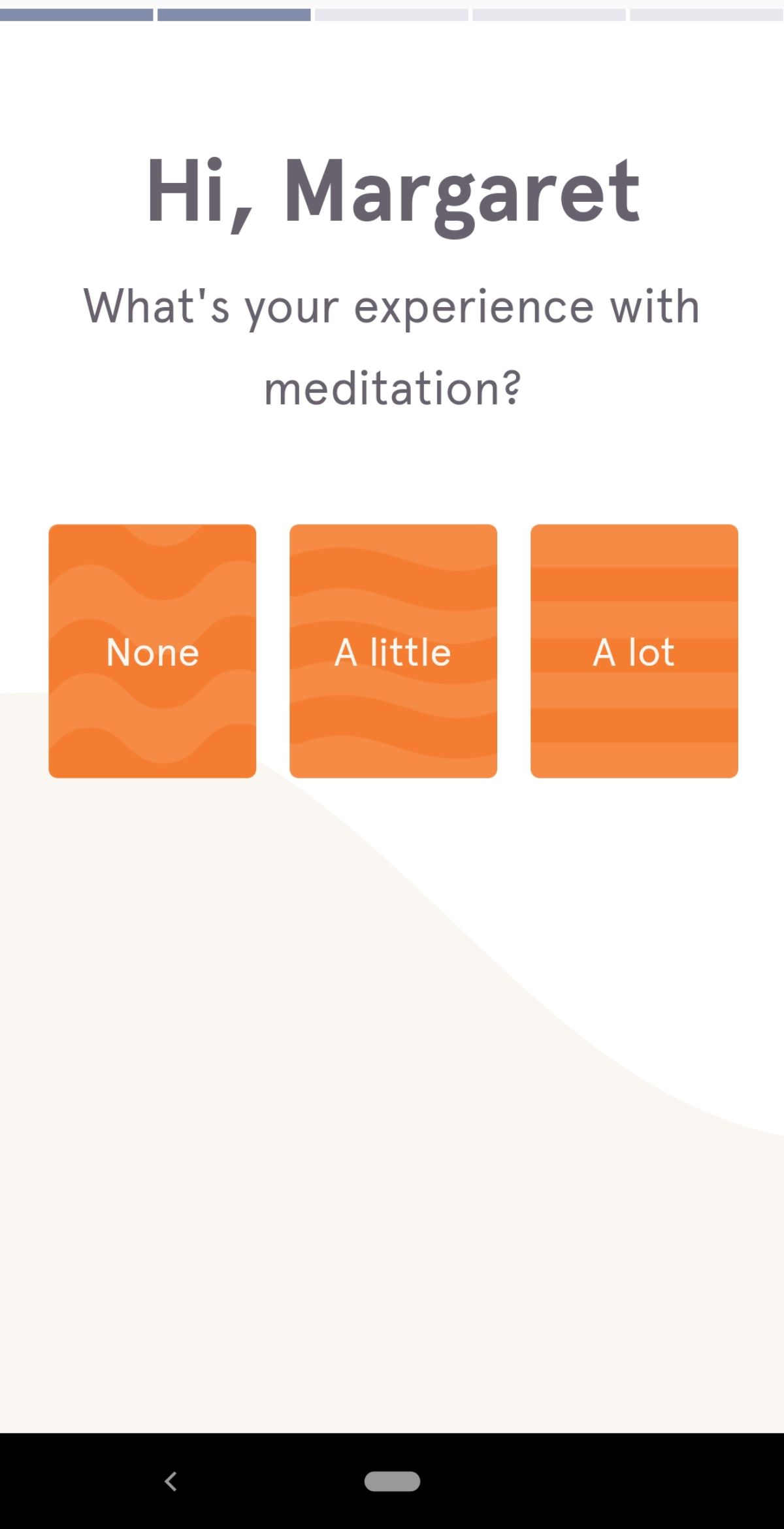
this is an example of a good user onboarding flow that removes unnecessary options to combat the choice paradox

Be prescriptive with the choices you offer users—don't ask 20 questions when you could ask 5. Your interface will be simpler and your users happier for it.

5. Zeigarnik effect: Emphasize an aha moment as an uncompleted task

The Zeigarnik effect, named for the Soviet psychologist who studied the phenomenon, refers to the human tendency to focus more on uncompleted tasks than completed ones. The psychological tension provided by an incomplete state helps us recall any relevant information we might need to complete the task.

The principle in practice

The blogging platform Ghost dug into their own data and realized that new users who accomplish a certain task were 10x more likely to subscribe to a paid account than those who don’t. Surprisingly enough, that task was not publishing a blog post—it was adding a custom blog theme.

When they discovered this data, Ghost created a simple onboarding sequence that included directing users to add a custom theme. Ghost also sent a lifecycle email to users who had not yet added a theme.
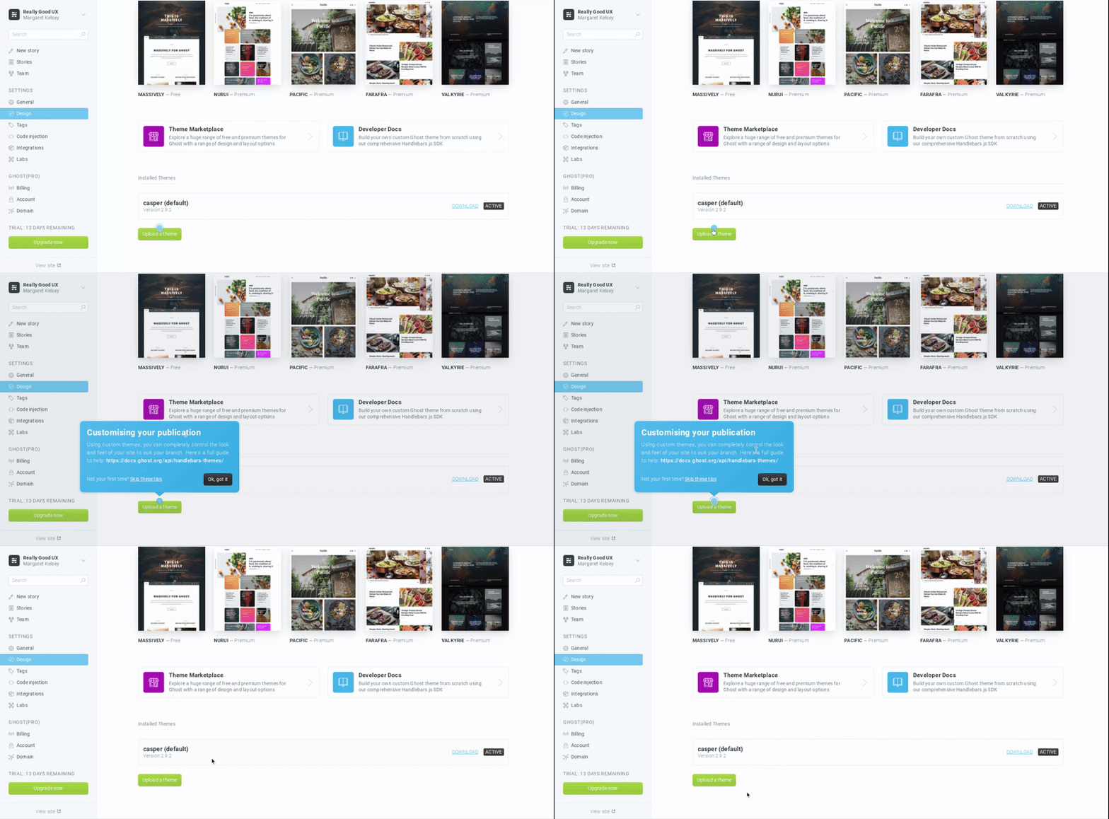
this is a gif image from ghost cms blogging platform that shows a prompt to customize a theme. this is an example of emohasizing the aha moment as an uncompleted task

They found that 26% of users who opened the lifecycle email and viewed the attached tutorial video added a custom theme, compared to 7% of new users overall. By orienting a critical aha moment as an incomplete task, Ghost drove more users to take action—and ultimately convert into paying accounts.

6. Peak-end rule: Make it an end to remember

People remember experiences as a series of particularly strong moments, almost like mental snapshots. While we tend to average our experience of events, the most intense moments and the final moments of an experience are weighted more heavily in that average. 

This is known as the peak-end rule, and it's something product designers can take advantage of when offboarding—yes, offboarding—churning customers. Because some folks will inevitably leave your product, and it's up to you to make a good last impression.

The principle in practice

Look at how Mailchimp does offboarding: They give their users the option of pausing or permanently deleting their accounts (and makes these options easy to find) and include support links explaining how to export data from the account before it's is permanently deleted. The entire process is straightforward and easy to navigate, leaving a lasting positive impression on the user.
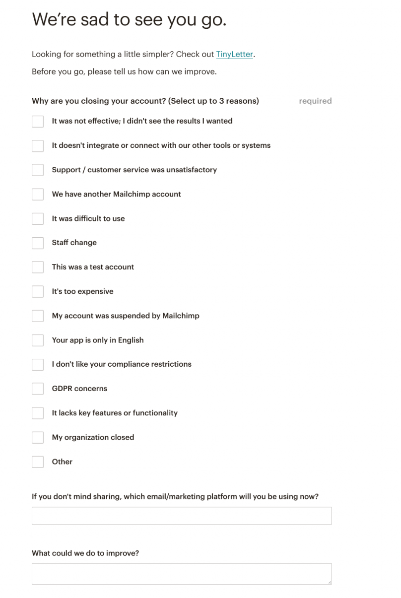
this is an example of a positive offboarding flow from mailchimp that appears when a user cancels their mailchimp account. the header says "we're sad to see you go" and there are a series of offboarding questions
this is a screenshot of the success message that appears when you delete your mailchimp account. this is an example of a good last impression in UX

Small improvements, when applied to the most important points of the user journey, can have a large positive impact on the overall user experience. And remember, even after a customer has churned, they can still benefit your business through positive reviews, referrals, or even resubscribing in the future.

Effective user experiences are rooted in psychology

To say humans are complicated would be an understatement. But at the same time, we're remarkably predictable when it comes to certain patterns of behavior. 

Understanding the psychology behind why your users act the way they do allows you to design more effective—and enjoyable—product experiences.

Author's picture
Katryna Balboni
Content and Community Director at User Interviews
Katryna is the Content and Community Director at User Interviews. Before User Interviews, she made magic happen with all things content at Appcues. Her non-work time is spent traveling to new places, befriending street cats, and baking elaborate pies.
Skip to section:

Skip to section:

Editor's note: This article was originally published in March 2019 and has been updated in March 2020.

Exceptional user experiences are rooted deep in cognitive and behavioral psychology.

A deeper understanding of the psychology behind your users' decisions can help you build more powerful, engaging, and effective user onboarding experiences.

You don't need a degree in psychology to make meaningful changes to your user experiences. All you really need to get started is an understanding of a few key psychological principles that influence the way users interact with your product. In this article, we'll cover the following:

  1. Goal gradient effect
  2. Speak-easy effect
  3. Endowment effect
  4. Choice paradox
  5. Zeigarnik effect
  6. Peak-end rule

Let's dive in!

1. Goal gradient effect: Motivate users through a feeling of progress

The closer we get to reaching a goal, the harder we work to complete it. Think about the second wind you get after reaching the midpoint of a race or the feeling of excitement you experience when you're about to beat a high score.

As it turns out, whether or not we're actually making progress is irrelevant—even the illusion of progress toward a goal can encourage us to push to reach a goal faster. This is known as the goal gradient effect (aka the goal gradient hypothesis).

Many products take advantage of this human tendency by using progress bars or checklists. Helping users get started—whether through artificial accomplishments (like with a pre-stamped coffee card, to give a real-world example) or real progress toward a goal—significantly increases the likelihood that they will complete a given task.

The principle in practice

Showing users a progress bar with a substantial percentage already completed helps users feel like they've already made some progress and are not starting from scratch. This further motivates them to complete the task at hand, whether that's a signup form or an onboarding tutorial.

quora new user signup what are your inter

To give a very simple example, take a look at Quora's signup flow above. Quora briskly asks them to create an account and verify their email address. Once this is done, it shows them a progress bar that is already 30% completed. Thanks to the goal gradient effect, users are far less likely to abandon the signup process when they see this upfront progress.

2. Speak-easy effect: Use simple language in UX copy

The speak-easy effect is really just another term for familiarity bias (or the familiarity heuristic).  Humans innately prefer things we're familiar with whether they're words, products, or experiences. This principle works in reverse, too: We associate new experiences or words with risk and uncertainty. 

When the things that a company or product tells us feels familiar, we trust that it's true and that they have our best interests in mind, increasing the likelihood that we'll follow a direction or complete an assigned task. 

People tend to trust words that are easy to read more than complicated phrases. For example, one study showed that people rated food additives as more harmful when their names were more difficult to pronounce.

The principle in practice

Keeping UX copy concise helps build trust—always use the fewest words possible to convey meaning.

this is a screenshot image from dropbox that shows an example of clear UX copy and microcopy that uses plain language.

Dropbox does a great job of simplifying their microcopy, explaining each step of their onboarding process and app without overwhelming users.

Dropbox Paper adds a human element to their copy by populating their empty states with witty prompts and sample headlines each time a user creates a new document.

this is a screeshot from dropbox showing clever ux copy in a blank document. This is a good empty state screen example. the headline reads "untitled composition"
this is a screeshot from dropbox showing clever ux copy in a blank document. This is a good empty state example.

It's a small touch, but it helps build familiarity and trust in the product and brand.

3. Endowment effect: Let users take ownership of their experience

Say I give you a gift and tell you it's yours to keep. Then I say you can trade your gift with someone else. Do you want to keep the gift because it's “yours” even though I only just gave it to you? Or what if you inherited property that you'd never seen from a distant relative across the country: Would you care how the lawn was landscaped or what color the shutters were painted?If you answered yes to either question, you're not alone. The tendency to ascribe value to products that people think they own is known as the endowment effect.  

The principle in practice

Adding some aspect of customer-owned personalization to your onboarding can drastically improve onboarding completion rates.

Look for ways to customize the user experience or provide personalization options early in your user onboarding flow. This helps users to begin attributing value to your product early, creating an emotional connection with your app and increasing the likelihood they'll continue (or start) paying for your product.

Wealthfront's mobile investment app is an example of personalization done well: Not only does Wealthfront ask personalizing questions early on, but they also use the answers to customize moments of friction (like linking bank accounts) to put users at ease and remind them of their personal motivations.

this is an example of personalized ux in the wealthfront mobile app. this gif image shows personalizing questions that help boost user motivation
this is an example of personalized ux in the wealthfront mobile app. this image shows personalized UX copy that help boost user motivation

By adding personal details and customizing their preferences, users make the Wealthfront app “theirs” and are more likely to place a higher value throughout their experience.

4. Choice paradox: Give users fewer options

If you've ever felt overwhelmed by a restaurant menu with too many options, you've suffered from the paradox of choice.

The choice paradox occurs as the number of choices we're offered grows and we start to become overwhelmed and overloaded. Making a decision becomes difficult or impossible. Not only do we feel mentally exhausted after choosing between many different options, it also leaves us with the feeling that we could have made a better choice or that we missed something important.

The principle in practice

TurboTax does a great job of removing irrelevant options from the complicated process of filing tax returns. When filling out a tax return by hand, it's nearly impossible to know which sections of the pages and pages of forms are relevant to your personal tax situation.

By asking a few simple questions about a user's personal situation, TurboTax is able to eliminate a significant portion of the tax filing process that relevant. This reduction of choice keeps users from feeling overwhelmed by the complex process of deciphering the tax code.

this is a screenshot from turbotax 2019 ux. it shows clear ux copy, simplified choices, and personalization that helps make the user experience more relevant

Another example of a product that is designed to eliminate unnecessary options is Headspace's mobile app. Throughout the user onboarding flow, Headspace keeps its personalizing questions simple, straightforward, and limited. In the screen below, for example, Headspace could have given users more ways to answer a question about their past experience with meditation, but instead they went with 3 broadly applicable choices. The question feels easy to answer as a result, and helps users move more quickly through the onboarding flow.

this is an example of a good user onboarding flow that removes unnecessary options to combat the choice paradox

Be prescriptive with the choices you offer users—don't ask 20 questions when you could ask 5. Your interface will be simpler and your users happier for it.

5. Zeigarnik effect: Emphasize an aha moment as an uncompleted task

The Zeigarnik effect, named for the Soviet psychologist who studied the phenomenon, refers to the human tendency to focus more on uncompleted tasks than completed ones. The psychological tension provided by an incomplete state helps us recall any relevant information we might need to complete the task.

The principle in practice

The blogging platform Ghost dug into their own data and realized that new users who accomplish a certain task were 10x more likely to subscribe to a paid account than those who don’t. Surprisingly enough, that task was not publishing a blog post—it was adding a custom blog theme.

When they discovered this data, Ghost created a simple onboarding sequence that included directing users to add a custom theme. Ghost also sent a lifecycle email to users who had not yet added a theme.

this is a gif image from ghost cms blogging platform that shows a prompt to customize a theme. this is an example of emohasizing the aha moment as an uncompleted task

They found that 26% of users who opened the lifecycle email and viewed the attached tutorial video added a custom theme, compared to 7% of new users overall. By orienting a critical aha moment as an incomplete task, Ghost drove more users to take action—and ultimately convert into paying accounts.

6. Peak-end rule: Make it an end to remember

People remember experiences as a series of particularly strong moments, almost like mental snapshots. While we tend to average our experience of events, the most intense moments and the final moments of an experience are weighted more heavily in that average. 

This is known as the peak-end rule, and it's something product designers can take advantage of when offboarding—yes, offboarding—churning customers. Because some folks will inevitably leave your product, and it's up to you to make a good last impression.

The principle in practice

Look at how Mailchimp does offboarding: They give their users the option of pausing or permanently deleting their accounts (and makes these options easy to find) and include support links explaining how to export data from the account before it's is permanently deleted. The entire process is straightforward and easy to navigate, leaving a lasting positive impression on the user.

this is an example of a positive offboarding flow from mailchimp that appears when a user cancels their mailchimp account. the header says "we're sad to see you go" and there are a series of offboarding questions
this is a screenshot of the success message that appears when you delete your mailchimp account. this is an example of a good last impression in UX

Small improvements, when applied to the most important points of the user journey, can have a large positive impact on the overall user experience. And remember, even after a customer has churned, they can still benefit your business through positive reviews, referrals, or even resubscribing in the future.

Effective user experiences are rooted in psychology

To say humans are complicated would be an understatement. But at the same time, we're remarkably predictable when it comes to certain patterns of behavior. 

Understanding the psychology behind why your users act the way they do allows you to design more effective—and enjoyable—product experiences.

Author's picture
Katryna Balboni
Content and Community Director at User Interviews
Katryna is the Content and Community Director at User Interviews. Before User Interviews, she made magic happen with all things content at Appcues. Her non-work time is spent traveling to new places, befriending street cats, and baking elaborate pies.
You might also like...