← Visit Appcues.com
×
×

How TurboTax turns a dreadful user experience into a delightful one

Here are 9 tactics TurboTax used to create UX so good you might (might!) even enjoy filing your taxes.
Skip to section:

Skip to section:

Filing your taxes is never a fun task (unless you’re certain that you grossly overpaid on every paycheck and are guaranteed a large refund—but even then, “fun” isn’t the word most people would use).

Even still, as folks here at Appcues filed our 2018 taxes, we couldn’t help but admire the thoughtful details that Intuit’s product team had put into the TurboTax experience. TurboTax managed to turn the hugely complex processes of deciphering our archaic tax code into a step-by-step, intuitive flow. The result is a prime example of really good UX.

Here are 9 tactics that TurboTax uses to a dreadful experience a delightful one.

1. Orient messaging around the goal, not the task

Nobody is motivated to do their taxes for the sake of it. TurboTax knows this and instead orients its copywriting around the user’s true motivation: maximum refund, guaranteed—now that’s a value proposition we can get behind. 💰

turbotax homepage marketing copy

What's more, TurboTax does a great job speaking to needs of different user segments. Look at how they adjust their messaging to appeal to freelancers, independent contractors, and small business owners.

turbotax user persona marketing copy homepage

(Psst—For more on goal-oriented UX, check out How to design goal-oriented onboarding in 4 steps by Pantelis Korovilas of Turo and Hopper.)

2. Personalized user onboarding

Personalized user onboarding is a great way to build motivation through our human tendency towards commitment and consistency.

TurboTax uses personalization throughout its product to create a seamless and intuitive user experience. And this personalization of the user experience starts early: Before a new user even registers, they are asked to segment themselves by use case (in friendlier terms, of course):
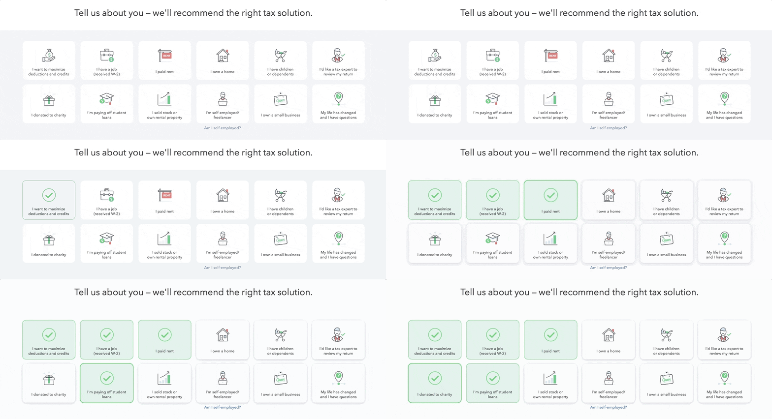
This is a gif showing self segmentation by persona on TurboTax's homepage prior to account creation. It shows a user selecting options that apply to them in the 2018 fiscal year

The options that a user selects on TurboTax’s website are used to automatically populate fields and give a more personalized experience later on in the app.  Below is a screenshot of a question several steps into the tax return process; you can see that the appropriate options have been pre-selected based on the user’s earlier input. This little detail reduces friction and makes the whole experience feel very cohesive.

This is a screenshot from TurboTax that shows self segmentation by use case and persona. The text says "let's get an idea of your financial picture" and there are 10 buttons with options that include: had a job, bank account interest, paid student loan interest, and more. The CTA says show more. This is an early screen in TurboTax's tax return app flow.

And TurboTax’s personalization doesn’t stop there. Even simple form fields are given a friendly touch with a first name token and clever copy:
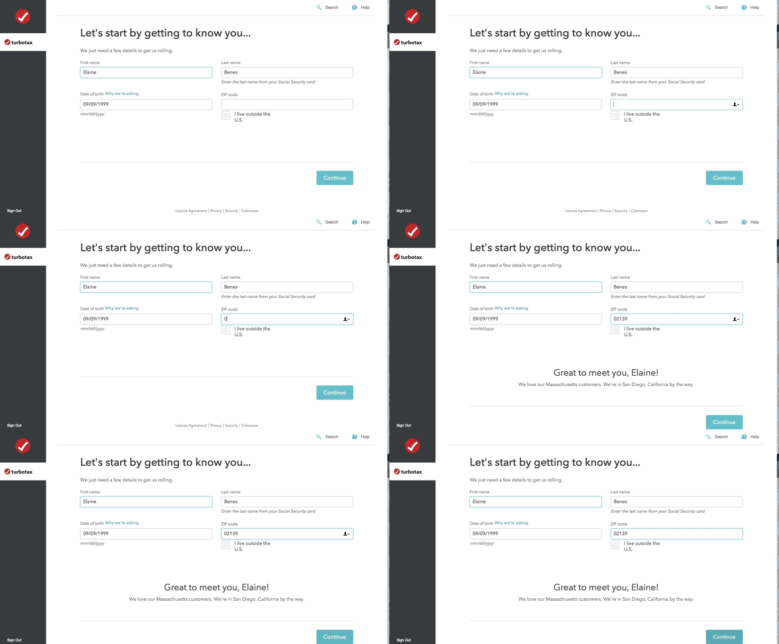
This is a gif of a personalized onboarding flow. This is an example of personalized onboarding UX from Turbotax. It says "Let's start by getting to know you" and as the user types in their zip code and completes the fields, a personalized message using a first name token appears welcoming the user to the product

For returning users, TurboTax compares the user’s information inputs with previous tax return to offer a custom user experience. For instance, if your address changed since the last time you filed, they make sure to check for a work-related moving expense deduction:

This is a screenshot of TurboTax tax return process. It shows an automatic detection of a possible tax deduction or credit. It says "let's check for work-related moving expensese"
PERSONALIZE AT SCALE

Delivering the same onboarding experience to all your users?

  • Increase user activation with personalized onboarding flows
  • Drive feature adoption to improve stickiness and retention
Charts and graphs

3. Automate and minimize common points of friction

Nobody likes manual data entry. TurboTax addresses this by automating data entry whenever possible. You can automatically sync data from hundreds of popular brokerage and payroll providers—or even import data from straight from your W-2 by uploading a PDF or taking a picture with your phone:
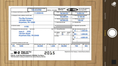
This is TurboTax's w-2 uploader. This is how you can upload your w2 form by taking a photo on your phone. This image shows an example W2.

By assuming this complexity themselves, the Intuit team provides simplicity to the end user, which results in a process that users are more likely to complete.

What about if you decide to manually input the information? TurboTax ensures a good user experience by matching the layout of its form field to that of a standard W-2. It’s a small detail, and many users are unlikely to notice that a point of friction has been removed—but that’s exactly what makes it such good, intuitive UX.
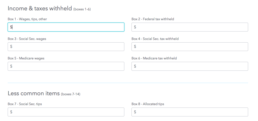
This is a blank w2 form field from Turbotax. It shows boxes 1-6 on a w2 in the same format as they appear on a physical printed w2. This reduces fricion while manually inputting user information by matching the layout to real world counterpart.

4. Inject some brand personality

As you are getting started, TurboTax poses a question:
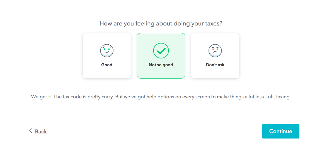
This is a question from turbotax that gauges user sentiment. It says "how are you feeling about doing your taxes" and there are 3 options. The microcopy is part of TurboTax's great UX strategy.

No, that’s not a hot new machine learning algorithm that has finally mastered empathy—it’s just smart product copy. TurboTax understands the mindset of its users and uses thoughtful copy to a make them feel comfortable.

This touch of personality makes the whole experience a lot less painful, almost like you’re having an accountant friend help with your taxes.

5. Keep the user focused on one task at a time

If you were to prepare your tax return the old-fashioned way, where would you begin? State or federal? With your income or by itemizing deductions?

With so many fields to complete, the process can easily overwhelm. There are hundreds of places one could start, creating a daunting choice paradox that inevitably results in inaction.

To combat this paralysis, TurboTax has prescriptive flow that focuses the user’s attention on one step at a time:

This is an example of how turbotax uses it's ui and ux to keep users focused on one part of their task return at a time.

6. Break up long workflows and set expectations for what’s ahead

No matter how streamlined TurboTax’s interface may be, filing your taxes is still a long, multi-step process.

TurboTax’s product team clearly gave a lot of consideration to the user journey as a whole—they’ve included checkpoints or milestones along the way that help break up a long workflow into more manageable sections.

What’s more, these milestones include helpful copy that sets clear expectations for what’s ahead:

This is a screenshot of a real turbotax 2018 2019 tax return workflow that shows an illustration of a government building and says "let's check your federal return and make sure it's good to go". This is an example of a milestone or checkpoint in a long multi-step process that breaks up the workflow for better ux

These aren’t generic screens, either—the information under “Here’s what’s coming up” is personalized for each user. Below is the same screen as seen by 2 different users, the first by a new user, the second by a returning user who has filed with TurboTax before:


This is an example of good ux setting user expectations by telling them what comes next. This screen from Turbotax says "let's dig into your tax breaks" and has a subheader that reads "here's what's coming up"

7. Show progress toward a goal

In addition to well-timed checkpoints, TurboTax keeps the momentum up by highlighting progress.

Take a look at the screen below. There are 3 progress indicators here:

  1. The user is notified that they will get a tax break based on the information they gave in the previous steps.
  2. The current section of the workflow (Deductions & Credits) is underlined in the navigation bar, giving the user a visual indicator of how many more steps there are left in the federal tax return process.
  3. At the top of the screen, there is a preview of how large a refund the user can expect at the federal and state levels. These numbers update in real time, according to the information provided at each step.
This is a screenshot image from a real turbotax user worflow that shows what happens when you qualify for a tax break. It shows a full screen modal that says "congrats, you get a tax break" and a subheader "Studen Loan Interest Deduction"

8. Celebrate success

Woohoo! Taxes are complete and we don’t have to think about them for another 11.5 months!  Celebrating success like this is a commonly missed opportunity in the software world. But a simple victory message like the one below helps users internalize a sense of accomplishment:

this is a confirmation screen that you see after filing taxes with turbotax. It is an example of celebrating user success through UX

9. Provide ongoing value

TurboTax knows that no matter how many congratulations they send a user’s way, what people really want is their tax refund. That’s why they follow their confirmation email with a second:
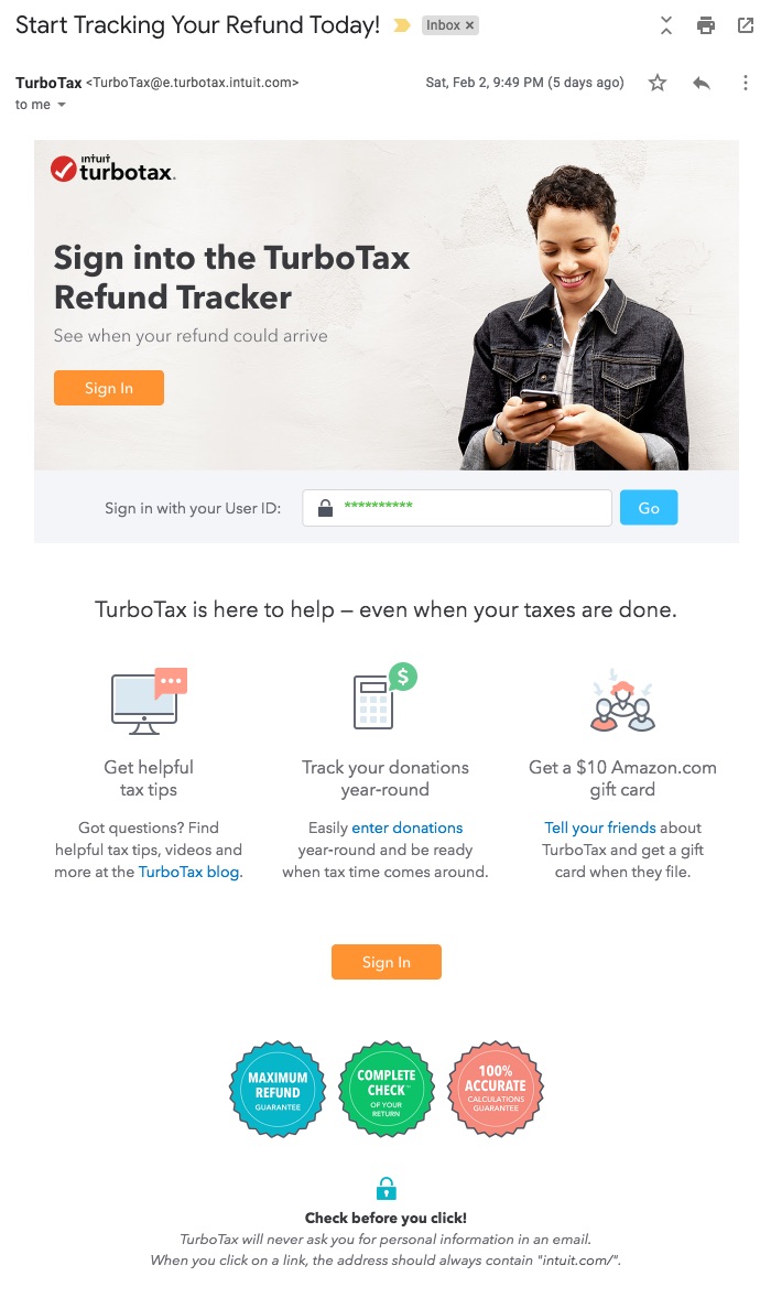
This is a reengagement email from turbotax with the subject line "start tracking your refund today" with a link to turbotax's refund tracker for people who want to know when they'll get their tax returns.

The subject line—“Start tracking your refund today!”—grabs the attention of people eagerly awaiting a direct deposit. But it’s the copy inside the email that’s really important: “TurboTax is here to help—even when your taxes are done.” 

This messaging is reinforced when a user revisits TurboTax to track their refund. Just below their refund status, users see a header that reads: “We’re with you all year. Here’s what you can do next” along with a link to Intuit’s financial product, Turbo.

This is a screenshot from TurboTax's refund tracker page with a CTA to check out Intuit Turbo for credit score, debt to income ratio, etc.

Intuit’s active user rates peak sharply during tax season. In order to increase engagement year-round, they need their TurboTax users to adopt other products in their suite. This value-adding follow-up email and simple landing page encourage users to expand to a secondary use case in a way that feels natural and logical, rather than pushy.

9. Pay attention to the details

TurboTax’s product doesn’t just fulfill its value proposition—it delivers value while feeling cohesive, friendly, and trustworthy from start to finish.

How? It’s all in the details.

For example, their FAQs are seamlessly integrated into each page alongside relevant steps in the return process, making them highly contextual, easy to find, and just and easy to ignore if you don’t need them—the slideout only appears when you click on a question, and can be hidden with a click:

this is an example of contextual faq as in-app messaging and inline links. This is a screenshot from turbotax that shows an FAQ slideout with a search function. the text says "let's do a quick check for other income"

By allowing users to pre-sign early in the return process, TurboTax avoids dampening excitement at the finish line:
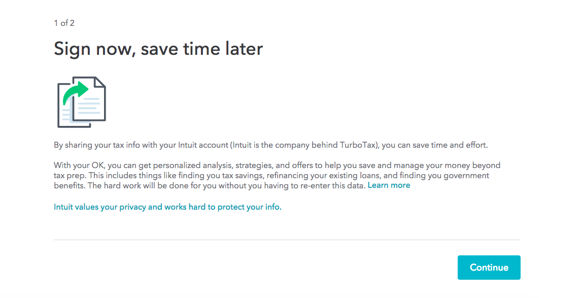
This is a screenshot from Turbotax's web app. It says "sign now, save time later" and there is a blye CTA continue button.

Even their password creation field has good UX—the password checker tells users exactly which criteria their password needs to fulfill, and updates in real time as they type (and check out that informative tooltip):
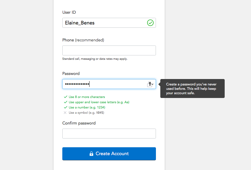
This is turbotax's registration screen that asks new users to create a user id and password. This is an example of a good password checker that automatically updates in real time as a user creates a password

Conclusion

TurboTax is filled with thoughtful microcopy and UI patterns that are always one step ahead of the user. It’s clear their product team has spent thousands of hours on usability testing, iterating each step of this complicated process over and over again. The result is a simplicity that will put even the most anxious mind at ease.

This is a gif image of TurboTax's animationed loading page . This is the screen users see when they are ready to file their taxes
Author's picture
Jackson Noel
Co-Founder and CEO at Appcues
Skip to section:

Skip to section:

Filing your taxes is never a fun task (unless you’re certain that you grossly overpaid on every paycheck and are guaranteed a large refund—but even then, “fun” isn’t the word most people would use).

Even still, as folks here at Appcues filed our 2018 taxes, we couldn’t help but admire the thoughtful details that Intuit’s product team had put into the TurboTax experience. TurboTax managed to turn the hugely complex processes of deciphering our archaic tax code into a step-by-step, intuitive flow. The result is a prime example of really good UX.

Here are 9 tactics that TurboTax uses to a dreadful experience a delightful one.

1. Orient messaging around the goal, not the task

Nobody is motivated to do their taxes for the sake of it. TurboTax knows this and instead orients its copywriting around the user’s true motivation: maximum refund, guaranteed—now that’s a value proposition we can get behind. 💰

turbotax homepage marketing copy

What's more, TurboTax does a great job speaking to needs of different user segments. Look at how they adjust their messaging to appeal to freelancers, independent contractors, and small business owners.

turbotax user persona marketing copy homepage

(Psst—For more on goal-oriented UX, check out How to design goal-oriented onboarding in 4 steps by Pantelis Korovilas of Turo and Hopper.)

2. Personalized user onboarding

Personalized user onboarding is a great way to build motivation through our human tendency towards commitment and consistency.

TurboTax uses personalization throughout its product to create a seamless and intuitive user experience. And this personalization of the user experience starts early: Before a new user even registers, they are asked to segment themselves by use case (in friendlier terms, of course):

This is a gif showing self segmentation by persona on TurboTax's homepage prior to account creation. It shows a user selecting options that apply to them in the 2018 fiscal year

The options that a user selects on TurboTax’s website are used to automatically populate fields and give a more personalized experience later on in the app.  Below is a screenshot of a question several steps into the tax return process; you can see that the appropriate options have been pre-selected based on the user’s earlier input. This little detail reduces friction and makes the whole experience feel very cohesive.

This is a screenshot from TurboTax that shows self segmentation by use case and persona. The text says "let's get an idea of your financial picture" and there are 10 buttons with options that include: had a job, bank account interest, paid student loan interest, and more. The CTA says show more. This is an early screen in TurboTax's tax return app flow.

And TurboTax’s personalization doesn’t stop there. Even simple form fields are given a friendly touch with a first name token and clever copy:

This is a gif of a personalized onboarding flow. This is an example of personalized onboarding UX from Turbotax. It says "Let's start by getting to know you" and as the user types in their zip code and completes the fields, a personalized message using a first name token appears welcoming the user to the product

For returning users, TurboTax compares the user’s information inputs with previous tax return to offer a custom user experience. For instance, if your address changed since the last time you filed, they make sure to check for a work-related moving expense deduction:

This is a screenshot of TurboTax tax return process. It shows an automatic detection of a possible tax deduction or credit. It says "let's check for work-related moving expensese"
PERSONALIZE AT SCALE

Delivering the same onboarding experience to all your users?

  • Increase user activation with personalized onboarding flows
  • Drive feature adoption to improve stickiness and retention
Charts and graphs

3. Automate and minimize common points of friction

Nobody likes manual data entry. TurboTax addresses this by automating data entry whenever possible. You can automatically sync data from hundreds of popular brokerage and payroll providers—or even import data from straight from your W-2 by uploading a PDF or taking a picture with your phone:

This is TurboTax's w-2 uploader. This is how you can upload your w2 form by taking a photo on your phone. This image shows an example W2.

By assuming this complexity themselves, the Intuit team provides simplicity to the end user, which results in a process that users are more likely to complete.

What about if you decide to manually input the information? TurboTax ensures a good user experience by matching the layout of its form field to that of a standard W-2. It’s a small detail, and many users are unlikely to notice that a point of friction has been removed—but that’s exactly what makes it such good, intuitive UX.

This is a blank w2 form field from Turbotax. It shows boxes 1-6 on a w2 in the same format as they appear on a physical printed w2. This reduces fricion while manually inputting user information by matching the layout to real world counterpart.

4. Inject some brand personality

As you are getting started, TurboTax poses a question:

This is a question from turbotax that gauges user sentiment. It says "how are you feeling about doing your taxes" and there are 3 options. The microcopy is part of TurboTax's great UX strategy.

No, that’s not a hot new machine learning algorithm that has finally mastered empathy—it’s just smart product copy. TurboTax understands the mindset of its users and uses thoughtful copy to a make them feel comfortable.

This touch of personality makes the whole experience a lot less painful, almost like you’re having an accountant friend help with your taxes.

5. Keep the user focused on one task at a time

If you were to prepare your tax return the old-fashioned way, where would you begin? State or federal? With your income or by itemizing deductions?

With so many fields to complete, the process can easily overwhelm. There are hundreds of places one could start, creating a daunting choice paradox that inevitably results in inaction.

To combat this paralysis, TurboTax has prescriptive flow that focuses the user’s attention on one step at a time:

This is an example of how turbotax uses it's ui and ux to keep users focused on one part of their task return at a time.

6. Break up long workflows and set expectations for what’s ahead

No matter how streamlined TurboTax’s interface may be, filing your taxes is still a long, multi-step process.

TurboTax’s product team clearly gave a lot of consideration to the user journey as a whole—they’ve included checkpoints or milestones along the way that help break up a long workflow into more manageable sections.

What’s more, these milestones include helpful copy that sets clear expectations for what’s ahead:

This is a screenshot of a real turbotax 2018 2019 tax return workflow that shows an illustration of a government building and says "let's check your federal return and make sure it's good to go". This is an example of a milestone or checkpoint in a long multi-step process that breaks up the workflow for better ux

These aren’t generic screens, either—the information under “Here’s what’s coming up” is personalized for each user. Below is the same screen as seen by 2 different users, the first by a new user, the second by a returning user who has filed with TurboTax before:

This is an example of good ux setting user expectations by telling them what comes next. This screen from Turbotax says "let's dig into your tax breaks" and has a subheader that reads "here's what's coming up"

7. Show progress toward a goal

In addition to well-timed checkpoints, TurboTax keeps the momentum up by highlighting progress.

Take a look at the screen below. There are 3 progress indicators here:

  1. The user is notified that they will get a tax break based on the information they gave in the previous steps.
  2. The current section of the workflow (Deductions & Credits) is underlined in the navigation bar, giving the user a visual indicator of how many more steps there are left in the federal tax return process.
  3. At the top of the screen, there is a preview of how large a refund the user can expect at the federal and state levels. These numbers update in real time, according to the information provided at each step.
This is a screenshot image from a real turbotax user worflow that shows what happens when you qualify for a tax break. It shows a full screen modal that says "congrats, you get a tax break" and a subheader "Studen Loan Interest Deduction"

8. Celebrate success

Woohoo! Taxes are complete and we don’t have to think about them for another 11.5 months!  Celebrating success like this is a commonly missed opportunity in the software world. But a simple victory message like the one below helps users internalize a sense of accomplishment:

this is a confirmation screen that you see after filing taxes with turbotax. It is an example of celebrating user success through UX

9. Provide ongoing value

TurboTax knows that no matter how many congratulations they send a user’s way, what people really want is their tax refund. That’s why they follow their confirmation email with a second:

This is a reengagement email from turbotax with the subject line "start tracking your refund today" with a link to turbotax's refund tracker for people who want to know when they'll get their tax returns.

The subject line—“Start tracking your refund today!”—grabs the attention of people eagerly awaiting a direct deposit. But it’s the copy inside the email that’s really important: “TurboTax is here to help—even when your taxes are done.” 

This messaging is reinforced when a user revisits TurboTax to track their refund. Just below their refund status, users see a header that reads: “We’re with you all year. Here’s what you can do next” along with a link to Intuit’s financial product, Turbo.

This is a screenshot from TurboTax's refund tracker page with a CTA to check out Intuit Turbo for credit score, debt to income ratio, etc.

Intuit’s active user rates peak sharply during tax season. In order to increase engagement year-round, they need their TurboTax users to adopt other products in their suite. This value-adding follow-up email and simple landing page encourage users to expand to a secondary use case in a way that feels natural and logical, rather than pushy.

9. Pay attention to the details

TurboTax’s product doesn’t just fulfill its value proposition—it delivers value while feeling cohesive, friendly, and trustworthy from start to finish.

How? It’s all in the details.

For example, their FAQs are seamlessly integrated into each page alongside relevant steps in the return process, making them highly contextual, easy to find, and just and easy to ignore if you don’t need them—the slideout only appears when you click on a question, and can be hidden with a click:

this is an example of contextual faq as in-app messaging and inline links. This is a screenshot from turbotax that shows an FAQ slideout with a search function. the text says "let's do a quick check for other income"

By allowing users to pre-sign early in the return process, TurboTax avoids dampening excitement at the finish line:

This is a screenshot from Turbotax's web app. It says "sign now, save time later" and there is a blye CTA continue button.

Even their password creation field has good UX—the password checker tells users exactly which criteria their password needs to fulfill, and updates in real time as they type (and check out that informative tooltip):

This is turbotax's registration screen that asks new users to create a user id and password. This is an example of a good password checker that automatically updates in real time as a user creates a password

Conclusion

TurboTax is filled with thoughtful microcopy and UI patterns that are always one step ahead of the user. It’s clear their product team has spent thousands of hours on usability testing, iterating each step of this complicated process over and over again. The result is a simplicity that will put even the most anxious mind at ease.

This is a gif image of TurboTax's animationed loading page . This is the screen users see when they are ready to file their taxes
Author's picture
Jackson Noel
Co-Founder and CEO at Appcues
You might also like...