.png)
When competition heats up, the best product experience wins—and, in this economy, competition has never been more fierce.
Maybe you’re hitting your OKR’s, sure. But if you don’t know how the competition is faring, do you really know if you’ve got a winning product experience? (Hint: you don’t).
That’s where we come in. 🤗
We’ve spent the past decade working with thousands of product-led SaaS companies dedicated to leveling up their product experience. Whether folks are new to PLG or experienced vets, we’ve heard the same 2 questions over and over again:
Enter the Appcues benchmark report.
Before you can improve product performance, you have to measure it. But with the overwhelming number of touch points, tools, and user feedback mechanisms out there, knowing which metrics to focus on has never been more challenging. Fortunately, with a bit of help from our benchmark report, you can uncover the insights you need to chart your product’s success. This report features our shortlist of the 7 most impactful product experience metrics—so you can filter out the noise and focus on growth.
Of course, knowing what to track is only half the battle. So, we surveyed 250 of our customers and benchmarked their performance across these 7 core metrics. This post provides a high-level overview of our findings, but if you’d like the full report, download it here:
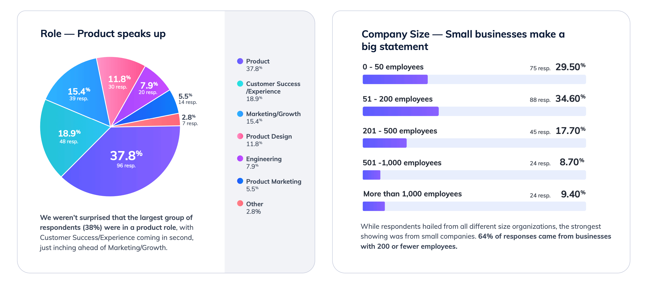
Before we get started, let’s take a peek at our wonderful customers who responded to our survey:
Before we reveal the benchmarks, it’s important to understand how we define each metric:
Alright, now let’s get into it! 💪
📊 The average free-to-paid conversion rate was 14.65%.
What did we learn?
📊 The average activation rate was 30.22%.
What did we learn?
📊 The average time to value was 56.2 days.
What did we learn?
Anyone else find it interesting that the average time to value for a free trial exceeds the typical trial duration of 14 to 30 days? Just sayin’…
📊 The average adoption rate was 33.67%.
What did we learn?
📊 The average NPS was 29.66.
What did we learn?
📊 The average NPS was 79.2%.
What did we learn?
📊 The average net revenue retention rate was 102%.
What did we learn?
Remember, this was the tl;dr version of each product benchmark—if you wanna dig deeper, be sure to download the full report here.
Now that you’ve got an idea of how your SaaS measures up, here are a few tactics and ideas to help you beat the benchmarks.
Providing a self-serve onboarding helps companies deliver a better user experience and a shorter time-to-value—not to mention it’s just wildly resource-effective. Respondents taking advantage of self-serve onboarding tactics and in-app walkthroughs saved an average of:
(Pssst, that’s a savings of around $70,000 a year with average salaries of $140,000 for engineers and $95,000 for customer success. 🤑)
A user journey map is a visual representation of how a customer moves through your marketing and sales funnels. It includes all the key touchpoints to capture the overall customer experience. User journey maps reveal important insights that help your product team design an effective onboarding.
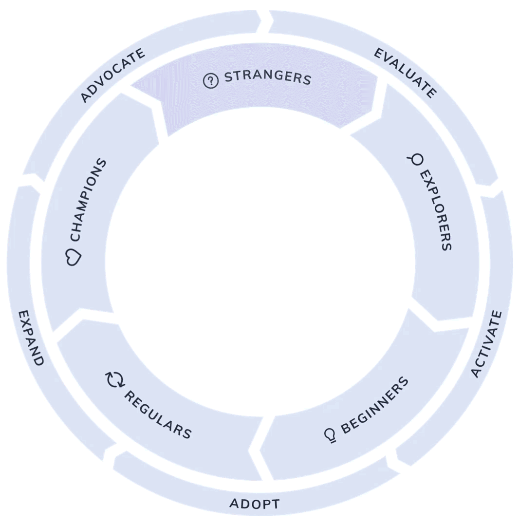
Typically, the user journey map is built on a 4-phrase framework: awareness, consideration, conversion, and adoption.
💡 Pro Tip: We recommend mapping this out using the 5 stages of the product-led growth flywheel instead: evaluate, activate, adopt, expand, and advocate.
Once you have your user journey mapped out, you can overlay the metrics you want to track onto the corresponding parts of the journey. This helps you see the connection between various touch points and user behavior. It’s also handy for helping you identify what’s working and where there are gaps are in your product experience.
Since there’s no one-size-fits-all strategy when it comes to improving metrics, a test-and-learn approach is the most efficient way to make progress. To ensure you get clear results, focus on one metric at a time. Once you’ve identified an opportunity, just follow these 3 steps:
Having robust tools in your product stack enables you to test-and-learn at scale. In competitive environments (read: SaaS landscape) speed to market is critical. Select a tool that makes it easy to get started and empowers your team to rapidly iterate.
Remember, relying on engineering teams to make continuous changes often results in deprioritizing small (but meaningful!) product changes. Every update takes engineers away from working on core product functionality—which is exactly what no-code product adoption tools like Appcues solves for.
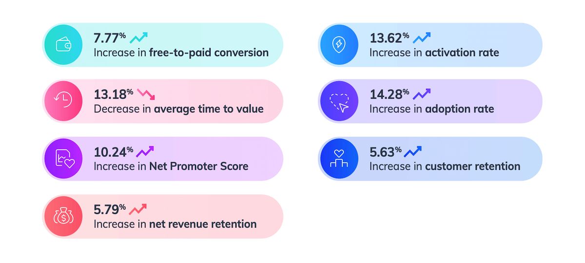
Customers that use Appcues saw the following improvements across each core metric:
If you, too, want your product metrics to go up and to the right, then might I recommend scheduling a personalized demo with Appcues. The next time we publish a report, it'll be your benchmarks everyone is trying to best. 🤓