.png)
When CockroachDB was first conceived it didn’t have a Graphical User Interface (GUI) and the only way to interact with CockroachDB was through the command line interface (CLI). As the product evolved, the engineering team started building internal GUI tools to visualize database configurations and metrics that would help them diagnose performance issues during development. These tools were eventually made accessible to all CockroachDB users and became known as the Admin UI.
The Observability team at Cockroach Labs recently took on a redesign of the Admin UI, which gives developers the tools they need to monitor performance and troubleshoot their CockroachDB cluster.
Here are 3 things we learned about designing for developers:
When developers work with a database to build applications, there is a large ecosystem of tools and resources they use to interact with that database. One important tool they use is CockroachDB’s command line interface (CLI) to execute SQL statements and issue commands to the database. Our product team must consider these workflows when designing the user experience for the Admin UI because actions taken in the CLI will surface in the Admin UI.
An example of a project where we needed to consider the CLI workflow was when designing the Network Latency page in the Admin UI. The Network Latency page displays round-trip latencies between localities in your cluster and can help you to determine if there are high latencies between nodes or regions. It is important to monitor high latencies because this can ultimately slow down your application performance.
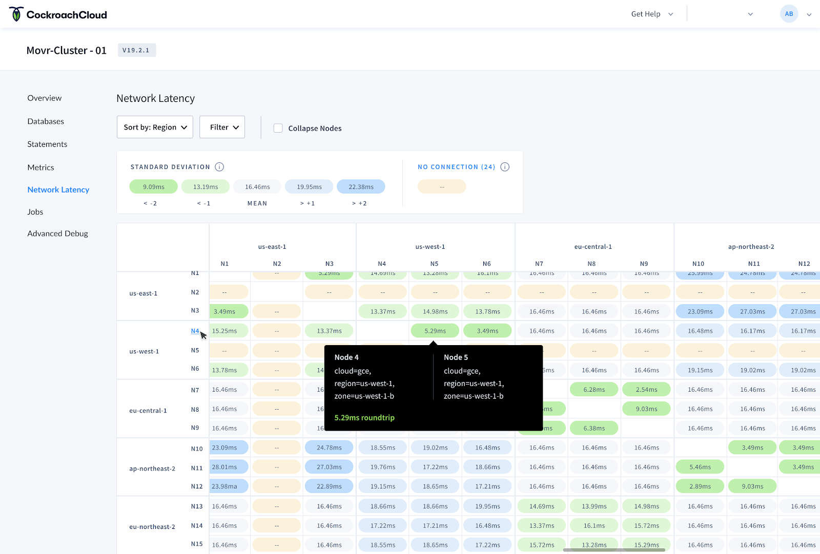
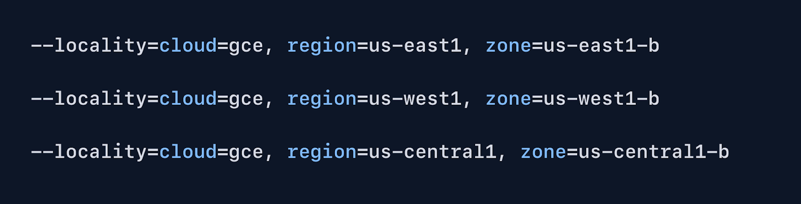
When setting up a new CockroachDB Cluster, a developer can use the CLI to initiate their cluster and add multiple nodes on which to store their data. They also have the option to add localities which can be used to influence the location of their data. These localities could include tiers for region, country, datacenter, rack, etc. A typical locality configuration in the CLI may look like the one below, which includes:
Once configured, localities can be visualized in the CockroachDB Admin UI within tools like the Network Latency page.
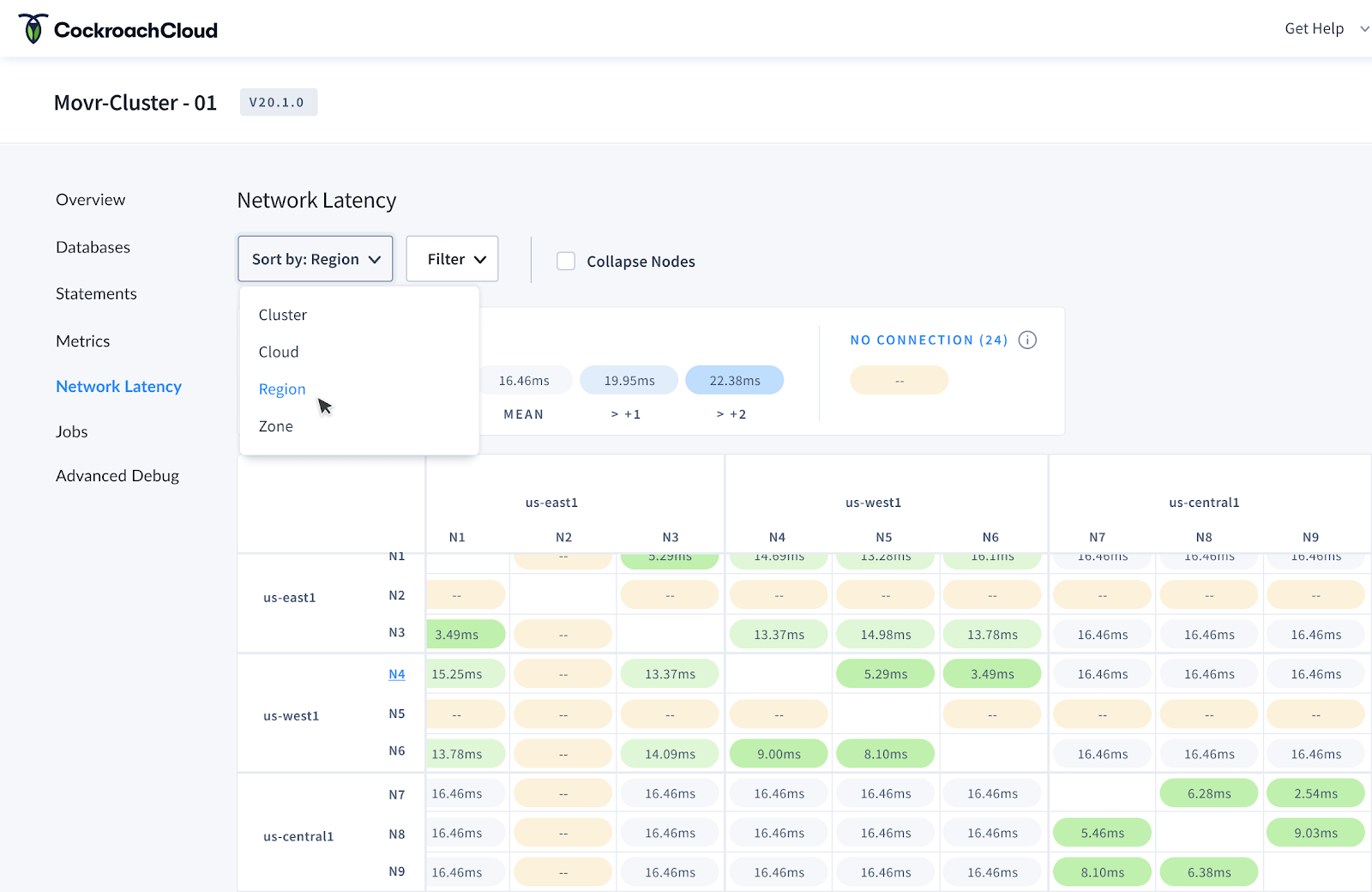
In the above screenshot, you can see the locality configurations that were made in the CLI are surfaced in 2 places on the Network Latency page:
By considering the various locality configurations that users might create using the command line interface, we were able to design a solution for displaying these custom configurations in the Network Latency page. This solution ultimately gives developers an easy way to determine if there are high network latencies between regions so they can improve the performance of their application.
Developers often rely on documentation to use any type of platform or tool, and the quality of this documentation can make or break their experience. Our team at Cockroach Labs understands the importance of documentation and continues to build upon an exceptional library of articles, references and tutorials to help developers get started and maintain their database.
We knew that users were bouncing between using CockroachDB and reading docs to solve their issues. We wanted to remove that friction of jumping in and out of the Admin UI, however we didn’t want to overload the user with too much information in the UI. Our challenge was to strike a balance between contextual help and information overload.
📖 Read more: How to turn your top help articles into in-app guides
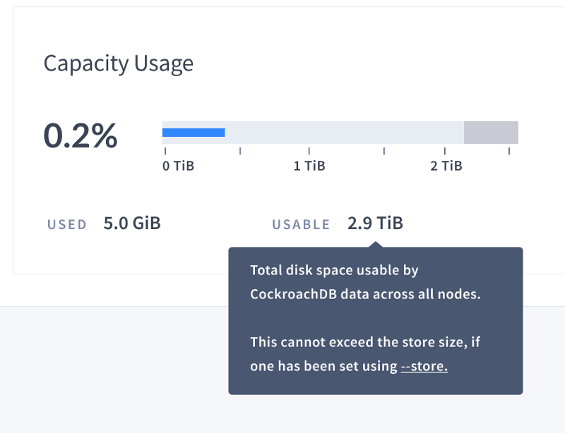
Because different databases use different terminology to describe concepts, we knew it was important to provide clear definitions for concepts surfaced in the UI. For example, we heard from our users that it was confusing to understand how exactly Storage metrics were being calculated since there are a few ways you could go about it.
When redesigning the Admin UI we wanted to surface definitions and contextual links to docs so that users don’t have to go hunt down answers. We’ve started by adding definitions in the form of tooltips across the UI to help developers understand what exactly certain labels mean.
For example, when a user hovers over any type of storage metric, like ‘usable capacity’ seen in the screenshot below, a tooltip appears with the definition and link to full documentation about storage metrics.
📖 Read more: Tooltips: How to use this small but mighty UI pattern correctly
Our next steps for this project will be to build out the rest of the definitions into the UI and to provide more action-oriented guides and links to documentation that will help users to troubleshoot specific issues.
Another area where we incorporate help messaging to guide users is within empty states in the UI. For example, we recently added the ability for developers to download a statement diagnostics bundle for a specific SQL statement fingerprint. The diagnostics bundle includes detailed information about a query, like traces, that a developer can use to troubleshoot query performance.
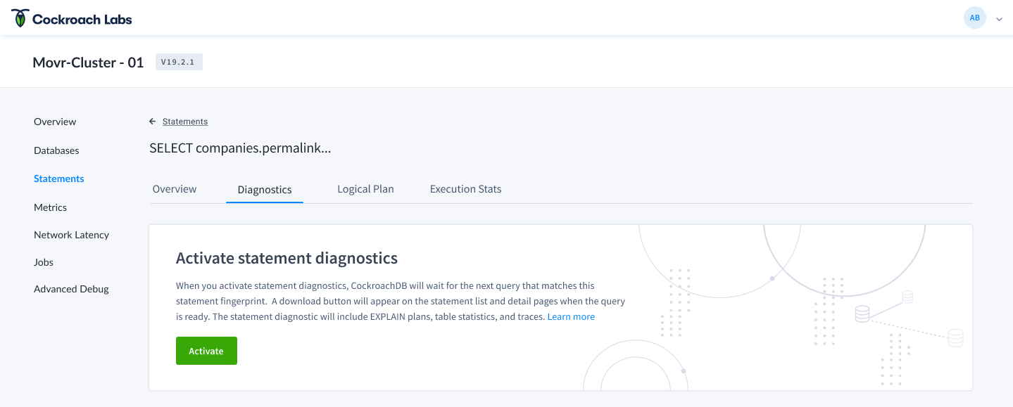
Users have to explicitly activate these diagnostics bundles, meaning they aren’t readily available when the UI loads. As you see in the screenshot above, we use the empty state on the statement detail page as an opportunity to incorporate help text which guides the user through activating diagnostics. We also provide links to documentation so users can easily learn more about how to use these diagnostics.
One of the perks of designing database tools at Cockroach Labs is that we are designing products for developers with developers. This gives us inside access to the very people that would use CockroachDB. Our product team has learned to take advantage of this proximity by testing solutions with our coworkers early in the development process.
📖 Read more: Why every engineer should user test
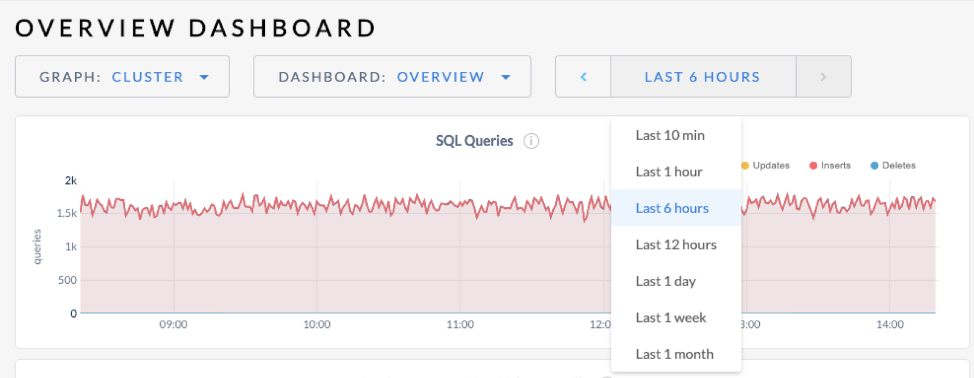
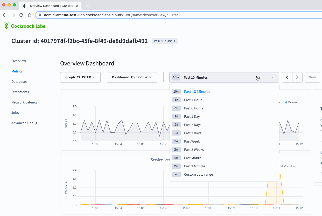
As part of the Admin UI redesign we wanted to address some known UX issues . One of these issues was related to the time selector for metrics graphs. These graphs give developers a way to monitor metrics like SQL performance, replication, or storage metrics and can help answer questions like “are any of my nodes running out of storage?”, or “how are my queries performing?”. When trying to answer these questions, developers usually want to see metrics over a period of time so they can compare what is happening now versus 10 minutes ago.
Our process for updating the time selector component looked like this:
The original time selector in the Admin UI only let users select from a handful of predefined time ranges and did not store this selection in the URL. This resulted in a poor user experience for developers who need to view more granular timeframes and want to share a snapshot of a graph with their colleagues. It also prevented developers from easily viewing a small slice of time several days in the past when conducting a post-mortem.
After defining objectives, we reviewed tickets filed from customers and internal teams about UX issues with the time picker.

We knew that other products had solved this problem so we looked at tools like Graphana, Datadog, and LightStep to understand common UX patterns for time series selectors.
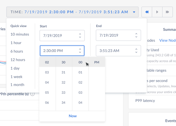
In version 1, we gave users a way to select a predefined time range OR select a specific start/end time all in one view. Users could then navigate through the previous/next timeframes or return to ‘now’ using the controls.
We tested version 1 with SREs (Site Reliability Engineers) on our team for usability feedback and found a few issues:

Based on the usability feedback, we iterated on the design:
Testing our initial solution with the internal SRE team allowed us to iterate faster so that our customer received an even better user experience.
📖 Read more: 6 ways PMs can collect, analyze, and leverage user feedback more effectively
We are constantly learning how to build a product developers love and will continue to share our learnings along the way. Learn more about CockroachDB and the redesigned Admin UI here.

.png)
%2520(1).png)