.png)
Freight and distribution software supports a complex chain of users (warehouse staff, dispatchers, drivers, and logistics managers) each with distinct needs. A strong app walkthrough can accelerate adoption, reduce costly errors, and ensure your product delivers value fast in high-pressure environments. In this guide, we’ll explore how to create onboarding experiences tailored to logistics platforms, and highlight tactics to help users navigate workflows like shipment tracking, dispatch management, and load assignment.
Handing your product off to a new user without offering guidance on how to use it is a surefire way to tank your retention rates.
And, let’s be real, how many people are going to sit through a 10 minute video about your product? To bridge the dreaded “Learning-Doing” gap, you have to get a little creative and offer hands-on learning.
Specifically? App walkthroughs.
App walkthroughs are an effective way to take what users know they have to do and teach them how to, well, actually make it happen. Like using your software or those underutilized features you’re trying to get folks on board with.
With a good app walkthrough, you don’t just teach; you build understanding. That kind of innate, deep knowledge not only boosts retention, but drives your product forward into better growth.
The problem you’re seeing: Your users are dropping off the app before they can get to your value.
The play to try: Build an app walkthrough that doesn’t just passively teach; but actively walk users through what good usage looks like.
Use the blog below to learn more about:
An app walkthrough is an interactive tutorial built inside of a digital product that prompts users step-by-step through best practice and how-tos. The goal of an app walkthrough is to teach users how to use the product by doing vs passive watching.
Companies use app walkthroughs for onboarding, feature education, subscription renewals, product launches, and more.
Why walkthroughs matter in freight tech
Freight users don’t have time to figure things out by trial and error. They’re operating in high-pressure environments where every minute counts—and small UX issues can become costly operational problems.
Strong walkthroughs can:
For a clean example, we turn to SaaS. Blip, a chatbot builder, opted to use in-app walkthroughs to create a better onboarding experience.
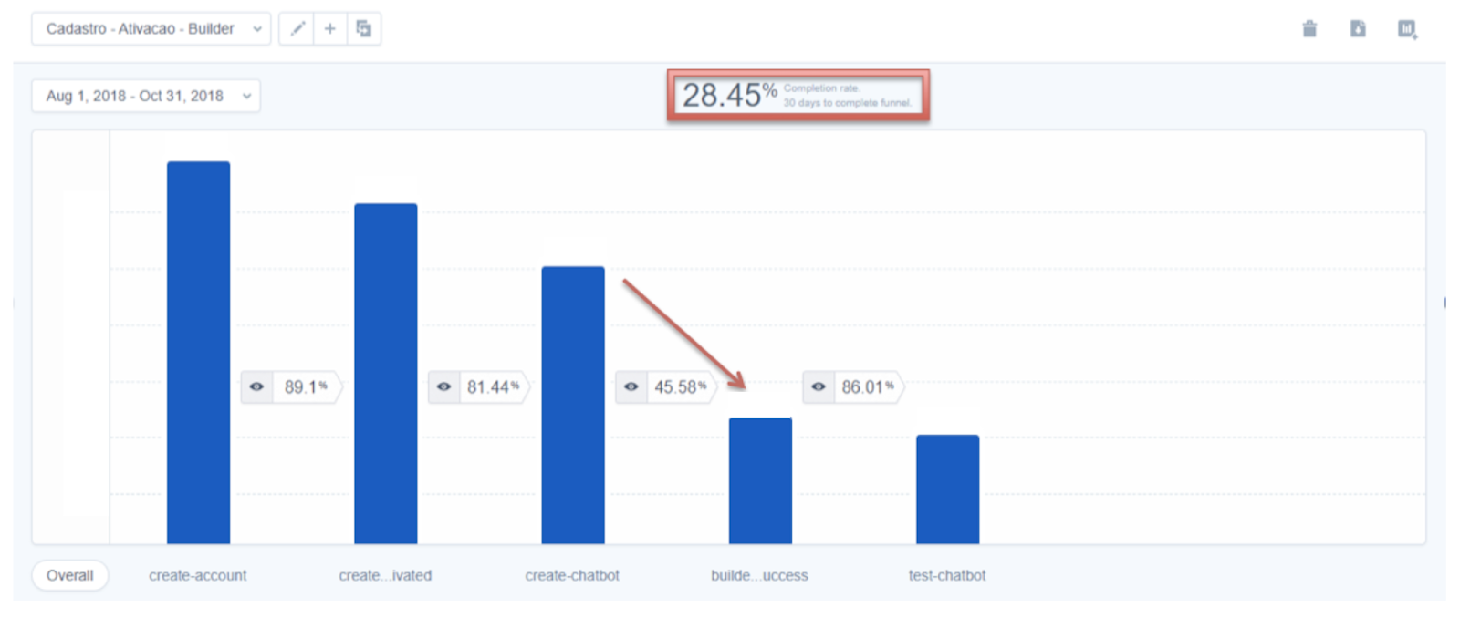
“We knew that the aha moment or activation criteria for our users was publishing and testing their chatbot,” Guilherme Valadares, Product Marketing Manager, said.
“The problem for us was that the users were not creating and publishing their flows in the first session. They were exposed to a lot of features in our platform and they did not have a clear path.”
Overexposure to features is a common problem in the digital age. A solid app walkthrough can take a low completion rate (in this case, ~28%) and lay a more clear path so users are less overwhelmed.
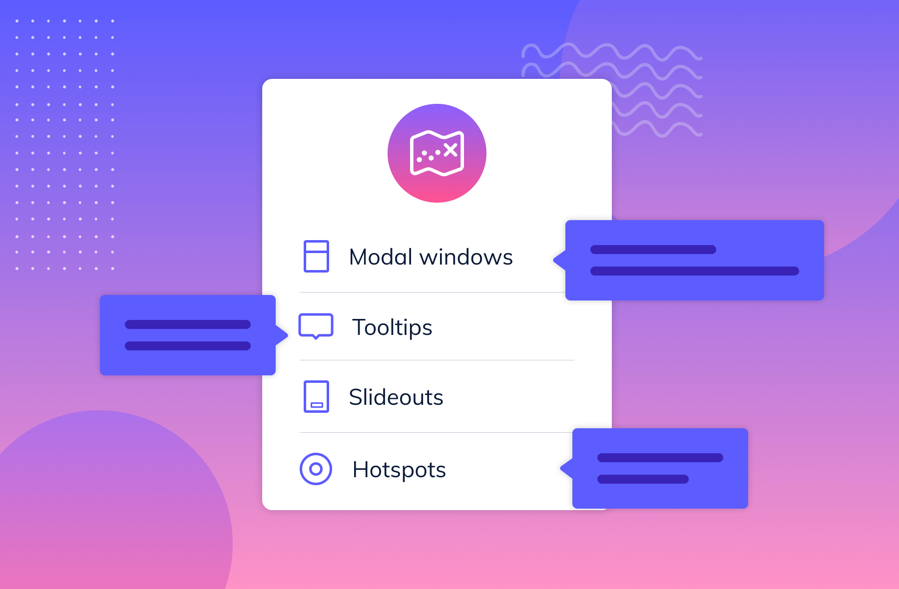
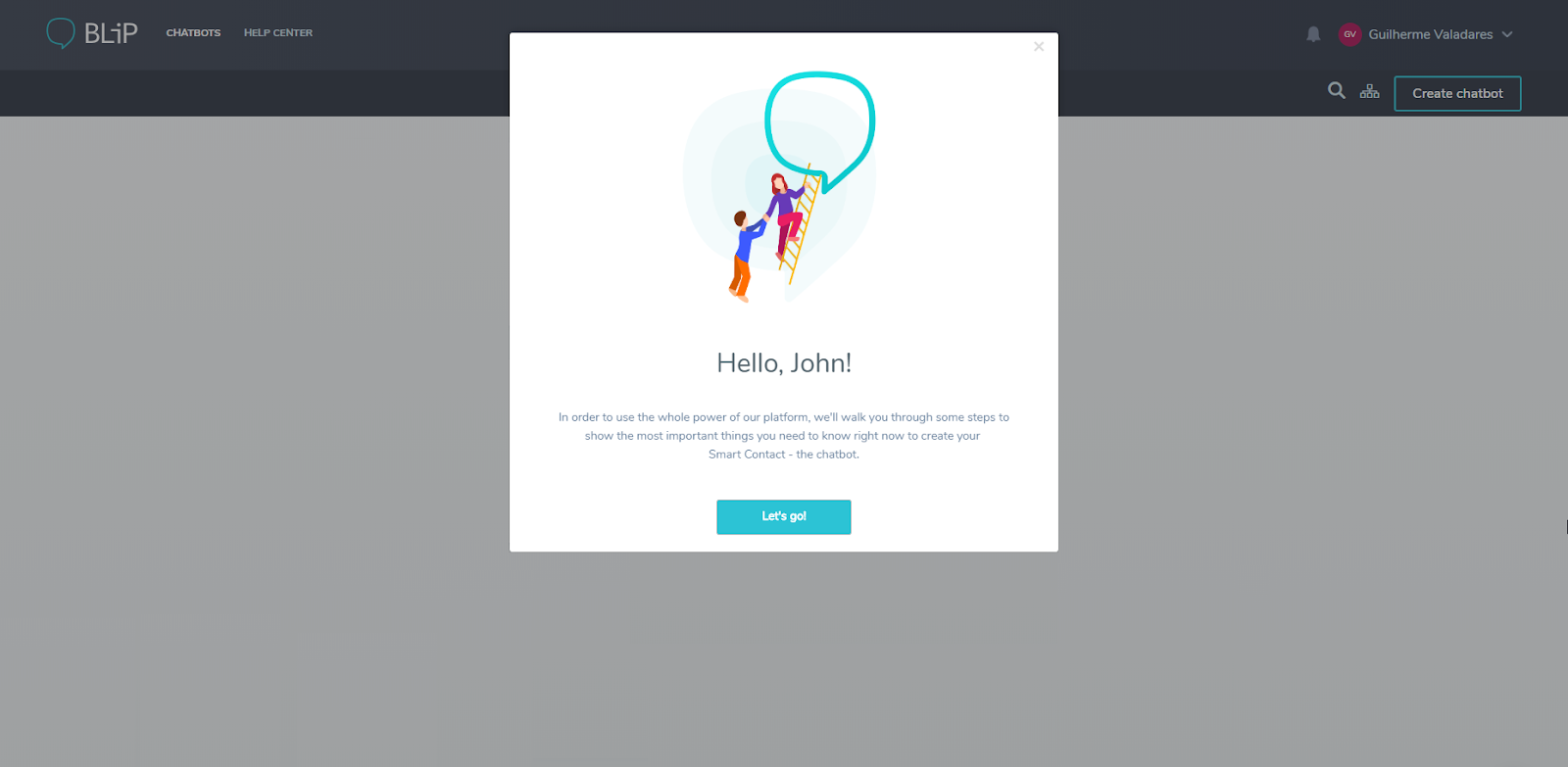
For example, Blip started their onboarding process with a modal (a pop-up window) welcoming users onto their platform. With a combination of tooltips, hot spots, and other Learning-Doing app techniques, they were able to build a full journey that brought their users immediate value. No more getting lost, no more sitting in an overwhelming feature forest.
That’s the result of a well-considered app walkthrough.
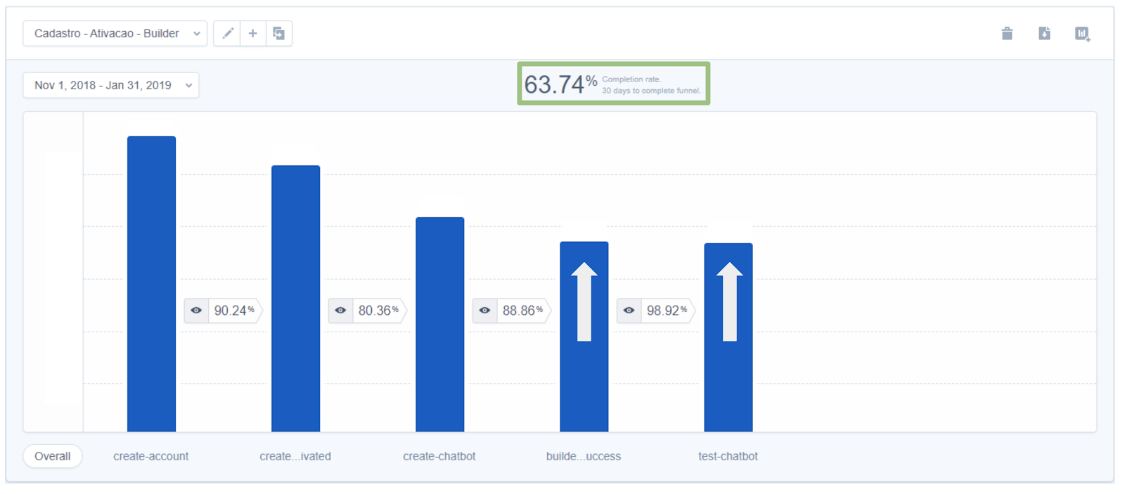
By building out an onboarding app walkthrough path, they saw their retention rate spike to ~64%.
That’s a 124% jump thanks to users learning by doing, and being given a clear path forward.
You can learn more about Blip here, but if you want to get a better understanding of the tools you can use to build an app walkthrough like this one, we have a course for you!
Check out the Ultimate Guide to User Onboarding to learn the principles to build an onboarding app walkthrough like the one you just learned about.
How you use app walkthroughs can change based on your goals, but the best problem solvers that see real results have specific traits in common. They include:
Problem: Freight tech users are getting overwhelmed and specific features are being underutilized.
Solution: You teach your users how to use distribution features with interactive feature walkthroughs and breakdowns.
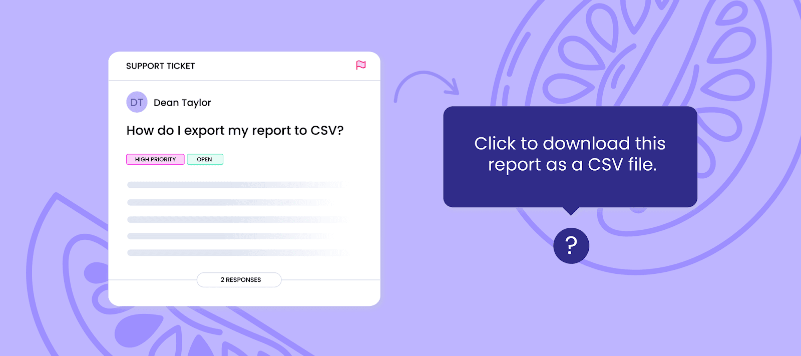
What’s the point of having a product if no one knows how to use it? One of the best app walkthrough uses are a series of modals, hot spots, etc that:
This is a great opportunity to take a page out of the SaaS handbook and pick up some of their customer retention and education strategies.
In order to help your user get the most out of the app experience, you need to have a set goal in mind for your walkthrough. What are you trying to get your users to accomplish, and what’s the quickest path to get there?
App walkthroughs can make the overall onboarding process smoother and more enjoyable, but only when you have a clear recommended journey in mind.
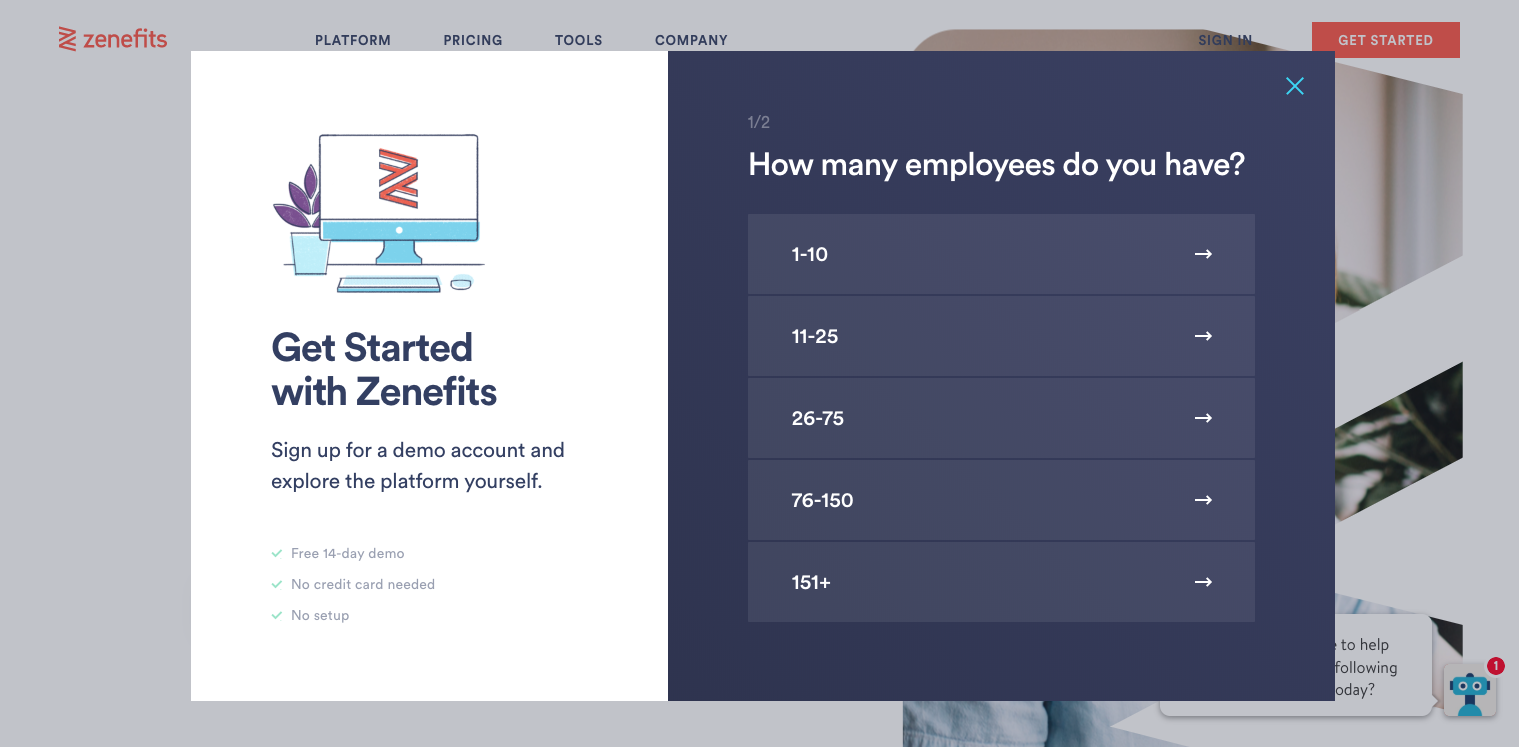
For example, app Zenefits knows exactly where it wants you to go when you first begin your trial.
Want an easy user journey onboarding template? Use this flow to map out your walkthrough from first idea to final step.
Should your users get frustrated with your product, they might try to figure it out for themselves or simply give up. But, when neither of those two are an option, users are going to reach out to your customer support team.
Providing an app walkthrough can save countless person hours explaining the same processes time and again, allowing your team to focus on more pressing issues.
We pulled together our own version of this, check out how we figured out our support sweet spot.
"We recently rolled out a new trial experience for Appcues. Our goal was to personalize the onboarding for each user and highlight the exact features that would bring value.Previously our onboarding pushed all users to a specific “aha moment” of building an experience. Now we use app walkthroughs to show which parts of the product will provide the most value to them based on their use case. For example, for the user onboarding use case we highlight flows and experiments." - Meg Gowell, Director of Growth @ Appcues
The difference between an app walk through and a product tour can be hard to define. In the software industry, the two are often meant to define the same thing.
In this instance, an app walkthrough is interactive, while a video product tour is visual. It’s a recording of how to use the app, not an actual “learn by doing” technique. And although that kind of passive education can help some users, it’s not a perfect solution.
Having both covers your bases for multiple learning types.
A good walkthrough can be hard to nail. Too long and you risk losing the user along the way. Too short, and users might not get the product knowledge they need to use your features properly. Too flashy? Distracted. Too boring? They’re on Reddit now.
Here are five companies that provide premium walkthrough experiences for their users.
Freight platforms typically serve multiple personas: fleet managers, drivers, dispatchers, brokers, and admins. A generic onboarding flow won’t cut it.
Case in Point:
A leading “Uber for Trucking” platform built by Intellias uses role-based onboarding to guide users through only the steps relevant to them. Drivers get walkthroughs for uploading licenses and completing vehicle checks. Company admcins see tools for fleet setup and driver onboarding.
Pro tips:
Drivers are on the go. They need app flows that are simple, self-serve, and reliable in less-than-ideal conditions. Your walkthrough should help them complete key actions without confusion.
Example: FreightPath
Their Driver Onboarding Package includes guided flows for scanning PODs, updating delivery status, and handling documents—all from a mobile device.
Tactics to use:

Logistics platforms often have powerful (but complex) setup flows. Dispatchers and brokers may need to upload carrier lists, connect load boards, or define automation rules. A checklist keeps the onboarding experience focused and achievable.
Example: Fast Forward TMS
Their onboarding process breaks setup into logical chunks—company info, fleet details, integrations—and uses inline guidance to walk users through each.
Checklist must-haves:

Many dispatchers stick to a small set of tools—even when your product offers more. Smart walkthroughs can introduce advanced features at the right moment.
Example: Tai Software
Their onboarding guide walks users through integrations with load boards, driver tracking tools, and accounting platforms. Rather than throwing everything at users up front, they pace feature education throughout the workflow.
Best practices:
So you’ve got a video product tour—maybe it lives on your homepage, maybe it’s the first thing users see post-signup. Great. But while a good video can show off your product, it can’t help your users actually use it.
Here’s how to translate that passive watch-and-leave experience into a hands-on walkthrough that guides users through the real thing.
Before you build anything new, zoom in on what you’ve already got. Where are people dropping off? Where do they get stuck or confused?
Look at your data. Tap into event tracking. Watch session replays. Layer in qualitative stuff—customer interviews, support logs, live usability tests. What you’re trying to pinpoint: the gaps between what users see and what they actually do.
If you already have a product tour in place, use it as a baseline. A walkthrough shouldn’t repeat the same content—it should move the user from “got it” to “did it.”
Try analyzing a few user cohorts and see what that information tells you.
Forget the marketing flow. What do users actually need to do to be successful inside your product?
Sketch out the steps a user has to take from login to value. (The real ones, not just the pretty ones.) Note where things are unclear, repetitive, or easy to miss. That’s where your walkthrough should step in.
This doesn’t have to be fancy. A quick user journey map or list of tasks can help you visualize what support needs to show up when.
They typically look something like this:
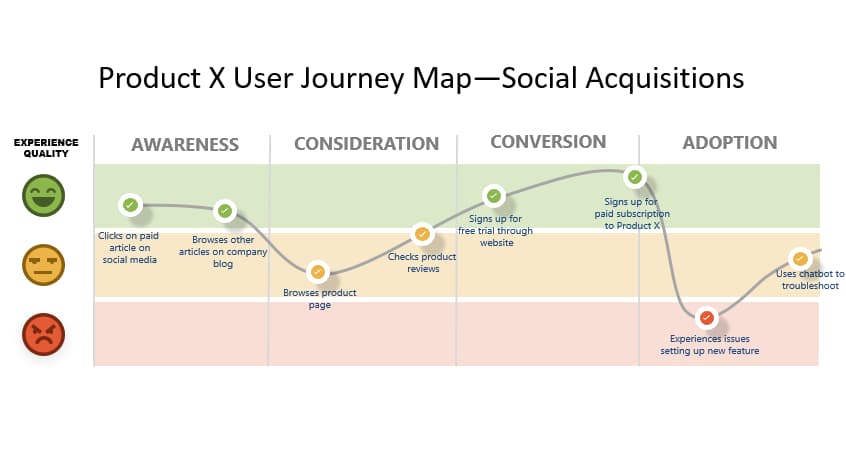
Creating a user journey map requires understanding of who is buying your product, different stages they go through and the potential obstacles they may encounter on the way. In the case of app walkthroughs, you’re likely to be focusing more on the Adoption side of the process.
Now that you know what needs fixing, you can design your walkthrough to fill in the blanks, where users typically stall or skip.
This is where in-app patterns come in. Some go-to formats:
Once you’ve mapped it out, it’s time to build. If you’ve got engineering help, go for it. If not, tools like Appcues can help you design and deploy walkthroughs without touching code.
Either way, don’t skip validation. Test it internally first. Then soft-launch to a subset of users. Watch the data. Ask for feedback. Tweak accordingly.
A walkthrough isn’t a one-and-done project. It’s part of your product experience—and that means it’s never really finished.

Building an app walkthrough? Use this checklist to keep things focused on what actually helps your users, not just what looks good.
What to track:
Tools like Appcues let you A/B test walkthrough copy, flow, and placement—so you can keep improving over time.
Whether you’re onboarding an owner-operator or a national freight team, a clear, focused walkthrough can make the difference between quick adoption and costly mistakes. When done right, walkthroughs not only speed up training: they reduce support volume, improve operational accuracy, and keep your platform mission-critical from day one.
Take Canva, for example. A guided tour of all their templates would be overwhelming. The product is built for exploration, so handholding might actually get in the way. What Canva needs more than a walkthrough is great discoverability.
But if your product has a few more moving parts—or if your users need to complete a set of actions before they hit value—a walkthrough can make all the difference.
In those cases, a walkthrough isn’t just helpful. It’s critical. It shows your users what to do, when to do it, and why it matters. And done well, it can dramatically speed up time-to-value.


.png)