← Visit Appcues.com
×
×

Welcome pages: Best practices from industry leaders

Your welcome page is the first impression you'll give to new users. Nailing it will help improve long-term retention and adoption rates.
Skip to section:

Skip to section:

A journey of a thousand miles begins with a single step. For your users, that first step is your product welcome page, and boy is it an important one.

A welcome page is typically the first screen your users see when they start a free trial of your product or download your app. Its goal is to welcome new users and get them excited to take that next step on their way to loving your product. From a business perspective, welcome pages are even more crucial. First-time user experiences significantly affect long-term revenue. Increasing week 1 user retention by 15% leads to around a 40% increase in revenue overall.

A welcome page might seem like an insignificant single page users only see once, but it represents the starting place for every user journey. Get your welcome page right, and it’ll build momentum behind your user that propels them through onboarding, activation, adoption, and beyond. And it all starts with a single page.

To help you design the perfect welcome page, we’ve collected welcome pages from industry leaders to see how they get their users out the door on the right foot. Learn from what they do and then try to make it better. And instead of saying goodbye to many of your users too soon, you’ll be celebrating their product milestones for a long time to come.

Slack: Allow people to hit the ground running

Slack’s welcome page is deceptively simple. At face value, it’s a simple message with an emoji. But look closer, and you see it's been designed to prepare users for success.

Welcome page from Slack
Image from Slack

The first thing Slack does is use its welcome page to hint at its UI. Although the purple sidebar isn’t yet populated with Slack channels and messages, the lines on the top-left hint toward the navigational menu to come.

Next, Slack places the big, green “Explore Slack” button in a sea of white space. Users’ eyes are automatically drawn to it as the natural next step on their way to learning about Slack. If users click, they’ll be greeted by Slack’s actual UI, which seamlessly floats in underneath the welcome message.
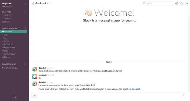
Welcome page from Slack
Image from Slack

If your UI often stays static, creating a custom illustration like Slack’s will focus new user’s attention on your welcome message. It’s an effective way to ease a user into the product experience (and it’s a neat party trick, too.)

Lastly, Slack includes a “skip the tutorial” button—though you’ll be forgiven for missing it there at the bottom of the page. It’s always a good idea to give users an opportunity to skip the product tour. Forcing them to sit through what they already know will just amount to additional frustration and a poor user experience.

Acorns: Welcome users like you mean it

Anyone can write a brief welcome modal that thanks a user for signing up or trying out a product. But if you want to be successful, use this first impression opportunity to really wow your new users—like Acorns does.
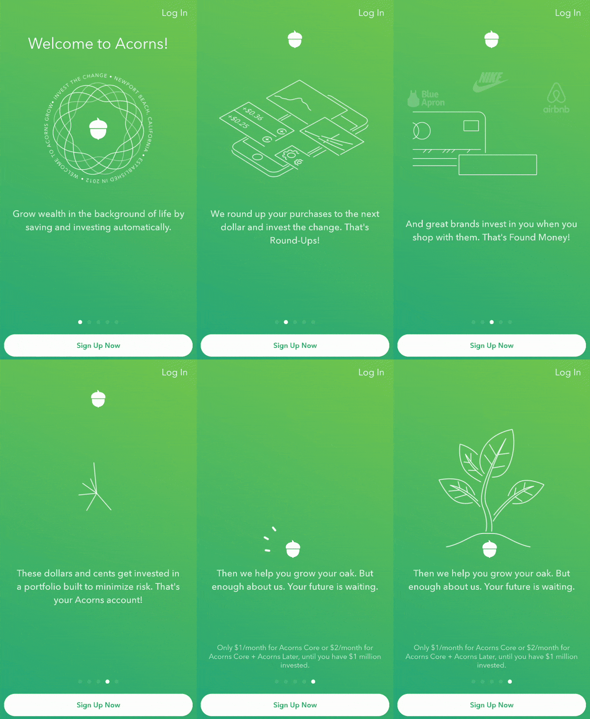
Welcome page from Acorns
Image from Acorns

Acorns is an investment platform that helps millennials save for the future, and they want users to be as excited as they are about this opportunity.  They build this excitement through snappy animations and copy that makes you want to get started now.

All of these tactics are in play in their third slide about Found Money.

Welcome page from Acorns
Image from Acorns

The copy is simple to understand, and it spells out exactly how Acorns will help users save: buy things you like and get money back to invest for free. The addition of the Blue Apron, Nike, and Airbnb logos is a nice touch because those might be companies their users are already spending money with. Putting these logos on the screen gets their users thinking about saving more with Acorns by continuing their existing shopping habits.

Pinterest: Guide users to aha quickly

Pinterest welcomes new users by having them choose what topics they want to see on their home feeds. Users select what they like, and Pinterest creates a customized feed for them, easy peasy.

Welcome page from Pinterest
Image from Pinterest

But instead of just promising users they’ll show content on their feed that aligns with their interests, it proves it on the welcome page. Each time a user clicks on another topic, they see the content on their feed (located behind the topic-chooser modal) adjust to their selected interests. If someone chooses “DIY and Home Improvement,” they’ll see the paint roller pin appear in the top-left of the screen.

Welcome page from Pinterest
Image from Pinterest

Change it to “Funny Photos,” and the same thing happens. Pinterest shows users they’re going to give them content they find interesting, captivating, and compelling—even if it’s just a dog in glasses.

Welcome page from Pinterest
Image from Pinterest

Using this welcome page, Pinterest doesn’t need to tell users why they should be using their product. They show them. You might not get users to their first aha moment on the welcome page. However, the sooner you make it happen, the more likely they are to stick around to learn more about what your product offers.

Hive: Make learning into a game

Games captivate people. There’s a reason people fixate on a word game for hours but can’t be bothered to read the care manual for their new $40,000 car. The manual lacks any gamification elements that turn dry subjects into fun ones. Hive harnesses our love of games by using gamification techniques to motivate users through their welcome page and user onboarding flow.

Welcome page from Hive
Image from Hive

Hive’s welcome page simply instructs users to get started by clicking on “Hive Mastery” with an arrow pointing down. The arrow and the name “Hive Mastery” feel like something out of a game tutorial, not a project management platform.

Welcome page from Hive
Image from Hive

When users click on Hive Mastery, they get a drop-down of tasks they need to complete to get to 100%. What makes this more game-like is that Hive doesn't just show users how to do it. Hive gives them “hints” but otherwise lets users figure it out on their own.

Leaving users to muddle through your UI is a risky proposition. However, when you’re confident in your product’s intuitiveness like Hive is, the risk pays off. Users have a list of tasks to do, and they’re incentivized to go out and explore the Hive platform to accomplish them. Through this exploration, Hive users will learn to use the platform and be more engaged than if Hive had just held their hand through a traditional product tour.

Personalize your welcome page for results users will welcome

One welcome page tactic that never gets old is personalization. A personalized experience that starts on the welcome page sends a message to users that your product aims to give them what they want, not what the generic Jane Doe wants.

With today's tools, personalization is becoming an easier thing to deliver. If you want to learn more, check out these starting points for creating personalized products your users will love.

PERSONALIZE ALL THE THINGS

Make the most of every touch point with personalized in-app communication

  • You did the hard part (got users to your product) now make sure they're set up for success
  • Welcome new users and teach them what they need to know (only when they need it)
Charts and graphs
Author's picture
Lyla Rozelle
Sr. Customer and Lifecycle Marketing Manager at Appcues
Lyla is a marketer working on growth at Appcues. She works remotely from the hilltowns in Western Massachusetts where's she usually hiking with her hound dogs or researching antiques.
Skip to section:

Skip to section:

A journey of a thousand miles begins with a single step. For your users, that first step is your product welcome page, and boy is it an important one.

A welcome page is typically the first screen your users see when they start a free trial of your product or download your app. Its goal is to welcome new users and get them excited to take that next step on their way to loving your product. From a business perspective, welcome pages are even more crucial. First-time user experiences significantly affect long-term revenue. Increasing week 1 user retention by 15% leads to around a 40% increase in revenue overall.

A welcome page might seem like an insignificant single page users only see once, but it represents the starting place for every user journey. Get your welcome page right, and it’ll build momentum behind your user that propels them through onboarding, activation, adoption, and beyond. And it all starts with a single page.

To help you design the perfect welcome page, we’ve collected welcome pages from industry leaders to see how they get their users out the door on the right foot. Learn from what they do and then try to make it better. And instead of saying goodbye to many of your users too soon, you’ll be celebrating their product milestones for a long time to come.

Slack: Allow people to hit the ground running

Slack’s welcome page is deceptively simple. At face value, it’s a simple message with an emoji. But look closer, and you see it's been designed to prepare users for success.

Welcome page from Slack
Image from Slack

The first thing Slack does is use its welcome page to hint at its UI. Although the purple sidebar isn’t yet populated with Slack channels and messages, the lines on the top-left hint toward the navigational menu to come.

Next, Slack places the big, green “Explore Slack” button in a sea of white space. Users’ eyes are automatically drawn to it as the natural next step on their way to learning about Slack. If users click, they’ll be greeted by Slack’s actual UI, which seamlessly floats in underneath the welcome message.

Welcome page from Slack
Image from Slack

If your UI often stays static, creating a custom illustration like Slack’s will focus new user’s attention on your welcome message. It’s an effective way to ease a user into the product experience (and it’s a neat party trick, too.)

Lastly, Slack includes a “skip the tutorial” button—though you’ll be forgiven for missing it there at the bottom of the page. It’s always a good idea to give users an opportunity to skip the product tour. Forcing them to sit through what they already know will just amount to additional frustration and a poor user experience.

Acorns: Welcome users like you mean it

Anyone can write a brief welcome modal that thanks a user for signing up or trying out a product. But if you want to be successful, use this first impression opportunity to really wow your new users—like Acorns does.

Welcome page from Acorns
Image from Acorns

Acorns is an investment platform that helps millennials save for the future, and they want users to be as excited as they are about this opportunity.  They build this excitement through snappy animations and copy that makes you want to get started now.

All of these tactics are in play in their third slide about Found Money.

Welcome page from Acorns
Image from Acorns

The copy is simple to understand, and it spells out exactly how Acorns will help users save: buy things you like and get money back to invest for free. The addition of the Blue Apron, Nike, and Airbnb logos is a nice touch because those might be companies their users are already spending money with. Putting these logos on the screen gets their users thinking about saving more with Acorns by continuing their existing shopping habits.

Pinterest: Guide users to aha quickly

Pinterest welcomes new users by having them choose what topics they want to see on their home feeds. Users select what they like, and Pinterest creates a customized feed for them, easy peasy.

Welcome page from Pinterest
Image from Pinterest

But instead of just promising users they’ll show content on their feed that aligns with their interests, it proves it on the welcome page. Each time a user clicks on another topic, they see the content on their feed (located behind the topic-chooser modal) adjust to their selected interests. If someone chooses “DIY and Home Improvement,” they’ll see the paint roller pin appear in the top-left of the screen.

Welcome page from Pinterest
Image from Pinterest

Change it to “Funny Photos,” and the same thing happens. Pinterest shows users they’re going to give them content they find interesting, captivating, and compelling—even if it’s just a dog in glasses.

Welcome page from Pinterest
Image from Pinterest

Using this welcome page, Pinterest doesn’t need to tell users why they should be using their product. They show them. You might not get users to their first aha moment on the welcome page. However, the sooner you make it happen, the more likely they are to stick around to learn more about what your product offers.

Hive: Make learning into a game

Games captivate people. There’s a reason people fixate on a word game for hours but can’t be bothered to read the care manual for their new $40,000 car. The manual lacks any gamification elements that turn dry subjects into fun ones. Hive harnesses our love of games by using gamification techniques to motivate users through their welcome page and user onboarding flow.

Welcome page from Hive
Image from Hive

Hive’s welcome page simply instructs users to get started by clicking on “Hive Mastery” with an arrow pointing down. The arrow and the name “Hive Mastery” feel like something out of a game tutorial, not a project management platform.

Welcome page from Hive
Image from Hive

When users click on Hive Mastery, they get a drop-down of tasks they need to complete to get to 100%. What makes this more game-like is that Hive doesn't just show users how to do it. Hive gives them “hints” but otherwise lets users figure it out on their own.

Leaving users to muddle through your UI is a risky proposition. However, when you’re confident in your product’s intuitiveness like Hive is, the risk pays off. Users have a list of tasks to do, and they’re incentivized to go out and explore the Hive platform to accomplish them. Through this exploration, Hive users will learn to use the platform and be more engaged than if Hive had just held their hand through a traditional product tour.

Personalize your welcome page for results users will welcome

One welcome page tactic that never gets old is personalization. A personalized experience that starts on the welcome page sends a message to users that your product aims to give them what they want, not what the generic Jane Doe wants.

With today's tools, personalization is becoming an easier thing to deliver. If you want to learn more, check out these starting points for creating personalized products your users will love.

PERSONALIZE ALL THE THINGS

Make the most of every touch point with personalized in-app communication

  • You did the hard part (got users to your product) now make sure they're set up for success
  • Welcome new users and teach them what they need to know (only when they need it)
Charts and graphs
Author's picture
Lyla Rozelle
Sr. Customer and Lifecycle Marketing Manager at Appcues
Lyla is a marketer working on growth at Appcues. She works remotely from the hilltowns in Western Massachusetts where's she usually hiking with her hound dogs or researching antiques.
You might also like...