Everything teams need to plan, build, and improve onboarding for real, meaningful activation.
The moment a user signs up for your product is the most important moment in your relationship with them. Get user onboarding right, and you earn a loyal, paying customer. Get it wrong, and they're gone — often before they've seen anything that would have made them stay.
This guide covers everything product and growth teams need to know about user onboarding: what it is, why it matters, how to design it well, and how to build onboarding experiences that consistently turn signups into activated, retained users. Whether you're building your first onboarding flow or auditing one that isn't performing, this is your reference.
Want to dive right in? Skip ahead to the onboarding plays.
User onboarding is the process of guiding new users from the moment they sign up to their first meaningful experience with your product. It's the bridge between "I just created an account" and "I get it — this is valuable."
That bridge is not a single screen. It's not a welcome email. It's an end-to-end journey that spans multiple touchpoints — in-app flows, emails, empty states, tooltips, checklists, and more. When teams think of onboarding as just a product tour or a signup form, they're only seeing a fraction of what onboarding actually is.
The scope matters because every touchpoint in that journey is an opportunity to help a user succeed — or a place where they can fall off and never come back.
These two terms get used interchangeably, but they describe different things.
Customer onboarding is a business level process.
It typically involves contracts, implementation, account configuration, and getting an organization set up to use your product.
It's often managed by a customer success team and happens at the company level.
User onboarding is product-level.
It's focused on individual end users — the actual humans who log in, click around, and either find value or don't.
It's about helping a person reach their first meaningful outcome inside the product.
In a B2B SaaS context, both matter. A company might be successfully onboarded as a customer while individual users inside that company are completely lost. Ignoring user onboarding because customer onboarding went smoothly is a common and costly mistake.
A typical user onboarding journey moves through a few distinct stages: signup, initial setup, first key action, and the aha moment — the point where the user first experiences the core value your product delivers.
The aha moment is the north star of onboarding design. It's the moment a user thinks, "Yes, this is exactly what I needed." Everything in your onboarding flow should be engineered to get users to that moment as quickly as possible.
For a project management tool, the aha moment might be the first time a user sees their team's tasks organized in one place. For an email marketing platform, it might be sending their first campaign and seeing open rate data come in. The specific moment varies by product — but the principle is universal.
Every step in your onboarding flow should be evaluated by a single question: does this accelerate the user's path to the aha moment, or does it slow them down?
Effective user onboarding directly impacts the metrics that determine whether a SaaS business grows or stalls. When users reach activation quickly, they're more likely to convert from trial to paid, less likely to churn in the first 30 days, and more likely to expand their usage over time.
Think about what that compounds into: higher activation rates mean more revenue from the same acquisition spend. Better retention means longer customer lifetimes and higher LTV. Faster time-to-value means users become advocates sooner — driving referrals and positive reviews.
Onboarding isn't a UX nicety. It's a revenue lever. Teams that treat it as a strategic priority consistently outperform those that treat it as an afterthought.
If you can't measure it, you can't improve it. These are the core metrics that define onboarding success:
Track these consistently. They'll tell you where your onboarding is working and where it's losing people.
The most common onboarding mistake is building a feature tour. Users don't sign up because they want to see your feature list — they sign up because they have a problem they need solved.
The best onboarding experiences are built around the user's desired outcome. Every step should be framed in terms of what the user gets, not what the product does. "Set up your first project" lands differently than "Explore the project management module." One is about the user. The other is about the product.
Before you design a single onboarding step, ask: what does this user actually want to accomplish? Then build a path that gets them there.
Every unnecessary step in your onboarding flow is a potential exit point. Unnecessary form fields, mandatory tutorials, information overload — all of these cause drop-off before users ever reach value.
The principle of progressive disclosure is your guide here: only ask for what's necessary, when it's necessary. Don't collect information you don't need at signup. Don't show users features they won't need for weeks. Surface complexity only when the user is ready for it.
To audit your onboarding for friction, walk through it as a new user and ask at each step: is this required for the user to reach value? If the answer is no, cut it or move it later.
One-size-fits-all onboarding consistently underperforms. A marketing manager and a software developer signing up for the same product have different goals, different vocabularies, and different definitions of success.
Segmenting users by role, use case, company size, or stated goal allows you to deliver guidance that feels relevant rather than generic. This can be implemented through welcome surveys that collect context on day one, conditional flows that branch based on user attributes, and dynamic content that adapts to what you know about the user.
Personalization doesn't have to be complex to be effective. Even a simple two-path flow — one for individual users, one for teams — can meaningfully improve activation rates.
Users need to feel progress. Quick wins — small, early moments of success — build confidence and momentum that carry users through the harder parts of onboarding.
If a user can accomplish something meaningful in their first five minutes, they're far more likely to come back. That "something meaningful" doesn't have to be the full aha moment — it just has to feel like a step in the right direction.
This connects directly to time-to-value. The faster you can show users a result, even a small one, the more invested they become in seeing what else the product can do.
A product tour guides users through key parts of your product in a structured sequence. When done well, they're short, focused, and tied to a specific action the user needs to take. When done poorly, they're a forced march through every feature in the product — which users skip or abandon.
The difference between a linear forced tour and a contextual triggered walkthrough is significant. Contextual walkthroughs appear when a user reaches a relevant moment — visiting a page for the first time, hovering over an unfamiliar element, or completing a prerequisite step. They feel helpful rather than scripted.
Keep product tours to the minimum needed to get a user to their first key action. Everything else can wait.
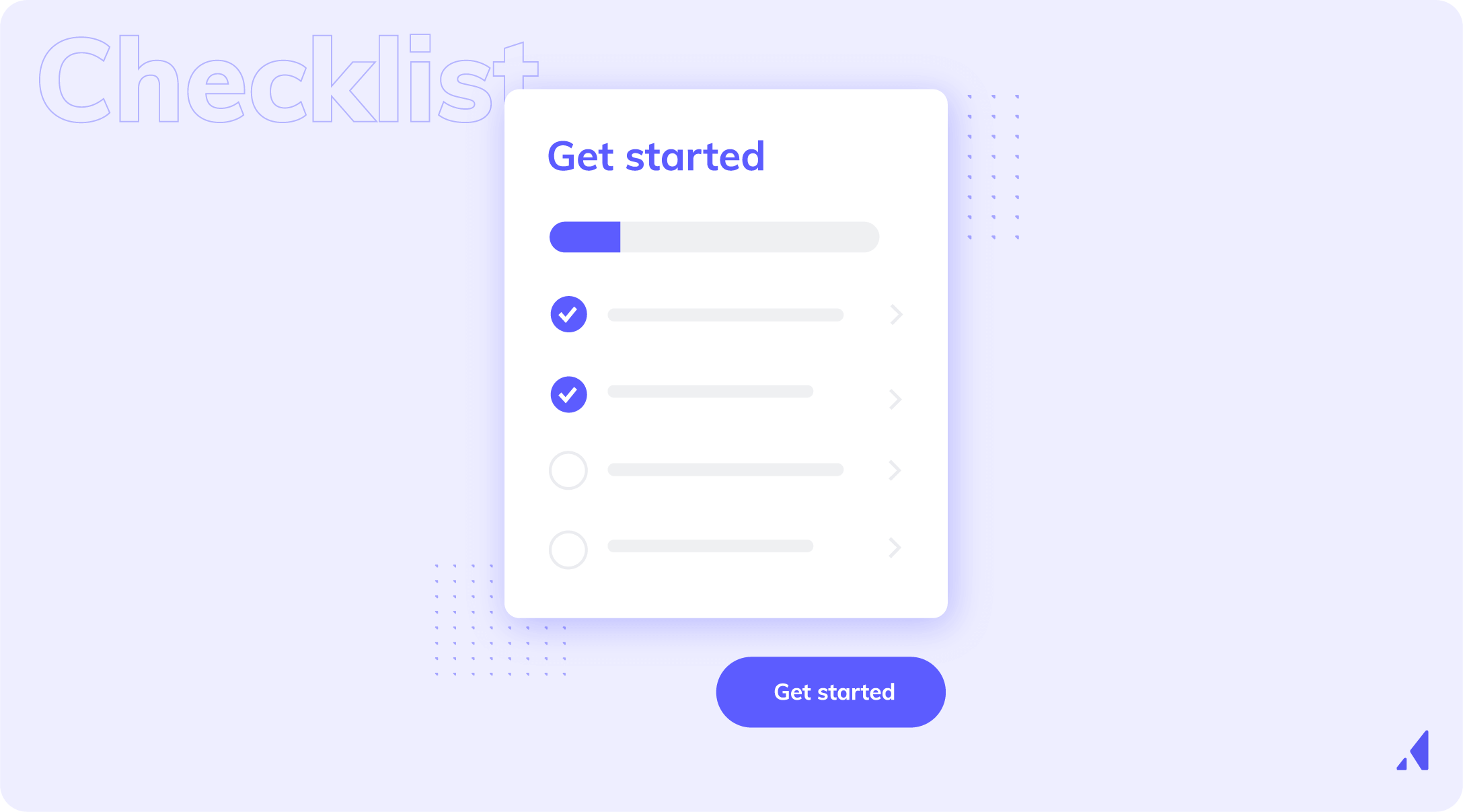
Onboarding checklists work because of a simple psychological principle: people want to finish what they've started. A checklist with three items completed out of five creates a pull toward completion that keeps users engaged.
Best practices for onboarding checklists:
The "you're almost there" effect is real. A checklist that's 60% complete is more motivating than one that's 0% complete. Design your checklist to create that momentum early.
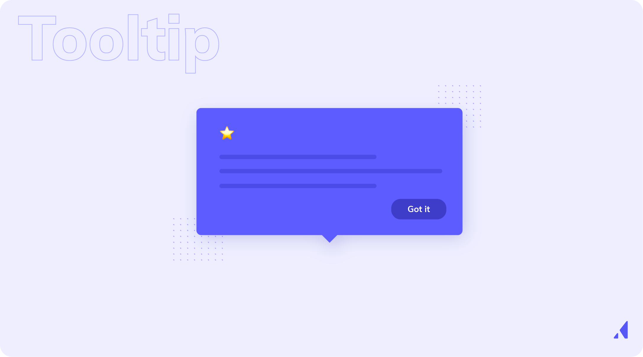
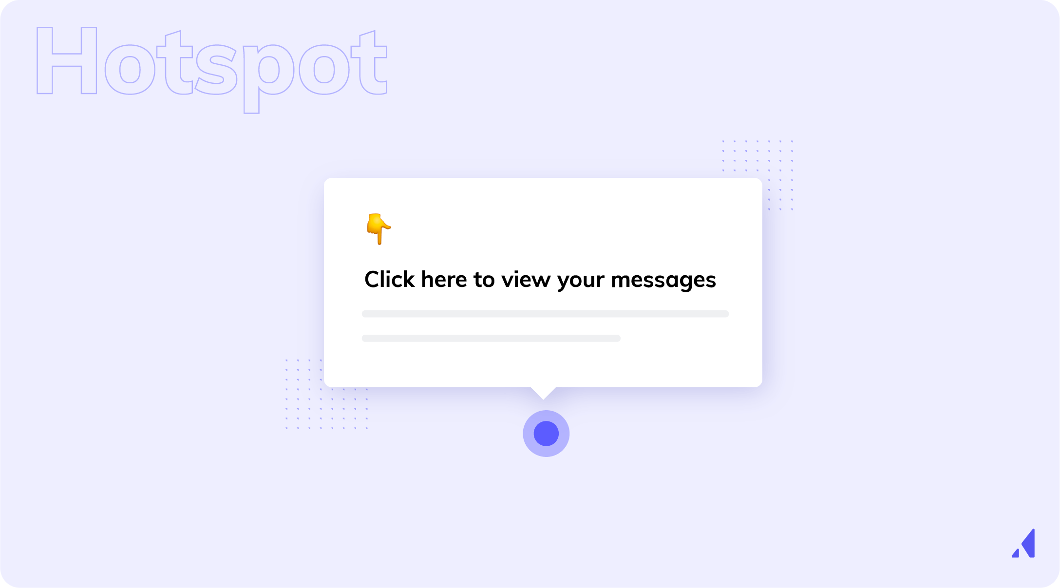
Tooltips and hotspots are lightweight, contextual onboarding elements that surface guidance exactly where users need it — without interrupting their flow.
Proactive tooltips are triggered by user behavior: visiting a page, completing an action, or pausing on an element.
Reactive tooltips appear on hover or click. Both have their place, but proactive tooltips tend to be more effective for onboarding because they anticipate user needs rather than waiting for confusion to occur.
These work best for secondary features or UI elements that aren't immediately intuitive. They're not the right tool for introducing core concepts — that's what your primary onboarding flow is for.
Empty states are the screens users see before they've added any data or taken any action. They're one of the most underutilized onboarding opportunities in most products.
A poorly designed empty state shows a blank screen with no guidance. A well-designed empty state tells the user exactly what to do next, shows them what the product will look like once they do it, and gives them a clear CTA to take that first action.
The best empty states include a clear instruction, a visible call to action, and ideally a sample or template that shows the user what's possible. They turn a moment of potential confusion into a moment of momentum.
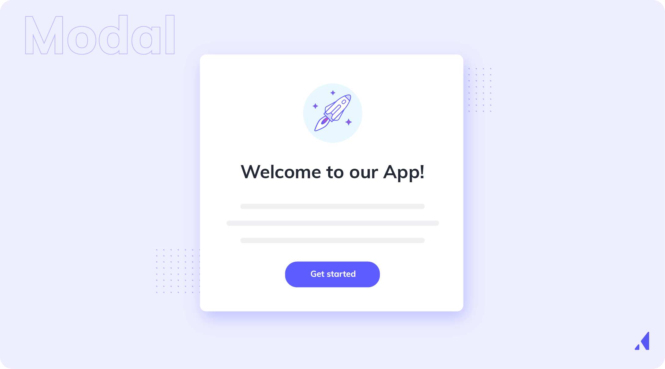
Modals can be powerful onboarding tools — or they can be the thing users immediately dismiss without reading. The difference is timing and relevance.
A modal shown at the right moment — when a user first logs in, when they reach a key decision point, or when they're about to encounter something new — delivers value. A modal shown at the wrong moment creates friction.
Best practices for onboarding modals:
Effective user onboarding doesn't live exclusively inside the product. Users don't always complete onboarding in a single session — they get distracted, they get pulled into meetings, they close the tab and forget to come back.
Onboarding email sequences — triggered by user behavior or time elapsed — re-engage users who've dropped off, reinforce in-app guidance, and drive users back to key activation moments. An email that says "You're one step away from [specific outcome]" is far more effective than a generic "Come back to our product" message.
SMS, push notifications, and other channels can play a role in a multi-touch onboarding strategy, particularly for mobile-first products. The key is that every channel should be coordinated — users should receive consistent, complementary guidance across all touchpoints, not redundant or contradictory messages.
Before you design anything, you need to know what "activated" means for your product. Activation is not logging in. It's the specific action — or set of actions — that correlates with long-term retention.
To identify your activation metric, look at your retention data. What do users who stick around have in common? What did they do in their first session or first week that churned users didn't? Cohort analysis is the right tool here.
Once you've identified that metric, it becomes the anchor for every onboarding design decision. Every step in your flow should exist to move users toward activation — nothing else.
With your activation metric defined, map every step a new user takes from signup to that moment. Don't do this from memory or assumption — use real user data, session recordings, and analytics to understand what users actually do, not what you think they do.
Journey mapping reveals gaps, unnecessary steps, and moments of confusion that you'd never find by looking at the product from the inside. It also shows you where users are succeeding — which is just as important to understand.
Your journey map will show you where users are abandoning the flow. These drop-off points are not failures — they're opportunities. Each one represents a fixable problem.
Use funnel analysis, heatmaps, and session recordings to understand what's happening at each drop-off point. Is the user confused? Is there a technical error? Is the next step unclear? Is there too much friction?
Prioritize drop-off points by volume and impact. Fix the one where the most users are leaving first — even a small improvement there will have an outsized effect on your overall activation rate.
Not all users need the same onboarding. A marketing manager and a developer using the same product have different starting points, different goals, and different levels of technical comfort.
Translate your journey map into segmented onboarding flows with conditional logic built in. A welcome survey on day one can collect the context you need to route users into the right flow. From there, each segment gets guidance tailored to their role and use case.
This doesn't have to be complex. Even two or three distinct paths — based on the most meaningful differences in your user base — can dramatically improve activation rates across the board.
Onboarding is never done. The best onboarding experiences are built iteratively — launched, measured, improved, and launched again.
Run A/B tests on your onboarding flows. Test different welcome messages, different checklist structures, different modal copy. Watch your activation metrics, completion rates, and early churn data. Establish a regular cadence — monthly or quarterly — for reviewing onboarding performance and making improvements.
The teams that win at onboarding are the ones that treat it as an ongoing optimization process, not a one-time build.
After all that—the psychology, the definitions, the justifications—it would be downright disingenuous to claim that there’s one clear way to onboard.
What we’ve seen works in our decade of working with product growth folks, frankly, is all dependent on the product, the user’s goal, and even the moment they’re in.
The real winners in the space, those 82% onboarding completion champions, have done their due diligence. When they implement user onboarding, it's from a place of planned decision-making. They're working from a series of tried-and-true tactics that they've tested and honed.
Those tactics, when combined, become plays that can be adapted and iterated on over time.
Below are the delivery mechanisms those teams return to again and again. Not because they’re easy. Because they work. Actually work.
Most onboarding experiences can be built using five core plays.
User response to this play:
“I know where I am, and I know what to do first.”
What makes this play distinct:
Its only job is getting users grounded, not education.
A full product tour. If you’re explaining features in depth, you’ve gone too far afield.
User response to this play:
“I’m making progress, and I’m getting closer to something useful.”
What makes this play distinct:
It creates momentum over time, deepening user engagement beyond a good first impression.
User response to this play:
“Help showed up exactly when I needed it.”
What makes this play distinct:
Guidance appears inside the workflow at the moment of action.
User response to this play:
“This product understands why I’m here.”
What makes this play distinct:
It changes which guidance users see, not how it’s delivered.
User response to this play:
“Oh! That’s why this is useful.”
What makes this play distinct:
Its focus is value, not instruction.
Each play answers a different user question:
When an onboarding flow fails, it’s usually because one of these questions goes unanswered rather than from a lack of UI polish.
Play Type | User Feels Like… | Core Purpose | Answers This User Question | What Users See | Use This When | Best-Fit UI Patterns |
|---|---|---|---|---|---|---|
Orientation | “I know where I am, and I know what to do first.” | Ground users quickly and reduce early confusion | Where am I? |
|
| Modals, slideouts, short walkthroughs |
Progression | “I’m making progress, and I’m getting closer to something useful.” | Create momentum and visible progress toward activation | How do I move forward? |
|
| Checklists, progress indicators |
Contextual Guidance | “Help showed up exactly when I needed it.” | Guide users inside the workflow at the moment of action | What do I do right now? |
|
| Tooltips, hotspots |
Personalization | “This product understands why I’m here.” | Show the right guidance to the right user | Is this for me? |
|
| Modals (questions), segmented flows |
Activation & Value Reinforcement | “Oh! That’s why this is useful.” | Connect actions to outcomes and reinforce value | Why is this worth it? |
|
| Slideouts, inline messages, success states |
If you want to learn more about how technology can improve your onboarding experience, check out our list of the best onboarding tools.
The first screen a user sees after signing up sets the tone for everything that follows. Use it well.
A welcome modal or screen should do three things: set expectations for what comes next, make the user feel understood, and collect the context you need to personalize their experience. A short welcome survey — two or three questions about role, use case, or goal — gives you the segmentation data to route users into the right flow while making them feel like the product was built for them.
Keep it short. Three questions maximum. Every additional question is a reason to abandon.
Onboarding flows triggered by user behavior consistently outperform flows triggered by arbitrary time delays. A tooltip that appears when a user visits a specific page for the first time feels helpful. A tooltip that appears three minutes after login regardless of what the user is doing feels random.
Behavioral triggers make guidance feel contextual. They show users the right thing at the right moment — which is the definition of good onboarding. Connect your onboarding flows to user events and actions, not clocks.
The goal of onboarding is activation, not education. Users don't need to know everything about your product on day one — they need to experience its core value.
Ruthlessly prioritize the steps that matter most and cut everything else. If a step doesn't directly contribute to getting the user to their aha moment, it doesn't belong in the primary onboarding flow. Additional features, advanced settings, and secondary workflows can all be discovered later.
When users complete a meaningful step, acknowledge it. A congratulatory message, a progress animation, a milestone email — these small moments of celebration reinforce positive behavior and build emotional connection with the product.
This isn't about being gimmicky. It's about recognizing that users are investing time and effort in learning your product, and that acknowledgment increases the likelihood they'll keep going.
Users will have questions during onboarding. The goal is to make help accessible without forcing them to leave the product or break their momentum.
In-app resource centers, contextual help links, and proactive support triggers all accomplish this. A resource center that lives in the corner of the screen — always accessible but never intrusive — gives users a safety net without interrupting the flow. Proactive support triggers can surface live chat or help articles at moments when users are most likely to be stuck.
The feature dump is the most common onboarding anti-pattern. It's the impulse to show users everything the product can do before they've experienced any value — a comprehensive tour of every feature, every setting, every capability.
The result is cognitive overload and drop-off. Users can't absorb that much information at once, and they don't have the context to understand why any of it matters yet. Replace the feature dump with progressive, need-based guidance: surface information when users need it, not before.
For products with a mobile component, onboarding must be designed specifically for mobile contexts. Smaller screens, touch interactions, and different user intent all require different design decisions than desktop onboarding.
Common mobile onboarding failures include text-heavy modals that don't fit the screen, tap targets that are too small, and flows that assume a level of focus users don't have on mobile. Design mobile onboarding from scratch — don't just shrink your desktop flow.
Onboarding built at launch and never touched again becomes a liability. Products evolve. Features change. User expectations shift. Onboarding that was effective six months ago may be actively misleading users today.
Treat onboarding as a living system. Review it regularly, measure its performance, and update it when the product changes. The cost of maintaining good onboarding is far lower than the cost of the churn that bad onboarding causes.
New user onboarding is only part of the picture. Returning users who've been away for a while, users who've upgraded to a new plan, and users encountering a newly released feature all need contextual guidance.
Re-onboarding and feature announcement flows serve these moments. A user who upgrades to a premium plan should be walked through the new capabilities they've unlocked. A user who returns after 60 days of inactivity should be reminded of where they left off and what's new. These flows are often neglected — and they represent significant retention opportunities.
Appcues gives marketing and growth teams the ability to build, launch, and iterate on onboarding flows without a degree in coding. Using a visual builder, teams can create tooltips, modals, checklists, and product tours directly on top of their live product.
This removes the engineering bottleneck that slows most onboarding improvements. Instead of waiting weeks for development resources, product teams can build and ship onboarding changes in hours — and iterate just as quickly when the data tells them something isn't working.
Appcues enables teams to deliver personalized onboarding experiences based on user attributes, behavior, role, or plan type. A single team can maintain multiple onboarding flows for different user personas without exponentially increasing their workload.
This means a marketing manager and a developer signing up for the same product can each receive guidance tailored to their context without the product team having to build and manage two entirely separate products.
Appcues connects to product analytics and user events to trigger onboarding flows at exactly the right moment. When a user visits a key page, completes a specific action, or goes idle for too long, Appcues can surface the right guidance automatically.
This makes Appcues-powered onboarding feel native and contextual rather than scripted. Users experience guidance that seems to anticipate their needs — because it does.
Appcues includes built-in analytics that show flow completion rates, step-by-step drop-off analysis, and goal tracking. Teams can see exactly where users are succeeding and where they're falling off — and use that data to make targeted improvements.
A/B testing functionality lets teams experiment with different onboarding approaches and identify what actually drives activation. Instead of guessing what works, teams can test it.
Appcues is a complete onboarding platform — not just a tooltip tool. Beyond product tours, it includes onboarding checklists that guide users through activation steps, in-app resource centers that surface help content without requiring users to leave the product, and NPS surveys that capture user sentiment at key moments in the journey.
This full suite of components means teams can design and manage the entire onboarding experience from a single platform.
Great onboarding looks different across product categories, but the underlying principles are consistent. Here are three patterns that illustrate what effective onboarding looks like in practice.
A B2B SaaS project management tool opens with a two-question welcome survey: "What's your role?" and "What are you trying to accomplish?" Based on the answers, users are routed into one of three onboarding flows — one for individual contributors, one for team leads, and one for executives. Each flow focuses on the single most relevant use case for that persona and gets users to a meaningful outcome within the first session. The result is a dramatically higher activation rate than a single generic flow produced.
A productivity app uses an empty state as its primary onboarding mechanism. Instead of a modal tour, new users land on a beautifully designed empty state that shows exactly what their workspace will look like once they've added their first project — complete with a sample template they can use immediately. The CTA is a single button: "Create your first project." One action, immediate value, no tour required.
A collaboration platform combines a short in-app checklist with a behavioral email sequence. The checklist has five items, ordered so that completing the first two delivers immediate value. For users who complete items one and two but stall on item three, a triggered email fires 24 hours later with a direct link back to the next step and a one-sentence explanation of why it matters. Completion rates for the full checklist are significantly higher than before the email sequence was added.
Project management tool Asana helps teams organize, track, and manage their work on web or mobile. Their product is characterized by a clear, simple interface with playful details and pops of color.
New users are given a succinct, action-driven onboarding tour that walks them through creating their first task—a clear aha moment.
Qordoba (an AI writing assistant for businesses) used our platform to create a beautiful user onboarding flow.
Qordoba greets its free trial users with 5 beautifully played modals. The succinct onboarding flow does a great job of reiterating Qordoba's key value propositions, introducing new users to key parts of the product, and driving them toward an activation event (installing the Chrome Extension).
Grammarly acts as a personal writing assistant—users can check for spelling, grammar, word choice, and more through in-line suggestions.
We’re big fans of Grammarly’s UX in general—they do a great job with everything from emails to upgrade prompts—and their onboarding experience is no exception. Their clever learn-by-doing demo doc does an excellent job of encouraging discovery and teaching users how to use the tool’s myriad features within a controlled environment.
Unlike many apps, Duolingo has a user onboarding experience that begins with the product and ends with a signup form—it’s an excellent example of gradual engagement.
Gradual engagement involves postponing registration for as long as possible—usually until the moment when users must register in order to progress further. Duolingo does this expertly: Their onboarding flow guides visitors through a quick translation exercise, showing how quick and easy it is to learn a new language, before asking users to commit to the product with a signup.
Great user onboarding is not a feature, a screen, or a one-time project. It's an ongoing, strategic investment in user success — one that compounds into better activation, higher retention, and stronger revenue over time.
The goal is always the same: help users reach value as quickly as possible. Every friction point you remove, every moment of clarity you add, every irrelevant step you cut makes that journey faster and more likely to succeed. The teams that treat onboarding as a continuous optimization process — not a launch deliverable — are the ones that build products users actually stick with.
In a market where acquisition costs are high and switching costs are low, great onboarding is one of the most durable competitive advantages a product team can build. Start there.
If you're ready to move from onboarding that leaks users to onboarding that activates them, Appcues is built for exactly that.
Marketing and customer teams use Appcues to build personalized, behavioral, AI-powered onboarding flows that get users to value faster — and keep them there.
Explore an interactive demo or connect with a product specialist to see how Appcues can help your team build onboarding that actually works.