.png)
.png)
What company has the best user onboarding experience?
After a decade of helping build 1000's of onboarding experiences, we get this question all the time.
The honest answer is that it depends.
User onboarding best practices are highly dependent on who the new user is, their motivations and pains, and a product's ability to satisfy that new user's desire.
Can we really say whether Netflix or Slack has a better user onboarding experience when they're built for widely different audiences and purposes? Even within a product category, subtle differences in value propositions and user personas make attempting an apples-to-apples comparison a dangerous game.
Every product's user onboarding experience is different. And it should be.
So while we can't crown a single champion, some onboarding experiences stand out from the pack.
That's why we compiled 26 of the best user onboarding examples we could find, broken down by what makes each onboarding tactic so effective for you to learn from.
Looking for onboarding examples for your specific industry? Check out these posts:
User onboarding is the process of guiding new users from their first interaction with your product to the moment they experience its core value - the "aha moment." It includes everything from signup flows and welcome screens to product tours, checklists, and contextual nudges that help users activate and stick around.
Great onboarding shortens time to value, drives faster activation, and turns signups into engaged customers. If you don't deliver core value in the first session, there's no guarantee users will come back for a second one.
Most effective onboarding flows follow a natural progression: signup, activation, first value, habit formation, and expansion. The best user onboarding examples in this post illustrate different approaches to moving users through those stages.
Why does this matter? When Blip improved their onboarding, they increased activation by 124% and reduced time to value by 9.7X. That's the kind of impact a well-designed onboarding flow can have on your business.
It's also worth noting that user onboarding and customer onboarding aren't the same thing. A user is an individual person; a customer is an account. The best onboarding experiences are designed for users, real people with specific goals, not just accounts.
Before we dig into the best user onboarding examples, let's set up a framework for what makes onboarding great. These user onboarding best practices are the principles you'll see play out across the examples below.
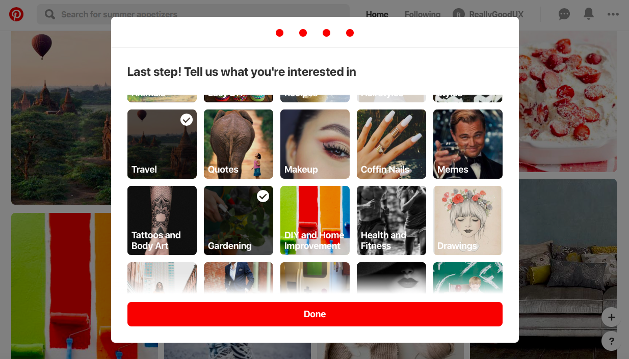
Not every project is the same, which means users come to the platform with different needs. The fastest way to personalize your user's experience is to ask a couple of questions up front and then tailor onboarding paths based on user role, goals, or use case.
Good onboarding checklists are personalized to each individual user segment. Doing this properly requires research and a deep understanding of the user journey.
The goal is to show core value as quickly as possible - if users don't find it in their first session, they may not return. Effective product tours should reduce time to value, not "time to discovering every feature." Hone in on your product's core value and eliminate steps that users can discover for themselves at a later time.
Progressive disclosure (deferring advanced or rarely used features to a secondary screen) makes applications easier to learn. Rather than having an onboarding checklist throw all the features at a new user at once, the user can simply click on what they find most interesting.
When teaching someone something new, the most effective approach isn't just "show or tell." It's guiding them through the process step-by-step. Great mentors and teachers use this hands-on, interactive method so learners can truly understand and internalize the process. This is how they make things "stick."
Interactive walkthroughs teach the users by doing. They push the users to complete certain actions before continuing the tour. If you're not sure which approach fits your product, our guide to choosing the right onboarding UX pattern breaks down the pros and cons of each.
Onboarding checklists drive completion. A typical checklist has 3–5 items, including various elements of your product tour, the action required for the user to activate, and some sort of welcome or account setup. Progress bars create momentum and make users feel accomplished. The results can be dramatic. Ghost discovered that when a user completed their 5-step progress bar (including adding a custom theme), they were 1,000% more likely to convert to paying customers.
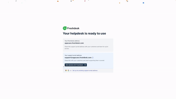
Freshdesk uses the power of positive reinforcement by incorporating elements like confetti to celebrate user achievements. It's a great way to give digital kudos to a user while also motivating them to take the next step. Giving users a goal to work toward increases motivation and retention. Games use coins, power-ups, and level-ups to keep players moving forward. Your onboarding can do the same.
Don't trap experienced users in a mandatory tour. The knowledge workers Lucidchart spoke with felt offended with a heavy-handed approach. Offer help centers, resource hubs, and re-accessible walkthroughs so users can get help on their own terms.
For products handling sensitive data, onboarding must build trust before it can deliver value. Clear, honest microcopy reduces drop-off, especially for fintech, healthtech, and any product handling sensitive data. Mint's onboarding explicitly states why it needs user information and highlights the value in continuing, creating context that builds trust at every step of the account creation process.
One way to delight new users is to let them choose their own adventure. Their own onboarding adventure, that is. Asking a couple of questions up front is the fastest way to personalize your user's experience.
And according to Product Manager Stefanie Brown, it can do wonders for conversion, too. After a lot of iteration, her choose-your-own-adventure modal for Crowd Content resulted in a 15% increase in conversion.
Crowd Content's platform connects clients seeking content writers with the freelancers they need to get the job done. But not every project is the same, which means users come to the platform with different needs. To address this, Crowd Content serves up a welcome modal (bonus points for the friendly face), that asks users how they plan to use their product.
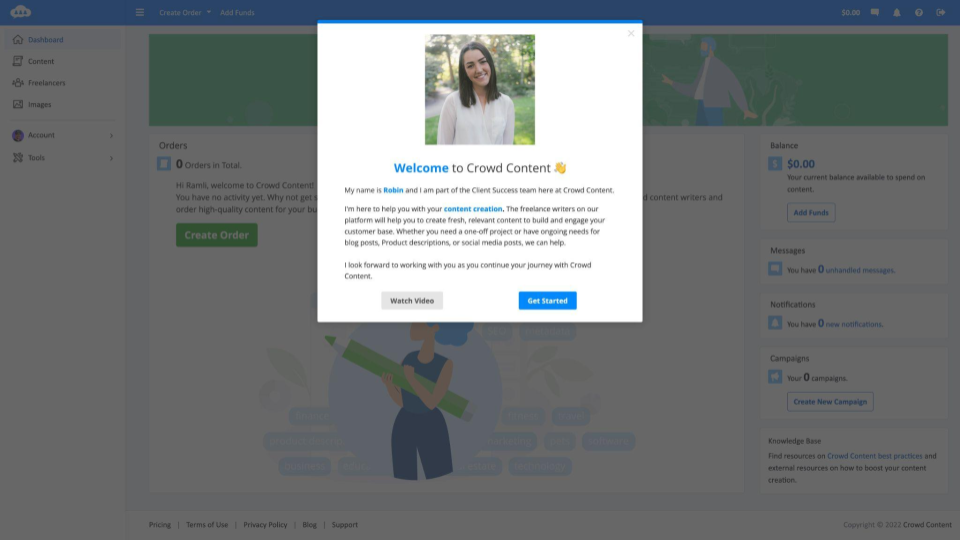
Crowd Content knows most of its customers fall into two groups: those working on one-off projects and those planning to use the product for continuous content creation. Each user is sent through a personalized onboarding flow depending on how they answer the questions in the modal.
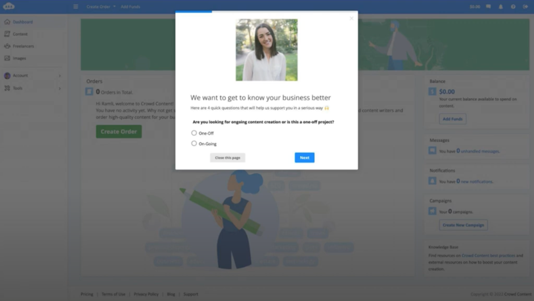
These unique flows ensure that users receive guidance on features that are relevant.
Stefanie harnesses the power of the Appcues-HubSpot integration to drive even more personalization with in-app surveys. By leveraging two custom properties in HubSpot ('One-Off' and 'On-Going'), she finely tunes the communication frequency with users.
'One-Off' users receive more up-front information and on-demand support, while 'On-Going' users are sent more frequent check-ins. This has been a great way for their small (but mighty!) team to streamline client communication.
The results? The proof is in the percentage: they increased conversion 15% by personalizing their onboarding with findings from their new user survey. As Stefanie says: "Personalizing the onboarding experience with a new user survey improved our conversion rate by 15% because new users feel like someone cares about them and wants to ensure their success."
Casey Winters was a member of the team behind Pinterest's onboarding as the product experienced rapid growth. During Casey's tenure, the team ran hundreds of experiments to improve their activation rate.
Casey emphasized that "you really need to accomplish showing the main value in the first session. Or else there's no guarantee there will be a next session." To this end, Casey had the Pinterest activation team "invest in removing a lot of the complexity of the product over time, so we got people to the core value of the product as soon as possible."
Pinterest has a clear understanding of what their new users want, which, according to Casey, "is [to see] cool topics that [they're] interested in." The onboarding process asks users to define their interests during signup and pairs that with browser location data for more relevant suggestions.
Pinterest's initial localization experiment improved the activation rate abroad by 5–10% depending on the country and demographic. By the end of onboarding, users experienced 1–2 significant aha moments and understood the product's core value.
This is a masterclass in using data to continuously optimize your onboarding process, not just building it once and forgetting it.
Duolingo's user onboarding experience begins with the product and ends with a signup form. That's exactly what makes it brilliant.
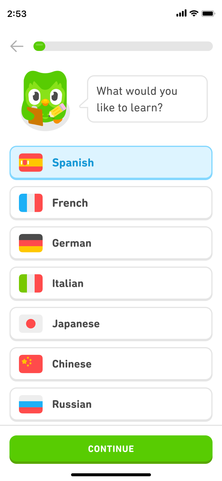
The onboarding flow guides visitors through a quick translation exercise of their choosing, showing how quick and easy it is to learn a new language before asking users to commit to the product by signing up. By the time you hit the signup page, you've already gotten value.
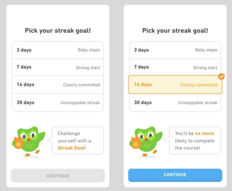
Duolingo uses persona-based onboarding and custom milestones to motivate users throughout the signup process. The user journey starts by asking users about their language learning goals and the reasons behind them. "Why are you learning a language?" Giving users a goal to work toward increases motivation and retention, and understanding a user's reason for signing up allows Duolingo to tailor the app experience, adjusting the intensity and duration of lessons so the tool fits the user's needs rather than the other way around.
Privy tailors the onboarding experience to user goals. They ask new users: "What's most important to you right now?"
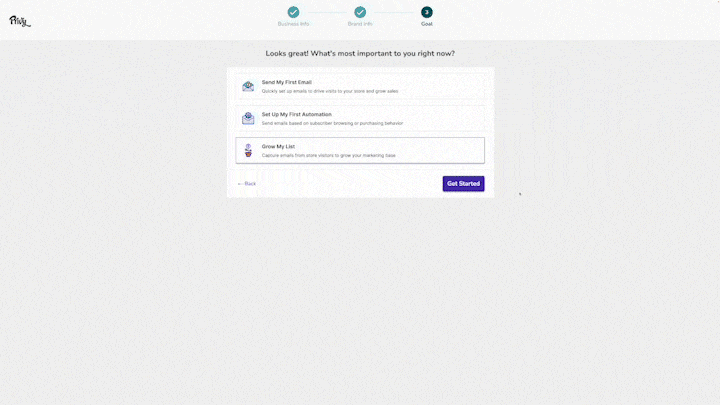
Privy's buffet method narrows freedom down to three options.
Privy uses a "buffet style" method: users are guided but have the freedom to select what suits them. The onboarding offers three choices (the right number, since too many causes inaction and confusion).
This approach taps into a fundamental human desire for autonomy and self-direction. Users value the opportunity to choose a path aligning with their individual goals. If a user wants to grow their email list, Privy prompts creation of an exit-intent popup called "Privy Plays." For a sales goal, Privy suggests cart abandonment flows.
This is a great example of how empowering users with choices supports activation. The onboarding is structured around what users want to achieve and drives them to their first conversion event fast.
When teaching someone something new, the most effective approach isn't just "show or tell." It's guiding them through the process step-by-step.
Great mentors and teachers use this hands-on, interactive method so learners can truly understand and internalize the process. (Read: this is how they make things "stick.")
Freshdesk, a customer support platform, exemplifies this philosophy in its onboarding experience.
We wanted to learn more! So, we chatted with their Customer Success Manager, Courtney Jamison, and dug into what makes their learn-by-doing onboarding experience so impactful.
Celebrate user milestones. Freshdesk uses the power of positive reinforcement by incorporating elements like confetti to celebrate user achievements. It's a great way to give digital kudos to a user while also motivating them to take the next step.
A little surprises and delight from Freshdesk
As Courtney notes: "I love that we are seeing a celebration for the user. They added in some fun confetti. It's a great way to motivate users to the next step in the journey."
Guide users to learn by doing. Instead of overwhelming users with too much information, Freshdesk keeps its intuitive step-by-step walkthrough focused. You're expertly guided through opening, replying to, and closing a support ticket without any confusion or fuss.
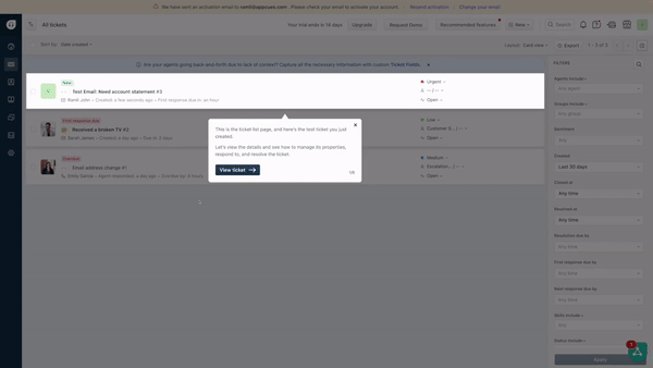
Ramli John uses a metaphor to explain why this works: "It feels like you're walking through a wilderness, and there's a guide who's making sure that you don't step in mud, a snake pit, or something dangerous. It's walking you step-by-step through Freshdesk's happy path."
Give users a space to practice. One of Freshdesk's standout features is a risk-free environment where you can practice replying to support tickets with three dummy customer requests. It's hands-on learning without the pressure.
Courtney says: "Freshdesk's approach helps users avoid feeling like they're about to break something. There's no pressure to perfect your response. The result is that Freshdesk can focus on how easy and intuitive it is to solve and close a ticket."
Key takeaways from Freshdesk's learn-by-doing onboarding approach:
Grammarly introduces new users to their grammar-checking tool with an interactive demo document that's packed with feature demonstrations.
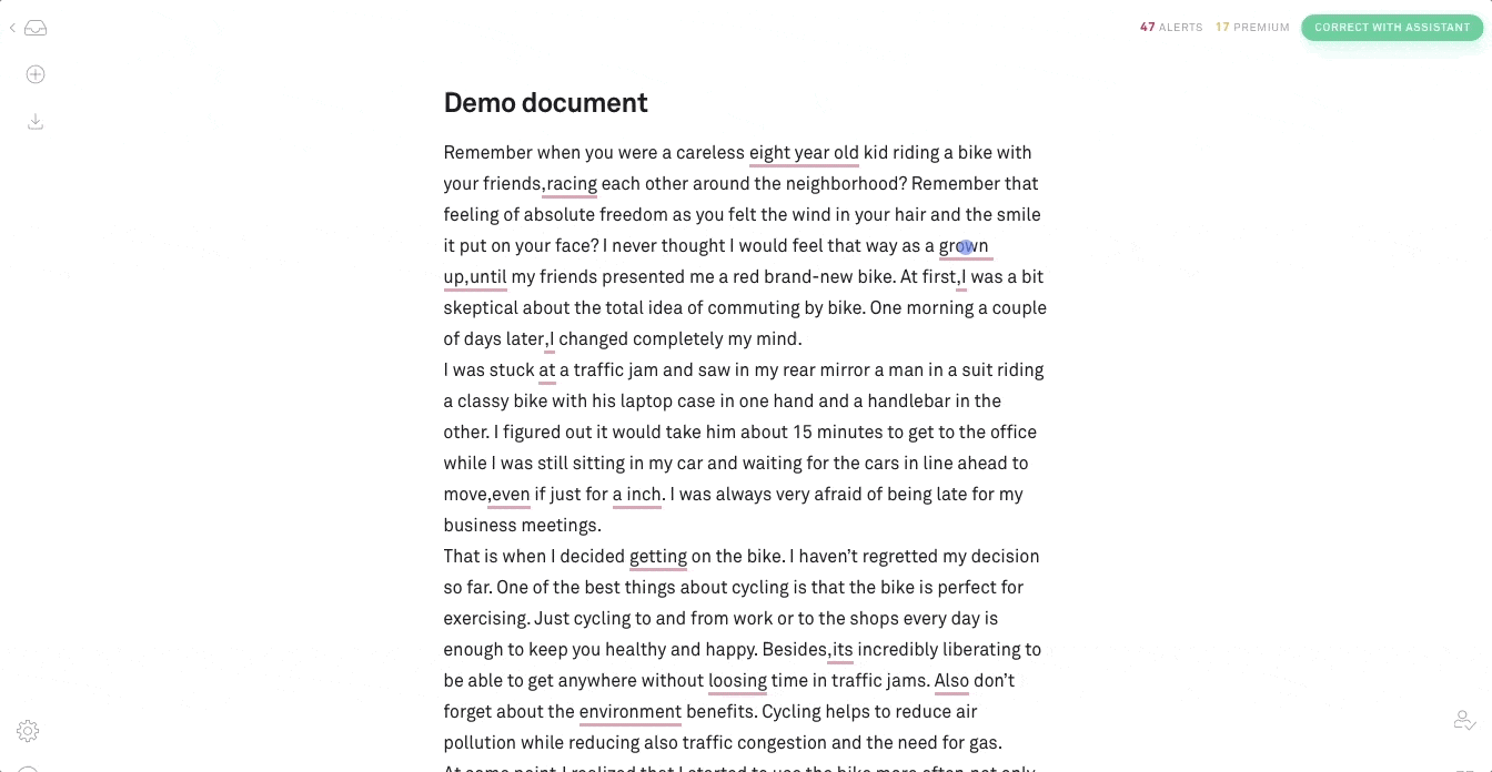
Users learn how to edit documents and familiarize themselves with the Grammarly assistant by performing actions and making edits that they're likely to encounter in their own projects. It's learning by doing: users see edits in context, making the experience interactive and visual.
Think of it like the "Level 1-1" principle from Super Mario Bros.: the first experience is carefully designed to teach core mechanics without the user realizing they're being taught. Grammarly's demo document does exactly that. You learn the product by using it, not by reading about it.

The Chrome extension onboarding reinforces this core value across the user's entire browsing experience, so the product is always demonstrating its worth.
Slack onboards new users by getting them to jump right in and chat right away, with a computer named Slackbot. The Slackbot hosts a product walkthrough with an interactive approach that drives users to take meaningful action while educating them on how to use the software.
Like Super Mario Bros., Slack's first screen is designed to make the right action the obvious action. Instead of overwhelming users, Slack introduces them to features like Threads and Activity through its empty states. Helpful microcopy explains how these features will function once the user is active on the platform.
Slack's onboarding has evolved significantly over the years. In 2014, 60% of the screen was an on-brand visual. By 2016, that was replaced with a value preview showing a colorful wireframe of the chat room. Account creation now personalizes with team name input, and password creation is deferred in favor of a 6-digit confirmation code.
The most recent version is more pared down than ever, trimmed of introductions and cutting right to the chase. Users are dropped into a fully functional "General" channel with a short message explaining the purpose and channel members. The result is a minimal, contextual onboarding experience.
Trello's signup is quick and fluid. You enter your name, email, and password, and you're done with your dashboard appearing one second later.
The board and card metaphor is intuitive enough that minimal onboarding is needed. Trello's onboarding is engaging, whimsical, and focused. It doesn't try to teach you all 48 features at once.
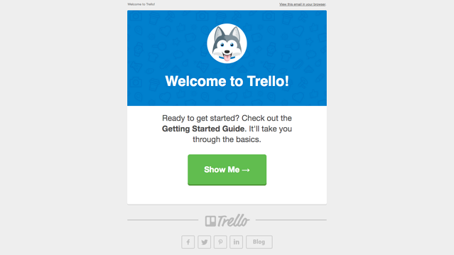
Trello's welcome email is extremely well-done with down-to-earth, natural, and friendly copy that matches Trello's brand personality. It arrives the same day you sign up.
Sometimes the best onboarding is getting out of the way. Trello's product is so intuitive that less onboarding = faster time to value.
Asana's signup process isn't as quick as Trello's (you need to go to your inbox, wait for the confirmation message, and click the verification link before getting any value), but the "aha!" moment is worth the wait.
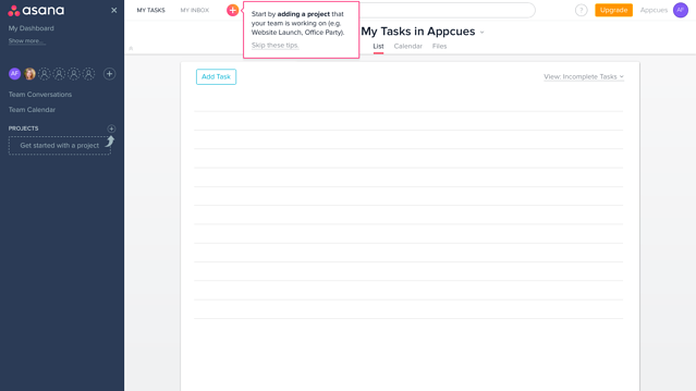
The user really sees the benefit of Asana for the first time when mentioning a teammate on a task. Asana's ability to combine task management and email into one platform is its core value. Behavior-based tooltips nudge users to assign tasks right after creating their first project.
For collaborative tools, the "aha moment" often requires another person. Asana designs its onboarding to drive users toward that social activation point. What stands out in Asana's onboarding flow is that there's nothing on the screen that can cause friction.
Thinkific greets new users with an onboarding checklist based on what successful early users do. The checklists populate in creators' dashboards upon first login and include built-in educational content reflecting high-level jobs for first-time users.
Progress bars gamify the experience within each module, and videos integrated throughout provide context and long-form explanations. Thinkific's four-step checklist for users new to the site builder offers a "jump-in, jump-out" design that allows flexible progression without forcing linear paths.
"We offer a checklist that gives some structure in terms of what you can do first, second, and third. But, it doesn't force you to do anything in any linear path."
Every checklist is based on customers' jobs-to-be-done within activation. The heavy video integration was driven by user feedback and validated by clicks, watch time, and post-video actions.
Thinkific’s JTBD-focused checklists ft. Kris Chichak | Behind The Experience Ep. 17 - YouTube
Tap to unmute
Thinkific’s JTBD-focused checklists ft. Kris Chichak | Behind The Experience Ep. 17 Appcues
Blogging platform Ghost noticed that when a user added a custom theme during the onboarding process, they were 1,000% more likely to convert to paying customers.
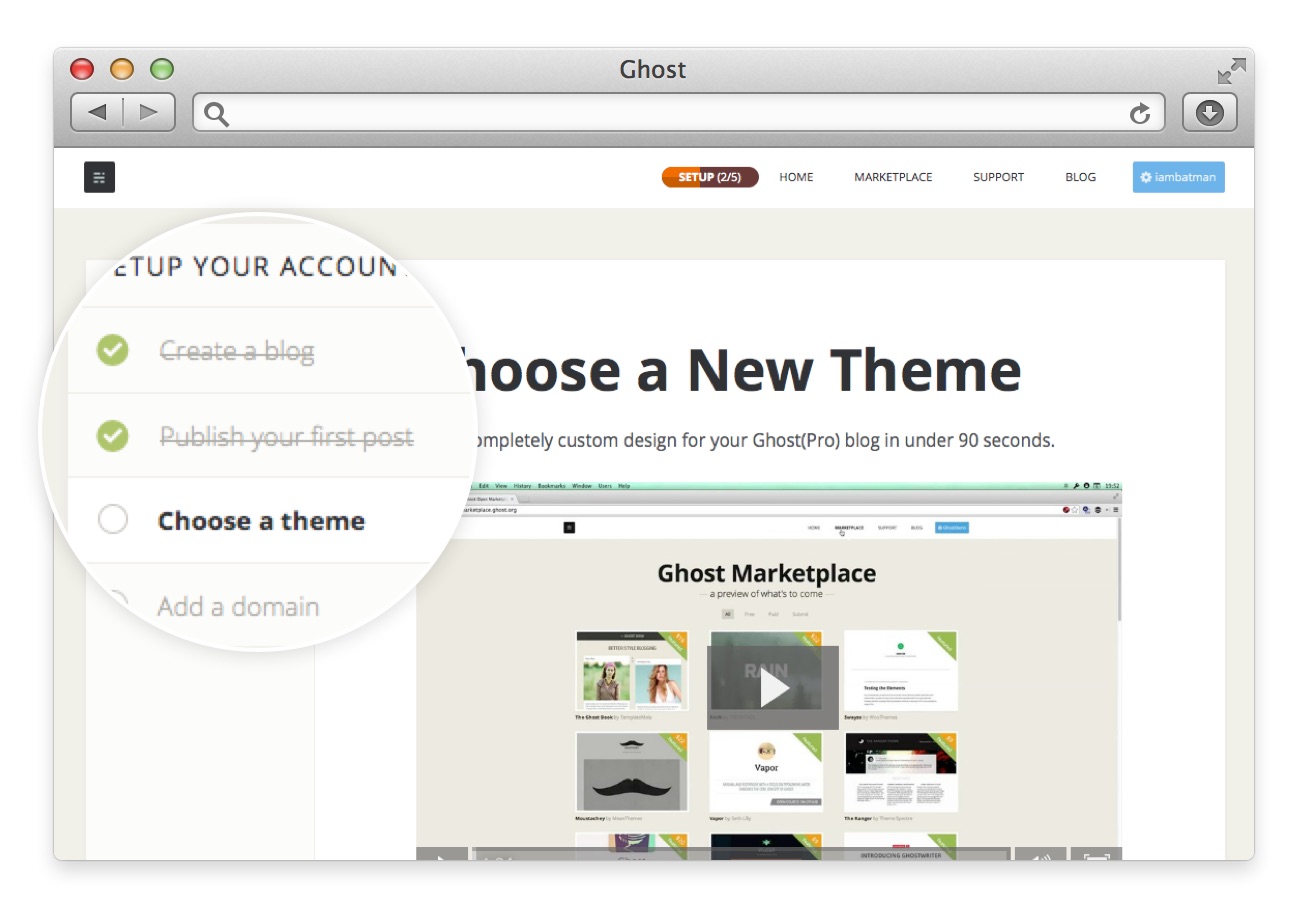
In 2014, Ghost added a simple progress bar to its onboarding flow with 5 steps, one of which was to replace the default theme with a theme of their own choice. This gave users a clear sense of ownership and progress through the setup process.
Sometimes one step in the checklist is the activation event. Ghost identified their "magic action" and built the entire progress bar around making sure users complete it. This is a powerful lesson: find the single action most correlated with conversion, and design your onboarding checklist to drive users there.
Xero's "Setup Guide" is packed with everything for getting started: videos, product tours, checklists, knowledge base articles, and more.
Items are categorized by meaningful tasks new users might want to learn, like "Sending an invoice" or "Adding a bill." Each task connects to a desired outcome, and a "Need Help" option sits alongside informative content.
This multi-format approach accommodates different learning preferences: reading, watching, and doing. Xero's comprehensive onboarding recognizes that help availability builds trust and goodwill. The adaptive checklist changes based on user progress and selections, keeping the onboarding process feeling manageable rather than overwhelming.
When HubSpot redesigned its new user onboarding flow, it extensively incorporated user testing sessions with real users into the process. HubSpot reached out to unengaged trial users, watched real people struggle, and iterated until the friction was gone.
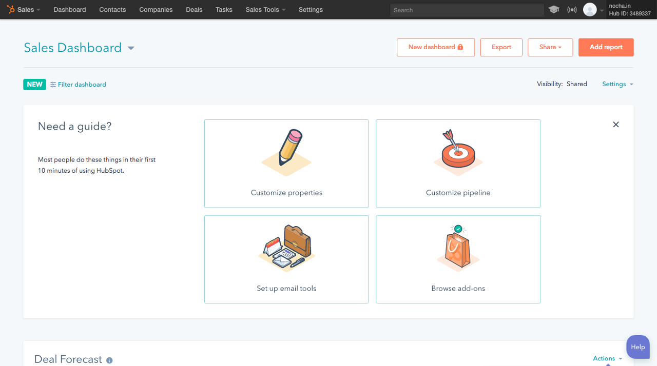
The result? They 4x'd their target metric.
HubSpot serves different checklists for marketers, salespeople, and service teams, each with guided account setup tailored to the user persona. This proves that great onboarding isn't just good UX design. It's research. The lesson: design for users new to your product, not product experts.
Nike's Run Club app uses motivation to retain customers and increase revenue. The app helps the user set goals, celebrates their progress, and surveys customers to offer personalized product recommendations later in the customer journey.
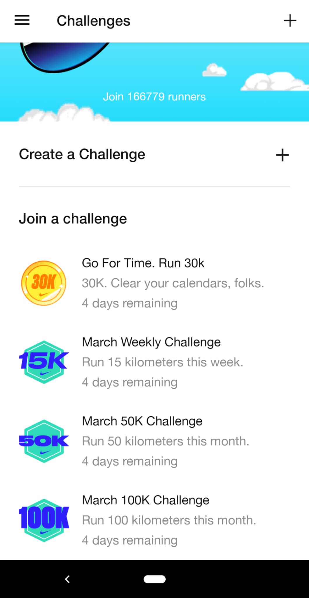
Nike prompts its users to join and create challenges with set goals and time limits so they remain motivated to keep using the app. Push notifications encourage continued engagement and celebrate progress along the way.
Nike uses onboarding data not just for the app experience, but for e-commerce recommendations downstream. Onboarding becomes a revenue driver, not just a retention tool.
Chorus only highlights the most essential tools everyone will need in their onboarding flow, a design format called progressive disclosure. Advanced tools are discoverable later, as they're needed.

This is a textbook example of progressive disclosure: showing users just enough to be productive, then layering in complexity as they grow. Instead of front-loading your onboarding with every feature, Chorus allows customers to discover more advanced tools on their own timeline.
Mint's account setup process addresses the user's need for security and builds trust by creating the context for each ask in clear language.
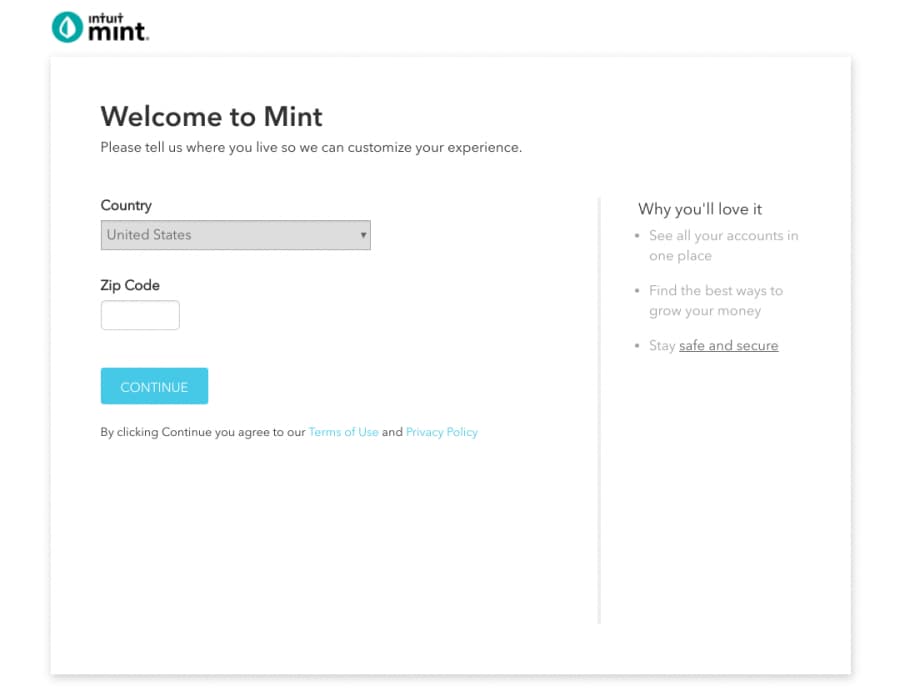
The welcome message clearly states why Mint needs user information for account creation and highlights the value in continuing. Every step of the account creation process explains the "why," creating trust with users who are handing over sensitive financial data.
For products that handle sensitive data (finance, health, insurance), onboarding must build trust before it can deliver value. Mint shows how to do this by leading with transparency.
Lucidchart originally used a 10-step onboarding process, but the lengthy product tour didn't resonate with users. As Allen Liao, former group product manager at Lucid, noted: "The knowledge workers we spoke with felt offended with a heavy-handed approach."
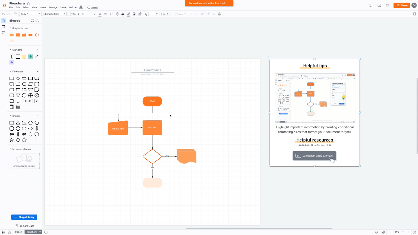
Lucidchart redesigned to a more nuanced approach. Features marked as interesting but nonessential appear as tips on the loading screen. A "Helpful tips" modal window is tucked away to the side of the screen, out of the workspace, offering in-depth feature explanations without forcing them on users.
The approach is differentiated by user type: freemium users see a modal with helpful options, while premium users see a more expansive template selection. Premium users are greeted with options to start with an existing template, create from scratch, or watch a 60-second overview.
Kate Syuma, Miro's former Head of Growth Product Design, spent 6 years shaping Miro's onboarding. In the early years, there was no real onboarding in place, just a v1 sign-up flow. Kate built Miro's first Design Growth team dedicated to the onboarding foundation, sign-up flows, and first sessions.
During hyper-growth, the company grew from 150 to 1,000 people in 6 months, and the user base scaled from 3 to 10 million. COVID brought non-technical users who required a simplified first experience.
One standout experiment was "Say Hi," where users were prompted to perform an easy collaborative action using the Reactions feature to increase the aha moment. The hypothesis: "If we break the ice for new board joiners, nudging them to perform an easy, simple, and delightful collaborative action that removes their fear of engaging with a new tool, we'll increase the aha moment."
After "Say Hi," board collaborators received a notification encouraging them to return to the board. A key learning: review your onboarding quarterly with your product manager, designer, and team. And sometimes, too many visuals make flows messy. Cleaner, simpler flows performed better.
Great onboarding is never "done." Miro's story is about the evolution, not just the end state.
Lauren Schuman, VP of Product Growth at Mural, designs the new user onboarding experience with a clear mission: onboard with an educational but playful experience while helping users discover value quickly.
The onboarding experience includes a six-step checklist called an "onboarding quest." The steps were determined by working backward from user retention data. Upon completing each step, cheerful emoji feedback serves as real-time validation of progress.
"Play to wow" is a core company value, and that philosophy extends to the onboarding. Playful design includes confetti and other celebratory elements throughout. As a collaborative digital whiteboard platform, Mural infuses play into onboarding because designing for collaboration is the core philosophy guiding the entire experience.
Instead of a blank page, PandaDoc gives users a field of possibilities already half-made. The most popular and best-looking templates are displayed upfront, with specific categories on the left side for users with more time to search.
There are no lessons or instructions. Just easy-to-access templates based on user preferences. As Eugenia Brown, Product Manager at PandaDoc, explains: "The biggest insight is that users like to start with something. They don't want to start with a blank document. So that's why the whole idea of the template gallery is. So if we show them the template gallery, this choice of different templates, they are more likely to interact with the application more."
This design makes PandaDoc flexible for onboarding different user types. The template gallery approach addresses a fundamental insight about user behavior: nobody wants to start from zero.
Pitch uses GIFs to educate and onboard users on key features. Targeted GIFs show exactly how the product benefits users, and the advantage is that users don't need to click play. The demonstration goes straight in.
A welcome modal for new users includes a GIF showing the ease of building and editing a deck. This visual of the product working helps users before they even dive in.
An added benefit: GIFs reduce customer support queries by proactively addressing FAQs like "How do I edit text?" GIFs hit a sweet spot between static screenshots (not enough) and full video tutorials (too much).
Signals is among the best at shortening TTW (Time to Wow). It's a measure of how long it takes a user to see the true value of your product.
Signals optimizes for TTW in three key ways:
The post-sign-up process walks you through sending your first tracked email from Gmail with a pre-composed message with very clear instructions. Less than a minute after sending that email, the user is notified that someone has opened their email. The notification is almost instantaneous, and that clearly communicates the value of the product.
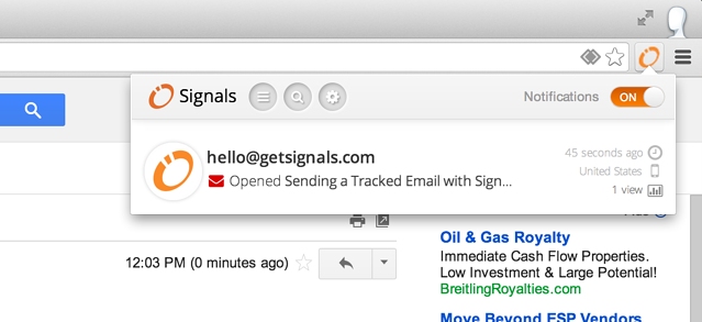
Signals may have the shortest time to "wow" of any SaaS product. The entire onboarding is designed to get users to experience the core value (email tracking) in under 60 seconds.
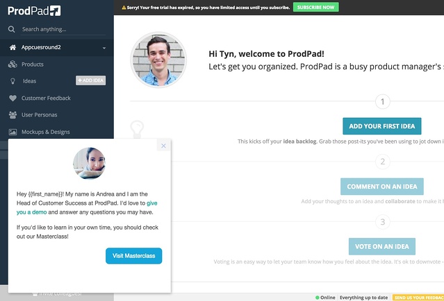
ProdPad trial users are steered toward their first WOW moment, adding a product idea, via a series of customized tooltips.
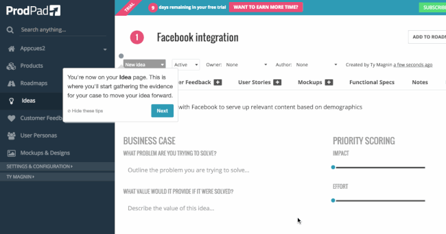
Andrea, ProdPad's Head of Customer Success, built the entire product tour without the help of her engineering team. Using Appcues, she was able to update and iterate on the content in the tour at her own will and no longer had to go through her engineering team to get prioritized, coded, and deployed. Requests that took hours or days now take minutes.
She also created a slideout to offer a demo to new trial users that want one, as well as a link to ProdPad's user onboarding video series called "Masterclass."
The results? After implementing Appcues for user onboarding, ProdPad cut the time it took for free trialers to convert to paid customers in half, from 8 weeks down to 4 weeks. After a few more iterations, they cut it in half again, bringing the trial period to an average of 2 weeks. That's an 80% improvement on free trial to paid period, and an acceleration of ProdPad's free-to-paid conversions by 400%.
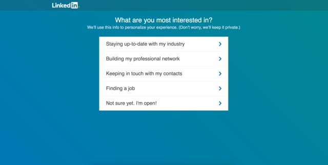
LinkedIn does an excellent job steering users toward value and setting the stage for a meaningful, personalized experience. The onboarding directs new users toward finding connections via email import and uploading a profile picture, with additional personalization questions that build a robust profile step by step.
LinkedIn's onboarding copy is to the point and shows the full range of the platform
LinkedIn's copy is excellent at anticipating and relieving user anxiety. The mastery over best practices extends from first onboarding to advanced use cases.
But LinkedIn's onboarding doesn't end after signup. Post-onboarding, LinkedIn provides a steady stream of engagement activities like endorsing someone for a skill, congratulating someone on a work anniversary, and more. This is secondary and tertiary onboarding in action: ongoing engagement loops that make the product stickier over time.

Where LinkedIn stumbles is with features like Groups, where users complete a tour only to be greeted with blank space and no clear next action. A quick tour points to an empty element while promising "amazing groups to join." That lack of reward is a major de-motivator for new users.

Avoid empty states wherever you can.
Trainual moved its video tutorials and educational resources into discrete hotspots sprinkled throughout the UI. The target audience (primarily C-suite executives and founders) wanted a stripped-back experience, and that's exactly what Trainual delivered.
The hotspots allow users to explore on their own time, clicking for help when desired. They're well-designed: small enough to be discrete, eye-catching enough to be noticed, with contrasting colors that help them stand out and grab user attention.
The results, as reported by Director of Product Taylor Sell: "Our activation metric went up 100%, and our conversion rate went up 80%."
The success came from optimizing onboarding to what the target audience wanted, not just from the hotspots themselves. Hotspots were the right tool for creating the stripped-back experience their C-suite clientele sought, with on-demand guidance that allows experienced users to skip if desired.
Tumblr uses persona-based onboarding with user-generated content visuals. After signup, users select 5 or more interests, immediately personalizing their feed and giving a sense of ownership over the experience.

The power of this approach is that the onboarding IS the product experience. By selecting interests, you're building the feed you'll actually use, making the act of onboarding indistinguishable from getting value.
Looking across all 26 examples, three patterns show up again and again in the ones that drive real results.
The highest-performing onboarding flows don't explain the product. They put users inside it. Grammarly drops you into a demo document full of errors to fix. Slack has you message Slackbot. Freshdesk gives you three dummy tickets to close. Signals walks you through sending a tracked email and delivers a real-time open notification within 60 seconds.
In each case, the user's first action is the same action they'll repeat as a paying customer. That's why these flows convert: there's no gap between "learning the product" and "using the product."
What to do: Identify the single action most tied to activation (the way Ghost identified custom themes, or ProdPad identified adding a product idea) and make that action the very first thing your onboarding asks users to complete.
Ghost added a 5-step progress bar and saw users become 1,000% more likely to convert. Trainual moved to on-demand hotspots and doubled their activation metric. ProdPad introduced targeted tooltips and cut their free-trial-to-paid timeline by 80%. Freshdesk's confetti after closing a first ticket reinforces momentum. Mural's emoji feedback after each checklist step does the same.
These aren't cosmetic touches. They're conversion mechanics. Each small reward (a progress bar ticking forward, a confetti burst) gives users evidence that they're succeeding, which keeps them moving toward the next step.
What to do: Map every milestone between signup and activation, then add a visible reward at each one. Progress bars, celebratory animations, and completed-state indicators all work. The goal is to never let users wonder whether they're making progress.
Lucidchart learned this the hard way. Their original 10-step product tour "offended" the knowledge workers they spoke with. They replaced it with contextual tips tucked into a side modal. Chorus shows only essential tools on first login. Slack introduces features like Threads through empty states, explaining them before they're populated. Thinkific's checklist lets users jump in and jump out without forcing a linear path.
Front-loading every feature creates overwhelm. The examples that drove the strongest results all practiced progressive disclosure: surface the essentials first, then layer in complexity as users demonstrate readiness.
What to do: Audit your current onboarding and count how many features you introduce before the user completes their first core action. If it's more than three, cut it down. Move everything else to contextual tips, empty states, or secondary resource hubs users can access on their own terms.
Even the best-intentioned onboarding can fall flat. Here are the most common onboarding mistakes we see teams make - and how to avoid each one.
No progressive disclosure. Trying to show everything on day one. Take the Chorus approach: essential tools first, advanced features later. Lucidchart learned this the hard way when their 10-step product tour didn't resonate. "The knowledge workers we spoke with felt offended with a heavy-handed approach."
Ignoring user personas and sending every user through the same onboarding flow. Follow Crowd Content's model: segment upfront and personalize. A 15% conversion increase is what happens when you stop giving every user the same experience.
Users finish the tour and stare at a blank screen. Think LinkedIn's Groups feature, where users complete a tour only to be greeted with blank space and no clear next action. Use checklists like Thinkific or empty states like Slack to always show what's next.
"Click here" without "here's why this matters to you." Follow Mint's trust-building approach: create context for every ask. Explain the "why," not just the "what."
Flying blind without tracking activation, completion, or time to value. Define your "magic action" like Ghost did with custom themes and measure whether users reach it. HubSpot 4x'd their target metric by incorporating user testing. You should have a plan in place for how you are going to track and analyze your onboarding, as well as a process for making quick and frequent iterations.
Treating mobile as an afterthought or carbon-copying the web experience. Study Nike Run Club: mobile app onboarding should leverage push notifications, goals, and device-native patterns to keep users engaged.
You should have a plan in place for how you are going to track and analyze your onboarding, as well as a process for making quick and frequent iterations to smooth out points of friction and continuously reduce time to value. For a deeper dive, see our complete guide to user onboarding metrics and KPIs. Here are the key metrics to track, each illustrated with a real example from the best user onboarding examples above.
Activation rate - The percentage of users who reach the "aha moment." Pinterest ran hundreds of experiments to optimize this single metric, and improved it by 5–10% abroad with one localization experiment.
Time to value (TTV) - How fast do users experience core product value? Signals gets users to their "wow" in under 60 seconds. How fast does your product deliver value?
Onboarding completion rate - Ghost found that completion of their 5-step progress bar was the strongest predictor of conversion. Users who completed it were 1,000% more likely to convert.
Feature adoption rate - Are users actually using key features post-onboarding? Chorus optimizes for this by hiding advanced features until users are ready for them.
Trial-to-paid conversion - ProdPad cut their trial period from 8 weeks to 2 weeks by improving their onboarding, an 80% improvement.
User retention and churn rate - Do onboarded users stick around? Duolingo's goal-setting drives long-term retention through personalization.
Checklist completion rate - For products using onboarding checklists (Thinkific, Xero, HubSpot), track how many users finish. Trainual saw their activation metric go up 100% and conversion rate go up 80% after optimizing their approach.
Here's a summary of the best practices from the best user onboarding examples above:
The best user onboarding experiences don't happen by accident. They're personalized to where users are, responsive to what they're doing, and designed to get people to value as fast as possible. Whether it's Crowd Content's choose-your-own-adventure modal, Freshdesk's learn-by-doing sandbox, or Ghost's conversion-driving progress bar, the throughline is the same: the right experience, delivered to the right user, at exactly the right moment.
Many of the examples in this post - Crowd Content, ProdPad, Thinkific, and Trainual - were built with Appcues, a customer engagement platform that helps product and marketing teams deliver personalized in-app, email, and push experiences without engineering dependency and without months of roadmap negotiation. The people who knew their users best launched these experiences in hours.
Appcues helps you build personalized onboarding experiences that respond to what users actually do in your product - then measure what's working and iterate fast, without waiting on a sprint cycle. If your onboarding feels more like a formality than a growth lever, that's exactly the problem we're built to solve.
Want to go deeper on onboarding for your specific industry? Check out these posts: