
.png)

Simplicity is the ultimate sophistication, and a mighty business weapon.
It's why Google dominates search and Apple hit a market cap of one trillion dollars. Google Search consists simply of a logo, a search bar, and two buttons. And the iPod—the device that shaped Apple's future—was controlled by one intuitive element: the signature click wheel.

Both Google and Apple have dominated their markets because their products seem simple and straightforward. Their products deliver tremendous user value that requires minimal user effort.
Many products strive for simplicity in a bid to replicate this success, but fail because simplicity is only applied at the surface level. The removal of clutter and the maximization of white space in the UI can help make a product look better and improve its usability, but this type of simplification won't give you the rewards you are looking for.
To leverage simplicity to maximum effect, you first need complexity. You need to search for uncertainty and novelty—these are the conditions that provide the opportunities for true innovation and disruption.
Once you find complexity, your team needs to be set up to handle it. They need to be adaptable, fast, and dynamic in order to simplify that complexity and use it to your product's—and your users'—advantage.
Here we take a look at several seemingly simple products—at a macro and micro level—and uncover the hidden complexities at the heart of their success.
Simplicity is not an objective fact. My simple is different from your simple, which means there is the perception of simplicity. This is what the customer takes away from the experience of using a product; to them, this is all that matters.
Ice cream seems like a simple business. It's been around a while—dating back to the second century B.C.—and you only need four ingredients to make the cold stuff yourself.
Adding your favorite confectionery chunks into ice cream seems like a logical and simple next step. But producing chunky ice cream is surprisingly complicated, and it's in this complexity where Ben & Jerry's found their advantage.
To produce the seemingly simple idea of chunky ice cream, Ben & Jerry's had to choose to do things that were more complex than others were willing to do—or even try to do.
Classic ice cream machines are designed to handle liquids and fine ingredients like sugar. So Ben & Jerry's had to experiment and build specialized machinery that could handle all the extra ingredients that they are now famous for.
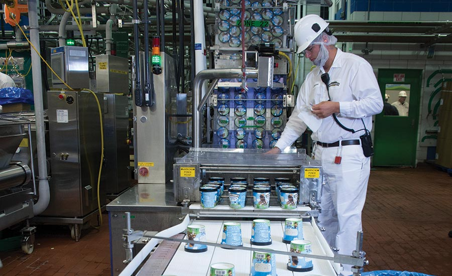
Achieving this on a large scale was a deeply complex process that (literally) involved a lot of moving parts. But it was worth it: Inventive flavors and pints packed to the brim with chocolate chips, swirls, and novel ingredients are a crucial part of Ben & Jerry's brand. And to their customers, it all seems quite simple.
The journey from complexity to simplicity has been similar for the likes of Uber and Deliveroo. The idea of booking a taxi or ordering take-out food with your smartphone may seem simple on the surface, but the realities are actually immensely complex.

With discipline and patience, Uber and Deliveroo were able to interface with uncertainty. This willingness to take on the hidden complexity behind their seemingly straightforward ideas led both companies to create products that are simple on the surface, but full of user value on the inside.
Thinking about simplicity at a macro level starts with a concise mission statement: Ben & Jerry's product mission is to “make fantastic ice cream;” Uber's is to “bring transport to everyone;” Deliveroo's is to “transform the way we eat.”
Product missions should distill the point of the product to its essence, and it make a company's goals simpler to understand. From this, teams can narrow their focus down to the essential causes and effects that really matter to their product.
Managing complexity on behalf of the user happens at both the macro and the micro level. Macro simplicity is about the purpose of the product. The micro is about the features, functions, and design.
A perfectly sensible way to make a product feel simple at a micro level is to follow web conventions and standards. This means making your interface familiar and to conform to familiar patterns because people expect things to work a certain way based on their previous experiences.
But taking this approach won't lead you to profound simplification. Conventions and standards live in the comfort zones of both the product team and the users; nothing special will happen here because it discourages teams from searching for complexity and innovative solutions that will give your product that competitive edge.
Take the password reset process as an example. Most products stick to the standard method: After a couple failed login attempts, you click on a "forgot password" button, follow the security steps, check your email, go back to the app, and set up a new password—one you're likely to forget all over again on your next visit.

This process has become a standard not because it is good UX, but because it's an easy and straightforward solution from a developer's perspective.
But Monzo, a mobile-only bank, chose to take on more complexity in order to provide a better user experience. The result is a solution that takes away the burden of the typical password reset process and replaces it with a “magic link”:
On a failed login attempt Monzo sends the user the magic link via email. Upon opening the email, the user is automatically taken back to the app, and logged in. They're also remembered, meaning they don't need to log in again on subsequent visits.

For Monzo, this process was much more complicated to build, but by taking on the complexity, they've designed a process that is much simpler for the user.
The same mentality can be applied to all areas of your product. When you look beyond web conventions and identify the complexity involved in using your product, you will find innovative ways to simplify your product and create a more positive user experience.
One method to help you apply micro simplicity to your product is the OODA loop, a tool developed by military strategist John Boyd to explain how organizations can win in uncertain and chaotic environments. It involves four steps of decision-making: Observe, Orient, Decide, and Act.
These steps bring objectivity to your process and foster a cleaner train of thought towards the problem at hand, helping you develop a simpler but more powerful solution to a complex problem.
We've really only scratched the surface of simplification in this article. We've concentrated on the macro and micro functions of products to understand how simplification can drive value, but the influence of simplicity does not stop there.
The likes of Google and Apple apply the same mentality to their mission, strategy, processes, and culture. Each domain comes with its own set of complexities—and therefore its own set of opportunities.
The critical thing to remember is that you should not shy away from complexity. Instead, you should look for it and challenge it. This is the space where true simplification happens and where product value is created.

.png)