.png)
Most SaaS products lose the majority of their new users within the first week. Not because the product is bad — but because users never got far enough to understand why it's good. The difference between a user who churns on day three and one who becomes a loyal, paying customer for years often comes down to a single variable: how well the onboarding experience was designed, measured, and optimized.
That's where user onboarding metrics come in. They're the framework that separates product teams who make decisions based on evidence from those who make decisions based on gut feel. Without them, you're guessing. With them, you can diagnose exactly where users drop off, what's driving activation, and which changes actually move the needle.
This guide covers everything you need to build a rigorous onboarding measurement practice: which metrics matter and why, how to calculate each one, what benchmarks to aim for, how to set up a tracking system, and how to translate data into concrete improvements. Whether you're a product manager, a growth lead, or a customer success director, you'll walk away with a clear, actionable framework you can apply immediately.
Onboarding isn't a welcome email and a product tour. It's the entire process by which a new user goes from curious to capable — from signing up to genuinely relying on your product. And it has a direct, measurable impact on almost every business outcome that matters.
When onboarding works, users activate faster, build habits around the product, and stick around long enough to generate real revenue. When it doesn't, they churn — often silently, without ever filing a support ticket or explaining why they left.
The cost of poor onboarding compounds quickly. Every dollar you spend acquiring a user who churns in the first 30 days is a dollar wasted. Worse, those users often require disproportionate support resources before they leave — driving up costs without generating any return. And because early churn inflates your overall churn rate, it suppresses the retention metrics that investors, boards, and growth teams use to evaluate product-market fit.
The flip side is equally powerful. Improving onboarding — even incrementally — has a compounding effect. Users who activate faster retain at higher rates. Users who retain longer expand their usage. Users who expand generate more revenue and refer more customers. Every improvement you make to onboarding ripples forward through the entire customer lifecycle.
But none of this is visible without the right metrics. You can't improve what you can't measure. And you can't measure what you haven't defined. That's why treating onboarding as a measurable, optimizable system — rather than a subjective experience — is one of the highest-leverage investments a product team can make.
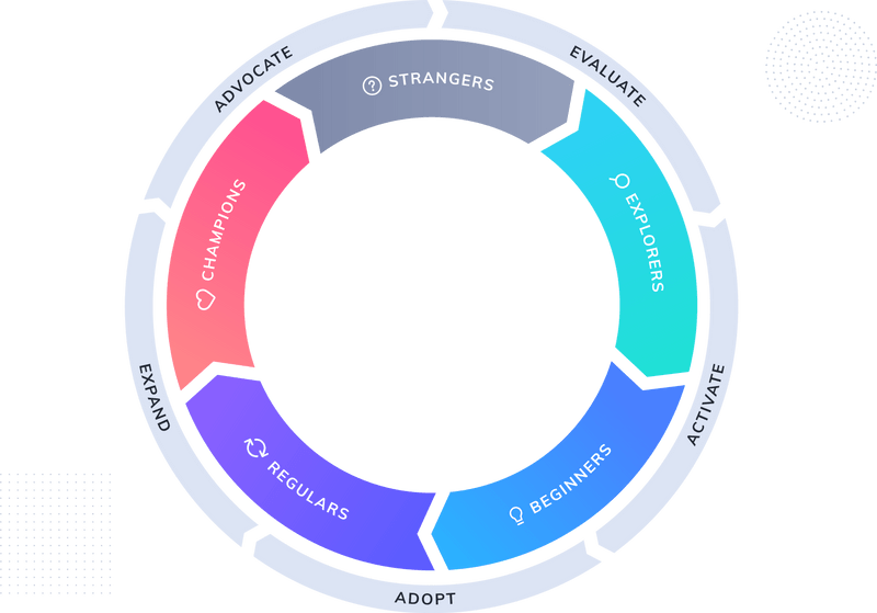
Before diving into individual metrics, it helps to have a mental model for how they fit together. Think of onboarding as a funnel with five distinct stages: acquisition and signup, activation, engagement, retention, and expansion.
Each stage has its own set of relevant metrics. Each stage also has its own failure modes. A user can drop out at any point — and the reason they drop out at stage two is very different from the reason they drop out at stage four. Understanding where users are leaving requires visibility across the entire funnel, not just a single data point.
Here's how to think about each stage:
This is where onboarding begins — before the user ever sees your product. How users arrive, what they expect, and how frictionless the signup experience is all set the stage for everything that follows.
Metrics like signup conversion rate (the percentage of visitors who complete registration) and time-to-signup (how long the registration process takes) are leading indicators of onboarding quality. A long, confusing signup flow creates friction before the user has experienced any value. A high drop-off rate at signup often signals a mismatch between what users expect and what they're asked to do.
Activation is the most critical stage of onboarding. It's the moment a user first experiences the core value of your product — the "aha moment" that makes them think, this is worth my time.
Activation rate is widely considered the single most important onboarding metric because it's the leading indicator of everything downstream. Users who activate are dramatically more likely to retain. Users who don't activate almost never come back.
Once a user has activated, the question becomes: are they building habits? Are they coming back? Are they using the features that make your product sticky?
Feature adoption rate and session frequency are the key signals here. They tell you whether onboarding created a lasting behavior change or just a one-time interaction. Low engagement after activation often means the onboarding experience didn't do enough to establish a usage pattern.
Retention metrics are the ultimate downstream indicator of onboarding success. If your onboarding is working, users stick around. If it's not, they churn — and they usually churn early.
Day 1, Day 7, and Day 30 retention rates are the most common checkpoints. They reveal how quickly the impact of onboarding decays and where the biggest drop-offs occur. Early churn — within the first 30 to 90 days — is almost always an onboarding problem, even when it doesn't look like one.
This is the core of the guide. Each metric below is defined precisely, explained in terms of business impact, and accompanied by a formula you can bring directly to your dashboard.
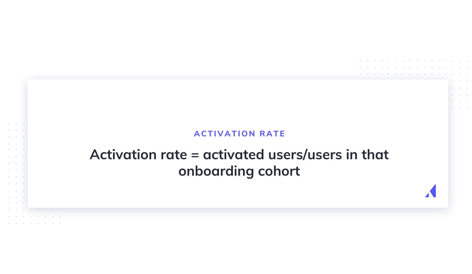
Activation rate is the percentage of new users who reach a predefined "aha moment" or complete a key action within a set time window.
Formula: (Activated users ÷ Total new users) × 100
What counts as "activation" depends entirely on your product. For a project management tool, it might be creating and assigning a first task. For a communication platform, it might be sending a first message to a teammate. The key is to identify the action that most strongly correlates with long-term retention — and then measure how many users reach it.
Activation rate is the north star of onboarding performance. It's the metric that most directly predicts whether a user will stick around, and it's the one that most clearly reflects the quality of your onboarding experience.
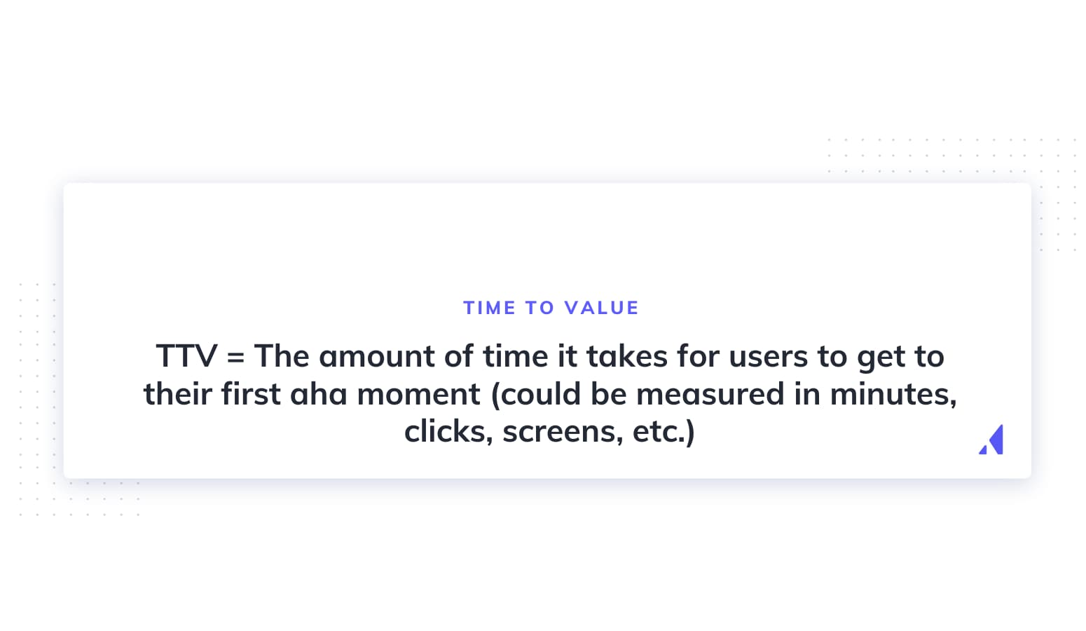
Time to Value is the elapsed time between a user signing up and experiencing meaningful value from the product.
There are two flavors worth distinguishing. Immediate TTV refers to quick wins — the first moment a user feels the product is useful. Long-term TTV refers to deeper value — the point at which a user is genuinely reliant on the product. Both matter, but reducing immediate TTV is often the highest-leverage improvement a team can make, because users who don't experience value quickly rarely stick around long enough to experience deep value.
To measure TTV, define what "value" looks like for your product (often the same as your activation event), then calculate the average time between signup and that event across your user base. Segment by cohort to see whether TTV is improving over time.
Drop-off rate is the percentage of users who abandon the onboarding flow at each step.
Formula: (Users who started step N but didn't complete it ÷ Users who started step N) × 100
This metric is diagnostic. It doesn't just tell you whether onboarding is broken — it tells you where it's broken. Map your onboarding flow step by step, instrument each transition, and calculate drop-off at every stage. The step with the highest drop-off rate is your highest-priority optimization target.
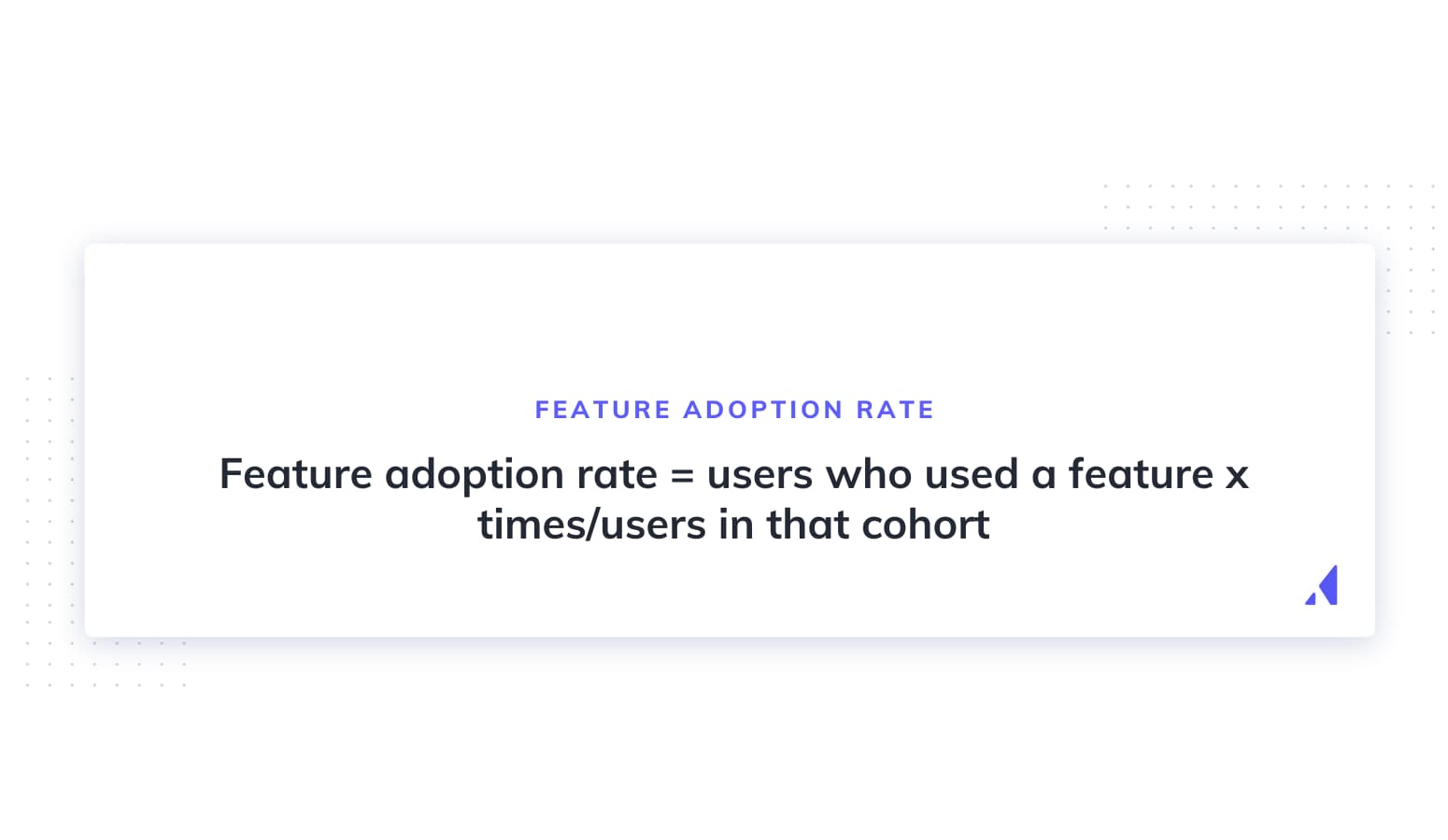
Feature adoption rate is the percentage of users who use a specific feature at least once — or regularly — within a given time period.
Formula: (Users who used the feature ÷ Total active users) × 100
This metric becomes especially powerful when you segment it. Break it down by user cohort, plan type, or acquisition channel and you'll start to see patterns. Maybe users who come in through a specific channel adopt your core feature at twice the rate of others. Maybe users on a higher-tier plan adopt a key feature that users on the free tier never discover. Those patterns are onboarding opportunities.
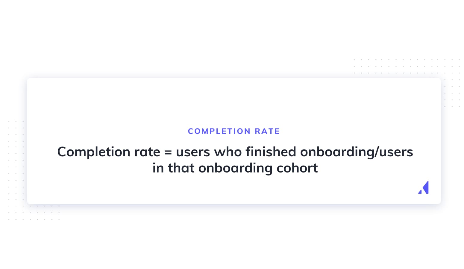
Onboarding completion rate is the percentage of users who complete all steps of a defined onboarding flow — a product tour, a setup checklist, or a configuration wizard.
Formula: (Users who completed all steps ÷ Users who started the flow) × 100
A word of caution: a high completion rate doesn't automatically mean successful onboarding. If users complete your checklist but still churn within 30 days, the checklist isn't driving the right behavior. Always connect completion rate to downstream retention and activation data to understand whether your onboarding flow is actually working.
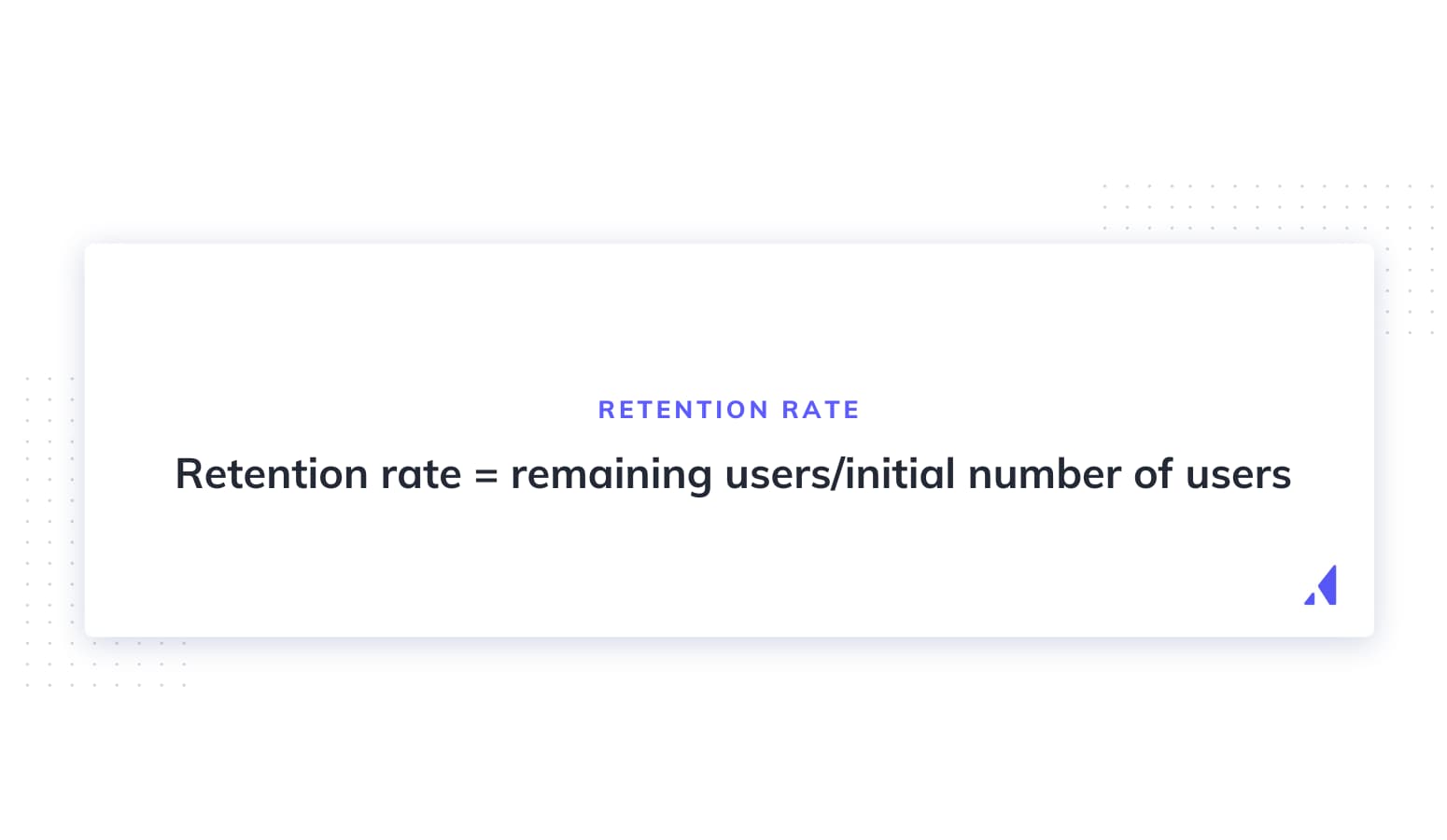
Retention rate measures the percentage of users who return to the product after their initial session, measured at multiple time horizons.
Formula: (Users active at end of period ÷ Users who signed up at start of period) × 100
Tracking retention at Day 1, Day 7, and Day 30 gives you a layered picture of onboarding durability. Day 1 retention is heavily influenced by the first-session experience — if users don't come back the next day, the initial onboarding likely failed to create a reason to return. Day 7 and Day 30 retention reflect whether the product has established genuine habit formation.
Healthy benchmarks vary significantly by product type, but as a general reference point, consumer apps often target 25–40% Day 30 retention, while B2B SaaS products typically aim higher given the intentional purchase context.
Churn rate is the percentage of users (or customers) who stop using the product within a given period.
Formula: (Users lost during period ÷ Users at start of period) × 100
It's worth distinguishing between voluntary churn (the user chose to leave) and involuntary churn (a payment failure or technical issue caused the cancellation). Both matter, but they require different interventions.
Early churn — within the first 30 to 90 days — is almost always an onboarding problem. The user didn't find enough value quickly enough to justify staying. If your churn is concentrated in this window, that's a clear signal to audit your activation experience before looking anywhere else.
Customer Lifetime Value is a downstream metric, but it belongs in any serious conversation about onboarding because it reflects the cumulative impact of onboarding quality over time.
Users who are well-onboarded activate faster, churn less, and expand their usage — all of which compound into higher CLV. A user who activates on day one and retains for three years generates dramatically more revenue than a user who churns after 60 days. The difference between those two users often traces back to the quality of their first few sessions.
Think of CLV as the long-range signal that confirms whether your onboarding investments are paying off.
NPS deployed during or immediately after onboarding provides qualitative signal that complements your quantitative metrics.
The key is timing. Trigger an NPS survey after a user completes their first key action, or at the Day 7 mark — not immediately after signup, when users haven't yet experienced the product. The responses will surface friction points that your funnel data can't explain: confusing terminology, missing features, unmet expectations.
Onboarding NPS is particularly valuable because it captures sentiment at the moment of highest emotional stakes — when users are deciding whether this product is worth their continued attention.
Support ticket volume from new users is a proxy metric for onboarding confusion. When users can't figure out how to do something, some of them file a ticket. Many more just leave.
Track the volume and nature of support tickets submitted in the first 30 days. Categorize them by topic — setup issues, feature confusion, billing questions — and look for patterns. A cluster of tickets around a specific feature or step is a direct signal that your onboarding isn't adequately preparing users for that moment.
High early ticket volume also has a direct cost implication: it inflates your support overhead and signals that your onboarding is doing work that your support team is having to redo.
Benchmarks are useful reference points, but they come with an important caveat: they vary enormously depending on your product type, pricing model, and target audience.
A self-serve B2C app with a free tier will have very different activation benchmarks than an enterprise SaaS product with a high-touch sales process. A product with a complex setup flow will naturally have lower onboarding completion rates than one with a single-step activation. Comparing your numbers to an industry average without accounting for these variables can lead you to the wrong conclusions.
That said, here are general reference ranges for key metrics:
The more important number is your own trend line. Are your metrics improving month over month? Is a recent onboarding change moving activation in the right direction? Your baseline is your most honest benchmark — and improving against it consistently is what drives compounding growth.
Knowing which metrics matter is only half the battle. The other half is building a system that tracks them consistently so you can act on the data.
Start with the two metrics that matter most: activation rate and retention rate. These are the leading and lagging indicators of onboarding health, respectively. Get these instrumented and visible before adding complexity.
Before you can measure activation, you need to define it — and this step deserves more rigor than most teams give it.
The common mistake is defining activation based on intuition: "users should complete their profile" or "users should watch the tutorial video." These actions feel important but may have no relationship to actual retention.
The right approach is data-driven. Run a cohort analysis: look at users who retained at Day 30 and work backward to identify which early actions they had in common. The action that most strongly predicts long-term retention is your activation event. Define it precisely, including the time window in which it should occur.
Event instrumentation is the process of tagging user actions — clicks, form completions, feature interactions — so they're captured in your analytics system.
Clean, well-labeled event tracking is the foundation of any onboarding metrics program. Without it, you're working with incomplete data. Decide which events are critical to track (every step in your onboarding flow, every key feature interaction), name them consistently, and document what each event represents.
There are two approaches: auto-captured events, which your analytics tool records automatically based on user interactions, and manually defined events, which you explicitly instrument for specific actions. Most teams use a combination of both.
No single tool does everything. Most teams use a combination of:
The goal isn't to use every tool — it's to ensure that the metrics you've defined are visible, consistent, and reviewed regularly. Establish a cadence: weekly check-ins on activation and funnel drop-off, monthly reviews of retention and churn trends.
Even teams that care about onboarding metrics make predictable errors. Here are the most common ones — and how to fix them.
Tracking vanity metrics instead of quality metrics. Total signups is not an onboarding metric. It tells you nothing about whether users are finding value. Replace it with activation rate and Day 7 retention.
Defining activation incorrectly. If you define activation as "completed profile setup" but that action has no correlation with retention, you're optimizing for the wrong thing. Use cohort analysis to validate your activation definition against actual retention data.
Failing to segment by cohort or channel. Aggregate metrics hide important patterns. A 35% activation rate looks fine until you segment by acquisition channel and discover that one channel is driving 80% of your activations while another is dragging the average down.
Measuring completion without connecting to downstream behavior. A 70% onboarding checklist completion rate sounds great. But if those users churn at the same rate as users who didn't complete the checklist, the checklist isn't doing its job. Always tie completion metrics to retention outcomes.
Reviewing metrics too infrequently. Onboarding metrics reviewed quarterly are nearly useless for driving improvement. Set a weekly or bi-weekly review cadence so you can catch problems early and act on them before they compound.
Metrics are only valuable if they lead to action. Here's a practical workflow for turning onboarding data into onboarding improvements.
This is not a one-time project. The teams who win at onboarding treat it as a continuous optimization loop — always measuring, always testing, always improving.
Cohort analysis segments users into groups based on a shared characteristic — signup date, acquisition channel, plan type, or user persona — and tracks how each group behaves over time.
Aggregate metrics tell you what's happening across your entire user base. Cohort analysis tells you why — and for whom. If you recently changed your onboarding flow, cohort analysis will show you whether the new cohort (users who experienced the new flow) is activating at a higher rate than the previous cohort. If you're seeing high churn from one acquisition channel, cohort analysis will surface that pattern before it becomes a serious problem.
A/B testing lets you run controlled experiments on your onboarding experience — testing different welcome messages, checklist structures, tooltip placements, or modal sequences — and measure which version performs better.
The key discipline is measuring statistical significance before drawing conclusions. A small sample size can produce misleading results. Define your success metric upfront (usually activation rate or Day 7 retention), determine the sample size you need to reach significance, and resist the temptation to call a winner early.
Even small improvements compound significantly. A 5-percentage-point increase in activation rate, sustained over a year, translates into meaningfully more retained users, more expansion revenue, and lower effective CAC.
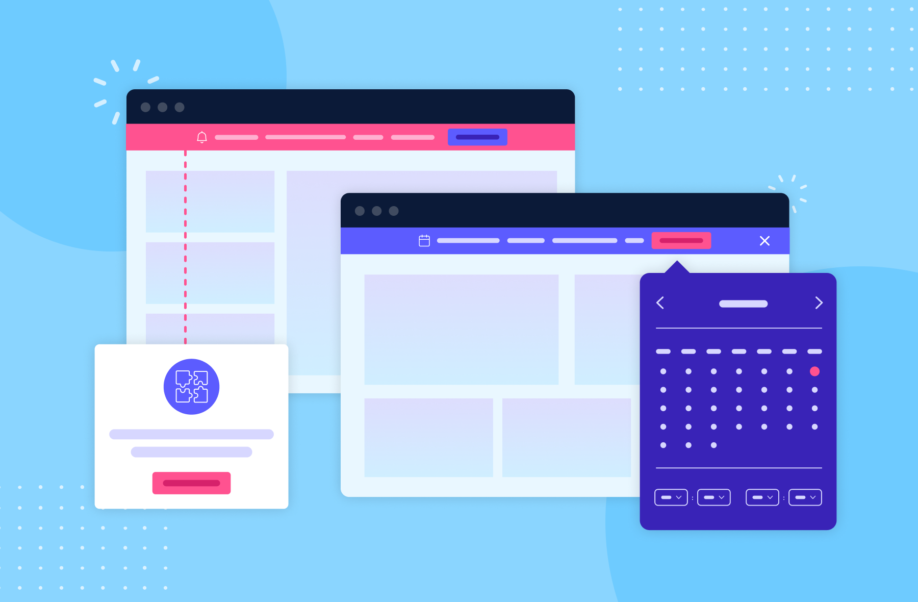
Most analytics tools tell you what is happening in your onboarding funnel. Most onboarding tools let you build flows. But very few do both — and the gap between measurement and execution is where most onboarding programs stall.
Appcues is built to close that gap. It combines in-app onboarding experiences with built-in analytics that tie directly to the metrics covered throughout this guide, so product and growth teams can measure and improve onboarding in one place.
Here's what that looks like in practice:
Appcues is designed for product and growth teams who need to move fast. No engineering required to build, test, and iterate on onboarding experiences. You get the data to know what's working and the tools to fix what isn't — in the same platform.
User onboarding metrics are not a reporting exercise. They're a growth lever — one of the most direct and controllable levers available to a product team.
The metrics that matter most are activation rate, time to value, retention rate, and feature adoption rate. These are the signals that tell you whether your onboarding is working and where it's breaking down. Benchmarks are useful context, but your own trend line is the number that matters — consistent improvement against your baseline is what compounds into better retention, lower CAC, and higher revenue.
The teams who win at onboarding are the ones who measure consistently, act on the data, and iterate continuously. They don't treat onboarding as a one-time setup task. They treat it as an ongoing system that can always be made better.
Every percentage point improvement in activation rate means more users who stick around. More users who stick around means more revenue, more referrals, and more room to grow. It starts with knowing your numbers.
See how Appcues helps you measure and improve every stage of your onboarding funnel — from first login to activation and beyond. Start a free trial or book a personalized demo to see it in action.
Not ready to trial yet? Explore our onboarding resources to go deeper on activation benchmarks, checklist templates, and onboarding flow best practices.