
.png)
Everyone knows it’s easier and less expensive to keep an existing customer than it is to land a new one. That’s not rocket science.
It is, however, a fact that SaaS companies need to take to heart.
Retaining existing customers is an incredibly important indicator of a company’s stability, sustainability, and longevity. In fact, it’s arguably the most important metric you can look at. Other numbers can be spun to tell a variety of stories, but retention doesn’t lie.
And small shifts in retention drive major changes to the bottom line:
A modest 5% improvement in retention will translate into a 25 to 95% profit increase while a seemingly benign 3% monthly churn will ultimately amount to 31% churn annually. Ouch.
So, how exactly do you keep your users coming back for more?
Step 1: Have a great product. Obviously.
Step 2: Make sure people are actually using that product.
Being able to consistently drive feature adoption is a non-negotiable, must-have ingredient for achieving strong retention. Users only stick around if your product delivers value. A product that isn’t being used, is only being used once in a while, or is only being used to half its potential can’t deliver the kind of meaningful value that earns customer loyalty.
To summarize: Consistent feature adoption = high retention/low churn = a healthy company with a long, happy future.
Achieving consistent feature adoption is all about keeping your users engaged at each step in their journey. Our Product-Led Growth Flywheel framework covers the 5 stages of the user journey—Stranger, Explorer, Beginner, Regular, and Champion—and aligns those against the key actions users need to take to move from one stage to the next: Evaluate, Activate, Adopt, Expand, and Advocate.
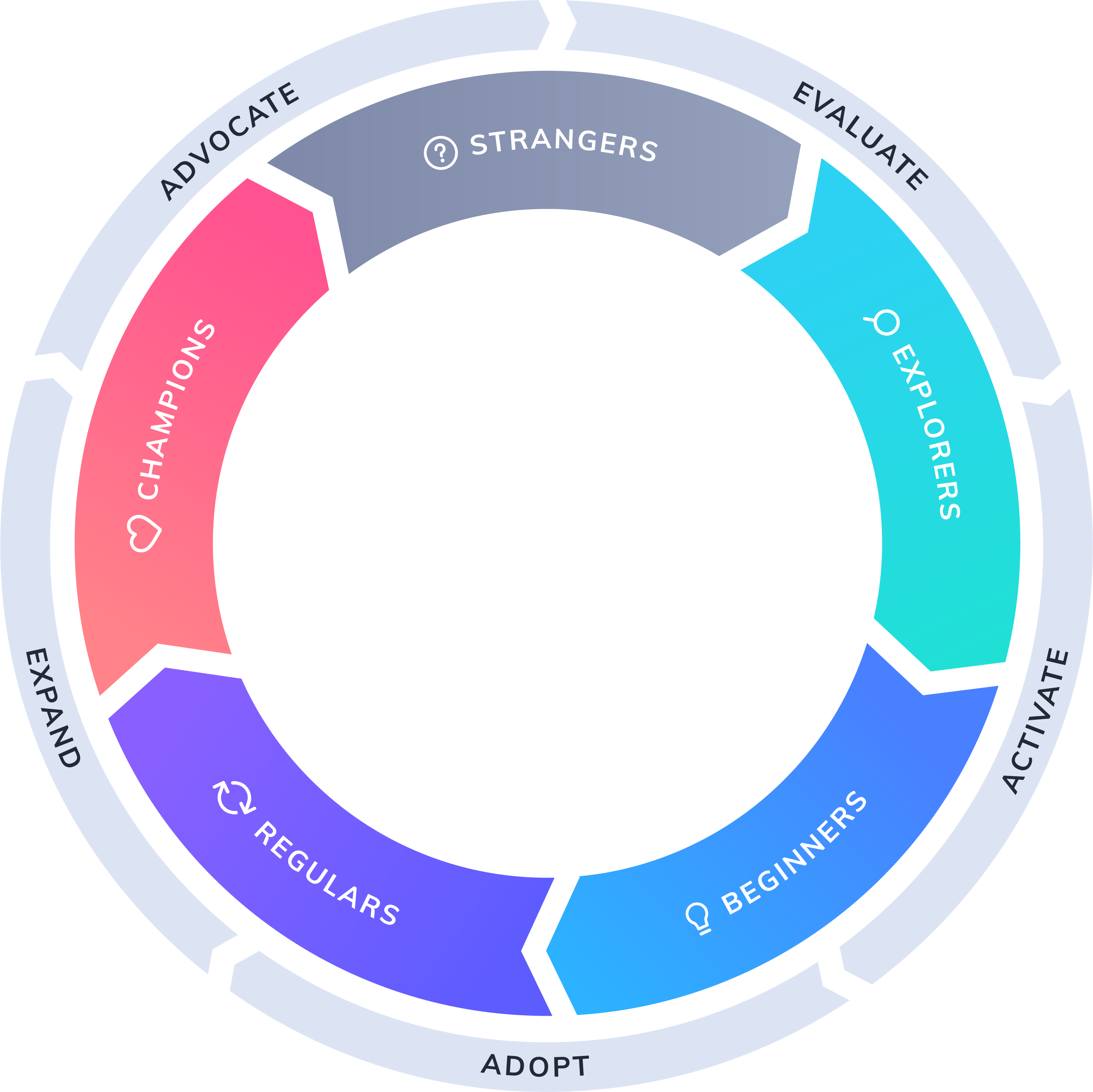
While you might assume that feature adoption is mostly an issue for beginners who are working through activation and adoption, adoption is actually important at every stage of the journey.
The trick is making sure you’re tailoring the way you encourage feature adoption based on where a user is in their journey.
Adoption for beginners is all about getting to the aha moment—the moment when a new user experiences your product’s value first hand—as quickly and easily as possible.
This is the job of onboarding—finding the shortest path to activation. Successful onboarding guides new users effortlessly to their first “win.” After that, they will be hooked and excited to learn more.
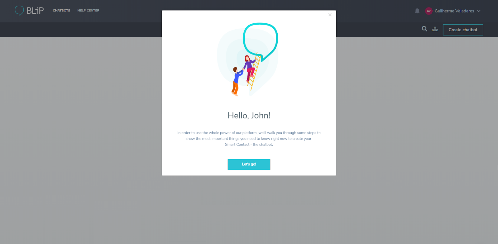
This Brazil-based conversational platform company used Appcues to create a multi-step, personalized walkthrough that resulted in a 9.7x reduction in their time-to-value (aka, time-to-aha). Using a combination of tooltips and slideouts, Take was able to create a clear path for new users building their first chatbot. This improved clarity and guidance reduced the median time it took a user to complete all the steps in the funnel from 1.1 hours to a mere 6.8 minutes.
More importantly, this improvement helped Take solve a critical funnel conversion issue of users dropping out at various stages of the process. Within 2 months of publishing the Appcues flow, the dropout rate at “publish the bot” stage decreased from 55% to under 11%, and the dropout rate at the final “test chatbot” stage was reduced from 14% to just over 1%.
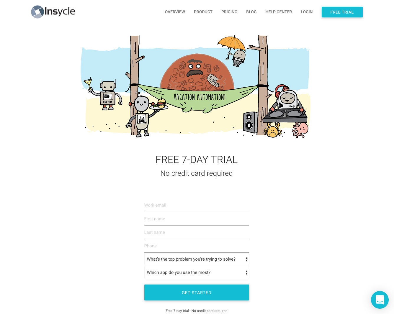
Data management for SaaS companies may not sound like a lot of fun, but Insycle isn’t afraid to add some quirkiness to an otherwise serious subject with unique illustrations that accompany key onboarding steps.
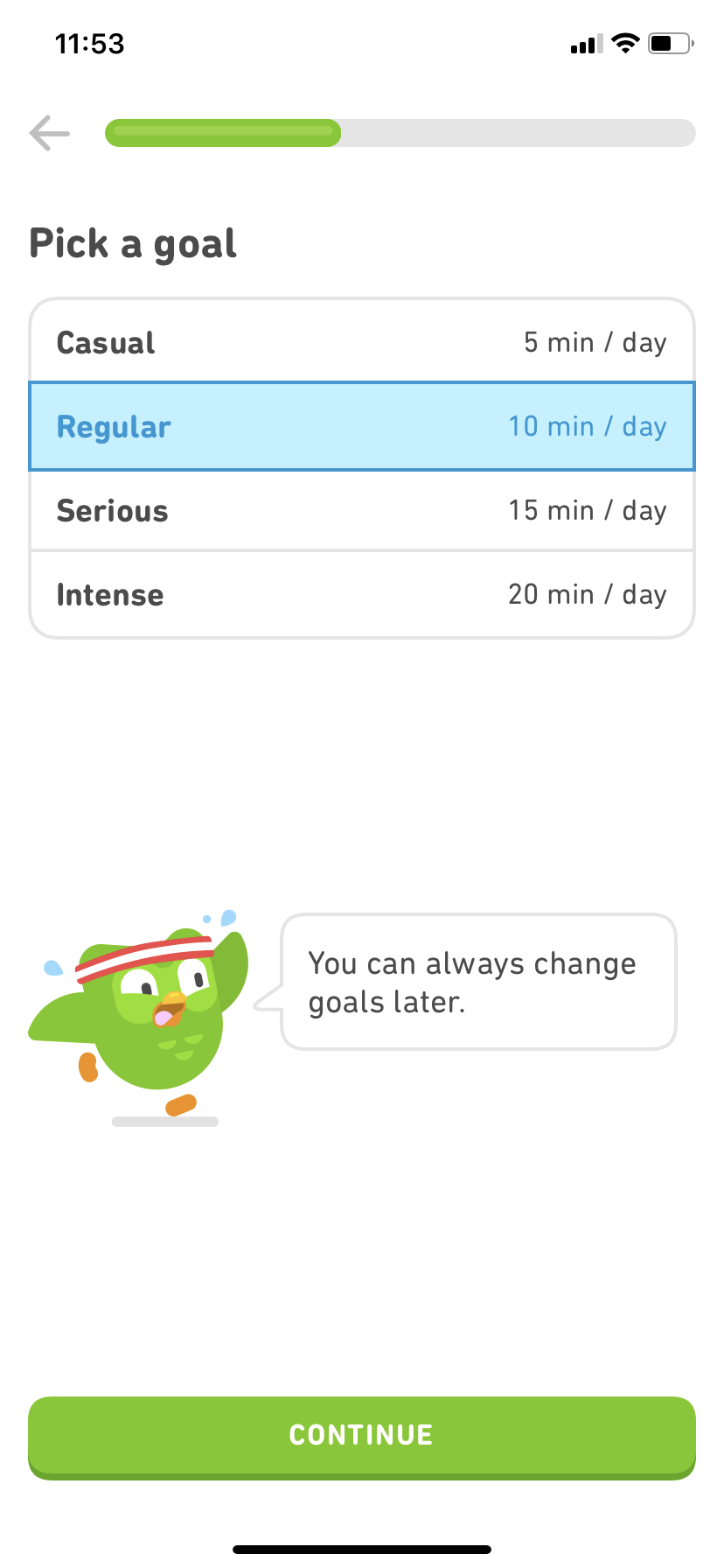
This language learning app is a great example of several onboarding best practices.
For starters, Duolingo segments uses based on skill level since beginners and more advanced learners have very different needs. By identifying where the user is in their language-learning journey, Duolingo can put them on the right path to reach their aha moment as soon as possible.
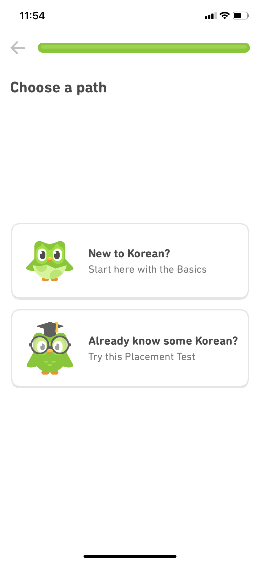
Duolingo also asks the user to pick a goal. Setting a clear goal increases motivation and retention—and gives Duolingo another clue about how to tailor the experience.
Looking for a more? Find out how Yotpo used Appcues to increase new user engagement, drive feature adoption, and improve retention.
Once a user graduates from the beginner stage to become a regular user of your product, you need to take a slightly different approach to influence further feature adoption. Since, in most cases, regular users will have the basics down, you need to switch your focus to highlighting “deeper” features and use cases.
Ongoing education using tooltips and tours helps these more experienced users get more out of your product. By surfacing features they either don’t know about or just haven’t incorporated into their workflows, you can help increase both their feature adoption and their product proficiency.
The more features they use, the more users will be able to accomplish, and the more confident they’ll be about their own abilities and your product’s value. And the more features a user incorporates into their workflow, the more embedded your product becomes into their day-to-day—increasing retention in the long term.
Ongoing education is also extremely helpful in overcoming “feature blindness.” We humans are pretty good at filtering out anything that we consider irrelevant. We do it with online ads all day every day. Feature blindness is a similar phenomenon in which users stop noticing features that they don’t use regularly. It’s kind of a use-it-or-lose-it situation.
Well-placed prompts, highlights, and tooltips can encourage regular users to reactivate these neglected features. This is especially important if the feature in the blindspot is part of your app’s core functionality. It’s one thing for a user to ignore a nice-to-have feature, but if they stop or never start using a core featurem, that undermines your product’s ability to deliver value. No value, no retention.
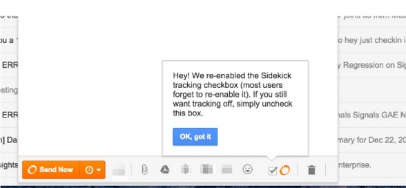
Originally called Sidekick, HubSpot Sales is a suite of time-saving sales tools including email templates, sequences, tracking, and scheduling. Early on, Hubspot ran into a surprising challenge with their email tracking feature.
Despite the fact that being able to see when an email recipient received and opened an email was one of the product’s super powers, users were turning the “open-tracking” feature off. Even after they’d had an initial positive experience, they were opting out.
The problem was that, without this key feature, the product’s ability to deliver value was severely hampered.
As it turned out, users were turning tracking off for specific emails, and then forgetting to turn it back on. Over time, they forgot about the feature (there’s that feature blindness), and just left it disabled.
While HubSpot could have left open-tracking always on, this would have forced users to uncheck the feature manually when they wanted to send an email without tracking.
To avoid creating friction, their solution was to automatically turn tracking back on after long periods of inactivity. The key to making this work was that they reintroduced the feature with a tooltip so that users could rediscover it.
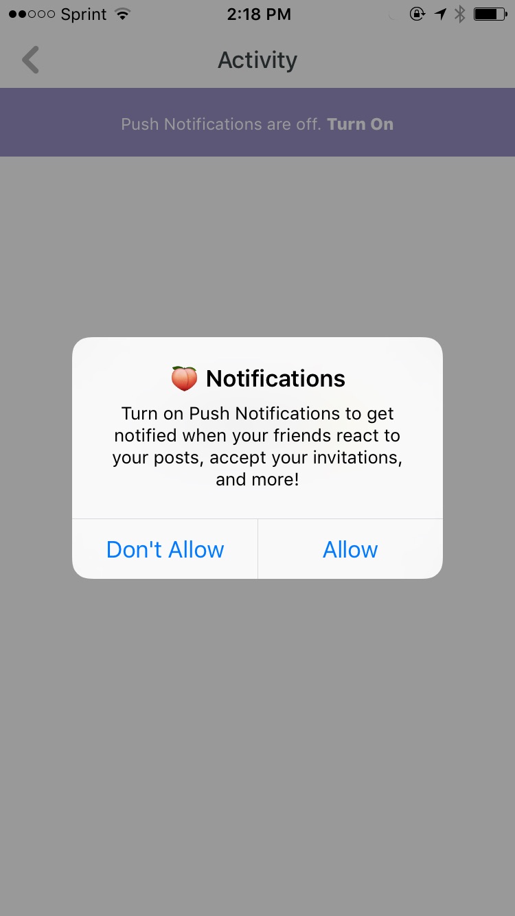
Push notifications are vital for social networks and messaging apps to maintain and increase user engagement. Despite this, many apps only offer the opportunity to turn on notifications during initial onboarding.
Gone-but-not-forgotten social media app Peach did a lot of things right (people were devastated when the app went down). For instance, instead of asking users to enable notifications right away, they guided users through the rest of their profile set up first.
Then, they used 2 in-app messages to encourage users to turn push notifications on.
When a user landed on their empty activity feed for the first time, Peach served up a prompt inviting them to allow notifications.
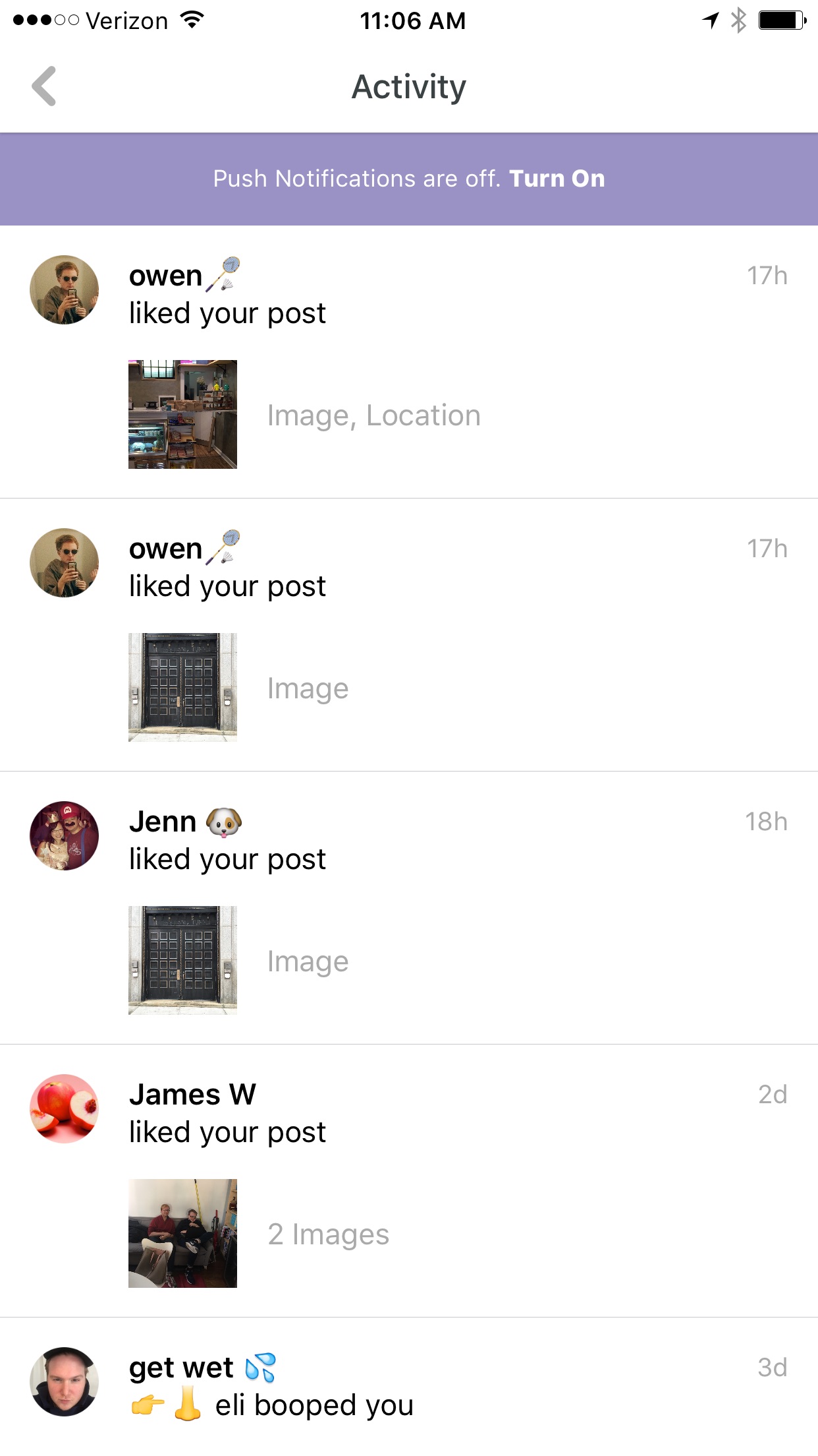
Then, if the user declined that initial invitation, Peach presented a persistent banner in the notifications feed as a contextual reminder.
When you have a complex product like Airtable’s relational database, providing contextual guidance is especially important. But you don’t want that guidance to disrupt the user experience. Airtable does a great job of presenting relevant tooltips in context in a way that helps the user along without slowing them down.
Updating and adding new bells and whistles to your product is always exciting (and it’s a necessary part of the game if you want to keep up with the Joneses). New features are also an excellent opportunity to boost engagement and win back lapsed users.
But you have to be a little careful about how you handle new feature announcements. Too many too often can start to feel like spam, and users will completely tune out.
The key to ensuring your announcement is well received is making sure you deliver it in the right context.
While an email announcement is a good support tactic for getting the word out about a new feature, an in-app tooltip delivered while someone is using your product will get more attention and—if it delivers valuable information relevant to the specific task at hand—more actual engagement.
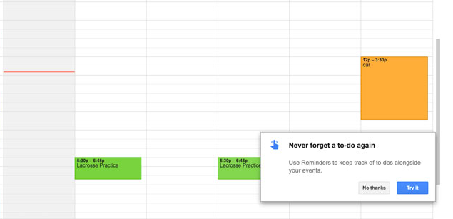
When Google launched Reminders for their Calendar app, they didn’t make the mistake of assuming that all users would know how and why to use this new feature. Instead, they used a pop-up modal to launch a short, focused tutorial that takes place in the app and makes it easy for users to start using the feature right away.
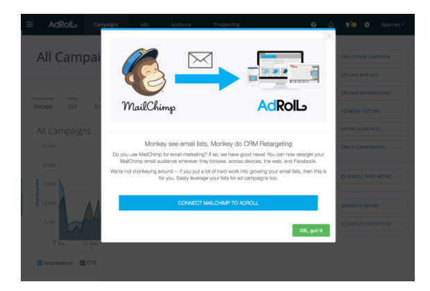
AdRoll used segmentation to their advantage when they released their MailChimp integration. Since they knew this added feature would only matter to users who were already MailChimp customers, their pop-up modal promoting the integration was only delivered to users in the MailChimp customer segment.
When Github uses a tooltip to highlight a new feature, they make sure it’s specific, contextual, and timely—appearing exactly when the user is most likely to interact with the feature. They also routinely include links to more information for users who want to go deeper.

Find out how Litmus used Appcues to create new feature announcements that increased feature adoption by up to 2100%.
Converting and activating new users is kind of like the falling-in-love part of a relationship. It’s exciting getting to know someone. And new users are obviously necessary for growth. But it’s crucial to realize that your job doesn’t end with activation. Just like in real life, keeping a relationship strong takes work.
Adoption is the foundation of a healthy, growing software company. It’s how you move your users from the beginner stage to the regular stage and put them squarely on the path to becoming champions who just can’t say enough good things about your product to anyone who will listen.
Using feature tours and prompts to create an ongoing dialog with your users is a very effective way of nurturing your relationship by delivering helpful and relevant information that is focused on driving their success with your product.
If you’d like to learn more about building these kinds of experiences without taxing your development team’s resources, our team here at Appcues would love to chat. Learn more, try it out, get in touch!


.png)