← Visit Appcues.com
×
×

10 tooltip examples to help level up your in-app messaging
How 10 popular products improve feature adoption using tooltips.
Skip to section:

Skip to section:

No two tourists are exactly alike. Some travelers are thrilled by discovering hidden gems through a combination of exploration and sheer luck. Others know exactly what they’re looking for and head directly to the first of many famous landmarks. Some wouldn’t even go outside without the assistance of an experienced tour guide.

The same goes for users of your product. Some are familiar with your UI to the point where any disruption to their routine causes frustration. Others are new, excited, and perhaps a bit confused about the best way to use your product to accomplish their goals. At least one person is actively trying to remember their log-in password and has been for the last fifteen minutes.

Tooltips act as tour guides for your app. They provide simple but essential information for users as they click and hover their way through your product. Tooltips help guide customers through the discovery of new features and services. Used correctly, even basic tooltips help enhance your user experience by minimizing friction. The opposite is also true: Used poorly, tooltips can frustrate users by disrupting their journey through your product. So how does one find the perfect tour guide for so many different types of tourists?

The key to building A+ tooltip content is simplicity. The best tooltips deliver a concise and easy-to-read message to the customer. They also provide opt-out options for users who would rather guide themselves through your features. Finding the right blend of “helpful” and “simple” can be a delicate balancing act. However, when done right, tooltips like the ones below drive product adoption by creating a more seamless user experience.

1. Slack’s Quick Switcher search

Team messaging app Slack’s built-in search tool is called the Quick Switcher. This sidebar is the fastest way to get around an app that handles a high volume of conversations every day. Messages often get tangled, channels can become congested, and important information can quickly become buried.

screen grab of slack app with tooltip

Why the tooltip works

Slack made users aware of the search feature through a tooltip that demonstrates the search functionality. However, instead of explaining the functionality (searching messages), the tooltip explains how the search feature benefits the user (getting around Slack faster).

The Quick Switcher is easy to use, so Slack wisely dedicates the copy to explaining why customers should use it, not how. This copy is easy to read as the blue tooltip contrasts nicely against the rest of the UI.  It also offers an option to hide the sidebar button in a single click for maximum ease. Finally, the tooltip provides a keyboard shortcut to make navigation even faster for developers and other Slack users who might prefer the keyboard.

2. Google Analytics’ custom reports

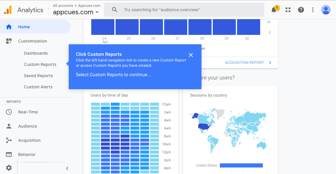
Tooltips are particularly effective for complex tools like Google Analytics. The user interface is quite busy to begin with, with many features hidden behind small icons. Tooltips help highlight subtle changes to the UI that would otherwise be ignored, helping to spur feature adoption without cluttering up the interface.
screen grab of google analytics dashboard with tooltip

Why the tooltip works

Google uses tooltips to guide users through each click instead of automatically taking users to the custom reports feature. This builds familiarity with the interface and makes it easier for users to find their way back on future visits.

Importantly, this tooltip provides minimal disruption to users who don’t want additional assistance. These users can opt out of the tooltips using the cursor instead of being stuck on a tooltip-aided tour.

3. LinkedIn’s simple introduction to reactions

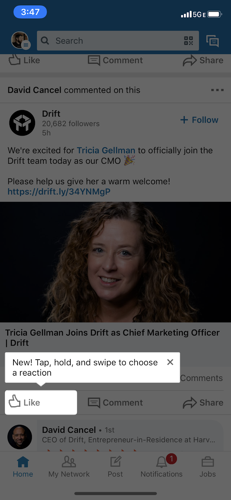
Tooltips are often best used when pointing out easy-to-miss changes. When LinkedIn added the ability to react to posts in 2019, they opted for a single, minimalist tooltip to highlight the new feature.

screengrab of linkedin app with tooltip

Why the tooltip works

LinkedIn’s tooltip is notable because it’s both so simple and so effective. Instead of telling users what reactions are, LinkedIn gives users just enough information to pique their curiosity and encourage them to explore the functionality on their own. While the tooltip doesn’t contrast aesthetically with the rest of the app, the background does dim to draw attention to the message.

4. GoTo Webinar’s tooltip walkthrough

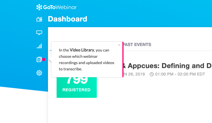
Tooltips can be used in conjunction with other in-app messages like modal popups to build guided tours for users. When webinar hosting service GoToWebinar rolled out their Transcription feature, they used Appcues to create a new feature announcement slideout and tooltip walkthrough.
screen grab of GoToWebinar app with video library tooltip

Why the tooltip works

GoTo Webinar keeps the walkthrough brief—5 steps in total—and keeps the amount of copy in each step to a minimum. This flow targets returning users who probably don’t need much hand-holding. The walkthrough is thorough without feeling overwhelming and shows users how to access this somewhat “hidden” feature in the future.

5. GitHub’s contextual feature announcements

Software development platform GitHub uses tooltips to highlight new features, provide links to related support articles, and give helpful tips so users can get more value from the platform.

screen grab of Github comment edit history tooltip

Why the tooltip works

GitHub’s tooltips are specific, contextual, and timely, appearing when a user is most likely to interact with a new feature. The example above provides enough information for the average user. However, it also provides a hyperlink to further resources for users requiring more details. This prevents the tooltip from becoming oversaturated with too much detail and instead focuses the reader’s attention on the most essential information.

OUR FAVORITE TIP

Skip the Sprint—add in-app Tooltips (*without* a developer)

  • Guide users through new features with a tooltip walkthrough
  • Add much-needed context to feature announcements
Charts and graphs

6. HubSpot’s efficient conversations

Marketing platform HubSpot has constantly evolved since launching way back in 2005, with regular tweaks, updates, and new features. They often use tooltips to ensure that users discover and adopt each new feature to get the most out of the tool’s capabilities.
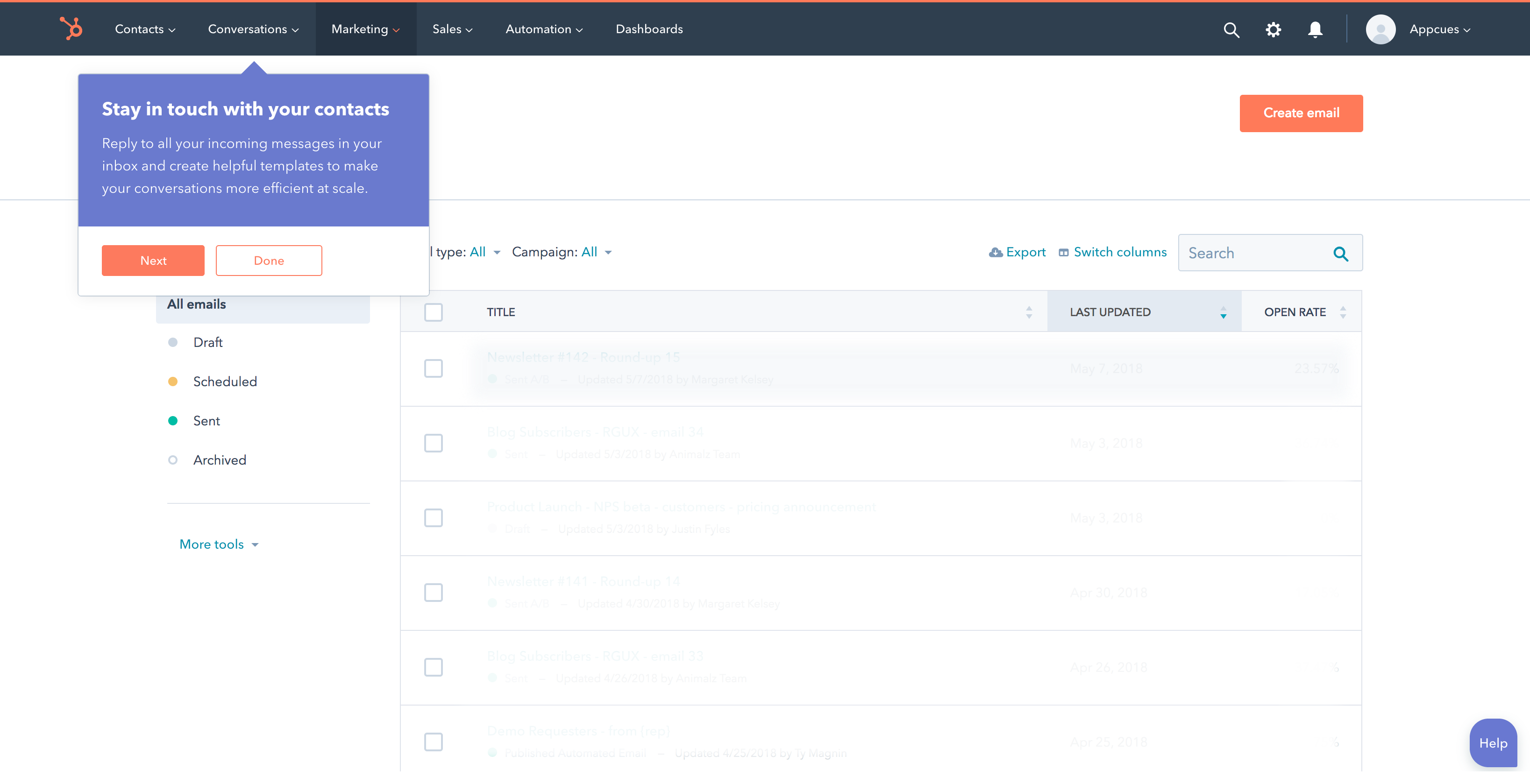
screen grab of hubspot dashboard with tooltip

Why the tooltip works

HubSpot’s tooltips make great use of contrast. The purple background stands out against the mostly white interface, and the CTA buttons’ colors are consistent across both tooltips and app. Additionally, the headline and body copy in this tooltip clearly outline the benefits of the new feature. This helps focus the in-app messages around the user’s goals, not the features themselves.

7. Grana’s on-brand announcements

The best tooltips reflect the aesthetic, voice, and culture of a brand. Grana is an online clothing store that emphasizes transparency. The company’s web experience reflects its style—essentials and basics—and its principles.

screen grab of grana website with tooltip

Why the tooltip works

For sold-out items, Grana displays a tooltip over the size-selection buttons to let consumers quickly know just what they need to know. It’s pretty annoying when shopping sites don’t inform shoppers of the status of any item until after selections are made. This approach also lets consumers know what “sold out” looks like for future browsing.

Grana wisely chose a color for its tooltip that isn’t included elsewhere on the page. This provides maximum contrast and draws the user’s attention to the tooltip text. However, the tip itself is small and concise enough that it doesn’t disrupt the buying experience.

8. Instacart’s friction-free promotions

The online grocery delivery service Instacart offers a few promotions to new and existing consumers. The company uses a tooltip to remind new users of a free delivery offer during the shopping experience.
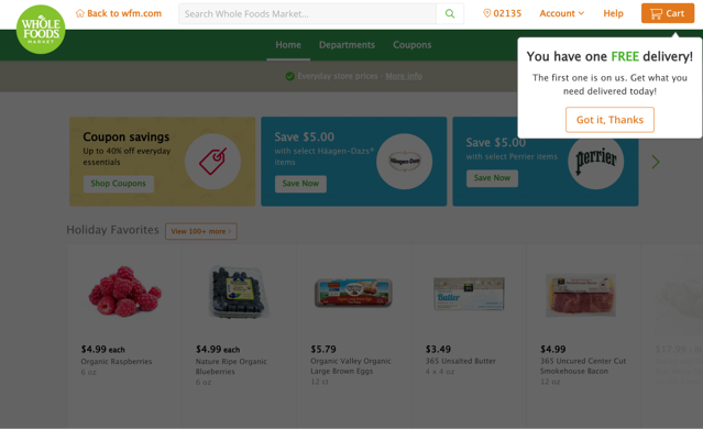
screengrab of instacart app with tooltip

Why the tooltip works

This tooltip is simple and to the point. It efficiently addresses two separate but equally important purposes. First, the headline emphasizes the value of the deal to the user by contrasting against the background color and using all caps. Secondly, the tooltip brings attention to the deal but only requires a single click to dismiss. This last point is especially important for new users, a group often susceptible to churning when faced with friction in their user journey.

9. Yelp’s flagging of important features

Yelp is increasingly becoming more than just a site for consumer-driven reviews. Even frequent visitors can easily miss important features buried deep within its UI. Instead of hoping customers discover these features on their own, Yelp draws attention to them with a blue tooltip.

screen grab of yelp sidebar with tooltip

Why the tooltip works

Yelp draws attention to this important offer by flagging it with a tooltip that pleasantly contrasts with the rest of the UI. This particular tooltip is only meant to attract attention, so it doesn’t contain a CTA or other link for further action. Instead, it reiterates the value of Yelp Cash Back to the user without breaking the user experience.

10. Amazon’s informative empty states

Online retail juggernaut Amazon uses personalization as a way to boost engagement and drive sales.Customers can “heart” items they find interesting as they shop. These “hearted” items provide a basis for Amazon’s recommendation engine to predict other items the customer may find interesting. The company uses tooltips in their mobile app to simply explain a rather involved process.
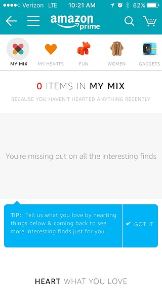
screengrab of amazon my mix view with tooltip

Why the tooltip works

When a customer hasn’t “hearted” any items, their list of personalized recommendations remains empty. This doesn’t help the customer or Amazon. It probably doesn’t help that “My Mix” doesn’t explain anything about what a mix is or why a customer should want one.

Amazon uses a blue tooltip in its mobile app to overcome this gap in information. The copy explains how the recommendation system works in simple language. The tooltip arrow points at an empty field and suggests how to fill it and why filling it is in the customer’s interest.

Help your users help themselves

Smarter, sharper tooltips are possible. Luckily, adhering to a few simple tips can elevate your tooltip game to customer-pleasing levels:

  • Keep the copy short and simple.
  • Allow users to opt out of or close the tooltip with a single click.
  • Contrast the tooltip with the rest of your UI to draw attention to it.
  • Highlight the value of the feature when possible.
  • Always keep the user’s goals in mind.

No single tooltip can appease every single customer’s preferences and needs. However, it can’t hurt to strive for tooltip perfection. French philosopher Albert Camus wrote, “The struggle itself toward the heights is enough to fill a man’s heart.” We’re pretty sure he was talking about tooltips.

Author's picture
Katryna Balboni
Content and Community Director at User Interviews
Katryna is the Content and Community Director at User Interviews. Before User Interviews, she made magic happen with all things content at Appcues. Her non-work time is spent traveling to new places, befriending street cats, and baking elaborate pies.
Skip to section:

Skip to section:

No two tourists are exactly alike. Some travelers are thrilled by discovering hidden gems through a combination of exploration and sheer luck. Others know exactly what they’re looking for and head directly to the first of many famous landmarks. Some wouldn’t even go outside without the assistance of an experienced tour guide.

The same goes for users of your product. Some are familiar with your UI to the point where any disruption to their routine causes frustration. Others are new, excited, and perhaps a bit confused about the best way to use your product to accomplish their goals. At least one person is actively trying to remember their log-in password and has been for the last fifteen minutes.

Tooltips act as tour guides for your app. They provide simple but essential information for users as they click and hover their way through your product. Tooltips help guide customers through the discovery of new features and services. Used correctly, even basic tooltips help enhance your user experience by minimizing friction. The opposite is also true: Used poorly, tooltips can frustrate users by disrupting their journey through your product. So how does one find the perfect tour guide for so many different types of tourists?

The key to building A+ tooltip content is simplicity. The best tooltips deliver a concise and easy-to-read message to the customer. They also provide opt-out options for users who would rather guide themselves through your features. Finding the right blend of “helpful” and “simple” can be a delicate balancing act. However, when done right, tooltips like the ones below drive product adoption by creating a more seamless user experience.

1. Slack’s Quick Switcher search

Team messaging app Slack’s built-in search tool is called the Quick Switcher. This sidebar is the fastest way to get around an app that handles a high volume of conversations every day. Messages often get tangled, channels can become congested, and important information can quickly become buried.

screen grab of slack app with tooltip

Why the tooltip works

Slack made users aware of the search feature through a tooltip that demonstrates the search functionality. However, instead of explaining the functionality (searching messages), the tooltip explains how the search feature benefits the user (getting around Slack faster).

The Quick Switcher is easy to use, so Slack wisely dedicates the copy to explaining why customers should use it, not how. This copy is easy to read as the blue tooltip contrasts nicely against the rest of the UI.  It also offers an option to hide the sidebar button in a single click for maximum ease. Finally, the tooltip provides a keyboard shortcut to make navigation even faster for developers and other Slack users who might prefer the keyboard.

2. Google Analytics’ custom reports

Tooltips are particularly effective for complex tools like Google Analytics. The user interface is quite busy to begin with, with many features hidden behind small icons. Tooltips help highlight subtle changes to the UI that would otherwise be ignored, helping to spur feature adoption without cluttering up the interface.

screen grab of google analytics dashboard with tooltip

Why the tooltip works

Google uses tooltips to guide users through each click instead of automatically taking users to the custom reports feature. This builds familiarity with the interface and makes it easier for users to find their way back on future visits.

Importantly, this tooltip provides minimal disruption to users who don’t want additional assistance. These users can opt out of the tooltips using the cursor instead of being stuck on a tooltip-aided tour.

3. LinkedIn’s simple introduction to reactions

Tooltips are often best used when pointing out easy-to-miss changes. When LinkedIn added the ability to react to posts in 2019, they opted for a single, minimalist tooltip to highlight the new feature.


screengrab of linkedin app with tooltip

Why the tooltip works

LinkedIn’s tooltip is notable because it’s both so simple and so effective. Instead of telling users what reactions are, LinkedIn gives users just enough information to pique their curiosity and encourage them to explore the functionality on their own. While the tooltip doesn’t contrast aesthetically with the rest of the app, the background does dim to draw attention to the message.

4. GoTo Webinar’s tooltip walkthrough

Tooltips can be used in conjunction with other in-app messages like modal popups to build guided tours for users. When webinar hosting service GoToWebinar rolled out their Transcription feature, they used Appcues to create a new feature announcement slideout and tooltip walkthrough.

screen grab of GoToWebinar app with video library tooltip

Why the tooltip works

GoTo Webinar keeps the walkthrough brief—5 steps in total—and keeps the amount of copy in each step to a minimum. This flow targets returning users who probably don’t need much hand-holding. The walkthrough is thorough without feeling overwhelming and shows users how to access this somewhat “hidden” feature in the future.

5. GitHub’s contextual feature announcements

Software development platform GitHub uses tooltips to highlight new features, provide links to related support articles, and give helpful tips so users can get more value from the platform.

screen grab of Github comment edit history tooltip

Why the tooltip works

GitHub’s tooltips are specific, contextual, and timely, appearing when a user is most likely to interact with a new feature. The example above provides enough information for the average user. However, it also provides a hyperlink to further resources for users requiring more details. This prevents the tooltip from becoming oversaturated with too much detail and instead focuses the reader’s attention on the most essential information.

OUR FAVORITE TIP

Skip the Sprint—add in-app Tooltips (*without* a developer)

  • Guide users through new features with a tooltip walkthrough
  • Add much-needed context to feature announcements
Charts and graphs

6. HubSpot’s efficient conversations

Marketing platform HubSpot has constantly evolved since launching way back in 2005, with regular tweaks, updates, and new features. They often use tooltips to ensure that users discover and adopt each new feature to get the most out of the tool’s capabilities.

screen grab of hubspot dashboard with tooltip

Why the tooltip works

HubSpot’s tooltips make great use of contrast. The purple background stands out against the mostly white interface, and the CTA buttons’ colors are consistent across both tooltips and app. Additionally, the headline and body copy in this tooltip clearly outline the benefits of the new feature. This helps focus the in-app messages around the user’s goals, not the features themselves.

7. Grana’s on-brand announcements

The best tooltips reflect the aesthetic, voice, and culture of a brand. Grana is an online clothing store that emphasizes transparency. The company’s web experience reflects its style—essentials and basics—and its principles.

screen grab of grana website with tooltip

Why the tooltip works

For sold-out items, Grana displays a tooltip over the size-selection buttons to let consumers quickly know just what they need to know. It’s pretty annoying when shopping sites don’t inform shoppers of the status of any item until after selections are made. This approach also lets consumers know what “sold out” looks like for future browsing.

Grana wisely chose a color for its tooltip that isn’t included elsewhere on the page. This provides maximum contrast and draws the user’s attention to the tooltip text. However, the tip itself is small and concise enough that it doesn’t disrupt the buying experience.

8. Instacart’s friction-free promotions

The online grocery delivery service Instacart offers a few promotions to new and existing consumers. The company uses a tooltip to remind new users of a free delivery offer during the shopping experience.

screengrab of instacart app with tooltip

Why the tooltip works

This tooltip is simple and to the point. It efficiently addresses two separate but equally important purposes. First, the headline emphasizes the value of the deal to the user by contrasting against the background color and using all caps. Secondly, the tooltip brings attention to the deal but only requires a single click to dismiss. This last point is especially important for new users, a group often susceptible to churning when faced with friction in their user journey.

9. Yelp’s flagging of important features

Yelp is increasingly becoming more than just a site for consumer-driven reviews. Even frequent visitors can easily miss important features buried deep within its UI. Instead of hoping customers discover these features on their own, Yelp draws attention to them with a blue tooltip.

screen grab of yelp sidebar with tooltip

Why the tooltip works

Yelp draws attention to this important offer by flagging it with a tooltip that pleasantly contrasts with the rest of the UI. This particular tooltip is only meant to attract attention, so it doesn’t contain a CTA or other link for further action. Instead, it reiterates the value of Yelp Cash Back to the user without breaking the user experience.

10. Amazon’s informative empty states

Online retail juggernaut Amazon uses personalization as a way to boost engagement and drive sales.Customers can “heart” items they find interesting as they shop. These “hearted” items provide a basis for Amazon’s recommendation engine to predict other items the customer may find interesting. The company uses tooltips in their mobile app to simply explain a rather involved process.

screengrab of amazon my mix view with tooltip

Why the tooltip works

When a customer hasn’t “hearted” any items, their list of personalized recommendations remains empty. This doesn’t help the customer or Amazon. It probably doesn’t help that “My Mix” doesn’t explain anything about what a mix is or why a customer should want one.

Amazon uses a blue tooltip in its mobile app to overcome this gap in information. The copy explains how the recommendation system works in simple language. The tooltip arrow points at an empty field and suggests how to fill it and why filling it is in the customer’s interest.

Help your users help themselves

Smarter, sharper tooltips are possible. Luckily, adhering to a few simple tips can elevate your tooltip game to customer-pleasing levels:

  • Keep the copy short and simple.
  • Allow users to opt out of or close the tooltip with a single click.
  • Contrast the tooltip with the rest of your UI to draw attention to it.
  • Highlight the value of the feature when possible.
  • Always keep the user’s goals in mind.

No single tooltip can appease every single customer’s preferences and needs. However, it can’t hurt to strive for tooltip perfection. French philosopher Albert Camus wrote, “The struggle itself toward the heights is enough to fill a man’s heart.” We’re pretty sure he was talking about tooltips.

Author's picture
Katryna Balboni
Content and Community Director at User Interviews
Katryna is the Content and Community Director at User Interviews. Before User Interviews, she made magic happen with all things content at Appcues. Her non-work time is spent traveling to new places, befriending street cats, and baking elaborate pies.
You might also like...