.png)

Here's a question nobody asks: what's the best UX you experienced today?
You probably can't answer it. Not because your day was badly designed - but because the best UX is invisible. It doesn't announce itself. It just quietly removes the thing that was in your way.
The products that get held up as gold standards of user experience design rarely got there through visual polish alone. They got there by solving specific, real problems in ways their users didn't have to think about. Slack's search prompts don't feel like upsells. Netflix's "Skip intro" button doesn't feel like a feature. Stripe's payment forms don't feel like work. They just feel like less friction.
That's the pattern worth chasing: not beautiful interfaces (though those help), but invisible ones.
We've put together 15 UX design examples from well-known products - organized by the principle each example demonstrates, not just a gallery of screenshots. (Looking for examples focused specifically on driving user action? See our companion piece: 12 UX design examples that motivate users to take action.) Whether you're a product manager looking for patterns to steal or a designer trying to articulate why something works, these examples give you a framework to take back to your own product.
Each example covers what it is, why it made the list, the specific UX detail that makes it work, and a concrete takeaway you can apply.
The examples in this category earn their place by doing less. The UX win isn't a clever new feature - it's the elimination of an unnecessary step, a cognitive burden, or a recurring annoyance. These products identified something users had to do and made it disappear.
Most SaaS products fire upgrade prompts on a schedule - end of the free trial, first Monday of the month, whenever the marketing team sets a campaign. Slack takes a different approach.
Slack surfaces upgrade prompts only when a user hits an actual limit. You search for a message from three months ago and hit the search cap. Immediately, a prompt appears explaining what happened and what the upgrade unlocks. The message storage fills up and the product tells you directly - here's what's happening, here's what fixes it.
This is good UX because the upsell helps the user instead of interrupting them. The user has already discovered the value gap themselves. The prompt just points to the bridge.
The conversion logic is straightforward: users who have already discovered the value gap convert at much higher rates than users who receive a general upgrade prompt - because the value proposition is proven, not hypothetical. They don't need convincing; they've already convinced themselves. (You can see Slack's integrated upsell prompts in detail on our GoodUX site.)
What to take away: Time your upgrade prompts to the moment of need, not to your marketing calendar. Users convert when they feel the value gap themselves, not when you tell them it exists.
It appeared in 2017 and it's become table stakes for streaming UX. The "Skip intro" button is a masterclass in solving a small, recurring frustration.
Before it existed, every binge-watching session involved the same ritual (Netflix's own retrospective tells the full story): wait for the intro to finish, or frantically scrub forward while trying to land on the right spot. Netflix identified the pattern - users were consistently skipping intros manually - and automated it. One well-placed button at the right moment, disappearing when it's no longer relevant.
What makes this example worth studying isn't the feature itself - it's the restraint around it. The button only appears when an intro is detected. It doesn't clutter every video. It doesn't require a setting toggle. It's contextually smart and visually quiet.
Netflix reported that tens of millions of users click this button per day. The feature cost very little to build relative to the experience improvement it delivers.
What to take away: Look for repetitive micro-frustrations in your product and automate them away. The best UX features are the ones users never have to think about - they just experience fewer obstacles.
Sending an email is one of the most irreversible actions in everyday digital life. You hit send, and it's gone. Gmail's "Undo Send" feature adds a tiny safety net around that moment - a brief window (typically 5-30 seconds, user-configured) during which you can call the email back.
The feature doesn't change how you send Gmail. You still hit the same button, the email still feels sent, and most of the time you never touch "Undo Send" at all. But when you notice the typo or realize you forgot the attachment, it's there. That's the UX principle: add safety nets around high-stakes, irreversible actions without adding friction to the normal path.
"Undo Send" existed as an opt-in Labs feature for years before Google made it default. The lesson there is worth noting too: features that reduce anxiety often have slow adoption when buried, but strong retention once surfaced.
What to take away: Add safety nets around irreversible actions. A small delay or confirmation step can eliminate user anxiety without changing the flow for users who don't need it.
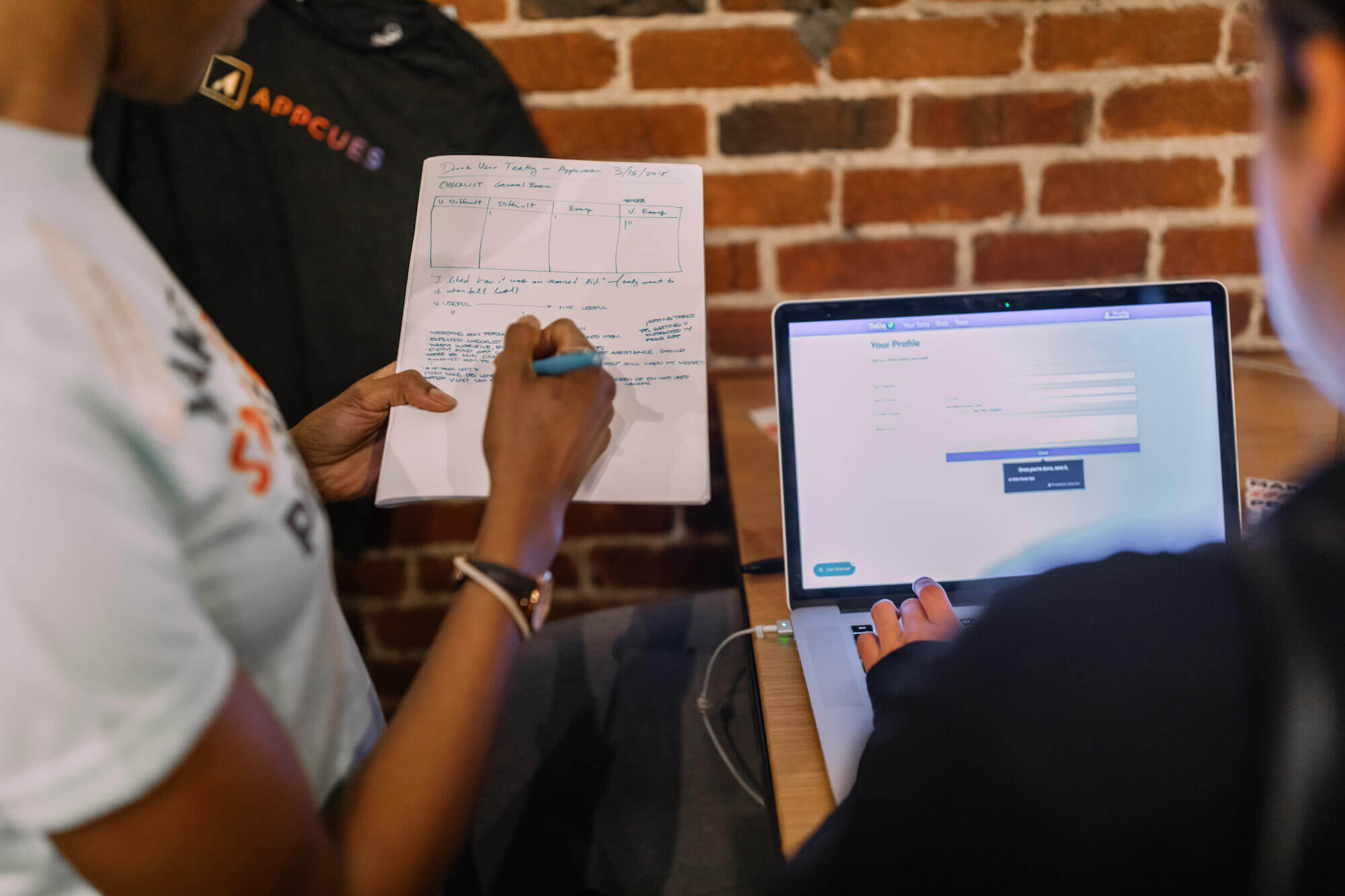
Feedback isn't an afterthought in these products - it's a core part of the experience. The examples below show how product teams bake user research and listening into the UX itself: timed well, scoped tightly, and designed to generate useful signal rather than noise.
Even Google, with their data reservoirs and army of UX researchers, still needs to talk to their users to fuel ongoing optimization.
The reason? They need to find out the why behind the what. But to avoid getting swamped by qualitative data, they carefully choose their questions to get the specific answers they want.
Google uses a mixture of multiple-choice questions and open questions to add depth to their research. And the specificity helps them retain focus on what really matters.
First, and most importantly, they ask why people are using their product. This provides the context of people's needs. When you understand this, you can effectively design for solutions. Second, speed and performance are essential to the success of a spreadsheet. Google concentrates on this point with the follow-up questions to get the full story of what users think, expect, and want from the product.
The surveys appear at quiet moments - not mid-task, not on first login, but during natural pauses when users have headspace to engage.
What to take away: Ask specific questions at quiet moments. "How are we doing?" yields generic answers. "Why are you using this product, and how does speed affect your experience?" yields insight you can act on. Research from Qualaroo found that contextually triggered in-app surveys see response rates 10-30% higher than email-based surveys, precisely because the context is fresh.
With ClassPass, having access to a global network of fitness studios helps users reach their fitness goals. There are tons of options, ways, and places to keep fit - from yoga to spin classes to boxing gyms. But if you walk into a class labeled "beginner" and find a drill-sergeant instructor, the mismatch can break the experience entirely.
Understanding that a first-time experience can make or break a user, ClassPass makes sure they get accurate feedback on all their classes as soon as possible. The next opportunity ClassPass has to get feedback on a session is the next time the user logs into their account. So that's exactly when they fire the modal - capturing the user's review of the class and, most importantly, the ability level they felt it was.
From this collective knowledge supplied by users, ClassPass can accurately categorize their classes instead of relying on their own interpretation. The feedback doesn't feel like homework because it's relevant, brief, and timely.
What to take away: Collect feedback as close to the experience as possible. The gap between an event and its recall is where useful data goes to die. Time your surveys to natural re-entry moments, not to a weekly batch job. In SaaS, products like Calendly and Loom use the same pattern - firing a one-question rating prompt immediately after a completed meeting or video share, when the experience is still fresh.
When Figma shipped floating side panels as part of a UI refresh, the response from users was fast and clear: they didn't like it. Figma rolled the change back. Quickly. And they communicated why.
This is genuinely rare. Most product teams push through unpopular UI changes, citing a "period of adjustment" or pointing to their own research as justification. Figma did the harder thing: they listened to the signal, acknowledged the friction, and reversed the decision publicly.
The result wasn't just a better UI - it was a trust event. Figma demonstrated that user feedback isn't collected as a formality. It's treated as a real product input. That kind of responsiveness tends to strengthen the feedback loop itself - users are more willing to share opinions when they believe those opinions matter.
What to take away: Ship fast, but listen faster. If users push back on a change with consistency and clarity, responding with speed and transparency builds more trust than the original feature ever could. Rolling back isn't failure - it's signal processing.
Generic experiences feel generic. The examples in this category show what happens when products design for context - what the user is trying to accomplish right now, where they are in the user journey, and how they want to feel. The result is UX that feels personal without being complicated.
Most search interfaces are built around the database behind them. You filter by number of bedrooms because that's a field in the schema. You filter by price range because that's a column in the table.
Airbnb made a different decision. Their filters aren't built around specs - they're built around experiences. "Cabins." "Caves." "Earth homes." "Treehouses." This changes how people search: not for what they need, but for how they want to feel. The shift is subtle but powerful. It moves the interface from transactional to aspirational.
Pair that with a layout that fluidly toggles between list view and map view - adapting to how different users prefer to explore - and you get a search experience that's responsive to individual browsing style, not just input fields.
The practical result is that users find listings they wouldn't have thought to search for, and they spend more time engaged with the product. Discovery becomes part of the experience, not just the means to a booking.
What to take away: Design filters and flows around user desires, not just database fields. Lead with how people want to feel, then support it with structure. Your schema is not your UX. Airbnb's category-based search redesign contributed to a reported 15% increase in bookings for non-traditional listing types in its first year - evidence that aspirational framing drives discovery and conversion.
Every music streaming service has listening data. Spotify built a cultural moment out of it.
Spotify Wrapped is an annual summary of each user's listening habits - but the way it's packaged transforms passive data into something users are proud to share. Top artists, total minutes listened, top genres, a "sound" personality. It's visual, it's personal, and it's designed specifically to be shared. Users don't just review their Wrapped summary - they post it.
The UX win here is the emotional layer placed on top of analytics. Raw numbers ("you listened to 48,302 minutes of music") become stories ("you were in the top 0.05% of Billie Eilish listeners"). The data is the same. The feeling it creates is completely different.
Spotify Wrapped generates significant social sharing and press coverage every December with no paid promotion - driven entirely by users who feel seen by a product they already use.
What to take away: Don't just show users their data - make it meaningful. When analytics become a mirror that reflects something users care about, UX becomes motivation. Think about the data you're already collecting and ask: what story does it tell about the person using your product?
Duolingo's streak counter itself is simple: complete a lesson every day, and your streak count goes up. Miss a day, and it resets. But Duolingo's real UX work is in the system built around that counter.
Streak Freeze lets you protect your streak on a day you can't practice. Streak Repair lets you recover after a miss. Animations celebrate milestones. Friend leaderboards add social accountability. The daily reminder isn't annoying because it's tied to something the user has explicitly chosen to pursue - learning a language.
This is gamification that works because it serves the user's goal, not just the platform's retention metrics. Duolingo has over 500 million registered users, and daily active user rates consistently outperform most consumer apps - the streak mechanic is a meaningful part of why.
The lesson isn't "add a streak counter to your product." It's that engagement mechanics land when they reinforce an outcome the user already wants.
What to take away: Gamification works when it serves the user's goal. The streak doesn't work because it's a clever retention trick - it works because learning a language is exactly what the user showed up to do. Align your mechanics with user intent, and the engagement follows.
Some of the most important UX work isn't flashy - it's the quiet consistency that makes users feel safe, especially in high-stakes moments. The examples in this category show how clarity, predictability, and thoughtful progressive disclosure build the kind of trust that keeps users coming back.
Stripe is boring in the best possible way.
Forms are quiet, flows are predictable, and field validation is clear. Error messages explain what happened without blaming the user. Interactions are rock-solid across every integration. When people enter credit card numbers, they're in a moment of heightened attention - and Stripe's job is to make that moment feel completely routine.
This is a deliberate design choice. Stripe could make their checkout flows more branded, more visually expressive, more differentiated. They don't - because differentiation in a payment flow creates hesitation, and hesitation creates drop-off. Their consistency across millions of integrations is itself the UX feature.
Stripe's developer experience earns equal praise for the same reason: clear docs, predictable APIs, error messages that explain rather than confuse. The design language is unified from the first API call to the final confirmation screen.
What to take away: Consistency isn't boring - it's reassuring. In mission-critical flows, make trust your primary UX feature. Save the creativity for moments where surprise is welcome. In the moments where users need confidence, give them exactly what they expect.
Bluetooth pairing has been a minor but persistent piece of friction in consumer technology for years. You go to Settings, find the device, tap pair, wait for the handshake, sometimes repeat. It works, but it's not invisible.
With AirPods, Apple reduced that process to a single action: open the case near your iPhone. Proximity triggers a connection prompt. Tap once to confirm. Done. No navigating to settings, no learning curve, no sequence to memorize. Setup becomes part of the physical unboxing - not a separate task you complete before you can use the product.
The UX logic here extends beyond headphones. Apple designed the moment where the product first earns trust - first use - to be as frictionless as anything that follows. The expectation is set immediately: this product works simply.
What to take away: Design your setup flows to feel like part of the product experience, not a prerequisite to it. The best user onboarding is the kind users don't notice - because it's indistinguishable from just using the product.
Notion starts simple: a blank page. That's both a feature and a risk. For new users, the blank canvas is welcoming - nothing to unlearn, nothing to navigate around. But Notion is a deeply capable tool, and if that depth were visible upfront, the blank page would feel like the edge of a cliff.
The solution is progressive disclosure via the slash command menu. Type "/" and you get a structured, searchable list of everything Notion can do - databases, toggles, callouts, linked views, and dozens more. New users discover what they need as they need it. Power users access every capability without leaving the keyboard. Complexity is hidden until requested.
This balance is genuinely hard to get right. Most products either under-surface features (users never find them) or over-surface them (users feel overwhelmed). Notion's slash command creates a demand-side reveal: depth appears when the user asks for it, not before.
What to take away: Reveal complexity gradually. Show what matters now, and let users pull more depth when they're ready for it. Progressive disclosure isn't about hiding features - it's about delivering them at the moment they become relevant. Amplitude takes a similar approach: smart presets and guided flows help users build their first dashboard without needing to understand every analytics option upfront.
The best product teams don't just ship and move on - they build measurement into the experience itself. These examples show how in-product feedback, real-time guidance, and intentional performance tradeoffs create products that get smarter over time.
The Net Promoter Score (NPS) is a proven, reliable metric for measuring customer sentiment, satisfaction, and loyalty. When your NPS is trending up, you know something is working. When it drops or plateaus, you know you've got work to do. It represents the overall health of your product's experience.
But NPS is only as good as the experience around it. The question itself is simple by design: "How likely are you to recommend this product to a friend or colleague?" One to ten. That simplicity is intentional - a lower-effort ask gets more honest responses. The real value, though, lives in the follow-up question: "What could we do better?" or "What's driving your score?" That's where the patterns emerge.
Timing is the critical variable. For SaaS products, there's no defined "end of experience" the way there is for a purchase or a support ticket. That means you have to be thoughtful about when to ask. The highest-signal NPS moments are transition points in the user journey: after a key activation event, after the user has had enough time to form an opinion, or when they return to the product after an absence.
Sampling matters too. Surveying everyone at once generates a noisy, moment-in-time snapshot. Rolling NPS - sampling a percentage of users on an ongoing basis - gives you a more stable read of sentiment over time and keeps individual users from feeling badgered. For NPS best practices, the combination of precise timing, rolling samples, and an always-present open-text follow-up is what separates useful programs from data collections that sit in a dashboard untouched.
What to take away: NPS isn't just a score - it's a UX pattern. The question is simple by design. The timing and follow-up are what make it useful. Fire it at transition points, sample on a rolling basis, and always pair the score question with an open-text field.
Loom skips the tutorial. There's no walkthrough video about how to make a walkthrough video. Instead, you land in the product and the interface gives you one clear invitation: "Start recording."
Visual prompts guide you as you go - what to click, what your recording looks like, when the countdown starts. Auto-transcripts appear immediately after you stop. Sharing happens in one click. The UX teaches through action, not explanation. First-time users become proficient without reading a help document, sitting through a demo, or clicking through an empty tour.
This is significant because the product's primary value - making asynchronous video communication feel easy - has to be experienced to be believed. Any amount of explaining reduces the impact. Loom bets that if they can get users to the first successful recording, the product sells itself. The UX is designed entirely around enabling that first moment.
What to take away: Bake learning into the product experience. When the interface is the tutorial, users build confidence through doing instead of reading. Identify the one action that proves your product's value and design a frictionless path to it.
Linear is a project management tool built for software development teams. And it makes no apologies for exactly that. There's no onboarding carousel. No tooltips explaining what a sprint is. No progressive disclosure for features that any experienced dev team will reach for on day one.
Every interaction in Linear is tuned for users who value speed over guidance. Keyboard shortcuts are first-class. The interface is dense but scannable. The product assumes you know what you're doing - and that assumption is itself a UX choice. By refusing to hand-hold, Linear communicates something to its target users: this was built for you specifically, not for everyone.
This is a risky tradeoff for most products. But Linear knows its audience well enough to make it confidently. The result is a tool that consistently earns strong word-of-mouth among developers precisely because it respects their time and doesn't treat them like beginners.
What to take away: Don't design for the masses if your product isn't for the masses. Knowing your user well enough to skip the basics is a genuine UX superpower. A product that makes assumptions about expertise - and gets them right - communicates deep respect for its users.
Fifteen examples across five categories, and a few clear patterns emerge. The best UX design examples aren't random - they share a common logic.
These patterns apply whether you're building a consumer app, a SaaS tool, or a complex enterprise platform. For more pattern-based examples, check out our guides to SaaS onboarding examples and onboarding UX patterns. The specific implementation changes. The underlying principles don't.
Great UX isn't a one-time project - it's the sum of every in-app moment. The examples in this article work because they show up at the right time, with the right message, for the right user. That's exactly what Appcues helps product teams build: personalized in-app experiences that guide users to value without requiring heavy engineering lift.
If you're ready to start building moments like these in your own product, Book a demo and see how it works.


.png)