.png)
Mobile app users are specific kinds of people. An app that doesn't get its point across quickly is an app that doesn't succeed. Onboarding's whole job is to get someone to their first real moment of value, the aha moment, before they lose interest and leave.
This guide covers both halves of that job: the UI/UX patterns you have to work with, and the best practices that make them land.
Mobile app onboarding is the process of introducing new users to your app and guiding them to their first moment of value (the aha moment). It includes welcome screens, guided tours, permission requests, and contextual tips.
Mobile onboarding can take many forms, but the basic components are fairly standard across apps. The welcome experience usually consists of overlays or full-screen modals that give a high-level view of features and value. After that, the patterns expand to include tooltips, hotspots, slideouts, and modals that serve as helpful tips along the user journey.
At the end of the experience, users should have the key information they need to navigate your app and get real value from it within the first session. The first time a user reaches that value is the aha moment, and onboarding exists to shorten the time it takes to get there.
Let's look at the core patterns first, then the best practices that make them work.
Highlight value, keep messaging succinct, include progress bars, allow skipping.
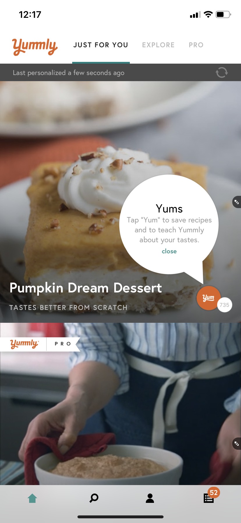
Many apps rely on user data to function. That doesn't have to be a hindrance. It's often a chance to provide a more personalized experience, and to show users you're doing so. Take advantage of the data users provide as early as possible to give instant feedback and signal that their inputs are shaping a tailored experience, not just being harvested. Tailoring the experience right out of the gate gives people more reason to stick around, because they know your content will be relevant to them.

Versatile for high-stakes messages: feature announcements, upsells, permission requests. Use sparingly.
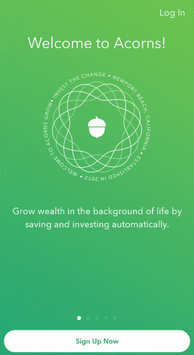
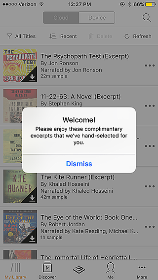
Mobile modals, which can be partial overlays (popups) or full-screen takeovers, are an extremely versatile pattern. Beyond the welcome message, modals work for any high-stakes or high-profile message: new feature announcements, product upsells, marketing campaigns, or essential permission requests.
.png)

Further reading: 8 examples of great mobile modals that will delight and engage your app users
Contextual help for feature discovery and navigation. Keep under 140 characters.
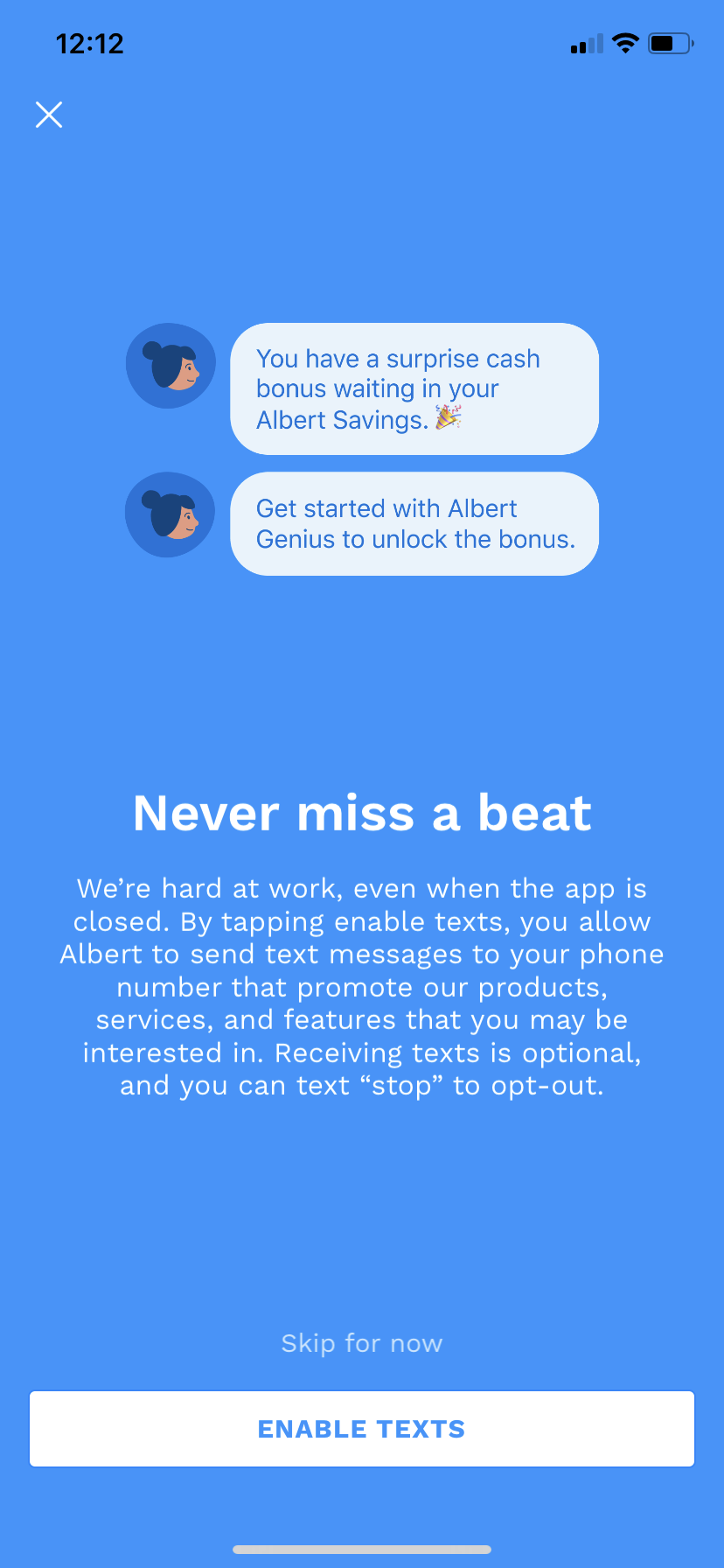
Mobile tooltips keep the learning state alive after the welcome flow ends. They're great at providing contextual help while a user is actively engaged with your app, whether that's highlighting an interface change, helping users discover a new feature, or nudging them to complete an important action. Used well, tooltips lift both session length and retention.
.png)
Further reading: 5 unique ways to use tooltips for mobile apps
Subtle discovery cues. Less invasive than tooltips. Good for secondary features.
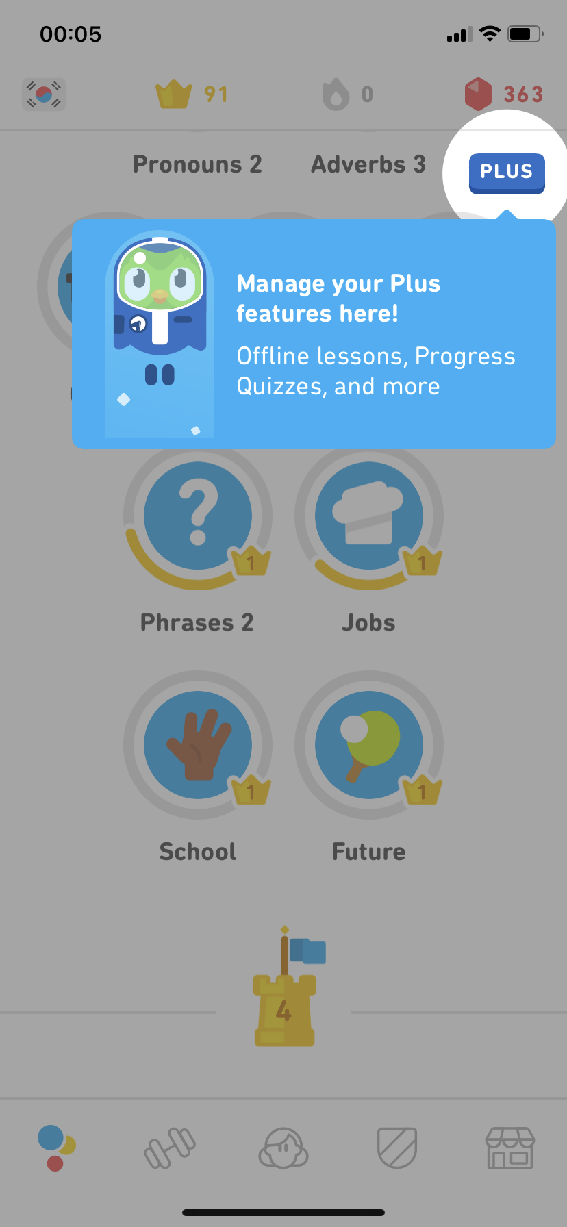
Hotspots are similar to notification badges but cover a wider range of use cases. They're a subtle, non-intrusive pattern good for secondary alerts, drawing attention to new features, or gently guiding users through an app as a series of beacons.
They're more common in desktop and web apps today, but more mobile apps are starting to experiment with them as the search for novel experiences continues.

Real-time notifications without full-screen disruption. Good for instant feedback.
Banners, slides, and cards aren't exclusive to mobile, but they're far more common in mobile interfaces than on web or desktop. Banners and slides overlay the base UI, while cards are in-line messages that appear amid core app content.
Used correctly, these patterns notify users about important information in real time without disrupting the whole experience, and they're great for instant feedback confirming an action worked.


.png)
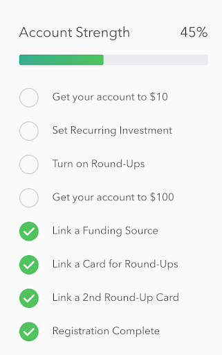
Gamified task completion. Include progress bars, one task per item, easy access.
Onboarding checklists help users complete important tasks and inject a dose of gamification that motivates people through multi-step processes. They work because they break a complex process into small, achievable tasks, and the familiar list format helps users see exactly how many steps remain.
Knowing the patterns is half the work. The other half is using them well. These best practices apply across whatever patterns you choose, and they're what separate onboarding that converts from onboarding that gets skipped.
Your onboarding should communicate value immediately and establish trust. Highlight immediate benefits within the first few screens, keep branding consistent, and show users what to expect, something as simple as "3 quick steps to get started" with a progress indicator goes a long way. Showcase key features without overwhelming people.
A long or complicated sign-up causes drop-offs. Minimize form fields and ask only for essential information. Offer single sign-on through Google or Apple, and let users skip steps and explore the app before committing. Fast, low-friction entry gets people to your app's value sooner.
Instead of overwhelming users with every feature at once, introduce them gradually. Guide people step by step, use tooltips and contextual prompts to explain features as they become relevant, and make tutorials interactive rather than long and static.
Users engage more when onboarding feels built for them. Ask relevant questions about goals and preferences, segment users so you can show different flows based on behavior, and adapt content dynamically so the experience stays relevant. Asking new users about their interests upfront does double duty: it tells you their preferences and gives you the data to deliver a personalized in-app experience.
A good onboarding experience doesn't stop at the app's edge. Send a welcome email summarizing key benefits, use push notifications and SMS reminders to encourage users to finish onboarding, and personalize those messages based on user data.
With Appcues, you can combine in-app guidance with out-of-product messaging in one cohesive flow. Start with an in-app product tour and a checklist that spurs completion. If a user drops off, trigger a follow-up email recapping what they missed with an easy way to continue, then use push and SMS to bring them back. This multi-channel approach lifts activation and retention.
If users drop off during onboarding, bring them back deliberately. Send reminder emails or push notifications with useful tips, offer an incentive like a free feature or discount, and use behavioral triggers to identify and address drop-offs. The same approach doubles as a soft upsell path: pair re-engagement messages with educational tips that move free users toward paid plans.
Users are more likely to grant permissions when they understand why they're needed. Be clear about what you're accessing and why, let users manage permissions easily in settings, and highlight the security measures that protect them. A dedicated onboarding step explaining how data is collected, stored, and used builds trust rather than friction.
Keep onboarding consistent across web and mobile. Sync user progress between devices so people can resume later, keep messaging consistent across in-app, email, and push, and offer a smooth web-to-mobile handoff for users who sign up on desktop but use the app on their phone.
Monitor user behavior to refine the experience over time. Track funnel performance and drop-off points, A/B test different flows to see what works, and optimize messaging by analyzing engagement across email, SMS, and push. Onboarding is never finished, keep analyzing interactions and iterating.
Fact-check before publish: One source attributes a 26% lift in installations to an experience-level-segmented onboarding checklist, and a separate study is cited for mobile onboarding improving retention by upwards of 50%. Verify both against the original sources before publishing.
A few mistakes drive churn more than anything else:
By the end of your onboarding flow, users should have what they need to navigate your app, and you should have the data to give them an excellent experience. The aim is a lasting first impression that sets users up for their next login and fights app abandonment over the long term.
Using these patterns and best practices well can reduce support tickets, improve retention, and grow revenue. A smooth onboarding process isn't just about showing users how to use your app, it's about showing them why they should.
Few things matter more to an app’s success than user onboarding: the process of orienting new users to your product and helping them achieve value as soon as possible. However, we’ve all gone through labyrinthine onboarding that causes us to quit.
Efficient onboarding is a key part of good UX, especially since new users do care whether the experience is quick and painless. My company Clutch, a B2B research firm that helps businesses find software providers, and I surveyed 501 mobile device users to figure out what people want to see and do in those make-it-or-break-it first minutes inside an app.
Here’s what we found: 72% of respondents said that providing all required information in less than 60 seconds was somewhat to very important.
These stats mean that app developers and UX designers are competing against a ticking clock. They only have a minute or so to get new users inside their app and excited about using it.
The secret to making users stay? Getting the value proposition across as soon as possible.
The value proposition is what an app can do for its users. It’s not the features themselves, but what those features make possible. Uber and Lyft make transportation easy; Venmo lets users split checks without a headache. User onboarding is the first and most important time to make sure your app’s value proposition is as clear as possible, so don’t overlook the opportunity to win over users.
Here are four best practices for communicating your app’s value from the start. With successful execution of these tactics, you may even be able to onboard mobile users in under a minute.
People like to make their mark on empty spaces, and not just those inside apps.
“Painters such as Bosch, Brueghel, and Duvet showed this need to fill up the ‘design space’ with elements — people, animals, buildings, trees, etc. They made busyness their business!” writes Mads Soegaard for the Interaction Design Foundation.
Look at Bosch’s “The Garden of Earthly Delights,” for example.

Just like Bosch, who filled up every corner of this space, your users will take advantage of your app’s features to fill the white space you give them.
Consider the breakout app Sarahah, which allows users to receive anonymous messages about themselves. It began as a way for employees to tell their managers how they could improve without fear of reprisal, but now it’s evolved into a burgeoning social network. Sarahah has recently topped the App Store charts.
After I signed up, I was taken to a screen that was empty except for a single number: 0. I had no messages. I’ll be honest: That made me wish I did have something in my inbox.
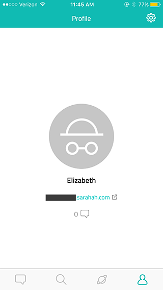
The design seemed almost too minimalist—what was I supposed to do at this point? Cajole people into messaging me?—but the page did send a strong message.
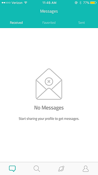
I tapped on the number 0, which took me to this screen. I was supposed to persuade people to message me! Another empty page gave me a strong indication of how it would be filled if I invited my friends to join Sarahah.
Although Sarahah only has one feature (messaging) and is still in its infancy, it uses empty space to its advantage. Sarahah serves as an example of how to guide users with an absence of instruction rather than too much instruction.
Another way to get new users excited right off the bat is to let them experience your app before you ask them to register.
As the value proposition is all about ‘show, don’t tell,’ show your users what an app can do, don’t tell them. Allow people to give some of your features a try. Once they can interact with your app, they’ll know what your app actually does for them, not just what it promises to do.
In Clutch’s survey, we asked respondents to tell us why they’d downloaded an app. The top reasons included:
Think about which of these categories your app falls into, then consider how to prove that your app provides entertainment, social networking, or the latest news. Focus on the features which bring that message home and let users try those features during onboarding.
The audio entertainment platform Audible, for example, gives users both fun and products. People pay for audiobooks, which they can then listen to anywhere. The app plays to its users’ desires by showing off its capabilities for free.
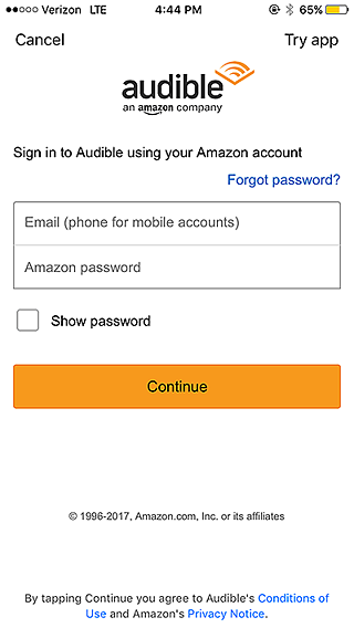
When I downloaded Audible, I was presented with a welcome screen that let me tap ‘get started’ before I had to turn over any information.

Aside from a single (well-explained!) permission request to access my other audio books, the app wasn’t arm-wrestling me into giving personal data before I was ready. I didn’t have to sign up for an account or enter my credit card information.
Audible runs on a monthly subscription model, but it gave me an opportunity to start a trial.
‘Try App’? Intriguing. I tapped that option.
Free audiobooks? Don’t mind if I do.
In less than a minute, I was listening to The Girl with the Dragon Tattoo. According to the audio player, I had 45 minutes of audio left before my trial ended – enough to last me a few days of commuting.
Audible let me experience the app’s main draw—quality, easy-to-access audiobooks—without promising anything I wasn’t ready to give. After 45 minutes of free audio, plenty of listeners will be persuaded to sign up for a monthly program.
Consider your own app. If you were a user, what would impress you into keeping the application? Factor those features into your onboarding.
Regardless of whether or not you let users try a feature for free, getting inside your app should still be easy and intuitive.
Include too much ‘gift wrapping,’ like extraneous copy, distracting graphics, and unnecessary forms, and users will lose interest. You want to wow them, but don’t put on a firework display so bright your users forget what they’re looking at.
In our survey, over 40% of respondents said that filling out forms with their personal information was slightly to very frustrating. Don’t give users a reason to jump ship at the very beginning because they’re frustrated! Sometimes, you can get away without asking for anything at all.
Consider Shazam, which lets people identify the name and artist of songs they hear anywhere. That’s its only major feature, though it can perform a few other helpful tasks. For example, once Shazam has identified a song, users can tap on buttons that let them buy or listen to the song elsewhere.
I put Shazam to the test by having it guess a random song my coworker played on Spotify.
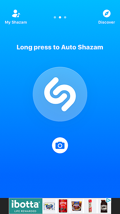
Upon opening, the interface showed a single call to action: hold down a button to make the app identify a tune.
I pressed it, and…
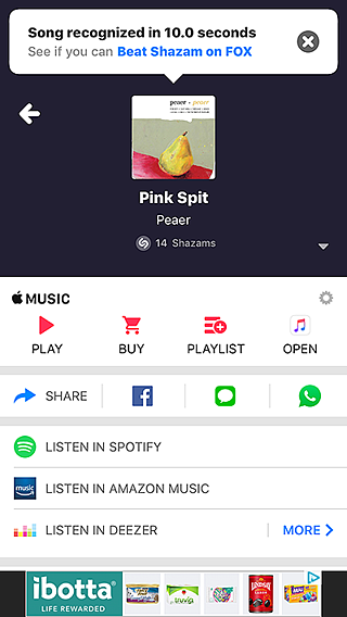
Voila! Ten seconds later, I had the information I needed: Jack was playing “Pink Spit” by Peaer.
Sure, the interface on the discovery screen is a little crowded. Sure, the banner ads are slightly annoying. But Shazam never made me register or sign up. It didn’t ask me for anything. It got right down to business and proved its value in ten seconds.
I’ll take the banner ads if it means an app is this easy to use.
When an app shows new users other people’s activity, those users can become inspired to investigate. What can the app do? What have other people done with it so far?
This technique works especially well for apps that allow users to upload audio files, images, and stories of any kind. During the onboarding experience, Tumblr displays art its users have submitted. New users are asked to choose topics they’re interested in, and Tumblr displays popular accounts tagged with that topic. Tumblr’s onboarding demonstrates value while users are making profiles.
Podbean is another mobile application that allows users to poke around, taking advantage of the sheer variety of podcasts the app offers.
When I opened Podbean for the first time, I was pleasantly surprised by how little information I had to give before I could genre-hop with abandon. All the app asked me for was an email address and password (and push notification permission, which was annoying, but I could handle that).
Once I’d completed that simple signup, the app asked me about my favorite types of podcasts.
Easy enough. I tapped ‘Business.’
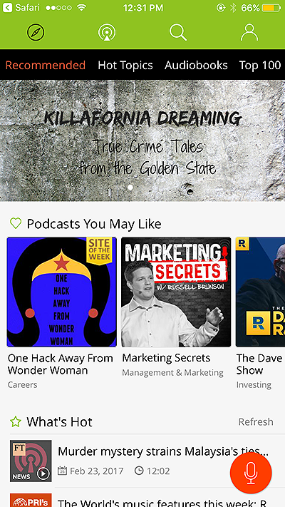
Podbean presented me with a treasure trove of business-related podcasts, all of which I could listen and subscribe to.
It took less than fifteen seconds for me to get inside the app and browse its entire podcast library. Podbean’s value became clear right away, since the app gave me some pointers on what it thought I might like and then let me take the reins.
When it comes to presenting your value proposition during mobile app onboarding, there’s no need to hide the aspects that make your app unique. After all, according to my survey respondents, people don’t want to waste time and prefer short onboarding experiences.
By taking advantage of blank space, keeping your app simple, and letting users browse and/or try features, you can make the most of the time you have. Show your users the difference your app can make in their lives, and they’re much more likely to return day after day.


.png)