.png)
When it comes to mobile-first experiences, we know it’s a lot of “hurry up and wait”—wait for app store approvals, wait on the next dev release, wait for your sanity to return 🫠. That’s a lot of sitting around and waiting on your SaaS!
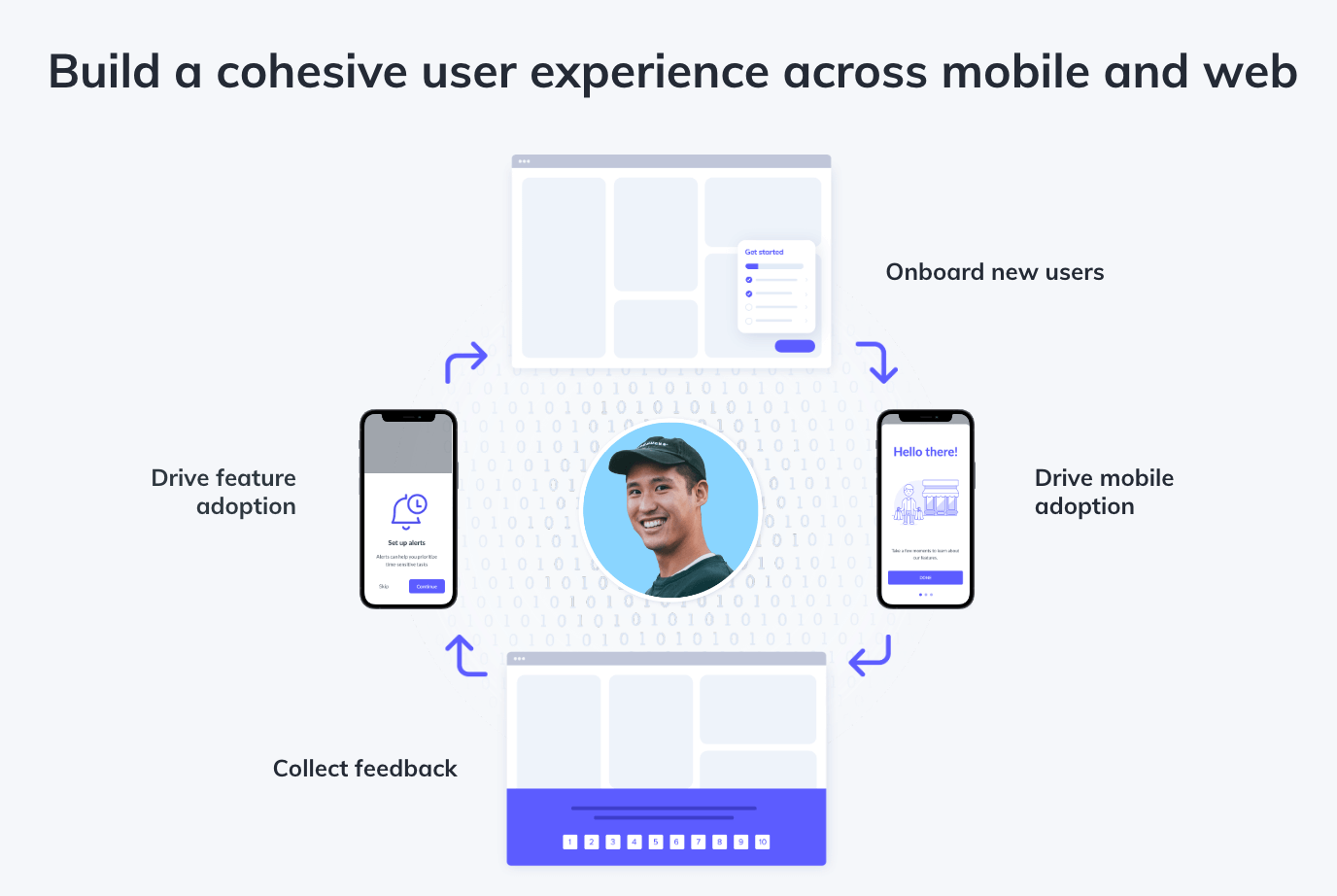
That’s because there’s not one way to build 2 distinct product experiences. There are, however, best practices for building a cohesive user experience across mobile and web.
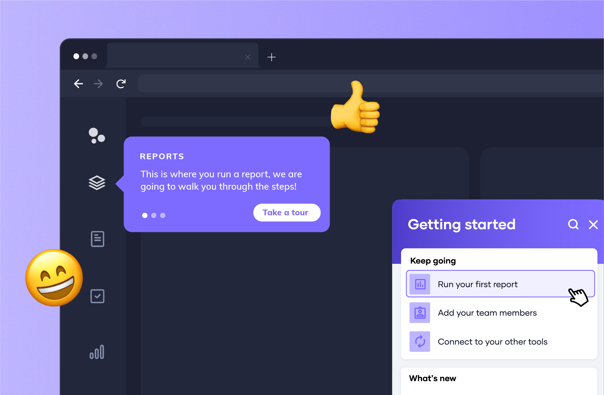
Enter Appcues Mobile: the mobile adoption cheat code you didn’t know you needed.
At the beginning of the year, we hired Senior Product Designer Sam Stuckless to work specifically on Appcues Mobile. Each week he treats the company Slack to bespoke mobile onboarding flows he crafts with the Appcues Mobile Builder.
But seeing a finished product is one thing. It’s easy to gloss over the blood, sweat, and resources that go into building these flows when you only look at the end result.
With that in mind, I started to wonder how true our claim to building “mobile-first onboarding experiences in minutes without a developer” actually was. Could it really be that easy? So, with Sam’s help, I decided to put our mobile where our mouth is and set out to prove it.
Spoiler alert: you can absolutely build native-looking mobile product experiences in minutes … and Sam walks you through a quick onboarding flow use case that shows you exactly how to do it.
Now that you’ve got IRL proof showing you anyone can implement mobile-first product experiences, let’s go beyond the build. In his tutorial, Sam drops some solid nuggets of wisdom that you’ll want to keep in mind when crafting mobile-first experiences.
Building cohesive product experiences across web and mobile is a key ingredient to adoption. As Sam puts it, even changing the color of a modal can “help users feel more at home in your app.”
Any product person will tell you that they’d love for every last pixel to be on brand. But it’s often those small tweaks that get compromised in busy release cycles. When you’re constantly submitting changes to the app store for approvals (and managing multiple versions of an app), branding tends to become second fiddle. But those small changes can drive big impact—making it easier for users to engage with your product over time.
Building a user onboarding flow? Consider giving users the option to skip it entirely.
Why? For starters, you can’t just assume it’s a user’s first time in your app. They could be logging in from a new device, for example. Trust me—there’s nothing more grating to your power-users than being forced to complete a lengthy onboarding flow designed for total newbs.
But! It’s equally important to make sure your welcome flows aren’t so easily skippable that someone clicks out of it by mistake. Small screens and big fingers mean you have to be even more intentional with your mobile screen real estate than you are on web.
There’s no hard and fast rule for how many steps to include in an onboarding. That said, Sam says 3–7 is the sweet spot.
The last thing you want to do is overwhelm your small screen users with large blocks of text. Splitting up your onboarding messaging into digestible steps is a great way to keep users engaged.
In the last step of Sam’s demo onboarding flow, he adds an unmissable full-width CTA button that lets users know exactly where to go next.
Once you’ve built a flow, consider it a foundational building block for all your future programs.
Sam shows how easy it is to clone flows and swap out multimedia elements like GIFs and images using the Appcues Builder. This way, the fruits of your labor can keep on laboring. You can spend that newfound time you got back learning more about your users to create smarter segments and triggers based on their behavior. With Appcues Mobile, you can trigger flows based on a user’s app version, a specific event, a particular audience, and more.
When users get frustrated with a bad product experience, they don’t care if it’s web or mobile. Your G2 reviews aren’t split into web vs. mobile—and your customer complaints aren’t either.
Your product experience has to work across small screens and svelte wide-angled monitors. With Appcues Mobile, you can be sure it will!

.png)