Interruptive patterns have been popularized and misused to the point where many of us have an instant “click-to-close” reflex. As in-product messaging evolves, our expectations change. On-demand resource centers come up in discussions more and more. Products are dedicating whole teams to building sophisticated help centers with announcements, tutorials, feedback, and more.
It was the perfect time to ramp up how we use our own Launchpad. We had three goals in mind:
Justin Kerins, Senior Product Manager here at Appcues took on the project after doing some research on our navigation and was really motivated to give it a fresh coat of paint.
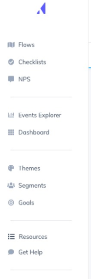
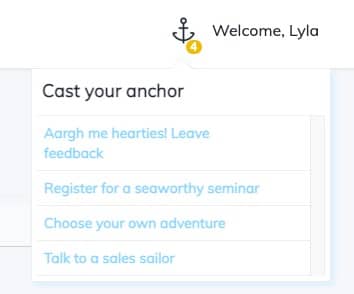
Can you spot Launchpad in our previous version? This was mostly standard, out of the box implementation, with the exception of a custom icon that blends right into Appcues.
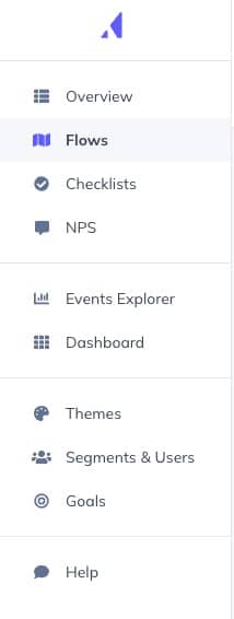
The basic installation worked great for providing a native-looking resource to recall flows. We had 3 flows targeted to the Launchpad in our prior "Resources" version, shown in the example screenshot above. When someone clicked one, it would relaunch that flow and after they viewed it, it turned gray to mark as read.
This was a slight tweak in the settings, we also have an example in our demo account that uses an unread counter rather than a text color indicator.
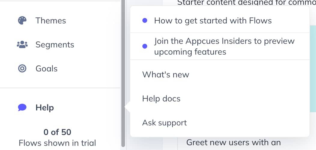
As a refresher (this was way back in the beginning of the article), a major goal of our new Launchpad was to combine multiple help items in our navigation. This meant that our current “Get Help” button that launches our help center chat widget needed a new home.
This is where we had to go a bit beyond the standard implementation (with slight customizations) of Launchpad to one that involves a bit more engineering, design, and product management to combine multiple widgets.
Installing Launchpad out of the box is simple. Much like when you installed Appcues for the first time, it’s a brief and painless addition of code with some CSS tweaking that repays dividends.
Embedding multiple widgets and links is slightly more complicated. Before I completely lose you at “API”--I'll walk through it in as plain language as possible.
We repurposed “Get Help” from the previous navigation that opened our help desk chat into a superpowered version of Launchpad that opens several widgets. Still with me? There’s a lot of names and jargon floating around, let me break it down:
While working on this article, I caught up with one of the engineers who worked the magic that brought our new Launchpad to life, Nick. He made a few comments in our draft. I'll paraphrase.
We ended up doing option 2 in my above list. However, it’s a bit more complicated than I have listed there. Nick made clear the engineering efforts were similar to building an experience with the API directly. We wanted to test the limits of Launchpad ourselves, but we still recommend option 3 for anything similar to what we did, like embedding additional widgets.
To make Launchpad look as native as possible, Nick’s team added the “Help” navigation item and gave it an ID for Launchpad to target. Then they styled it with CSS to be more on-brand, and used the `footer` option to embed the hardcoded links like “What’s new” and “Help docs” that link to our product updates page and knowledge base. In that same footer, we embedded the widget for our help desk to open support chat and docs search right from Launchpad. It was a bit of an engineering challenge, so again, Nick would stress that for an implementation similar to ours you can definitely achieve that with a simple installation (option 2) but option 3 has more flexibility and similar engineering efforts.
Timing? Well, don’t we love this answer: it depends. It took our team 1 product manager (Justin) to write it up, 1 designer (Lisa), and 2 engineers (Fer and Nick) 1 sprint to make this update. It could be more or less work for your team, but hopefully that gives you a decent frame of reference.
I can’t recommend installing Launchpad enough. Our flows in Launchpad are not only the most completed (often a vanity metric, let’s be honest) but they have the highest impact (views to goal completion). It lets people have more control over when and how they receive content, and if that’s not good UX, I don’t know what is.
x
x
x