.png)
AI isn’t magic. But when you’ve got a mile-long to-do list and someone (or something) can offer a hand? You take it.
So, here are two bite-sized ways I’ve used ChatGPT recently to keep things moving, especially when I hit a moment that would normally slow me down or have me asking someone else for help 🪄
Modern web apps are built in all kinds of unpredictable ways. So when it comes time to place a Tooltip or a Pin, it’s not always obvious which element to anchor it to—or how to tell Appcues exactly what you mean.
Sometimes, you’ll see an error like “this selector isn’t unique or valid.” Other times, the step works in the editor, but doesn’t show up in preview. It’s not that anything’s broken; selecting the right element is hard when you're not a developer.
This is the moment where I’d (and some of our customers) normally go to our Support team (shoutout to my heroes 🙏) to inspect the page, dig into the element structure, and help find the right CSS selector.
Now? I ask AI when I need help.
Here’s how:
(The video below shows this step by step, including what to capture and how to paste it in.)
Then, ChatGPT gives me a few selector options, explains which one is most stable, and follows Appcues best practices—no weird :nth-child() hacks or class names that vanish tomorrow.
Is it perfect every time? Not quite. But it gets me 90% of the way there without waiting or guessing. And that frees me up to strategize our next initiative.... and even write this article.
Next up: pivoting to a way AI helped with something a little more design-y.
When I was rebuilding our free trial emails (you can bet there’s more coming on that soon 👀), I wanted them to feel more like us: bold, skimmable, and visually balanced. Basically: less boring, generic, text-based, more “that’s a nice looking email.”
So I headed to reallygoodemails.com for some inspiration. Shoutout to Miro so many great-looking ideas that are clean, modern, and content-first.
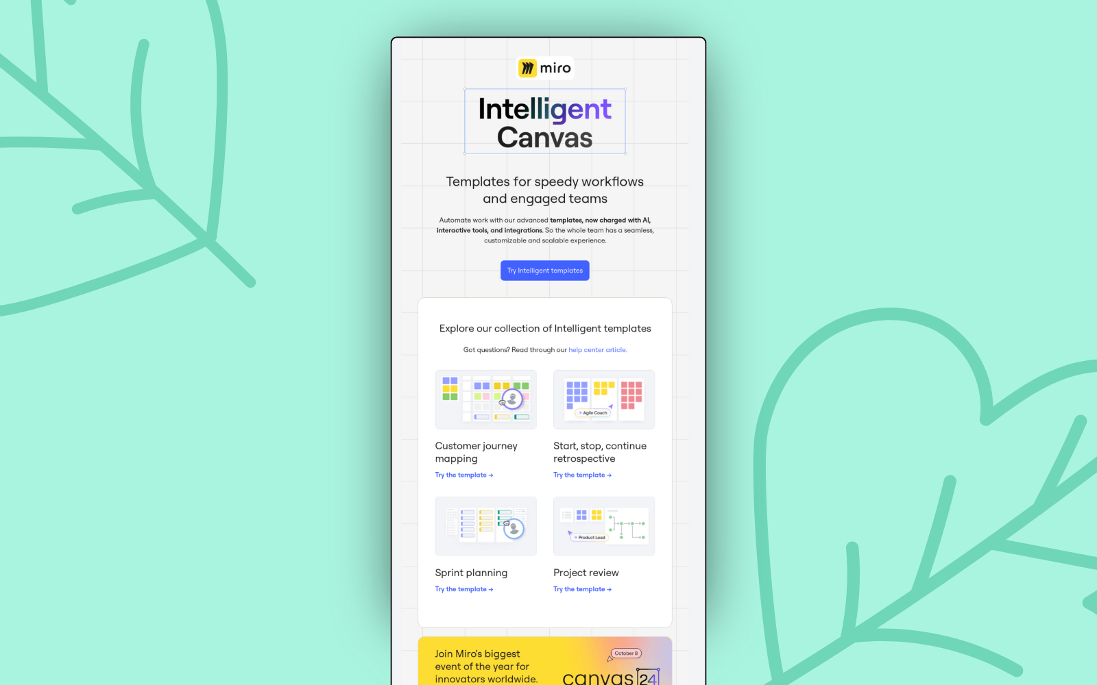
I love this, and I know the Appcues email builder can support designs like this. The problem is, layouts like that can take a hot second to build. I started wondering if a content block with custom HTML might be the faster path—not for the whole email, just for a nice two-column layout with text and a button side by side.
But I don’t know how to write HTML… so I thought: could AI write the code for that? Turns out—yep. It can.
I dropped the code into our builder. Then, I swapped the images, copy, and button URLs—and voila. She’s a beaut:
(Or, if something’s off, just go back to the thread and tell GPT exactly what to change—it’ll update the code for you in seconds.)
Honestly—what is next?
These were quick wins, but I know there’s a lot more I could do with AI to keep building smarter.
So you tell us what you want to see next:
I’ve got ideas. But I’d love to hear which one you’d want to see next.
Tell me what you think: bill.williams@appcues.com