.png)
Users form opinions about your product in seconds. Not about your architecture, your API design, or the elegance of your database schema. About what they see: buttons, forms, navigation, layout. A broken tooltip during onboarding, a misaligned CTA on mobile, a form that submits without validating required fields. These are the moments where trust evaporates before users ever reach the value your product delivers.
The problem is getting worse, not better. Product teams are shipping faster than ever. Weekly releases have become daily deploys. CI/CD pipelines push code to production in minutes. That speed is a competitive advantage, but only when it doesn't come at the cost of shipping broken experiences to real users. Every deploy that skips UI validation is a gamble: maybe everything renders fine, or maybe your onboarding modal now overlaps your navigation bar on Safari.
And the gap extends beyond core product UI. Teams building in-app experiences (onboarding flows, feature announcements, tooltips, upgrade prompts) are adding interface layers on top of their product. Those layers need the same testing discipline as the product itself. A checklist component that doesn't render on mobile is just as damaging as a broken checkout page.
Most content about UI testing focuses narrowly on QA automation tools and framework comparisons. This guide covers the full picture: what user interface testing actually involves, the techniques that work for different scenarios, and how to build a strategy that protects the moments your users care about most.
UI testing is the process of verifying that an application's visual elements and interactive components work correctly from the user's perspective. It answers a simple question: does the interface behave the way a user expects it to?
That covers a lot of ground. UI testing includes verifying layout rendering, form behavior, button actions, navigation flow, and responsiveness across devices and browsers. It checks whether elements appear where they should, respond when clicked, validate input correctly, and transition between states without breaking.
What UI testing does not cover is equally important. Backend logic, API responses, and database integrity belong to unit and integration testing. UI testing operates at the surface layer, the layer your users actually interact with.
A common misconception: UI testing is just "clicking around." In practice, it's a structured discipline that can be manual, automated, or both, with specific methodologies for each approach.
A few terms worth clarifying:
What this looks like in practice: Consider a SaaS signup flow. A UI test would verify that form fields render correctly, required-field validation fires when a user submits incomplete data, the submit button triggers the correct action, and the success state displays after completion. Research from Applause found that UI-layer defects account for roughly 40% of all bugs reported by end users, making this layer one of the highest-impact areas to test.
It's tempting to treat UI testing as a QA concern, something the engineering team handles before release. But the business impact of UI bugs lands squarely on product, growth, and marketing teams.
First impressions are UI impressions. Users don't evaluate your architecture. They evaluate whether the button works, whether the page loads correctly, and whether the experience feels polished. If those basics break, nothing else matters. Research from Google and Forrester has shown that 88% of online users are less likely to return to a site after a bad experience. UI bugs are the most visible kind of bad experience.
UI testing protects critical product moments. Onboarding flows, feature adoption prompts, upgrade paths, in-app announcements: these are the moments that drive activation and retention. A broken onboarding checklist doesn't just create a support ticket. It stalls the user before they ever reach the "aha" moment your product team designed around. For teams focused on meeting users in the right moment with the right message, a UI failure in that moment is a direct hit to user engagement.
The cost of finding bugs late is steep. Without UI testing, teams discover interface bugs through support tickets, churn data, and angry tweets. By then, the damage is done. Users who encounter a broken flow during their first session rarely give you a second chance. A study from IBM's Systems Sciences Institute found that bugs caught in production cost 6x more to fix than those caught during development. UI testing shifts that discovery earlier in the process, before real users are affected.
In-app experiences need testing too. For teams using tools to create tooltips, modals, checklists, and banners, UI testing extends beyond the core product. Those experiences are layered on top of your application, and they need to render correctly across browsers, screen sizes, and user segments. A feature announcement modal that overlaps with your navigation bar doesn't just look bad. It blocks users from completing their task.
There are three main approaches to UI testing, and the best strategies use all three. Here's when each technique makes sense.
Manual UI testing involves human testers interacting with the application, either following predefined test scenarios or exploring the interface freely.
Best for: Exploratory testing where you're looking for unexpected issues, evaluating subjective UX quality, and testing new features before automation scripts exist.
Limitation: Slow, hard to scale, and inconsistent across testers. What one tester catches, another might miss. Manual testing works as a starting point and a complement, not as a standalone strategy.
SaaS example: A product manager walks through a new onboarding flow on multiple devices before launch, checking that every step feels intuitive and renders correctly. No script could evaluate whether the flow "feels right."
Automated UI testing uses scripts that simulate user interactions (clicks, form submissions, navigation) and verify expected outcomes programmatically.
Best for: Regression testing, CI/CD pipelines, and repetitive cross-browser checks that would take hours to run manually.
Key frameworks:
Limitation: Automated tests require maintenance as the UI changes. Flaky tests (tests that pass and fail intermittently without code changes) are a real and persistent problem. Teams that don't invest in test stability end up ignoring their test suite entirely.
Visual regression testing uses screenshot comparison tools to detect layout shifts, styling drift, and rendering inconsistencies that functional tests miss entirely.
Best for: Design-driven teams, responsive layouts, and catching CSS regressions that don't break functionality but do break the user experience.
Tools: Applitools (AI-powered visual comparison) and Percy by BrowserStack (integrates with CI/CD and supports responsive snapshots).
Limitation: Dynamic content (timestamps, user-generated data, animations) can trigger false positives. Teams need to manage baselines carefully and configure ignore regions for content that changes between runs.
A simple decision framework: Use manual testing for discovery and judgment. Use automated testing for known flows that must not break. Use visual testing for design fidelity. Most production SaaS applications need all three, weighted toward automation as the product matures.
A UI testing strategy isn't a checklist you run once. It's a system you build, maintain, and refine as your product evolves. Here are six practices that separate effective testing from box-checking.
Map out the journeys that drive activation, conversion, and retention. Test those first and most frequently. A signup flow that breaks costs significantly more than a settings page with a misaligned icon. Prioritize by user impact and business risk, not by feature coverage percentage.
Template: List your top five user flows by revenue or product adoption impact. Those are your first five automated test suites.
Use a mix of manual, automated, and visual testing. Automate the repetitive regression checks that run on every deploy. Reserve manual testing for new features and complex interactions where human judgment matters. Add visual regression testing for responsive layouts and design consistency.
Cross-browser and cross-device testing is not optional for production applications. At minimum, cover Chrome, Safari, Firefox, and your top mobile viewports. Check your analytics to identify which browsers and devices your users actually use, then weight your testing effort accordingly.
Run automated UI tests on every pull request. Catch regressions before they reach production. Frameworks like Playwright and Cypress integrate directly with GitHub Actions, GitLab CI, and Jenkins. A test suite that only runs manually before a quarterly release is barely a test suite at all.
Use stable selectors (data-testid attributes) instead of brittle CSS selectors or XPath dependencies. Organize tests by user flow rather than page structure. When a test breaks, you should be able to identify whether the product broke or the test needs updating within minutes, not hours. For more on automated UI testing best practices, focus on selector stability and test organization.
If your team uses in-app messaging, onboarding flows, or feature announcements, those need UI testing too. A tooltip that renders behind a modal or a banner that breaks on mobile undermines the experience it was designed to create. These layered experiences are often the first things new users encounter. Treat them with the same rigor you apply to core product UI.
Even teams with established testing practices fall into patterns that undermine their efforts. Here are five of the most common pitfalls.
Not every UI element needs automated coverage. Spending the same effort testing a rarely used admin panel as your signup flow is a misallocation of resources. Prioritize by user impact and business risk. The 80/20 rule applies: 80% of your testing value comes from covering your 20% most critical flows.
Writing automated tests for a feature still in active development wastes time. The UI will change, the tests will break, and your team will spend more time maintaining tests than validating behavior. Wait until the UI stabilizes, then automate. Use manual testing during the iteration phase.
Desktop-only testing misses the bugs your mobile users encounter daily. If your analytics show 30% or more of traffic from mobile devices (and for most SaaS products, it does), skipping responsive testing means ignoring nearly a third of your user experience.
A button that fires the correct API call but renders off-screen is still broken from the user's perspective. Functional tests confirm behavior. Visual regression tests confirm appearance. You need both. Pairing functional tests with visual testing best practices catches the full range of UI failures.
Teams test their core product but forget to test the onboarding flows, tooltips, and feature announcements layered on top. These experiences are often built by product and growth teams outside the engineering test cycle, which means they ship without the same validation. If users see it, it needs testing.
Abstract best practices are helpful. Concrete examples of how UI testing prevents real problems are more useful.
A SaaS team builds a multi-step onboarding checklist to guide new users through account setup. During development, everything works smoothly in Chrome on desktop. But before launch, automated cross-browser tests reveal that the checklist component doesn't render on Safari mobile. The progress indicators collapse into an unreadable stack, and the "next step" button falls below the visible viewport.
Without UI testing, the team would have discovered this through support tickets, days or weeks after launch, after hundreds of new mobile users had a broken first experience. With automated cross-browser checks and solid onboarding best practices, they catch and fix the issue before a single user encounters it.
A product team launches a new feature and creates an in-app announcement modal to notify existing users. The modal looks great during internal review. But visual regression testing catches a problem: on screens below 768px wide, the modal overlaps with the top navigation bar. Users on smaller screens can't dismiss the modal or access the navigation, effectively locking them in place.
The fix takes 20 minutes. Without visual testing, the bug would have triggered a wave of confused support tickets and frustrated users.
A growth team designs two variants of an onboarding flow to test which drives higher activation. Before launching the experiment, they run automated UI tests against both variants across their supported browser and device matrix. The tests reveal that Variant B's custom illustration doesn't load on Firefox, leaving a broken image placeholder where the hero visual should be.
Without pre-launch UI testing, the experiment would have run with a broken variant, polluting the test data and producing unreliable results. Catching the rendering issue first ensures the experiment measures what it's designed to measure: which flow is better, not which flow is less broken. Teams running A/B testing on in-app experiences should make UI validation a standard pre-launch step.
UI testing protects the moments that matter most in your product: the first impression, the onboarding flow, the feature discovery that turns a new user into a loyal one. If your team builds in-app experiences to guide users through those moments, those experiences deserve the same testing discipline as your core product.
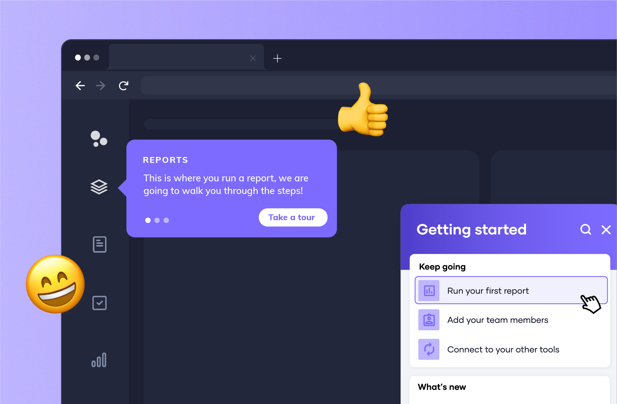
Appcues helps product and growth teams create, test, and optimize in-app experiences without engineering bottlenecks. Book a demo to see how.


.png)