
.png)
Newton’s first law of physics states that an object in motion stays in motion unless disrupted by an outside force. This principle explains how the Voyager 1 probe still hurtles through interstellar space despite having launched in 1977. The high speed of its launch coupled with a slingshot around Jupiter ensures that Voyager 1 will continue its journey well after humanity remembers it’s out there.
Your users have their own momentum. A new user considers your product, grows excited, and then finally signs up for it. They fill out their information, take your product tour, and then open up the project tab to find...a blank screen with no information. Yup—it’s an outside force disrupting motion.
Empty states inform users that there isn’t any information to display at the time. They are a necessary component of the product experience. Yet empty states often don’t receive the same level of attention as other components. A development team may focus on other important tasks as they work to create a quality product, resulting in less focus on empty states. This leaves some products that display blank screens or guidance of limited use.
These types of empty states hurt UX rather than help it. Alternatively, a well-designed empty state provides context and drives users to the next action. Taking the time to understand how and why your users reach empty states will help you preserve user momentum by enhancing UX and encouraging product adoption.
An empty state isn’t inherently “good” or “bad”—it just is. The customer has to look at something when their inbox is empty. Typically, customers stumble upon an empty state for one of four reasons:
Other than the error screen, none of these experiences are necessarily negative. However, they do halt the momentum of the user journey. Any friction on the user journey creates a churn risk. Even if a user doesn’t churn entirely, hitting a dead end limits the user’s chance of wholesale product adoption.
This problem is only compounded by the infrequency with which most users actually reach an empty state. Developers often think: A new user’s inbox won’t stay empty for long. Why sink time into a page they’ll only ever spend a handful of seconds looking at?
Unfortunately, the end result of this kind of thinking is that empty states are frequently left blank. The problem with a blank empty state goes back to Newton’s first law: an object in motion stays in motion, but an object at rest will remain at rest. Blank screens don’t provide solutions or suggestions, leaving a customer to either search for a solution or give up on the attempted action entirely.
Empty states pause momentum by nature. Whereas a poorly designed empty state may bring users to a complete halt, a well-designed empty state helps send the user further along in their journey. Luckily, keeping just a few simple concepts in mind will help you craft intentional and engaging empty states that preserve your users’ momentum.
The first thing your empty state needs to do is explain to the user how they got there. Trying to fix an issue before stating what the issue is will only lead to confusion. However, your users don’t need a 6,000-word explanation. Acknowledge their reason for reaching the empty state in as few words as possible, so the user doesn’t get bored and exit the state without taking action.
Once the problem has been acknowledged, it’s time to offer a solution to keep things moving. The main way to accomplish this is by including a CTA within your empty state.
Imagine your user reaches an empty state because they click on their inbox and there aren’t any messages. The solution is simple: they need to send their own messages, so they can receive replies. In cases where there is an obvious objective a user is trying to achieve, a simple button or link can take the user to the next logical step in the process.
Alternatively, a more complex situation may require outside help. A CTA can take the customer to a help resource, where they can search for their own solutions. Otherwise, a CTA could link back to the home screen to “reset” the intended action.
There are cases where a CTA isn’t the obvious way to correct course. For example, you can’t take users to search results that don’t exist. There’s also the chance that a user reached an empty state by mistake, in which case, a CTA is only going to take the user further away from where they intended to be. In these cases, a simple explanation of what may have gone wrong will often help the user correct course with minimal friction.
Empty states are often bland from a voice perspective, but they don’t need to be. Your copy can run the gamut from quirky to authoritative so long as it’s simple and informative. It’s important to remain mindful of the reason your user reached an empty state in the first place. Jokey content won’t sit well with a customer who received an error message and isn’t sure why.
Many existing products that do an excellent job designing empty states accompany their messaging with simple illustrations or images that fit with their overall product aesthetic. A well-designed empty state will only consist of a couple of sentences that are unlikely to take up much of the screen. Including an image is an easy way to occupy dead space while showing off a little product personality.
An empty state that works well in one context won’t necessarily be the right fit in another. Your product’s error states perform entirely different functions than an empty state detailing an empty inbox. Below, you’ll find several real-world examples that demonstrate the similarities and differences between the most common variations of empty states.
.jpeg)
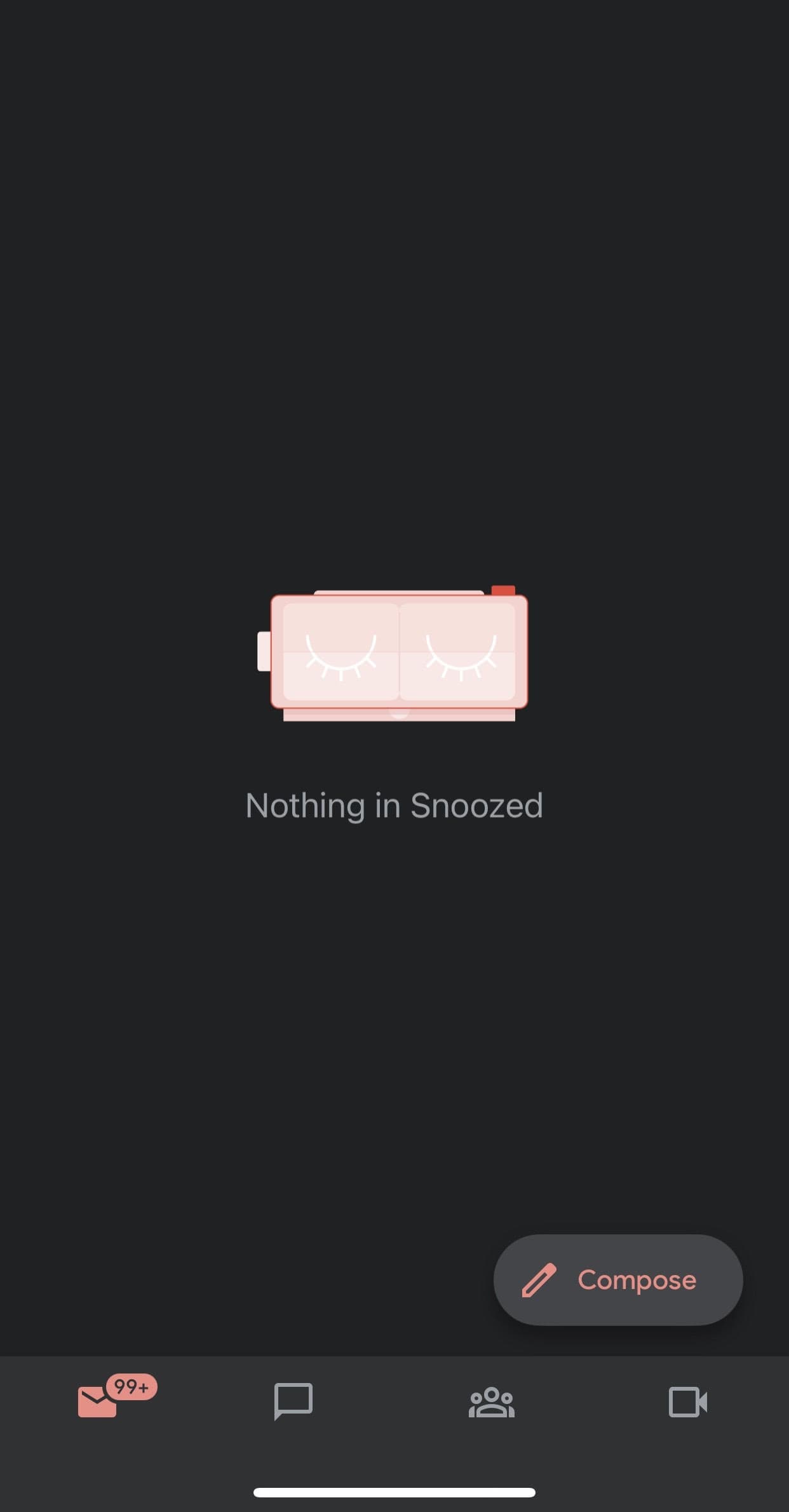
Networking is at the core of the LinkedIn experience. This makes the ability to send and receive messages critical to continued user retention. A brand-new user who deletes any automated “Welcome to LinkedIn!” message is bound to find the screen above, which does empty states right by:
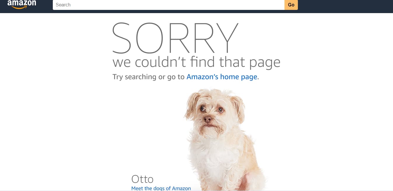
Customers use Amazon because it’s easier than going to a physical store. However, Amazon handles millions of products, making running into an error message a real possibility. These errors stand to disturb the seamless shopping experience that draws many customers to the retail giant.
Amazon’s error screens attempt to defuse tensions in a number of ways:

Collaboration software Quip contains a search function to help users find documents within their respective databases. If a particular set of keywords doesn’t return a result, the search menu displays the empty state shown above. Quip’s search-related empty state gets the job done by:
Space isn’t really empty. It’s full of small particles that gradually slow down the momentum of moving objects. However, there’s a difference between brushing up against a speck of space dust and getting walloped by a comet.
Your empty states shouldn’t really be empty either. An empty state is an opportunity to propel your users from a moment of inertia to continuous and active engagement with your product. A user’s momentum slows as they view an empty state. The entire interaction usually lasts only a few seconds before they move on. It’s up to you to determine whether they move backward or onward in their user journey.


.png)