Free-to-Paid Conversion: How to Turn Free Users into Paying Customers

.png)

.png)
Most conversion problems aren't really conversion problems. They're activation problems with a delayed consequence — users who never find the value in week one don't upgrade in month three, regardless of how many prompts they see.
That's the thing the upgrade-prompt obsession gets backwards. The conversion decision doesn't happen when someone clicks "upgrade." It happens — or doesn't — in the first few sessions, when users either get somewhere meaningful with your product or quietly check out.
The teams that consistently improve their free-to-paid rate aren't running better upgrade campaigns. They're doing better work earlier: getting users to value faster, staying in contact while they're figuring things out, and making the upgrade feel like something the user arrived at rather than something you asked them to do.
Free-to-paid conversion is one of the most closely watched metrics in SaaS, and one of the most misunderstood.
Most teams look at a low free-to-paid conversion rate and immediately reach for more upgrade prompts, tighter feature limits, or shorter trials. Conversion problems are almost never solved by adding pressure. They're solved by understanding what's actually preventing free users from seeing enough value to pay for it.
This guide covers free-to-paid conversion end to end: what it is, how to benchmark it, why it underperforms, and how to fix it. Whether you're running a free trial model, a freemium business model, or some hybrid of the two, the principles here apply.
Free-to-paid conversion is the process of moving users from a free tier (whether freemium or a time-limited free trial) into a paid account or paid subscription. Your free-to-paid conversion rate is the percentage who become paying customers within a set window.
A strong rate tells you your product is delivering real value, your upgrade path is clear, and your paid plans are meaningfully differentiated from your free tier. A weak one tells you at least one of those things is broken.
There are two primary free-to-paid models, and they behave very differently.
Which model you're running shapes everything about conversion: the tactics, the timeline, and the tradeoffs.
A free trial gives users full or partial access to the product, typically for 7, 14, or 30 days, before the trial ends and they must upgrade or lose access. These products are built around urgency: the free trial period is finite, and that deadline drives users toward a decision.
There are two variants:
Opt-in free trial: Users sign up without entering payment information. This lowers the barrier to sign-ups but produces lower-intent trial users. Conversion rates are typically lower because users have less skin in the game.
Opt-out free trial: Users enter credit card details upfront and are automatically charged when the free trial ends unless they cancel. This model reduces sign-ups volume but meaningfully lifts the trial conversion rate; users who commit their card are more serious buyers.
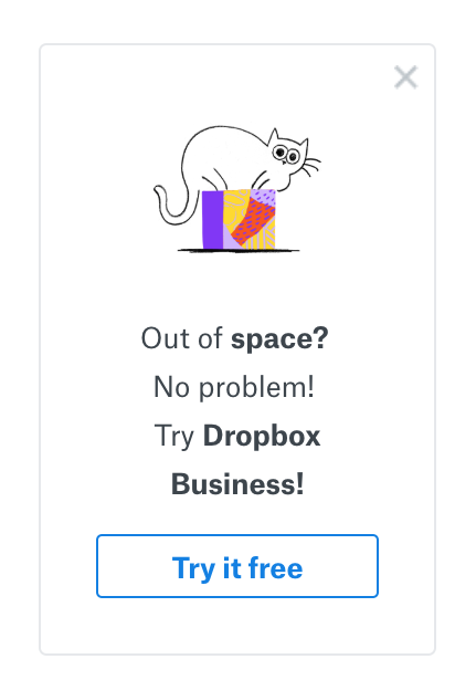
A freemium model gives users permanent access to a free tier with limited features. There's no deadline, which removes urgency but widens the top of the funnel and enables powerful network effects. Tools like Google Workspace, Slack, and Dropbox have built massive user bases this way. Without a clock ticking, converting free users takes longer and requires more deliberate effort.
A reverse trial splits the difference between both models. New users get temporary access to paid features, as they would in any free trial, but instead of churning when the trial ends, they drop to a permanent free account. They stay. They just lose what they'd gotten used to. For freemium self-serve products with a stuck paid conversion rate, it's one of the more reliable ways to unstick it.
Before diagnosing your paid conversion rate, it helps to know what good looks like. Several factors shape the benchmarks: product complexity, pricing, industry, and your model.
For free trial products:
For freemium business models:
A 3% free-to-paid conversion rate for a $500/month enterprise tool is a very different outcome than 3% for a $9/month consumer app. Benchmark against specific customer segments in your category, not just industry averages.
And if you're reading growth unhinged into these numbers expecting one change to move them dramatically, it usually doesn't. Sustained improvement in paid conversion rate comes from systematic work, not one-time tactics.
Most free-to-paid conversion problems trace back to the same few root causes. Before overhauling your pricing or building new upgrade flows, figure out which one is actually driving yours.
The biggest driver of low paid conversion isn't pricing or limited features. It's activation. Free users who never experience your product's core value have no reason to convert. Look at your data: what actions do paid users complete in their first week that free users don't? Start there.

When the free plan delivers everything the average user needs, there's no pull toward paid plans. Audit what free users create within the product and whether any of it requires a paid plan to be useful.
Users won't upgrade to advanced features they've never seen. If premium features are tucked behind a pricing page free users never visit, most will never know what they're missing. The upgrade path needs to show up in the workflow, not wait for users to go looking for it.
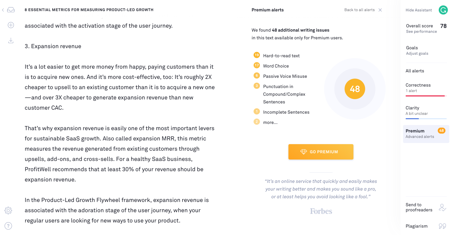
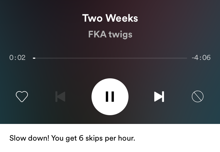
Poorly timed upgrade prompts frustrate users more than they convert them. There's a real difference between a nudge that appears because it's genuinely useful right now and one that interrupts every third action. The former builds toward conversion. The latter trains users to dismiss you.
If you're not tracking where users drop off or which user behavior patterns predict upgrade likelihood, you're optimizing blind. Conversion data is what turns guesswork into a conversion strategy that actually improves over time.
Most conversion problems come down to the same issue: teams push toward a decision before users have experienced enough value to make one. The framework below runs in three stages, find the treasure, map the path, engage throughout, and it works across both free trial and freemium products.
Before you can convert free users, you need to understand what they're actually trying to accomplish, not what your marketing says. What users actually do in the product, and what outcome makes your tool worth paying for.
This is the "treasure": the specific outcome that makes the product feel worth paying for. When users reach it, free-to-paid conversion follows naturally.
Start with your data. Look at the actions that correlate most strongly with paid conversion. Look at what paying subscribers do in week one that free signups at the same stage don't. That's your activation moment. Build everything else around getting users there.

Once you know what users are trying to accomplish, map the path from sign-up to that outcome. Where does friction appear? Where do users drop off, and do specific customer segments drop off at different points?
You're not just removing friction. You're designing a path where paid features show up when they're actually useful. The buying process should feel like a natural next step, not a wall. Use your conversion funnel to pinpoint the drop-off points. That's where the real work is.
Most teams front-load all their conversion effort into the first session, then go quiet. Free users who don't convert in week one might not hear from you again until a "your trial ends tomorrow" panic email. There's a better way:
In-app messaging tied to behavior. Tooltips, modals, and upgrade prompts that show paid features when a user needs them, triggered by what they're actually trying to do right now, not random pop-ups. Zywave saw an 80% lift in feature adoption by swapping a slideout for a pin at one friction point — format matters as much as timing.

Behavior-triggered email sequences. Trial users who've activated core features need different messaging than free users who signed up and never came back. Your most-engaged users and your dormant ones are completely different prospects. Treat them that way.
Social proof at the right moment. Showing what paying customers achieve, especially when it's role-specific, helps hesitant users upgrade. It works best not on the pricing page, but in the moment when a user is weighing the decision.
Re-engagement for dormant sign-ups. Free users who went quiet aren't lost. A well-timed re-engagement sequence, in-app or email, can bring them back.
Get users to the "aha moment" fast. Trial users have days, not weeks, to experience what makes your product worth paying for. Your onboarding has one job: get them to that moment before the trial ends.
Use milestone-based emails. Generic "your trial ends in X days" emails underperform. Tie email timing to user behavior. When a user completes a key action, send an email that connects that accomplishment to what becomes possible with a paid plan.
Make the final days count. The final 48–72 hours of a free trial create urgency naturally. In-app countdown messaging, combined with social proof and a clear value statement, tends to work well here.
Know your sign-up model tradeoffs. For opt-in models, don't ask for payment information too early. It creates unnecessary friction before users have seen value. For opt-out models, make the value during the trial period undeniable, because users who feel surprised by a charge will churn.
Make paid features visible in the workflow. Users should encounter paid features naturally, not by hunting down a pricing page. An upgrade prompt that appears when someone hits a ceiling will outperform any pricing page they never visit.

Segment your free users. Not all free signups are equal. Some are high-intent buyers on a longer runway. Others will never convert. Pulling sales and marketing resources toward the wrong group is expensive. Use behavioral data to find the buyers, and focus your energy there.

Try a hybrid approach. If your freemium paid conversion rate is stuck, let new users experience paid features briefly before dropping to the permanent free tier. The exposure gives users something concrete to miss, and something to upgrade back to.

Let network effects do some of the work. For products where value compounds with team size or collaboration, network effects pull users toward paid plans on their own. Design your free tier to encourage sharing that makes that happen.

Track these as part of your ongoing conversion strategy:
Segment all of this by acquisition channel, persona, and user behavior. Rolled-up numbers look fine until you break them apart. That's usually where the real problems show up. Review monthly.
All of this requires reaching free users when it matters, with messaging that reflects what they've actually done in your product, not just where they are in the calendar. Appcues handles that.
With Appcues, product and growth teams can:
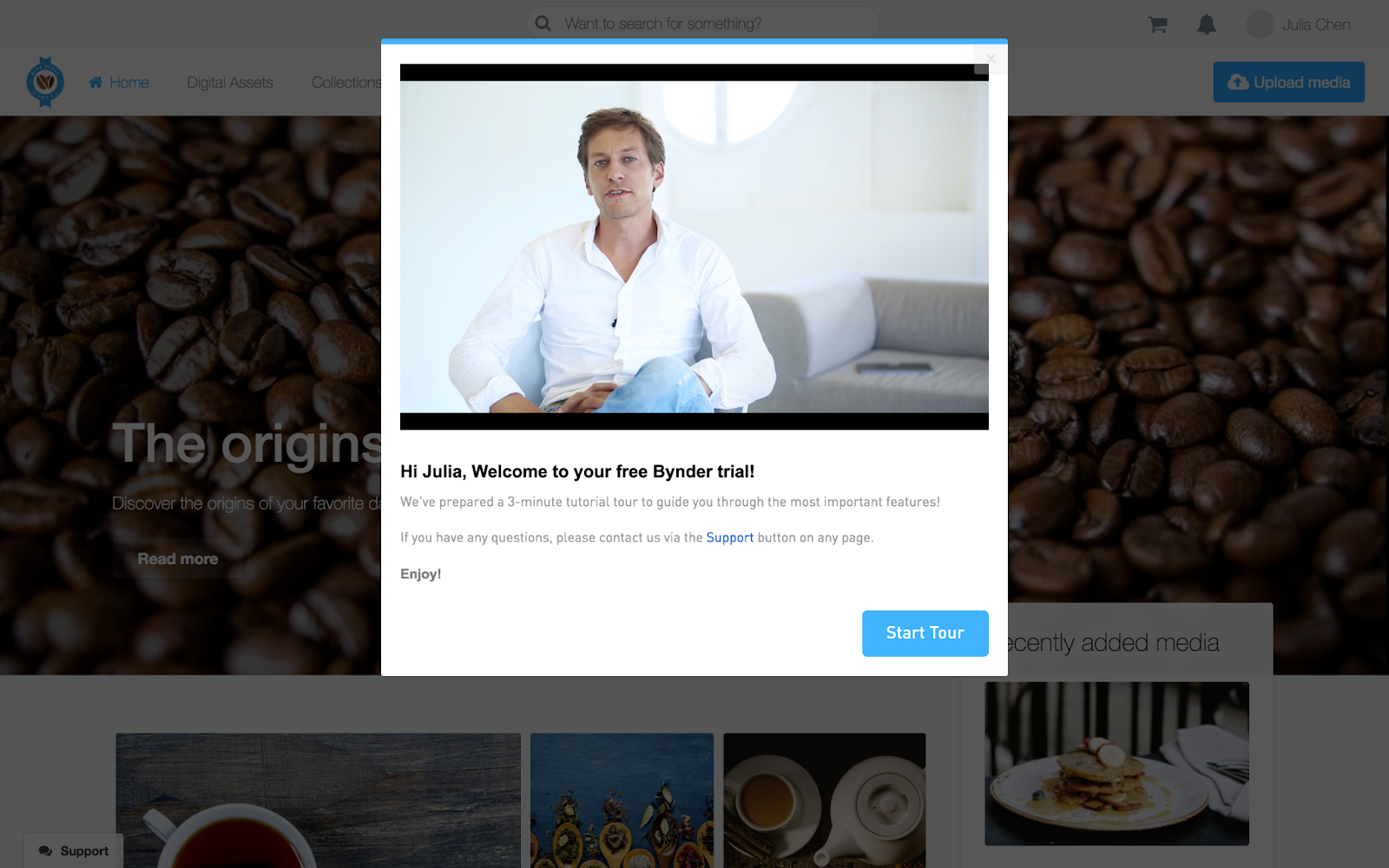
Whether you're optimizing a free trial model or a freemium business model, Appcues gives your team the tools to improve your paid conversion rate without waiting in the engineering queue. Bynder built a self-service guided demo with Appcues and cut their sales cycle by 9%.
