← Visit Appcues.com
×
×

Your retention problem starts with these 7 user onboarding mistakes
We’re all pretty lazy when it comes to apps. When deciding whether to download, learn the ropes, and make a habit of using a product...
Skip to section:

Skip to section:

We’re all pretty lazy when it comes to apps. When deciding whether to download, learn the ropes, and make a habit of using a product, there’s one big question on our minds: is this worth my time?

Most of the time, the answer is a resounding “no.” Customer retention numbers, as a whole, are pretty terrible. Close to 90% of apps are downloaded onto a device, opened once, and never used again. It’s not that 90% of apps are worthless—it’s that there’s too much friction in the onboarding process. Once the user sees a barrier in their path, they might decide it’s not worth overcoming.

If it’s a tool the user has to have, like the complicated tech stack at work, they might do backflips to learn it. They’ll Google answers when stuck, they’ll ask their tech-savvy friend to help, maybe they’ll hop on the phone and call customer support. But unless your app is established or mission-critical, users will give up as soon as they hit friction.

The real danger is that UI designers are often really bad at identifying points of friction. They assume users are more gung-ho than they actually are, and don’t offer nearly enough guidance in the user onboarding process. They don’t teach, nudge, or encourage users to take the behaviors that will lead them to achieve Aha! moments and ultimately, retention.

Below are seven points of friction you should watch out for, and eliminate, in your user onboarding process if you want to fix your customer retention problem. We've also put together a condensed video with the top six user onboarding mistakes.

1. Don’t Toss Users Into the Deep End

You might think your product’s interface is intuitive, but you’ve been staring at it every day for the past three months. The second a user is confused about which icon is which, or what this page is for, they’ll go back to that initial question: is this worth my time? If you don’t offer reinforcing tips reminding them what they’re there for and what they need to do next to be successful, the answer to that question will be “no.”

The first steps of onboarding need to provide context if you want to boost customer retention. Remind users what job they came here to do, and tell them exactly how to do it. If your product is nuanced or has a ton of diferent features, an explainer video might make sense, like this one from GoToWebinar. 
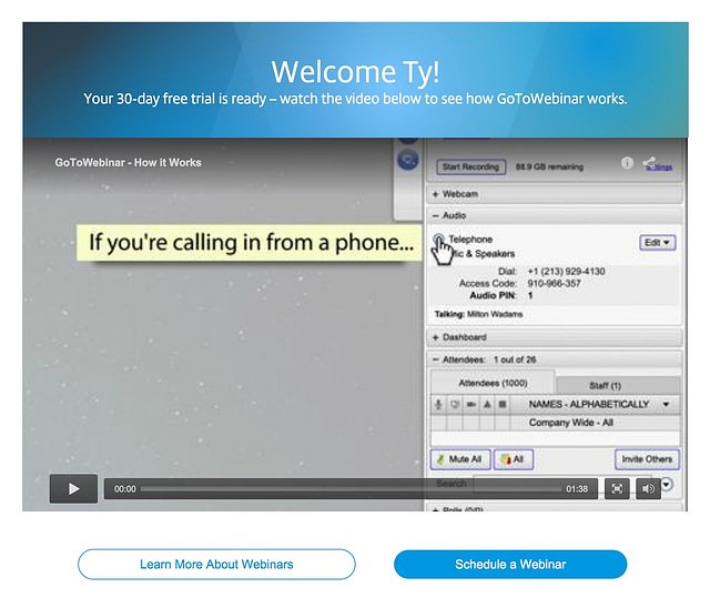
user onboarding webinars

Never assume that someone has downloaded your app knowing exactly what they want to do, or even what your app’s core value is.

Reinforce Core Value

What the user sees right off the bat in the onboarding experience should reinforce why they came to your product in the first place. If all they see is a flashy dashboard with no tooltips directing them, they’ll just get confused and leave.

That might mean explicitly stating what your tool is for, like in this example from Sidekick. The landing page for user onboarding (what users see when they use a free trial), reinforces the app’s core value and then offers a clear step of what to do by giving a “next” button. 

user onboarding sidekick

Users get context about the product and what their job is. Sidekick’s next step in their user onboarding flow is to ask users to make an email. By following the steps they’re told to take, they’ll see this core value statement in action.

2. Throw Out the Mandatory Tutorials

Some apps swing in the opposite direction. They offer way too much context in the form of a mandatory tutorial. While you want to show users the ropes of your product, it verges on cruel to dangle the product in front of them and not let them play with it until they see every nook and cranny.

Too much onboarding can also cause your customer retention problem. This is largely because users experience a lot of app fatigue. You might think your product is the best out there, but users are there to do a specific job. They’re tired of exploring new apps, and just want to find one that works.

Mandatory tutorials might seem like the best way to teach users to be experts in your app, but they can be barriers to getting the user's specific job done.

Keep the End in Sight

There’s a better way to approach a comprehensive tutorial, a bit more gently. One way is to let users opt out if they need to, rather than locking them into mandatory onboarding. Another way is to make sure users know that they can breeze through it if possible. If onboarding feels unending, they’re likely to just quit.

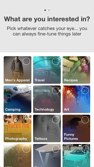
This onboarding flow from Pinterest does exactly that. It doesn’t put too much pressure on the initial sign-up. Pinterest knows that users want to dive right into the platform itself, so it tells them that they can breeze through this process and get to the meat of the app. Users know that they can always come back later.
user onboarding pinterest

Pinterest’s retention strategy does something else that’s really crucial: they let the user know how long the process will take. By those simple two dots at the top, the user knows there are only two steps here, and they won’t be stuck in onboarding limbo forever. By keeping the end in sight, they keep the user engaged. Modal windows, like progress bars and checklists, are some of our favorite UI flows at Appcues, since they tap into this powerful user psychology.

3. Do Away With Multiple Login Requests

Multiple login requests are a huge retention killer. Taking the user out of your app during onboarding is one of the biggest possible barriers you can put in their path. If you require an email confirmation, they can check their email and quickly get distracted by something else they’ve received. You’ll have the retention numbers to show for it. It’s also an easy way for someone to lose their password, which is a sure-fire way to lose your users permanently. A whopping 92% of users stop using a site once they forget their password.

Use social login

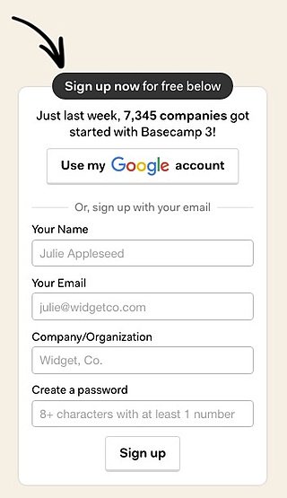
Basecamp’s pricing page is an example of a particularly seamless sign-up experience. For one, it’s not even on a separate page, it’s just an adjacent image on their pricing page. It tells users everything they need to enter right then and there (only 4 boxes to fill out, so the end is in sight), and it has the option for social login. 
user onboarding social login

Tools like Auth0 make single-sign-on really easy and secure, so you never have to worry about compromising your users’ information.

4. Avoid Manual Data Entry

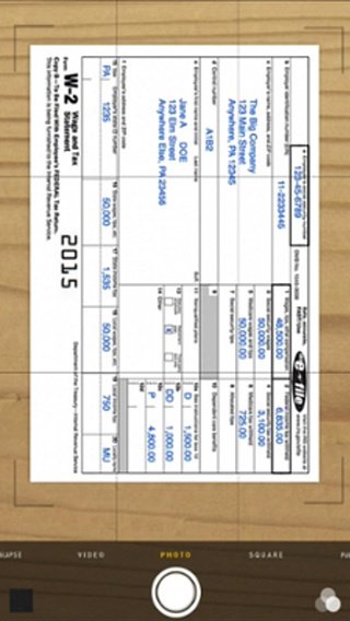
We’re lazy, remember? So we don’t want to input data, even if it’s crucial to making the app function as it should. Depending on the app, that might be additional personal information like location. For B2B companies, it might mean entering what tools you use and will need to integrate with, but for Turbo Tax, it’s the most annoying manual data entry of all: your tax info. Turbo Tax’s app tackles a notoriously difficult experience and automates a lot of it, preventing one of the biggest snags in the book.
customer retention strategy

5. Make Sure You Can Follow-Up

Your retention plan needs to extend beyond the first 10 minutes of the onboarding experience. You need to re-engage your users after the first time they open up your product. Users will inevitably leave mid-trial and forget about your app. If this happens, you need to be able to follow up with them. Don’t wait for users to come back to your app, because odds are, it’s not going to happen.

Find a Way to Reach Out

Your retention flow needs to be future-oriented. Ask yourself, “How am I going to get in touch with this user if they exit the app right now?” Here are some solutions to try during onboarding:

  • Ask for an email address so you can send follow-ups
  • Get the user to enable push notifications
  • Request that they install a native app

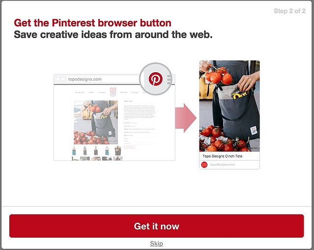
By having a second way of connecting with users, you’re less likely to lose them, and you might not become part of that dreaded 90%. This is exactly what Pinterest does when they use a pop-up window to encourage users to install their native app. It’s minimalistic (and customers can skip if they choose), but it ensures that users can hop right back onto the platform whenever they’re browsing the web. 
user onboarding pinterest

If a user leaves mid-onboarding or doesn’t come back to your product, you have a way to stay connected. And as long as you have something to follow up with (like telling them they should connect their analytics, or play around with a feature they haven’t tried out yet), they just might come back.

6. Tear Down That Paywall

Asking for a credit card is one of the biggest retention killers of all.That’s why SaaS free trials are so popular. They remove the barrier. It’s why Lincoln Murphy of Sixteen Ventures is a strong believer that you shouldn’t ask for a credit cardbefore someone can access your SaaS product’s free trial: 

For B2B, most people that sign-up for your trial aren’t doing so just to mess with you or for fun… they’re signing up because they thought your product would solve a problem for them or let them take advantage of an opportunity. If they didn’t convert, don’t blame them… you failed to convert them and asking for their CC up-front wouldn’t have helped.”

It’s important for users to have an Aha! moment before you ask for their credit card information. They need to really understand the value they’ll get out of an app during the free trial, before they start paying for it.

Nail Down Your Aha! Moment First

Chris Savage, Wistia CEO, writes about the importance of really knowing why you have a freemium plan before doing it. It’s important to experiment with a free plan. How much should you give away, and for how long? The real value in going free, for Chris, had to do with getting users to Wistia’s Aha! moment.As Chris writes,

“With free, many more people touched the product, which dramatically expanded the audience of people who care about Wistia. We started to really live out our company's mission to help people be awesome with video, because we were able to reach so many more eyes.”

But the company still had to iterate to get there. By experimenting with how to usher users to an Aha! moment quickly, they were able to determine when and how to offer a free plan, getting eyes on the product and healthy retention numbers.

7. Remember to Roll the Credits

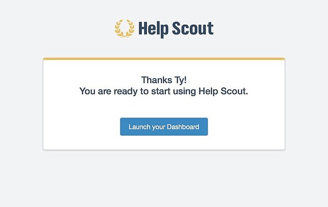
When onboarding is over, the audience needs to know they’ve “graduated.” There’s nothing worse than an incomplete onboarding experience that leaves the user confused. If they’ve completed onboarding but aren’t sure what to do next, odds are they won’t come back. That’s why you need to tell users that onboarding is done and they’re ready to start using the app. 
customer retention help scout

It’s part of what’s hopefully a long relationship with your customers in which you’ll continue to celebrate their progress.

Customer Retention Is All About Momentum

User onboarding, and ultimately customer retention, is about getting users to an Aha! moment as fast as possible. If a user has taken the time to download and open your product, you’ve got some momentum already. Good retention means not letting go. Hold on to that momentum by removing any potential friction points, any snags they might catch on. Even the smallest ones at the early stage of onboarding can be enough to cause users to never come back. Your initial onboarding flow, following up within the next couple days, and continuing to engage and delight your users is going to keep up that momentum—but only if you avoid these common retention hitches.

Author's picture
Ty Magnin
Skip to section:

Skip to section:

We’re all pretty lazy when it comes to apps. When deciding whether to download, learn the ropes, and make a habit of using a product, there’s one big question on our minds: is this worth my time?

Most of the time, the answer is a resounding “no.” Customer retention numbers, as a whole, are pretty terrible. Close to 90% of apps are downloaded onto a device, opened once, and never used again. It’s not that 90% of apps are worthless—it’s that there’s too much friction in the onboarding process. Once the user sees a barrier in their path, they might decide it’s not worth overcoming.

If it’s a tool the user has to have, like the complicated tech stack at work, they might do backflips to learn it. They’ll Google answers when stuck, they’ll ask their tech-savvy friend to help, maybe they’ll hop on the phone and call customer support. But unless your app is established or mission-critical, users will give up as soon as they hit friction.

The real danger is that UI designers are often really bad at identifying points of friction. They assume users are more gung-ho than they actually are, and don’t offer nearly enough guidance in the user onboarding process. They don’t teach, nudge, or encourage users to take the behaviors that will lead them to achieve Aha! moments and ultimately, retention.

Below are seven points of friction you should watch out for, and eliminate, in your user onboarding process if you want to fix your customer retention problem. We've also put together a condensed video with the top six user onboarding mistakes.

1. Don’t Toss Users Into the Deep End

You might think your product’s interface is intuitive, but you’ve been staring at it every day for the past three months. The second a user is confused about which icon is which, or what this page is for, they’ll go back to that initial question: is this worth my time? If you don’t offer reinforcing tips reminding them what they’re there for and what they need to do next to be successful, the answer to that question will be “no.”

The first steps of onboarding need to provide context if you want to boost customer retention. Remind users what job they came here to do, and tell them exactly how to do it. If your product is nuanced or has a ton of diferent features, an explainer video might make sense, like this one from GoToWebinar. 

user onboarding webinars

Never assume that someone has downloaded your app knowing exactly what they want to do, or even what your app’s core value is.

Reinforce Core Value

What the user sees right off the bat in the onboarding experience should reinforce why they came to your product in the first place. If all they see is a flashy dashboard with no tooltips directing them, they’ll just get confused and leave.

That might mean explicitly stating what your tool is for, like in this example from Sidekick. The landing page for user onboarding (what users see when they use a free trial), reinforces the app’s core value and then offers a clear step of what to do by giving a “next” button. 

user onboarding sidekick

Users get context about the product and what their job is. Sidekick’s next step in their user onboarding flow is to ask users to make an email. By following the steps they’re told to take, they’ll see this core value statement in action.

2. Throw Out the Mandatory Tutorials

Some apps swing in the opposite direction. They offer way too much context in the form of a mandatory tutorial. While you want to show users the ropes of your product, it verges on cruel to dangle the product in front of them and not let them play with it until they see every nook and cranny.

Too much onboarding can also cause your customer retention problem. This is largely because users experience a lot of app fatigue. You might think your product is the best out there, but users are there to do a specific job. They’re tired of exploring new apps, and just want to find one that works.

Mandatory tutorials might seem like the best way to teach users to be experts in your app, but they can be barriers to getting the user's specific job done.

Keep the End in Sight

There’s a better way to approach a comprehensive tutorial, a bit more gently. One way is to let users opt out if they need to, rather than locking them into mandatory onboarding. Another way is to make sure users know that they can breeze through it if possible. If onboarding feels unending, they’re likely to just quit.

This onboarding flow from Pinterest does exactly that. It doesn’t put too much pressure on the initial sign-up. Pinterest knows that users want to dive right into the platform itself, so it tells them that they can breeze through this process and get to the meat of the app. Users know that they can always come back later.

user onboarding pinterest

Pinterest’s retention strategy does something else that’s really crucial: they let the user know how long the process will take. By those simple two dots at the top, the user knows there are only two steps here, and they won’t be stuck in onboarding limbo forever. By keeping the end in sight, they keep the user engaged. Modal windows, like progress bars and checklists, are some of our favorite UI flows at Appcues, since they tap into this powerful user psychology.

3. Do Away With Multiple Login Requests

Multiple login requests are a huge retention killer. Taking the user out of your app during onboarding is one of the biggest possible barriers you can put in their path. If you require an email confirmation, they can check their email and quickly get distracted by something else they’ve received. You’ll have the retention numbers to show for it. It’s also an easy way for someone to lose their password, which is a sure-fire way to lose your users permanently. A whopping 92% of users stop using a site once they forget their password.

Use social login

Basecamp’s pricing page is an example of a particularly seamless sign-up experience. For one, it’s not even on a separate page, it’s just an adjacent image on their pricing page. It tells users everything they need to enter right then and there (only 4 boxes to fill out, so the end is in sight), and it has the option for social login. 

user onboarding social login

Tools like Auth0 make single-sign-on really easy and secure, so you never have to worry about compromising your users’ information.

4. Avoid Manual Data Entry

We’re lazy, remember? So we don’t want to input data, even if it’s crucial to making the app function as it should. Depending on the app, that might be additional personal information like location. For B2B companies, it might mean entering what tools you use and will need to integrate with, but for Turbo Tax, it’s the most annoying manual data entry of all: your tax info. Turbo Tax’s app tackles a notoriously difficult experience and automates a lot of it, preventing one of the biggest snags in the book.

customer retention strategy

5. Make Sure You Can Follow-Up

Your retention plan needs to extend beyond the first 10 minutes of the onboarding experience. You need to re-engage your users after the first time they open up your product. Users will inevitably leave mid-trial and forget about your app. If this happens, you need to be able to follow up with them. Don’t wait for users to come back to your app, because odds are, it’s not going to happen.

Find a Way to Reach Out

Your retention flow needs to be future-oriented. Ask yourself, “How am I going to get in touch with this user if they exit the app right now?” Here are some solutions to try during onboarding:

  • Ask for an email address so you can send follow-ups
  • Get the user to enable push notifications
  • Request that they install a native app

By having a second way of connecting with users, you’re less likely to lose them, and you might not become part of that dreaded 90%. This is exactly what Pinterest does when they use a pop-up window to encourage users to install their native app. It’s minimalistic (and customers can skip if they choose), but it ensures that users can hop right back onto the platform whenever they’re browsing the web. 

user onboarding pinterest

If a user leaves mid-onboarding or doesn’t come back to your product, you have a way to stay connected. And as long as you have something to follow up with (like telling them they should connect their analytics, or play around with a feature they haven’t tried out yet), they just might come back.

6. Tear Down That Paywall

Asking for a credit card is one of the biggest retention killers of all.That’s why SaaS free trials are so popular. They remove the barrier. It’s why Lincoln Murphy of Sixteen Ventures is a strong believer that you shouldn’t ask for a credit cardbefore someone can access your SaaS product’s free trial: 

For B2B, most people that sign-up for your trial aren’t doing so just to mess with you or for fun… they’re signing up because they thought your product would solve a problem for them or let them take advantage of an opportunity. If they didn’t convert, don’t blame them… you failed to convert them and asking for their CC up-front wouldn’t have helped.”

It’s important for users to have an Aha! moment before you ask for their credit card information. They need to really understand the value they’ll get out of an app during the free trial, before they start paying for it.

Nail Down Your Aha! Moment First

Chris Savage, Wistia CEO, writes about the importance of really knowing why you have a freemium plan before doing it. It’s important to experiment with a free plan. How much should you give away, and for how long? The real value in going free, for Chris, had to do with getting users to Wistia’s Aha! moment.As Chris writes,

“With free, many more people touched the product, which dramatically expanded the audience of people who care about Wistia. We started to really live out our company's mission to help people be awesome with video, because we were able to reach so many more eyes.”

But the company still had to iterate to get there. By experimenting with how to usher users to an Aha! moment quickly, they were able to determine when and how to offer a free plan, getting eyes on the product and healthy retention numbers.

7. Remember to Roll the Credits

When onboarding is over, the audience needs to know they’ve “graduated.” There’s nothing worse than an incomplete onboarding experience that leaves the user confused. If they’ve completed onboarding but aren’t sure what to do next, odds are they won’t come back. That’s why you need to tell users that onboarding is done and they’re ready to start using the app. 

customer retention help scout

It’s part of what’s hopefully a long relationship with your customers in which you’ll continue to celebrate their progress.

Customer Retention Is All About Momentum

User onboarding, and ultimately customer retention, is about getting users to an Aha! moment as fast as possible. If a user has taken the time to download and open your product, you’ve got some momentum already. Good retention means not letting go. Hold on to that momentum by removing any potential friction points, any snags they might catch on. Even the smallest ones at the early stage of onboarding can be enough to cause users to never come back. Your initial onboarding flow, following up within the next couple days, and continuing to engage and delight your users is going to keep up that momentum—but only if you avoid these common retention hitches.

Author's picture
Ty Magnin
You might also like...